D is for Daruma

Daruma, 達磨, lucky doll representing Bodhidharma

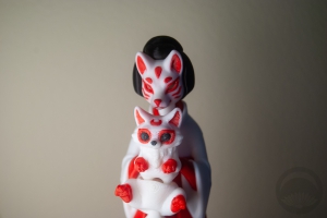
Daruma are those rounded, roly-poly little dolls (usually red, but other colours exist) with a grumpy-looking face. Often one or both eyes are left blank. They’re said to represent the bearded face of Bodhidharma, the founder of Zen Buddhism. Nowadays, they’re used to set goals and encourage perseverance. When you set a goal, you paint in the right eye in. When you accomplish the goal, you fill in the left. At the end of the year it’s common to return the daruma to the temple where it was purchased, for it to be thanked and set ablaze. You would then buy a new one to set a new goal for the upcoming year.

As I mentioned, the traditional colour for daruma is red, but it’s becoming more common to see a whole host of colours used to represent different goals. There are varying opinions as to which colour represents what, but some of the most common meanings are as follows:

Red – Luck & fortune
White – Marriage & harmony
Gold or yellow – Finance
Green – Health
Blue – Success
Pink – Love

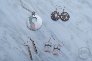
If you’d like to make your own daruma, keep reading! However, this one is not made of fragile papier maché and should absolutely not be burnt!

Continue reading

C is for Chidori

Chidori, 千鳥, plover

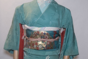
Since today’s feature is about everyone’s favourite goofy little bird motif, chidori, I had two obvious choices for this entry. My bold, high-contrast irotomesode with nami-chidori (plovers on waves) around the hem, or the quieter but more unusual kurotomesode with tiny chidori over stylised matsu (pines).

The subtle, small chidori won out in the end though. I really love this kimono so much, for several reasons. It was purchased in Boulder, Colorado, which is a place that means a lot to me, and it’s also a rarity since there was only a brief period where it was acceptable and stylish for kurotomesode to have a small amount of motif on the back of one sleeve. As much as I love the showier irotomesode, this piece below will always have my heart.

I paired it with a tsuke-obi that also has pine motifs and went for accessories all in the same sort of warm green/brown colour scheme. It’s a very subdued and harmonious outfit, which appeals to me more and more as I get older.

Since “chidori” is also the term used for herringbone patterns, I debated using this obidome as well. You can see where the name came from, the little interlocking shapes do indeed look like the stylised shape used to represent the birds. But it felt too modern and casual for the rest of the outfit, and didn’t fit over the obijime I’d chosen, so I’ll save it for another time 🙂
Items used in this coordination

B is for Bento

Bento (弁当), organised packed lunch, typically with rice
It seems a bit silly to pack a boxed lunch at a time when nobody’s supposed to be leaving the house! But nothing’s stopping me from eating it here at home.

I’ve never assembled a proper bento before, it always seemed too daunting and I’m usually in a rush on work days and rarely have the foresight to prepare it the night before. But now that I’ve got all the free time in the world, it seemed like a good opportunity to use this cute bento box that Kansai Gal sent me a while back. And yes, those are indeed Darth Vader Lightsaber chopsticks, because why not?

One container has rice, furikake, and poached chicken. The other has a nice selection of fresh veggies; tomatoes, carrots, radishes, and baby spinach underneath it all. I tried to cut the radishes into roses and the carrots into sakura, but I’m not sure how well I succeeded. The awkward vegetable cutting aside, it was way easier and more fun to assemble than I’d expected, if I’m being honest.

Would I do this again, once I’m back at work when all this craziness is over? Definitely. Will I bother trying to be cutesy and cut my vegetables into wonky flowers? Probably not.

A is for Aka

Aka (赤), red or crimson

Few things are as emblematic of Japan as the colour red. Initially, my plan for today included a simple coordination of red pieces, but the more I thought about it, the more I realised that red is so much more than that. It is the colour of the Rising Sun, the colour of celebration, the colour of torii gates, the colour of a geisha’s iconic makeup and accessories. It’s a colour that has become intricately intertwined with the fabric of Japan.

In the Heian era, benibana or red safflower, became an incredibly popular pigment for clothing, decor, and cosmetics. The Japanese love affair with red has never dwindled. While nowadays they’re mostly synthetic pigments, it’s still found in many traditional crafts, clothing, and makeup. It can represent anything from joy to piety to love to lust, depending on hue and context. It’s so much more than just “a colour”.

Here are a few of my favourite red pieces in my collection, so you can see just how beloved and versatile red is when it comes to Japanese textiles. Do you have any favourite red pieces, or items? If so, I would love to see in the comments!

April A to Z Challenge!

A few days ago, I discovered the April A to Z Challenge. Essentially, it’s a daily challenge where you write a blog post each day in April (except Sundays, for a little break) focusing on a topic beginning with a letter of the alphabet. Unfortunately, I missed the official sign-ups but I can still have fun participating.

I know I’ve said I’m not going to do daily challenges here, but since this isn’t going to be a coordination every day and I have no other commitments all month (thank you social distancing!), it felt like a good way to keep my mind occupied. There will definitely be kitsuke posts but there will also be DIYs, knowledge posts, and other fun things. Hopefully this will give us all something to look forward every morning in this strange and unstable time. 🙂