
Kimono, like any other garment out there, is subject to trends and changes in fashion. Usually, this just impacts the colours and patterns used, since the shape of a kimono is so fixed. Every so often, however, someone comes up with something really different and unique. Traditionally, brides in Japan will wear a special type of furisode called a kakeshita on their wedding day. The colours and styles and motifs of these can vary greatly, but they’ve always been the same basic garment. However, modern women are looking for ways to wear more modern dresses but still retaining a bit of that traditional feel. For a while now, there have been designers such as Aliansa who will convert a kimono into a western-style dress, but this requires irreversible changes to the kimono. This isn’t ideal for family heirlooms or treasured gifts. So what’s a bride to do?
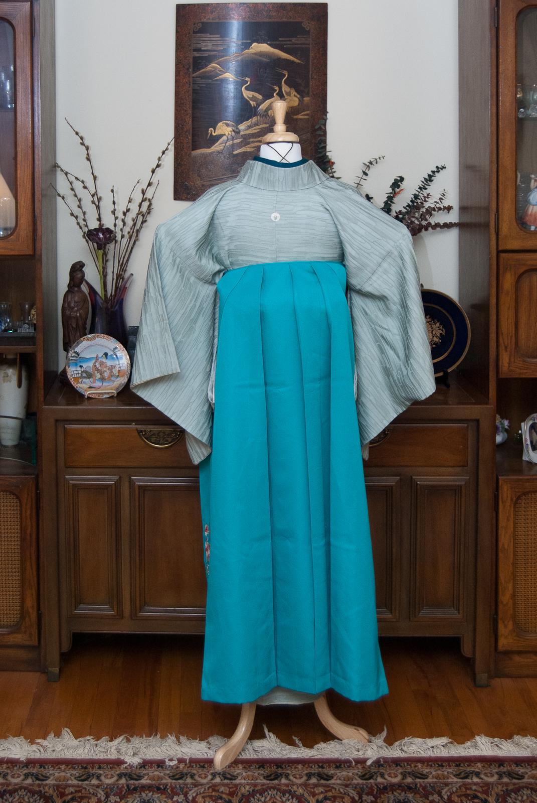
Enter The Oriental Wasou, a bridal studio that’s figured out a fantastic way to temporarily convert a furisode simply by folding it carefully and draping it over a western-style ballgown! They claim it takes only ten minutes, and after the event all you’d need to do is give your furisode a good steaming, fold it carefully, and store it away. When I first saw these adaptations, I knew I wanted to give one a try. However, I am not the sort of person who has ballgowns or wedding gowns just lying around, so the idea went onto the back-burner until I was at the thrift store a few weeks ago and found this utterly beautiful mauvey pink gown with a sheer black overlay. I knew right away it would be the perfect complement to my favourite furisode.

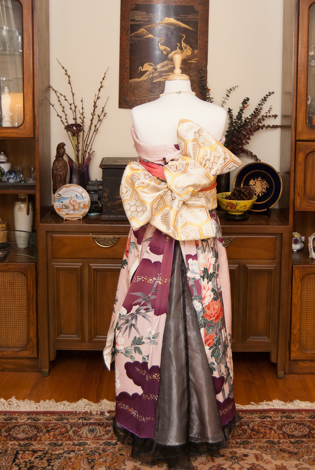
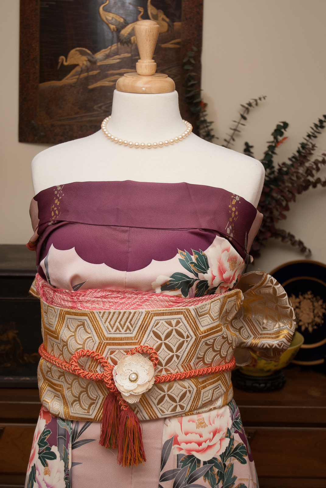
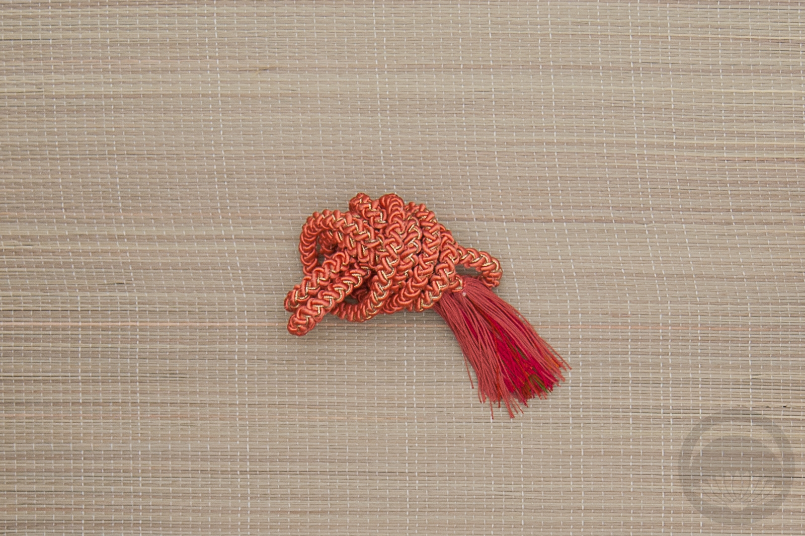
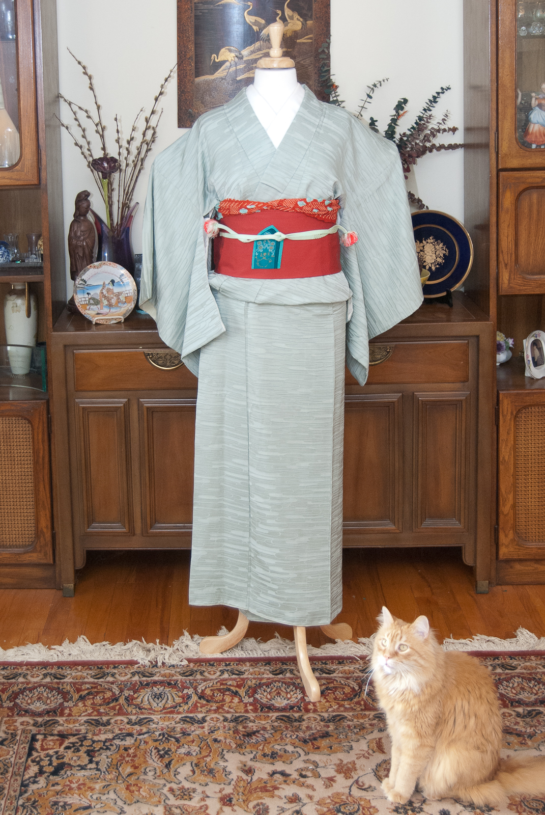
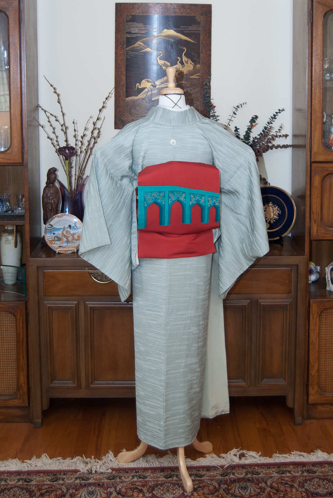
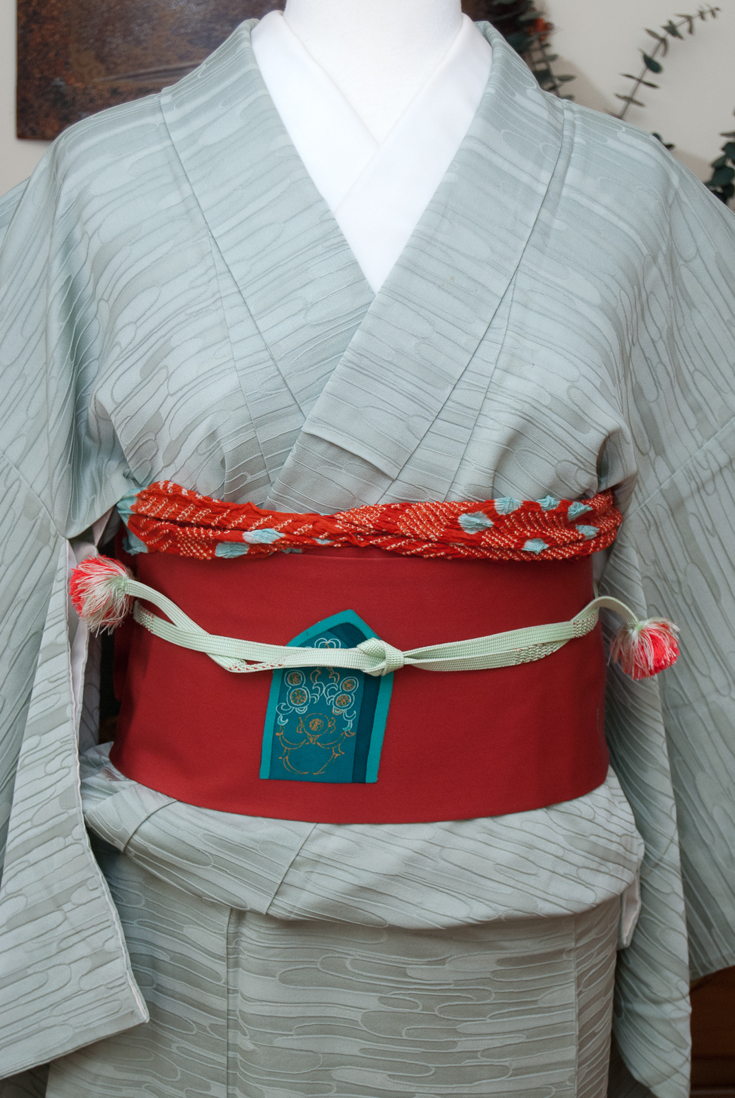
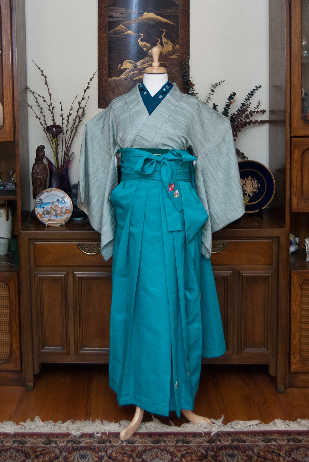
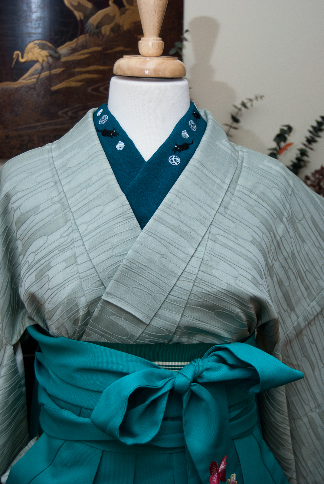
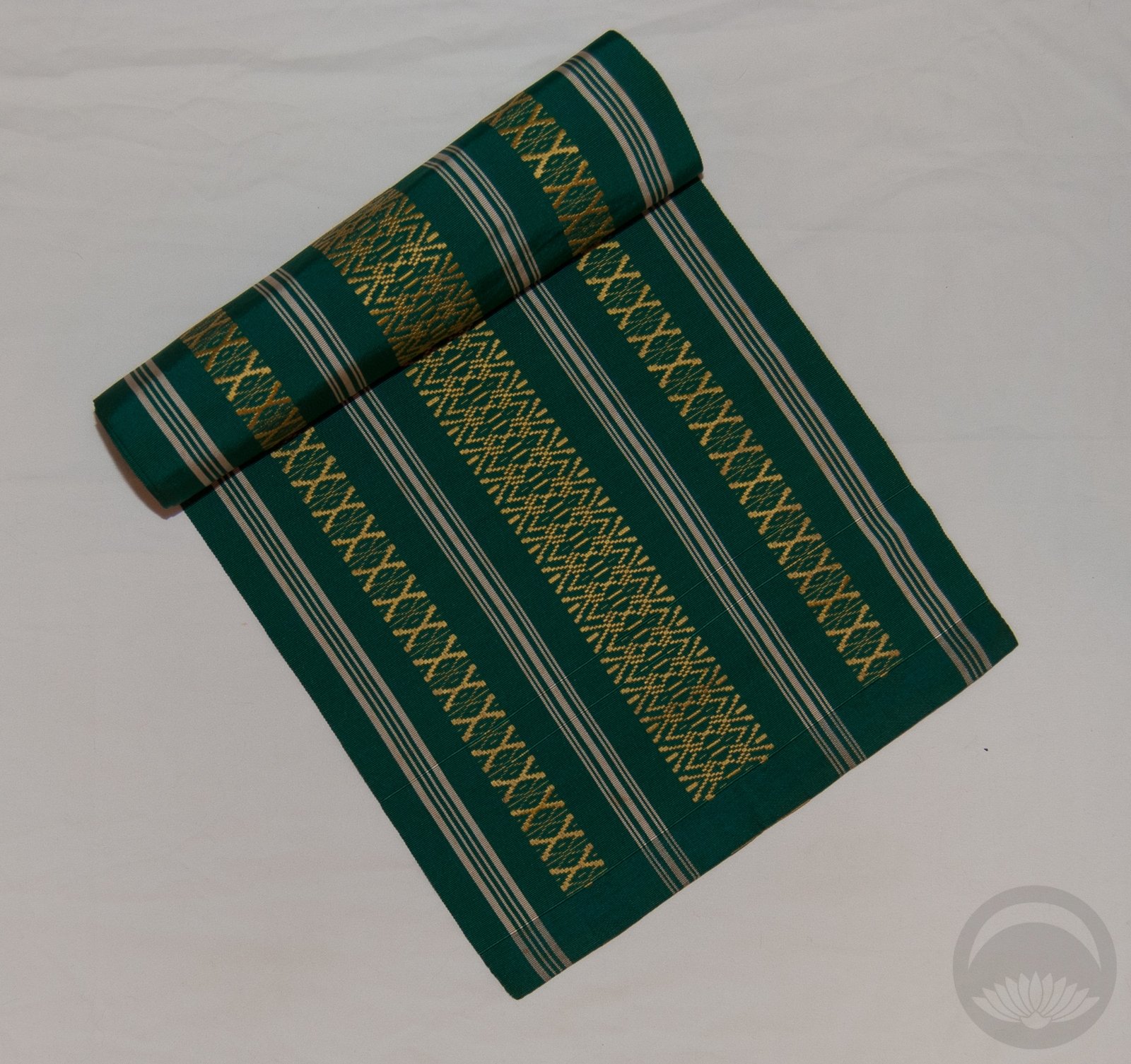
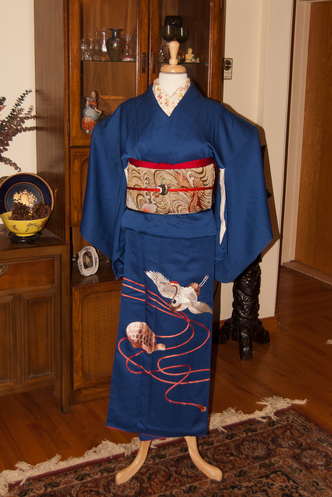
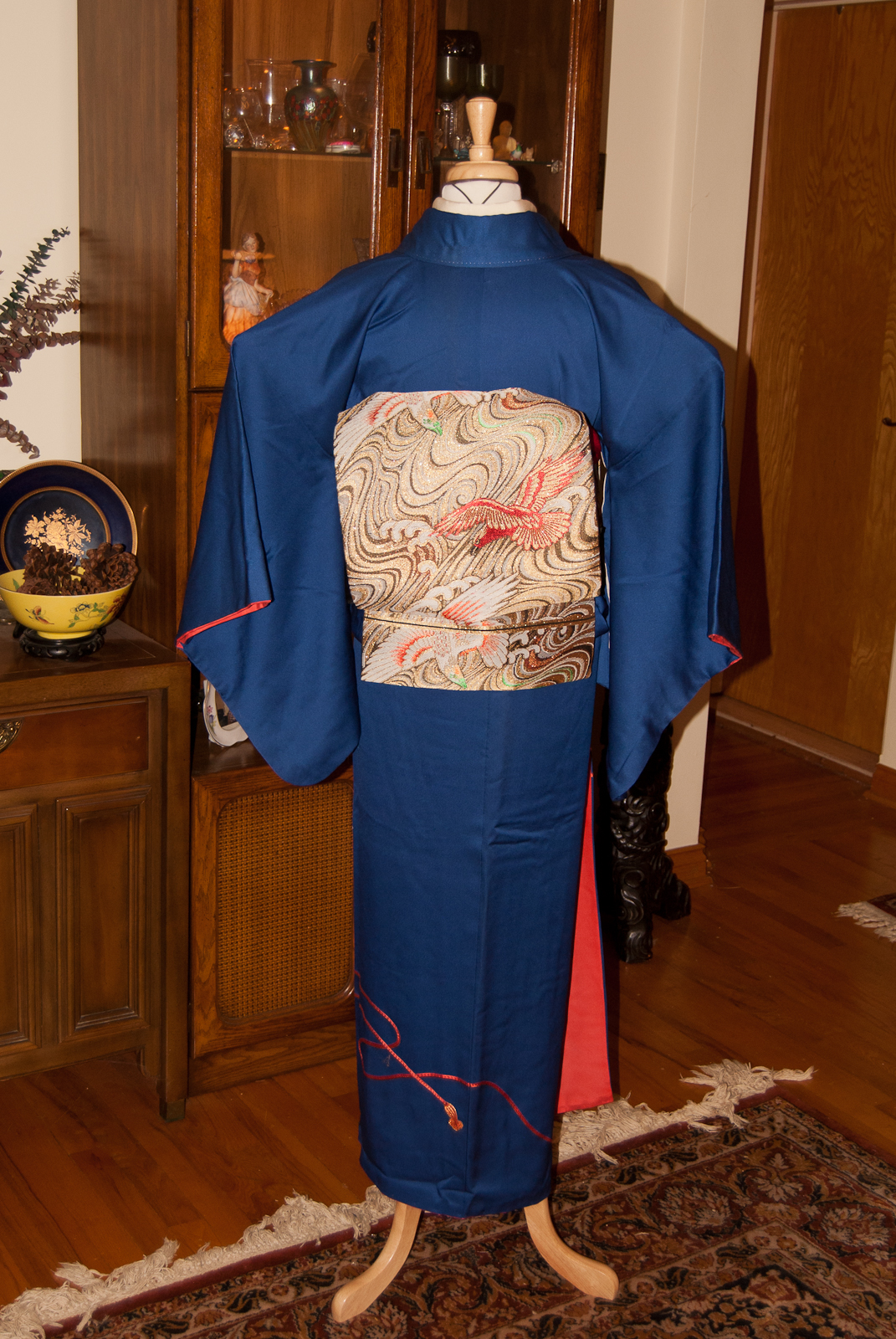
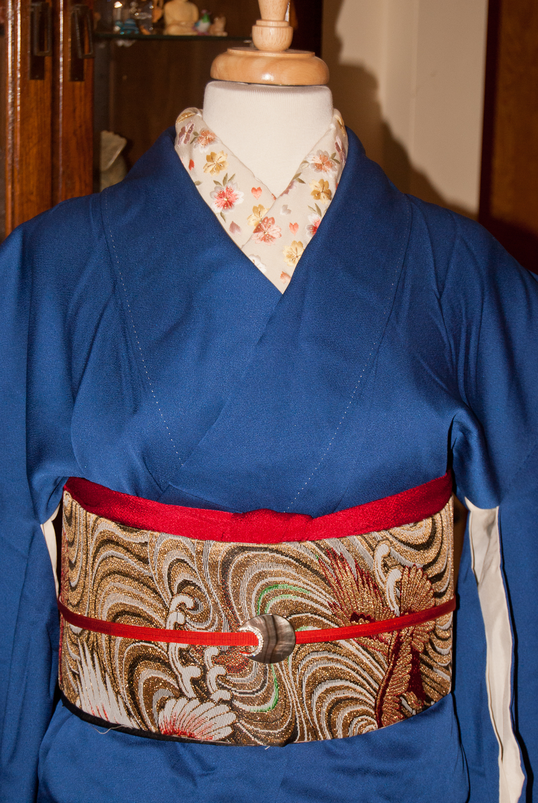
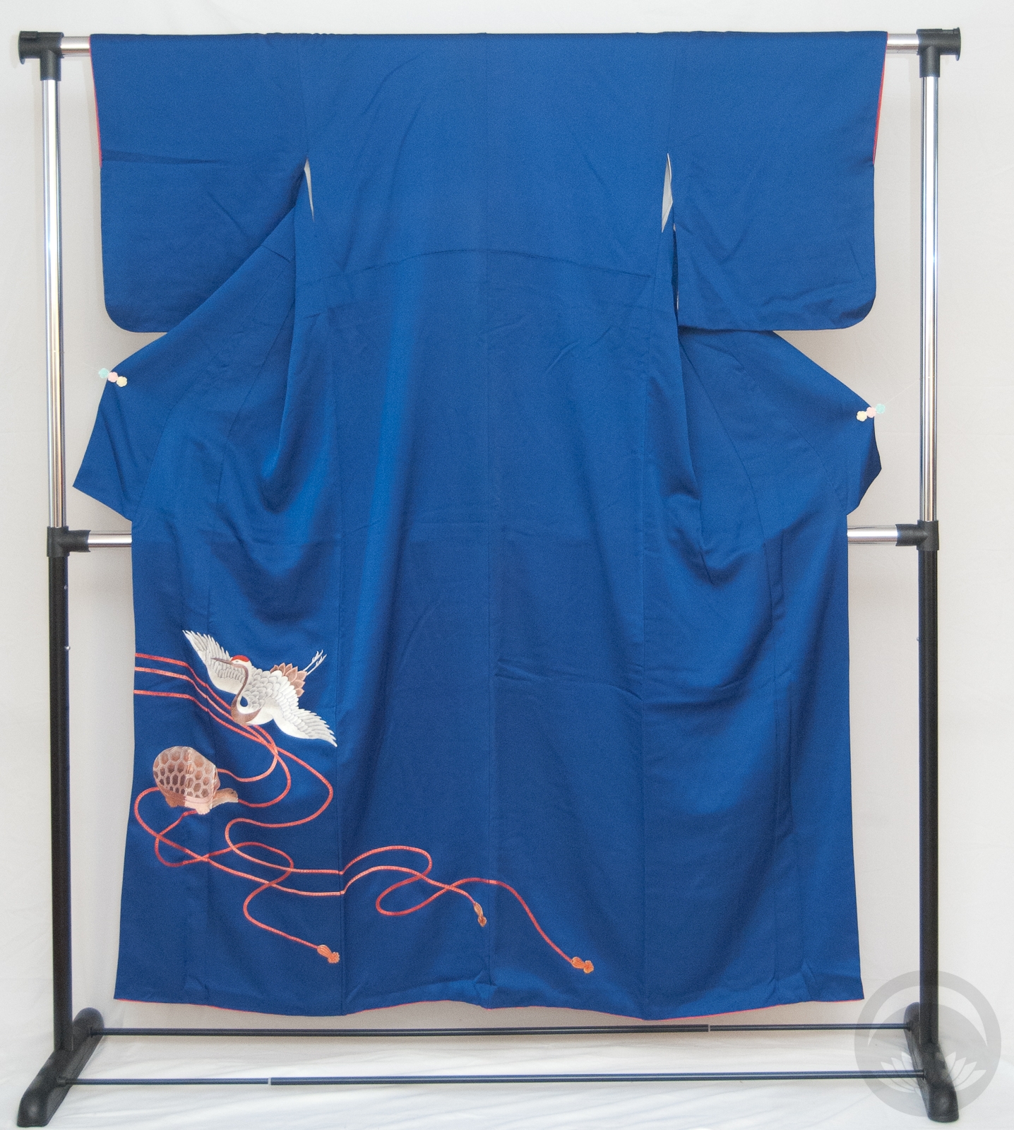
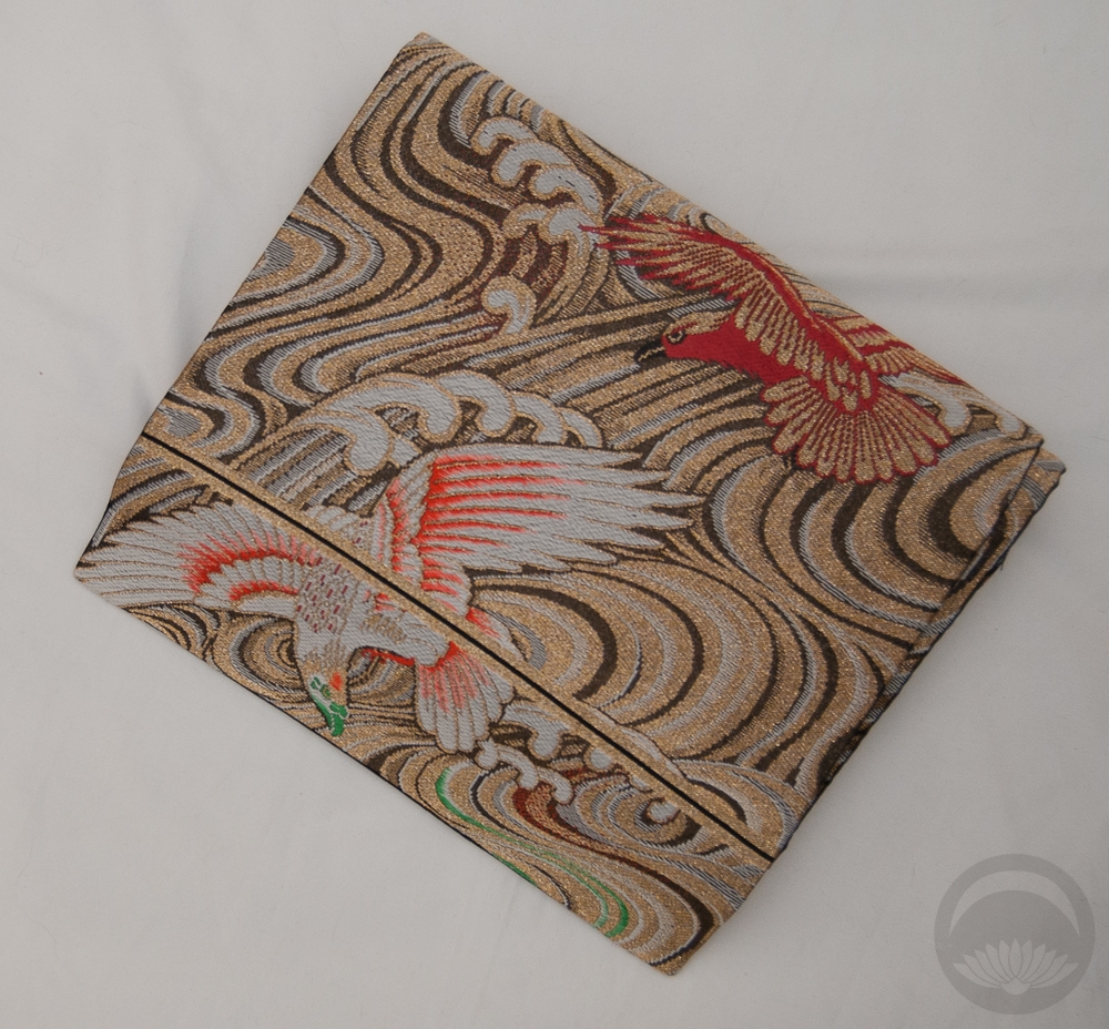
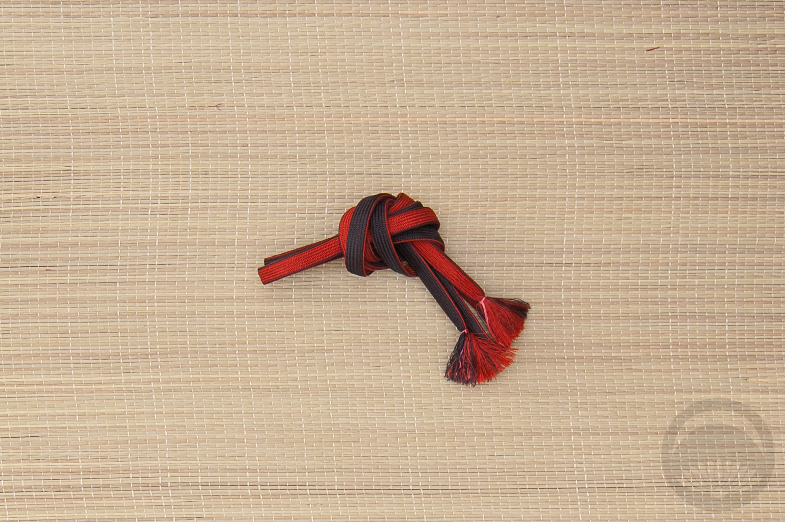
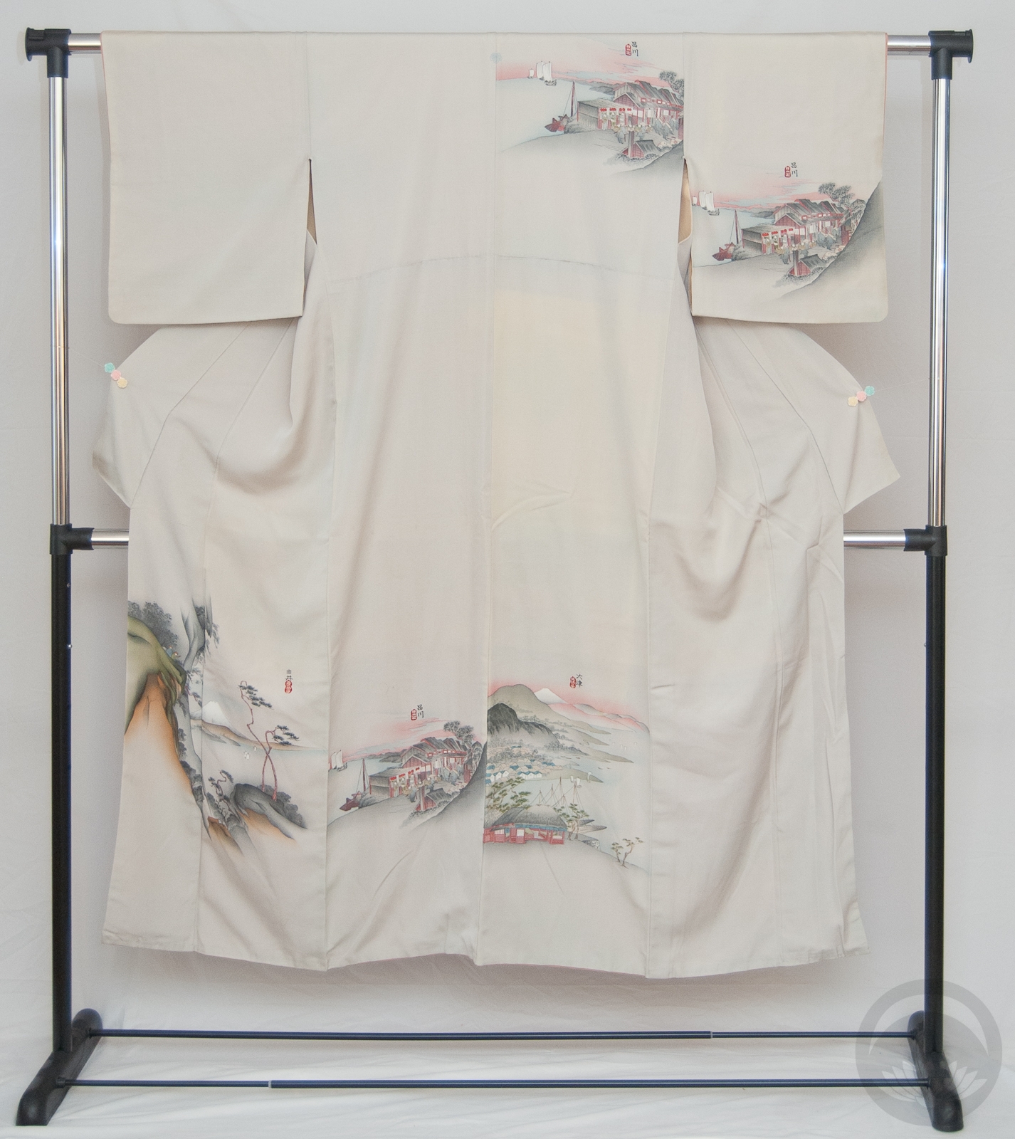
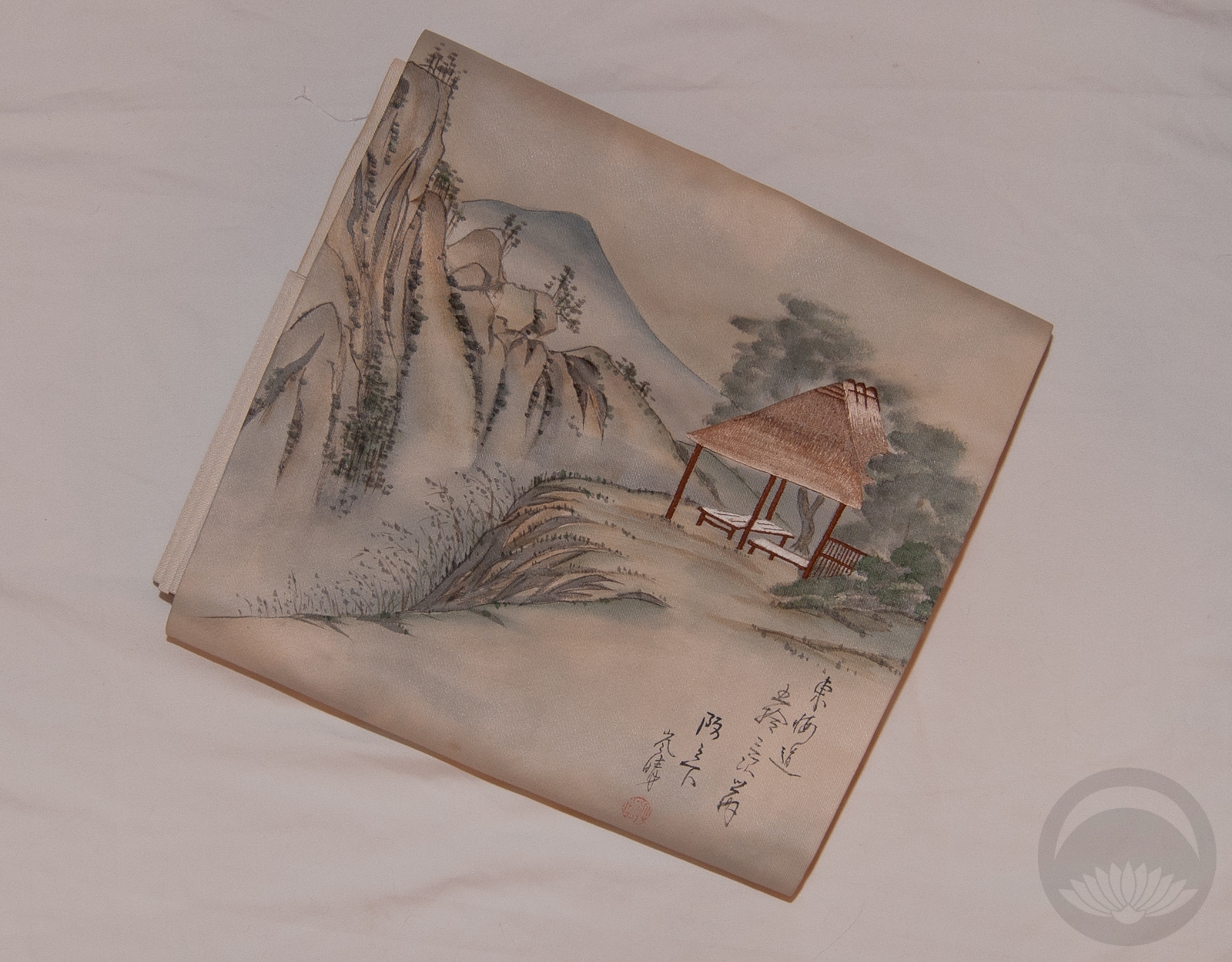
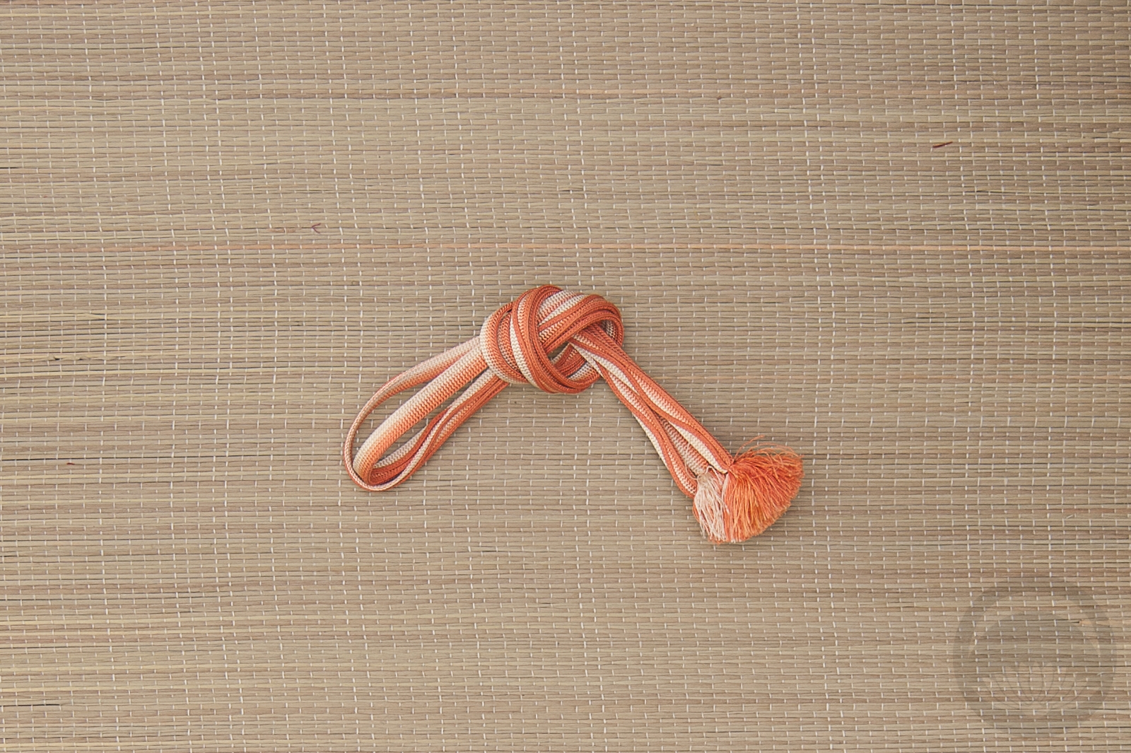
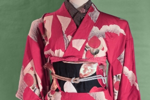
This furisode and I have had a colourful history. I bought it years ago while visiting my best friend at the time, even though I knew I’d never have a valid or justifiable reason to wear it. It didn’t matter, I was in love with it. I dressed myself in it a few times for photos, I had a lot of fun with it, and then a few years ago my friend and I parted ways. There was a lot of silly emotional baggage whenever I looked at the kimono, and I stopped doing pretty much anything with it. Fast-forward to middle of last year, and not only have we reconciled, it feels like we’re closer than ever. I knew I had to pair this outfit with the pearl necklace he’d given me for my birthday one year. The other accessories were chosen to help emphasise some of the colours in the kimono. The obiage and obijime perfectly mirror the shading in the peonies, and the obi helps draw out the gold flecks in the background. Since this is such a non-standard outfit, I had fun making up a big flashy obi musubi. It also helped to hide the draping and folding in the back of the kimono.
Overall, I think this experiment was quite successful. It’s definitely a departure from what I’m used to, but everyone needs to step out of their comfortable rut now and again, right?
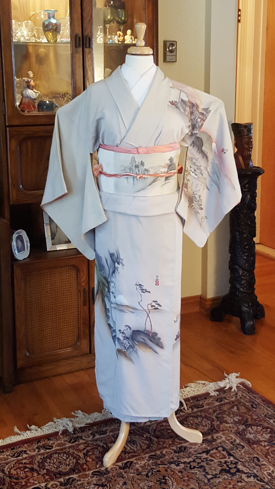
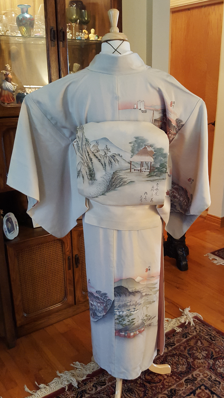
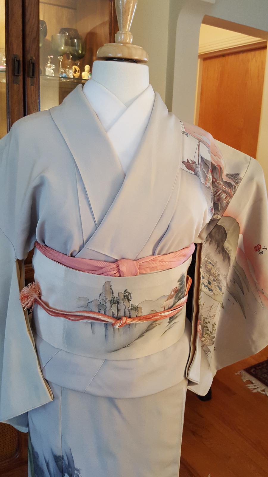
Items used in this coordination
-
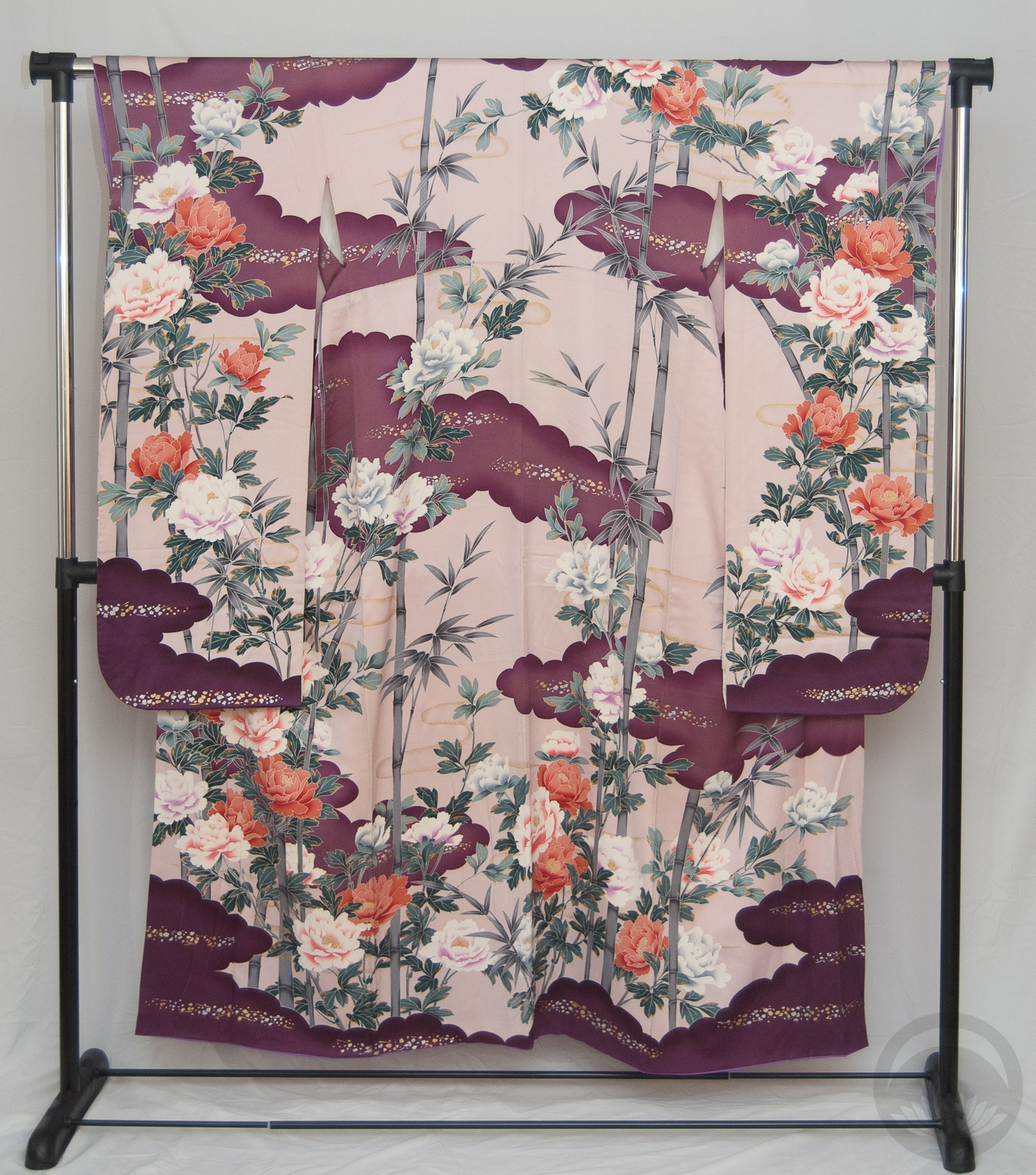
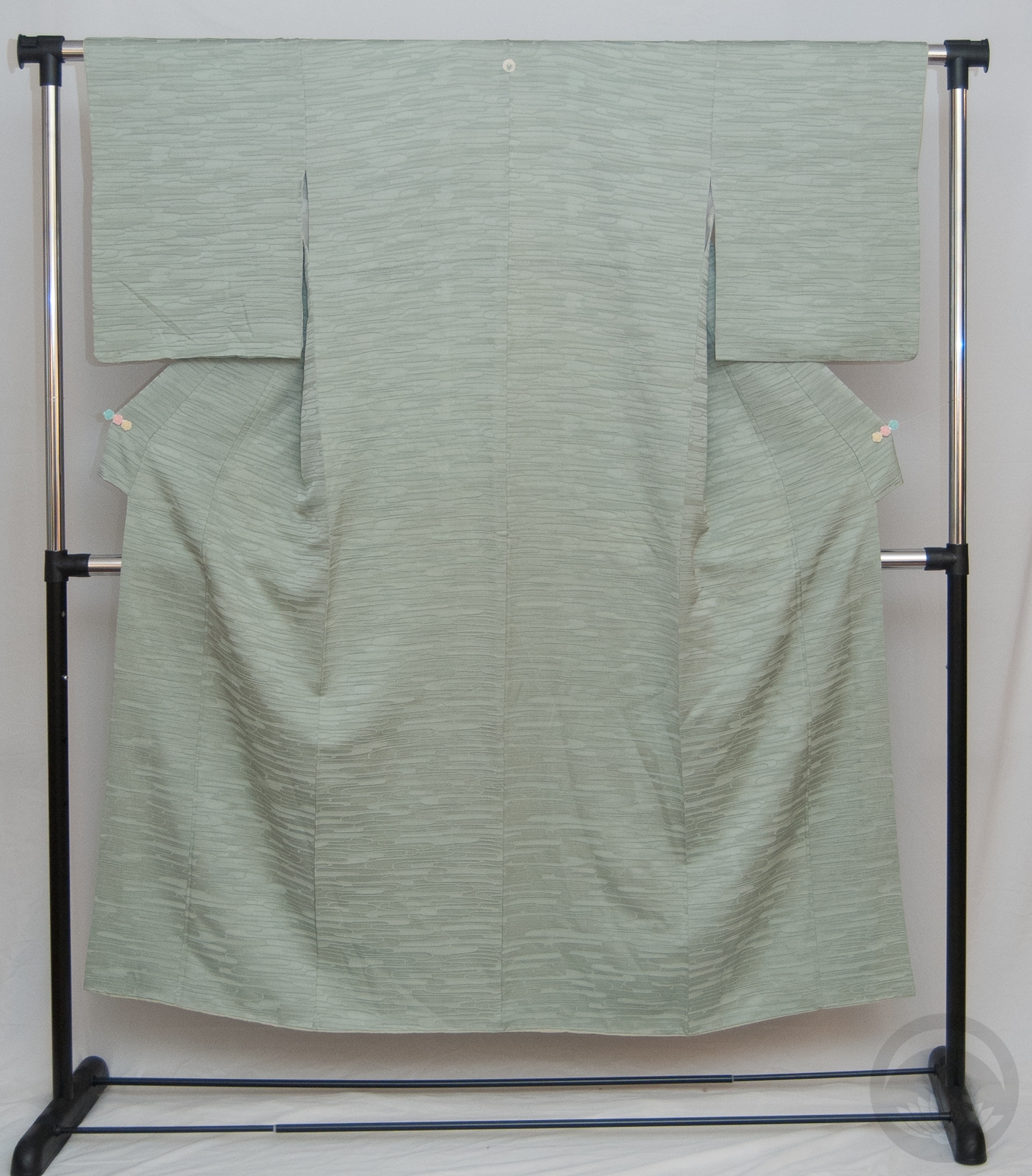
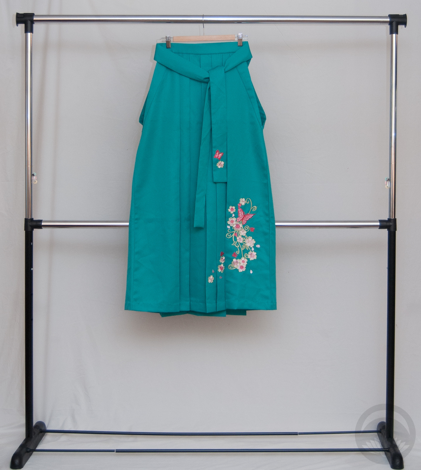
- Peony and Bamboo Furisode
-
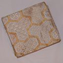
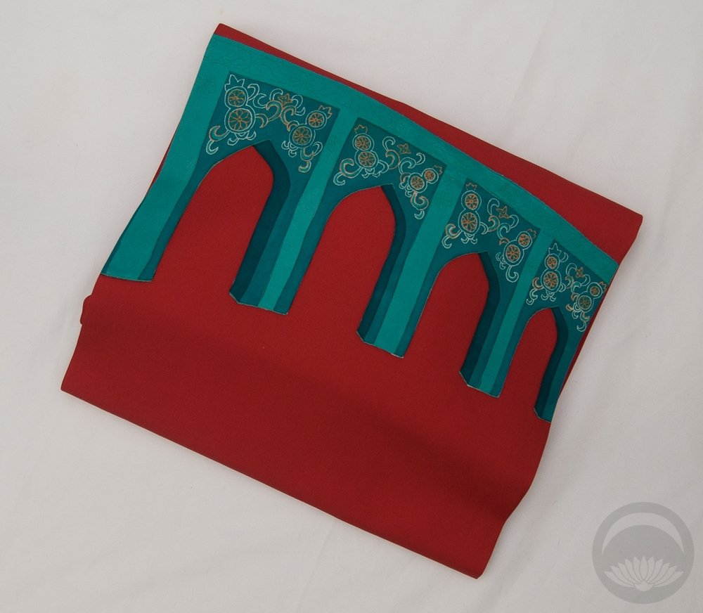
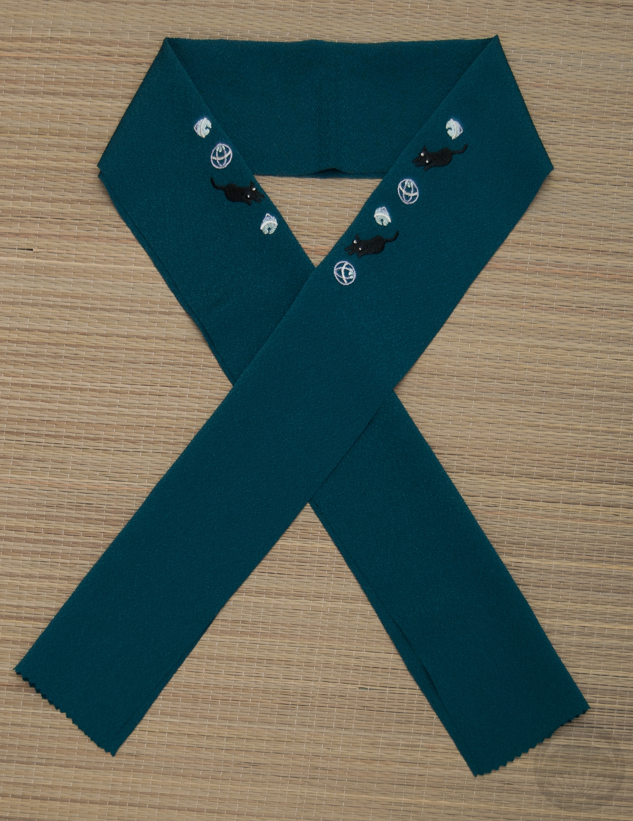
- Gold Geometrics

-
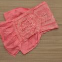
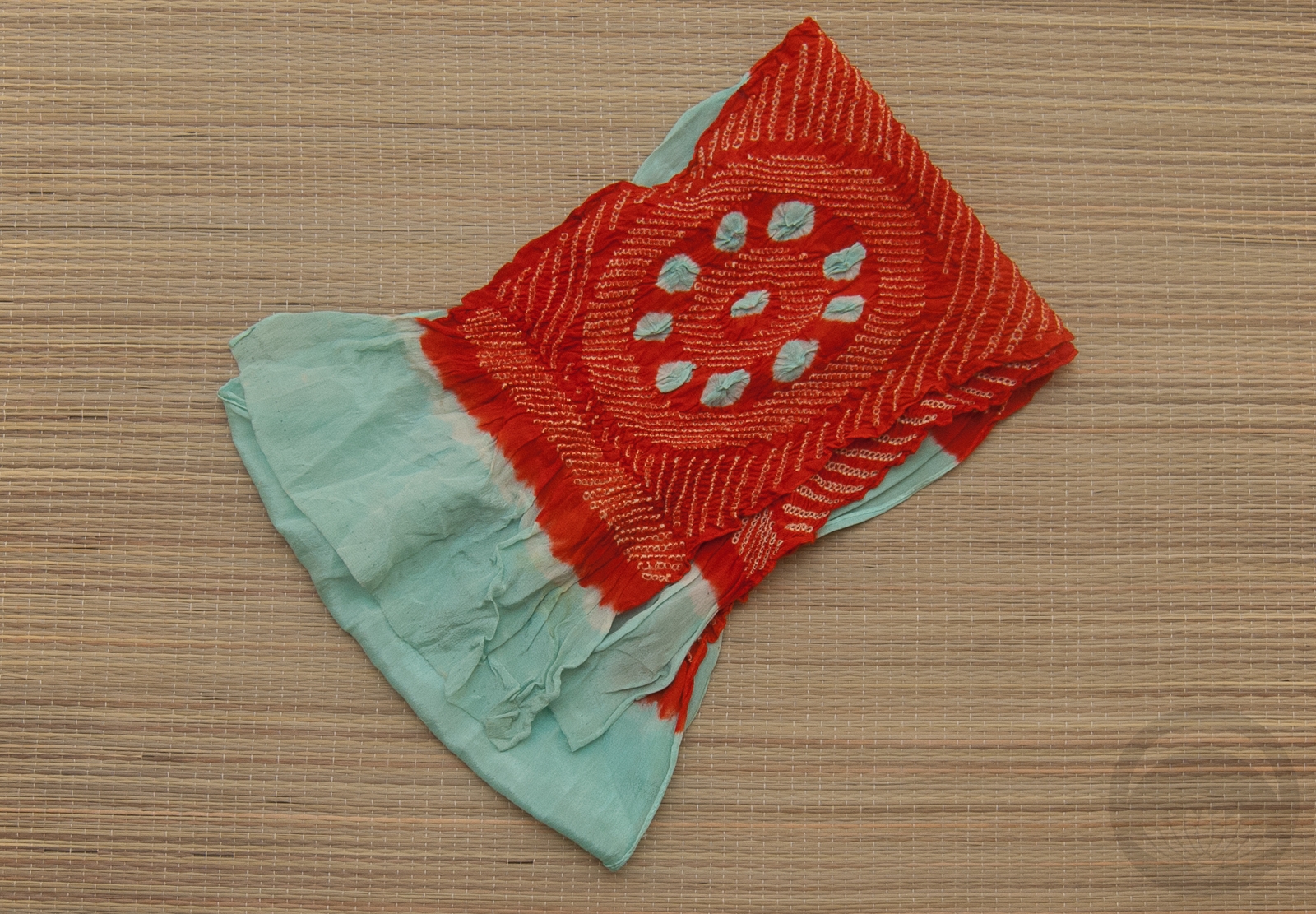
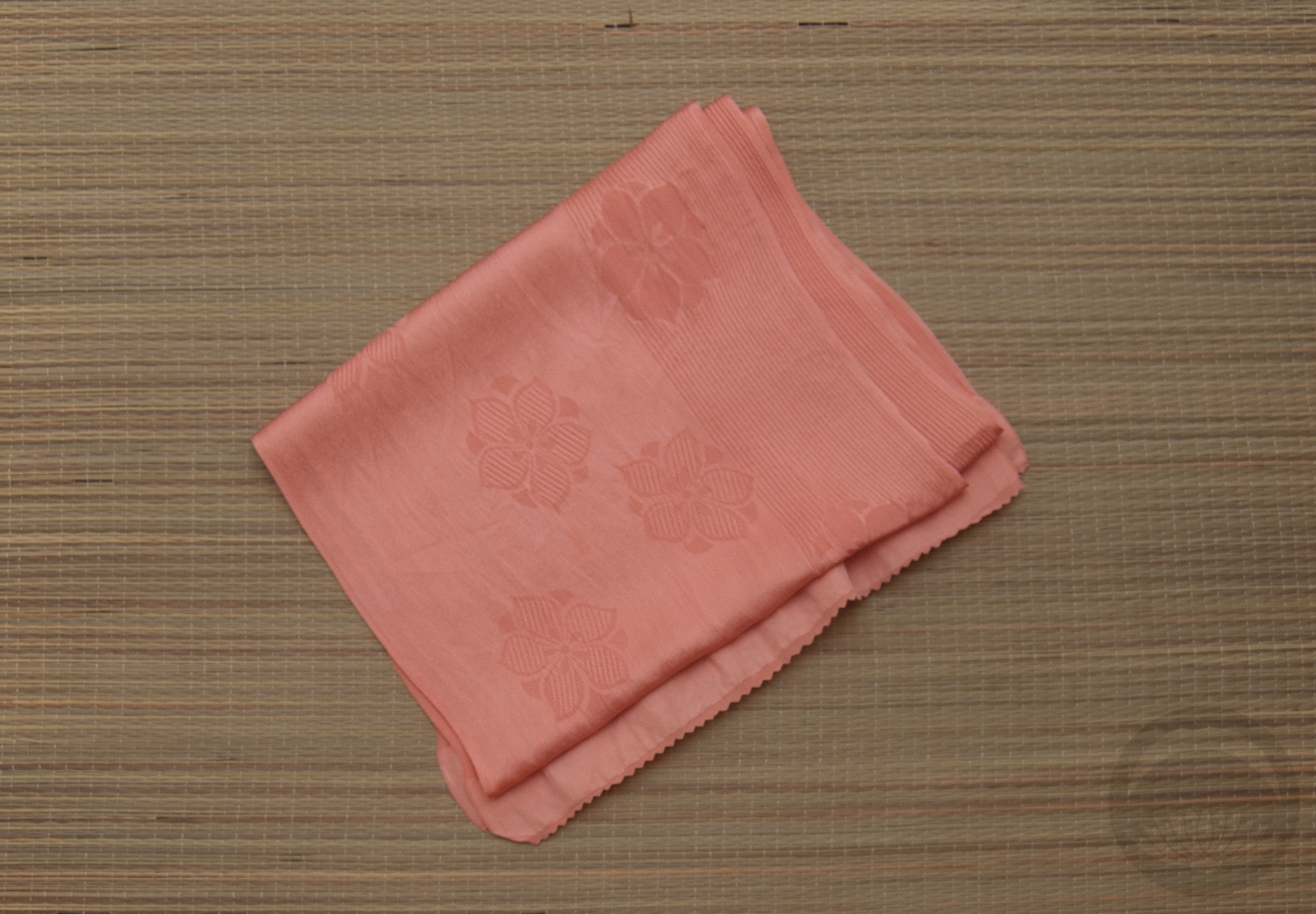
- Pink Shibori
-
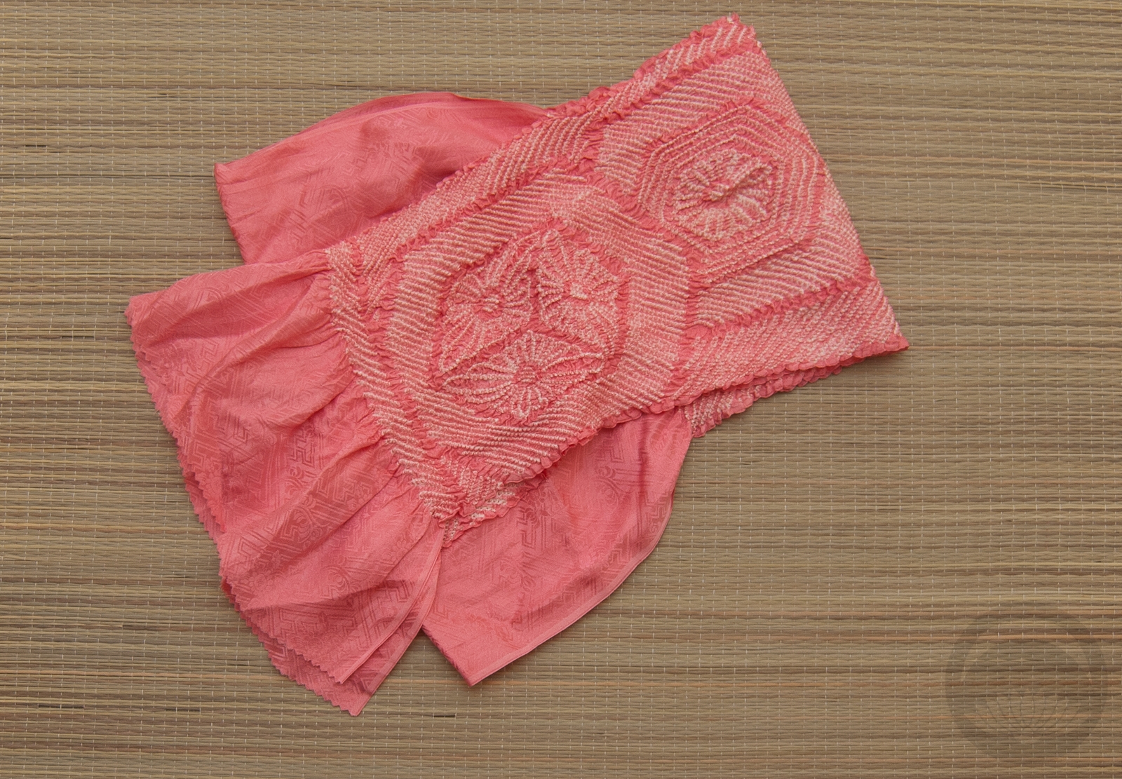
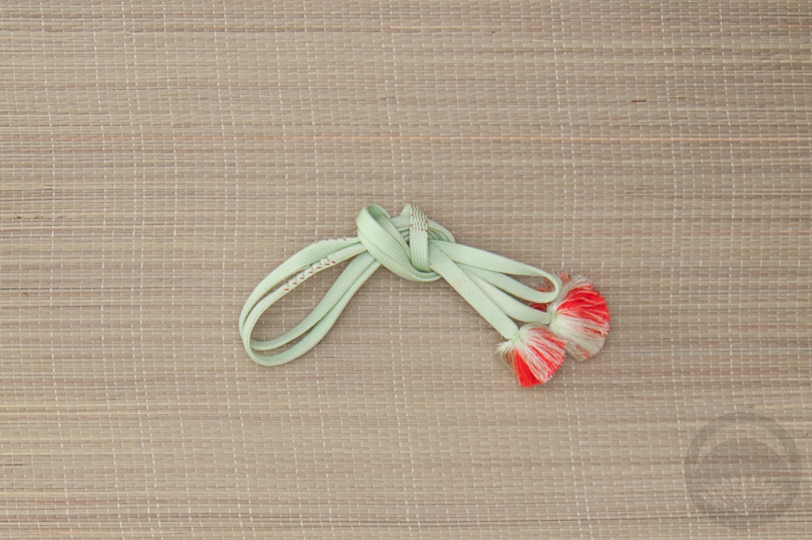
- Salmon Furisode


 Bebe Taian
 CHOKO Blog
 Gion Kobu