
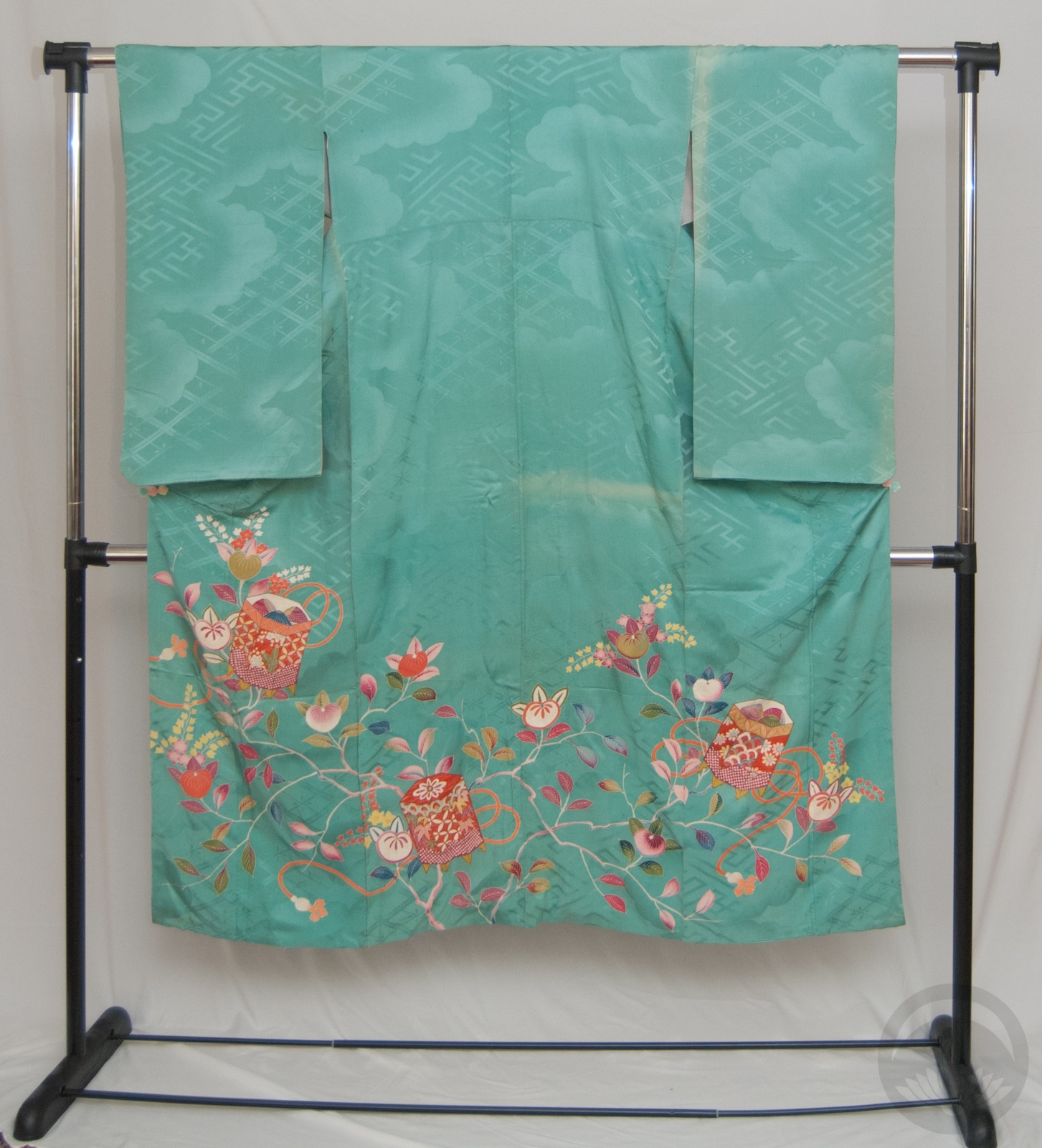
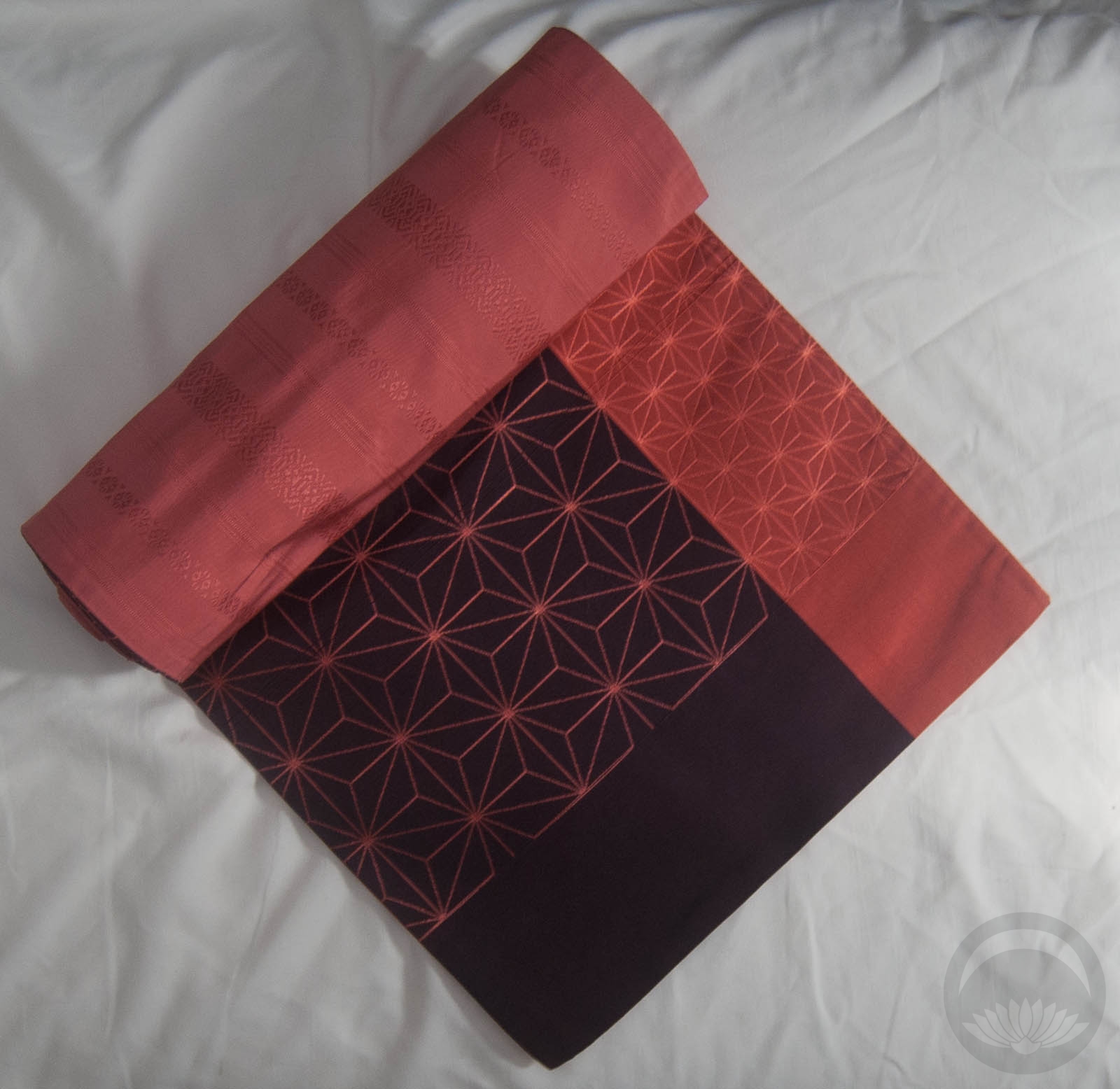
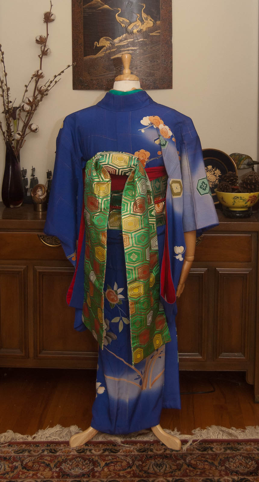
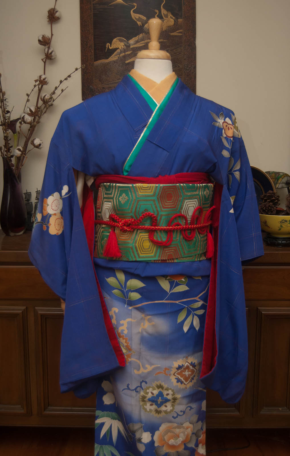
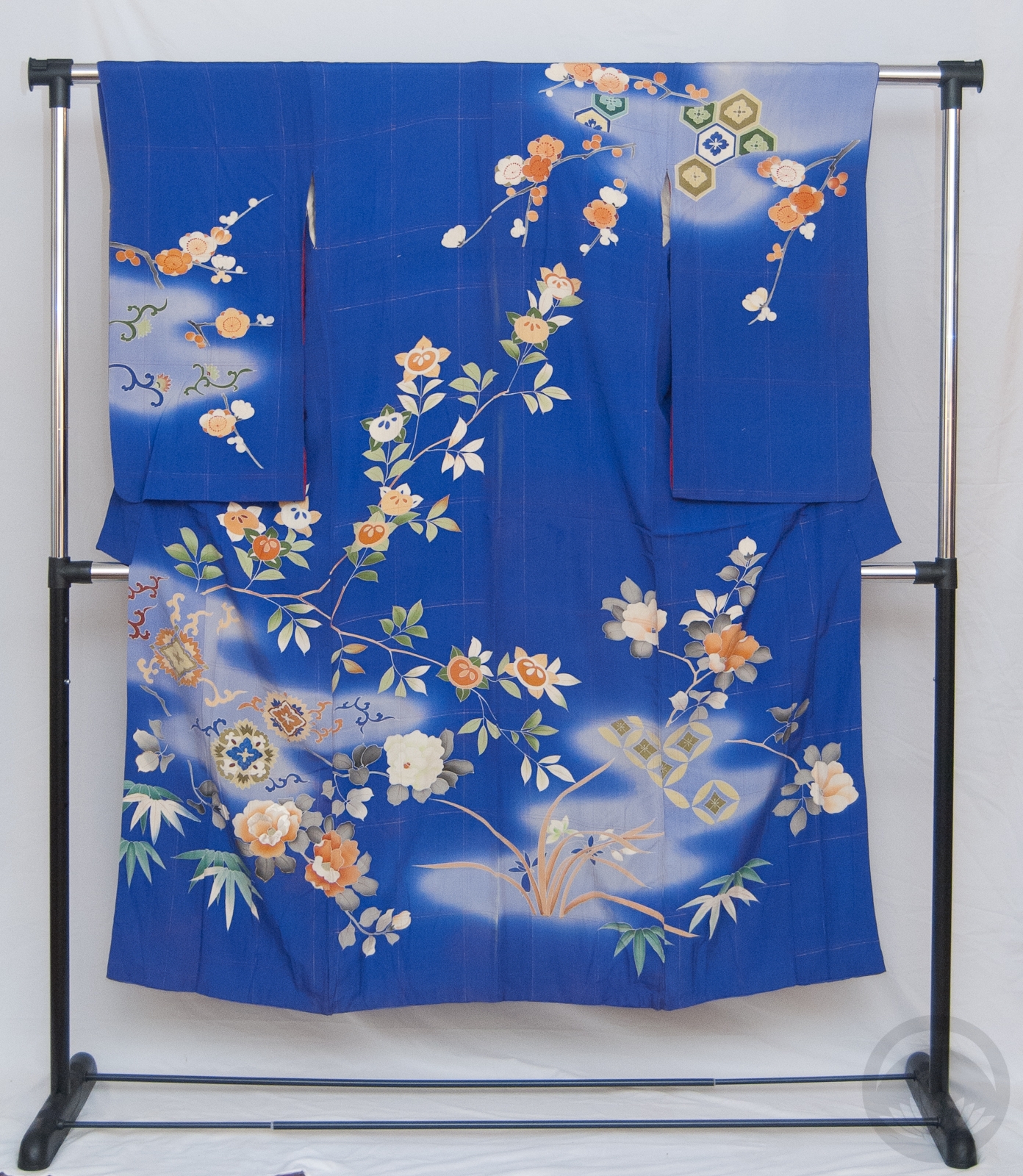
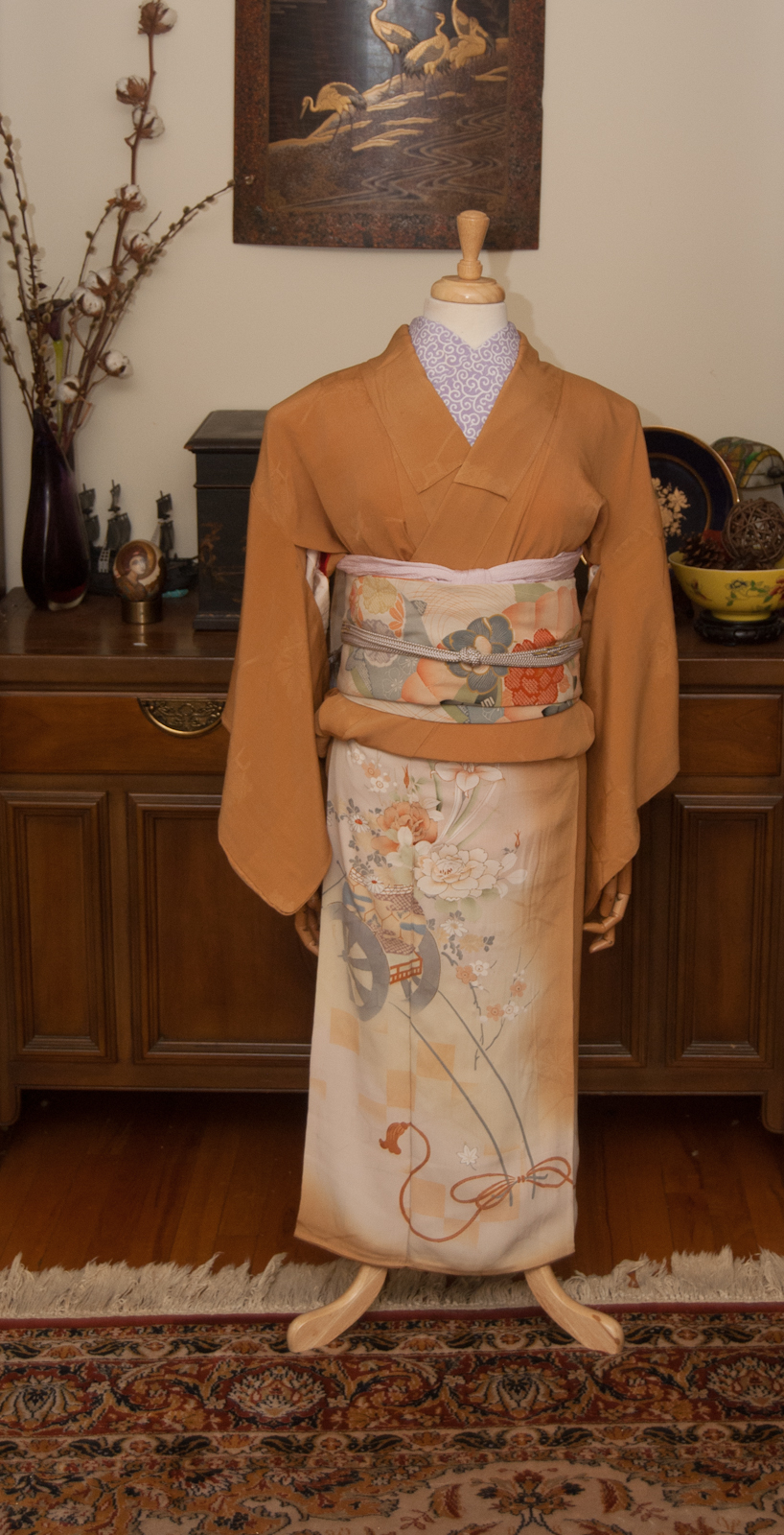
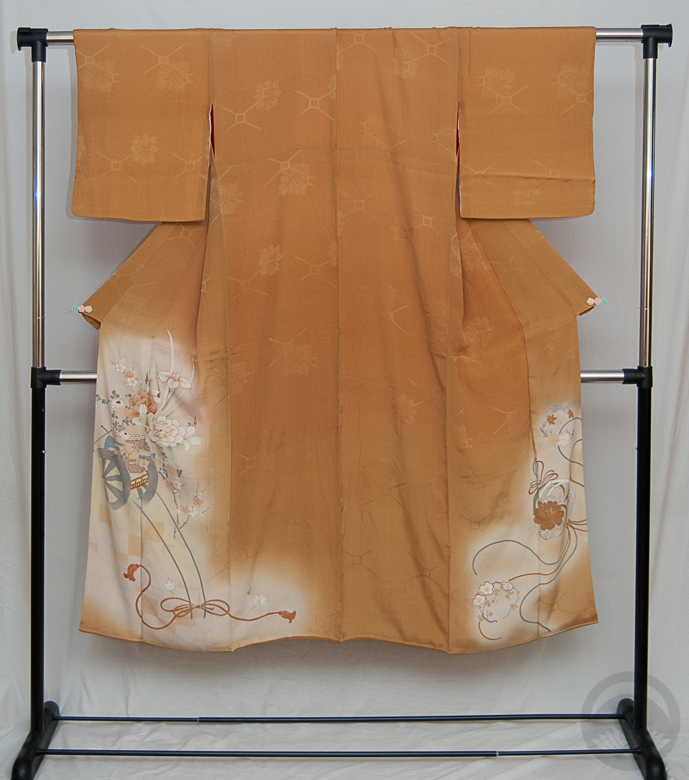
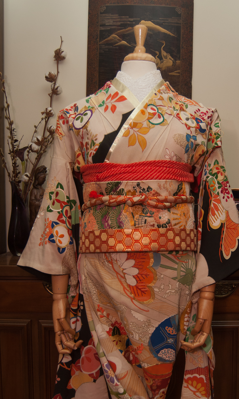
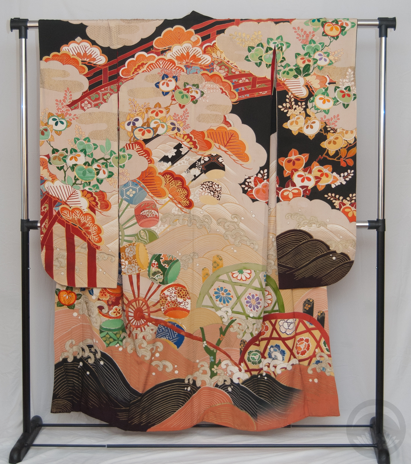
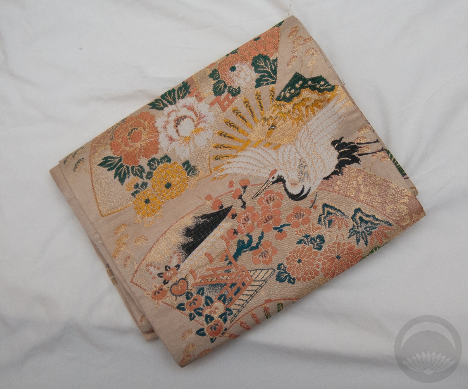
Last week, I espoused the virtues of not always sticking to your initial plan. This week reminded me once again why that’s so important! I received this lovely purple-and-pink hakata and asanoha obi during the week and had an entirely different kimono in mind for it. I’m working from home today, so during some down-time I went into the kimono room to collect the pieces I needed and just couldn’t find the kimono anywhere! While rummaging, I pulled this vintage turquoise beauty out and decided to re-think my entire plan. Pink and purple of the obi are both very prominent accent colours in the kimono so I just ran from there.
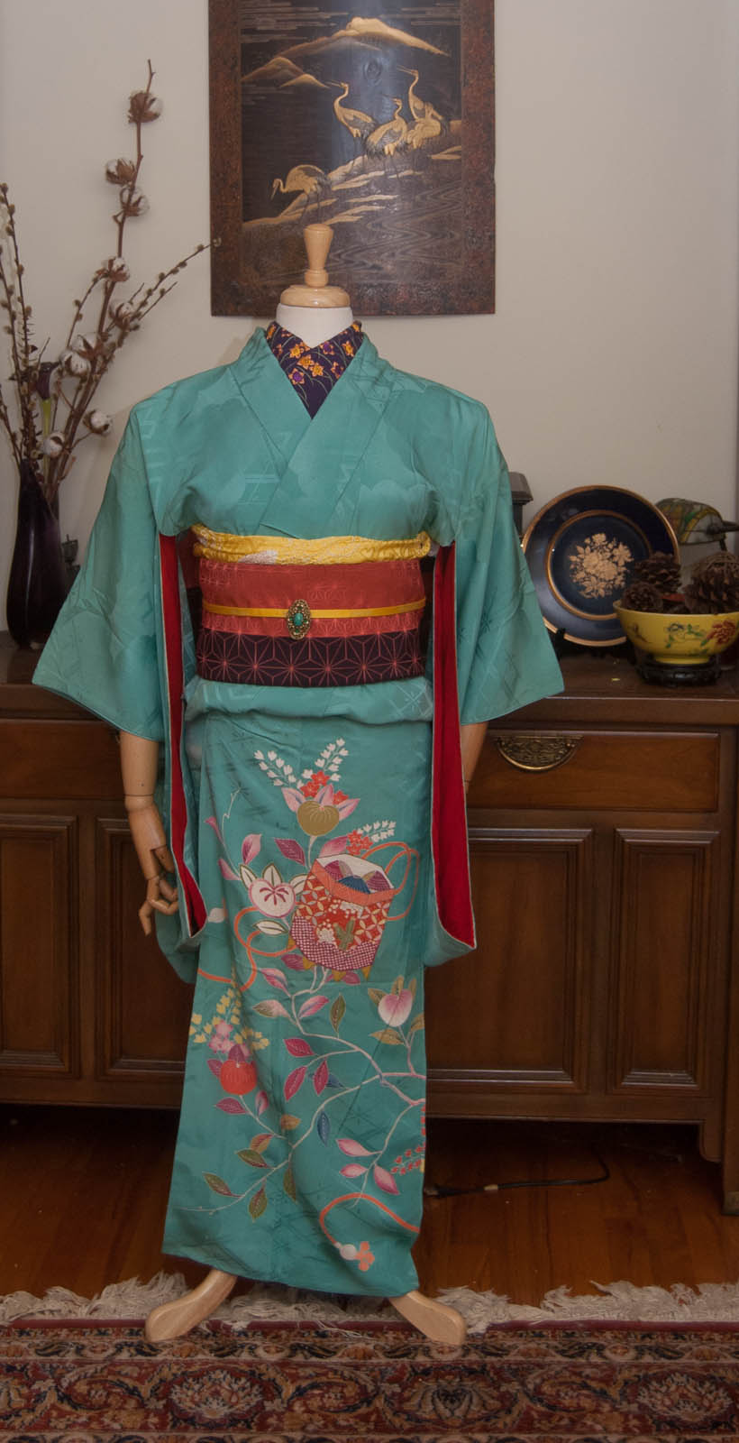
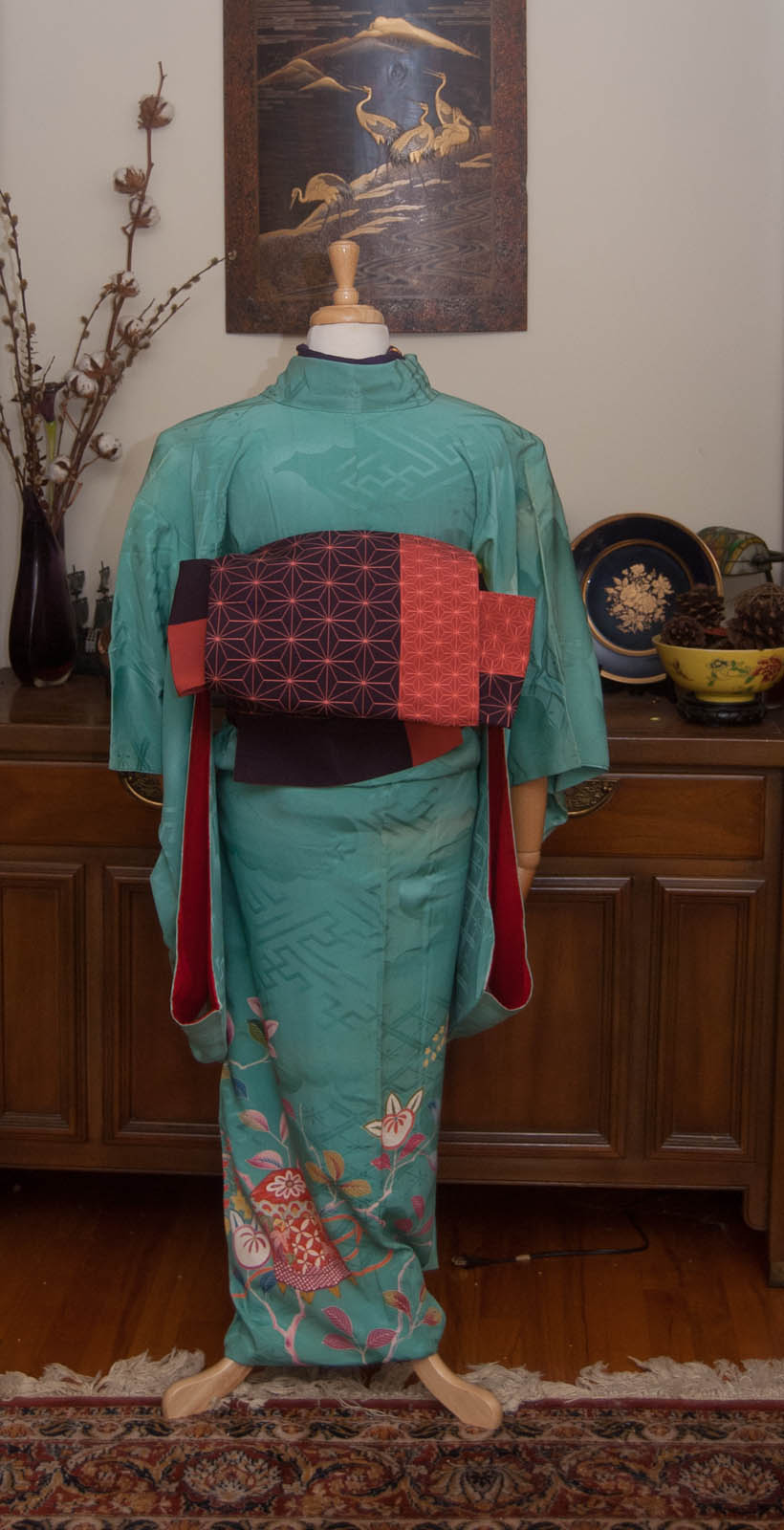
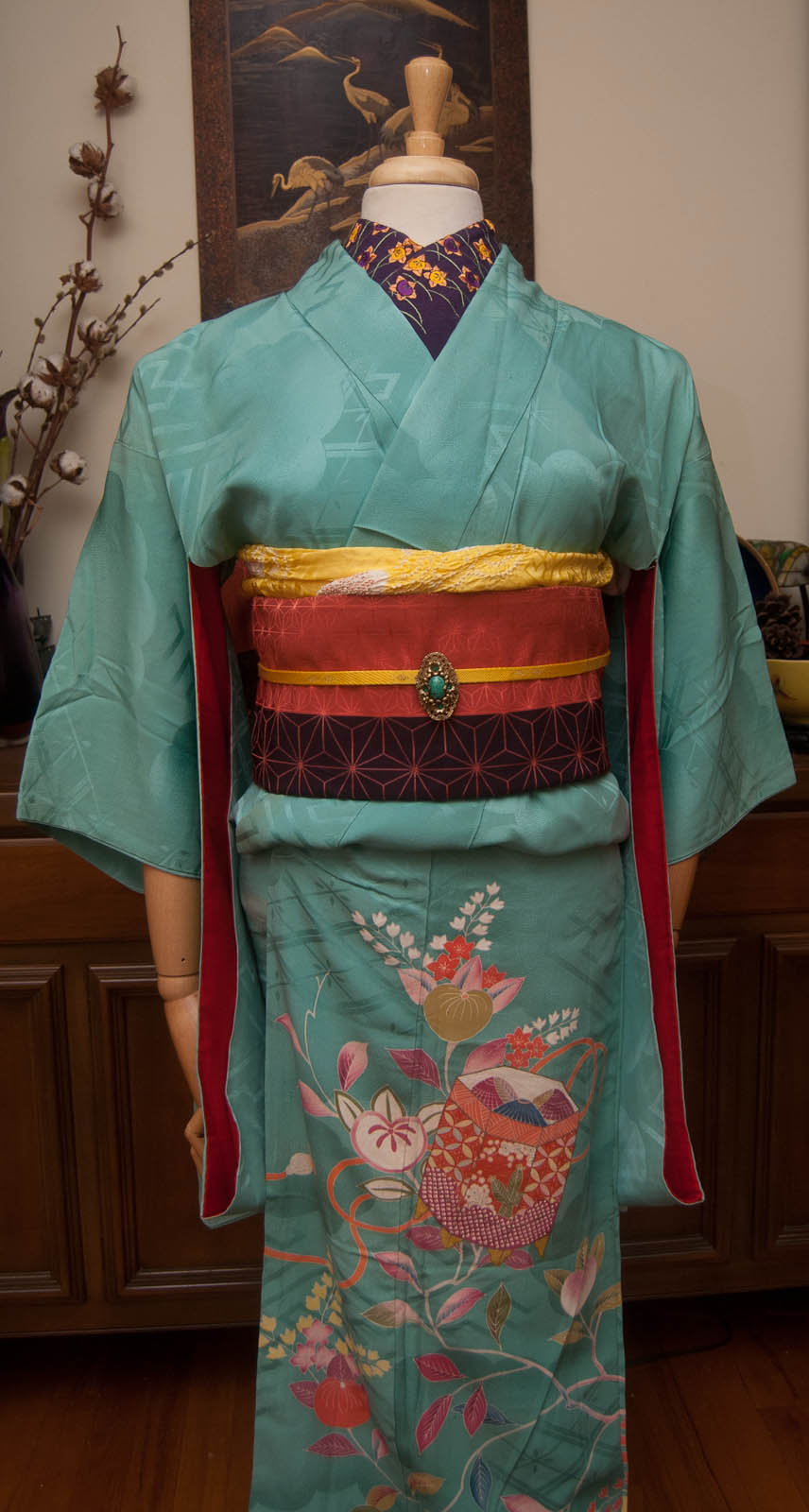
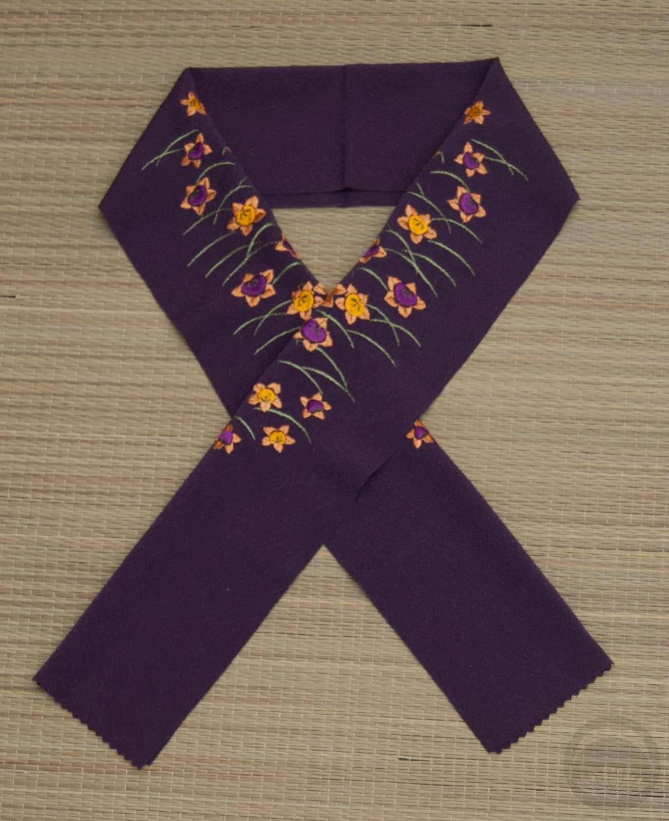
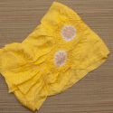
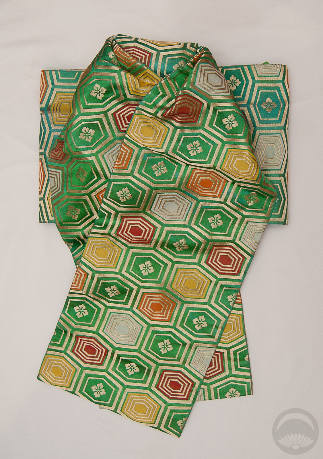
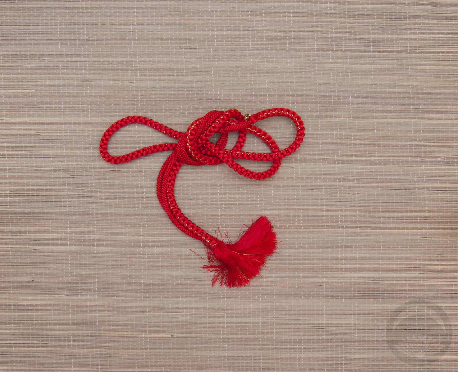
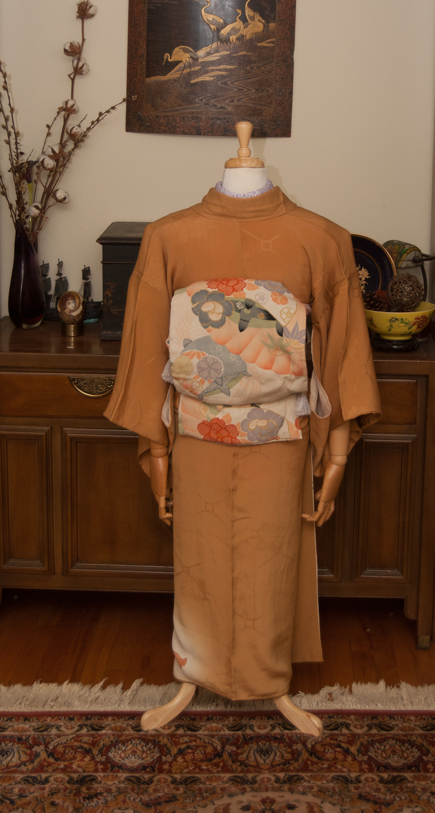
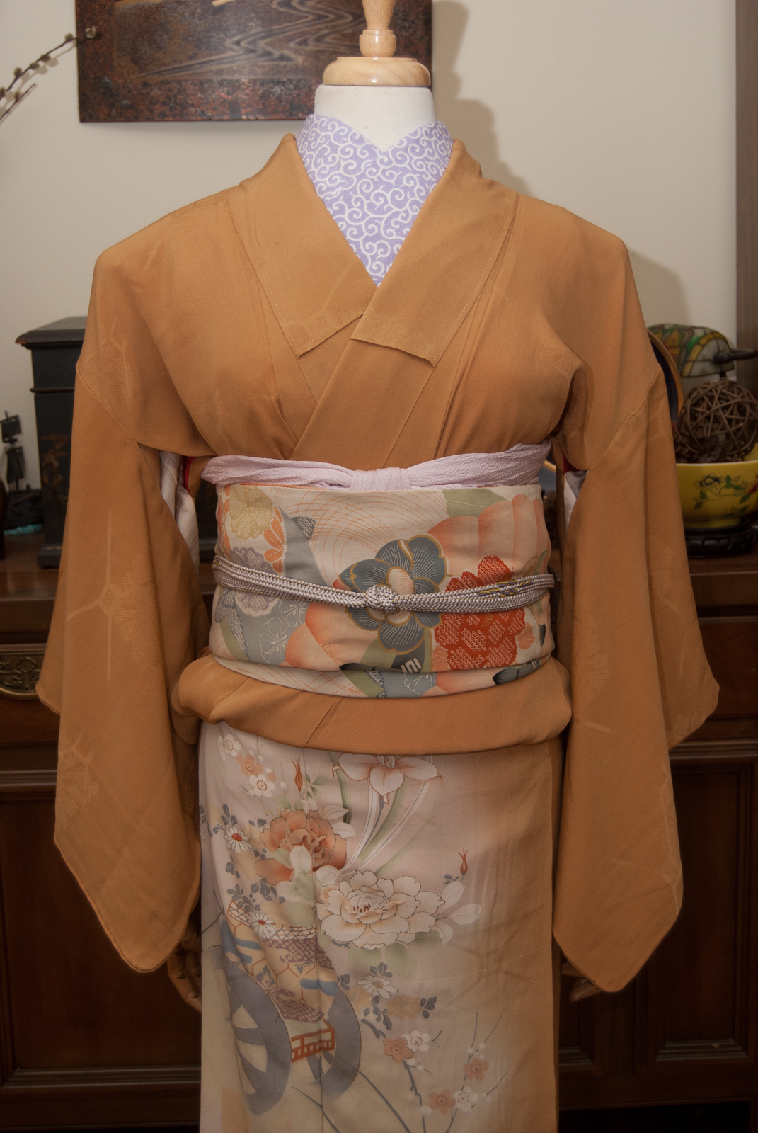
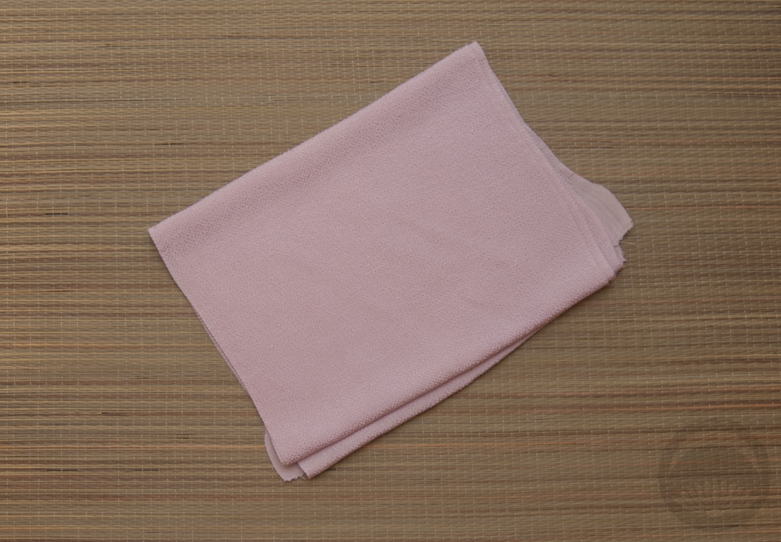
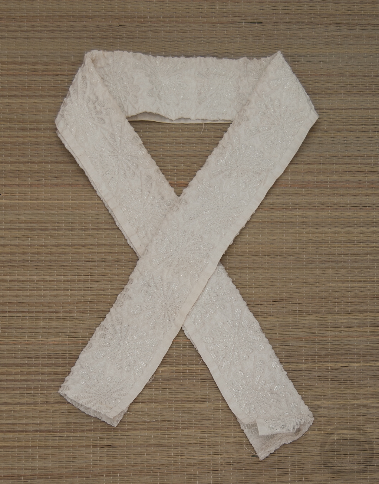
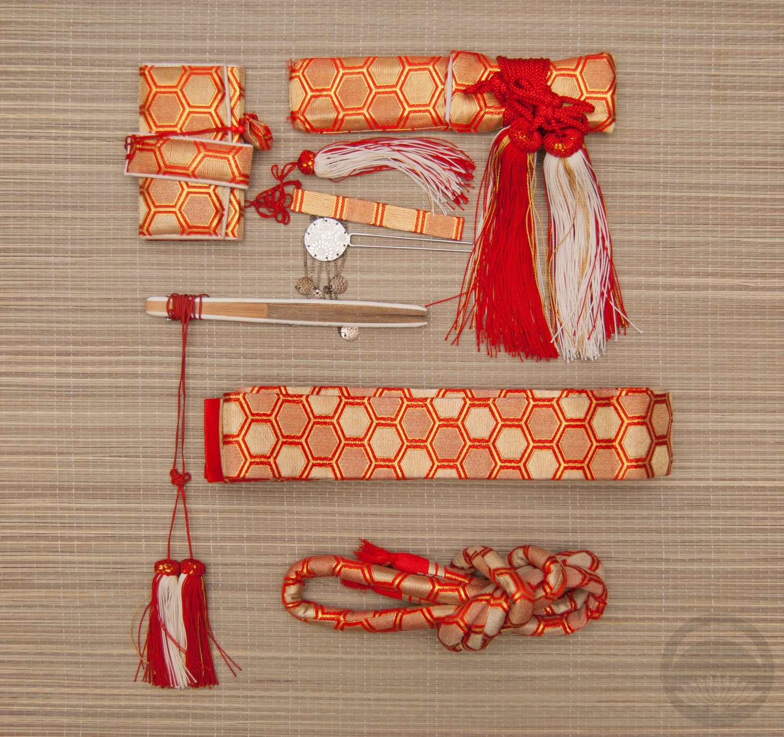
Once I’d committed to this kimono the rest all slotted neatly into place. The haneri matches the plum purple of the obi and echoes the tachibana motif in the kimono, and my ridiculously versatile yellow accessories literally tied the rest together. The “obidome” is actually a brooch that belonged to my late grandmother and just happens to be a spot-on match for the kimono, as well as having a lovely vintage feel to it that suits the age of the kimono very well. I tied the obi in a sort of tsunodashi variation because it’s a knot that always feels vintage to me too, and I love the way it shows off the two-colour design of the obi so nicely.
I’m very glad I didn’t fight and get frustrated and give up when I couldn’t find the kimono for my initial plan, because I love this one so much more!
Items used in this coordination
-
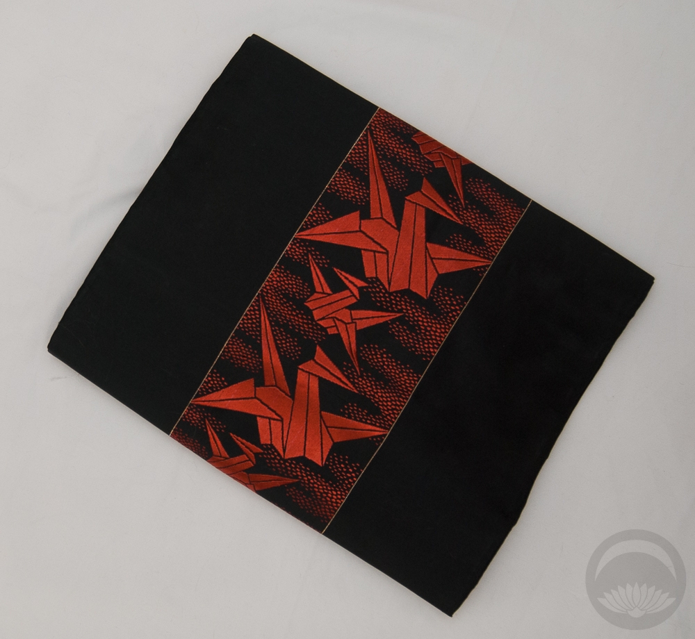
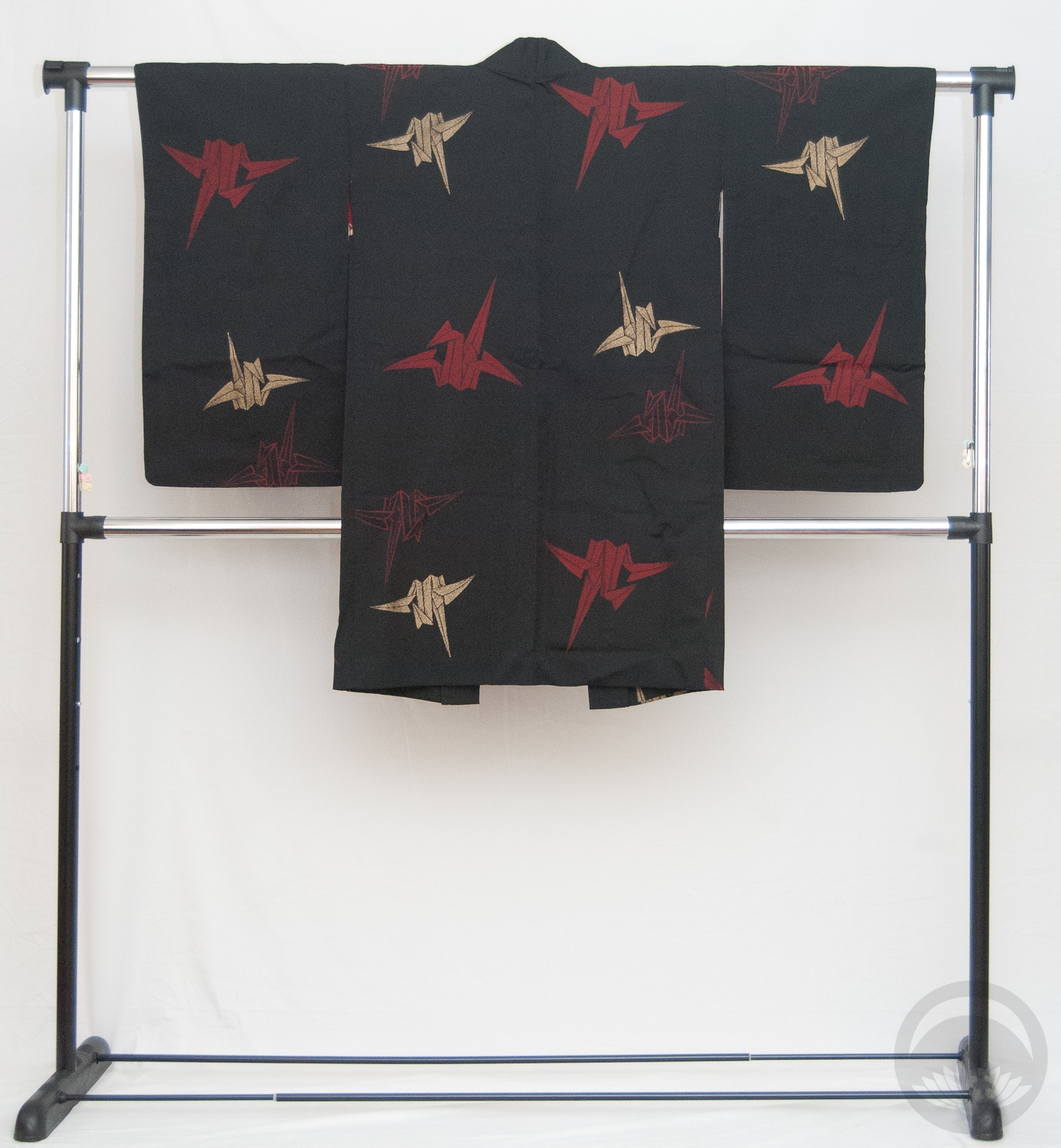
- Turquoise Tachibana
-

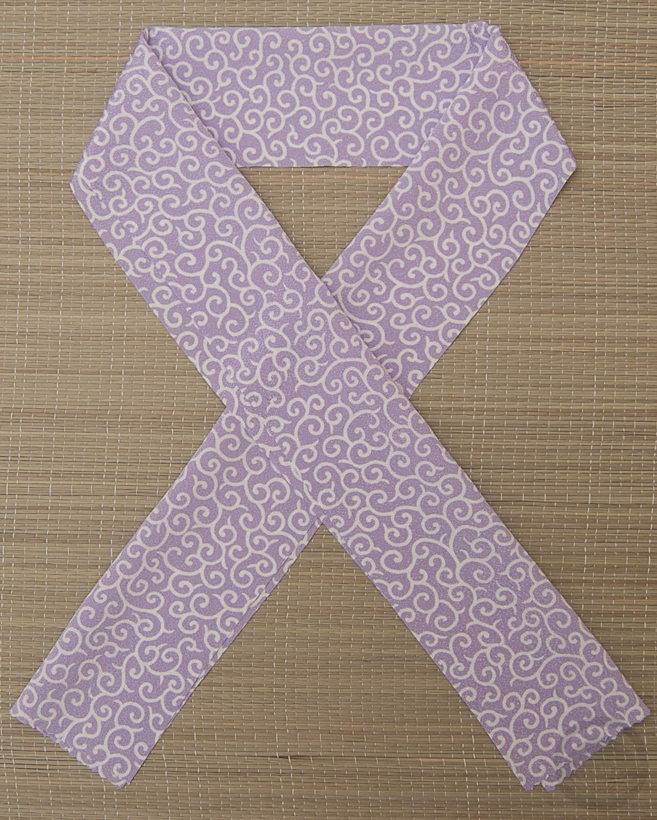
- Reversible Pink & Purple
-

- Tachibana
-
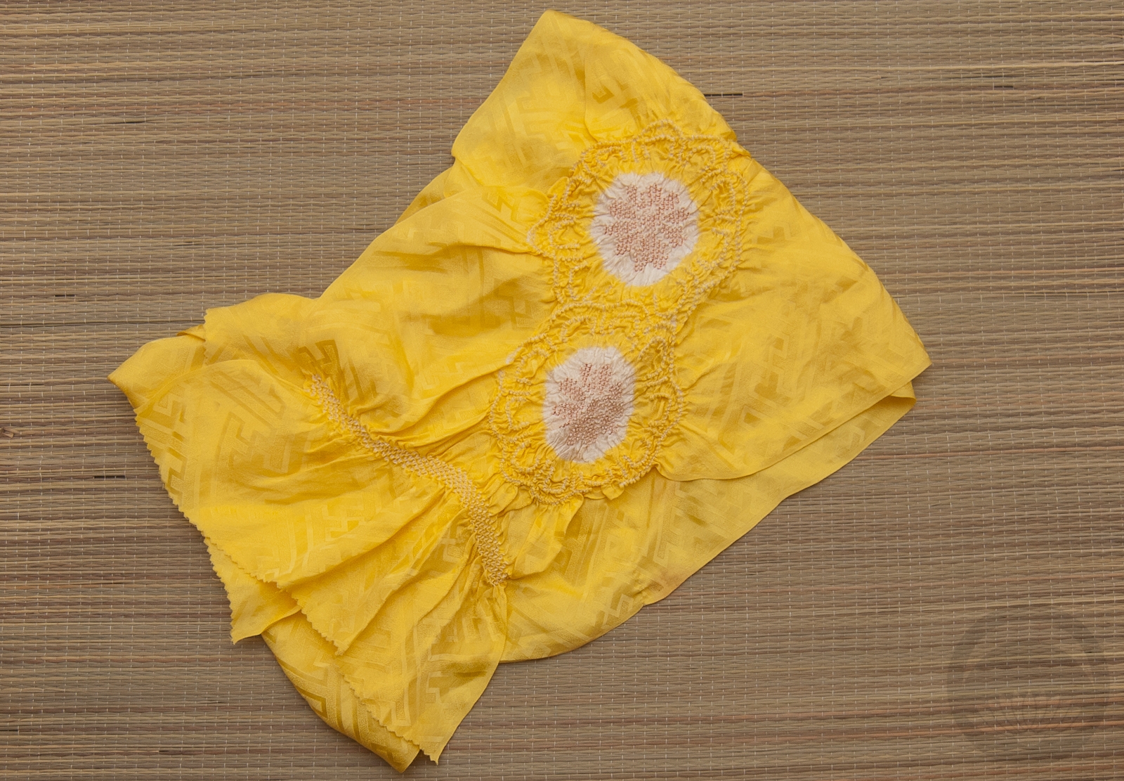
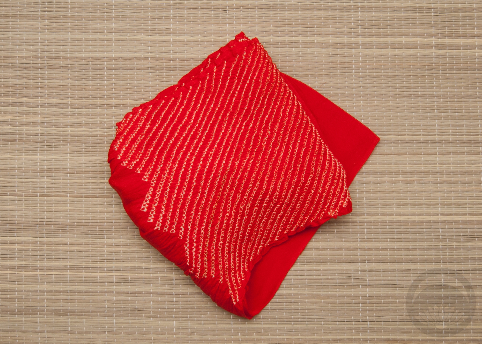
- Lemon Yellow Shibori
-
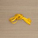
- Yellow Hakata


 Bebe Taian
 CHOKO Blog
 Gion Kobu