
Media Review – Sparks of Tomorrow (Nijuuseiki Denki Mokuroku – 二十世紀電氣目録-ユーレカ・エヴリカ-)

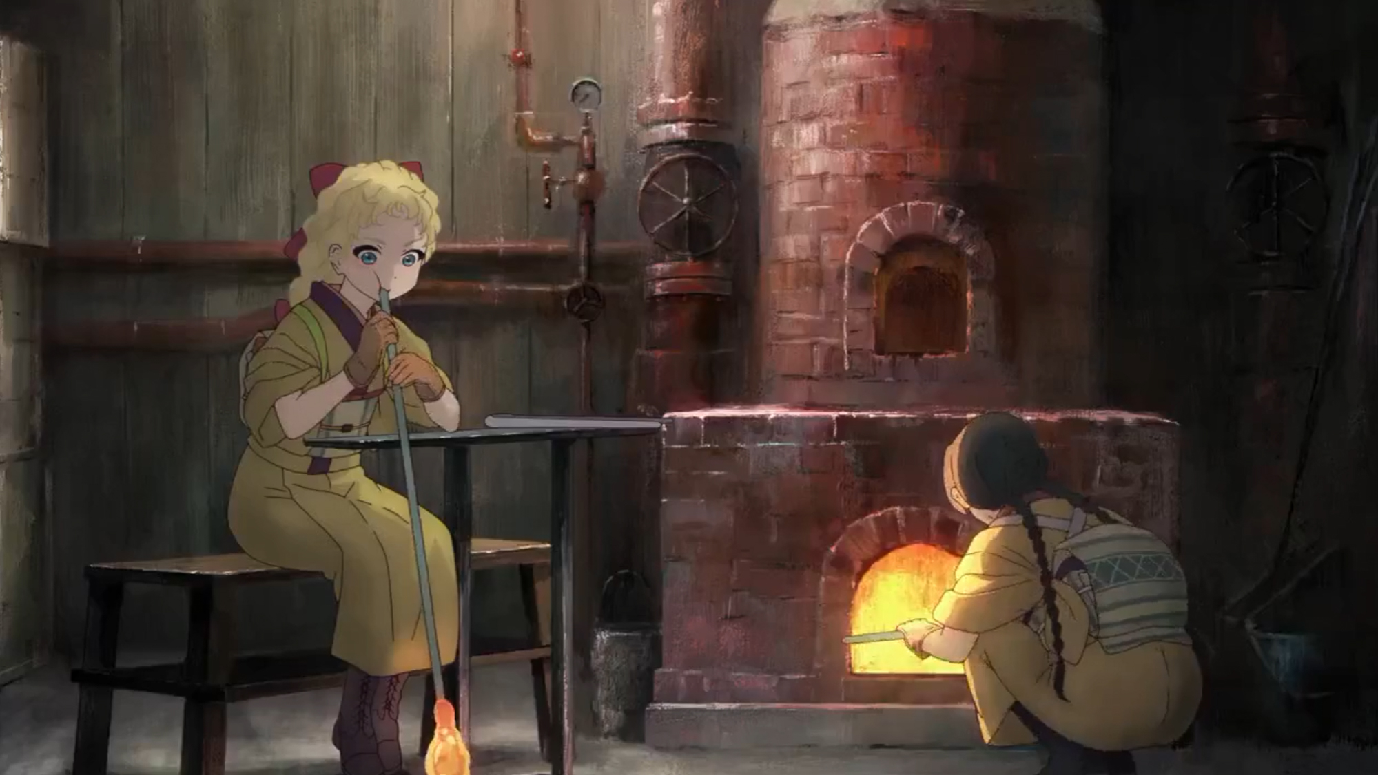
Originally, I had planned to do a larger post reviewing several alternate/fantastic historial anime that have come out recently. That post is still in the works, but I’ve been so smitten with Sparks of Tomorrow that I knew I had to give it a little feature before it finishes airing!

The Japanese title (Nijuuseiki Denki Mokuroku – 二十世紀電氣目録-ユーレカ・エヴリカ-) actually translates to 20th Century Electricity Catalog Eureka Evrika but oof, what a mouthful! Sparks of Tomorrow feels much catchier to my ear and is far easier to type, so that’s how I will be referring to it from here on out.

The official website has a great summary, so I will be helpfully borrowing from it.

──A little while ago.
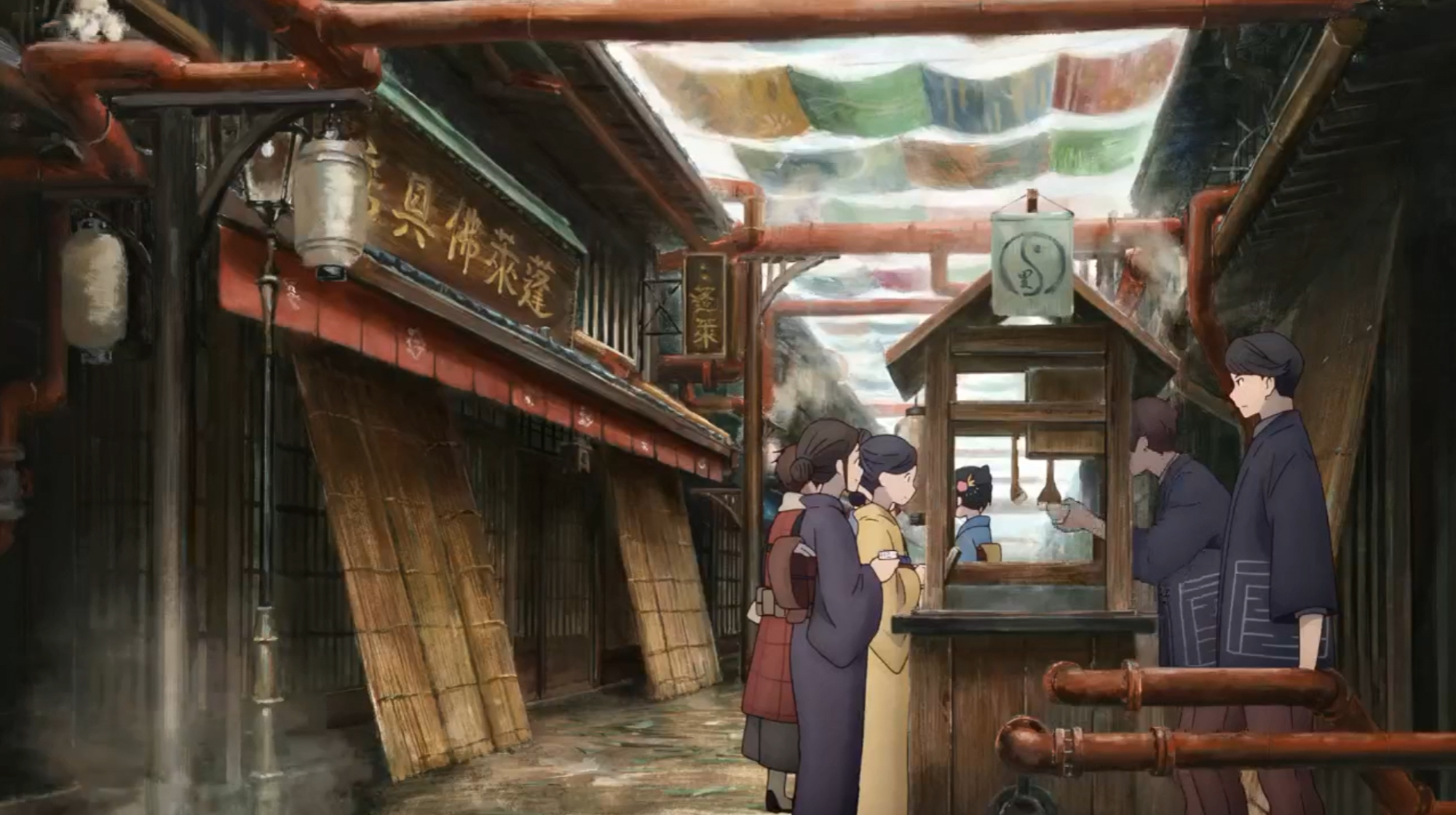
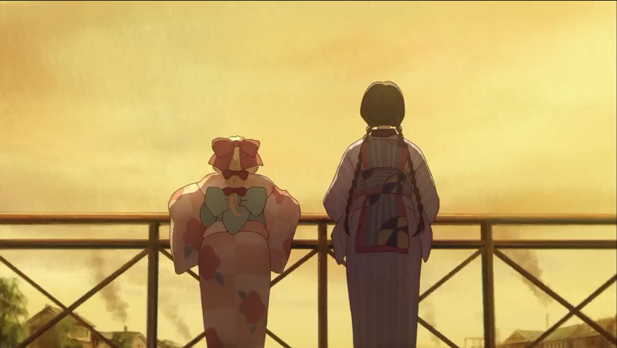
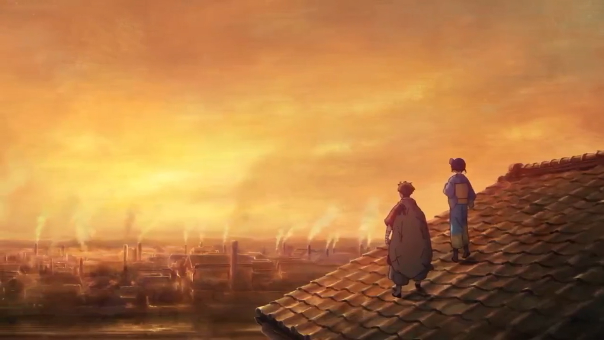
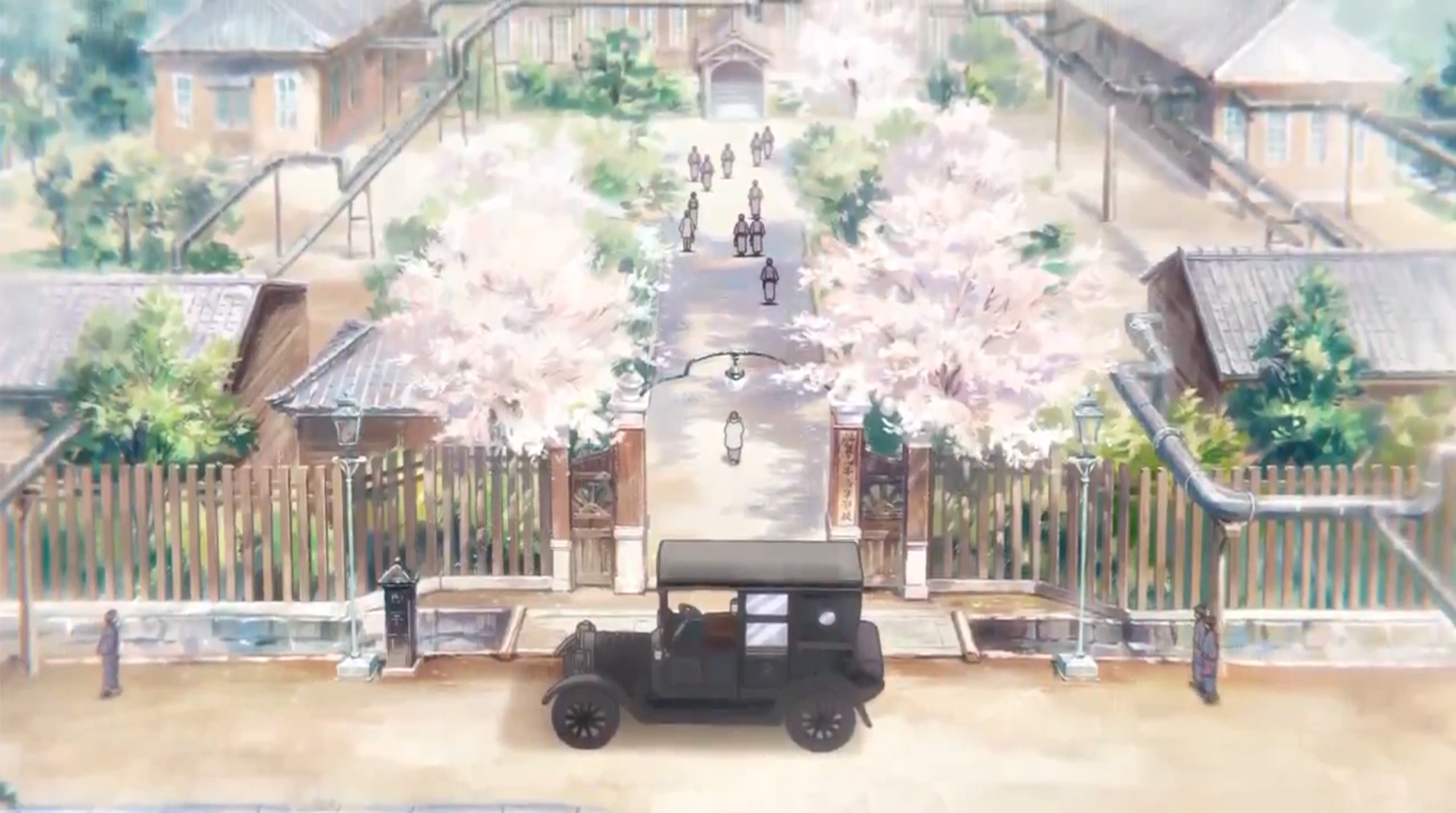
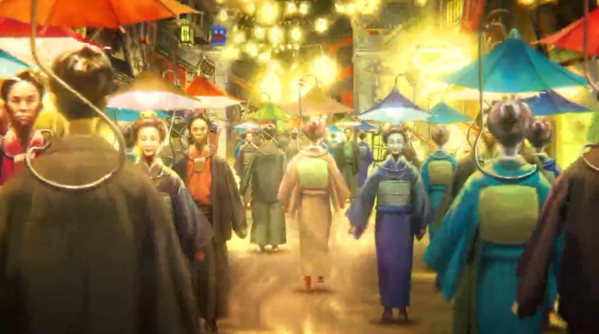
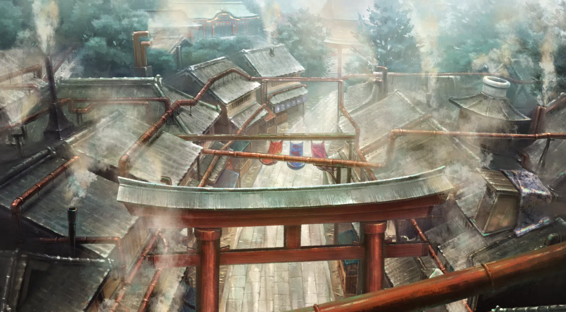
Kyoto in the early 20th century, having evolved differently from the history we know today. In a world where only steam engines had advanced, the city was shrouded in smoke.
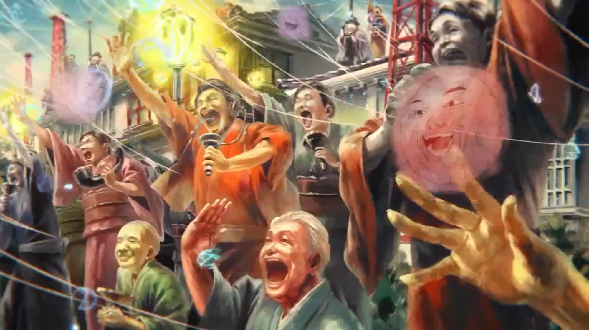
With challenging art backgrounds reminiscent of Impressionist paintings and intricate animation, it depicts the dreams of boys and girls shining in an era of upheaval and innovation.

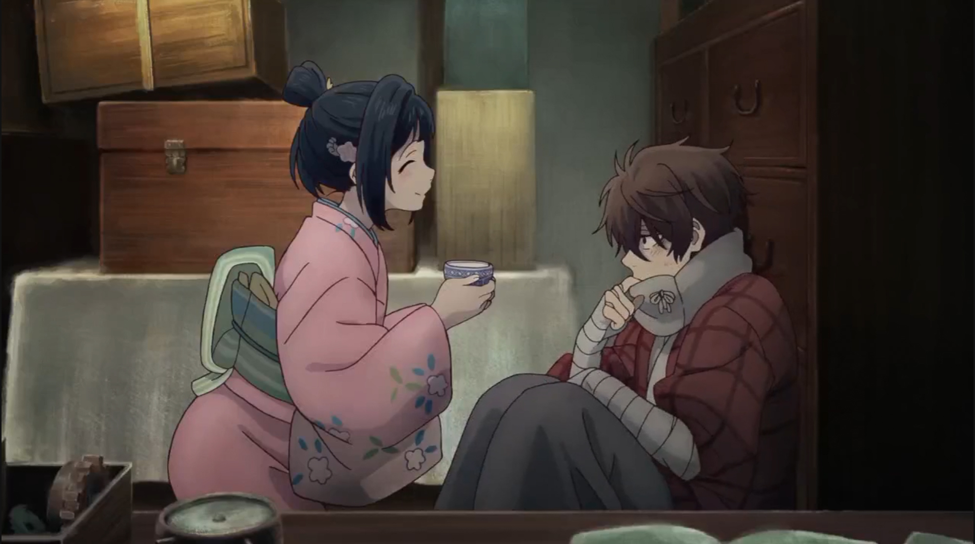
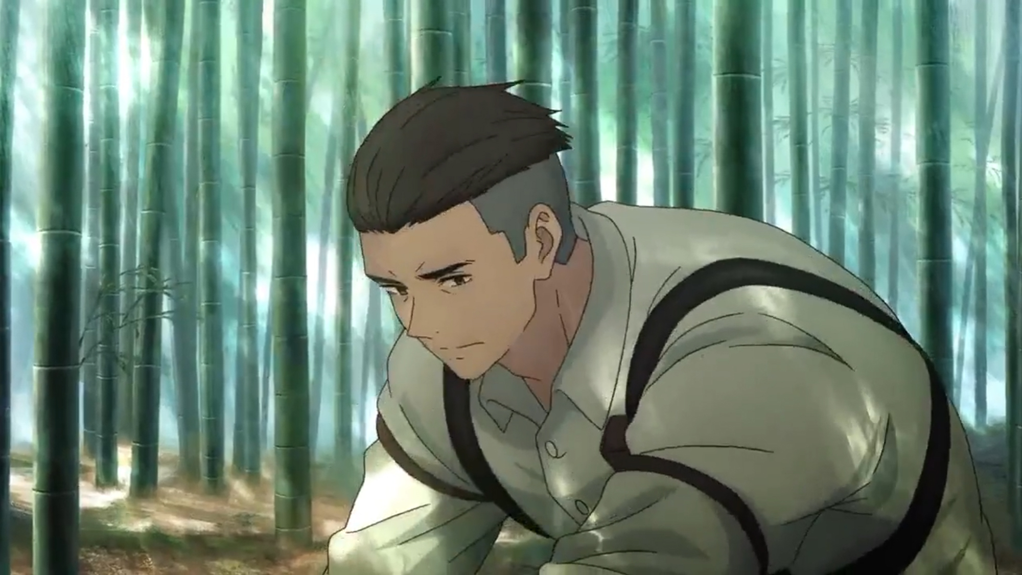
In a nutshell, it’s the story of Sakamoto Kihachi and his attempts to bring his older brother Seiroku’s vision of a modern electrical world to Japan. There’s the mystery of what’s happened to his brother, but I don’t want to delve to deeply into that and spoil anything. There might potentially be a budding romance between Kihachi and Inako, but right now there’s more focus on friendship, discovery, and some general slice-of-life situations. But everything comes back to electricity and the promise of the future.

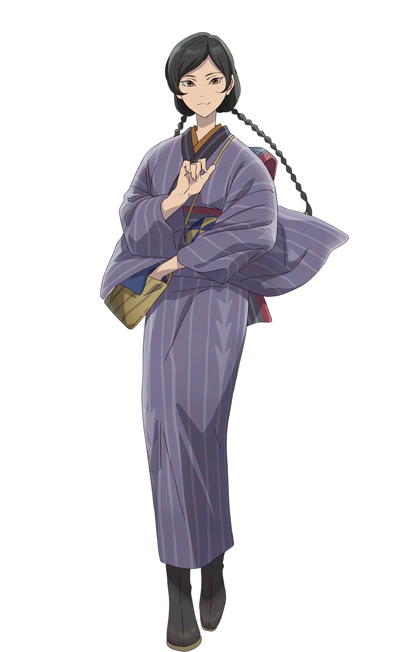
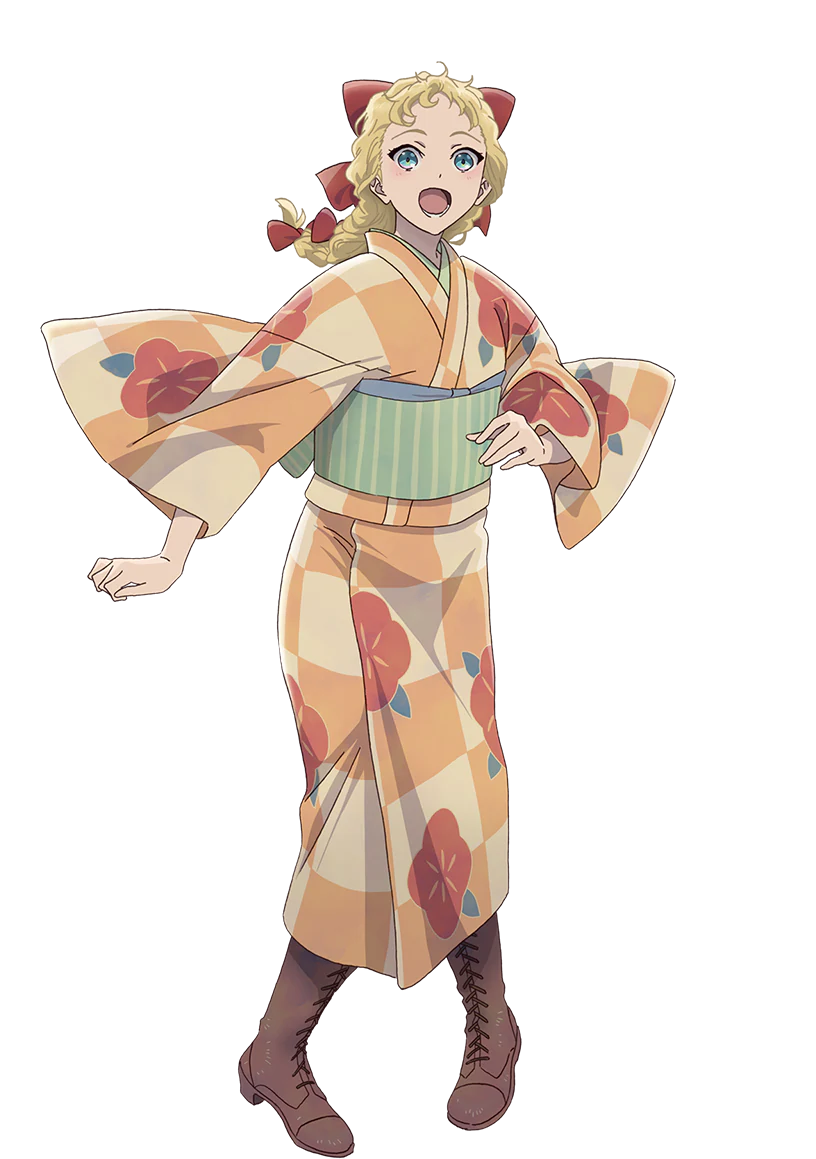
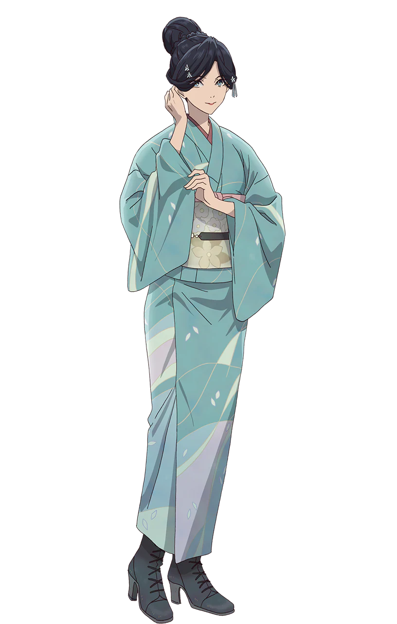
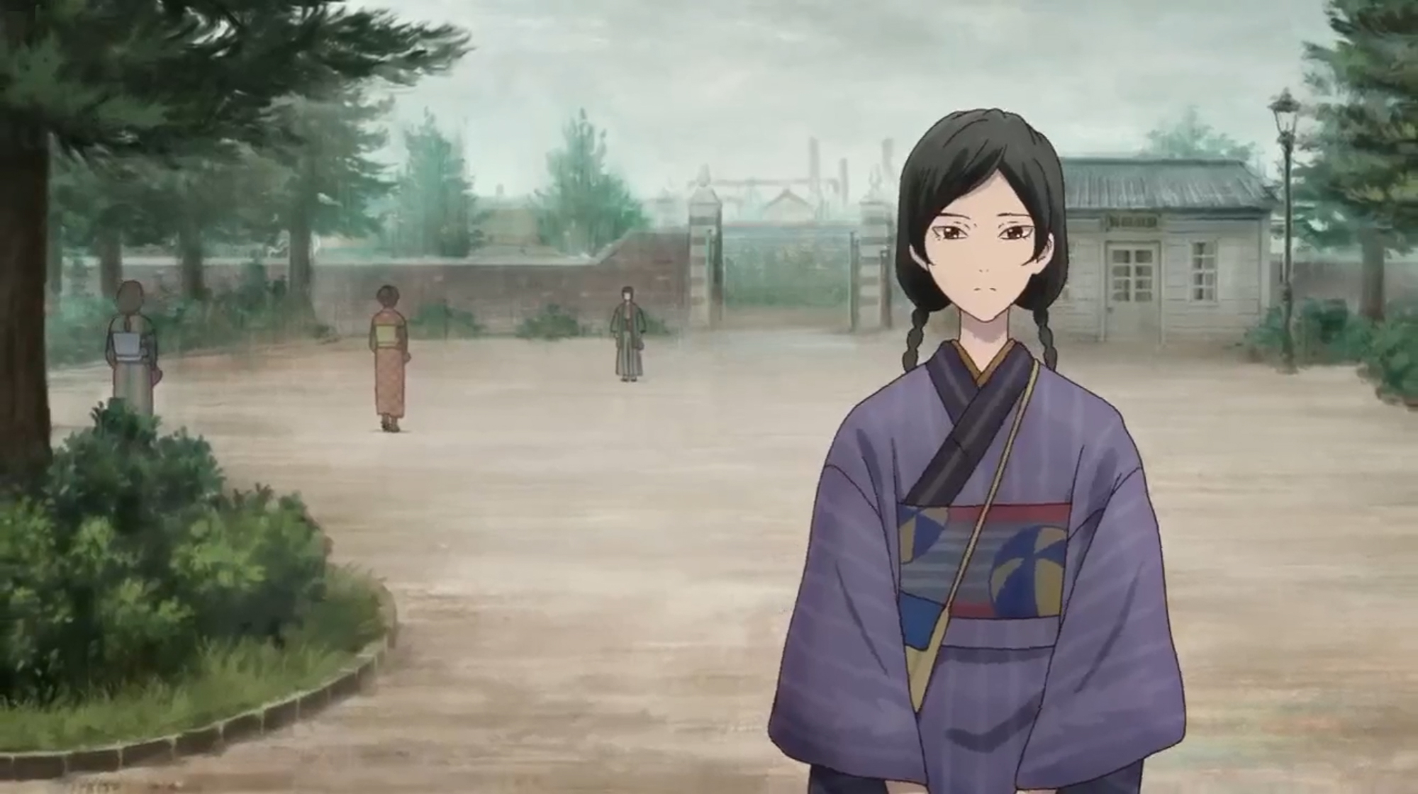
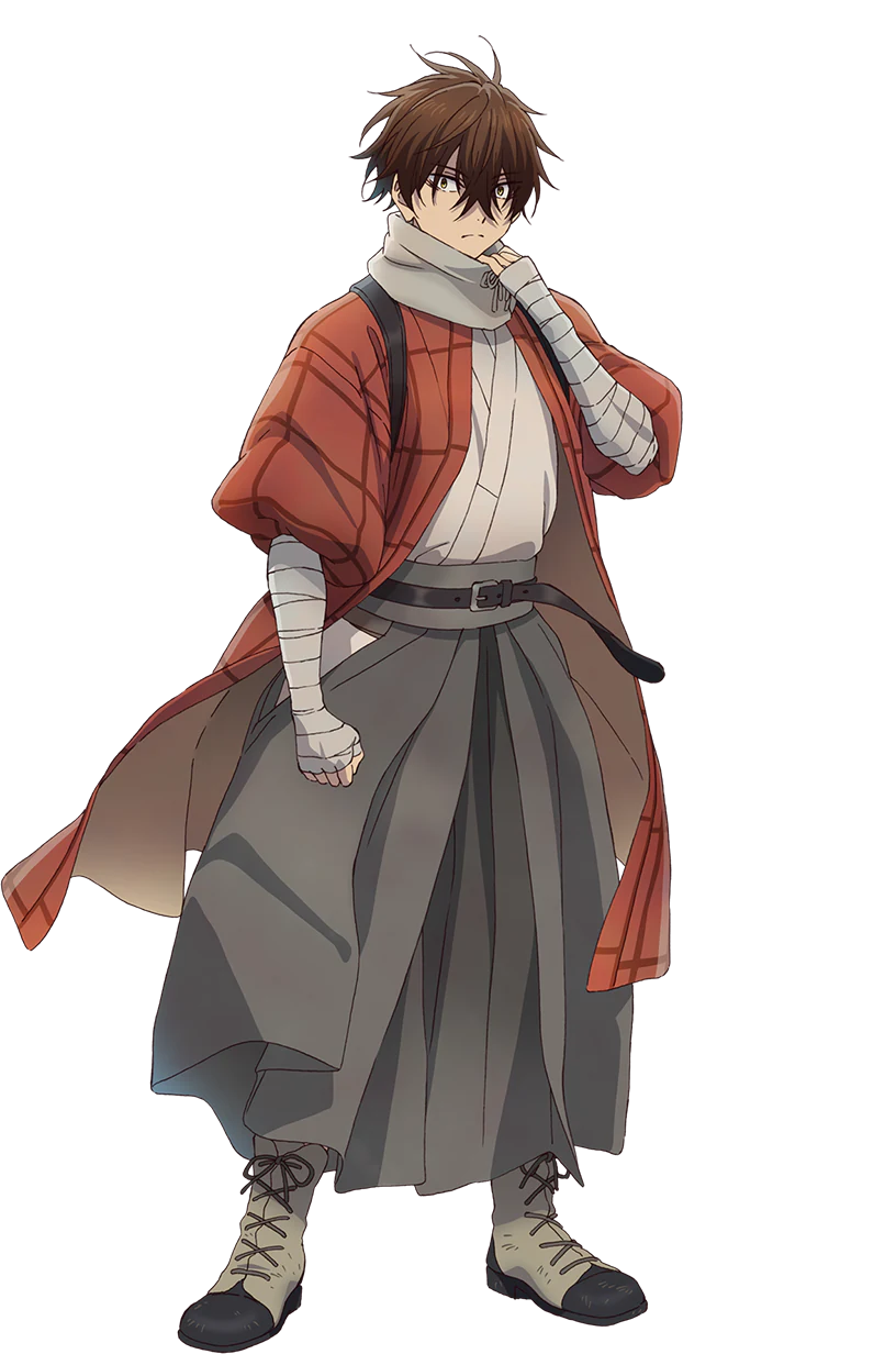
I shared the primary character designs on Instagram and Facebook a while back, but they’re absolutely worth sharing again because they’re so cool. I love how distinctly Meiji-era they feel, but with enough funky steampunk vibes — especially on the male characters — to remind us that this is definitely an alternate history and not accurate. I’m quite inspired to try reproducing some of these outfits, honestly.

 

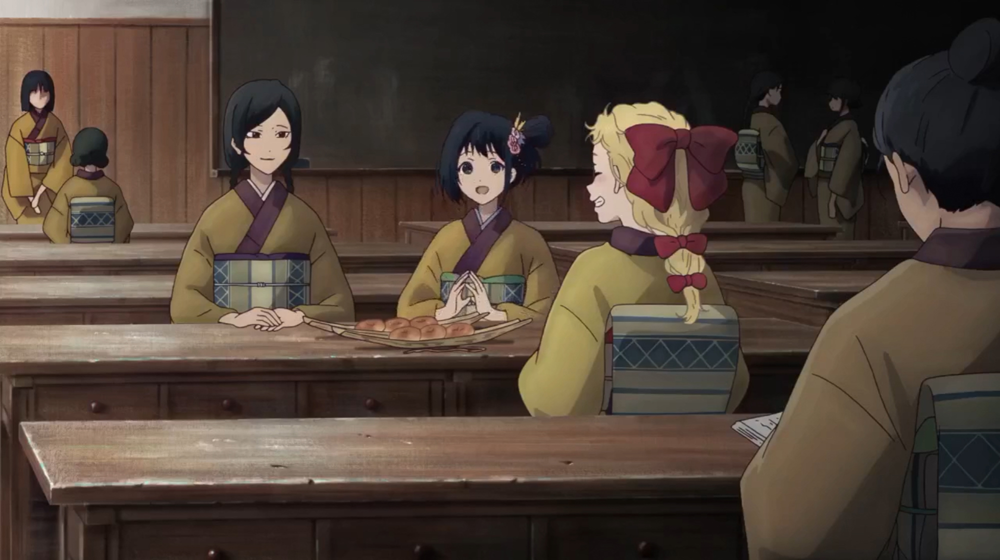
I really appreciate all the little bits of Meiji-era life in Kyoto and the details that are included in not only the main characters, but also the backgrounds. Whether it be the sake brewery Inako’s family owns, bolts of yuzen-dyed fabric drying high above the shopping street, or the girls sharing anpan at lunch, these little glimpses add so much richness for any fan of (recent) historical Japan. Addo in the fact that Inako has multiple kimono that we see throughout the show’s progression so far and it all comes together to make me very happy. I hope we’ll get to see more variety on the other girls too, aside from their school uniforms!
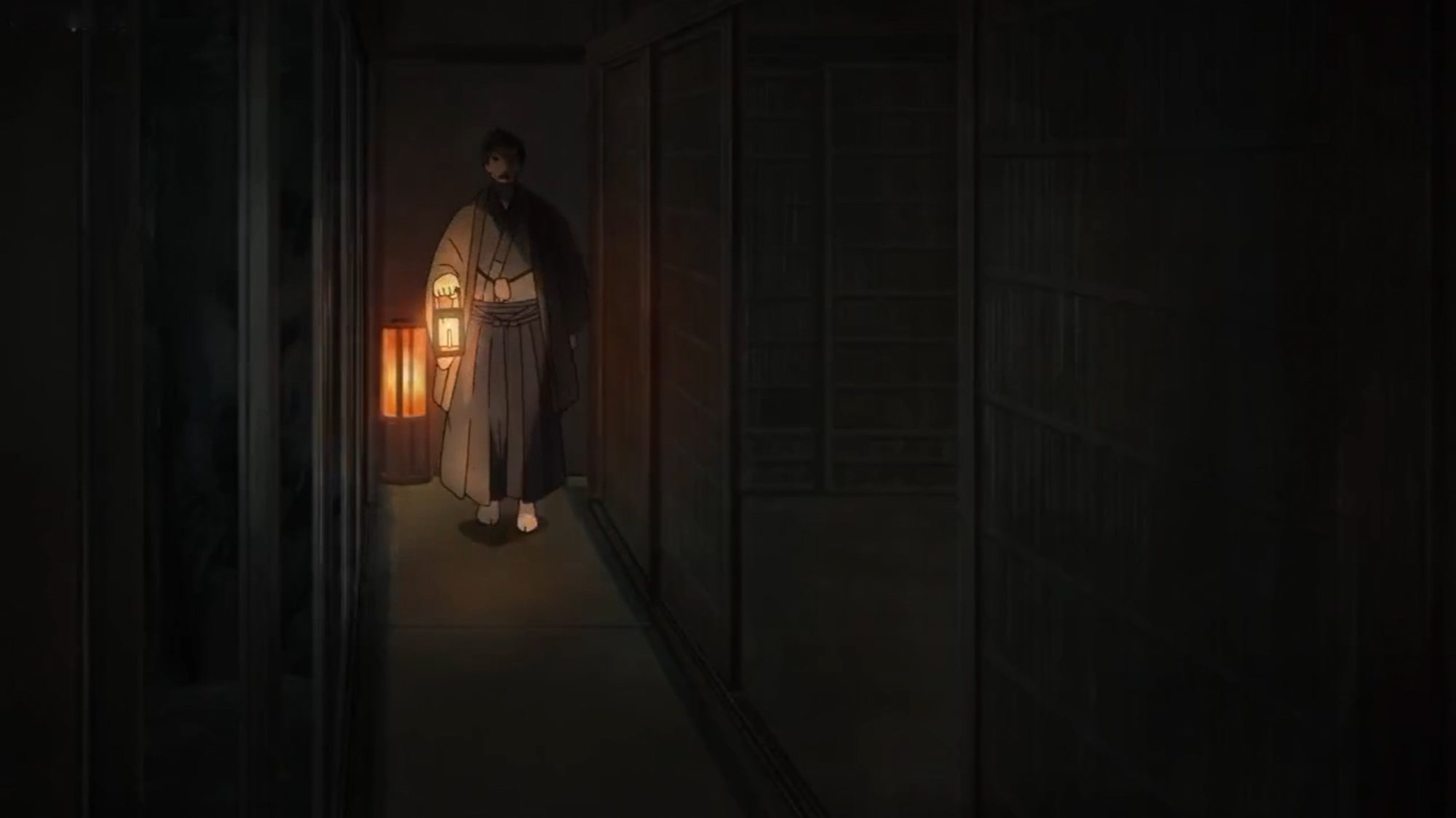
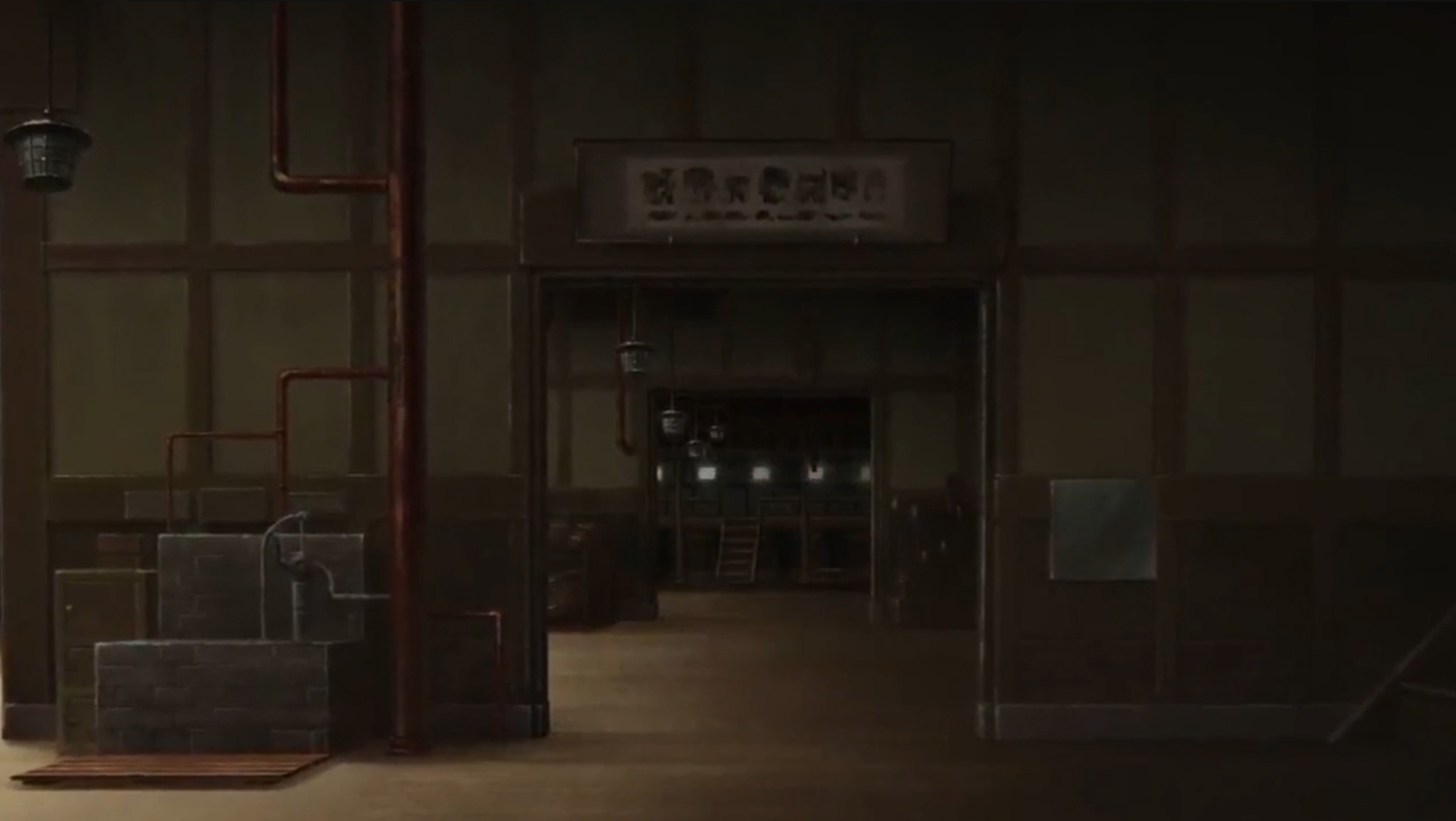
 

Another neat feature I’m really enjoying is the use of alternate art styles to help evoke eras or feelings. When Kihachi is imagining the hopeful future that electricity will bring, everything looks like Taisho or early Showa advertising paintings, and when we’re getting a bit of backstory about some characters, the style shifts to looking like nearly woodblock prints. I have my fingers crossed we’ll see more stylistic choices like this as the series evolves.
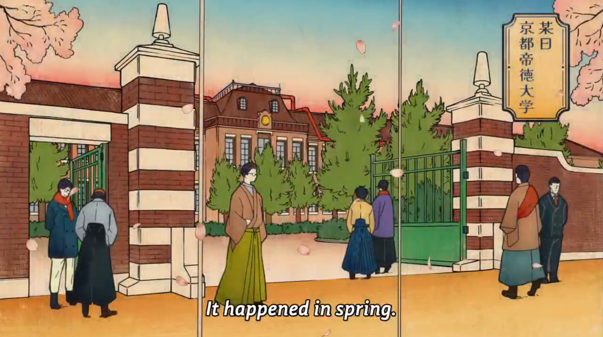
If you’re a fan of steampunk, mystery, science, Meiji-era fashion, alternate history, friendship, and adventure all rolled up together I can’t recommend Sparks of Tomorrow enough! I can only hope it keeps being as engaging as the first few episodes were!
Watch Sparks of Tomorrow on Netflix here!

Back to School, Meiji-Style!

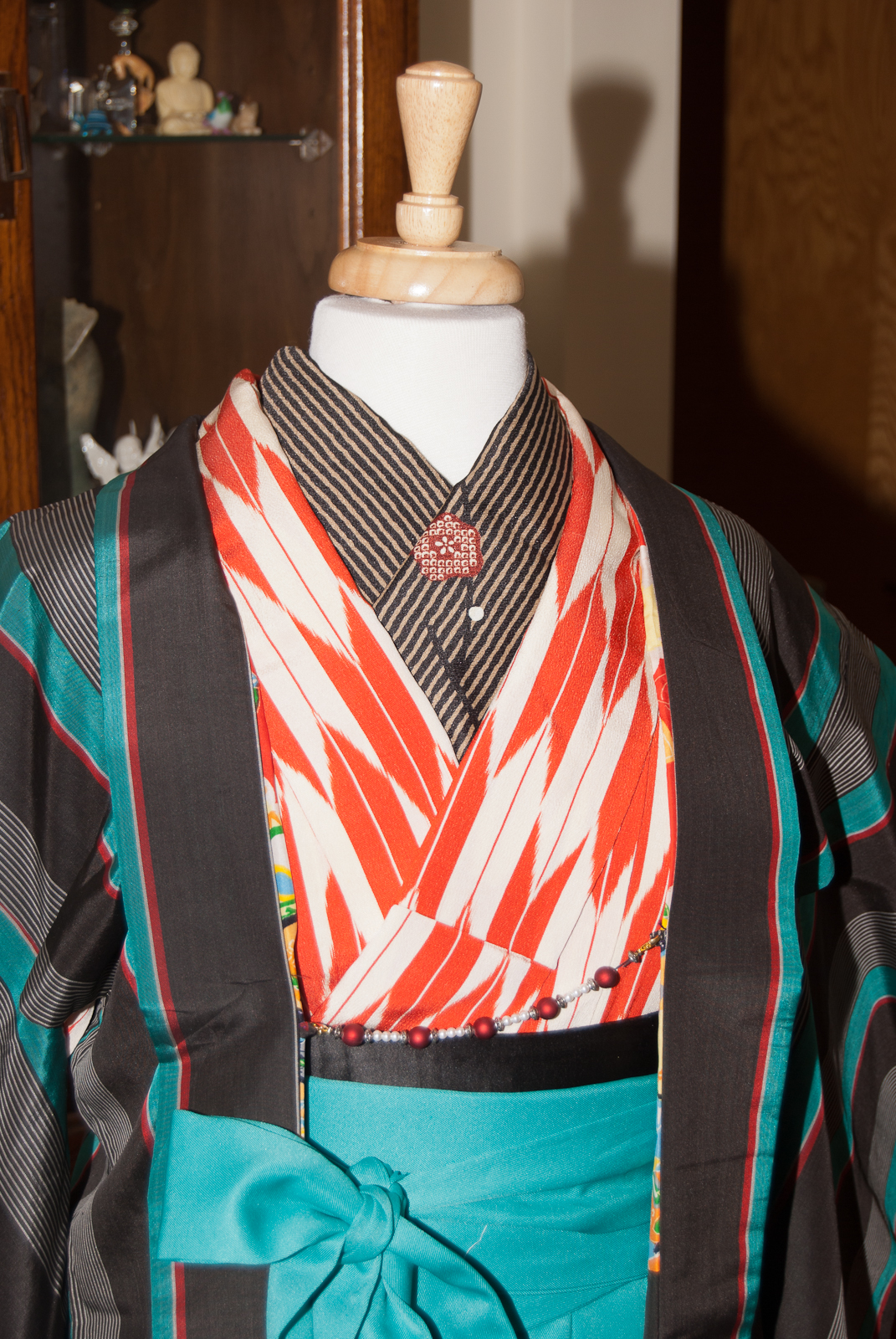
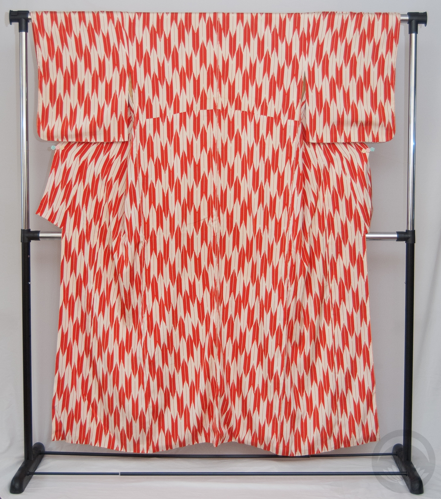
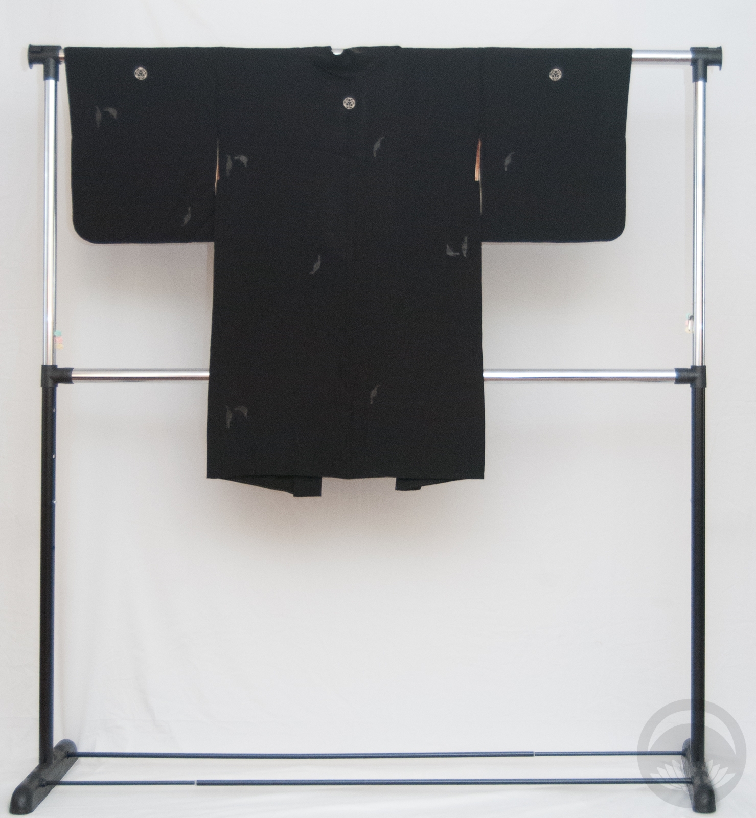
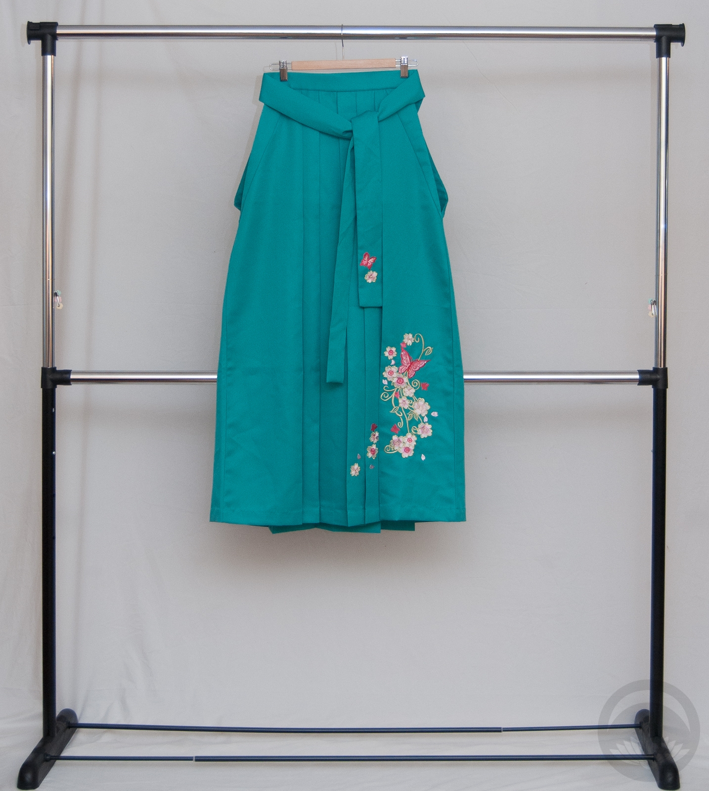
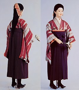
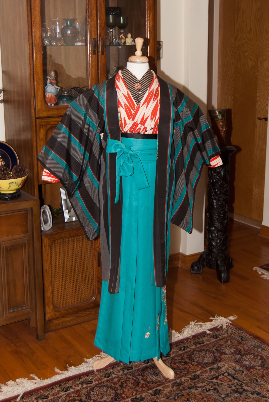
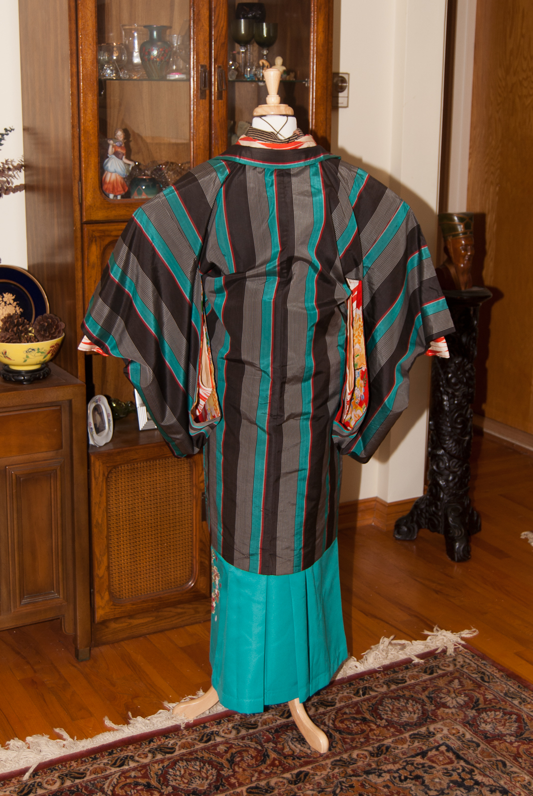
I have always loved the look of the traditional Meiji/Taisho era schoolgirl outfits; the youthfulness of the hakama, the timeless feel of the yagasuri kimono, the modern and almost masculine touches of little leather ankle boots. When I splurged on this teal hakama a few months back, I’d imagined pairing it with my red and white yagasuri komon. What I hadn’t thought of was including this vintage taffeta haori I love to death, but as soon as I saw the three pieces sitting together in a pile I knew I’d found the perfect finishing touch to this outfit and with lots of schools starting this week, it seemed like an ideal time to pull it all together.

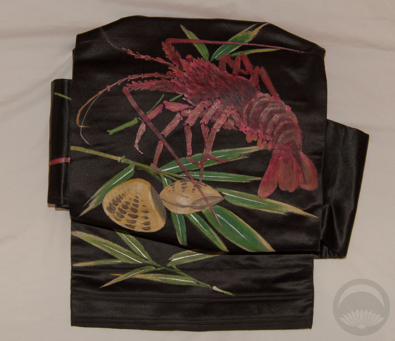
I knew I wanted to use a black obi to help anchor everything, but I don’t actually own a black hanhaba obi. Thankfully, because I was just dressing the mannequin, I could fudge things a little. I used the waist part of a two-piece tsuke-obi and a big obi-makura in the back to give the hakama something to anchor to. The plum motif of the haneri might not be totally seasonally appropriate for a “back to school” outfit, but the colours felt so right I had to run with it.

Aside from the haori (which is incredibly narrow, even by vintage standards), these pieces are all quite large which means I can totally fit into them. The hakama especially makes it easier and more comfortable for me, so expect to see this coordination on yours truly at some point in the near future. A cute pair of ankle boots would make things easy and still be appropriate to the ensemble. I just need to invest in a proper black hanhaba obi and then find somewhere to go and hope that the cooperates!

Items used in this coordination

New Feature: Outfit of the week!

Everyone, please say hello to the newest contributor to this blog. Her name is Tsukiko, she has no head, and she will be modelling outfits and coords that are either too small or too fragile for me to wear myself. As you probably know, my health is still not fantastic, and dressing myself simply for photoshoots is tiring and not ideal. Hopefully having Tsukiko around will encourage me to post more frequently! I am aiming to do one coordination a week, but we’ll see how long that lasts 😉

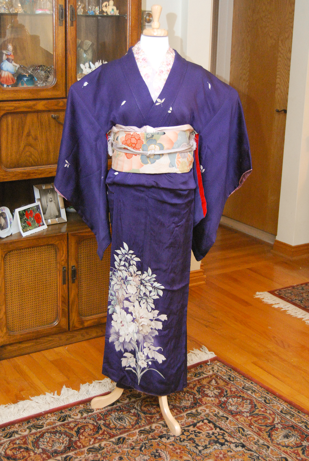
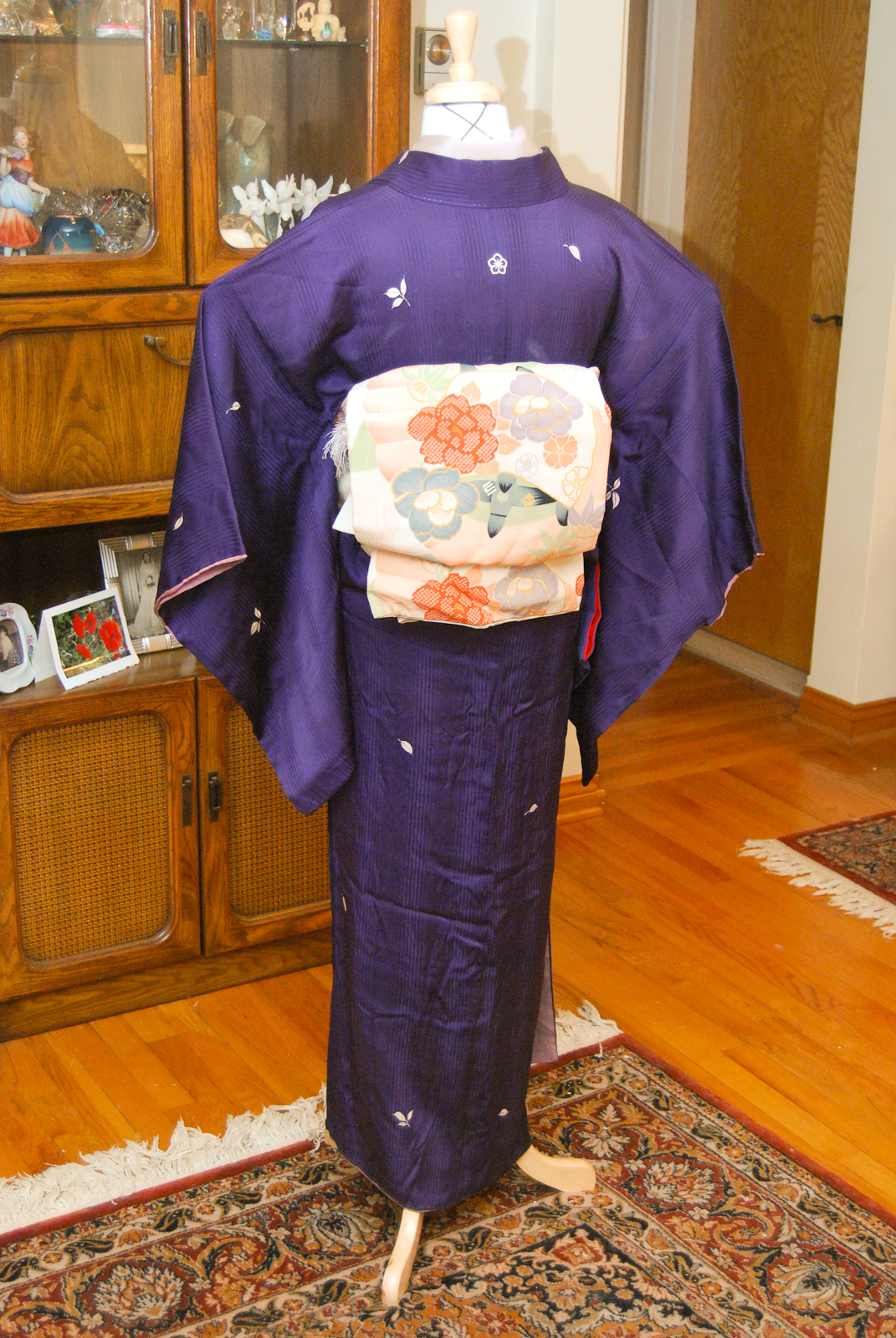
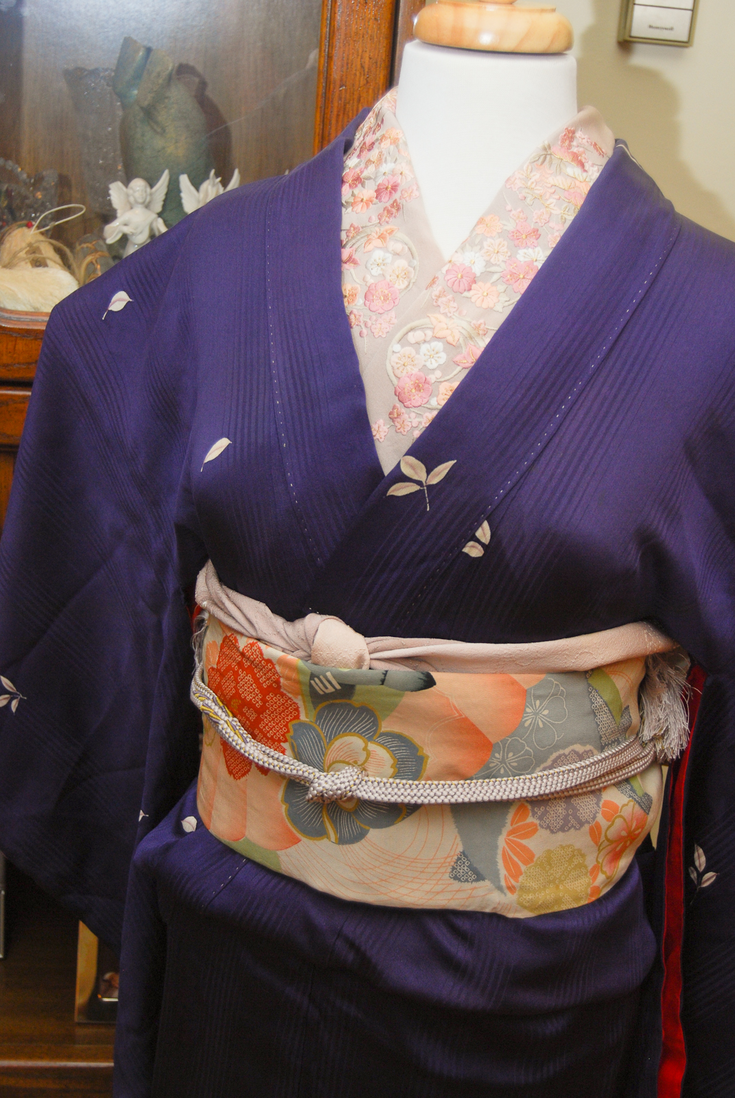
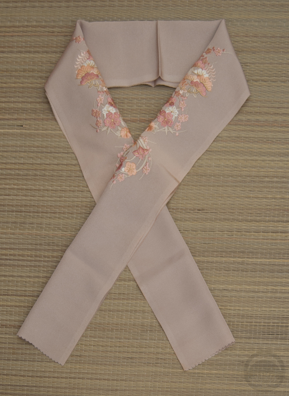
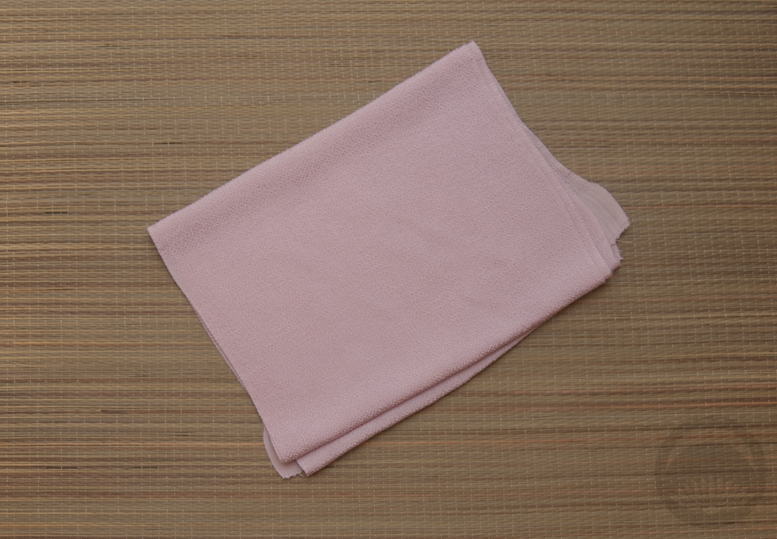
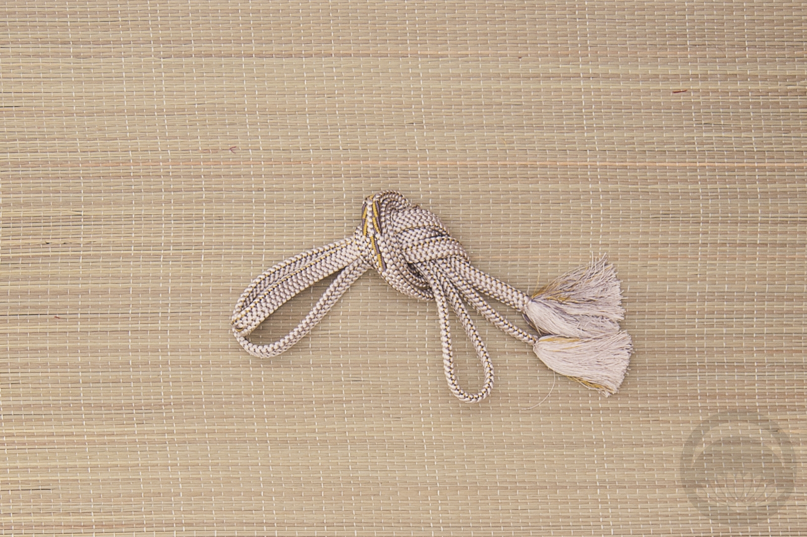
Today’s coordination was mostly an excuse to use this gorgeous antique irotomesode/komon hybrid. I have been in love with this thing since I received it, but it’s incredibly delicate and fragile silk and it’s very tiny. Realistically, even if I lost a hundred pounds, it still would not fit me. I paired it with a vintage remake obi I love to bits that’s also awkwardly small, and I love how soft and dusty they feel together. The obiage, obijime, and haneri are all modern, but they have a similarly desaturated pastel feel and I think they look perfect with the kimono. Please click on the images to see larger versions.

Items used in this coordination

Vintage Irotomesode-komon hybrid

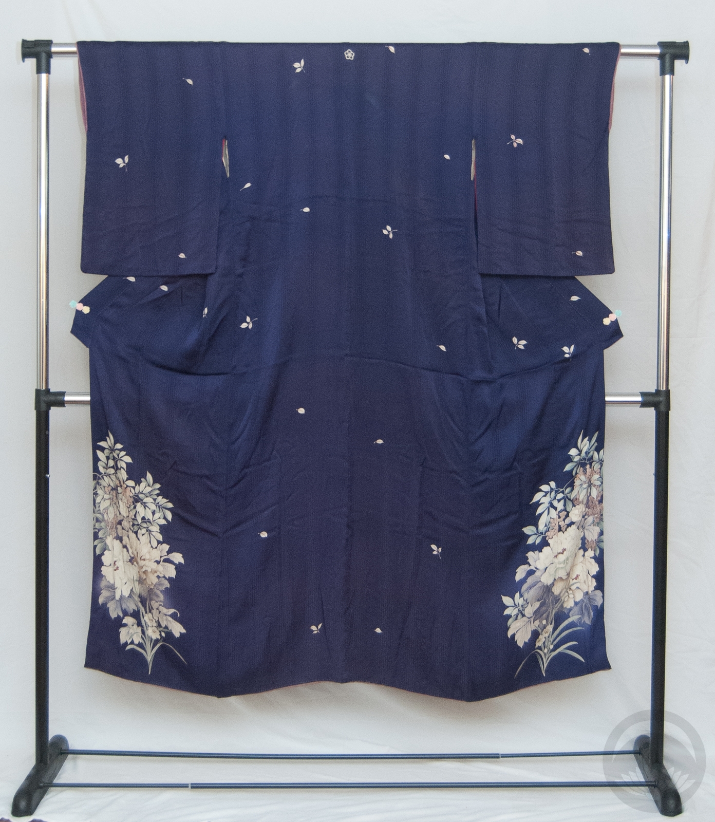
When I saw the listing for this item, I fell hard and fast in love. The late Meiji/Early Taisho style designs around the hem looked so soft and gorgeous, the varied-width stripe rinzu silk was awesome, and I found the small scattered pattern combined with the hem design really unique. I was expecting people to fight for it, but somehow it slipped under the radar and I got it for a great price.

It’s quite small, but I expected that. I will be able to wear it for photos but I don’t think I’ll be comfortable wearing it out of the house, sadly. However, as a conversation piece it’s pretty priceless. Nowadays kimono fall staunchly into very specific categories ranging from informal komon with all-over patterns to very formal tomesode with designs only below the knees, usually with a crest. This one somehow manages to be both. Before World War II, kimono were worn much more frequently and it was more common to see ones that blurred or outright crossed these formality lines, but I’d never seen one that was a combination of such blatantly different designs.

Another interesting aspect of it is that the motifs (peony, narcissus, and nandina) are very Spring season-specific. It’s a formal crested kimono, generally these tend to have more celebratory or all-season motifs, to prevent the need from owning too many. Anyone who could afford to have a formal, crested kimono that could only be worn for a month (possibly two) out of the year clearly had an appreciation for the finer things in life, and the finances to back that up.

The auction listing showed this as a standard indigo blue, so I was more than a little confused when I opened the package and a purple kimono fell out. I saw the rinzu stripes and the little leaves and knew it was the right item, but it’s a completely different colour. I don’t mind at all though – I’ve wanted a dark purple kimono for a very long time but they usually go for much higher prices. The yuzen work on the hem is also even more soft and delicate than the auction pictures had led me to believe. It’s a gorgeous piece, and my only complaint is that I like it even more than I thought I would so I am sad that it doesn’t fit me very well.

Irotomeosode-Komon Hybrid

Irotomeosode-Komon Hybrid