Lavender Formal

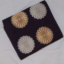
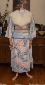
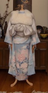
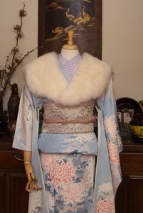
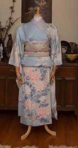
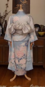
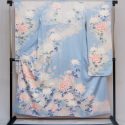
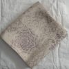
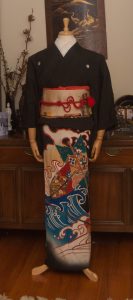
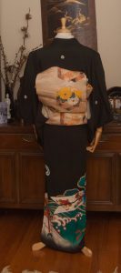
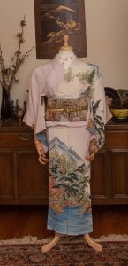
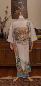
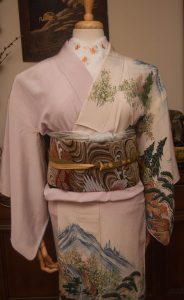
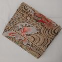
Today’s entry is something a little more straightforward, formal, and traditional than I’ve done lately. I got this beautiful two-sided obi from Sasa. It’s white with gorgeous silver floral round designs with tiny lavender accents. The other side is a very pale lilac with an asanoha texture. I’m honestly not sure what to quantify it as, but since this side feels like a formal fukuro obi I thought it would work well with my kurotomesode with lavender and peach tones.

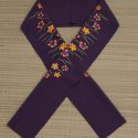
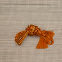
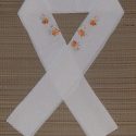
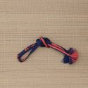
I tried to keep the kitsuke “correct” and traditional here; white-based formal obi, white haneri, gold and white obijime. However, being me, I did deviate a tiny bit by going with a peach obiage which is a spot-on perfect match for the ume flowers on the kimono. The obi is also incredibly easy to tie, which is always a good thing. I made one of the neatest and tidiest nijuudaiko musubi I’ve ever done, I think! I’m very much looking forward to coordinating this obi with other kimono, and maybe featuring the opposite, more casual side sometime soon.

Thankfully my life has calmed down a bit and some personal behind-the-scenes stuff that was causing me anxiety has been sorted out, so I can finally live up to the promise I keep making to be more active here. I’ve also got Patreon back up and running. While the blog will always be totally free, there are little perks you can get for helping support this passion of mine and enable me to keep sharing pictures, references, and information with you all. This hobby is not a cheap one!

Items used in this coordination

(The detail photo of the obi above is terrible, and will be replaced with a decent one as soon as I can set up my backdrop and stuff properly again!)

Bamboo for resilience, Paper cranes for hope

I try not to get too angry or too political on this blog, but there comes a point when keeping quiet is complicit with violence. I’ve devoted half my life to the study and appreciation of Japanese arts, and now more than ever I feel the need to speak up against the wave of racist violence being perpetrated against Asian-Americans of all cultures. While the most recent horrific attacks have been aimed at Korean and Chinese women, the types of people who commit these atrocities typically don’t know or don’t care about the difference.

Those of us who share a passion for one or more aspects of an eastern culture have a duty to help defend the beautiful, diverse people and cultures to whom we owe so much. So what can we do? Stand up. Speak up. Whether you witness something as egregious as a physical assault on an elderly woman, or people in power using racist terms like Kung Flu, or something as “minor” (and I say that sarcastically) as a relative lumping multiple Asian countries into some vague orientalist monoculture, step in and defend the peoples of those cultures you love and respect so much.

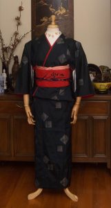
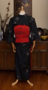
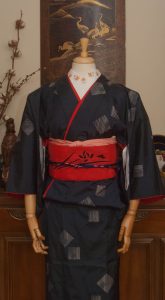
Of course, my way of channelling my frustration and anger usually involves the mannequin. I knew the best starting point would be my orizuru (paper crane) obi and haori, as hope for a more understanding and peaceful world. I paired them with this gorgeous Taisho-era bamboo komon, as bamboo is strong and resilient. It feels like an optimistic coordination in a dark time. I know in the grand scheme of things, this is a bit of an empty gesture, but it helps me to cope.

I wish I had a cute or pithy way to end this entry, but I just can’t find it in me today. Thank you for understanding.

Items used in this coordination

Blushing Valentine Bride

I absolutely intended to do this yesterday, but the universe clearly had other plans. It’s never too late for a little bit of winter romance though, so here we are! For February and Valentine’s Day, I decided to do a bit of a non-traditional wedding coordination. Generally, wedding outfits will be either all white (or white with metallic accents) or boldly coloured, depending on the time, location, and whether it’s for the ceremony or reception. This time though, I decided to go white with one bright accent colour; what could be more romantic than rosy pink?

I used a pink iromuji as the under-layer, since the colour was a perfect match, and I’m glad I went for it. I love the solid colours but play of texture – the kimono has a subtle sayagata rinzu, the iromuji is much more heavily textured, there’s the nubbly shibori of the obiage, the smooth flat surface of the obi, and even the shiny bumpy quality of the beaded obiage. Everything plays against everything else to create an outfit that despite being only two colours still remains visually very interesting.

Typically, a bigger musubi like tateya or something fancy created by a bridal studio would be used with a wedding ensemble. However, this obi has no stiffener and is very floppy, which really reduces the ways it can be tied without looking sad and anaemic, so I went with a very timeless soft bunko musubi. This also seemed like the perfect time to use the heart obijime knot (tutorial here). Since beaded obijime tend to be a bit slippery and often shorter than usual I wasn’t able to do it perfectly, but it’s still quite cute I think!

I’ve also gone ahead and reactivated my Patreon account. I know times are tough and money is tight for just about everyone, so I’m not expecting anything. But if you’ve got a few dollars to spare and enjoy the content I provide, please consider pledging! Every penny earned from there will go directly back into this blog, to cover new pieces, new reference materials, website hosting, and the like.

Items used in this coordination

Showa-ing Off

Sometimes it amazes me how small the online kimono enthusiast community can be. A while back I was browsing eBay and saw a bundle of some pieces I really liked for sale by a local seller. I reached out to them to ask if they’d be willing to offer local (but socially distanced!) pick-up and about an hour later I get a Facebook message from my friend Sasa, asking if the message was from me!  😆

One of the main reasons I wanted the bundle was this particular kimono; it reminds me very much of the first “big loss” I ever had on eBay, the first time I truly fell in love with a piece and was outbid in the last few seconds. It’s got a very distinct mid-late Showa era feel to it, the bold colours contrasting against a very soft background, the fantastical floral motifs that almost feel inspired by 60s psychedelia. I chose to pair it with this slightly older obi that echoes the teal-green foliage and has hints of a pale peachy pink that ties in to the kimono background.

I really love how well it all ties together. The obijime is an utterly perfect match for the kimono, and the red obiage provides just enough punch while echoing the bold red tones in the kimono designs. The soft kimono and bold obi contrast very well and the whole thing just feels very mid/late Showa era. I’m quite pleased!

Items used in this coordination

If this combination is wrong, I don’t wanna be right

I’m back! I’m feeling motivated again and have ideas for plenty of new coordinates using new items and ones I’ve had in my collection for a long time. The little break I ended up taking did wonders for my mental health and I thank you all for sticking around and being patient. 💖

Today I’ve got something really special for you. I have loved this kimono for over a decade, ever since I was lucky enough to wear it during a fashion show at a convention. You remember conventions, right? When thousands of people gathered together, packed themselves into small rooms, hugged, laughed, and shared common interests? Funny how alien that seems in our current world! They’ll come back eventually, though.

Anyway, Naomi dressed me in this stunning chocolate brown furisode with all kinds of gentle foliage and gold butterflies, and I was smitten. Fast forward a few years to when she’s thinning out her collection and now it’s come to live with me! It doesn’t fit me at the moment, but thankfully it looks gorgeous on the mannequin.

Typically, with a furisode like this the obi should be tied in a much larger, showier musubi. However, it’s got a more mature feel than a lot of furisode, and I knew I really wanted to pair this beloved obi from my 53 Stations of the Tokaido collection with it, so I went for a more grown-up style in general. I couldn’t resist adding back a bit of youth and flash with how I tied the obijime, though.
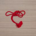
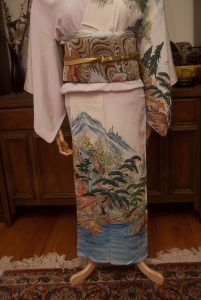
I’m sure I’ll do a more “appropriate” outfit with this piece in the future, but right now I’m really quite thrilled with how this turned out.

Items used in this coordination