Japanese-Inspired Dollhouse


Something a little different today! If you’ve been following me on Facebook or Instagram, odds are good that you’ve seen little bits and pieces of this Japanese-inspired dollhouse project I’ve been working on for quite some time. It’s finally complete, and it’s so satisfying to see everything together.

I started with this Romantic Nordic Cottage kit, but essentially only used the base structure and wiring kit. I liked the clean lines and open feel of it, and thought it would suit a Japanese aesthetic well. I kept the basic layout the same and used a few of the pre-cut pieces but also added a lot of custom furniture and accessories. I made a functional tansu and a sort of tokonoma out of popsicle sticks and stained with cherrywood stain markers. The markers made things so much easier, the small tip is the perfect size for this scale. The walls were covered with an assortment of embossed paper in neutral tones instead of using the busy and overly shiny print-outs included in the kit.

The bedding, hanging kimono, zabuton cushions, and chair upholstery are all actual kimono fabric scraps, as are the items inside the tansu. I tried to use pieces that had smaller-scale designs, to fit the general scale and dimension of the house. While I tried to make or at least alter nearly every piece, I bought the sushi, edamame, and dishware at a miniature expo. The decorative bowls and small cooking pot in the kitchen came from there too.
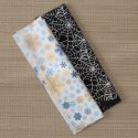
The original kitchen included in the kit had no sink, and the oven front was nothing more than a print-out I was supposed to glue onto a piece of wood, but it looked very unfinished. I used some heavy reflective paper to make a metal sink and build an oven door out of more of the same paper and some matchsticks. I even put on a tiny tea towel, made of shibori fabric.

The aquarium is quite possibly the thing I am most proud of. It was my first time working with resin, and I’m so pleased. I built the structure out of more popsicle sticks, used some gorgeous chiyogami paper from The Rare Orchid as the background, and I decorated the inside with some plant matter, teeny tiny shells, and polymer clay goldfish. I also had so much fun making the kokeshi doll in the little decorative shelf. Pretty sure that’s the tiniest face I’ve ever painted!

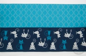
I really loved doing all the tiny detail work and decoration. I used a lot of beads and minuscule little knick-knacks I had lying around, and these sorts of things really help the whole thing feel like a real, lived-in home. There’s prints in the kitchen, including some vintage Japanese advertising and an adorable Sushi Cats print, and the art hanging in the tokonoma is by Ichiro Tsuruta, whom I’ve mentioned here before.

The tatami flooring is actually tatami repair stickers! The tile in the kitchen is adhesive vinyl cut into 1cm squares, and the flooring in the dining area is  more of the same imprinted heavy paper used on the walls. To give everything a more polished look, I finished off the edges with more stained coffee stirrers. It’s hard to see, but the bathroom is also “tiled” with more self-adhesive vinyl, and I made a mirror with the same reflective paper used in the kitchen. There are little bottles and toiletries made of beads. The initial kit just had clear acrylic walls in the bathroom, but that felt very exposed to me so I used some semi-opaque paper and decorative wire mesh to give a feeling of privacy.

This project was a labour of love, and reinforced how much I love working with miniatures.

 This post contains affiliate link(s). If you choose to purchase, I receive a small rebate or commission which goes to the continued maintenance of this site. 

Fudangi First Friday – Funky Punk Yukata

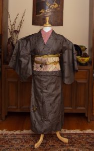
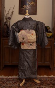
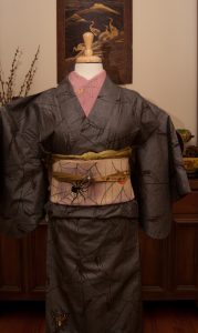
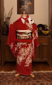
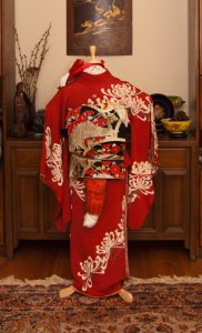
We’ve got a true first for this month’s Fudangi First Friday – I’ve actually never put a yukata on the mannequin until now! This coordination is actually something I had set out to wear to an event. On Wednesday, the lovely folks at Kimono Vintage Montreal organised an outing in yukata to the Montreal Jazz Festival, and what better place to wear something funky and non-traditional?

Unfortunately, the whole province was in the middle of a lethal heat wave (which has thankfully broken now).  Even when I was younger I never handled the heat well, and my chronic health problems only exacerbate the issue. I decided to be prudent and stay home, and thought it would be a good opportunity to feature the outfit on Friday instead.

I love this yukata so much, and I’ve worn it out to a street festival before. It’s got a really unusual pattern of flames, skulls, handcuffs and snakes, amongst other things. The obi came with it and from a distance looks like it’s just got butterflies on it, but up close you can see that there are skulls in their wings. It seemed like the perfect thing to wear to a big outdoor music festival.

Rather than fight against my figure and try to bind my chest in this heat, I’d already decided to use a coordinating cotton tank top underneath and wear the yukata in a loose, open fashion. I stuck with that choice on the mannequin, as well as hiking the hem up shorter than standard, and I love how it looks! I was also inspired by Nichole and her epic kimono style to use a belt in lieu of obijime, and I really love how it all looks together. I think I will make a point of finding somewhere to wear it out like this, because it seems a shame not to!

Items used in this coordination

Art Gallery – Pink Komon Portrait by Logan Spector

I fell in love with illustrator Logan Spector’s art in a group on Facebook we’re both part of. I contacted her about a kimono-related commission, and I am so beyond glad I did! I absolutely love how this turned out.

It’s obviously based off my recent coordination at the botanical gardens, and Logan’s attention to detail is just blowing my mind. From the kimono itself to the pattern on the haneri to my glasses and earrings, everything is spot-on perfect and translated into her unique art style so well.

I get really happy seeing how different artists interpret my face in their own looks while still being true to my weird nose and squishy jaw-line, and Logan was no exception. The whole process from start to finish was very pleasant, she showed me a draft and asked for input and kept me in the loop the whole time.

Please check out Logan Spector’s website and Instagram!

MonoKimono Challenge – Misty Mint

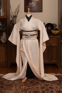
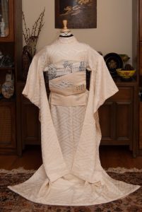
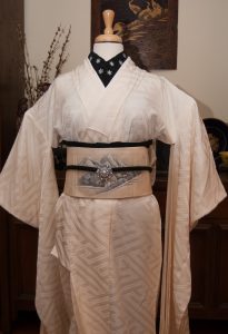
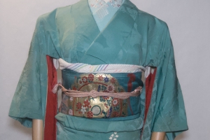
Does anyone else love Misty Mint candies? If you’ve never had them, they’re these wonderful, creamy, melty mint candy drops in beautiful pastel colours. They don’t make them anymore, sadly, and even if they did I couldn’t eat them since I’m allergic to dairy now, alas. However, the colour of this iromuji makes me think so fondly of them!

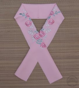
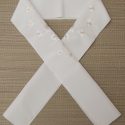
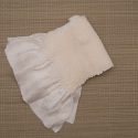
This coordination is basically a revisit of this monochrome outfit, but I wanted to do something softer, and without the hakama. This one feels more wearable, overall. I used the same kimono and haneri, but switched up to this shiny fukuro obi and accessories that blend in with the kimono itself. I had fun doing a sort of bunko variation with the obi, I quite like how it looks and it was very quick to do.

It’s also very interesting to me how this colour family photographs. In the original outfit with the hakama, it looks much more blue, today’s photos look much more green, and the catalogue photos below feel somewhere in between. All due to ambient light, time of day, and other external factors.

We’re halfway through the #monokimono challenge! I’m proud of myself for sticking with it, and already have plans for the second half of the year. Are you doing the challenge? If so, please share links in the comments, I would love to see!

Items used in this coordination

Sweet Creamsicle Ikebana

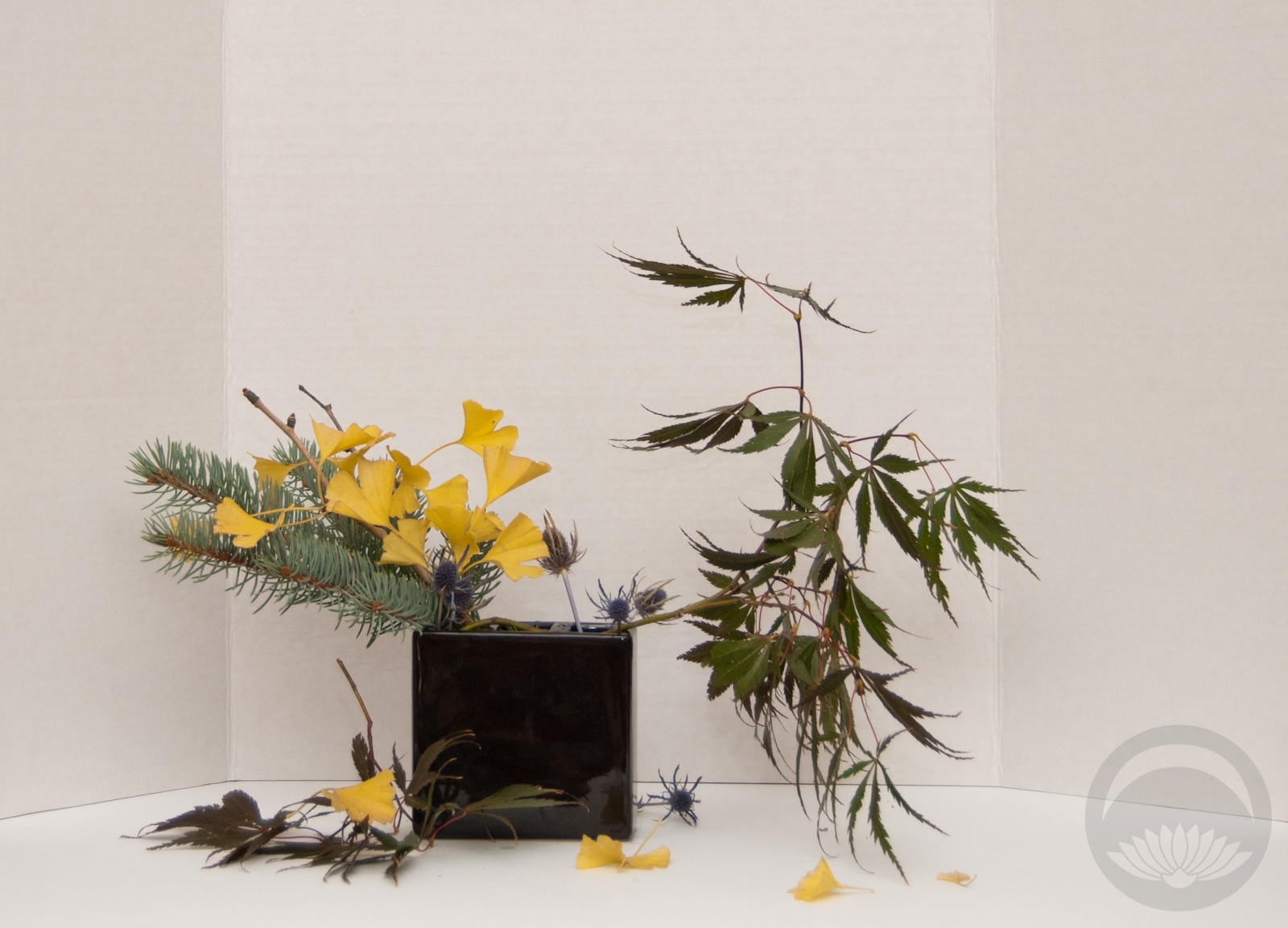
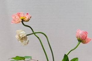
During the summer, I really do try to work with flowers from the great outdoors but when I saw this marked-down bouquet at the grocery store I felt an overwhelming urge to rescue it. I realise that the flowers were dyed by tinting the water orange, but come on, they look like a creamsicle!

The bouquet was a little past due and a fair number of the flowers were beyond salvaging, but I managed to rescue the large spider mum and the carnations which were what drew me to the bundle in the first place. I didn’t have a lot of length to play with so I focused on a small, tight, rounded shape with a little height for drama.

The oranges and creamy peach tones got a bit lost against the backdrop but then I remembered I had this awesome shibori-like fabric which provides great contrast.

Overall, this might not be the most dramatic or stylish arrangement I’ve put together, but there’s something undeniably charming and happy about it, and we could all use a little more happiness in our lives right now.