
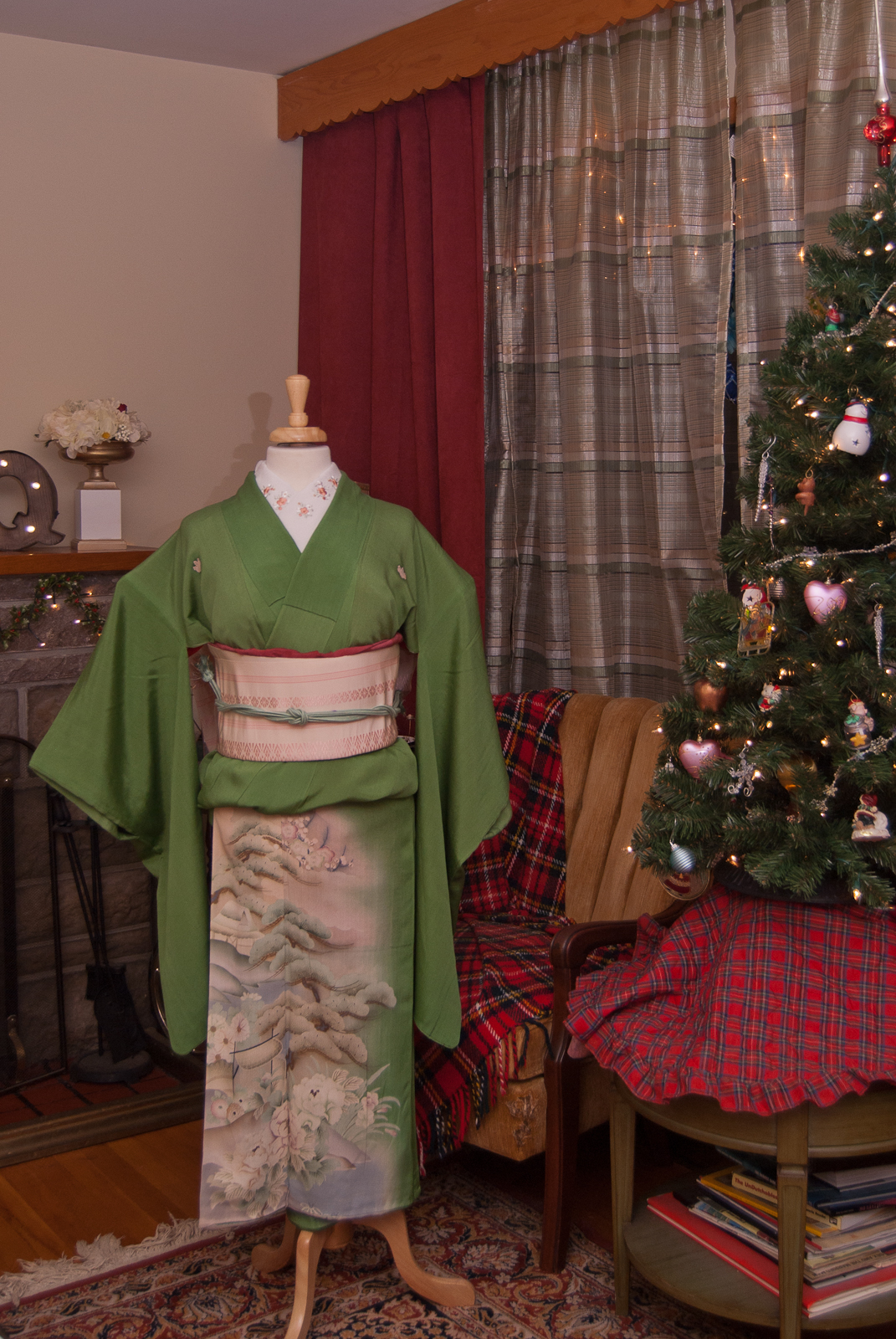
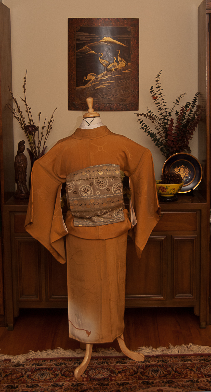
We interrupt your regularly-scheduled Hogwarts House kitsuke to bring you this month’s #monoKimono challenge. March brings us St. Patrick’s Day as well as the start of Spring so I thought green would be the perfect colour to work with this month.
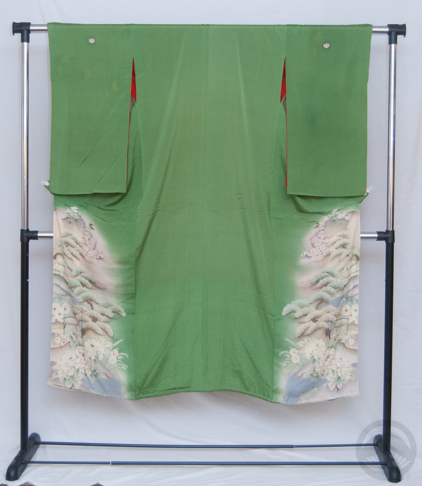
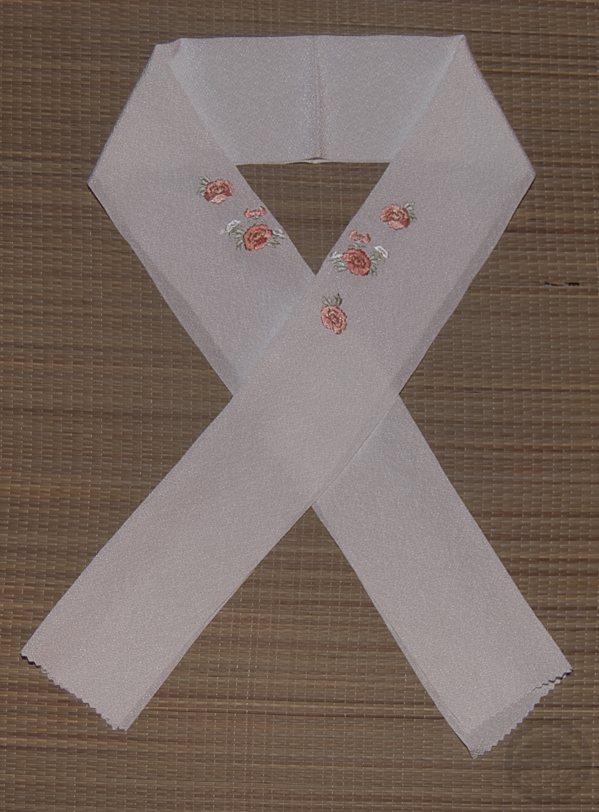
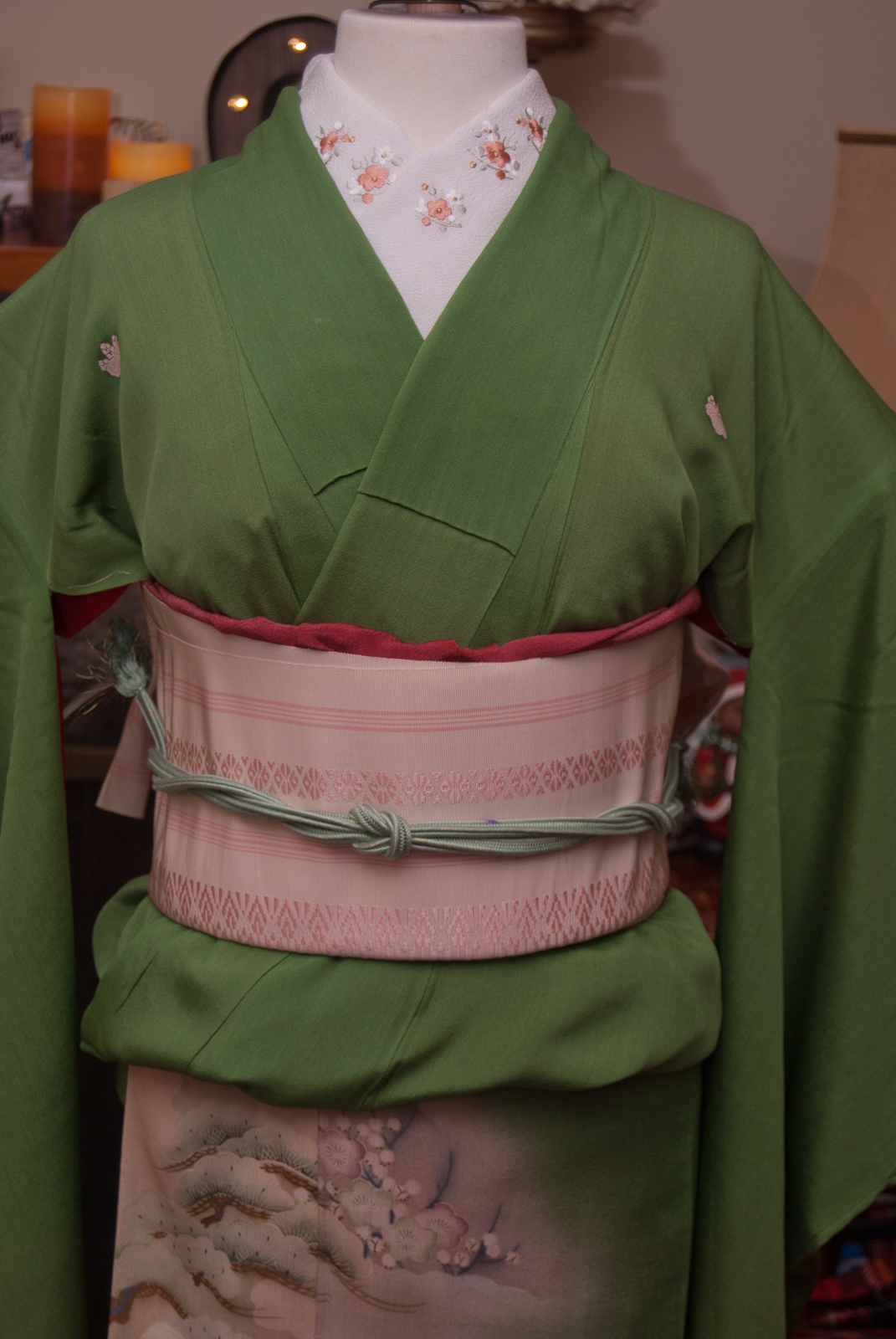
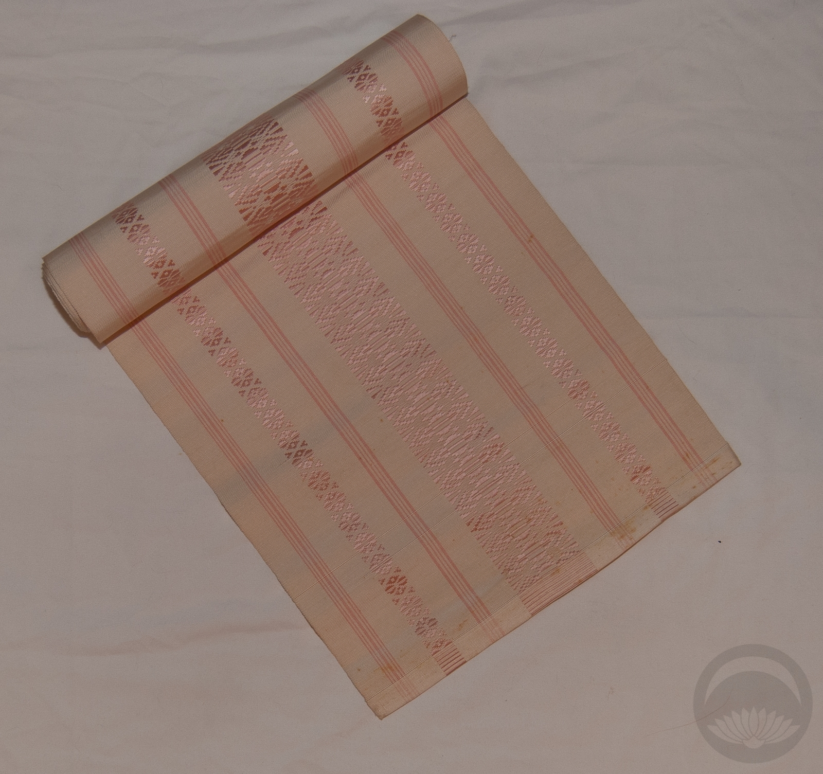
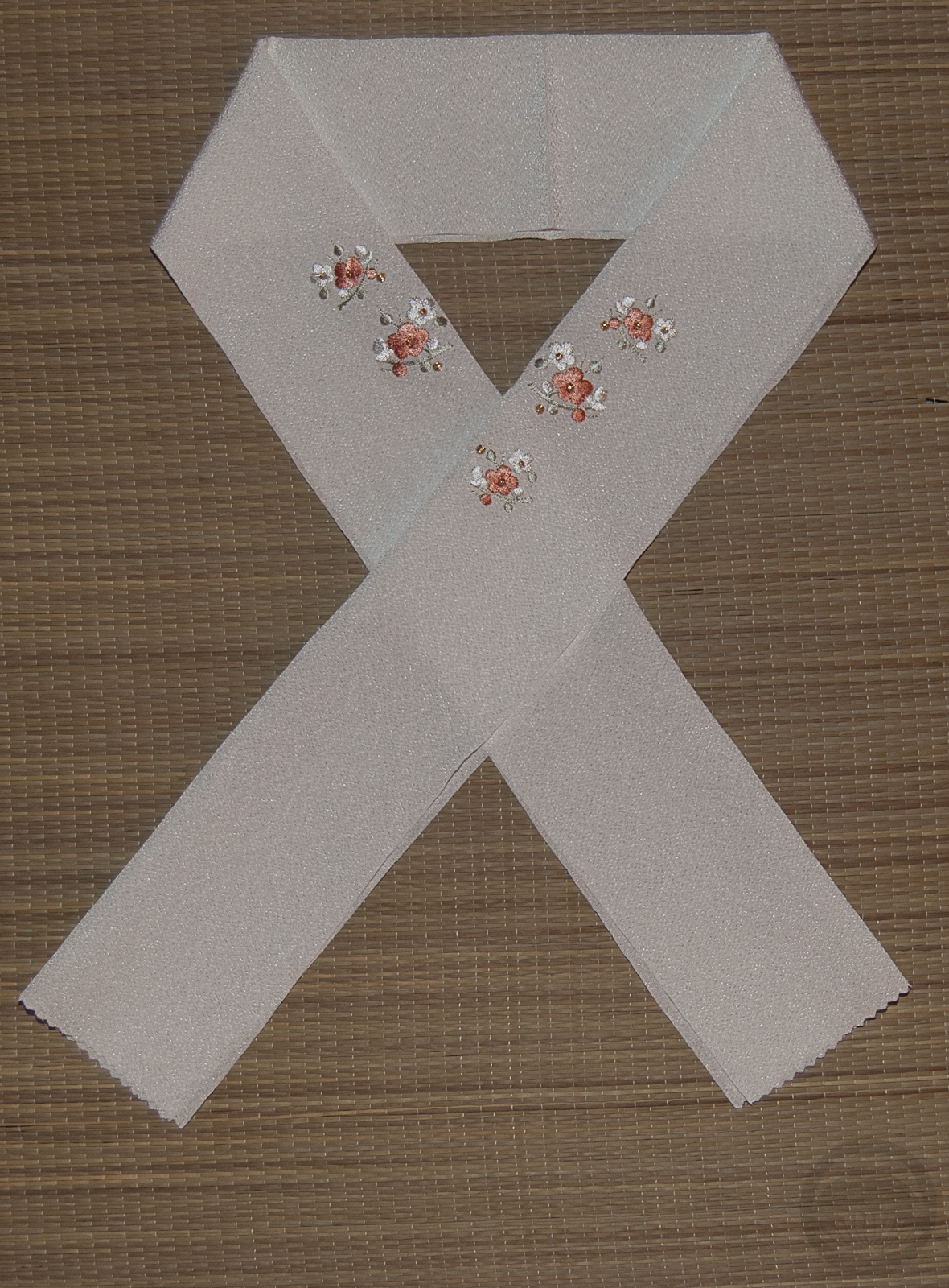
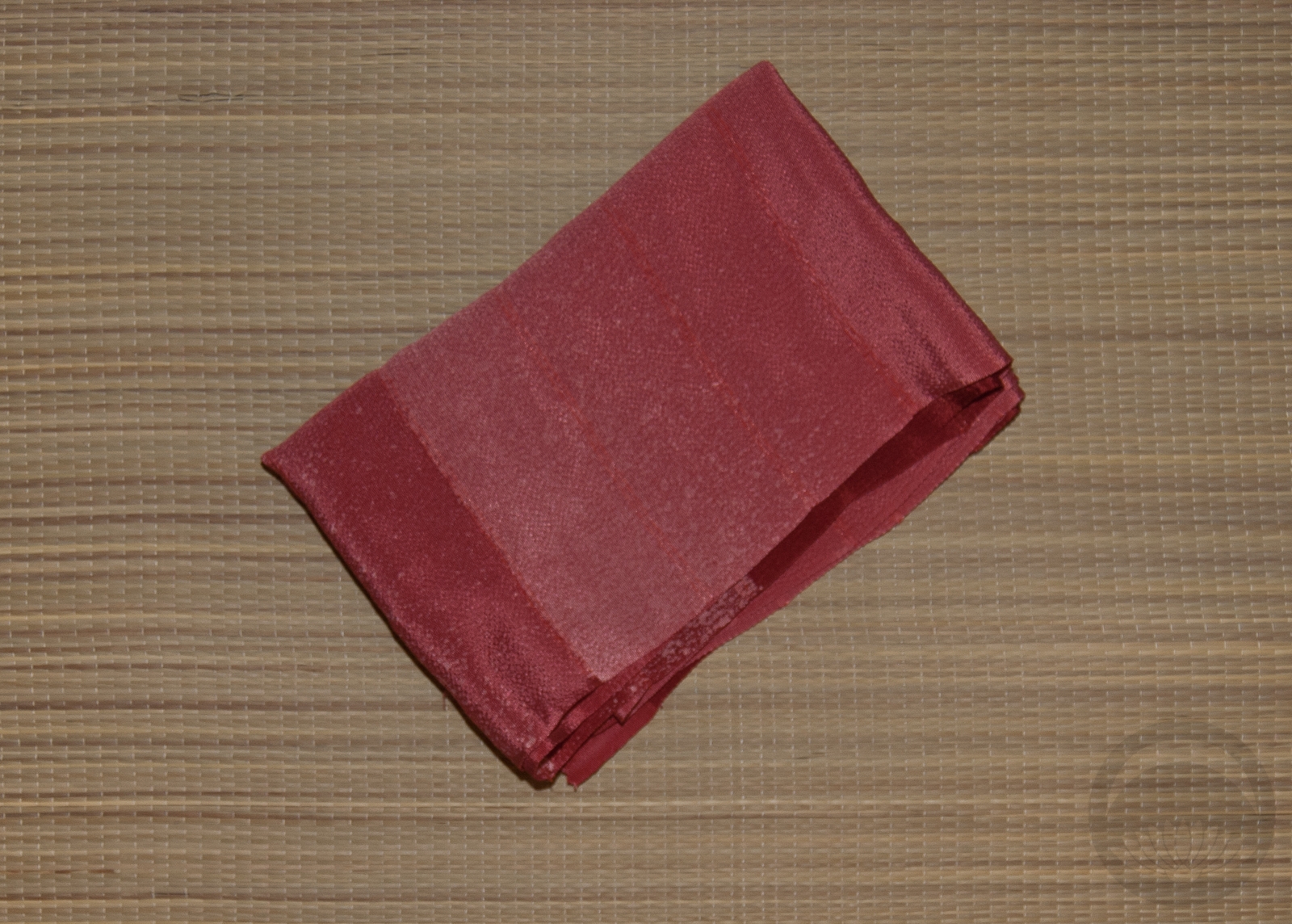
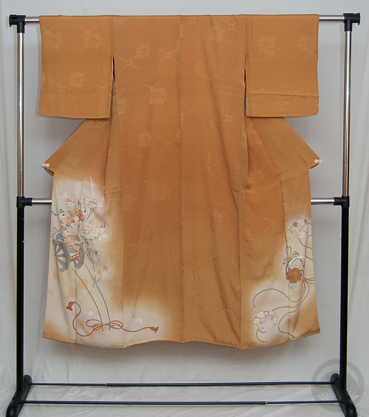
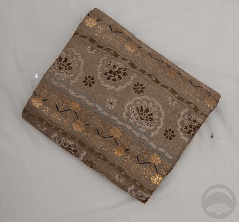
My vintage green irotomesode anchored the colour scheme, and since it’s so gentle and subtle I wanted to keep the whole outfit feeling very subdued. The back side of my green chuuya obi worked well, keeping things very simple and tying in with the slightly less saturated greens of the kimono’s hem design. My initial plan was to use a green cotton haneri with sayagata but it was slightly too warm and clashed with the kimono. Instead I chose a simple embroidered haneri that had enough green to tie into the monochrome theme but a few dusty pink accents to reflect the hem design. I ended up using the original cotton haneri as a kasane-eri, with so little of it visible it didn’t clash as much as it would have on the collar.

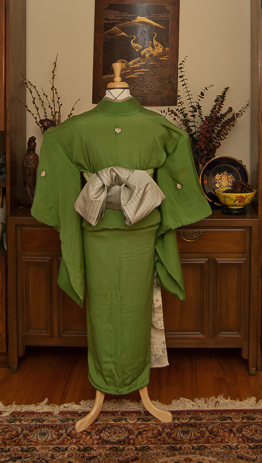
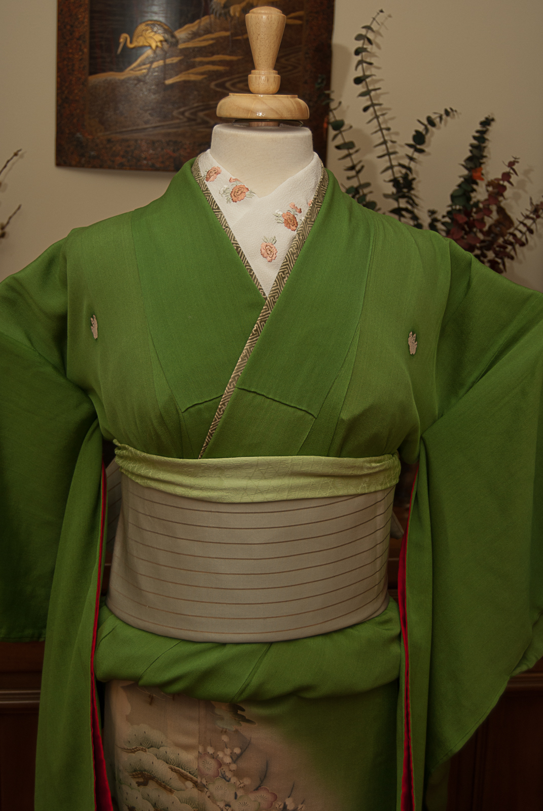
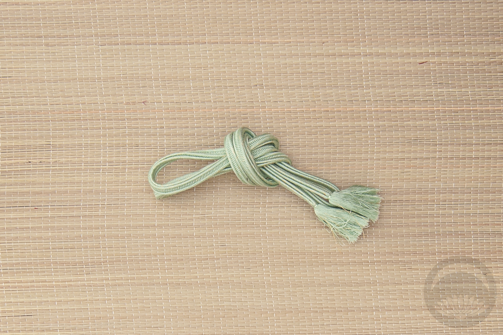
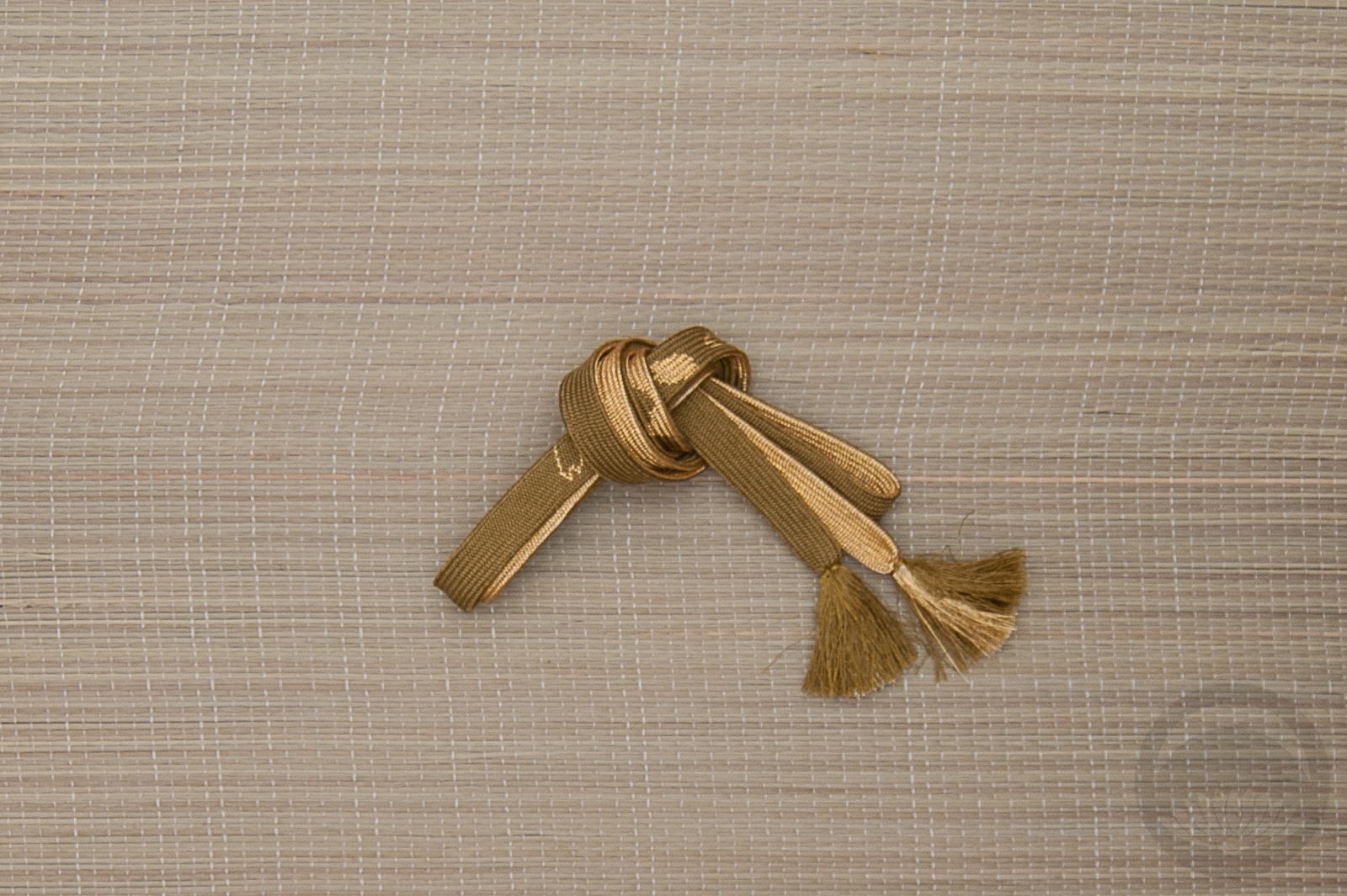
I tied the obi in a sort of bunko variation; no real concrete reason, I’m just getting tired of doing otaiko or niijudaiko musubi all the time lately. The obiage wasn’t necessary but I did want to inject one last shade of green to pull everything together. I skipped the obijime, since it wasn’t necessary either and none of the ones I had on hand fit nicely. I don’t think the outfit needs it, honestly, especially not with the pinstriping on the obi already.
We’ll be back to the Hogwarts project early next week. Until then, I hope you’re having a great weekend and a wonderful Easter or Pesach if you observe either of them.
Items used in this coordination
-

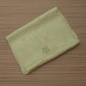
- Leaf Green Mirrored
-

- Pale Green Floral side 2

-

- Dusty Pink Botan
-

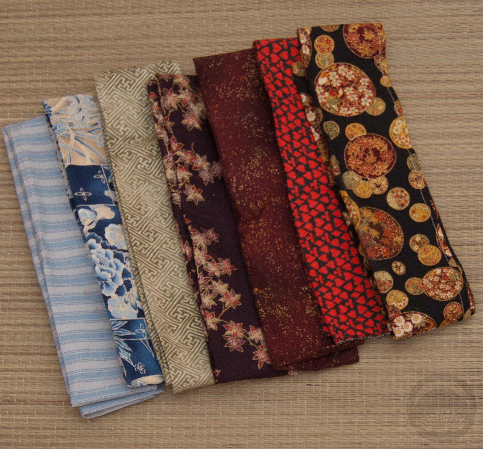
- Mixed Cotton
-
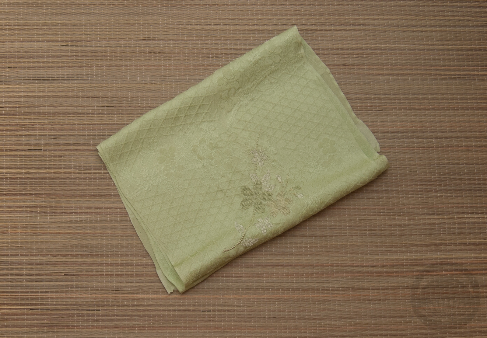
- Pale Green Rinzu with Embroidery


 Bebe Taian
 CHOKO Blog
 Gion Kobu