
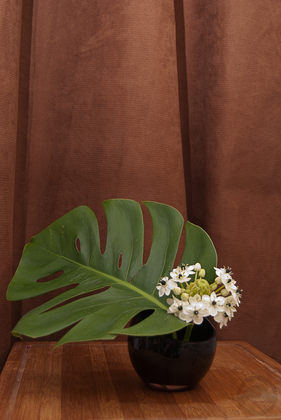
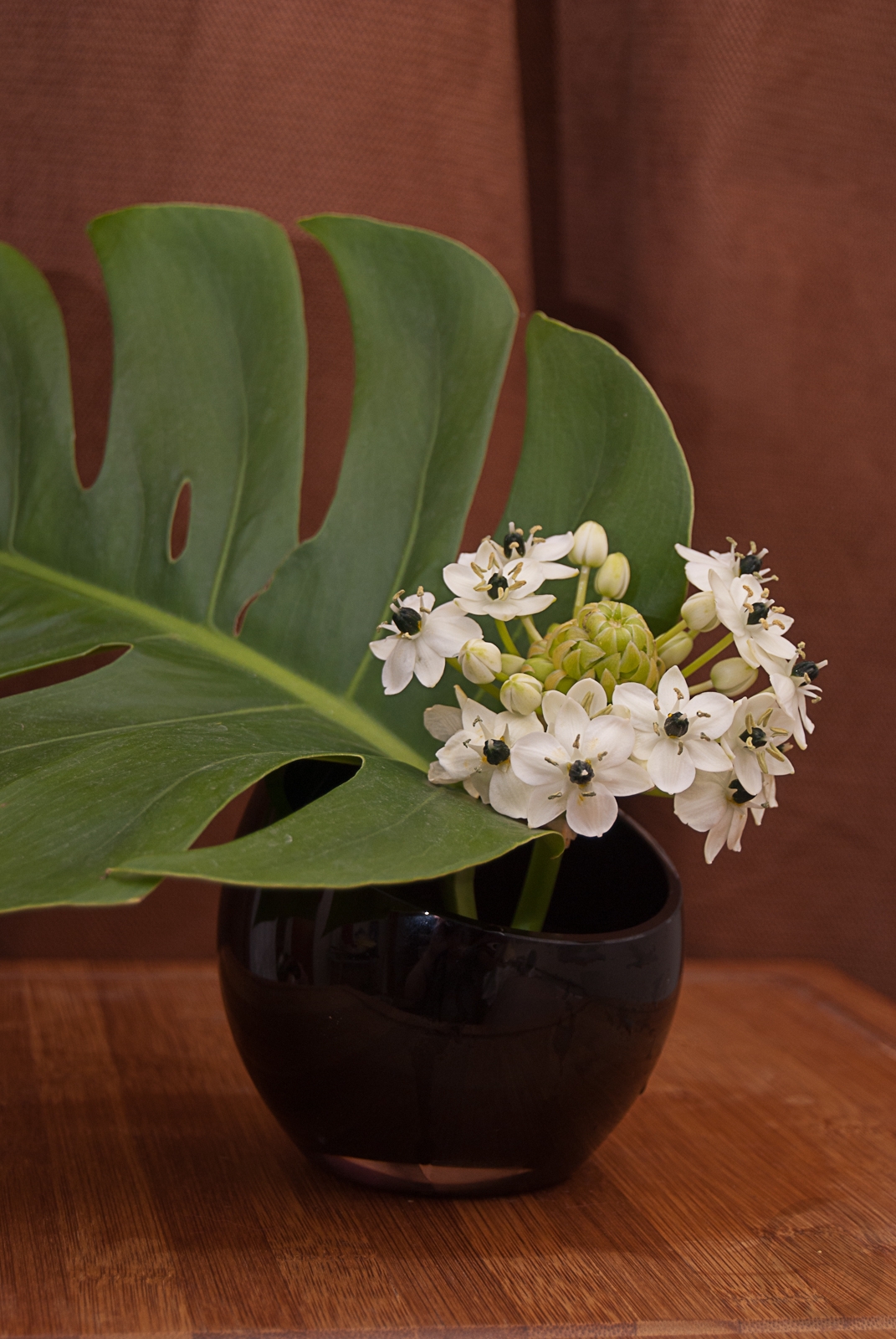
What first drew me to ikebana was the clean-lined simplicity of it all, the focus on a few sparse blooms without all the fluff and clutter that tends to be found in western-style flower deisgn. I’ve been experimenting a fair bit lately but I was itching to do a very sleek and low moribana-style arrangement, and when I found this gorgeous monstera leaf at the florist I knew it would be the perfect anchor for my next project. This interesting flower was all by its lonesome in a bucket in the flower fridge, and the texture and shape of it felt like a wonderful counterpoint to the glossy green foliage. I’m afraid I don’t remember what the flower is, but if anyone recognises it I’d love to know. The arrangement feels very heady and tropical to me, well-suited for to the oppressively muggy weather we’ve been having lately. I chose a very simple container to anchor them, in keeping with the clean and modernist vibe. I’m also quite pleased by how well the whole arrangement pops against the warm brown backdrop. This one might be incredibly simple, but it’s also incredibly effective.
Tag: green
Shape and Colour Ikebana
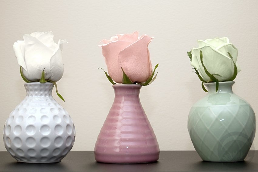 I bought this set of bud vases at everyone’s favourite enormous Scandinavian home goods store a while ago, with the intention of doing something with them, but I hadn’t decided on what. When I found a rose that was a very pale celadon green while out running errands today, I knew I’d found my project. I loved the idea of focusing on shape and colour here, and having three very balanced separate units forming one cohesive and harmonious grouping. I did debate using three different flowers to coordinate with the three different textures of vases, but in the end I felt that using the classic and neutral shape of the roses had the most impact. Thankfully, finding the pink and white ones was a breeze after the stroke of luck that was finding a greenish tinted one (I will be honest, I have no idea if it’s natural or if it was dyed for the florist’s, but either way it worked out quite well for me!) I think the soft, organic roses contrast the tactile and architectural quality of the vases perfectly, and the seeing the three of them together is like hearing three distinct notes coming together in one lovely chord. I arranged them simply on a dark surface to ensure all attention was on them without any background distractions, and I love the way they pop, pop, pop!
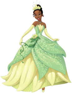
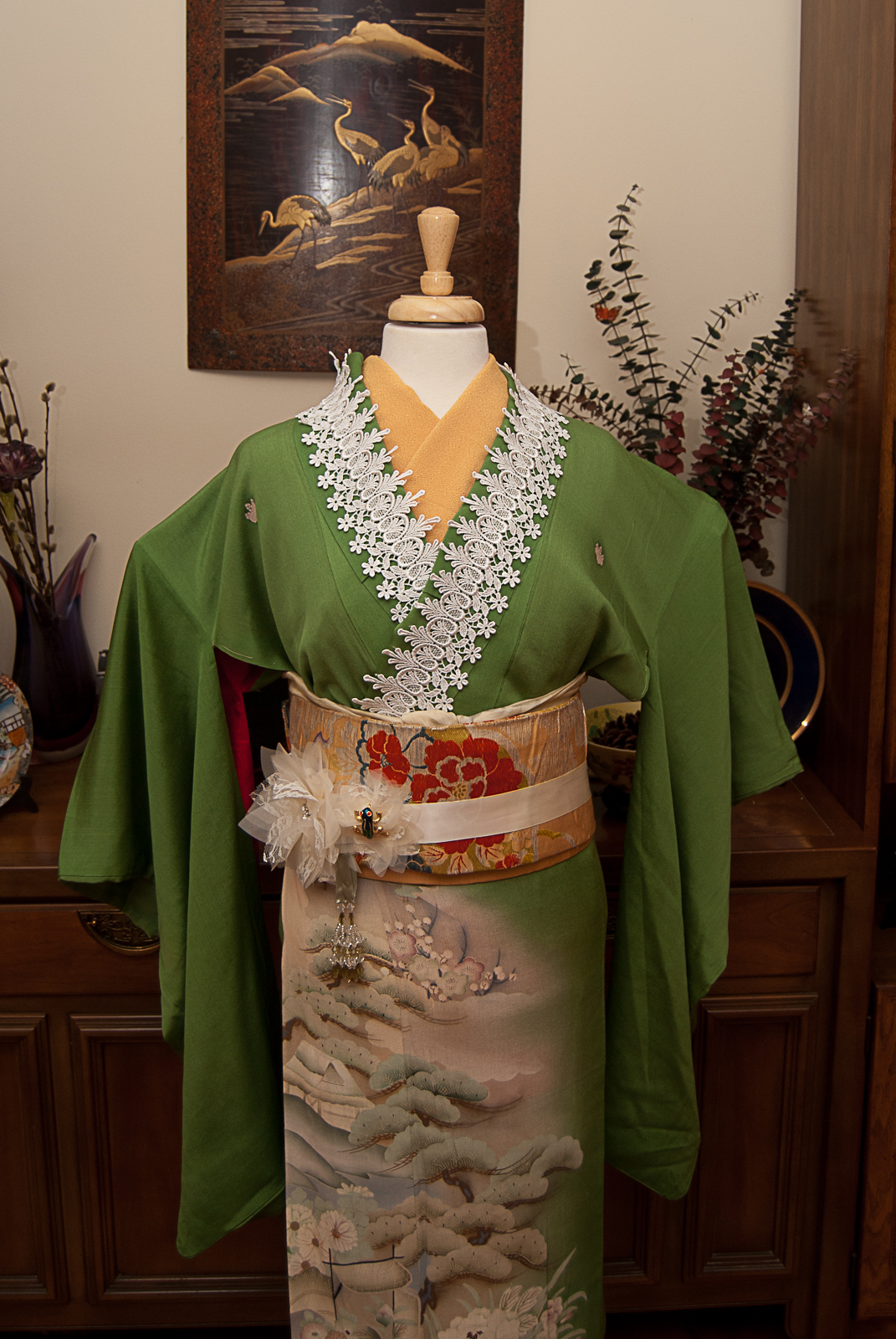
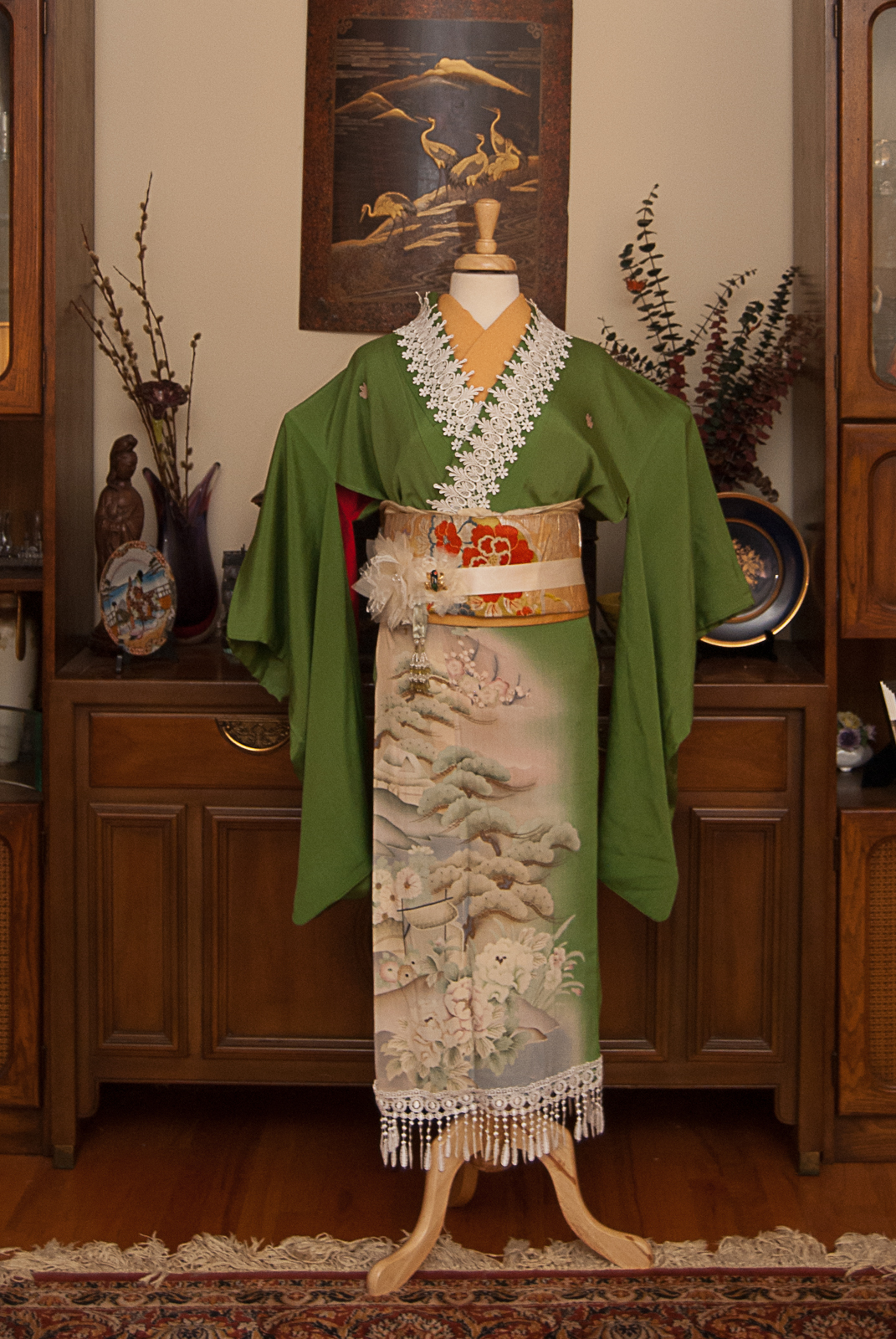
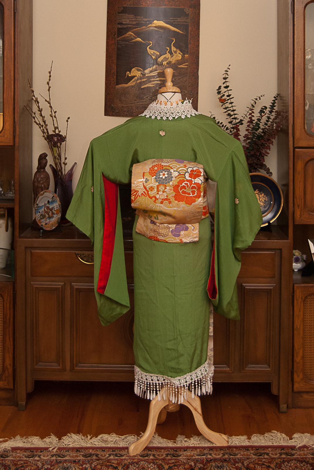
Tiana – Disney Princess Kitsuke Project
🎵 Dreams Do Come True in New Orleans🎵
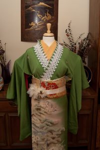
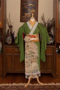
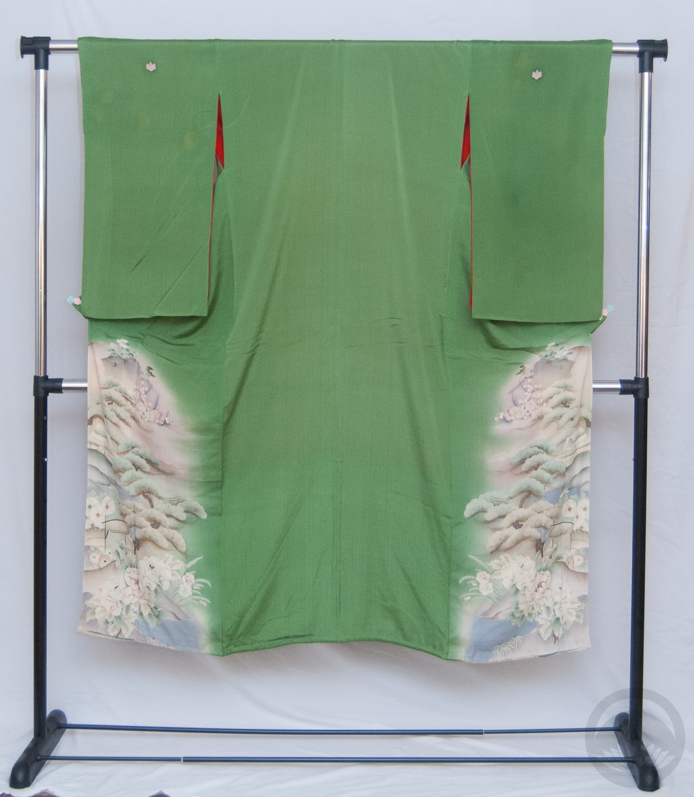
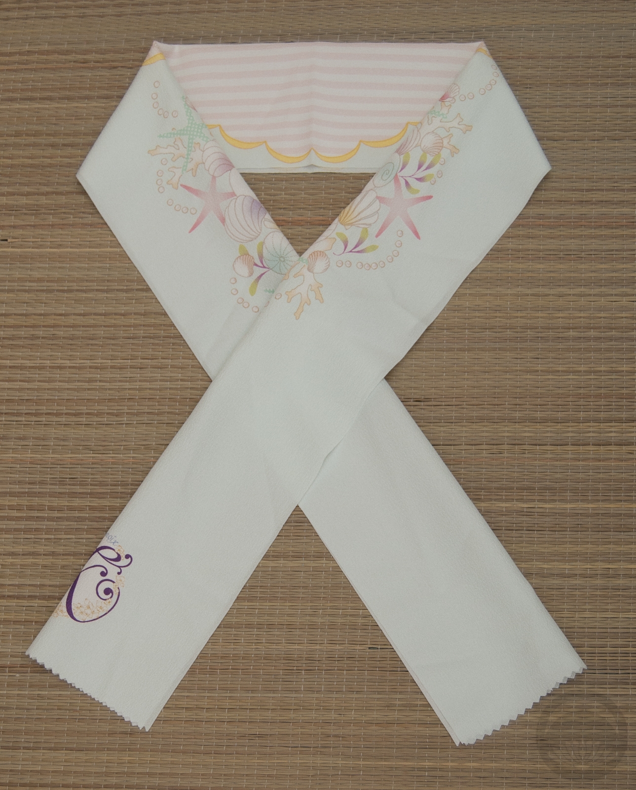
Tiana is one of the princesses I have had the most fun with so far. I knew right away I wanted to use this green irotomesode. Not only its it the perfect shade of froggy green, but it’s also from the same era as Tiana is. While most of the Princess movies exist in a bit of an amorphous time and space, The Princess and The Frog has such a distinct and concrete setting. I wanted something that brought together Taisho-era Japan and Jazz Age New Orleans, and felt like a kimono-hime outfit would strike exactly the mood I was aiming for.
-
-
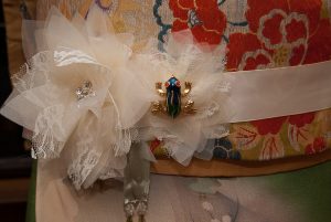
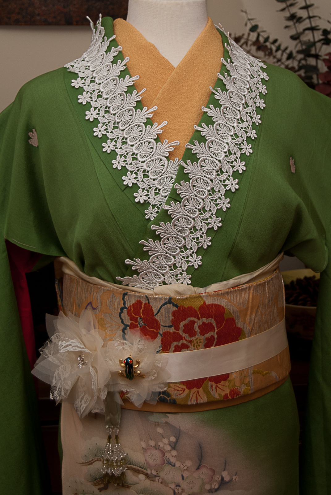
I built the outfit around the kimono, using golden yellow accents as a callback to her beautiful flowery gown. Some ivory lace appliqué on the collar and hem is reminiscent of flapper fringe, and when I found this gorgeous flower belt in the bridal section of the craft store, I knew I’d found my parallel for the lily on her gown. Of course, what is the princess without her frog? An enamel and gold brooch looks perfectly at home nestled in one of the flowers.
-
-

-

-
My original plan was to tie the obi in a more vintage-feeling musubi, especially since I used a standard niijudaiko on Aurora last week, but this obi is incredibly short and fragile, and I wasn’t comfortable putting too much strain on it. I then realised that the yellow colour tied in a puffy little square otaiko is reminiscent of Tiana’s famous beignets, so it worked out better than I’d planned. Aside from the obi, this one turned out almost identical to what I had in my head, and I couldn’t be happier that it came together so well!
Items used in this coordination
-
-
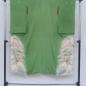
Leaf Green Mirrored
-
-
Yellow Florals
-

-
Solid yellow
-
-
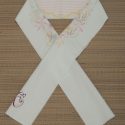
White and Gold Rinzu
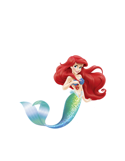
Ariel – Disney Princess Kitsuke Project
🎵Look at this stuff, isn’t it neat?🎵
Six weeks ago, I found a kimono on ebay that was perfectly reminiscent of Belle’s yellow ballgown from Beauty & The Beast. I snatched it up, and thus the ridiculous Disney Princess Kitsuke Project was born. I spent the following weeks plotting out coordinations for every single one of the official princesses. Made a few purchases, but mostly tried to use my existing collection. However, six weeks in, that gorgeous gold kimono still hasn’t arrived. I felt my frustration setting in and my motivation up and running away. I knew the only way to keep myself on track was to work on some of the other princesses in the interim.
-
-

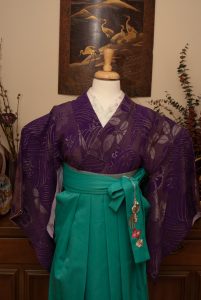
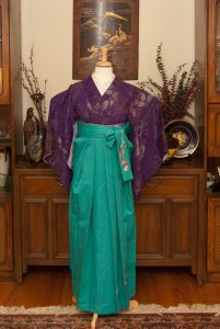
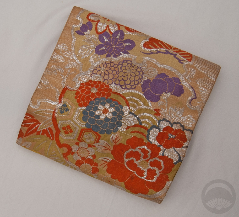
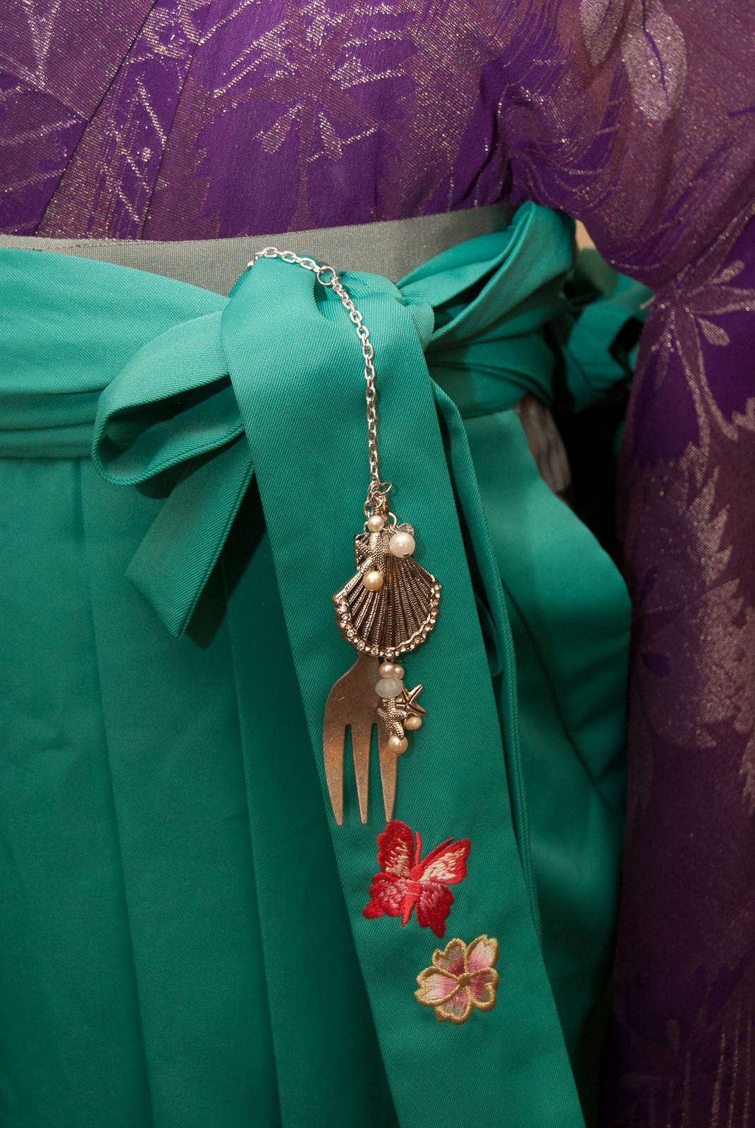
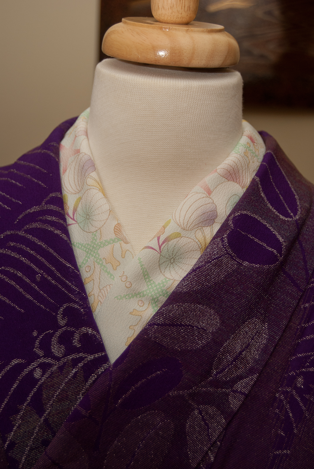
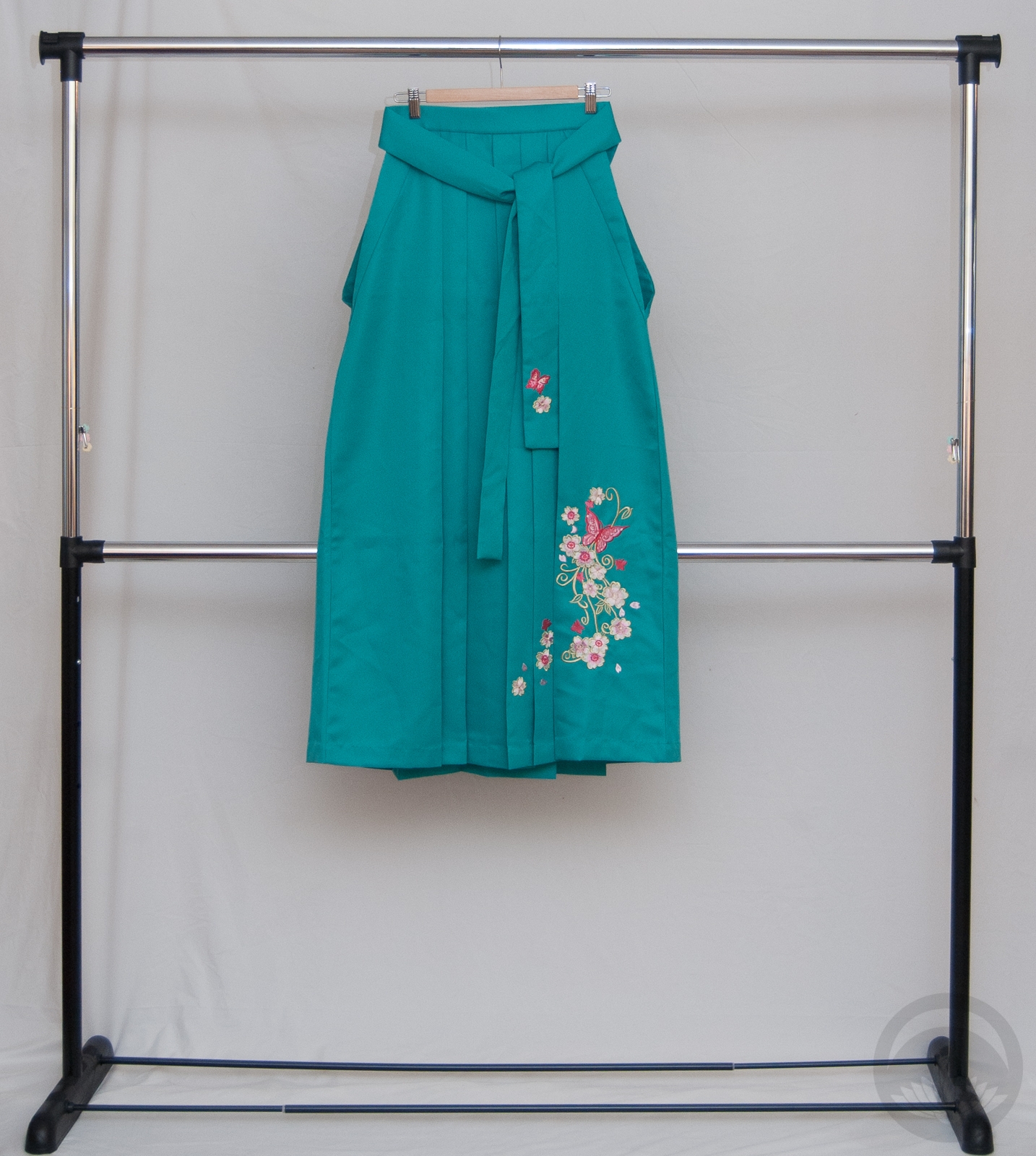
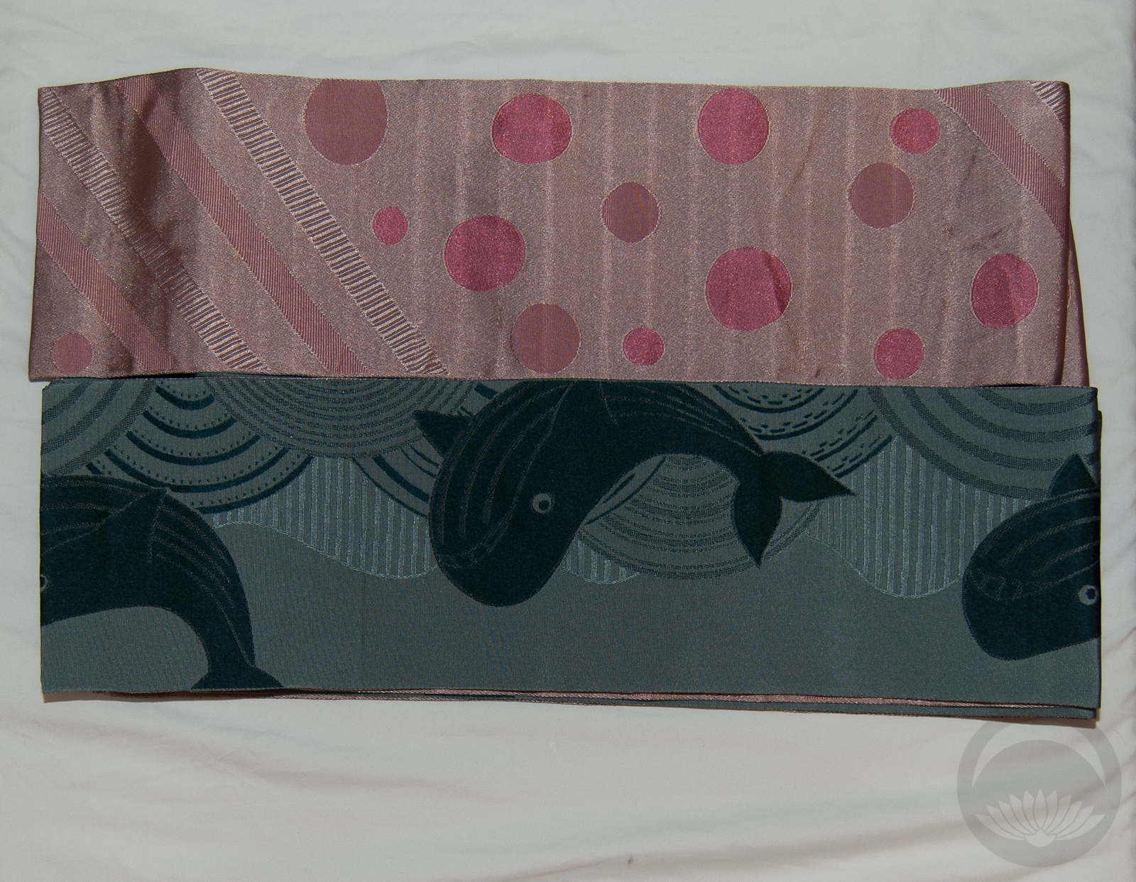
Ariel seemed like a good starting point, as she was the first “new” princess of my youth. I definitely identify the most with Belle (nerdy idealistic brunette? come on!) but had very strong memories of Ariel too so she seemed like logical next best thing. I chose my teal green hakama to mimic her tail, a sparkly purple komon to match her purple shell bra, and my shell haneri. It’s not very visible, but of course I had to use my whale hanhaba obi under the hakama, right? Last time I was at the craft store, I kept an eye out for charms and decorative items I could use in this project, and the first thing I found was a cute little shell charm. I figured I could work with that, and then I stumbled across the dinglehopper and couldn’t have been happier! I assembled them together with some silver chain, and some pearly beads and starfish charms finished it off perfectly.
-
-
-
-

Overall, I think this first outfit in the project came out exactly how I wanted it to. Which is a good thing, because now my motivation is back on track for the rest of them! I’ll likely be aiming to doing one a week, and then a big collective entry when they’re all complete. I hope you come back to see the others.
Items used in this coordination
-
-
Purple Lame
-
-
-
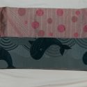
Blue Whales/Pink Bubbles
-
-
Seashells
Fresh Green Ikebana
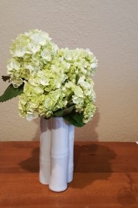 The rainy season is here, so of course it’s time for a lush ajisai (hydrangea) ikebana.
I actually did this one while I was in California last month; I’d had the bamboo-shaped vessel mailed to my friend there to save on shipping costs. I actually found the hydrangea while we were grocery shopping. I loved the refreshing pale green colour and the dense texture of the blooms, and thought they would be an excellent contrast to the stark white of the vase. I stuck to one plant material for this one to emphasise texture, contrast, and simplicity. It feels well-balanced and evokes a cool feeling to counter-act the summer heat and humidity. I do like the restraint of one type of plant material and suspect I will do more arrangements focusing on one type flower at a time.
However, I’m not sure this was as successful as I’d like it to have been because from a distance I think it looks like a bunch of cauliflower! I will have to try something different with this vase in the future.
-


-
-

Blogroll
 Bebe Taian
 CHOKO Blog
- Just Another Kimono Blog
- KaranKoron Dori
- Kimono & Coffee
- Kimono and Kitsuke
- Kimono Daisuki
- Kimono Life
- Kimono no Kokoro
- KimonoTEKA
- Red Delilah's Kimono Ai
- SAKE, KIMONO, and TABI
- Salon De Happiness
- Shakunetsu no Kimono
- Silk & Bones
- SiRe's Kimono Blog
- Strawberry Kimono
- Tansu Flowers
- The Kimono Lady
- YokoDana Blog
Japanese Culture
Vendors
Shape and Colour Ikebana
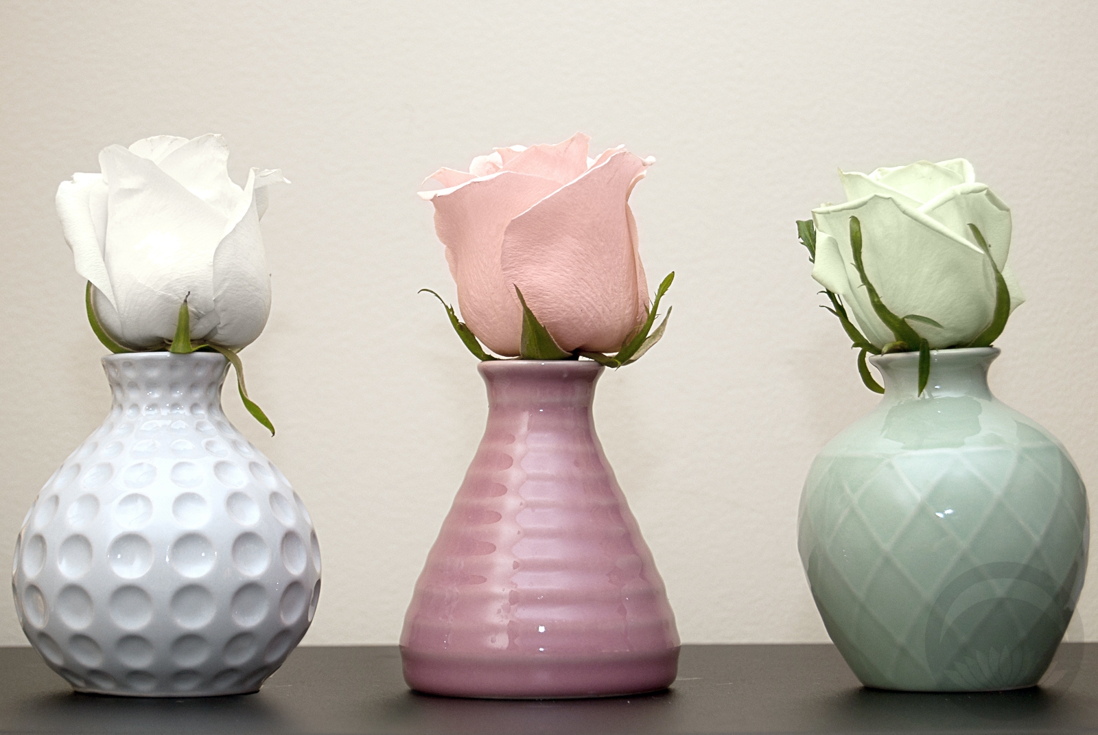 I bought this set of bud vases at everyone’s favourite enormous Scandinavian home goods store a while ago, with the intention of doing something with them, but I hadn’t decided on what. When I found a rose that was a very pale celadon green while out running errands today, I knew I’d found my project. I loved the idea of focusing on shape and colour here, and having three very balanced separate units forming one cohesive and harmonious grouping. I did debate using three different flowers to coordinate with the three different textures of vases, but in the end I felt that using the classic and neutral shape of the roses had the most impact. Thankfully, finding the pink and white ones was a breeze after the stroke of luck that was finding a greenish tinted one (I will be honest, I have no idea if it’s natural or if it was dyed for the florist’s, but either way it worked out quite well for me!) I think the soft, organic roses contrast the tactile and architectural quality of the vases perfectly, and the seeing the three of them together is like hearing three distinct notes coming together in one lovely chord. I arranged them simply on a dark surface to ensure all attention was on them without any background distractions, and I love the way they pop, pop, pop!
Tiana – Disney Princess Kitsuke Project
🎵 Dreams Do Come True in New Orleans🎵
Tiana is one of the princesses I have had the most fun with so far. I knew right away I wanted to use this green irotomesode. Not only its it the perfect shade of froggy green, but it’s also from the same era as Tiana is. While most of the Princess movies exist in a bit of an amorphous time and space, The Princess and The Frog has such a distinct and concrete setting. I wanted something that brought together Taisho-era Japan and Jazz Age New Orleans, and felt like a kimono-hime outfit would strike exactly the mood I was aiming for.

I built the outfit around the kimono, using golden yellow accents as a callback to her beautiful flowery gown. Some ivory lace appliqué on the collar and hem is reminiscent of flapper fringe, and when I found this gorgeous flower belt in the bridal section of the craft store, I knew I’d found my parallel for the lily on her gown. Of course, what is the princess without her frog? An enamel and gold brooch looks perfectly at home nestled in one of the flowers.

My original plan was to tie the obi in a more vintage-feeling musubi, especially since I used a standard niijudaiko on Aurora last week, but this obi is incredibly short and fragile, and I wasn’t comfortable putting too much strain on it. I then realised that the yellow colour tied in a puffy little square otaiko is reminiscent of Tiana’s famous beignets, so it worked out better than I’d planned. Aside from the obi, this one turned out almost identical to what I had in my head, and I couldn’t be happier that it came together so well!
Items used in this coordination
-
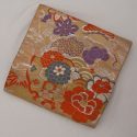
- Leaf Green Mirrored
-
- Yellow Florals
-
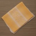
- Solid yellow

-
- White and Gold Rinzu
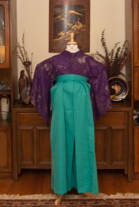
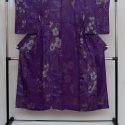
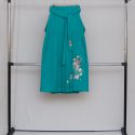
Ariel – Disney Princess Kitsuke Project
🎵Look at this stuff, isn’t it neat?🎵
Six weeks ago, I found a kimono on ebay that was perfectly reminiscent of Belle’s yellow ballgown from Beauty & The Beast. I snatched it up, and thus the ridiculous Disney Princess Kitsuke Project was born. I spent the following weeks plotting out coordinations for every single one of the official princesses. Made a few purchases, but mostly tried to use my existing collection. However, six weeks in, that gorgeous gold kimono still hasn’t arrived. I felt my frustration setting in and my motivation up and running away. I knew the only way to keep myself on track was to work on some of the other princesses in the interim.

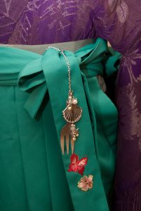
Ariel seemed like a good starting point, as she was the first “new” princess of my youth. I definitely identify the most with Belle (nerdy idealistic brunette? come on!) but had very strong memories of Ariel too so she seemed like logical next best thing. I chose my teal green hakama to mimic her tail, a sparkly purple komon to match her purple shell bra, and my shell haneri. It’s not very visible, but of course I had to use my whale hanhaba obi under the hakama, right? Last time I was at the craft store, I kept an eye out for charms and decorative items I could use in this project, and the first thing I found was a cute little shell charm. I figured I could work with that, and then I stumbled across the dinglehopper and couldn’t have been happier! I assembled them together with some silver chain, and some pearly beads and starfish charms finished it off perfectly.


Overall, I think this first outfit in the project came out exactly how I wanted it to. Which is a good thing, because now my motivation is back on track for the rest of them! I’ll likely be aiming to doing one a week, and then a big collective entry when they’re all complete. I hope you come back to see the others.
Items used in this coordination
-
- Purple Lame

-
- Blue Whales/Pink Bubbles
-
- Seashells
Fresh Green Ikebana
 The rainy season is here, so of course it’s time for a lush ajisai (hydrangea) ikebana.
I actually did this one while I was in California last month; I’d had the bamboo-shaped vessel mailed to my friend there to save on shipping costs. I actually found the hydrangea while we were grocery shopping. I loved the refreshing pale green colour and the dense texture of the blooms, and thought they would be an excellent contrast to the stark white of the vase. I stuck to one plant material for this one to emphasise texture, contrast, and simplicity. It feels well-balanced and evokes a cool feeling to counter-act the summer heat and humidity. I do like the restraint of one type of plant material and suspect I will do more arrangements focusing on one type flower at a time.
However, I’m not sure this was as successful as I’d like it to have been because from a distance I think it looks like a bunch of cauliflower! I will have to try something different with this vase in the future.
-
-
Blogroll
- Bebe Taian
- CHOKO Blog
- Just Another Kimono Blog
- KaranKoron Dori
- Kimono & Coffee
- Kimono and Kitsuke
- Kimono Daisuki
- Kimono Life
- Kimono no Kokoro
- KimonoTEKA
- Red Delilah's Kimono Ai
- SAKE, KIMONO, and TABI
- Salon De Happiness
- Shakunetsu no Kimono
- Silk & Bones
- SiRe's Kimono Blog
- Strawberry Kimono
- Tansu Flowers
- The Kimono Lady
- YokoDana Blog
Japanese Culture
Vendors


 Gion Kobu