Kimono Outfit Inspiration Generator!

Feel like playing with kimono coordinations, but aren’t sure where to start? Use this to generate ideas, and use as few or as many as you like! I made it to keep myself from going bonkers at work earlier today, and figured it would be fun to share it.

It will generate two sets of data. Traditional will give you a few simple options to work from, and Adventurous may result in some really out-there looks. You don’t have to use everything it suggests, but it would be fun to try getting them all into one coordination! If this results in any really cool (or really ridiculous) combinations and you put them together, I’d love to see them.

(Best viewed on a full screen, parts may overflow or be cut off on mobile apps)

October Rust – MonoKimono Challenge & Fudangi First Friday

I’m cheating today. Someone alert the authorities! Typically, the #MonoKimono challenge occurs on the last weekend of the month, and Fudangi First Friday occurs on, well, the first Friday. However, I had other things on my mind this past weekend, and I know this weekend is going to be quite busy, so I figured I’d take advantage of a free afternoon and combine the two smack in the middle of the week.

It’s finally, mercifully, starting to feel like Autumn here so that was my jumping-off point. I had to build an outfit that was both casual and monochrome, so it felt like the right time to bust out my rusty red-orange wool komon. My Tokaido hanhaba obi is an absolute spot on match for the kimono, even down to the yellow accent colour matching the yellow weave.

I’ve seen this sort of hanhaba musubi that almost looks like a miniature otaiko and wanted to give it a shot. It worked out quite well, I think. I also like the pop of contrast the yellow side offers – it echoes the yellow han-eri on the front view and helps draw attention to the subtle pattern in the kimono itself. I still think it’s subtle enough and in a close enough colour range to count as monochrome, too. While an obijime isn’t a necessity with this sort of an outfit, I did need it for this particular musubi and I just happened to have one that was another perfect match. I’m pretty sure this is the most monochrome outfit I’ve put together for this challenge so far.

Another reason I wanted to get this outfit on the mannequin is that I have something very neat in the works, and wanted her in something that felt seasonal and was nice to look at but also was very much a “background” feel and not something ornate that would steal the focus away. I’m being evasive now, but I promise I’ll tell you all what it’s for very soon!

Items used in this coordination

Harley Quinn

I hate clowns, but I love Harley Quinn. Go figure! This was the outfit I was most looking forward to. It was the most fun, but somehow also the most awful to put together! Even though the other three outfits in this project have been relatively standard and traditional kitsuke, my plan for Harley had been a bit off-the-wall from the very beginning.

For a character who was only created in the 1990s and was never meant to be a permanent addition, Harley’s had an enormous impact on the DC universe and really pop culture as a whole. She’s had some incredible character development, and a long with that a bevy of unique costumes and looks. None are more iconic than her original red and black harlequin jumpsuit though, so I knew that one had to be my starting point.

My red ume komon was the grounding point for the whole outfit, along with a black petticoat to give off a cute feminine vibe. Over top of that, I used a ro mofuku kimono I have that’s basically rotted apart at the seams. I’ve been planning to sew it back together, but I realised that it would be perfect to use as a sort of overlay. Since the seams were already separated, I sort of bustled it in four segments over top of the komon. A red, black, and white obi and accessories with card suit motifs were the perfect next step. I added some white ruffled ribbon to the collar and sleeves, and tucked a white shibori obiage in above the obi to look like more ruffles.

Despite it being an enormous pain in the posterior to put together, I could not be happier with how this outfit turned out. I could absolutely see Harley wearing it.

This is going to be the last Batman-themed outfit for a while. It’s been great fun, but I want to focus on a few different things for the month of October. I do have loose ideas for a few more characters so I’ll likely revisit those in the future though.

Items used in this coordination

Catwoman

Up next in my Batman-inspired coordinations, Catwoman! A jewel thief extraordinaire and on-again off-again love interest for Bruce Wayne himself, no project like this would be complete without her.

Her look and costume have evolved almost as much as her origins, and my initial plan was to go for black with hints of blue-green to evoke the gritty night-time feel of Gotham as well as echo her outfits in the Batman Ninja movie. But after some discussion with a friend, I realised I could absolutely pull in the purple as well, and have a very harmonious outfit that nodded to her original costume as well as the more modern iterations.

Of course, this was the perfect opportunity to use my teal haneri with black cats on it. I also tied a variation on a standard otaiko musubi with my teal obi that gives off the impression of cat ears. I really wanted this outfit to be as sleek and elegant as Selina Kyle is, but with a sense of whimsy and a clear nod to cats. The obidome is a stylised clay cat face my father sculpted and I then decorated with pearls and rhinestones to call back to her cat-burglar past. A rich purple obiage and obijime tied everything together, both visually and literally.

Unfortunately, the weather here is awful and dreary and the light in the living room was not amazing today. Combine that with the fact that purple and teal are two of the most difficult colours to photograph. I had to process the photos quite a bit, but I think in the end they’re pretty accurate, and the outfit conveys exactly what I was hoping for, so I’m quite pleased.

Items used in this coordination

Review – Paperless Post Project

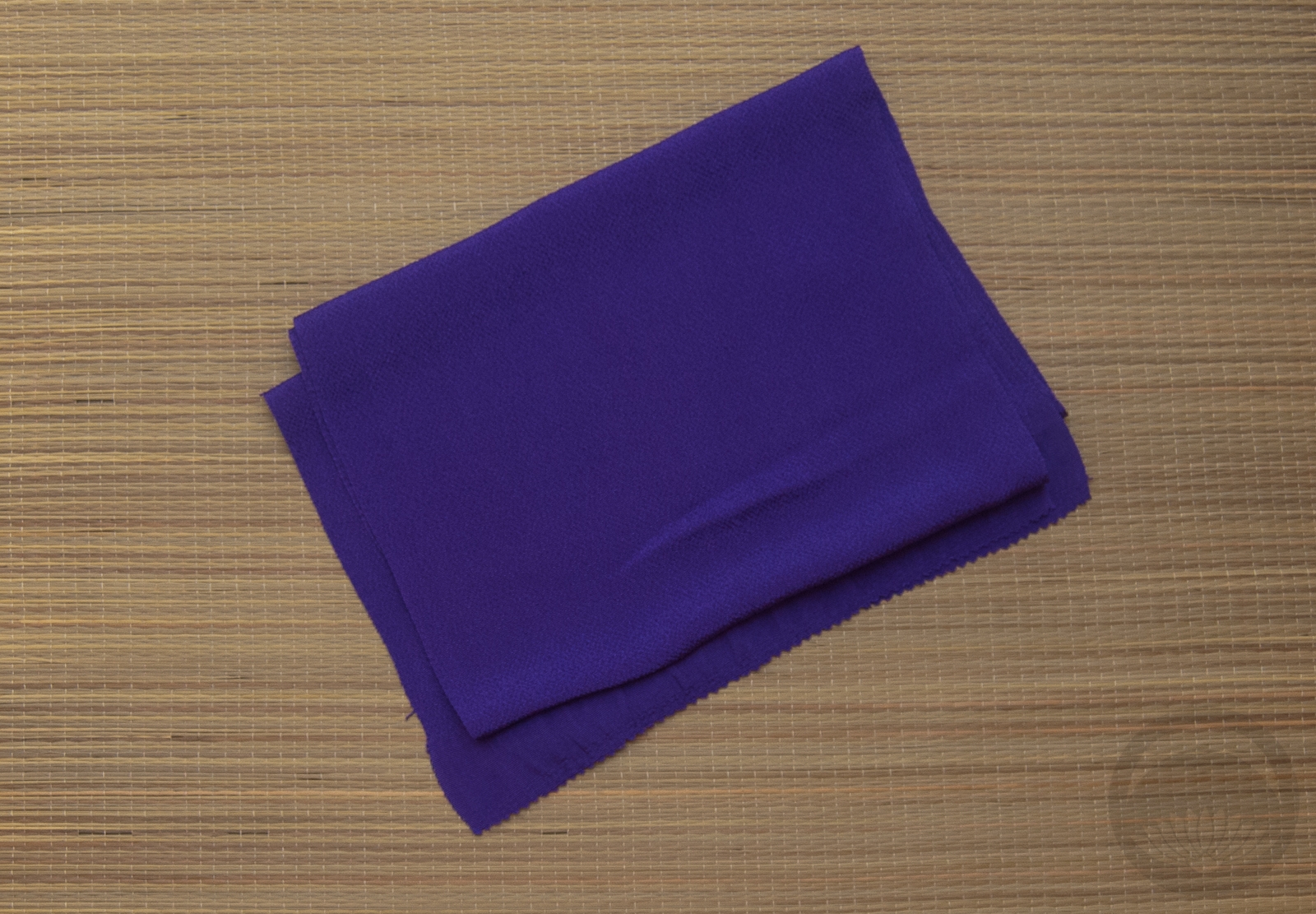
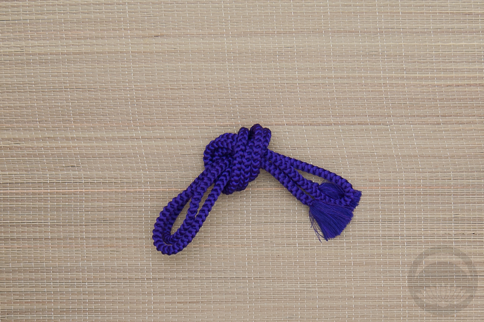
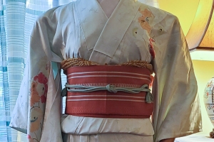
Recently, I was contacted by the Paperless Post Project, offering me some credits to explore and review their service. At first, I admit that I was uncertain about a way to tie it in to the content of this blog, but my worries were unfounded. We had a kimono club event coming up, and there’s such a wonderful variety of invitations and digital paper products that I knew it would be a great way to send out invites.

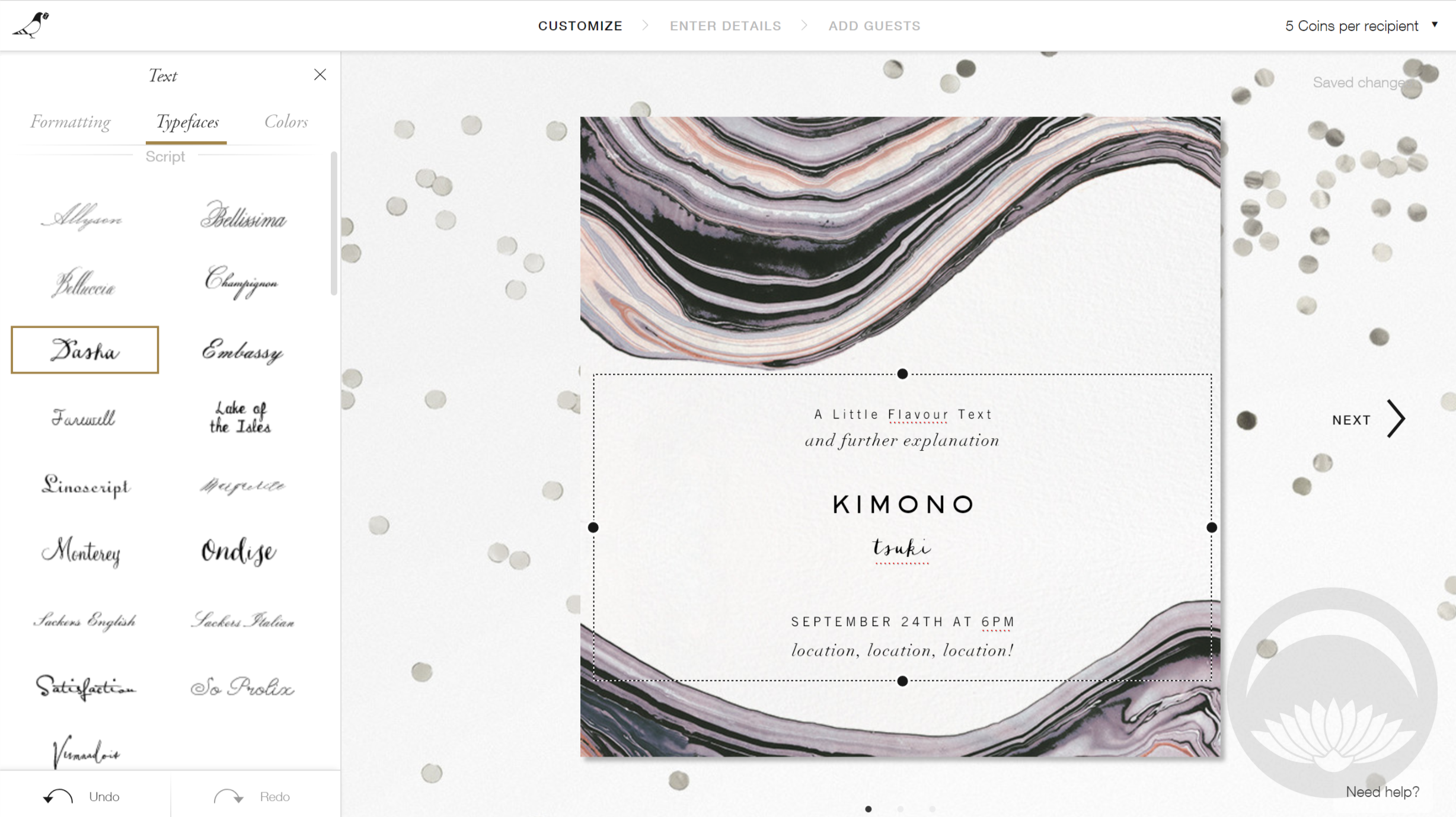
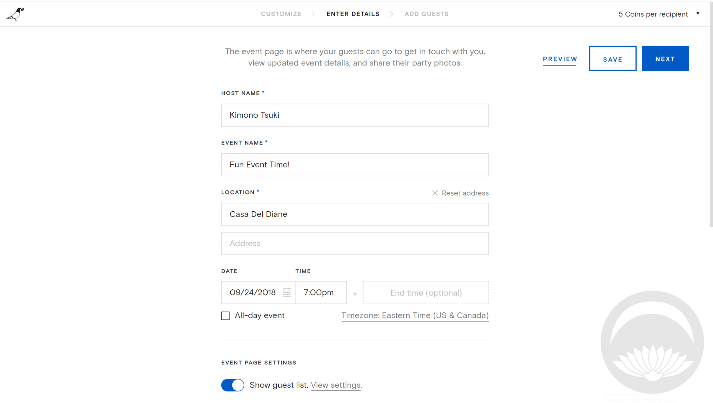
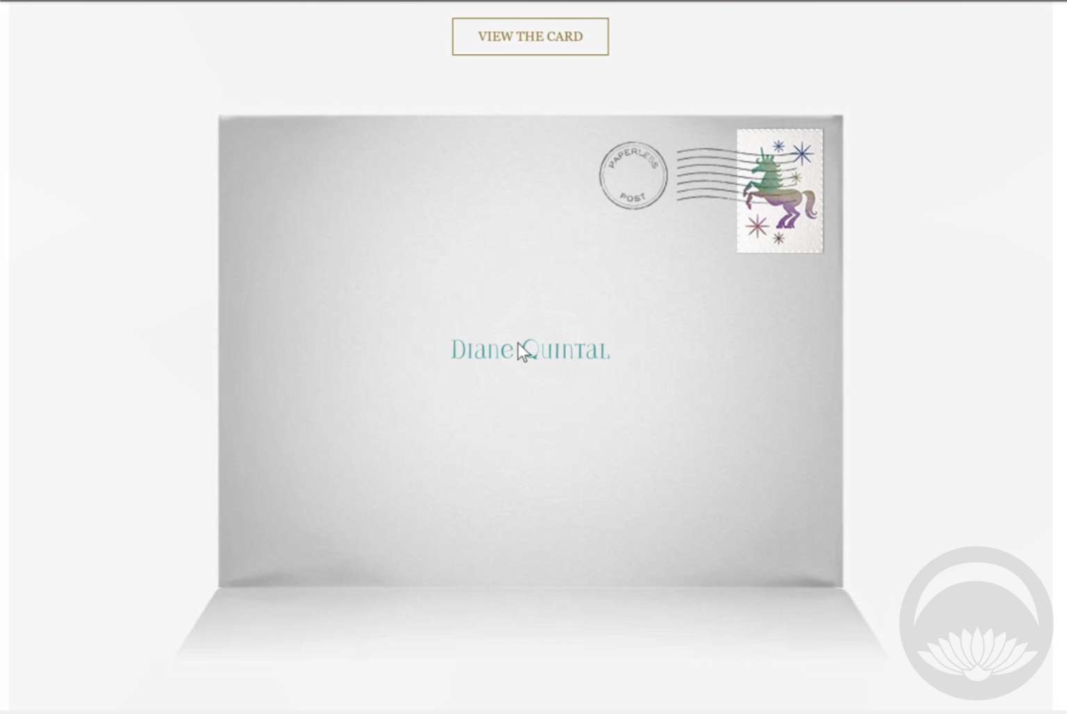
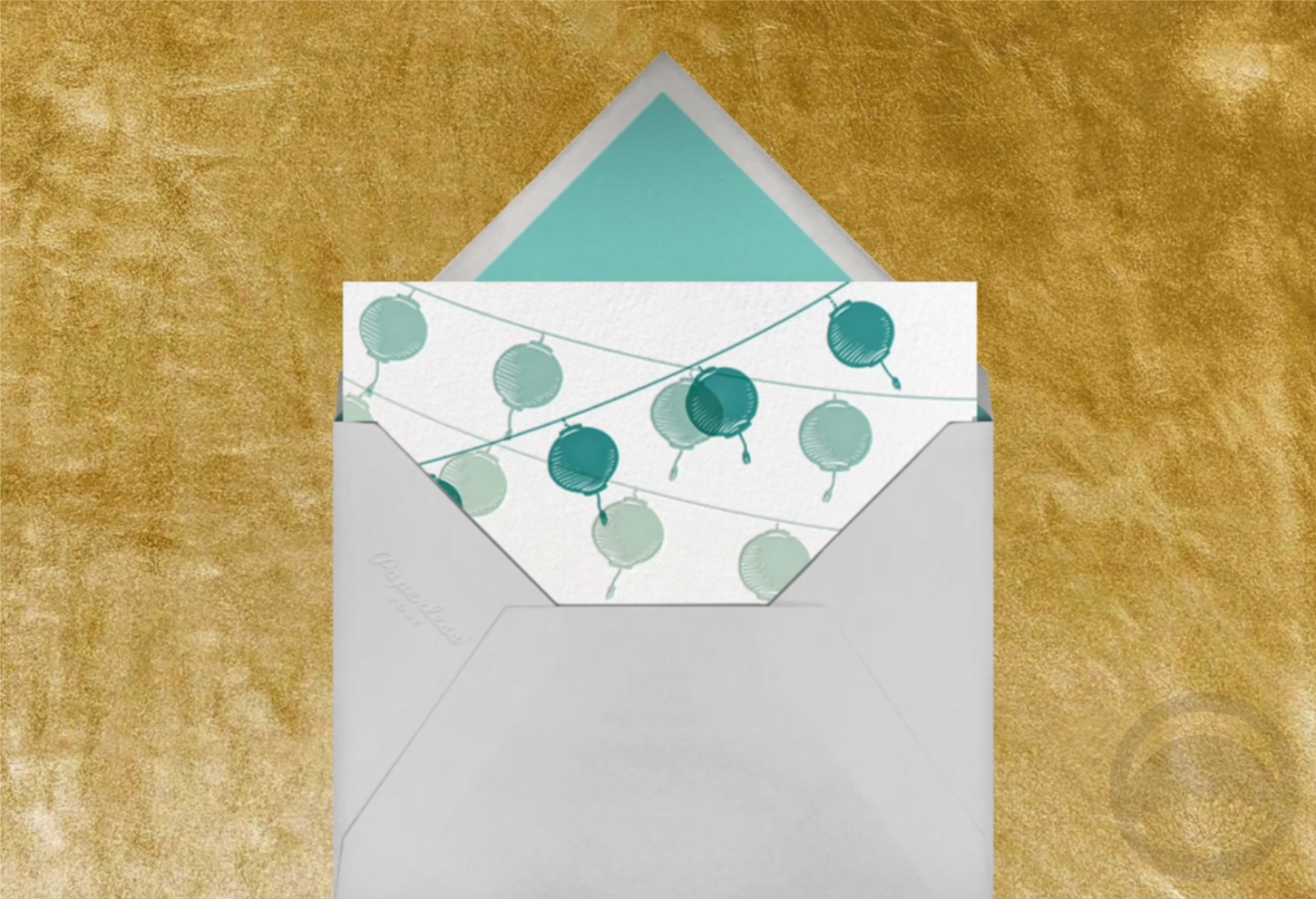
Paperless Post is a fantastic alternative to traditional mail. It’s infinitely customiseable and eco-friendly, but still feels exciting and cohesive, like receiving a physical invitation. The interface is fantastic – you can personalise nearly every aspect of the “mail” you’re sending, from the card to the envelope and stamp to even the backdrop surface the envelope opens on! For people who don’t have the time or skill to create their own designs, many of the pre-existing designs are absolutely gorgeous. However, if you enjoy that sort of a thing and like being in control, you can change or alter every element involved. As you know, seasonality and aesthetics play a huge part in kimono, so the fact that you can tweak and customise and find designs for nearly everything really appealed to me.

There are plenty of options on the site that are free, but some premium options do require an in-site coin currency. However, it’s totally possible to make and send a beautiful card or invitation without using any coins!

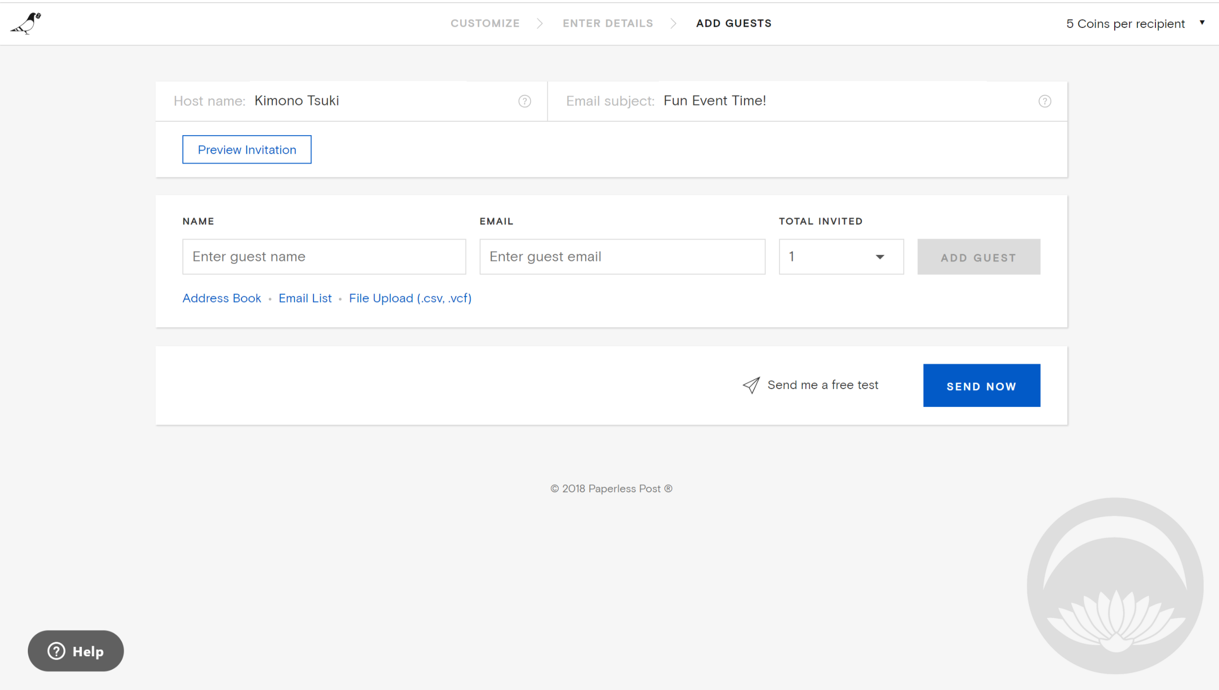
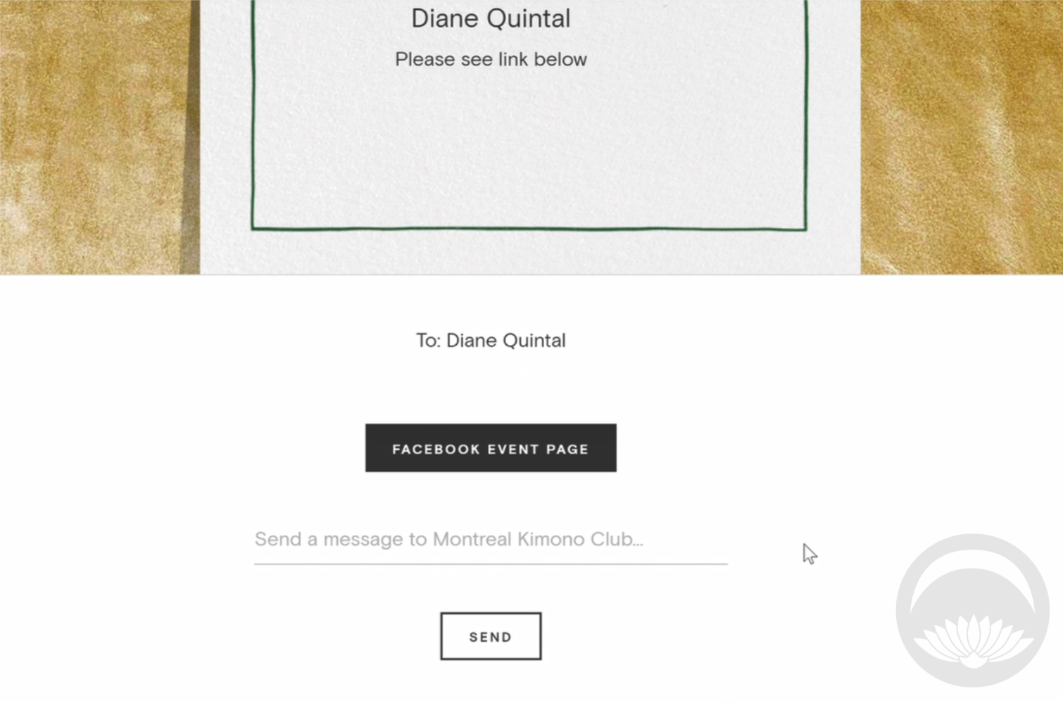
The interface is very straightforward and intuitive;  to change an element simply click on the part you’d like to edit. All the options will be displayed, and a small text in the upper corner will tell you how many coins you’ll need for each card or invitation you send out. You fill out your information and then finally enter the names and email addresses of your desired recipients. One feature I would like to see here would be some sort of integration with Facebook Events. In this modern age of social media, collecting email addresses seems almost archaic. That’s really my only “complaint” about Paperless Post, and it’s definitely a minor one. But if you’re hoping to share your card or invitation online, it’s something to keep in mind.

Now that the event is over and done with, here’s the lovely little invite I created for our kimono club meetup! You can see how much it looks and feels like “real” mail, from the envelope front to the card sliding out of the flap. It’s a really fun and charming experience.

Will Paperless Post replace physical mail entirely? Probably not. But in this brave new world of long-distance friendship, increasing postal service costs, and awareness of carbon footprints and environmental impacts, it’s definitely a service worth looking into!

 I received this item from the retailer or manufacturer for honest review purposes.If you have a topically appropriate craft, product, or service you would like me to review, please contact me.