
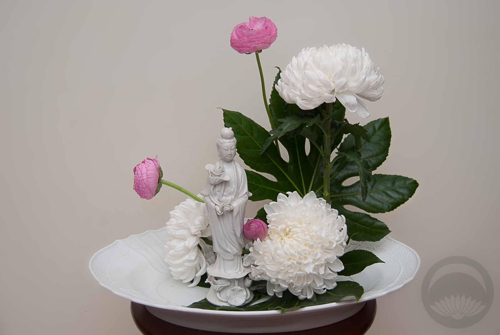
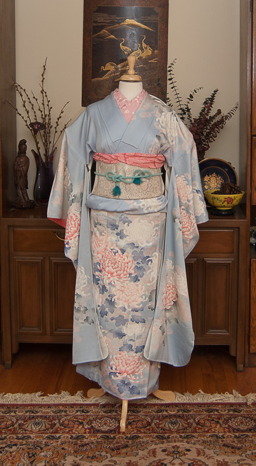
 This ceramic figure of Kannon (観音, Guanyin, Kwan Yin, more) belonged to my grandmother, who I’ve mentioned on this blog many times before. She was always an inspiration to me. I’ve never been a spiritual person of any ilk, but I can’t help admire and respect the bodhisattva of mercy and compassion. My grandmother and father always referred to her as Guanyin, which is her Chinese name. The Japanese refer to her as Kannon, so for the purposes of a Japanese-inspired arrangement that’s what I stuck with today.
A while back, Naomi sent me some great little vintage floral books, including one published by Coca-Cola, of all things. In it was a very pretty arrangement using a nearly-identical figure of her, so I knew I was determined to create one of my own at some point. My first thought was peonies, but I found these plush chrysanthemums and felt that I had to use them. The small pink ranunculus add a little touch of colour and the small rounded shape of them combined with the large ruffled kiku are reminiscent of peonies in the end, I think! To balance the soft organic qualities of both the flowers and the statuette I arranged them in repeating triangles, and then I anchored the whole piece in a shallow white vessel that also belonged to my grandmother to bring it all full circle.
Something I’ve had floating around in my head for months always has the possibility of going very awry and not turning out how I’d envisioned it. That would have been frustrating on a normal day, but while still dealing with a concussion it would likely have pushed me over the edge and resulted in a rather epic sulk.Thankfully, that was not the case this time. I’m really happy with how it pulled together.


 Bebe Taian
 CHOKO Blog
 Silk & Bones
 Gion Kobu
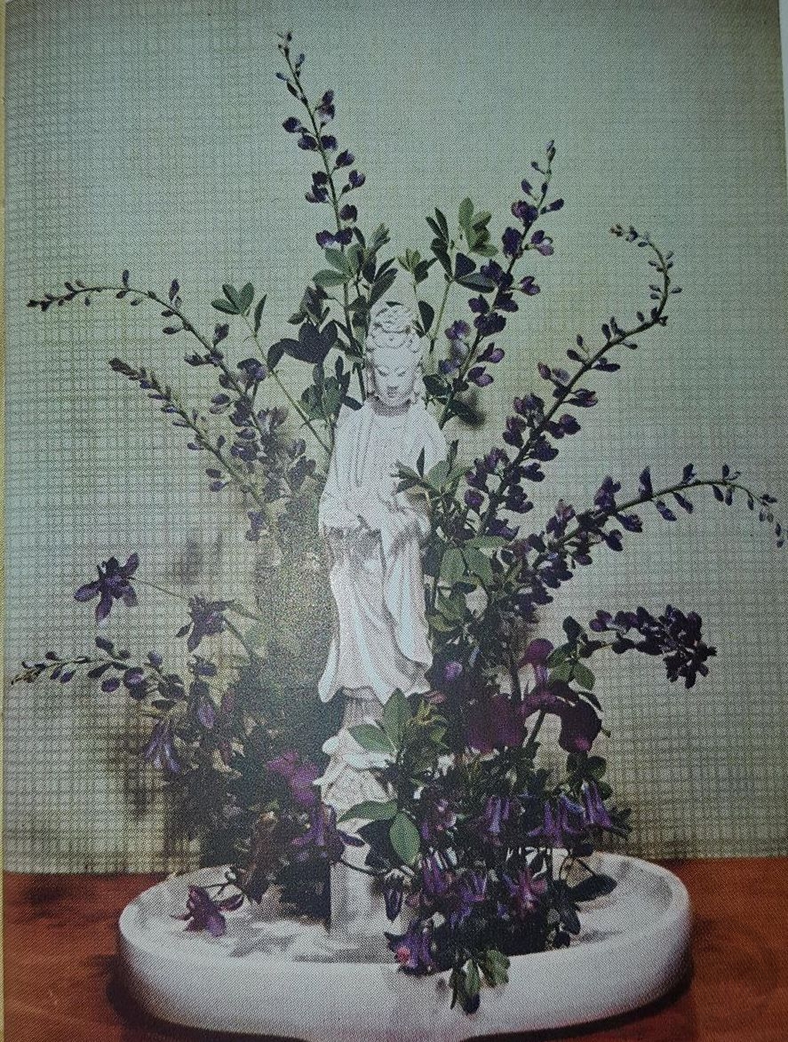