
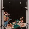
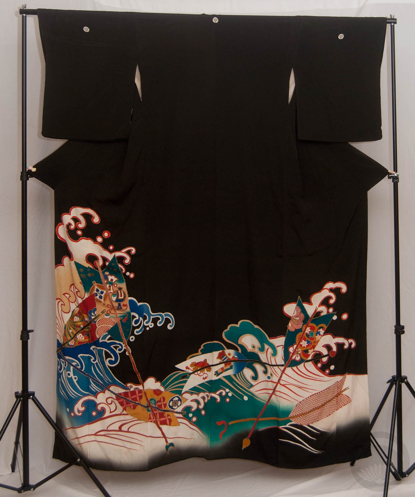
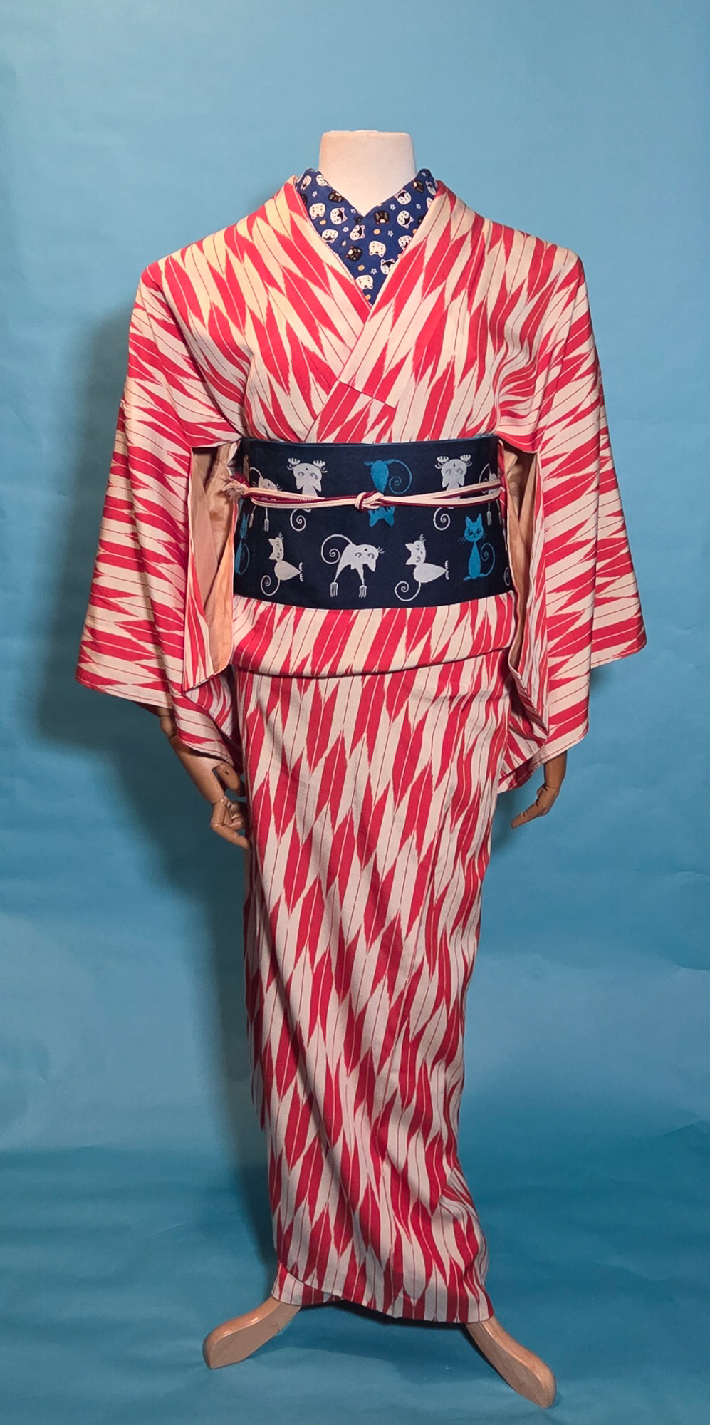
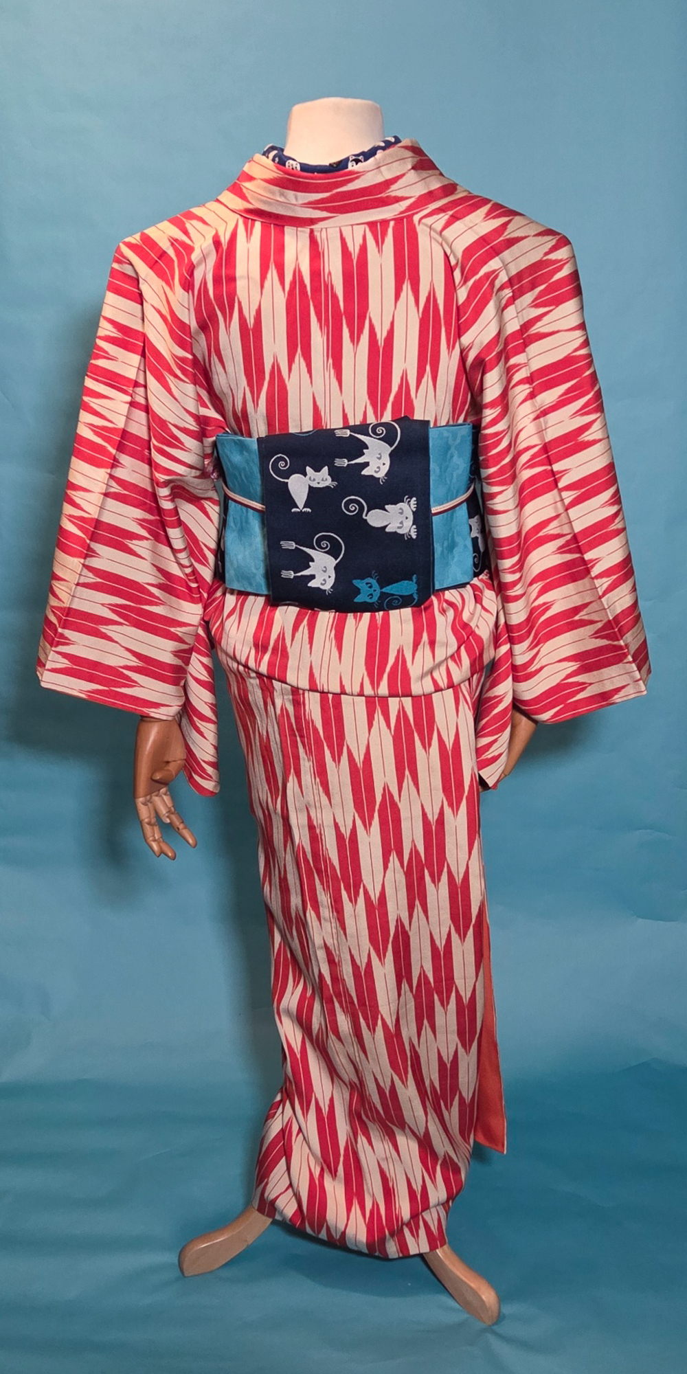
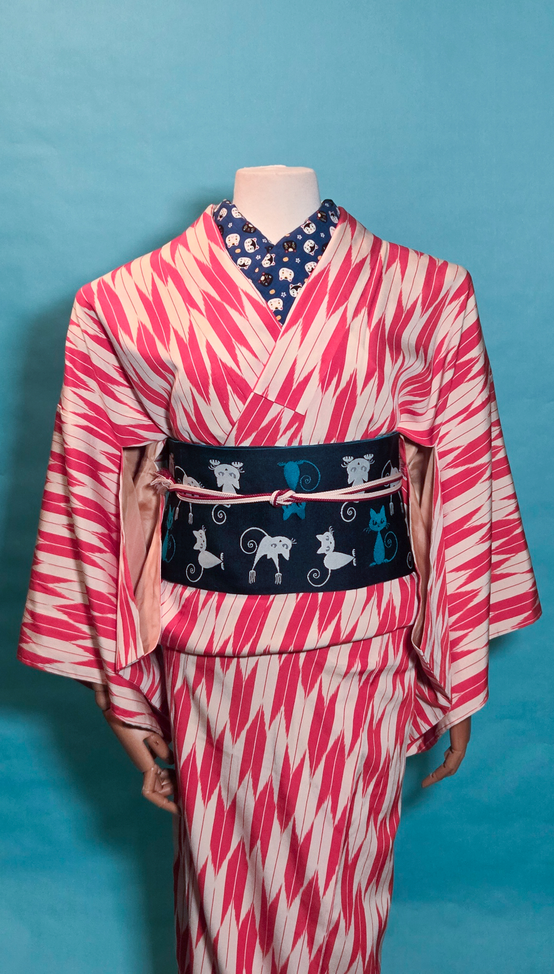
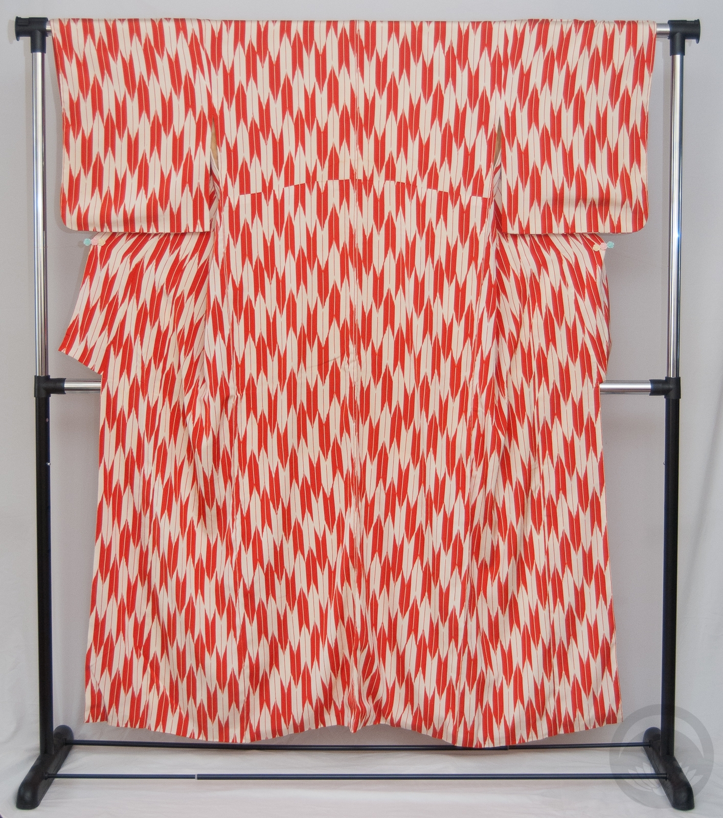
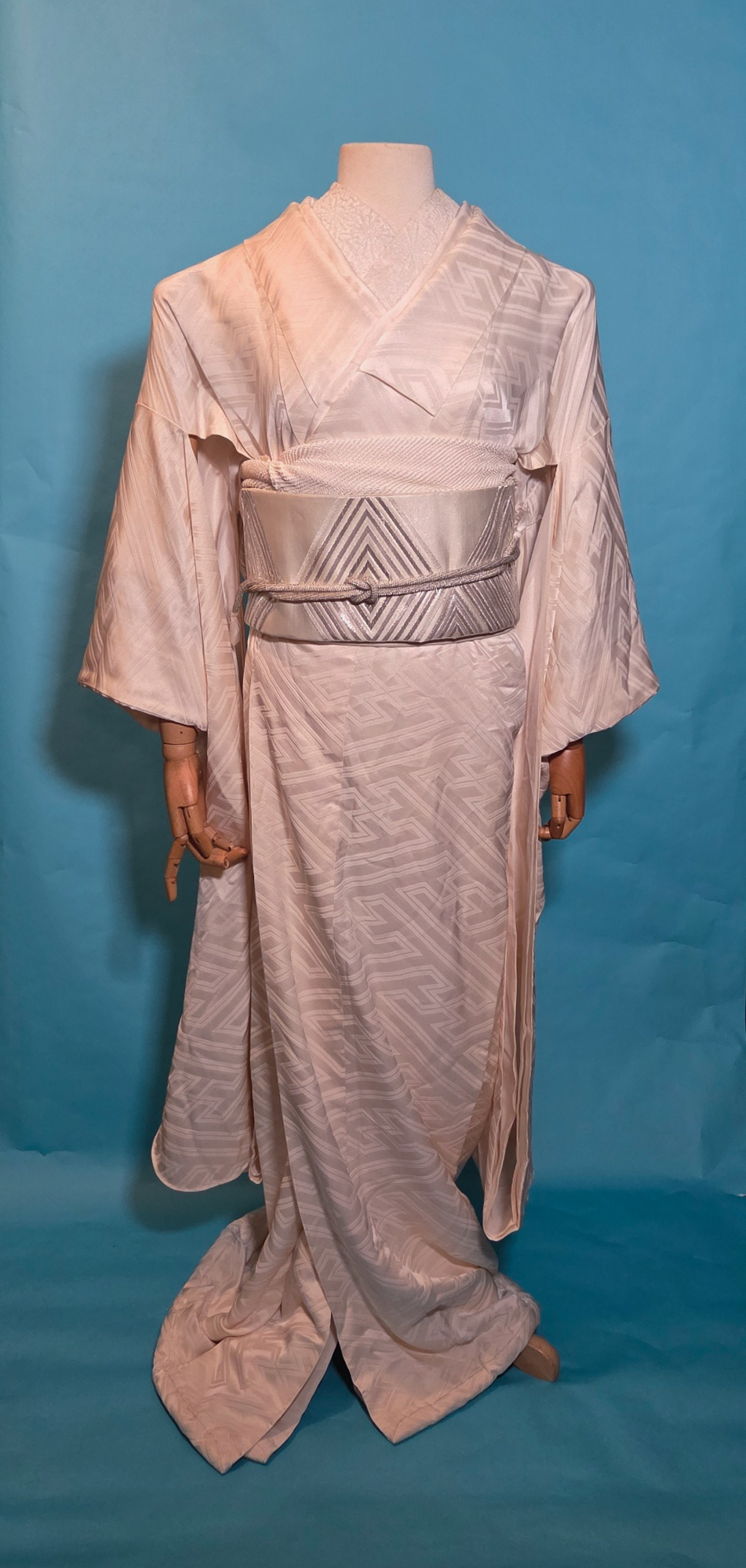
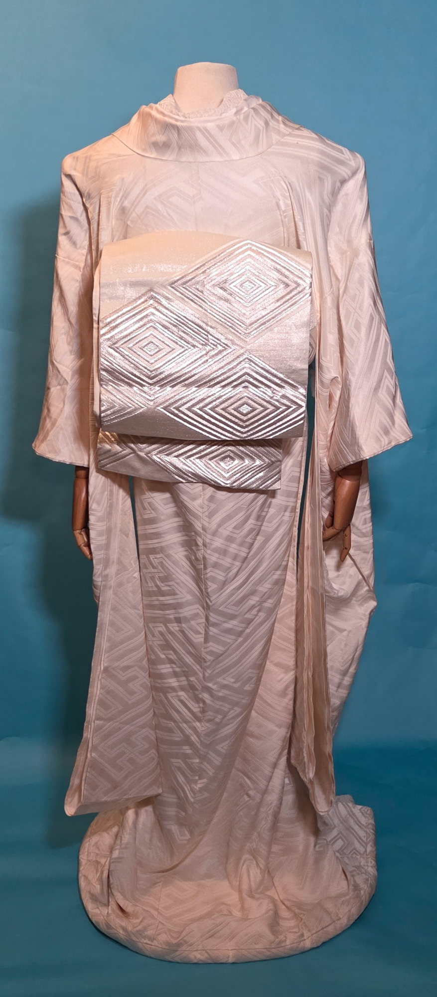
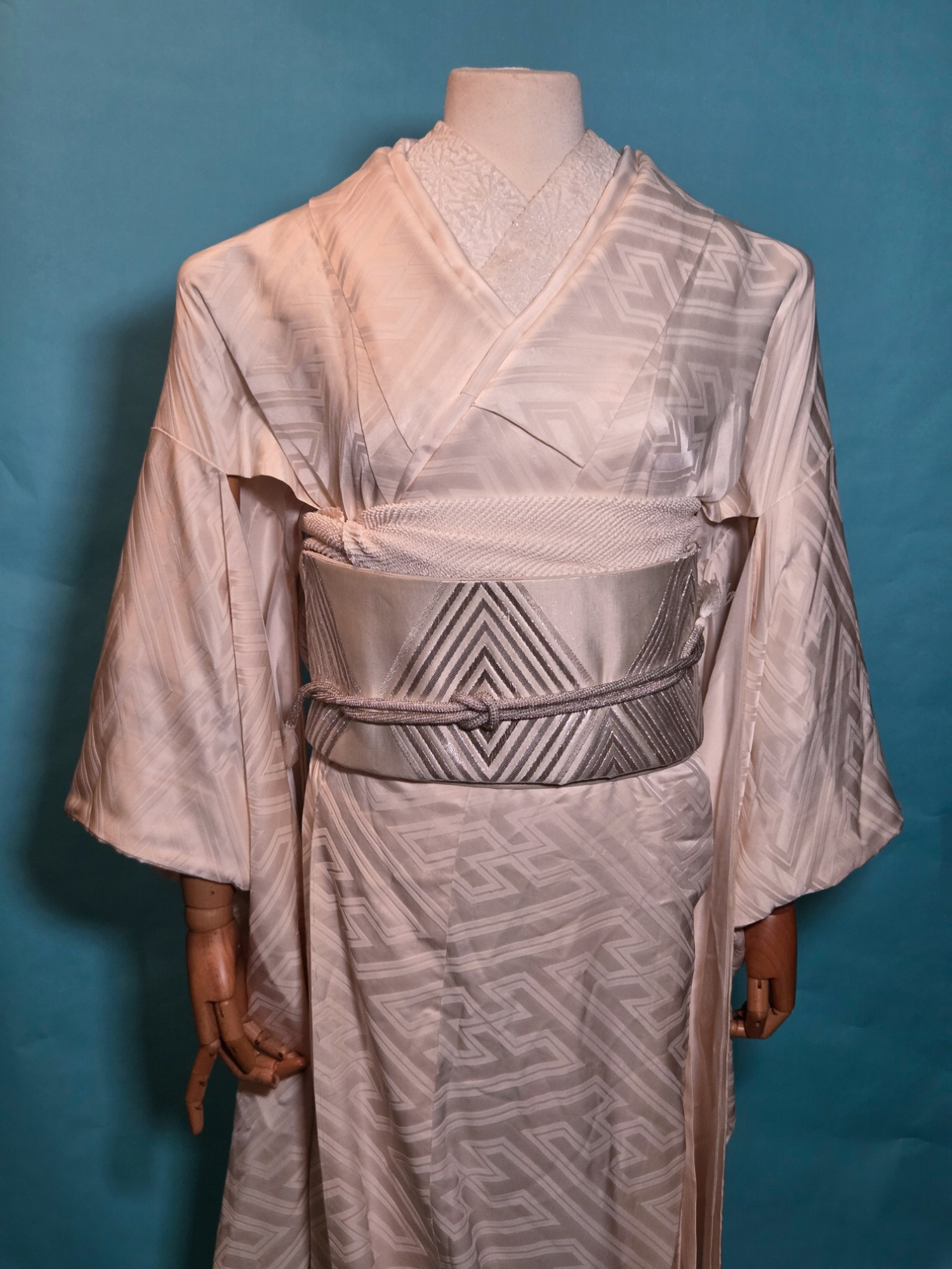
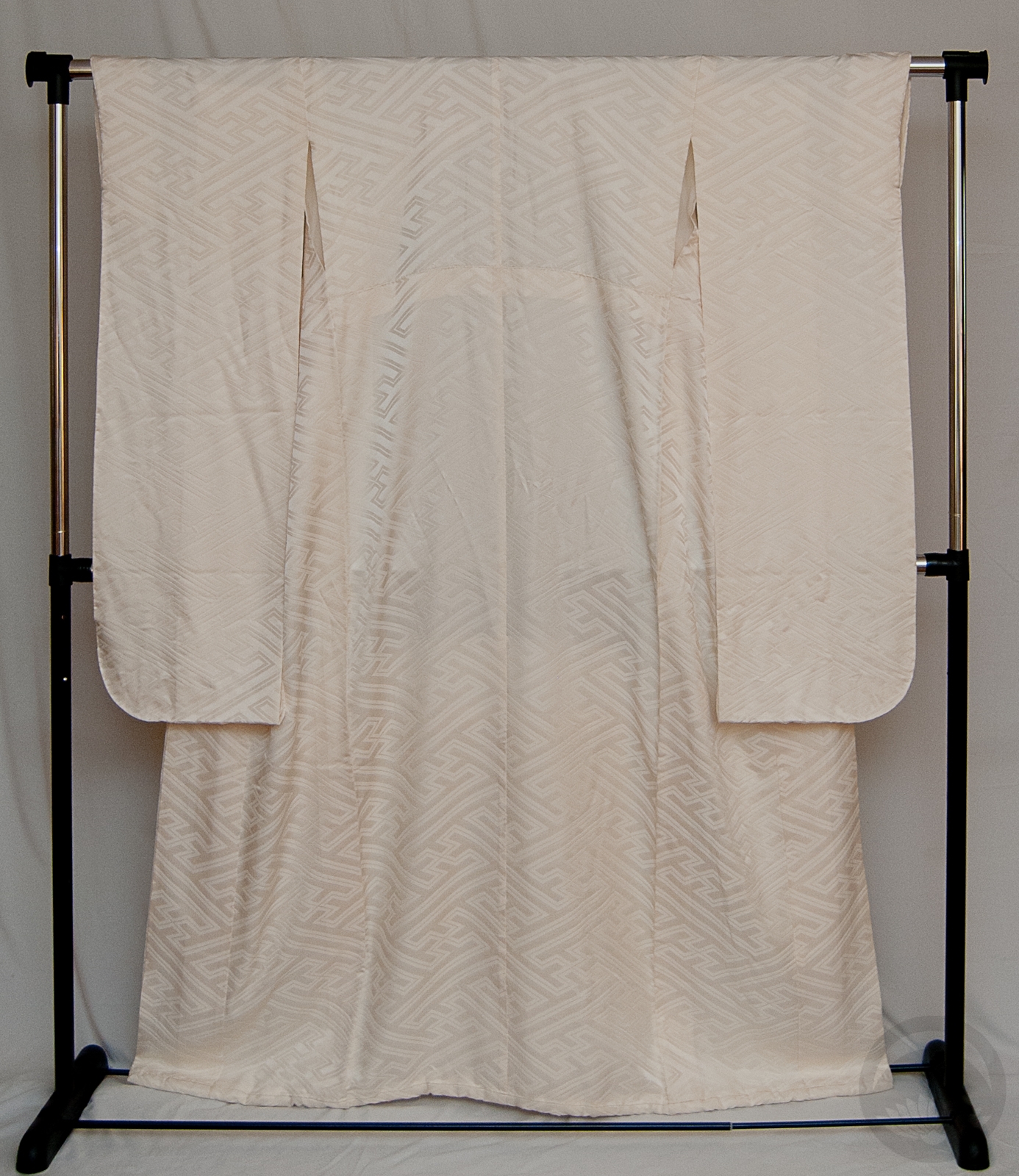
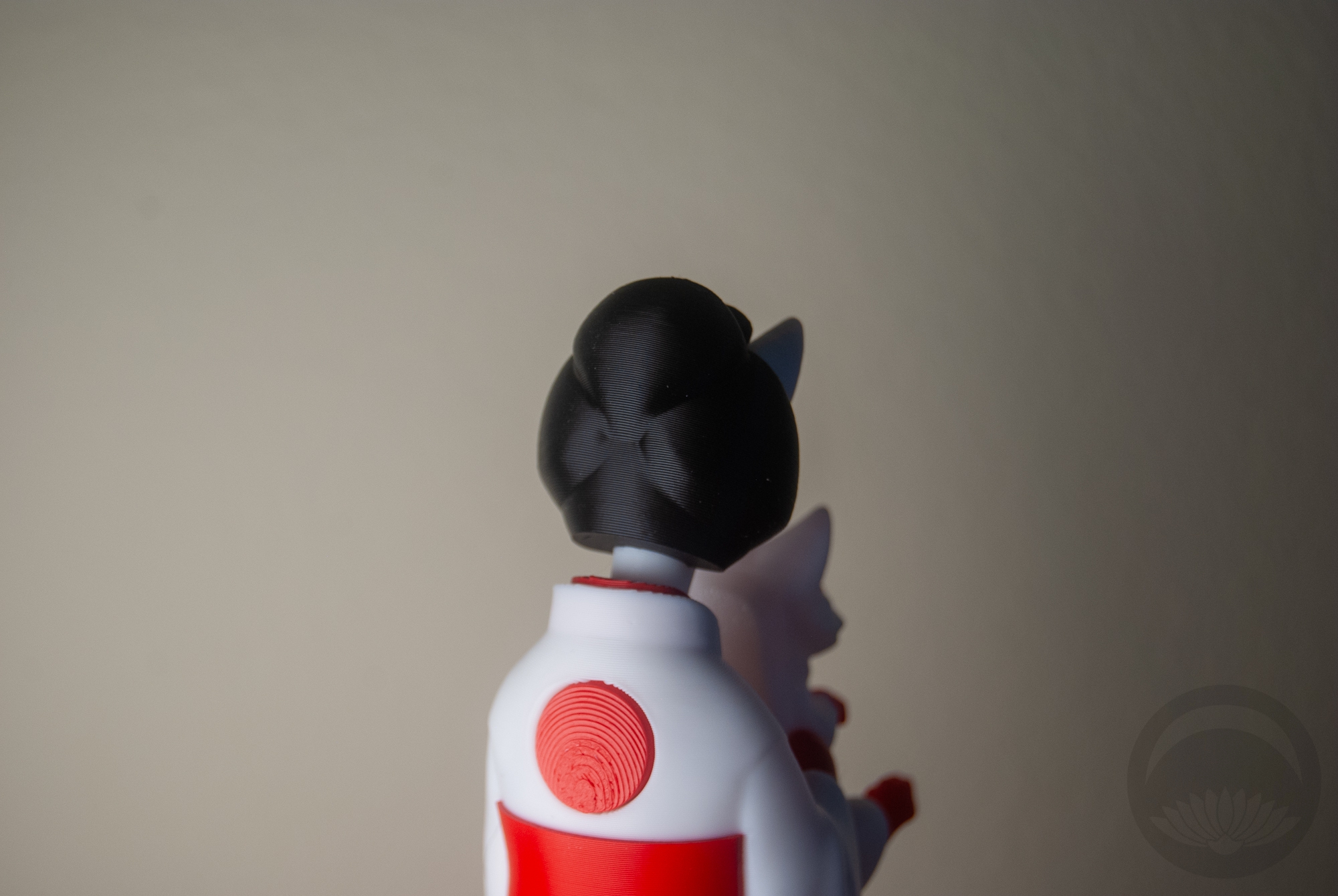
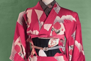
Just a little entry today, but I was so inspired by the Oshiroi perfume that I knew I had to make an outfit worthy of it. I knew it had to be something timeless and elegant, so using a kurotomesode was the way to go and this gorgeous hamaya piece fit the bill. It’s quite long and the design comes up very high. Also, when worn in a more standard way a lot of the design gets lost in the ohashori. This leads me to believe it was originally intended to be worn hikizuri-style, so of course I ran with it.
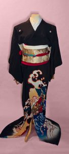
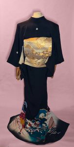
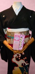
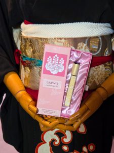
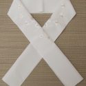
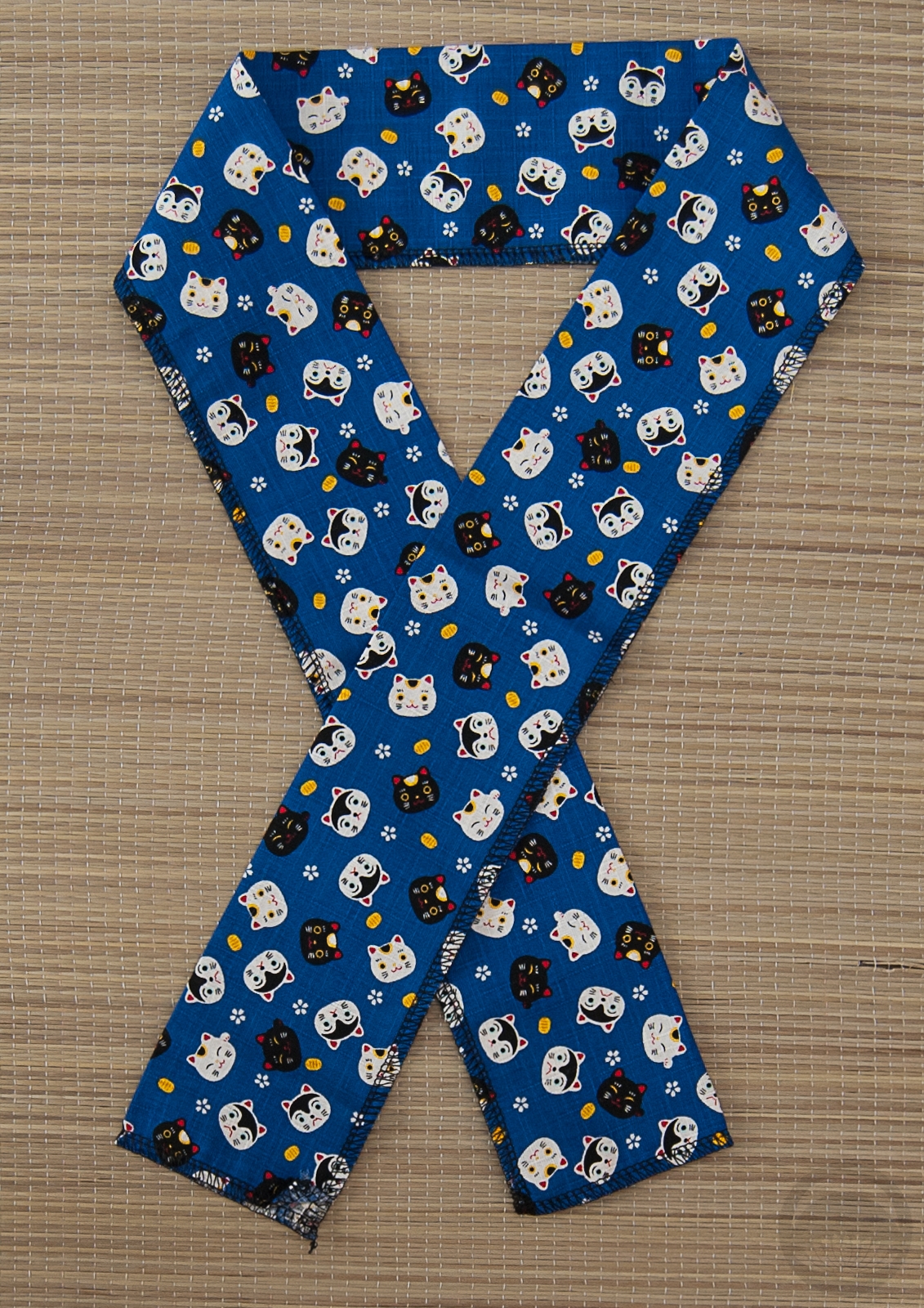
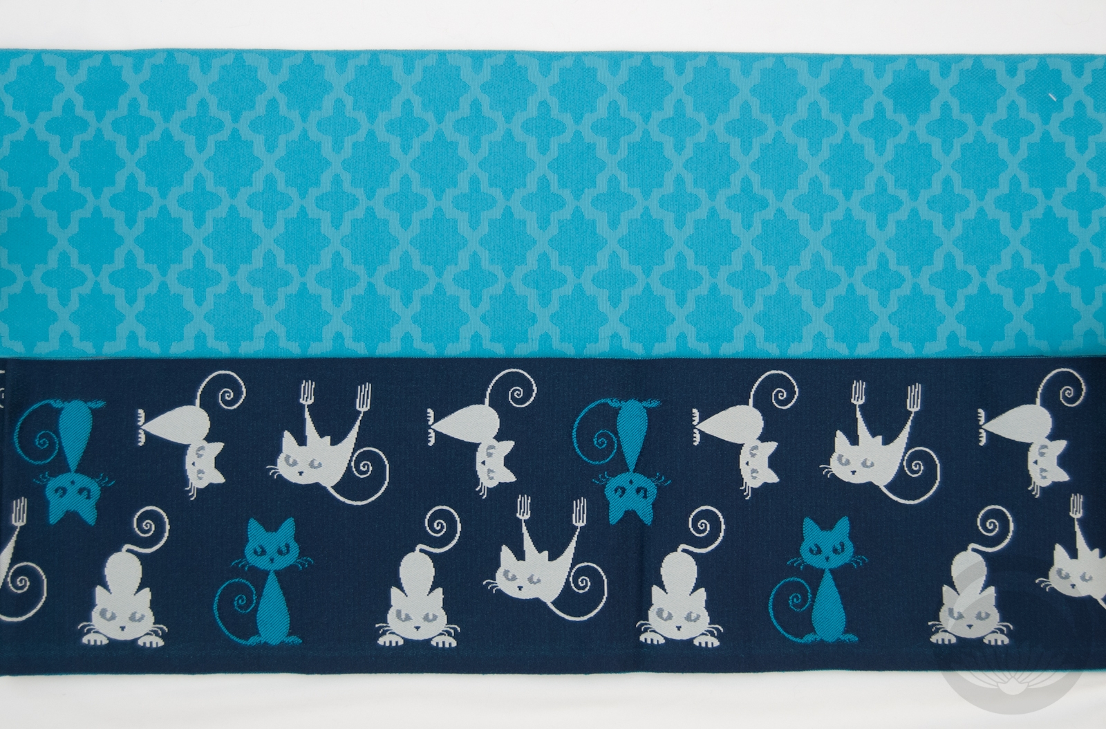
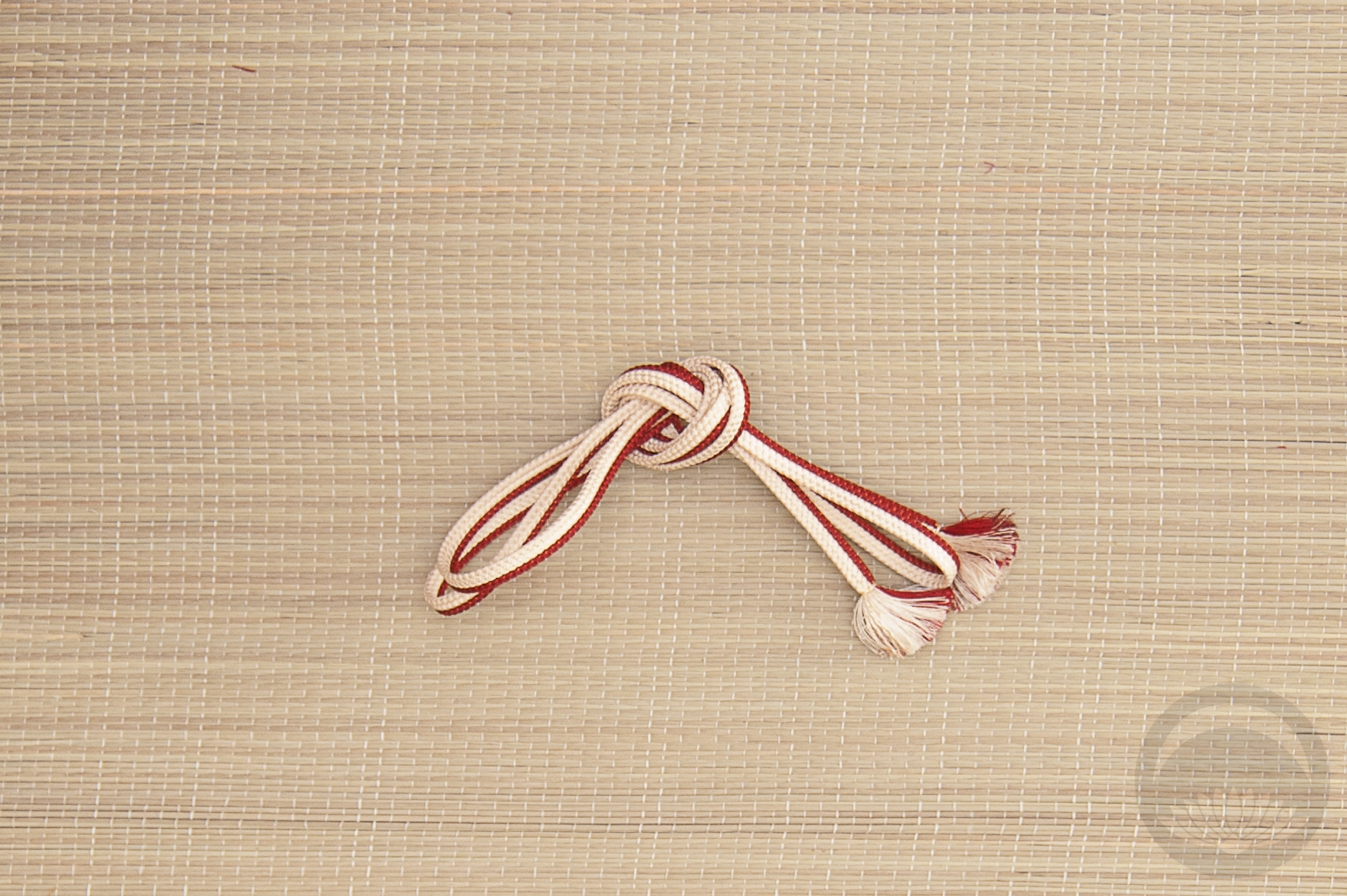
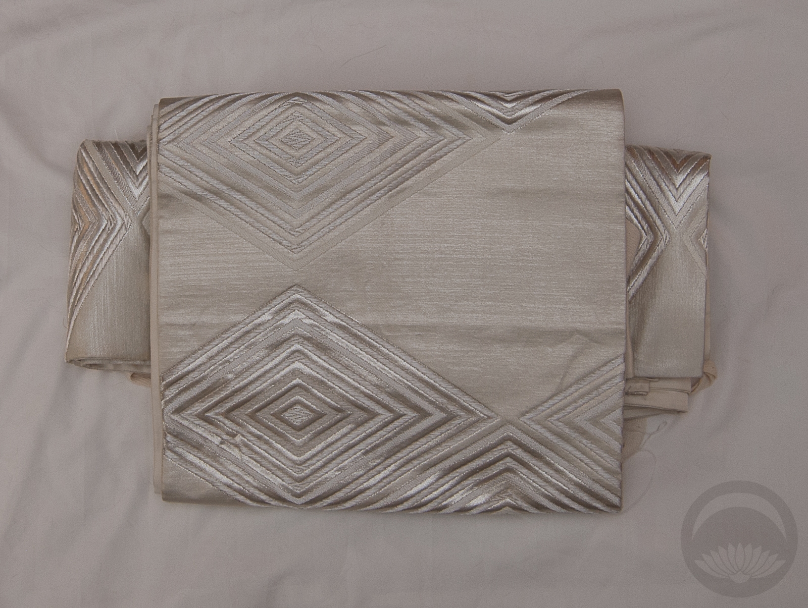
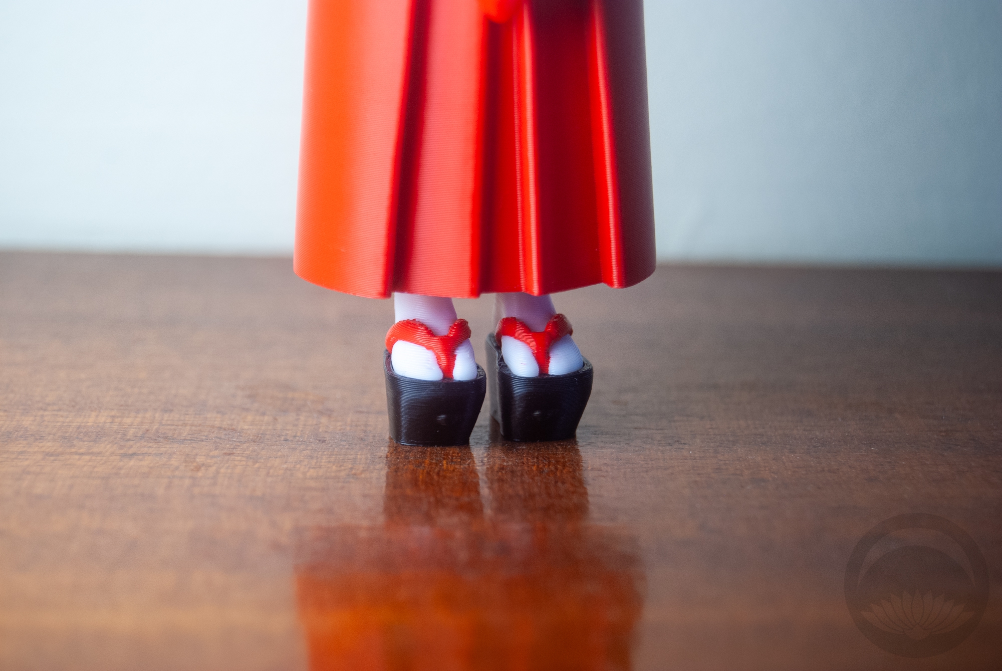
I went with my own twist on typical tachikata geiko-inspired styling, with a gorgeous gold obi and white and gold accessories. I even used a red obiage as a sort of momi beneath the obi, but it got a little lost. The obijime is technically too casual, but it matches the kimono so perfectly with that rich teal and almost pinkish red, I couldn’t not use it.
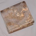
Getting the mannequin to show off the beautiful perfume box was a bit of a challenge, and I’ve had to photoshop the hands slightly so if they look mangled I apologise.
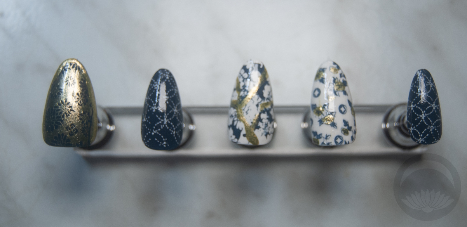
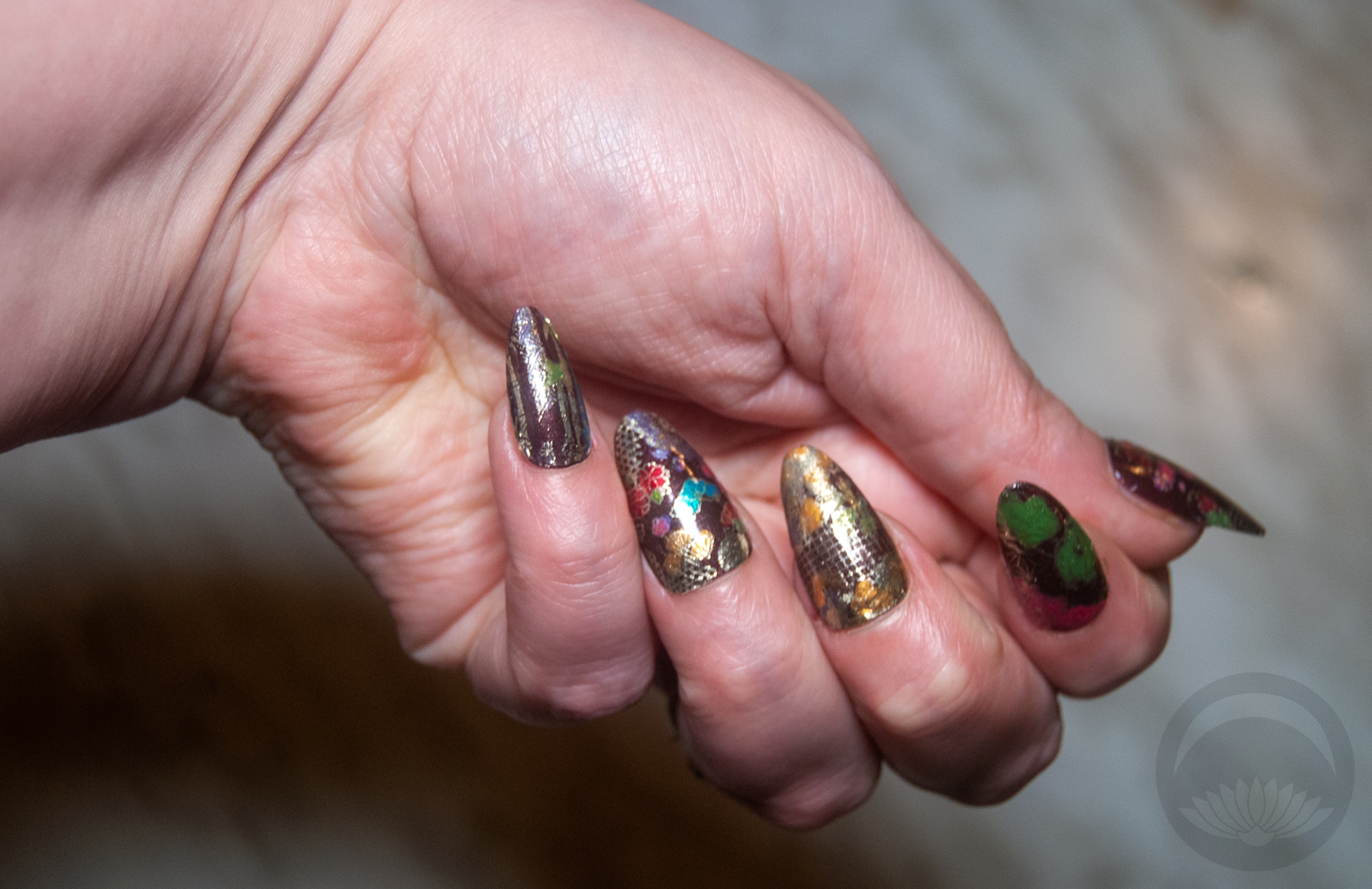
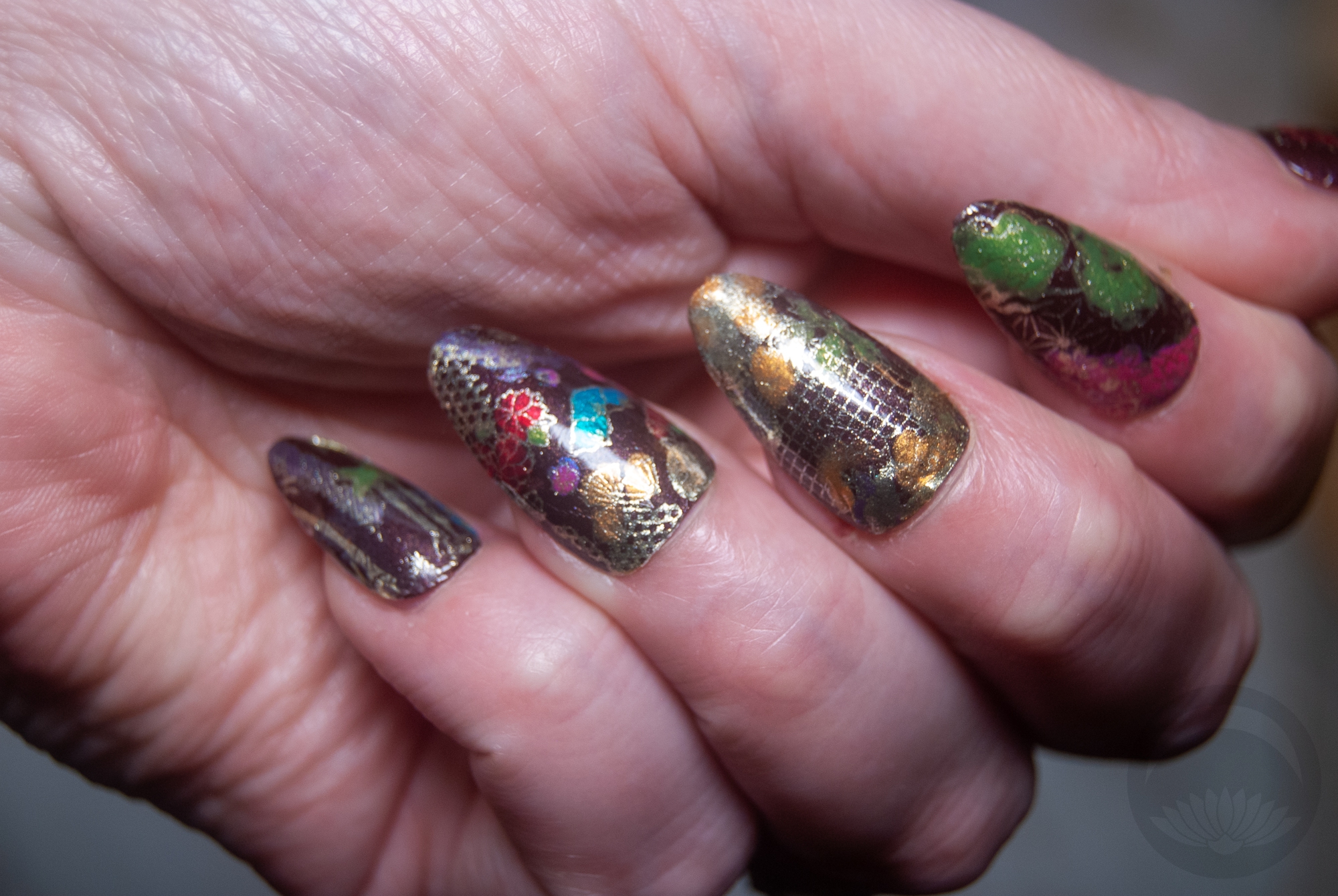
Items used in this coordination
-
- Arrow Kurotomesode
-
- Gold Mixed Motifs

-
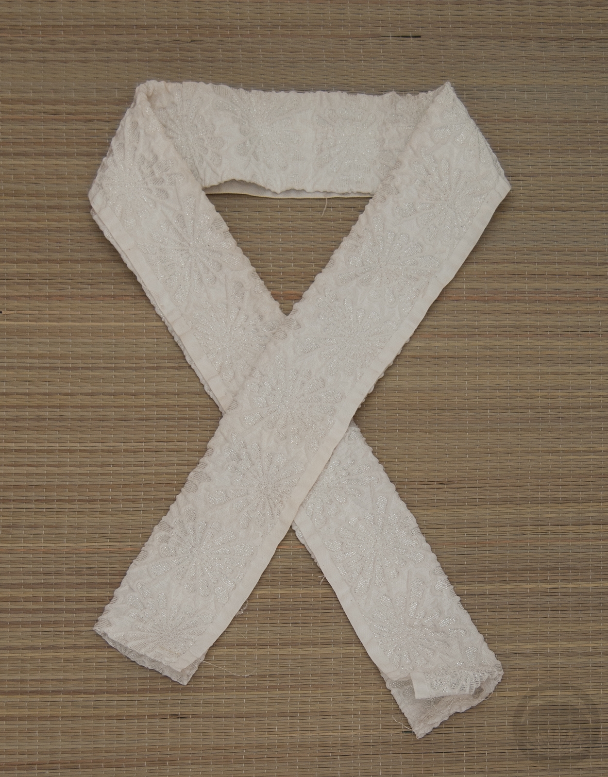
- White sakura

-
- White Shibori

-
- Magenta & Teal


 Bebe Taian
 CHOKO Blog
 Gion Kobu