
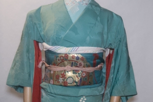
It’s been a long week! I was called in to work for two extra days, and as much as I love my job everyone has a limit before the start getting a bit crabby, right? Thankfully today I was able to stay home and work on some things that didn’t require leaving the house, so when time came to take a little break I decided to use that time productively and work with an obi I got recently and had no idea what to do with.
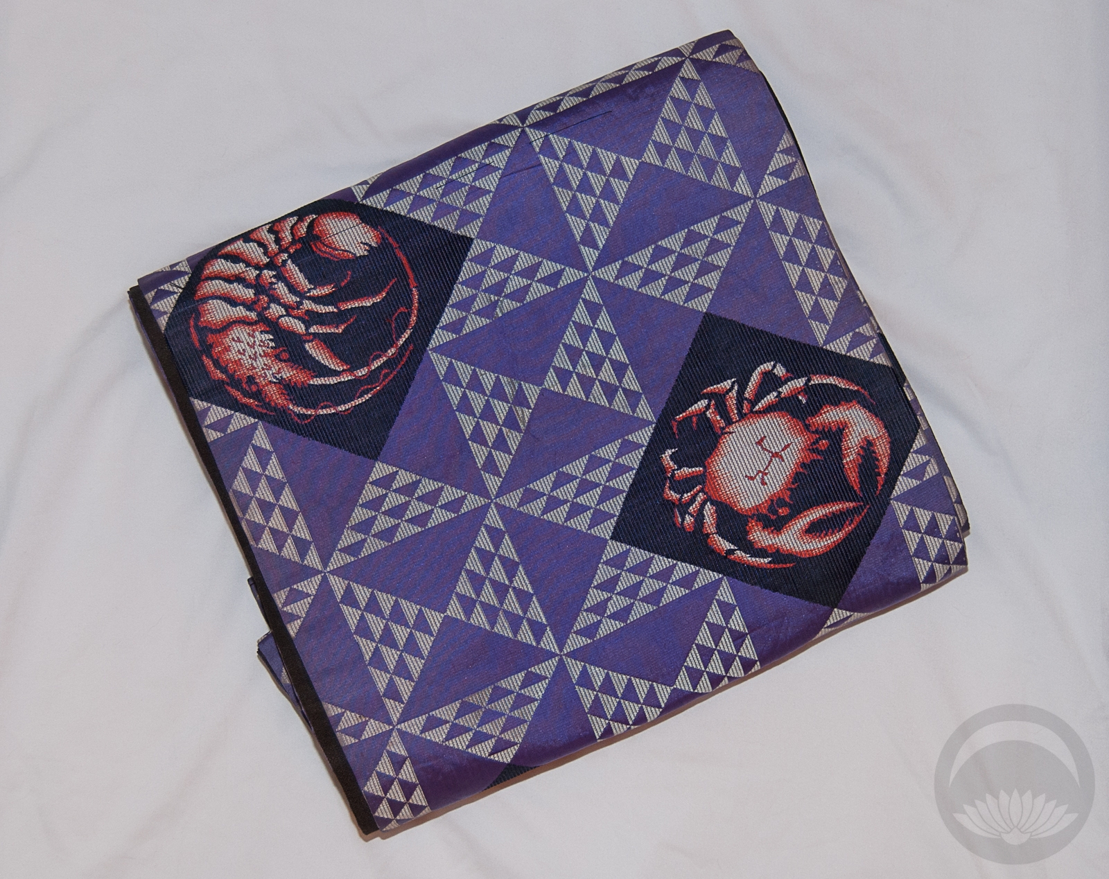
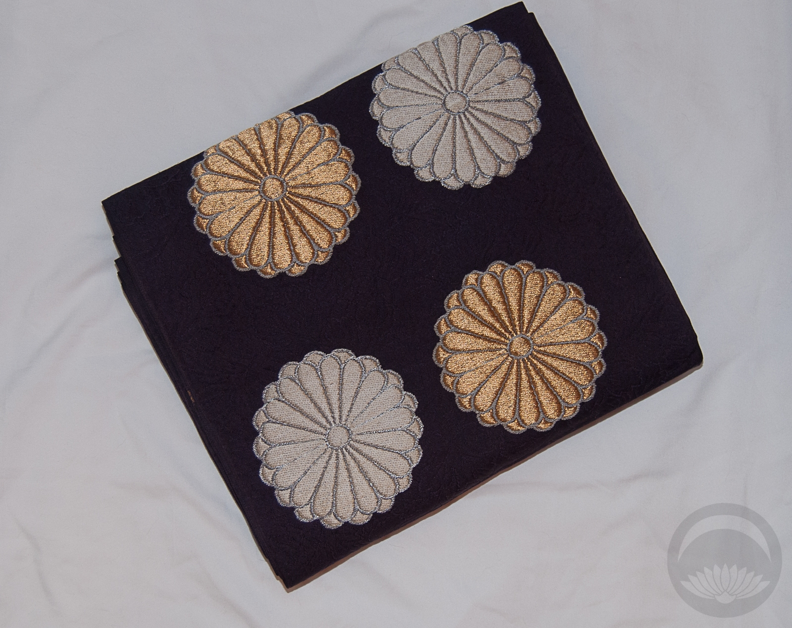
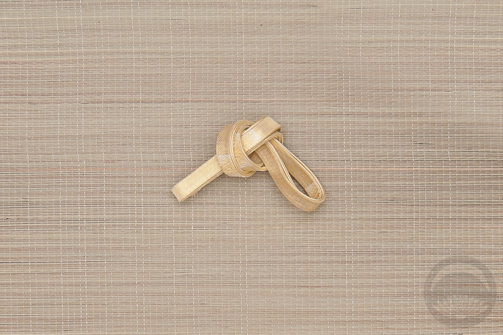
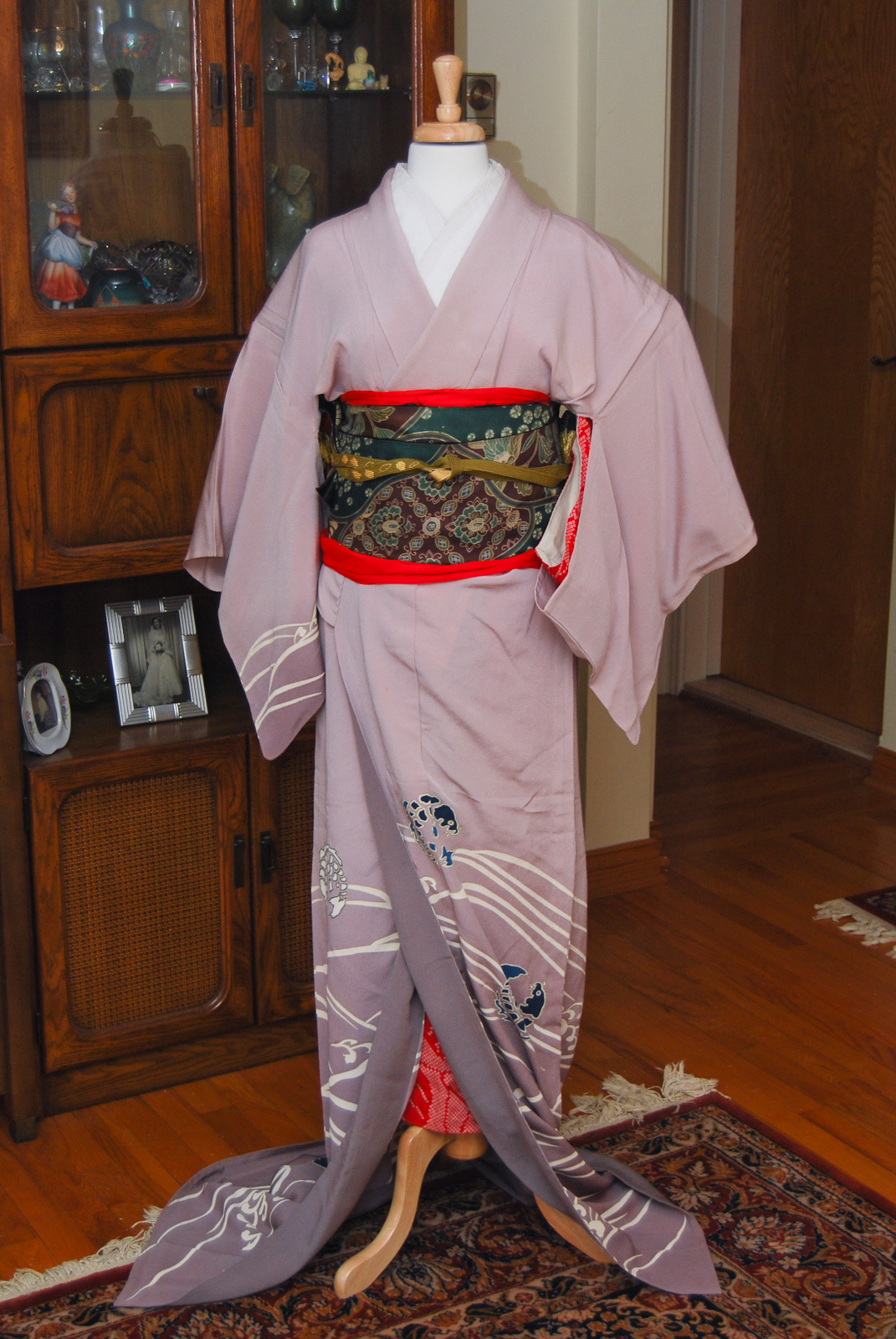
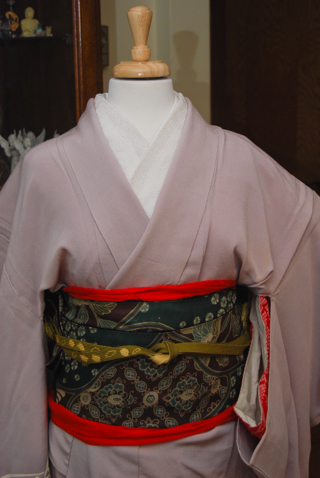
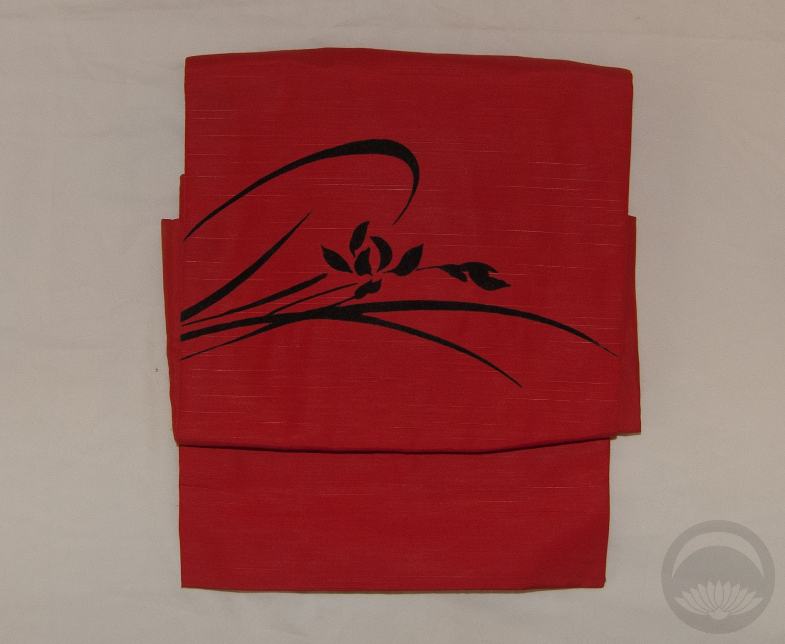
Naomi found this obi on Yahoo Japan literally years ago, and it had been sitting in a box ever since, following her around as she moved. She finally found the time to mail it to me and man, was it ever worth the wait. I love crustacean motifs, and this obi is no exception. It’s a gorgeous old chuuya obi with crabs and lobsters on the purple side. The other side is more “normal”, featuring a design of flowers and drums on solid black. It’s a nice bonus, to be certain, but this obi really is all about the pinchy sea creatures! It’s in rough shape, and the design placement is very odd, which makes it hard to tie. Eventually I’m going to turn it into a reversible tsuke-obi but until then I figured I could find a way to make it work on the mannequin.
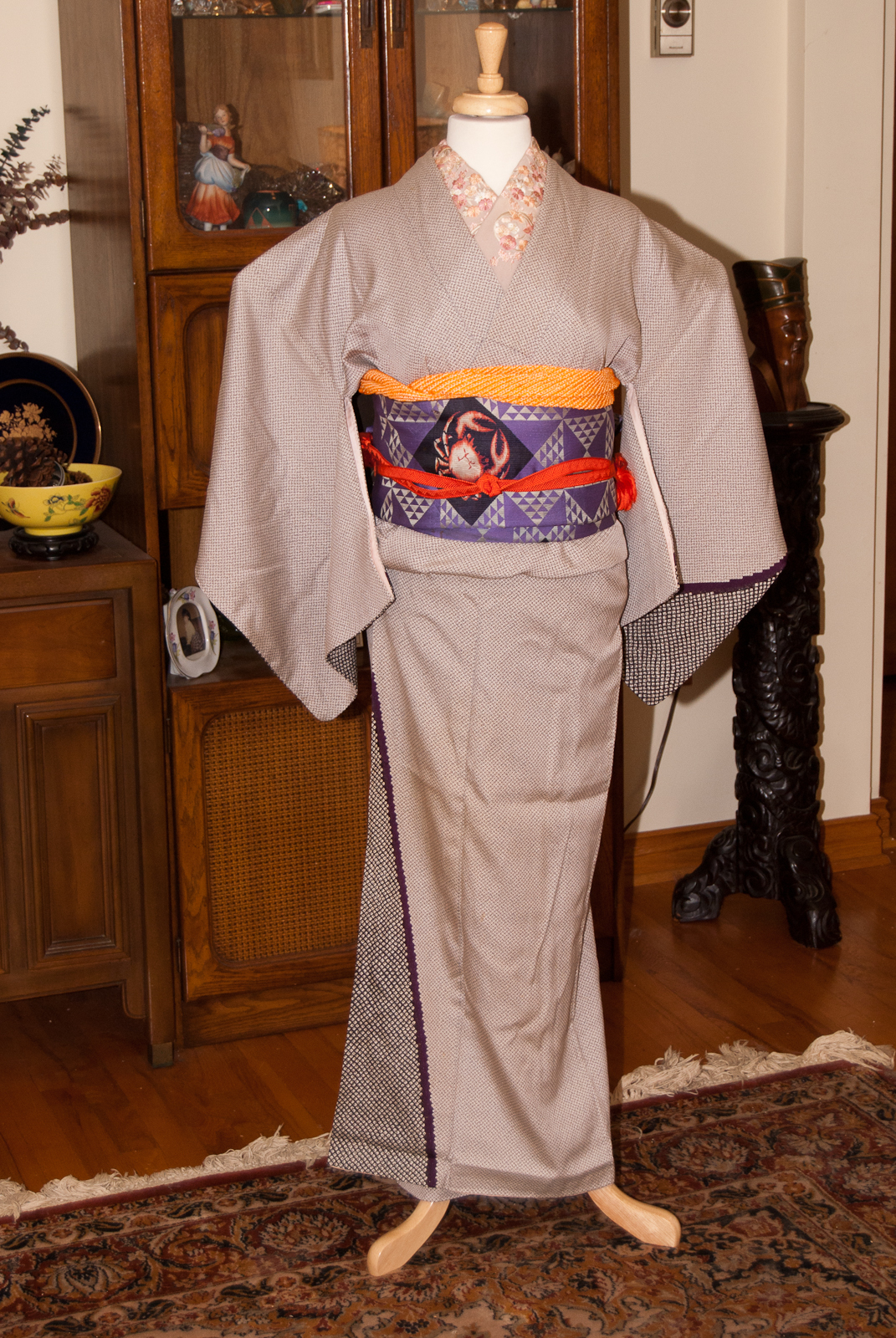
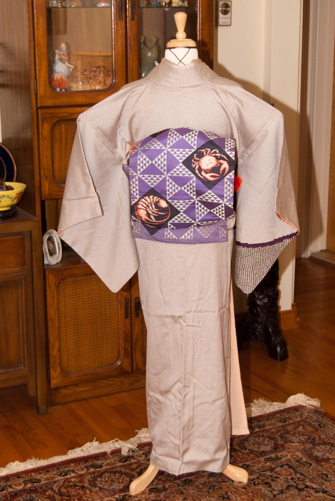

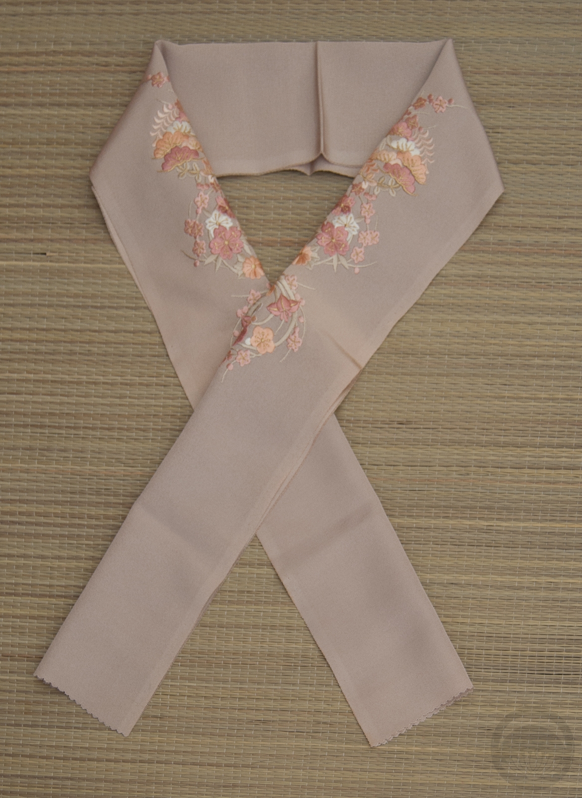
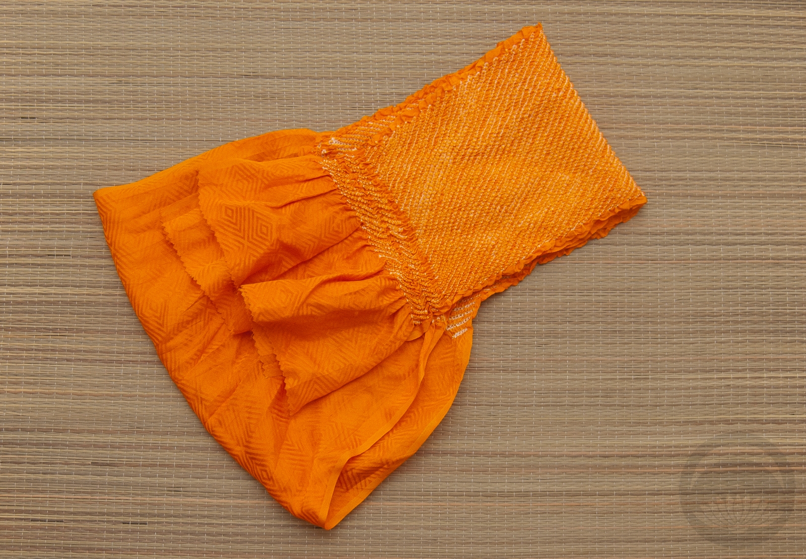
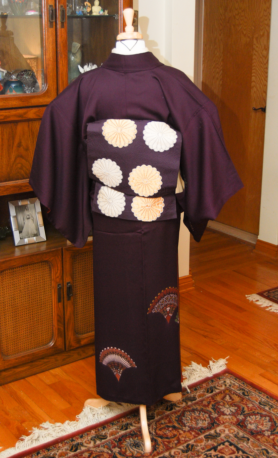
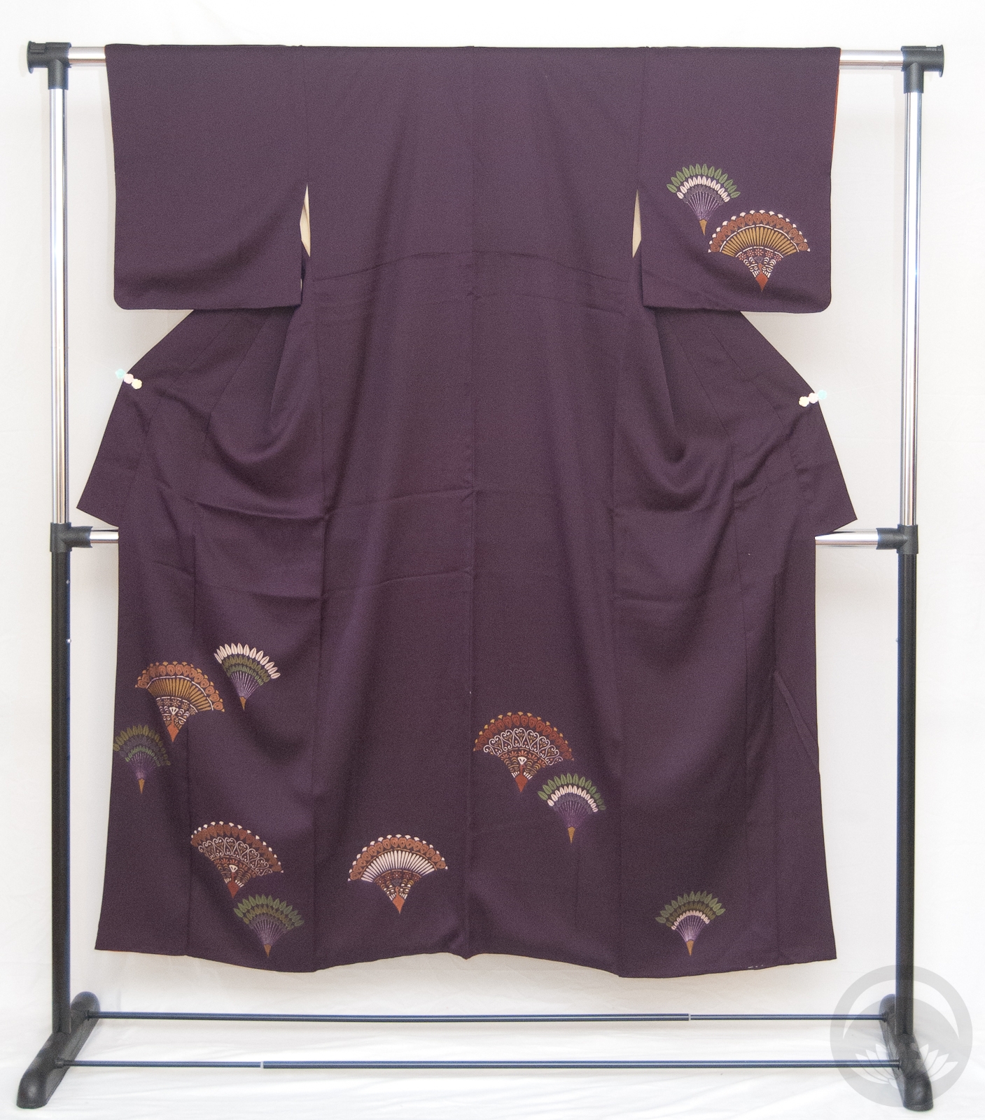
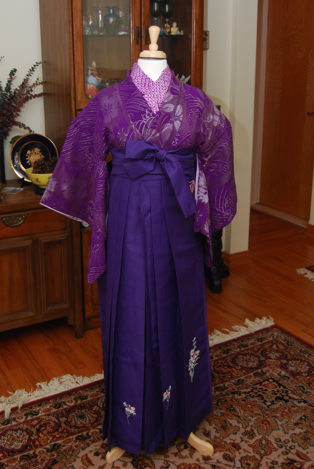
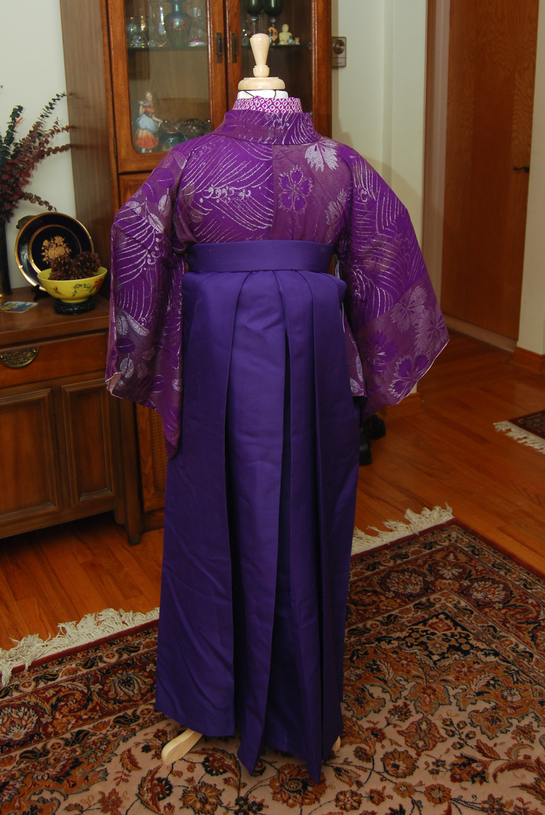
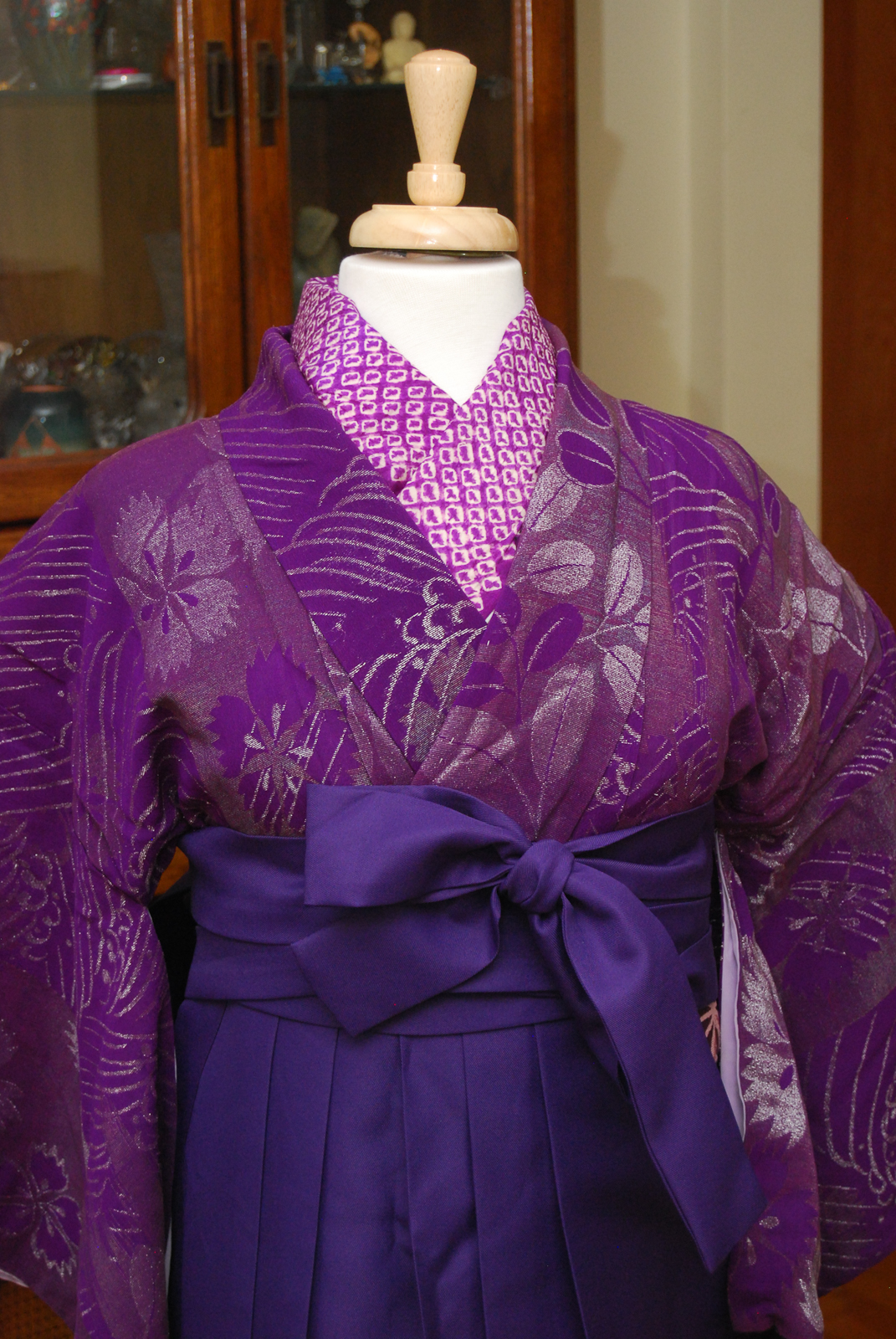
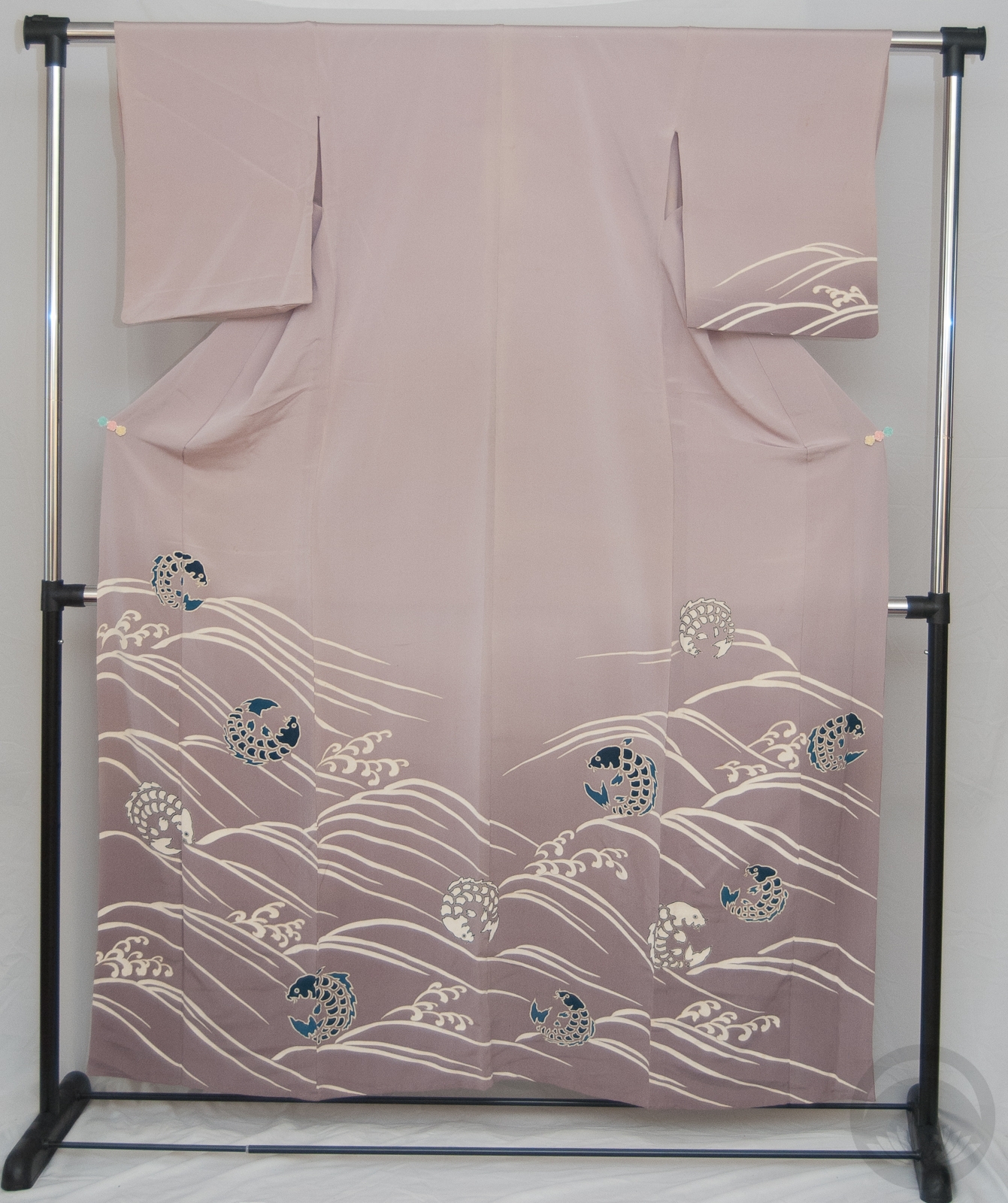
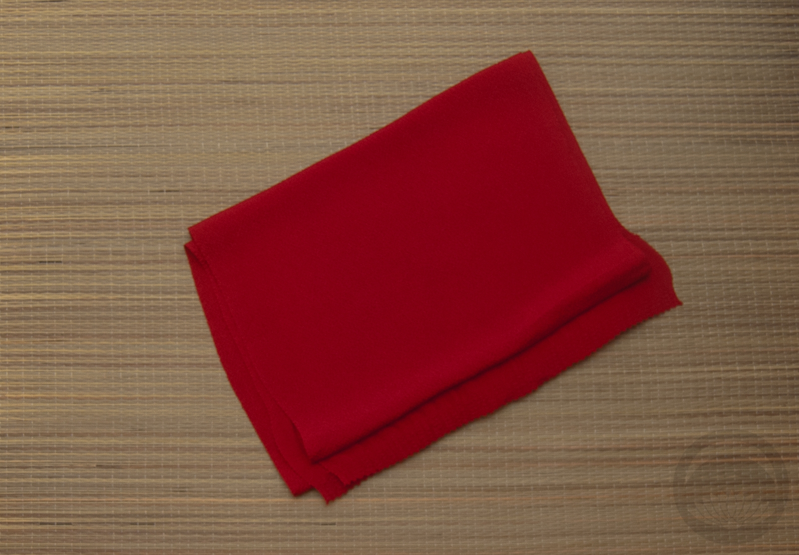
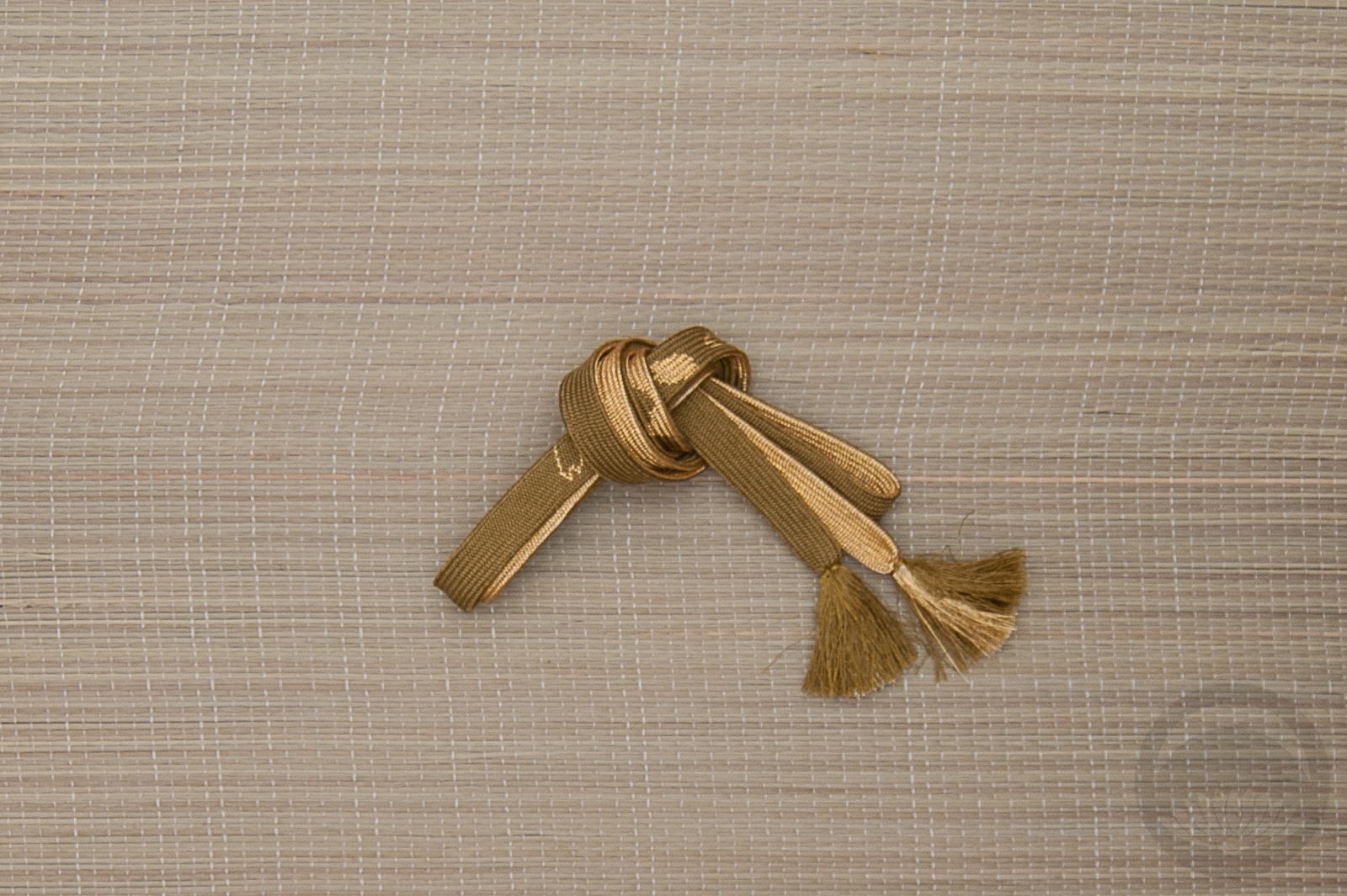
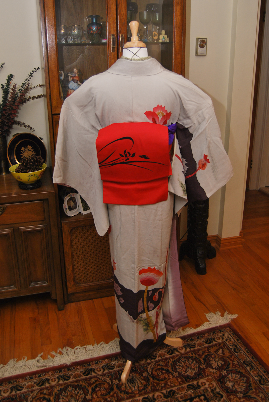
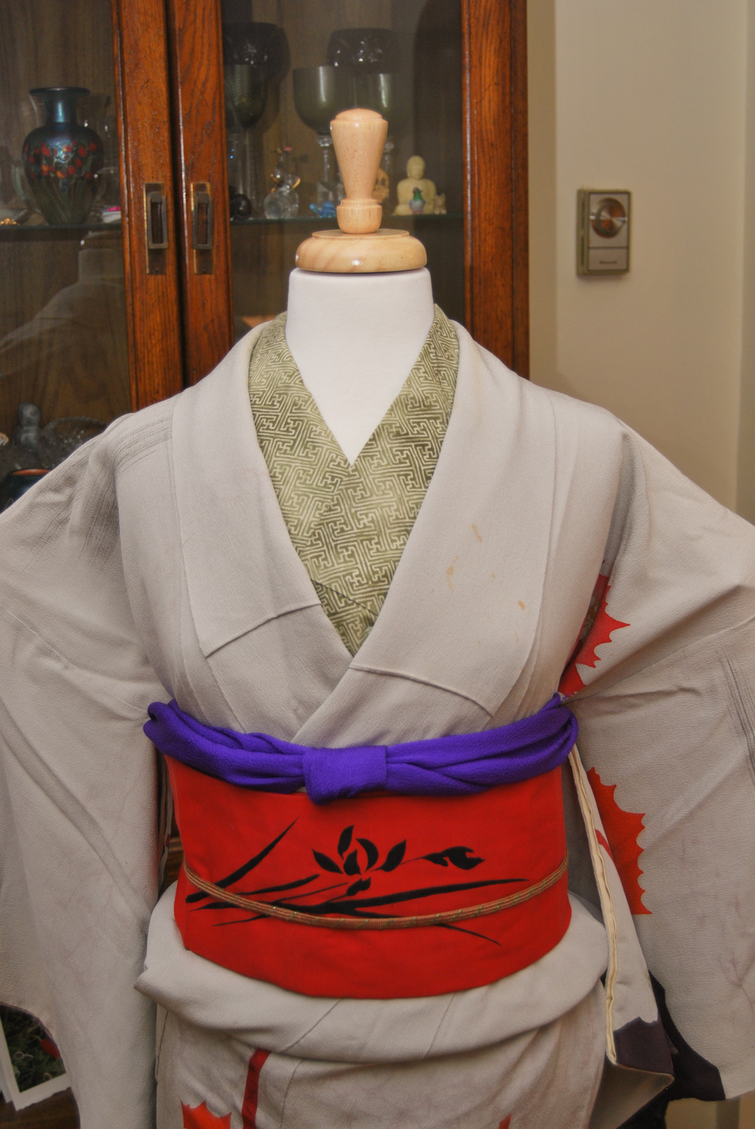
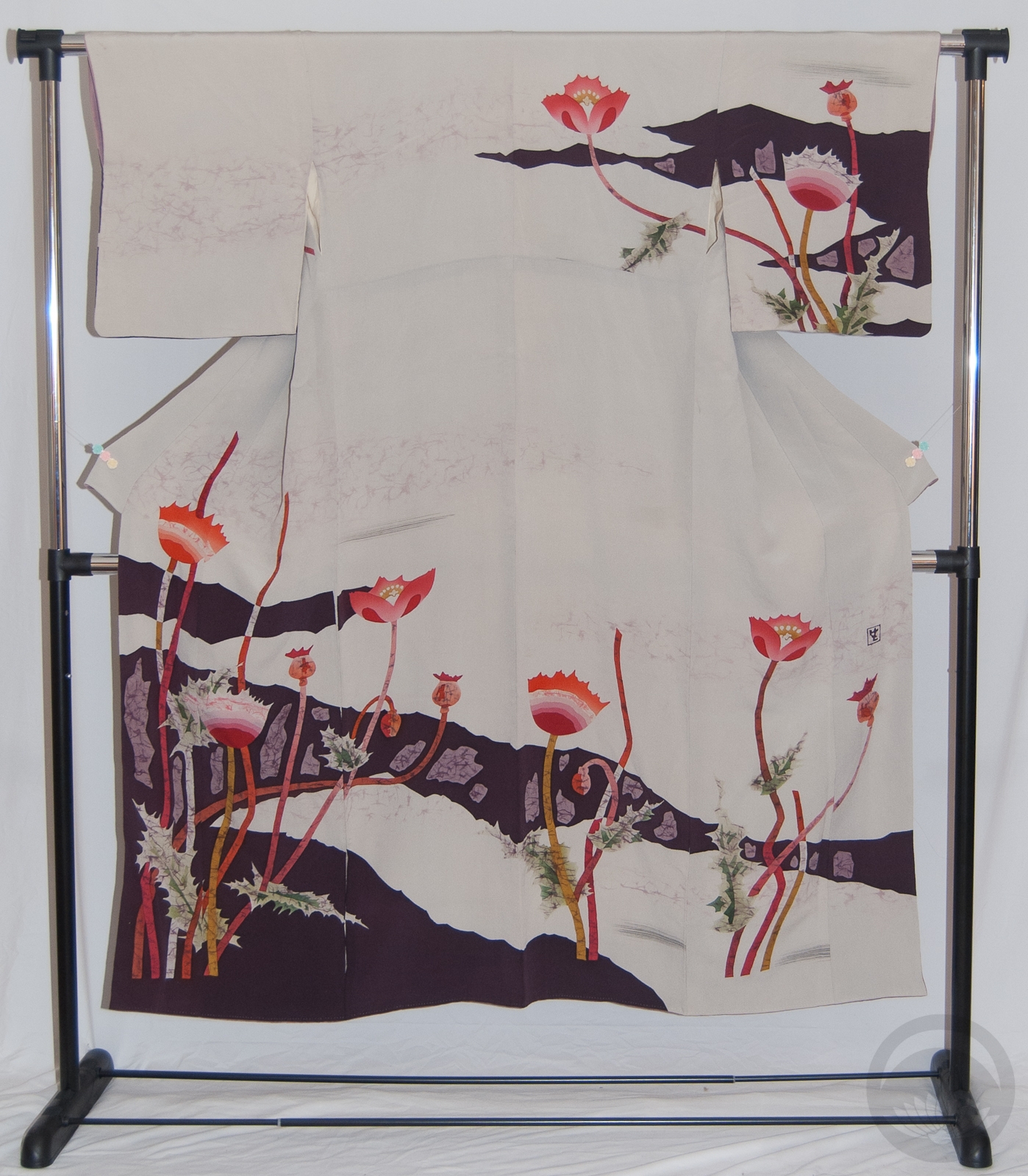
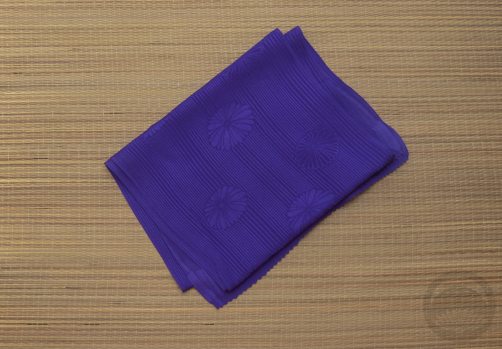
The kimono is one of the first casual-style kimono I ever purchased and to this day it remains one of my favourites it work with. It’s a thick, woven silk which makes it slightly rough and a dream to tie because it grips and stays where you put it. The pattern has always reminded me of fishing nets, so it seemed like a match made in crustacean heaven! I decided to run with orange accessories to emphasize the pattern, and realised afterwards that the shibori obiage is also vaguely reminiscent of fish roe, which was an accident but works perfectly. Unfortunately, I now have the Big Bag of Crabs song from Weebl’s Stuff stuck in my head. Things could be worse, I suppose!
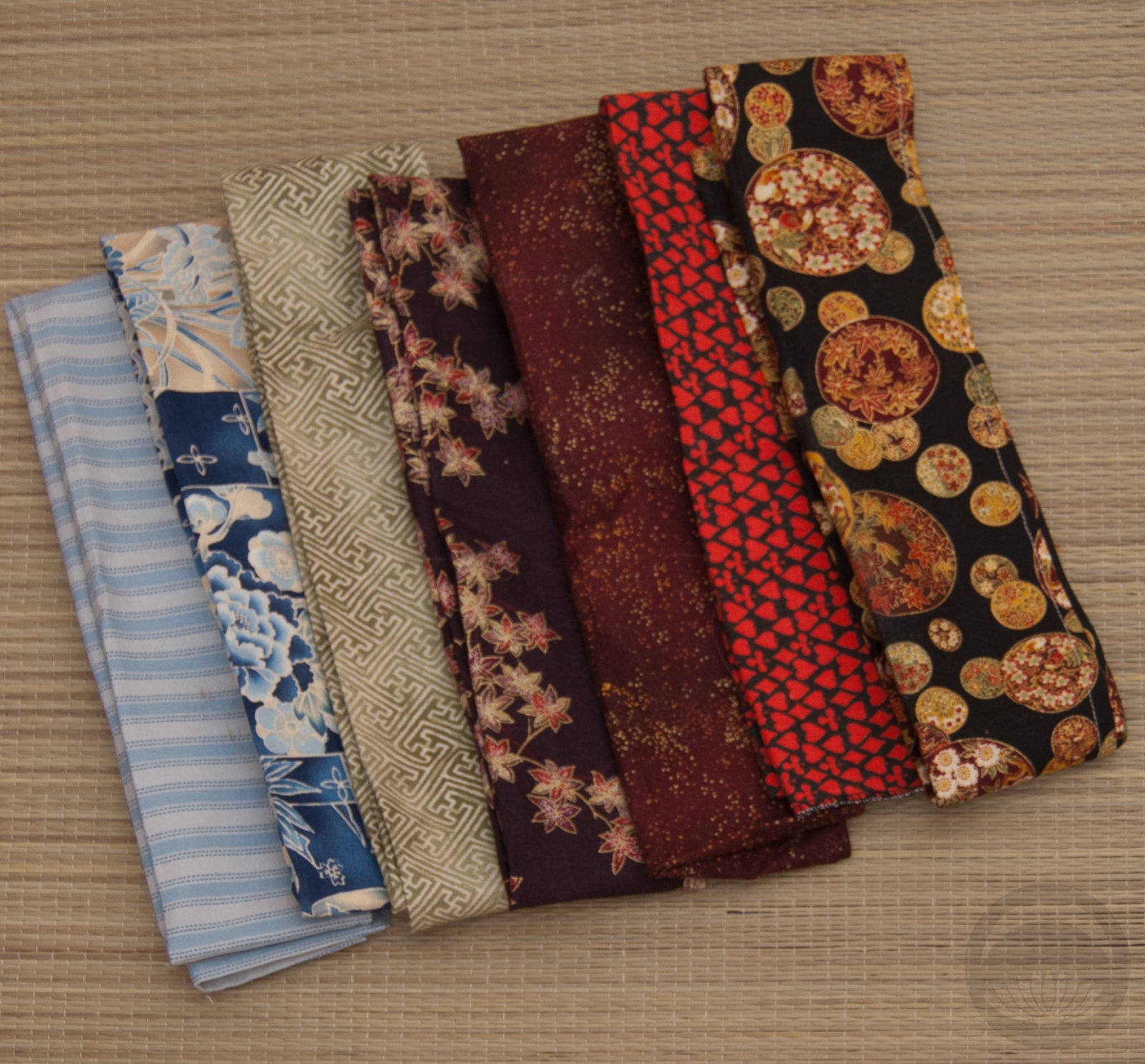
Items used in this coordination
-
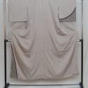
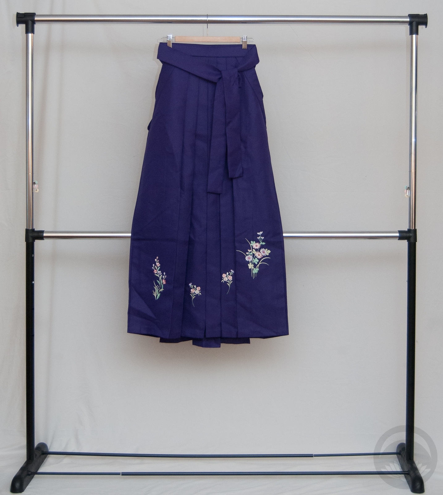
- Purple Net Weave

-
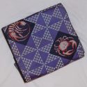
- Crustacean side 1
-
- Floral
-
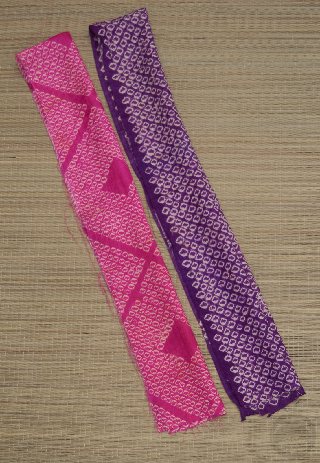
- Orange Shibori
-
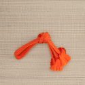
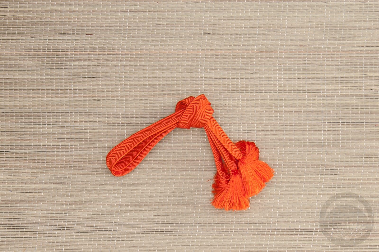
- Vibrant Orange


 Bebe Taian
 CHOKO Blog
 Gion Kobu