Hufflepuff Kitsuke

You might belong in Hufflepuff,
Where they are just and loyal,
Those patient Hufflepuffs are true
And unafraid of toil;

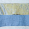
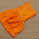
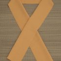
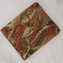
Hufflepuff is probably the most misunderstood and misrepresented Hogwarts House, and that is a real shame. It’s also not my personal house, but their values of loyalty, honesty, love, and hard work are things we should all aspire to. Hufflepuff’s colours are yellow and black, and they’re often associated with Herbology, food, and gardening in general, so of course this yellow kimono with roses and black obi with karabana were perfect. I wanted to tie in the earthiness I associate with this house, so brown accessories did that well.

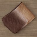
Again, like with the Gryffindor lions, I wanted something more subtle than just finding a badger-shaped brooch and slapping it on, and I realised this fake fur collar I have looked very much like badger fur. They’re usually depicted as black and white, but in reality they’re usually brown and beige. The collar also has the added bonus of emphasising the “cozy” vibe associated with Hufflepuff.

This turned out quite well, in my opinion. I do think there could be a bit more black, maybe a different kimono with black in the designs, but since I’m trying to be more prudent in my spending for a while and using items I already own, I’m very happy. There will be a little interruption in this project while I do a #monokimono outfit this weekend, but we’ll be back on track by next week.

Items used in this coordination

Gryffindor Kitsuke

You might belong in Gryffindor,
Where dwell the brave at heart,
Their daring, nerve, and chivalry
Set Gryffindors apart;

This is something I’ve wanted to do for a while, and I finally hashed it all out. Over the next little while, I will be doing an outfit inspired by each of the houses at Hogwarts! Gryffindor seemed like the most logical place to start, even if it is not my House (you’ll find out which that is soon enough).

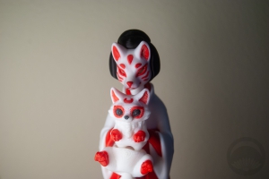
I knew the starting point would be the house colours for each outfit, so here we have the bold, firey red and gold of Gryffindor. I had to incorporate a lion, of course, but instead of just going for a typical lion-shaped brooch or something I thought I’d try to be a little more subtle, keeping these outfits looking more traditional. I thought on it for a while when it struck me – shishi, the protector lion-dogs!

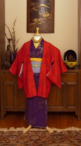
After that got sorted, everything else fell into place. The bold red kimono, dramatic and attention-grabbing, seemed like the next logical step. I had to pull in the gold as well, so that was the accessories sorted. Unfortunately, this obi is incredibly short. So short I couldn’t even tie it around the mannequin, who is quite petite. I had to fake it with clips and extra cords and a helping hand from my dad. It looks good in the end, but man was it a hassle! The finishing touch was a golden snitch necklace I made years ago used as a sort of obi-kazari. I’m worried it gets a little bit lost against the obi, but I really wanted to include it.
All in all, I think this is a good start to this mini-project. It’s an outfit that could easily be worn anywhere without feeling costumey, but once you know the logic behind each choice the traits of Gryffindor come through clearly. I’m very much looking forward to the other three outfits in this set.
Items used in this coordination

A Ship in Full Sail

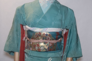
I’ve been itching to do something with this incredible black ship obi I got from Lyuba since it arrived, but somehow other things just kept getting in the way. Until today! I started with an iromuji that’s always kind of reminded me of tropical waters. It leans a little too far onto the mint green side, but it’s still in that watery family, and the thick textured rinzu totally looks like little rippling waves. It’s also very neutral, and since I wanted this incredible obi to be the focus, so that worked out quite well.

I went with soft accessories in the same colour family as the ship to help echo it without being overpowering, and an obijime that matches the iromuji to (literally) tie it all together. The result is a coordination that feels cohesive and thoughtful while still keeping nearly the entire focus on the beautiful hand-painted detail on the obi, which is exactly what I was aiming for.

Items used in this coordination

The obiage is quite new and I haven’t had time to add it to the catalogue yet, which is why it’s not in the item list above. My next Big Project is to finish photographing the stragglers and get all the obijime done. Hopefully over my next long weekend!

Art Gallery – New Wave Portrait by Mousetivity

About a month back, a friend posted an awesome portrait she’d had commissioned that brought to mind the iconic new wave pop art of Patrick Nagel. She linked me to the artist’s commission page and I bookmarked it for later perusal.

Fast-forward a few weeks and I’m still riding on the high of finding a kimono that fits me and happens to be in one of my favourite colours. I realised that the graphic design of the kimono, bold red lip, and funky glasses would be a perfect fit for the art style, so I contacted the artist and asked if it would be possible to replicate the pattern in his style.

He totally went above and put so much lovely detail into the kimono and my glasses, and even made the portrait larger than necessary to show it off to its best potential and included a background that helped balance the whole piece out. Be sure to view the full-sized version. He was an absolute pleasure to work with, and his prices start at a base five dollars, if you can believe that! If you’re interested in a funky and unique portrait like this, kimono or not, definitely check out Mousetivity on Fiverr.

Pretty Pastel Princess

I’ve been behind on mannequin coordinations lately! Hopefully this pretty pastel princess outfit will make up for it. I’ve wanted to do something sweet and girly with this furisode since I used it for Cinderella, and I finally decided to stop procrastinating and just do it.

I really wanted to play up the pink accents in the kimono, so I chose pink accessories and a silvery white obi with pink details and everything ties together so nicely. Despite all the pieces being relatively flashy and youthful-feeling, somehow the coordination still feels gentle. I’m not sure how I feel about the choice of obijime, since the blue doesn’t quite match the kimono, but I’ve been wanting to use this beaded one since I got it and couldn’t resist.

Since this was a dressy furisode outfit, I used the opportunity to practice my fukura suzume (chubby sparrow) musubi. I really do need to branch out and work on more interesting musubi in general, and I am going to try to make a habit of it in the future.

Overall, this coordination came together pretty much exactly how I’d been imagining it in my head and that makes me really happy. And while it’s certainly not as big as my new modern komon, this kimono nearly fits me properly so one day I’ll have to put this outfit on myself. Since the kiku is my birth month flower, maybe I’ll wear it for my birthday when next November rolls around.

Items used in this coordination