Tea Time – Dollar Tea Club

I originally came across Dollar Tea Club through a sponsored post on Instagram. Clearly those targeted ads work!

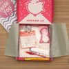
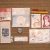
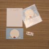
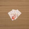
I love monthly subscription boxes. It’s a bit ridiculous how happy getting a little surprise in the mail makes me. I’ve been a subscriber to services like Ipsy and LootCrate before, but with the low Canadian dollar and ever-increasing shipping costs I’ve had to cancel them both. But Dollar Tea Club is so affordable that I know I’ll be sticking with it for quite a while. For the price of one drink at a cafe, you get three generously sized packets of loose-leaf tea and three compostable filters delivered right to your door. It’s such a great little treat.

I’ve been subscribed for several months now. I wanted to stick with it for a while before writing this review, just to make sure I’m as happy now as I was when I first signed up. I won’t be giving each specific tea a thorough review, this is more of an overview of the service itself.

There’s always a good variety of standard classics and interesting custom blends. Every tea I’ve tried has been lovely. During the summer, they sent several varieties of fruit-based herbal teas and they all made excellent iced tea drinks, so this is definitely a subscription service you can enjoy year-round. Admittedly, with a surprise selection like this, not every tea will be to everyone’s preferences. For instance, I have no interest in the supposed health benefits of things like Ease n’ Fit, but I will acknowledge that it was still quite tasty!

If you’d like to try out Dollar Tea Club for yourself, my referral code will give you $1 off your first month and give me a little bonus towards next month’s package. Since each month only costs $1, you’re basically getting to try it out for free. All you have to do is pay for shipping! Use code REFV8G0DF3D91 during your checkout.

 This post contains affiliate link(s). If you choose to purchase, I receive a small rebate or commission which goes to the continued maintenance of this site. 

Fudangi First Friday – Fall Forward

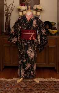
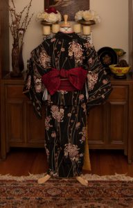
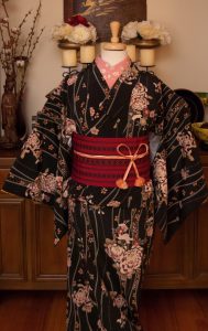
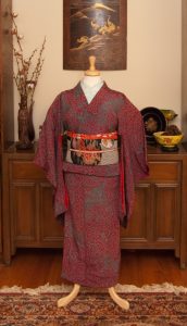
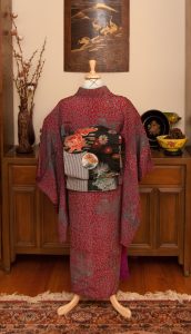
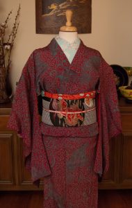
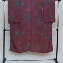
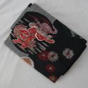
It’s the first Friday in September! It’s still feeling like the surface of the sun here in Montreal, but I couldn’t resist pulling out this wool piece. I got the obi from Kimono Yuki here during the Yatai food festival, and it seemed like the perfect piece to coordinate with the kimono.

Initially I was going to go with red accessories but I realised I’ve been doing a lot of matchy-matchy stuff and wanted to inject a pop of contrast and colour. I remembered this obijime I received from Kyoto Kimono as a thank-you gift for a project they were doing on Instagram a while back, so I thought now would be an ideal time to use it. To balance everything out I went with this ridiculously cute haneri with a blue base and red and black accents, so everything echoes at least one other part of the coordination.

I am sorry I missed Fudangi First Friday last month, it was just so hot and gross and miserable. Thankfully now that fall really is coming soon, things will eventually cool down and I’ll have no excuses. I also have a bunch of really cool reviews in the works, so be sure to keep an eye out for that.
Items used in this coordination

“Iki, wabi-sabi, what now?” – The language of Japanese aesthetics

Language is a fascinating thing. There are so many different ways to express certain things. Nowhere is this more apparent than when dealing with multiple languages. Often, there is no way to translate a kimono-specific word into English, because there’s not been a need for it. Loanwords are a fantastic solution for most of these, things that can easily be clarified with a glossary or reference chart with a short definition.
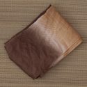
Sometimes, however, a simple glossary isn’t enough. These concepts are more abstract and can’t easily be translated into English or explained in a sentence or two. I thought it would be both useful and interesting to break down some of the more common terms or expressions that often get used when describing certain styles. I use several of these, and they’re more complex than any floating tool-tip or single line definition, so here they are collected in one easy reference.
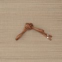
Iki – いき

The concept of iki evolved from the streamlined and urbane sense of style of the merchant class during the Edo era. In stark contrast to the overly ornamented, almost gaudy fashions worn by samurai and the ruling classes, a sense of iki evolved from simple colours and patterns and thoughtful unexpected touches. A sense of refinement would be clear in the quality of fabric and attention to detail more than flamboyant colour and embroidery. Think of the fashionably effortless appeal of a young Parisian woman, and there you will find a western analogue for iki.

Wabi-Sabi – 侘寂

Wabi-sabi is probably the aesthetic term most commonly referenced in English when discussing Japanese style. Here in the west, it has almost come to mean “anything Japanese”, but in reality it has a more precise usage. When something is truly wabi-sabi, it embraces the fragile imperfection of nature. It evokes a sense of transience, a slight roughness of aspect that reminds us all of where we came from. Raw slubbed silk, uneven handmade pottery, naturally winding and twisted branches are all wonderful examples of wabi-sabi.

Shibui – 渋い

Shibui is quite possibly the most straightforward of these terms. Like a sense of excellent, refined taste, shibui is simple and elegant, again focusing on quality craftsmanship and sparse lines. If iki is a stylish young woman, shibui is her refined grandmother. Unlike some of the others mentioned here, shibui may aim for perfection, but with the implicit understanding that it will never be fully achieved. Subtle but exceptional decoration and luxurious fabrics and materials are essential here.

Mono no Aware – 物の哀れ

When you think of the fleeting, ephemeral beauty of the short-lived sakura blossom, appreciating the moment all the more because you know it’s going to be over soon, you’re experiencing mono no aware. There is a distinctly Japanese awareness of the constantly changing essence of the natural world around us, as evidenced by the seventy-two micro-season calendar.Mono no aware not only acknowledges the impermanence of things, it focuses on that impermanence, as well as the wistful feelings it engenders.

Mottainai – もったいない

A bit of an outlier, mottainai isn’t a sense of aesthetics so much as a general philosophy of regret about waste and excess. It comes into play especially when it comes to vintage pieces, which are often remade into new things. It’s very common to find fukuro obi that may have been stained or are too small converted into hanhaba obi or tsuke-obi. Less common but still frequent are conversions like turning a kimono into a haori, or into a western-style dress. There is beauty in the history of a garment, and in giving it new life instead of creating more waste. This becomes more and more vital as a preservation method as traditional techniques start to die off, and a way to protect our increasingly fragile environment.

Kawaii – かわいい

If you’ve spent any time on the internet, odds are you’ve encountered kawaii. It’s absolutely a more modern concept than the others mentioned here, and may not necessarily be as relevant in the world of kimono, but it’s definitely starting to have more of an influence. We’re seeing more pastels, more frills, more lace, than ever before. Kawaii as an aesthetic isn’t just “cute”. It’s cute beyond cute. Cute as a lifestyle choice. It’s about embracing the youthful and girly in a way that can feel almost subversive in a world that encourages us all to grow up fast.

Are there any other terms like this you think should be included? Something you’ve heard or read but aren’t sure about? Please leave a comment below!

Lobster Bisque

Recently, someone on the Kimono Tsuki facebook page reminded me of my incredible pente lobster obi. I decided it had been far too long since I’d done anything with it, so I went about putting together an outfit in my notes.

I took advantage of today’s holiday to actually get it up on the mannequin. It always makes me happy when the parts of an outfit look as good in person as they did in my head. I knew I wanted to the obi to be the star of the show so I used my ivory iromuji to make sure it really popped. It coordinates well with the shells on the obi and is the most neutral base I’ve got in my collection. From there it was a pretty effortless thing, pulling accessories out in colours that echoed parts of the obi.

Overall, the end result is a very simple and straightforward outfit, but I think that works really well. The obi is so fun and just quirky enough that balancing it with otherwise very simple pieces feels right. I’ve had fun doing more non-traditional outfits with it before, and it felt good to go in the other direction. In spirit, this outfit actually feels very similar to how I coordinated the stencilled obi I made recently, but I don’t think that’s a bad thing. Iromuji are always a great way to make the obi the star of the show.

Items used in this coordination

#monoKimono Challenge – Summer White

This may be the last weekend in August, but we’re still suffering the heat here. With the humidity factored in, they’re predicting temperatures in the high 30s again this week. So I decided to run with some cool summer white usumono coordination for this month’s monochrome outfit, even though I did a white/cream one not long ago with the wedding ensemble.

I often find myself breaking the rules a bit with these monochrome outfits. I guess I figure that if I’m playing with one rule, I may as well play with them all. So this outfit is sort of all over the place formality-wise and season-wise, but I really wanted to keep it all in that warm white/cream family with yellow accents to make the bells on the kimono pop out.

Also, if I’m being honest, I just don’t have much variety when it comes to actual summer-weight accessories, so I had to use normal ones. Maybe I should limit myself to only buying usumono for a while. I’ve already cut down on my buying habits lately, this would be even better motivation to stick to that.

I quite like how this turned out, even if it does have a lot “wrong” with it. And it wasn’t too terribly overwhelming to put together even in this oppressive weather. Win-win!

Don’t forget, there’s only a few days left to enter the stencil giveaway!

Items used in this coordination