One Kimono, Four Ways – Week 4: Cute and Casual

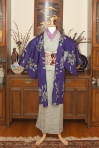
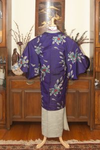
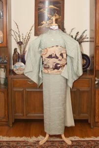
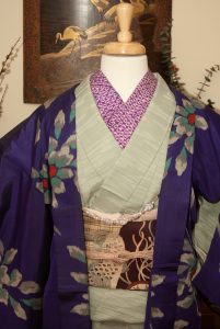
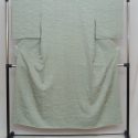
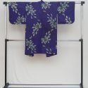
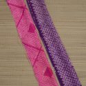
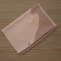
At last, we’re coming to the end of this month’s theme project. It’s been fun, but honestly I am glad it’s over. I’m getting a little tired of this iromuji! For the last outfit, I decided to try to accomplish the one thing this style of kimono can be very difficult to do; a simple, casual cooordinate. Typically, iromuji can be a lot of things, but relaxed town-wear is not one of them. To make it work, I stuck with otherwise casual pieces. A coloured haneri, a bright meisen haori, and one of my favourite nagoya obi all in shades of purple all pop against the cool mint tone of the kimono itself. The early-afternoon sunlight today helped to keep things soft and warm. I’m not sure this outfit was as successful as some of my other attempts during this experiment, but I do really love how the haori and kimono look together.

Overall, I’m quite pleased with his whole experiment. It’s been really interesting to work within the constraints of the one single kimono. I may do it again sometime later with something other than an iromuji, to make it more of a challenge. I’ve also got some fun craft projects in the works and I can’t wait to share them with you all.

One Kimono Four Ways

Items used in this coordination

One Kimono, Four Ways – Week 3: Punchy and Popping

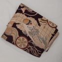
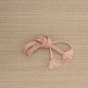
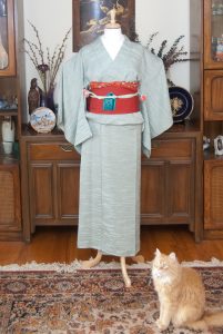
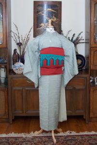
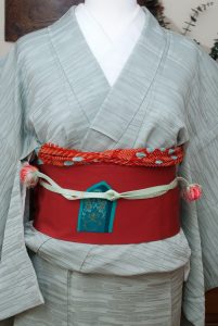
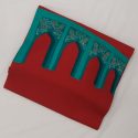
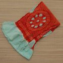
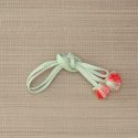
One of the great things about iromuji is how they can allow you to really focus attention on something other than the kimono itself. They make a great neutral canvas for a really bright or busy obi. I decided for this week’s entry that I’d do a really high-contrast coordination with a lot of “punch” to it, and this obi was the perfect place to start. It’s a very special obi; I received it anonymously from some lovely person online. I suspect their intent was to have me coordinate it with my Shah Mosque houmongi, but in the end the styles and colours were too different and I could never get them to work together. This kimono, however, is ideal. It’s a similar background colour to the houmongi and the orange-red of the obi really pops against it, but it doesn’t compete with the pattern on the obi itself. It’s a wonderfully neutral foil for the gorgeous obi, and the colours couldn’t work better together if they’d been made to go together. I’d initially thought of using a third bright colour (yellow or pink) for the obiage and obijime but then I remembered these pieces, and everything just clicked.

We’ve also got a special guest photobomber today! Those of you who are longtime readers have probably seen Vinnie before. He usually avoids the mannequin but today he decided he wanted to be the star of the show.

I hope you’re enjoying seeing these posts as much as I’m enjoying doing them! We’ve got one left, and then it’s time to focus on newer things.

One Kimono Four Ways

Items used in this coordination

One Kimono, Four Ways – Week 2: Modern and Monochrome

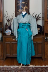
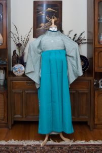
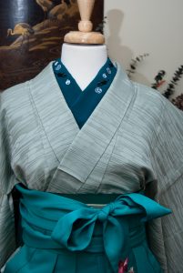
For this week’s outfit featuring my mint iromuji, I wanted a big departure from the very standard coordination from last week. This adorable kitty haneri is a very deep rich teal, and it struck me that I had a bunch of similar items in various shades of the same colour. I think pairing the iromuji up with them and using cooler lighting than last week’s photo really drives home the point that I was trying to make, that one kimono can look incredibly different with different accessories, and in different situations. Surrounded by the cool tones of the haneri, obi, and hakama the kimono itself leans much more towards the blue side of things than it did against the gold and lavender of last week.

So far, I think this experiment is going swimmingly! I look forward to seeing what else I can do with this piece.

One Kimono Four Ways

Items used in this coordination

Mini Review: Mini Moo Cards!

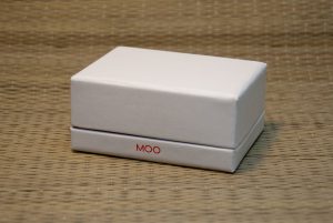
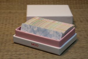
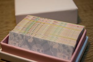
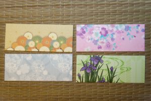
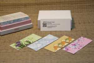
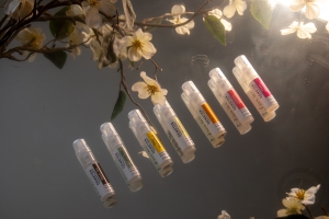
How cute are these? I’ve been wanting business/contact cards for the blog now, and I fell in love with these half-sized cards from Moo.com. I loved the fact that they include printing on both sides of the card, and you can have as many designs as you like, all for no extra cost. Since I change the theme of this blog with the seasons, it seemed perfect to get a selection that matches all four themes. The printing is excellent quality, as is the cardstock itself. I chose the Basic option, as it was the most affordable, and it’s definitely nice and solid and feels good against the fingers. Even the box they come packed in is lovely, and there’s something very satisfying about looking down into the packaging and seeing all the different back designs peeking out.

The pixelated bit is my mobile number, not a printing issue. I just took the precaution of blurring it out to prevent unsolicited phone calls.

If you want to get some custom double-sided cards of your own, please feel free to use my referral code to get a $15 rebate on your first order!

I purchased this item myself and chose to review it.This post contains affiliate link(s). If you choose to purchase, I receive a small rebate or commission which goes to the continued maintenance of this site.

One Kimono, Four Ways – Week 1: Stylish and Subdued

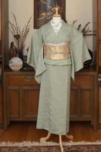
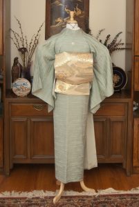
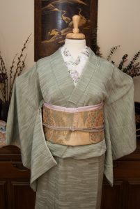
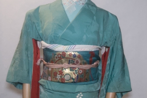
The beginning of February marks the beginning of a new little experiment for me. I thought it would be really interesting to choose one kimono to work with all month, just to show how versatile they can be. I specifically picked this mint iromuji because I feel like these solid-coloured kimono are one of the most often overlooked types of kimono. To some, they may be drab or boring, but I think they’re the “little black dress” of the kimono world. They are incredibly versatile, depending on what sort of styling and accessories you decide to coordinate them with. I hope that if you own an iromuji or two and don’t know what to do with them, by the end of the month you’ll have lots of ideas on how to wear them to different events!

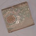
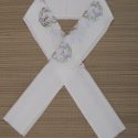
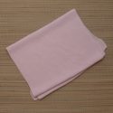
To start, I chose to do a quite traditional outfit in soft pastels. I feel like this would be appropriate for a variety of formal events where you don’t want to draw too much attention to yourself, such as a guest at tea ceremony, a wedding, or another formal reception. It also feels very much like it’s looking forward to spring, which is something I desperately need right now. I’ve always wanted to pair this obi and kimono together since the seafoam green colour in the roundels of the obi echoes the colour of the kimono so well, and I love how they look. An embroidered haneri isn’t entirely typical for this type of outfit, but I received this one (and several others) in the mail yesterday and they were too gorgeous not to use. I decided to echo the purple of the irises with the obiage and obijime.

Next week’s outfit will definitely be an unexpected departure from the tone of this one, so be sure to come back!

One Kimono Four Ways

Items used in this coordination