
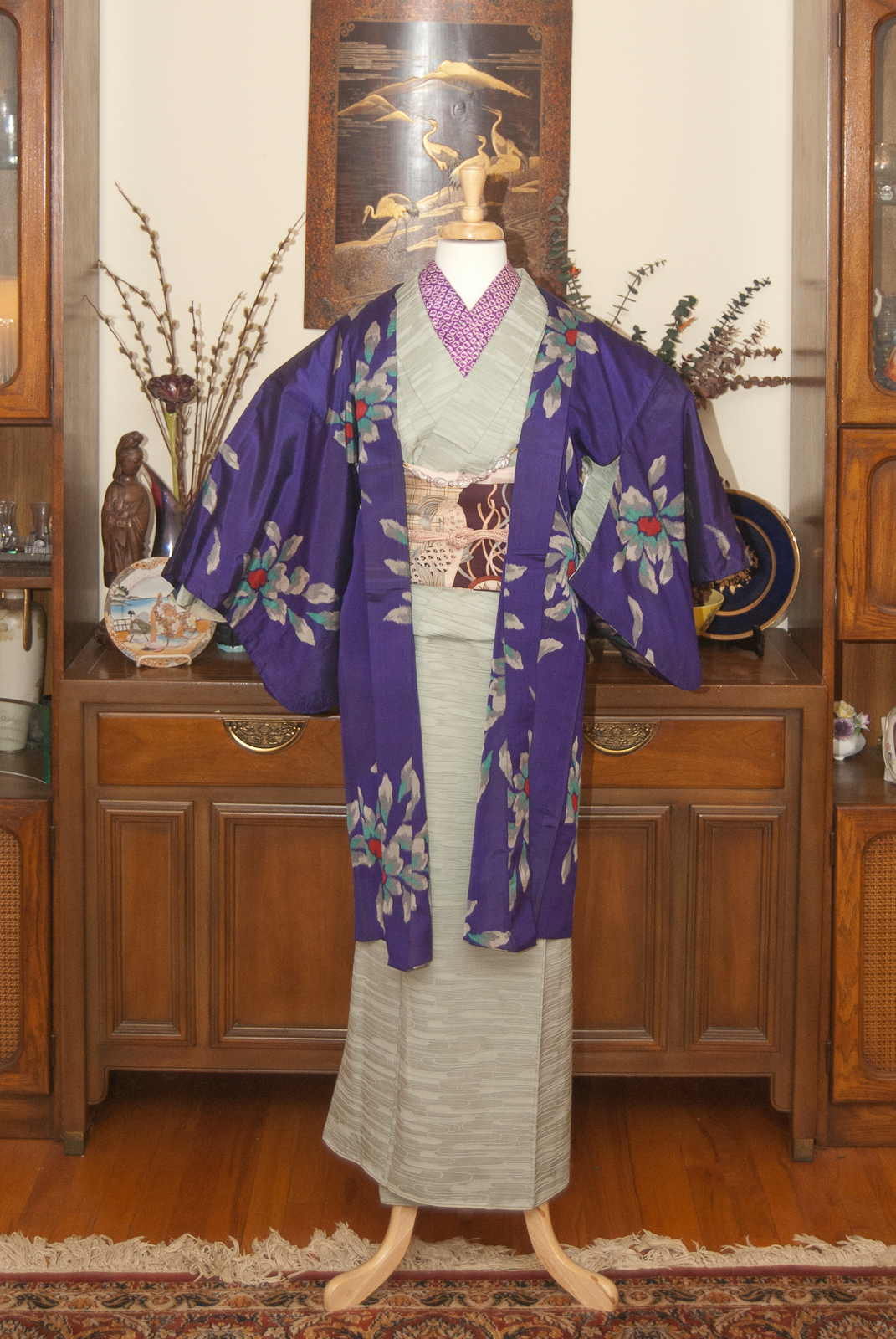
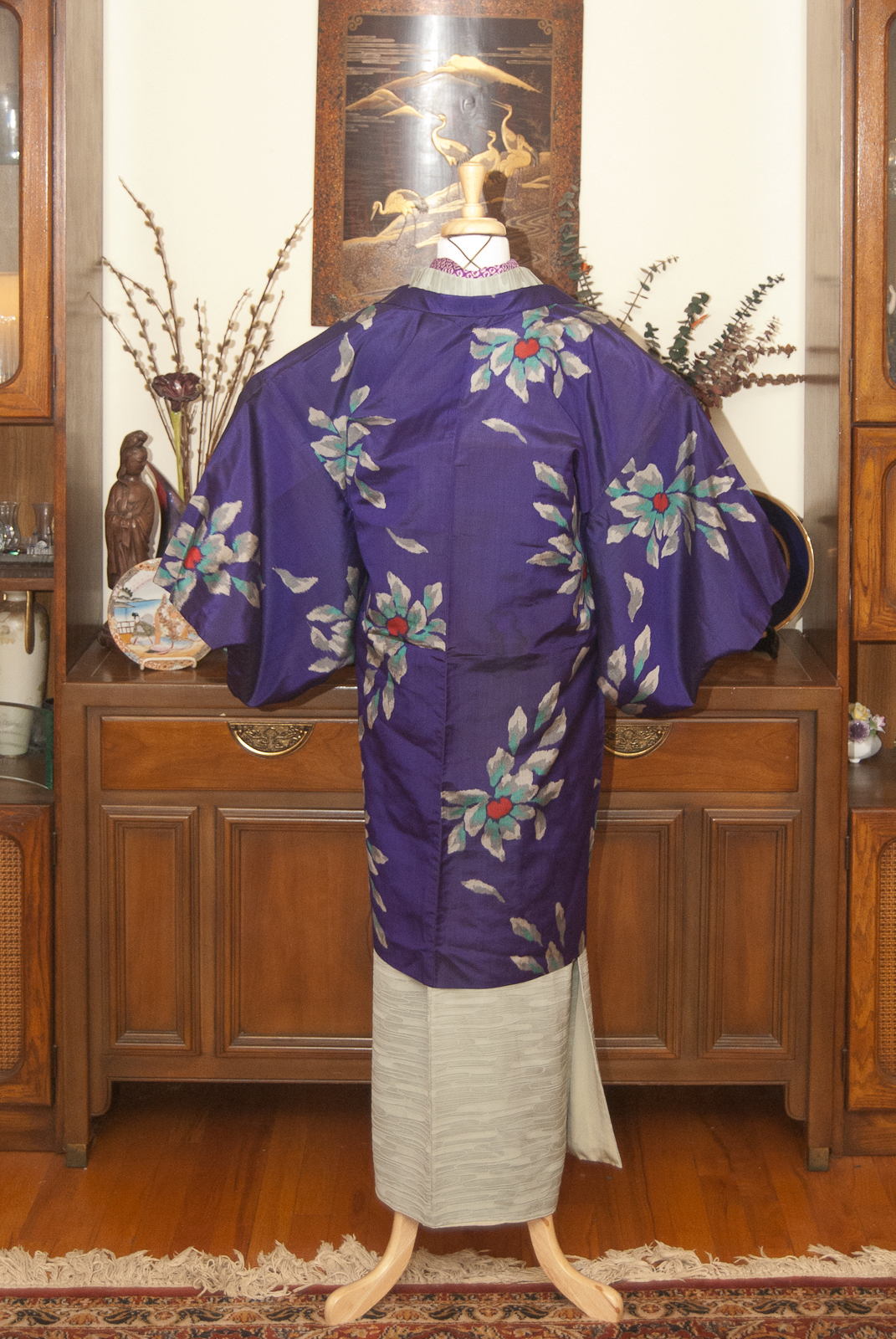
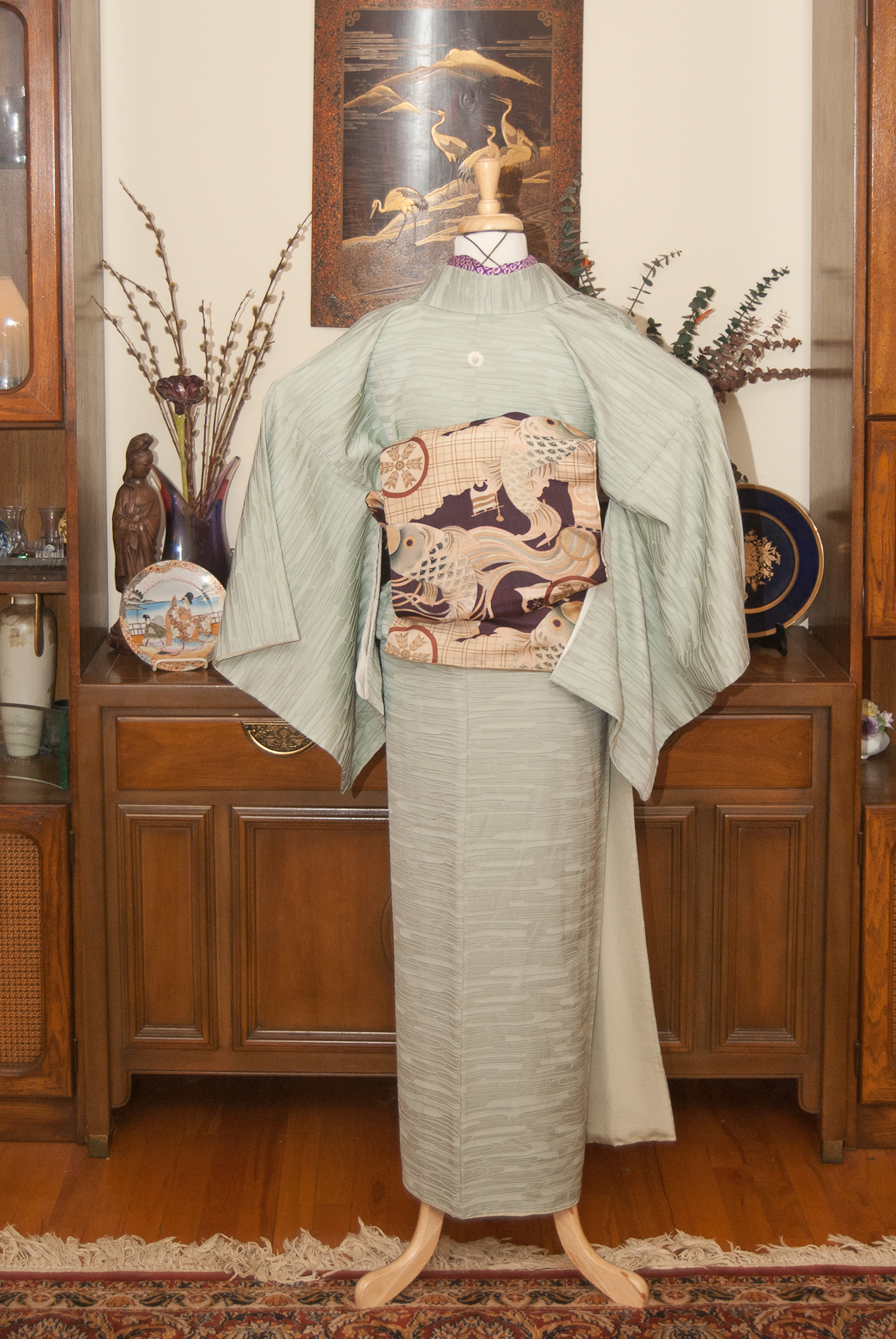
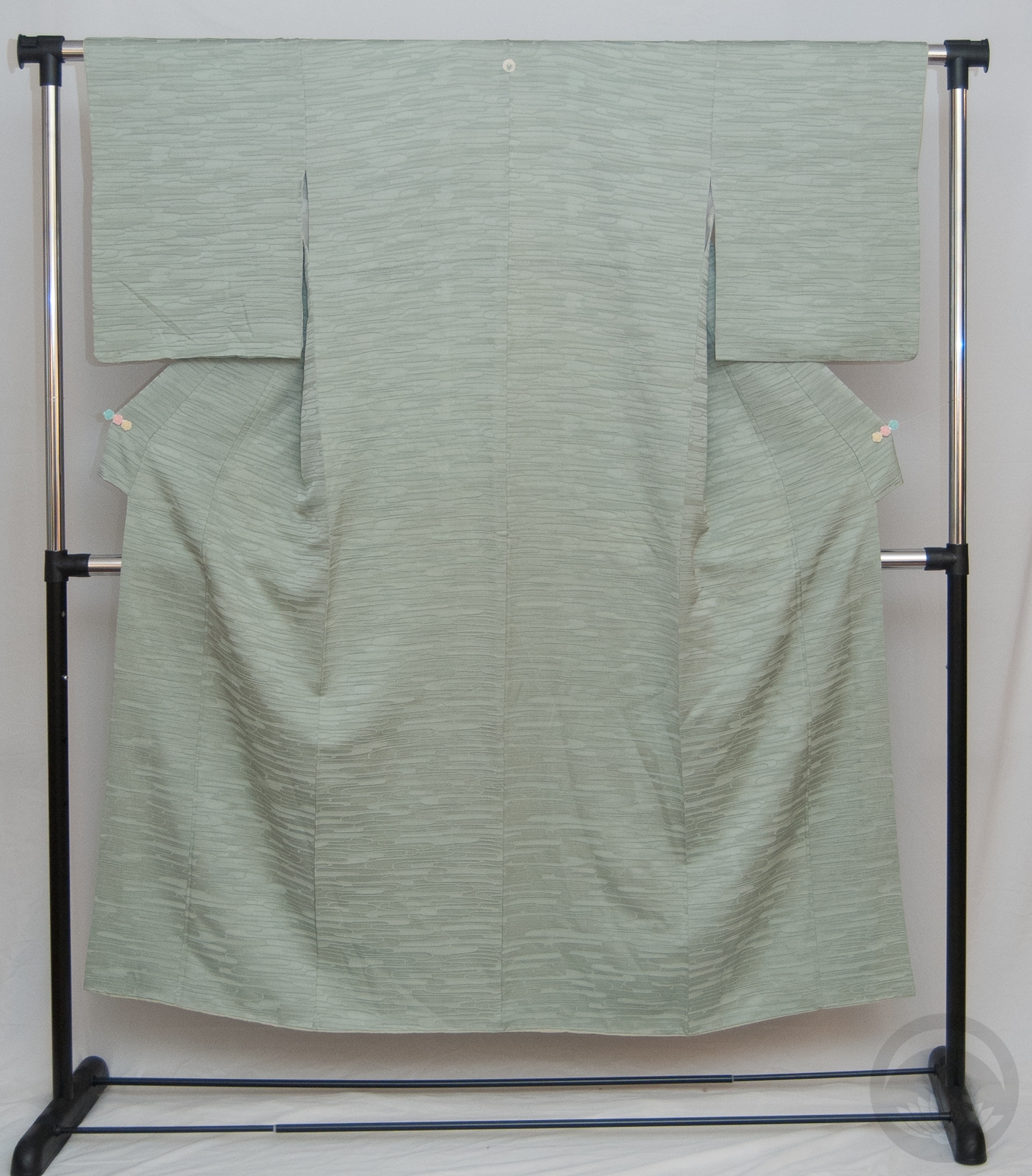
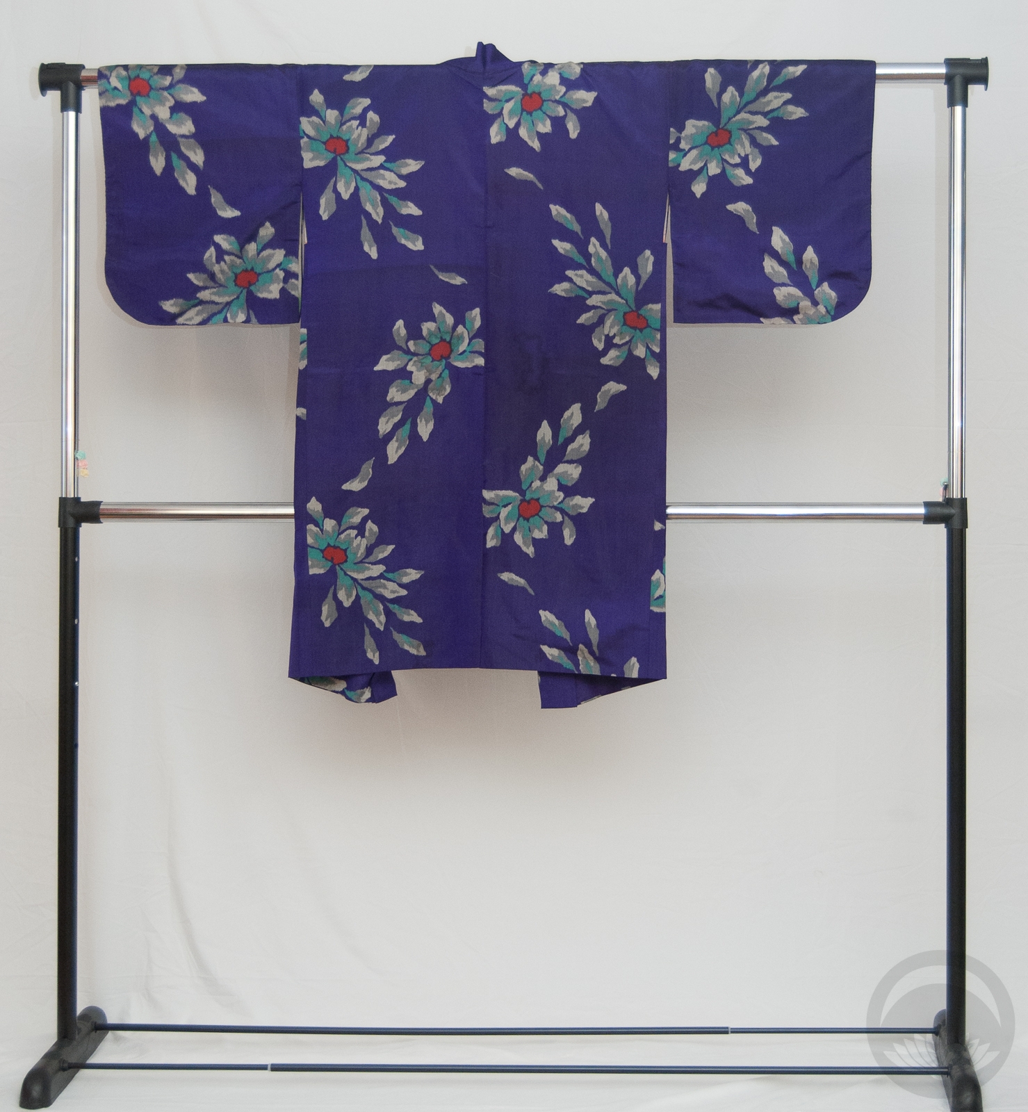
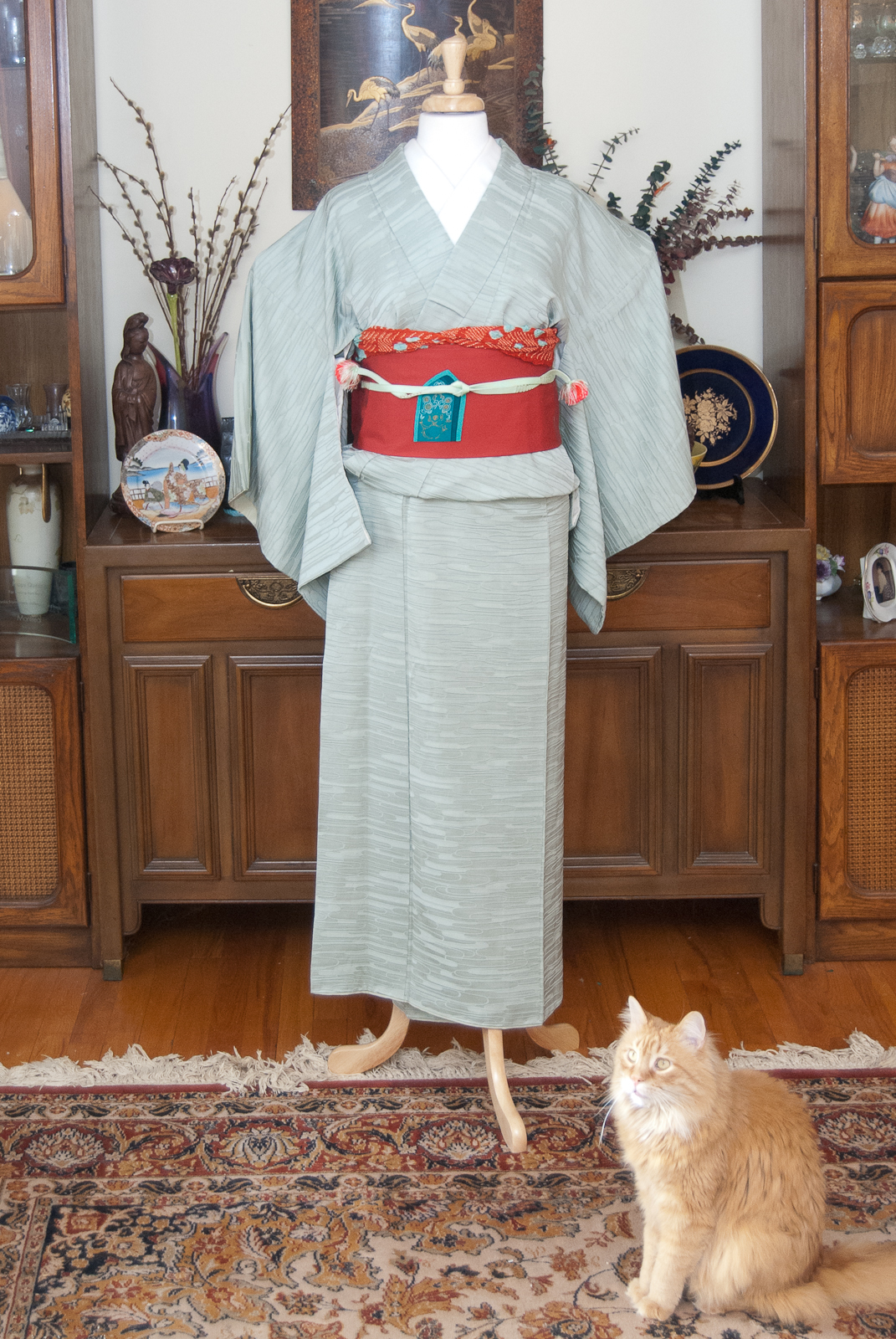
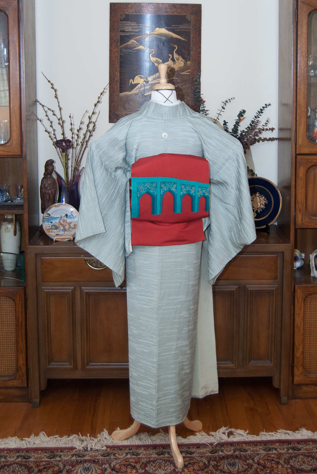
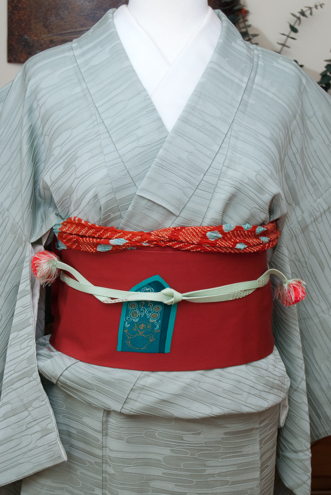
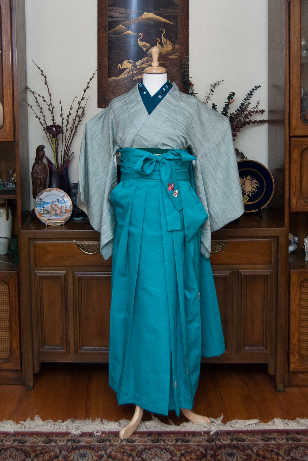
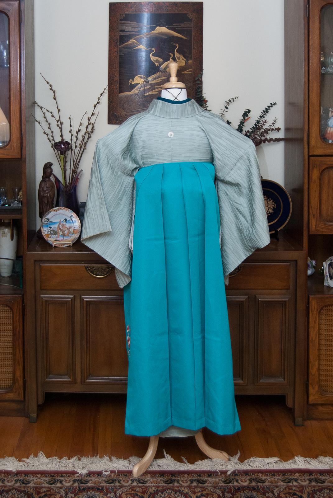
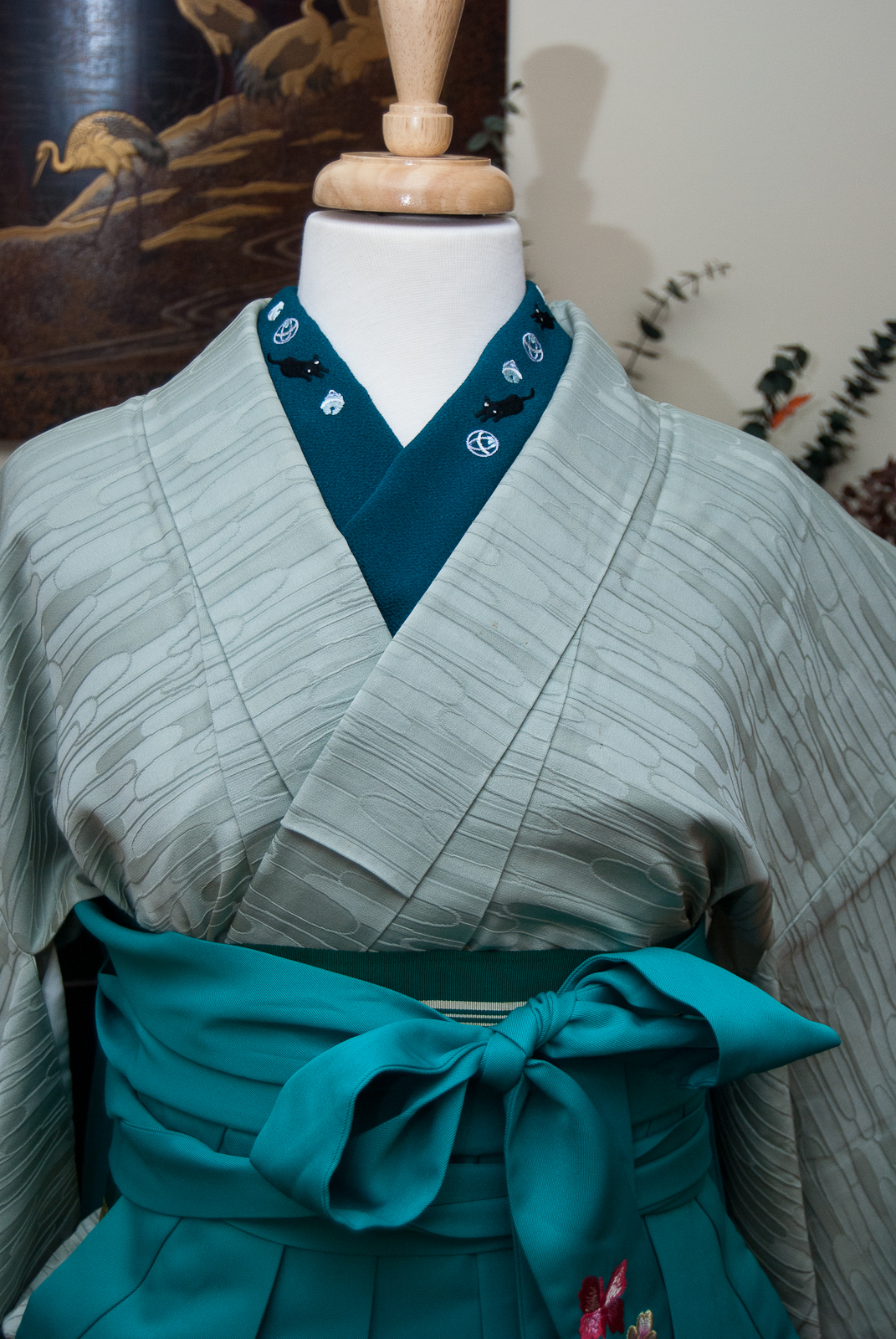
At last, we’re coming to the end of this month’s theme project. It’s been fun, but honestly I am glad it’s over. I’m getting a little tired of this iromuji! For the last outfit, I decided to try to accomplish the one thing this style of kimono can be very difficult to do; a simple, casual cooordinate. Typically, iromuji can be a lot of things, but relaxed town-wear is not one of them. To make it work, I stuck with otherwise casual pieces. A coloured haneri, a bright meisen haori, and one of my favourite nagoya obi all in shades of purple all pop against the cool mint tone of the kimono itself. The early-afternoon sunlight today helped to keep things soft and warm. I’m not sure this outfit was as successful as some of my other attempts during this experiment, but I do really love how the haori and kimono look together.

Overall, I’m quite pleased with his whole experiment. It’s been really interesting to work within the constraints of the one single kimono. I may do it again sometime later with something other than an iromuji, to make it more of a challenge. I’ve also got some fun craft projects in the works and I can’t wait to share them with you all.
One Kimono Four Ways
- February 2nd: Stylish and Subdued
- February 9th: Modern and Monochrome
- February 17th: Punchy and Popping
- February 23rd: Cute and Casual
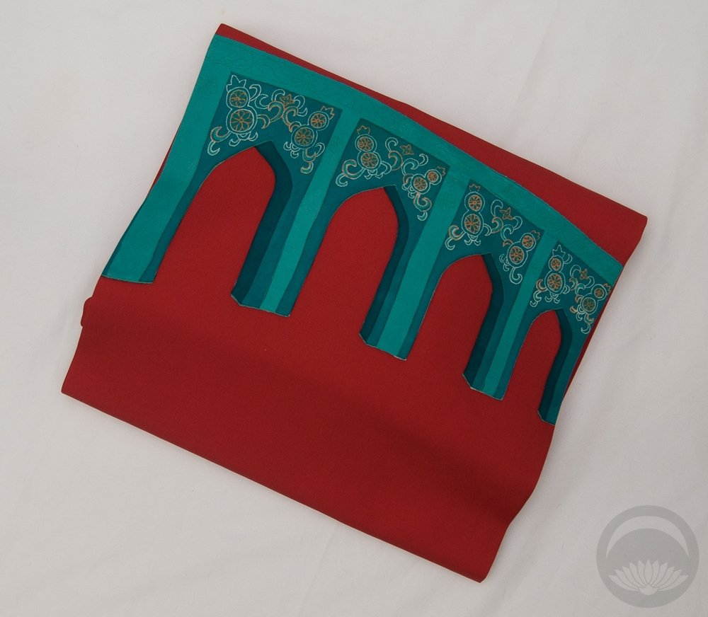
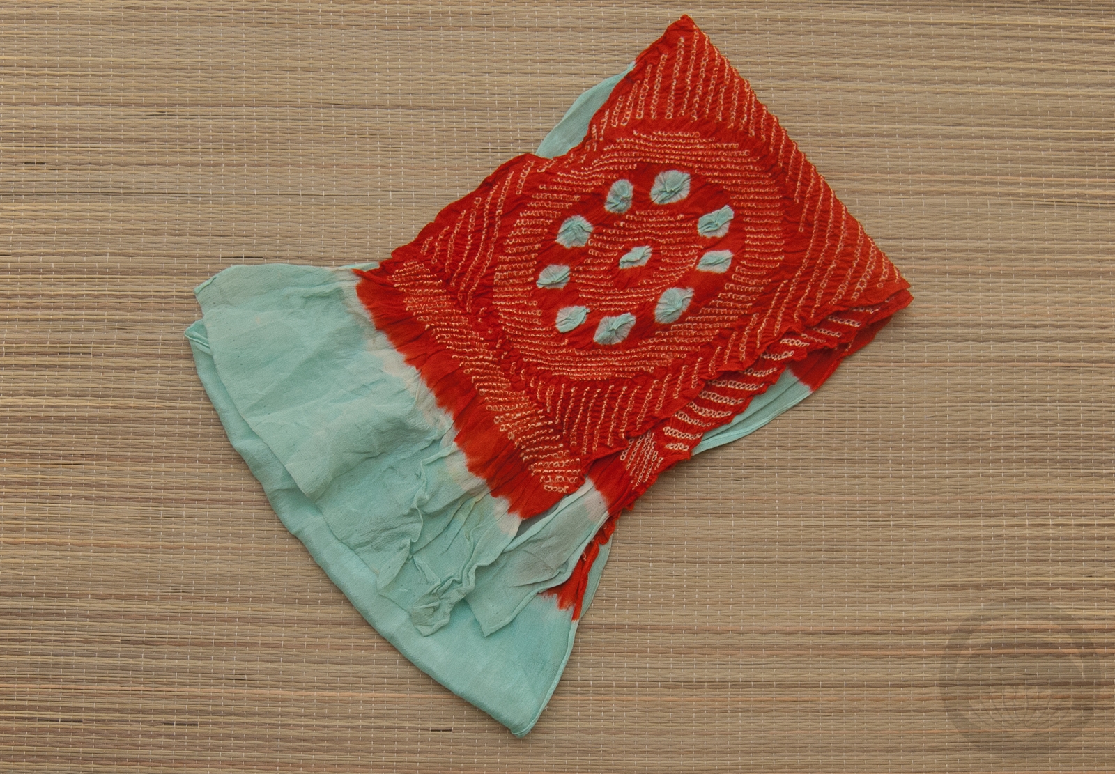
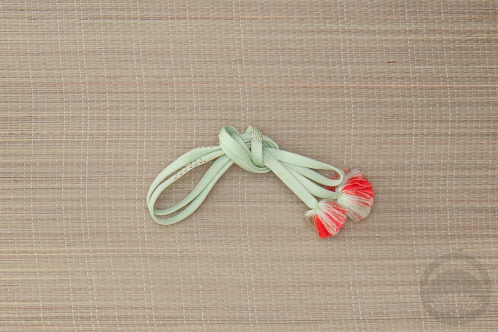
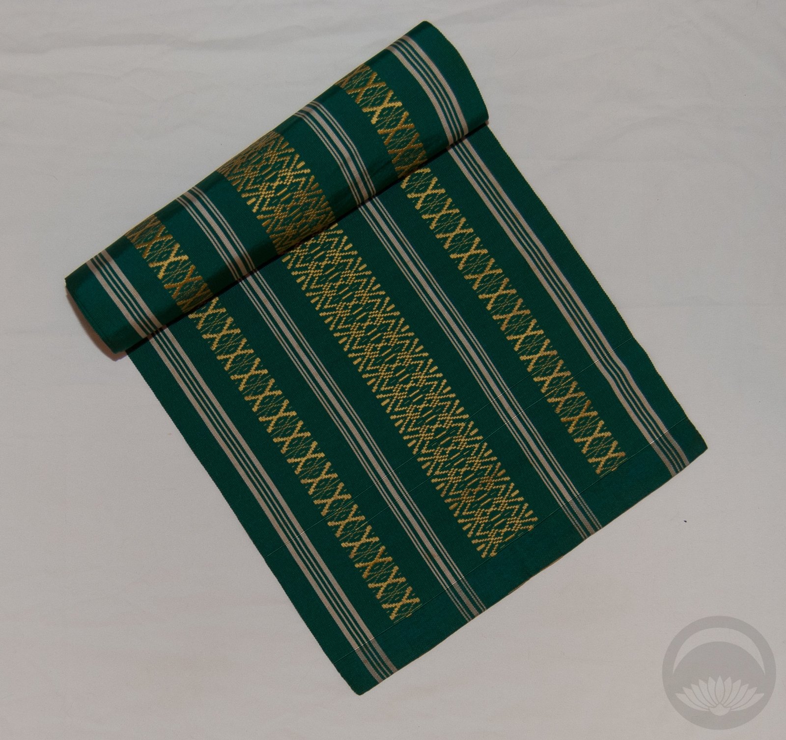
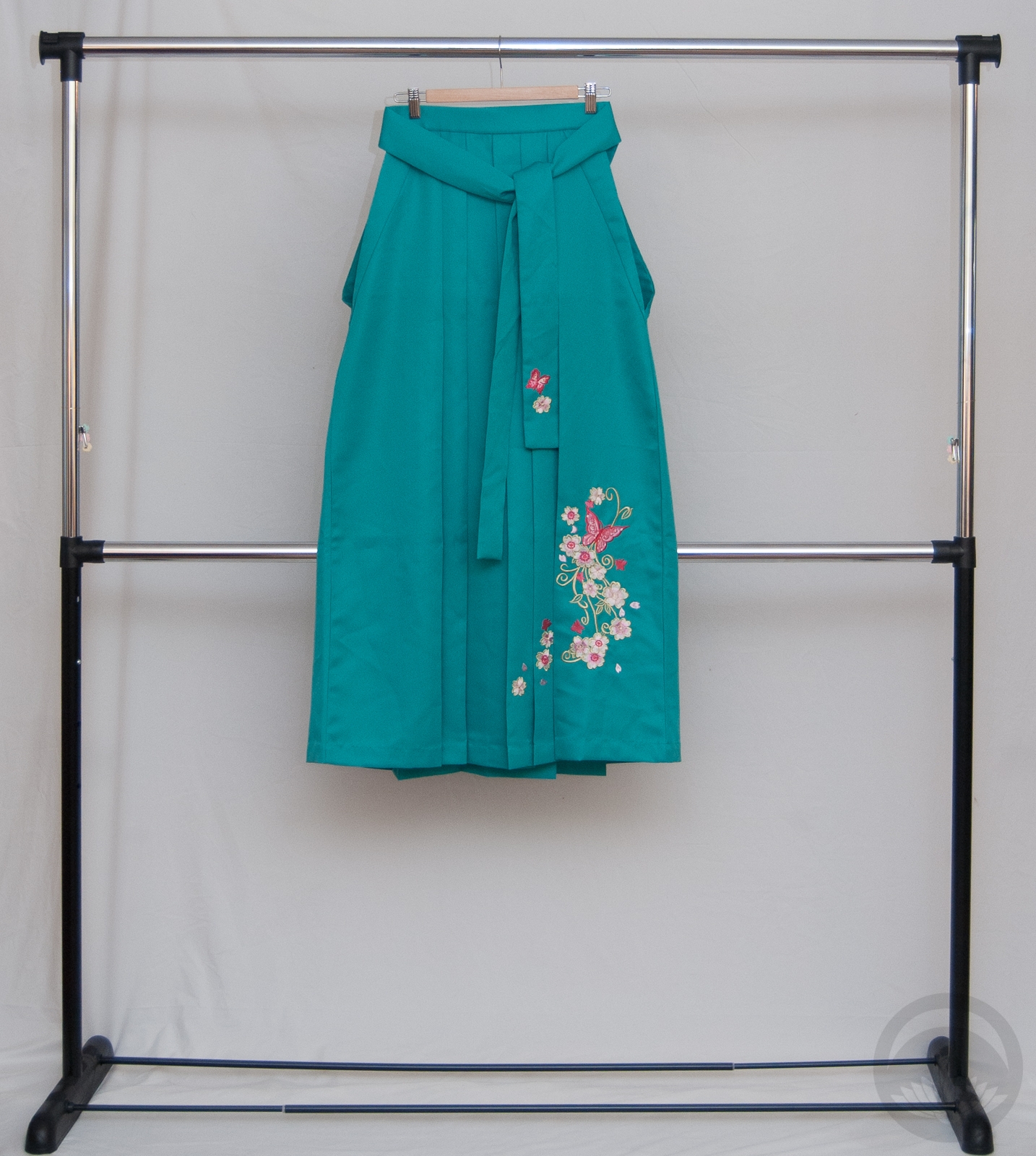
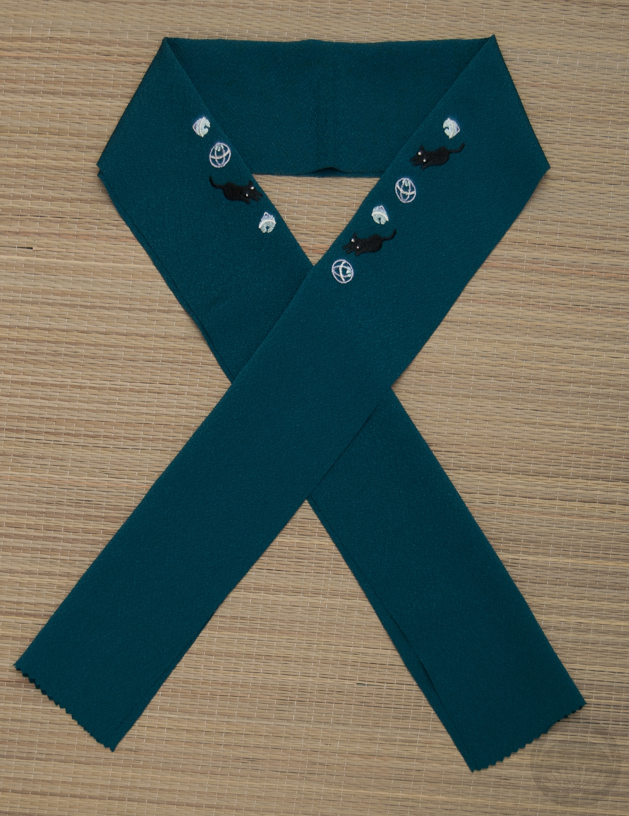
Items used in this coordination
-
- Mint Green
-
- Floral Meisen
-
- Plum Koinobori

-
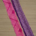
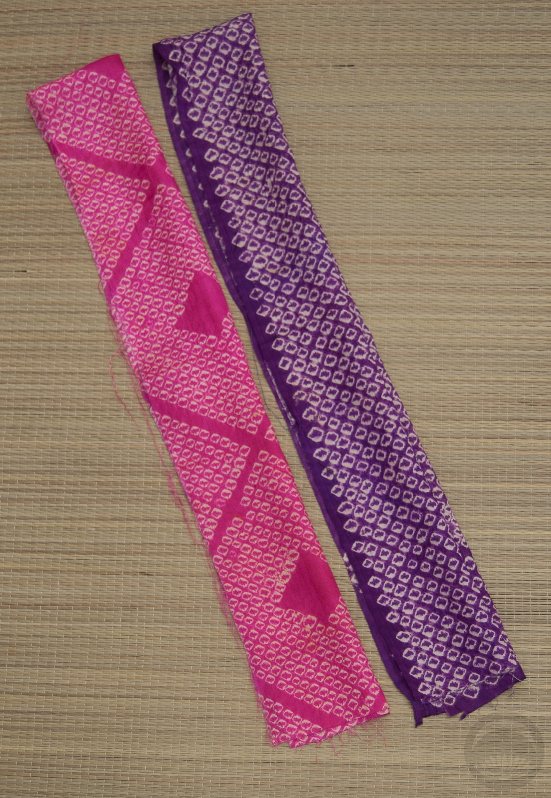
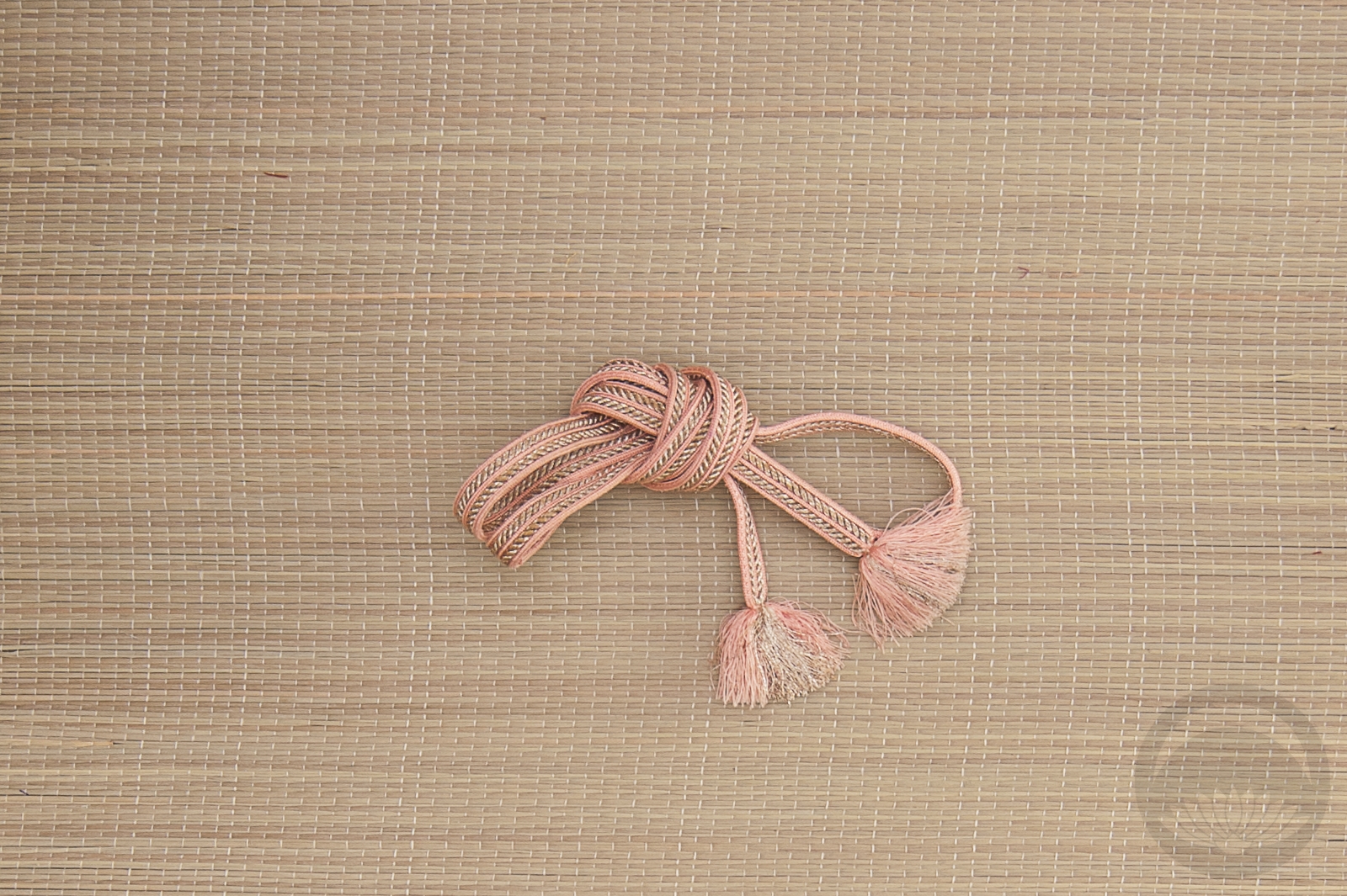
- Mixed Shibori
-

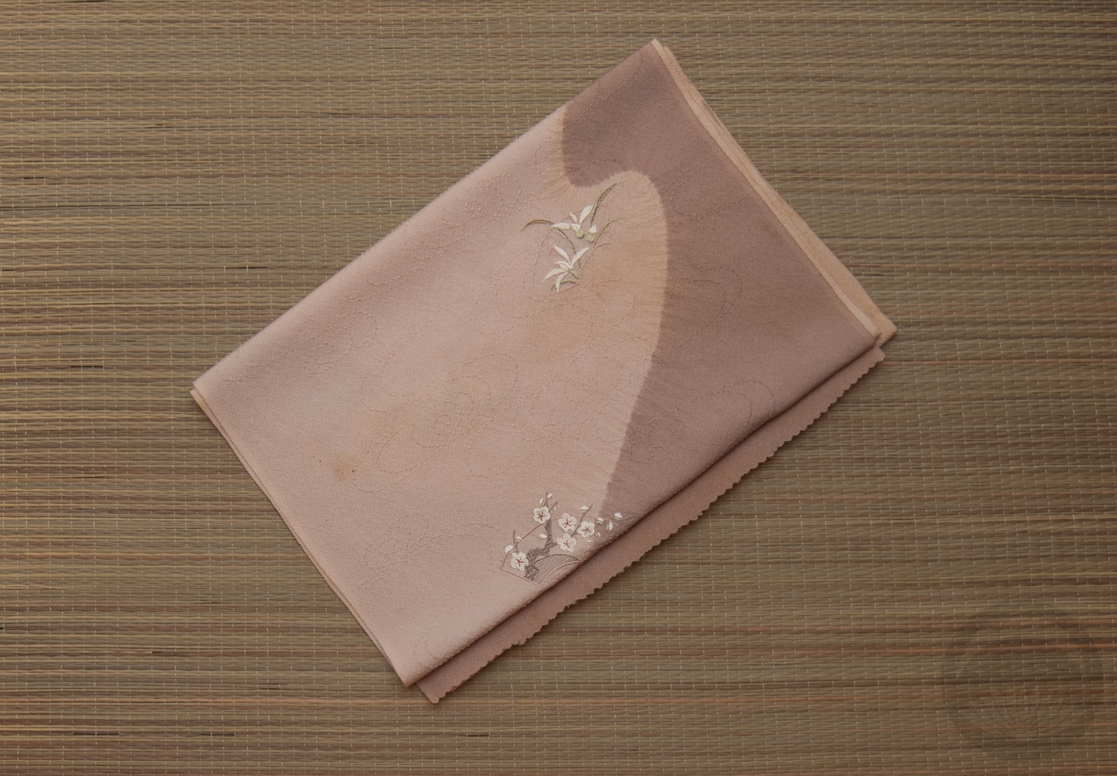
- Embroidered Dusty Chirimen
-
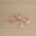
- Pink & Silver


 Bebe Taian
 CHOKO Blog
 Gion Kobu