
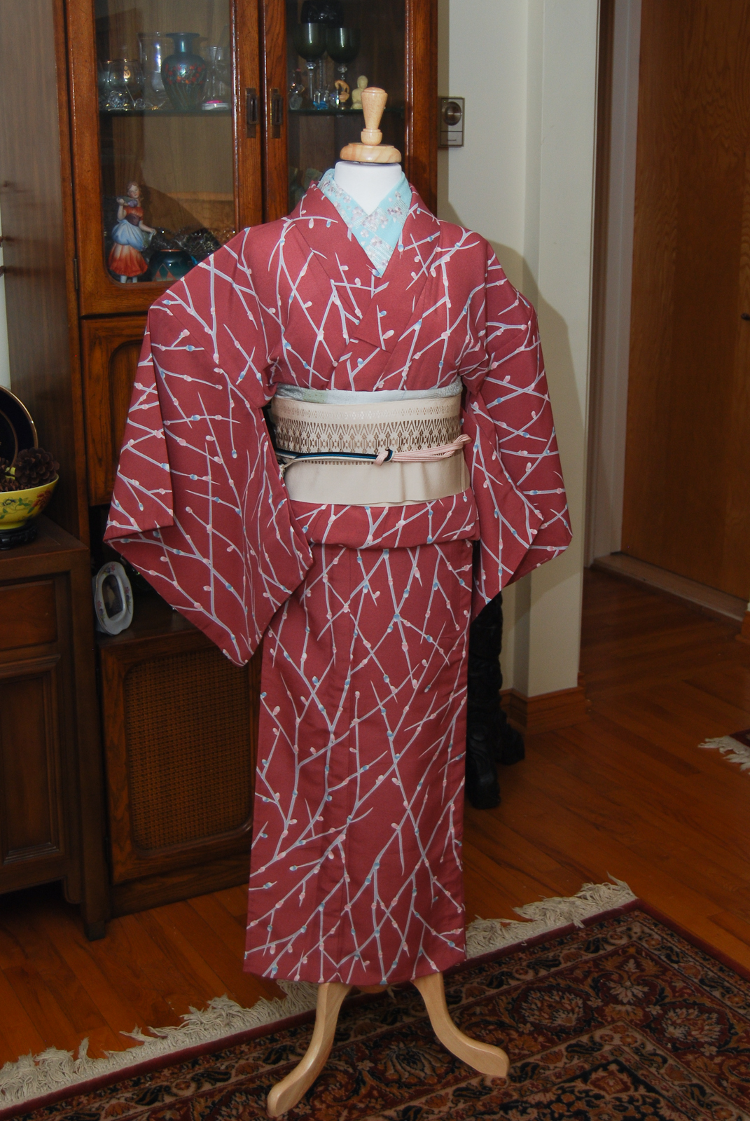
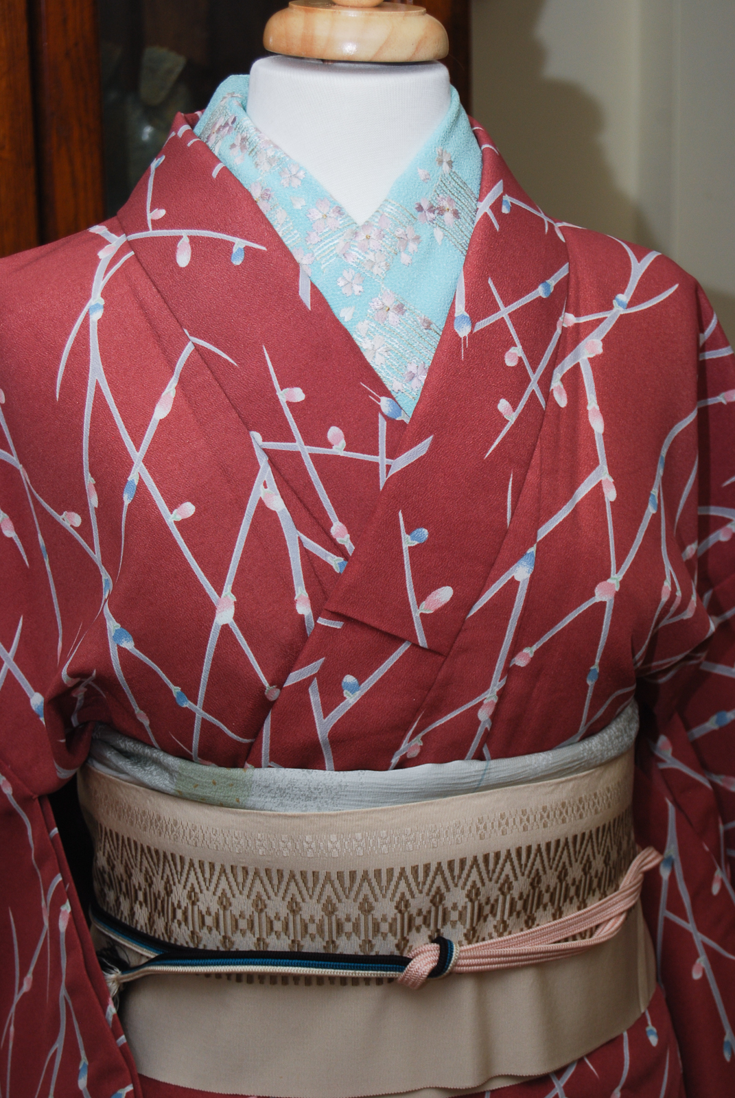
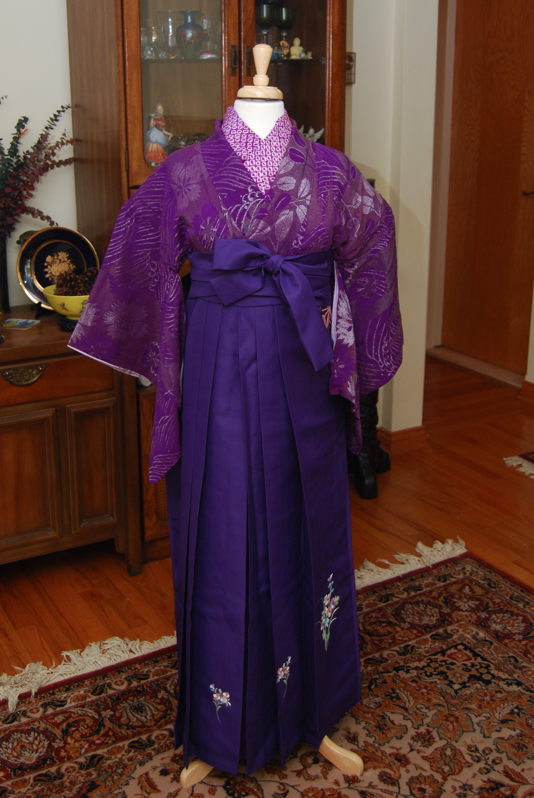
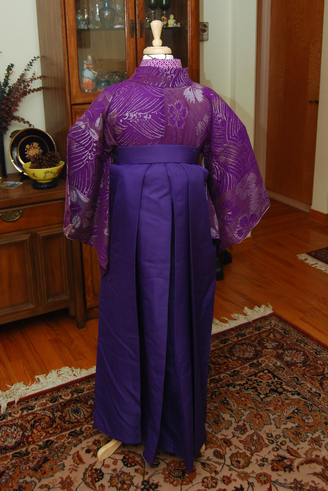
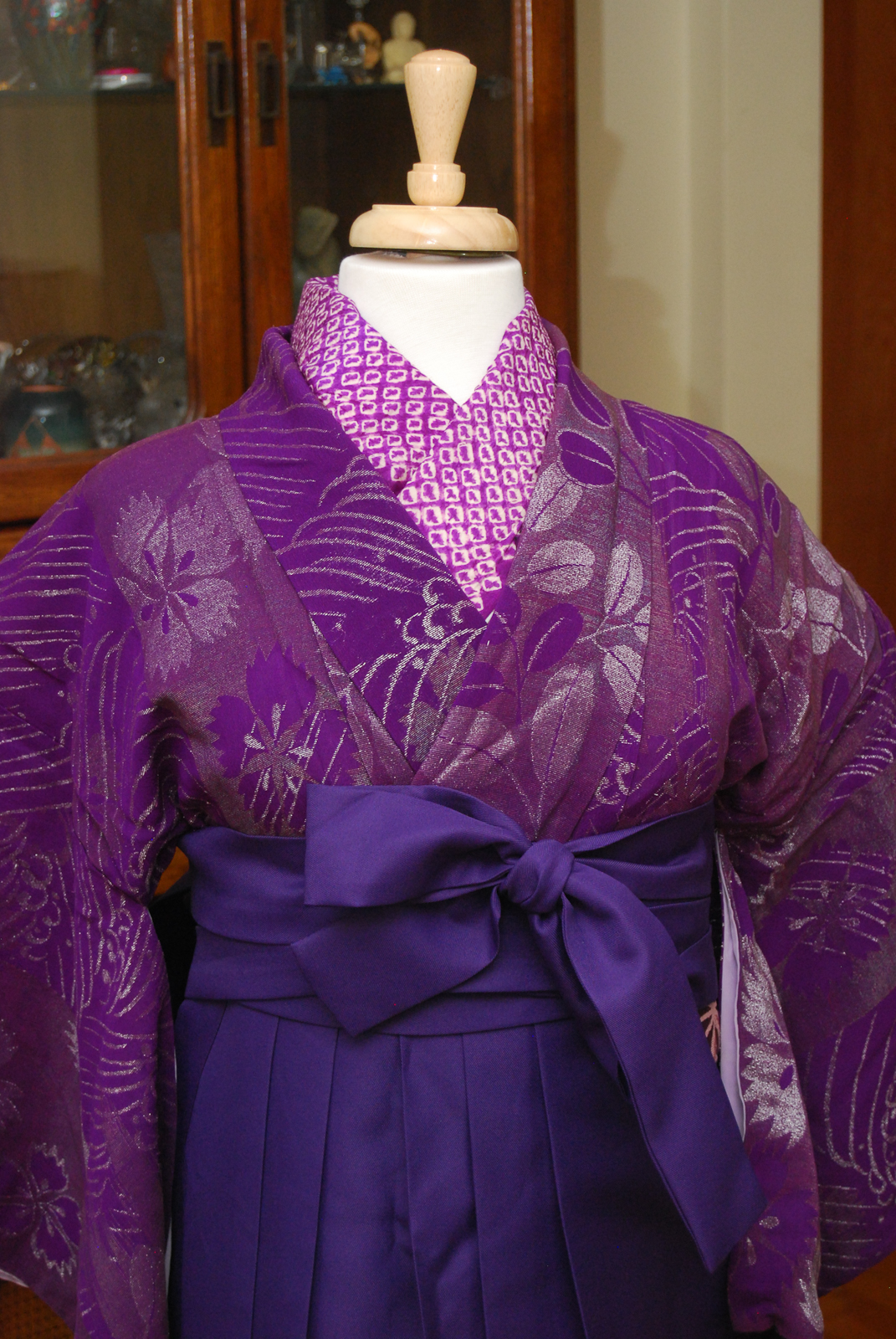
Typically, the rule of thumb for obi/kimono coordination is to choose contrasting colours and motifs. You want the two pieces to pop against each other and then be tied together with accessories. However, monochrome (or nearly monochrome) outfits are becoming more of a trend.
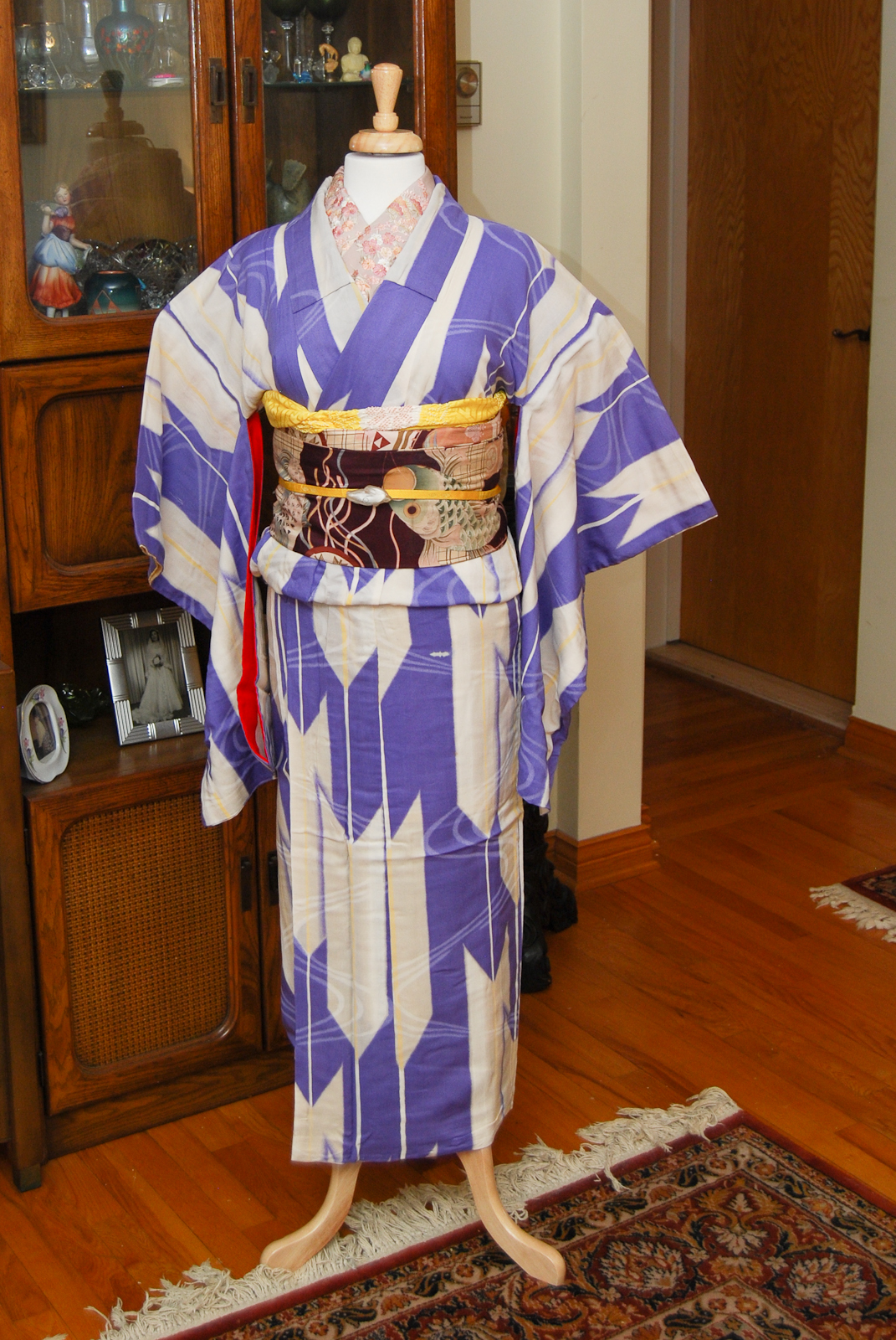
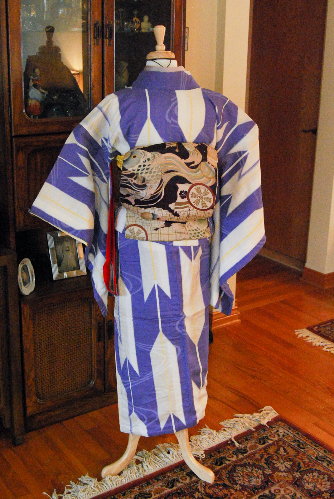
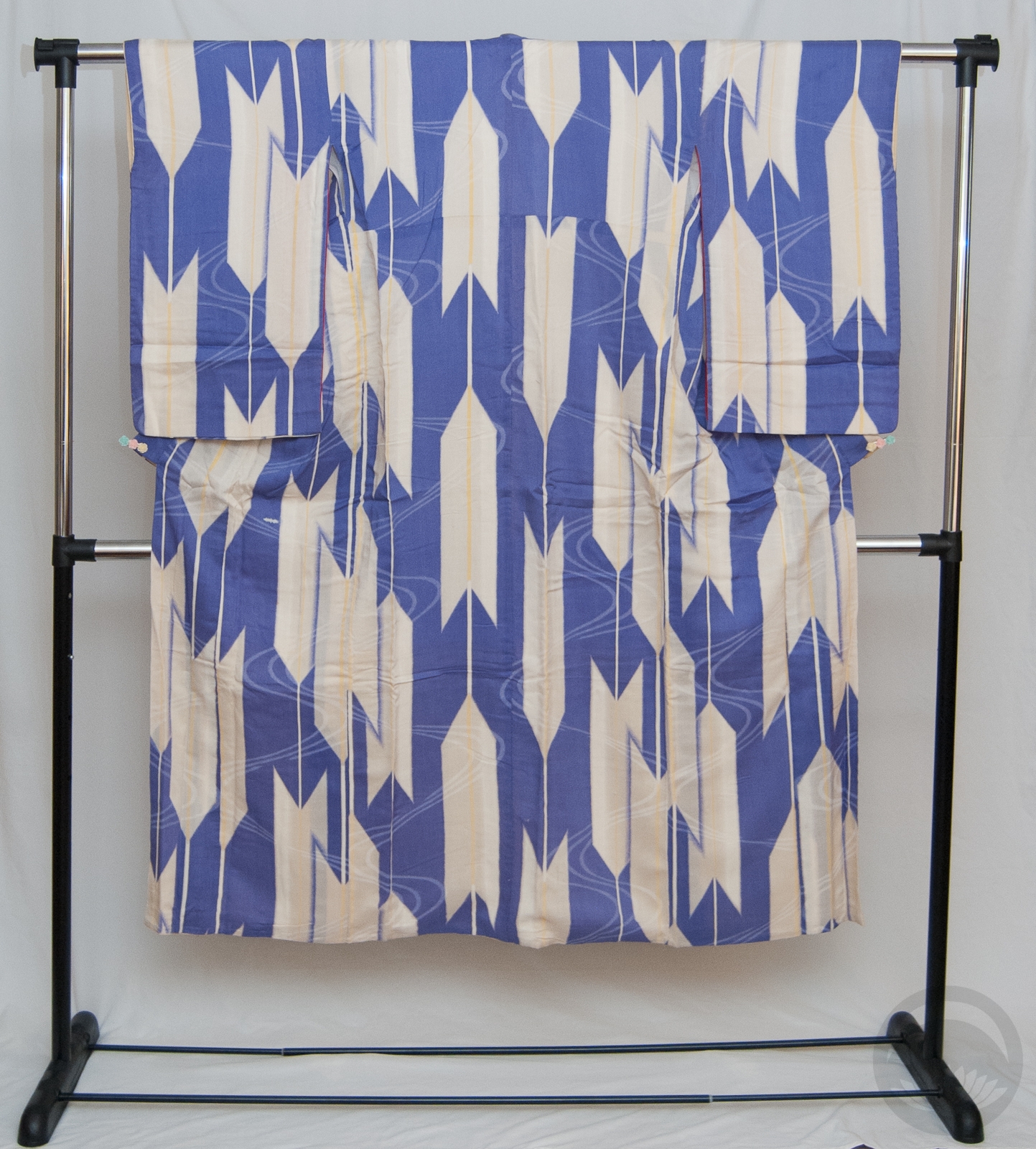
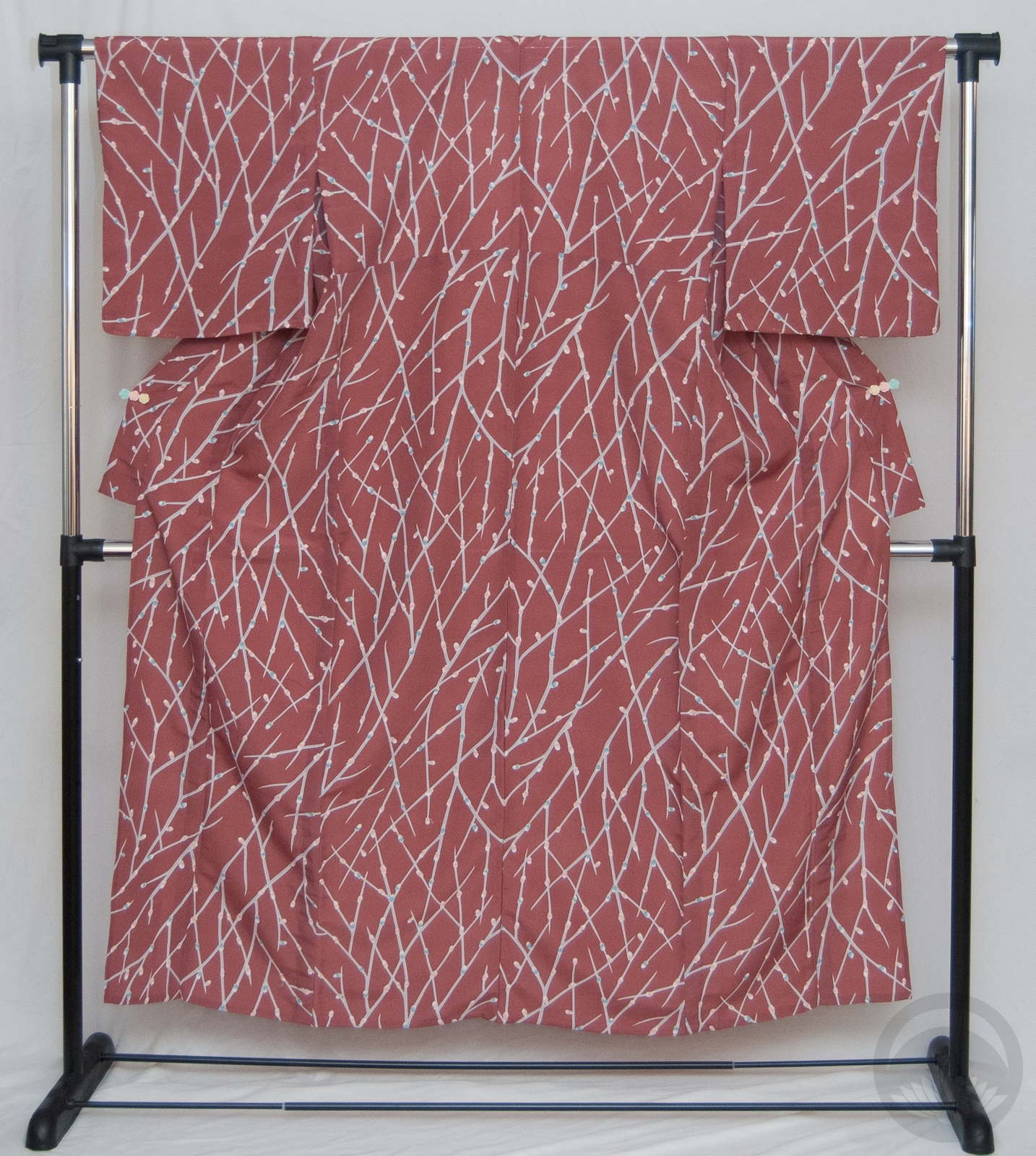
I found this plum tsukesage online and thought it would be a perfect match for the obi I already owned. While under the questionable influence of migraine medication I asked the lovely folks of the Immortal Geisha facebook group if I should go for it, and was actively and heartily encouraged. I tossed out an offer and promptly forgot about the whole thing. Imagine my surprise a week later when I got a shipping notice!
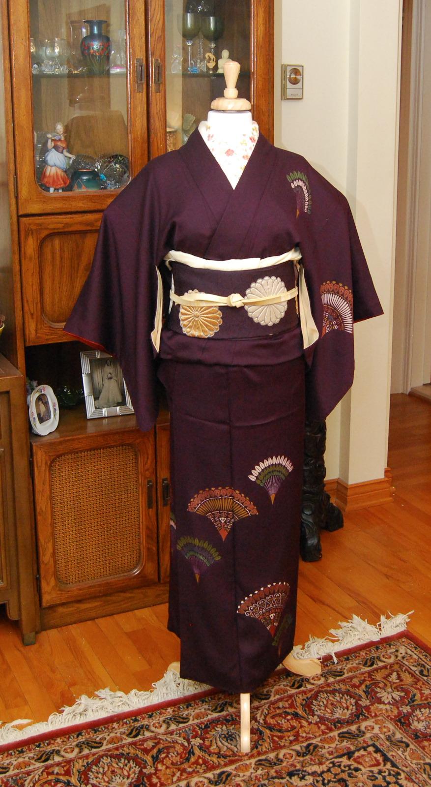
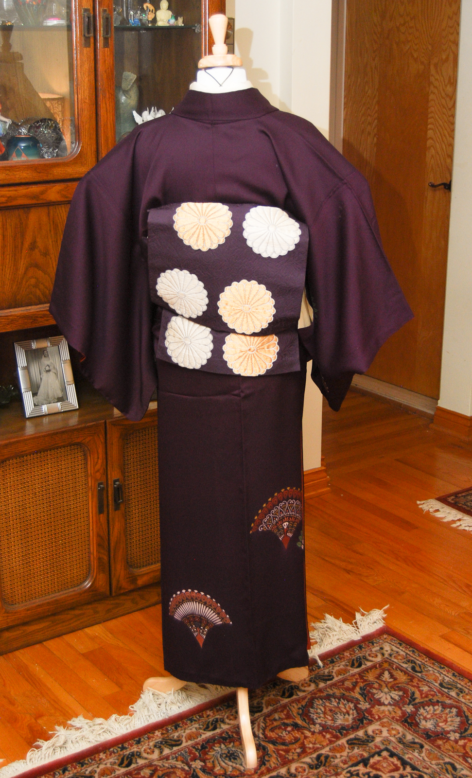

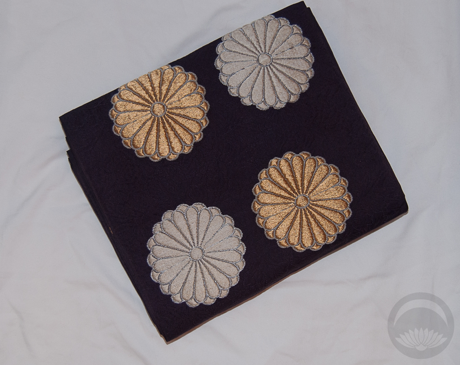
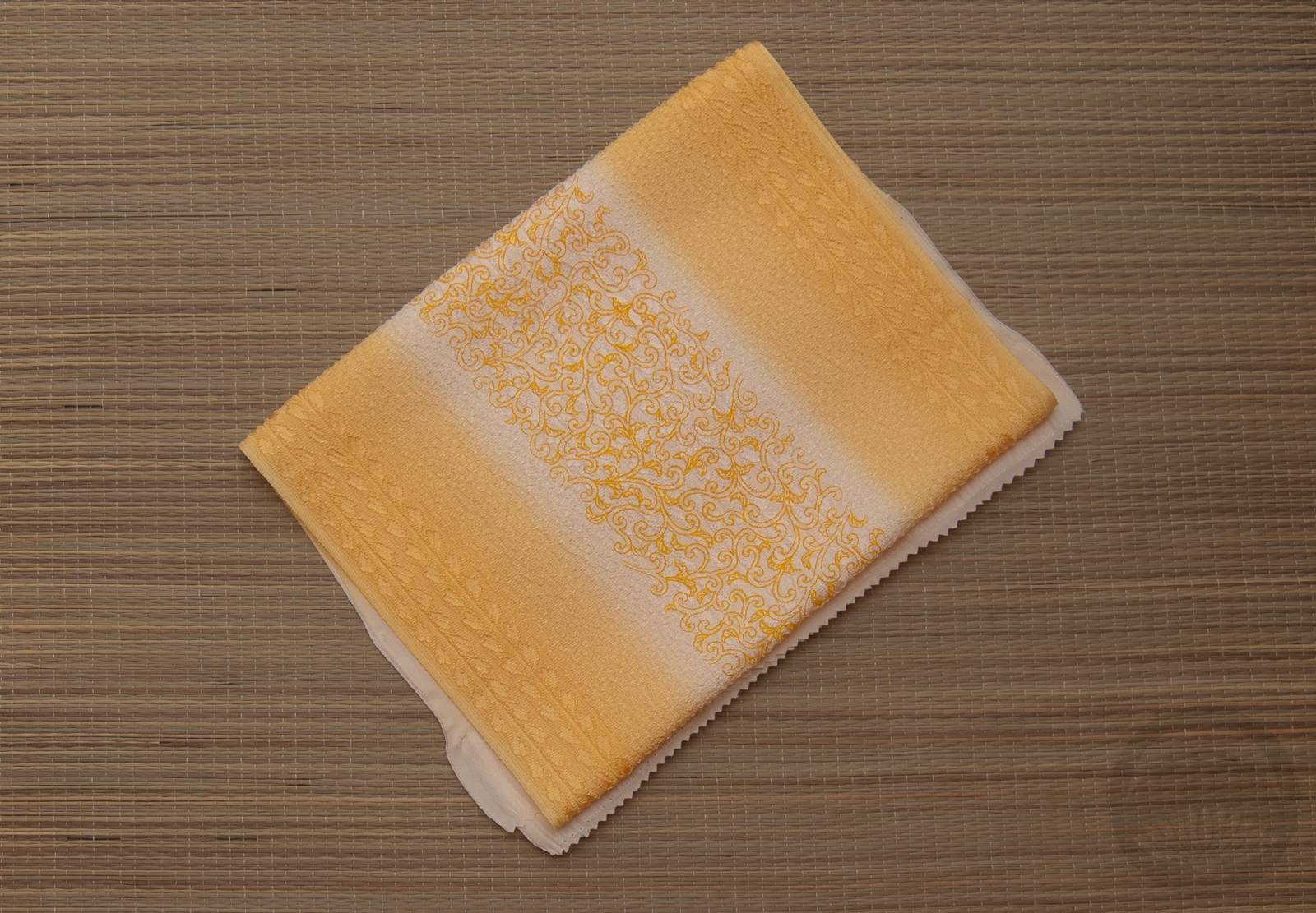
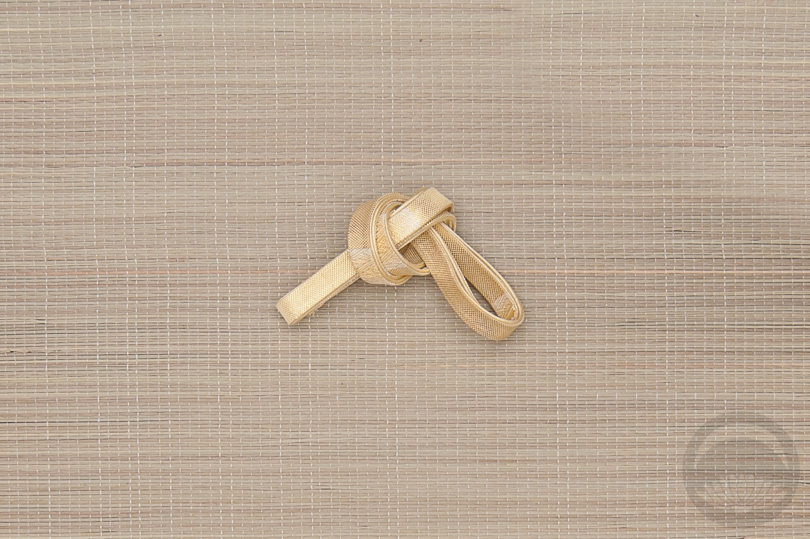
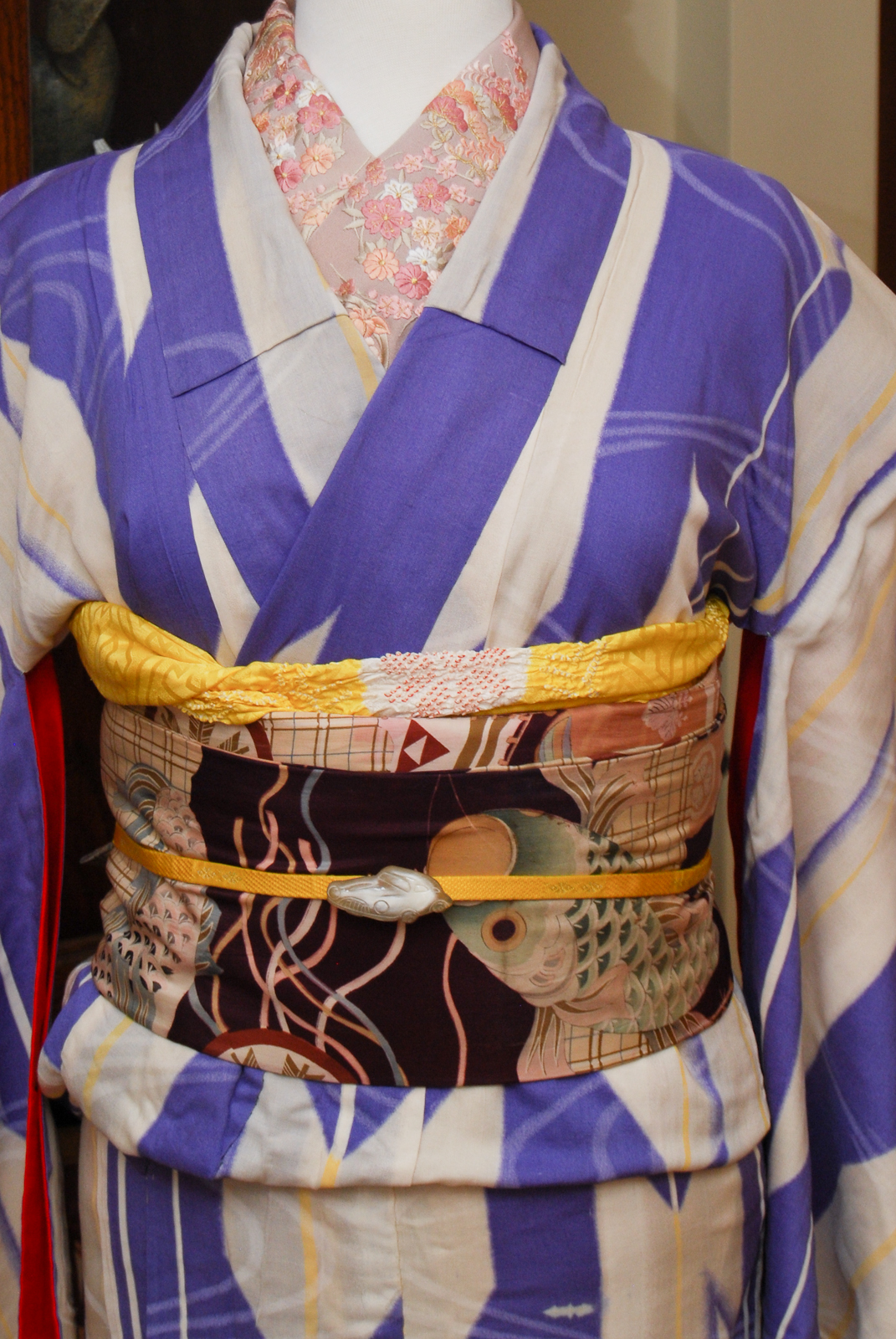
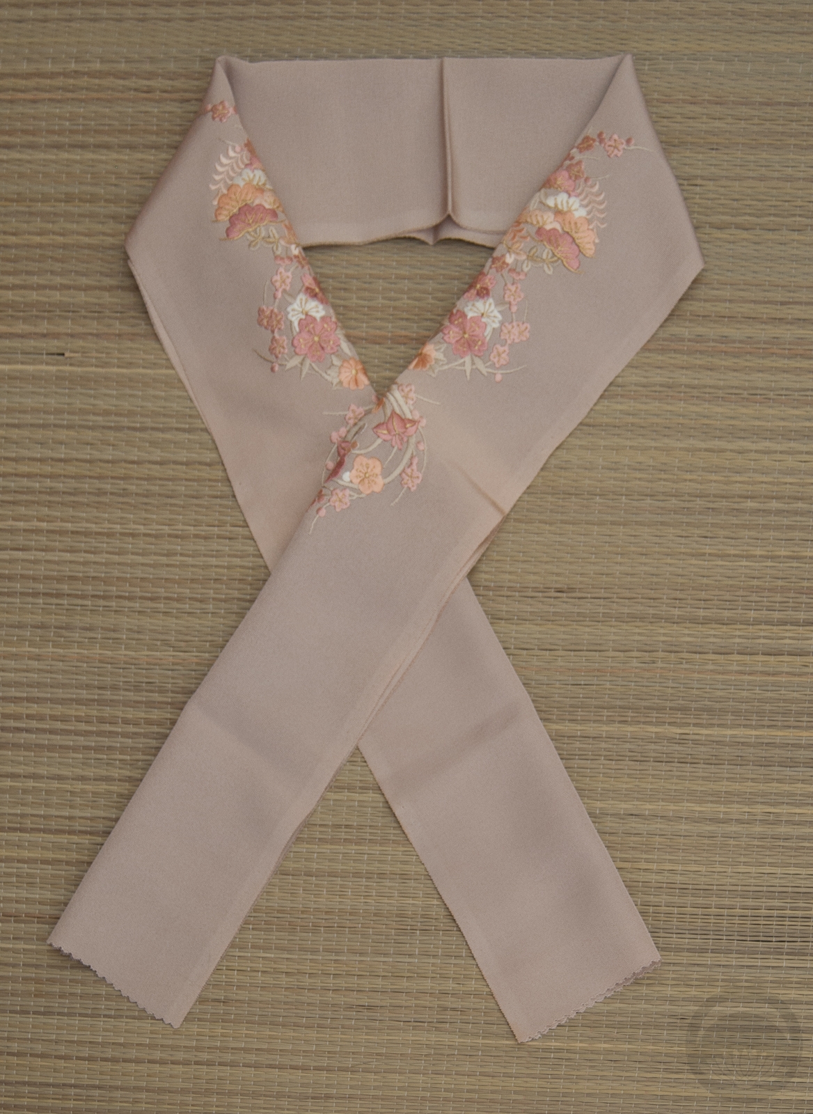
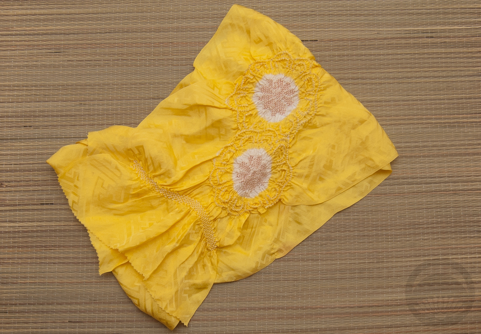
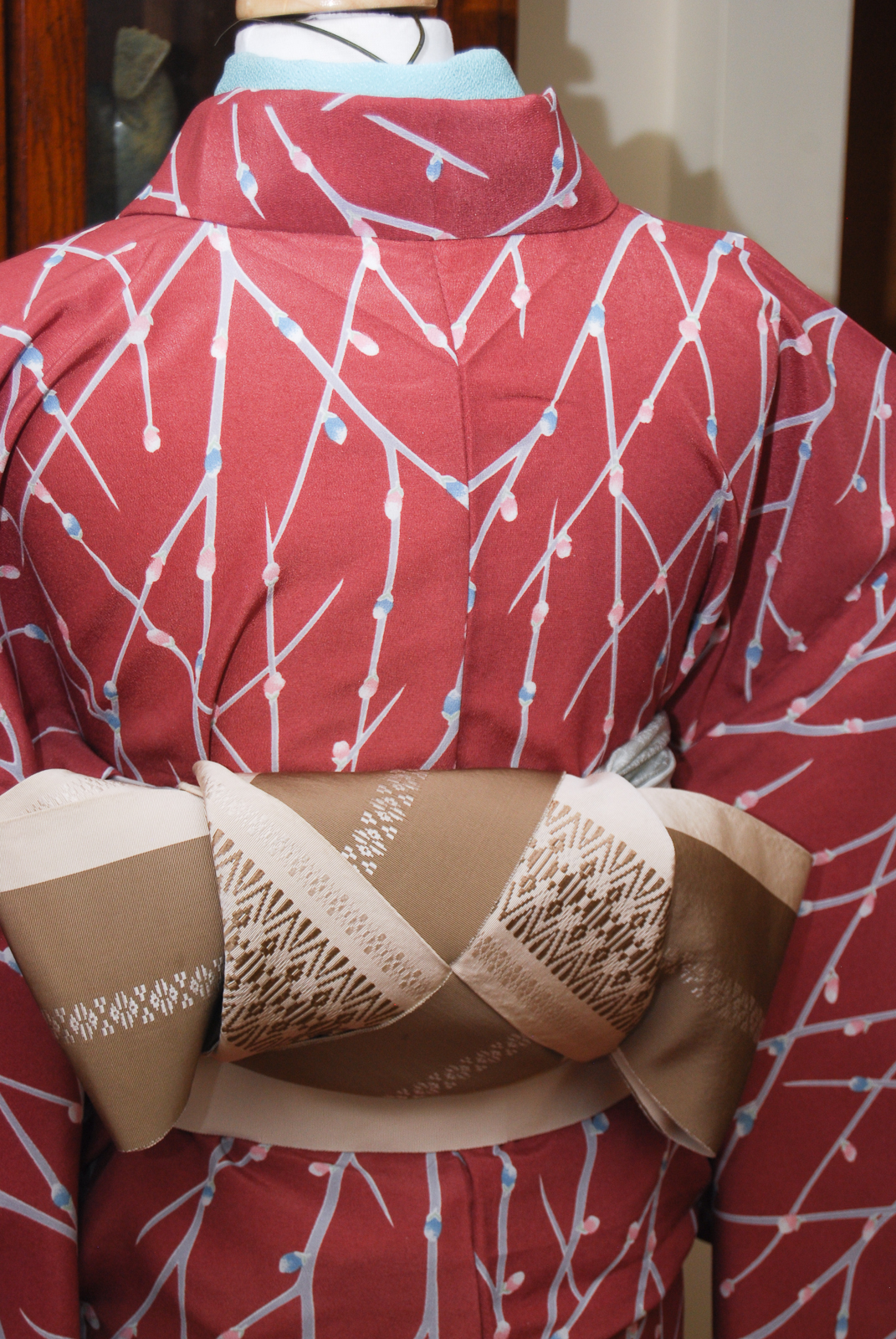
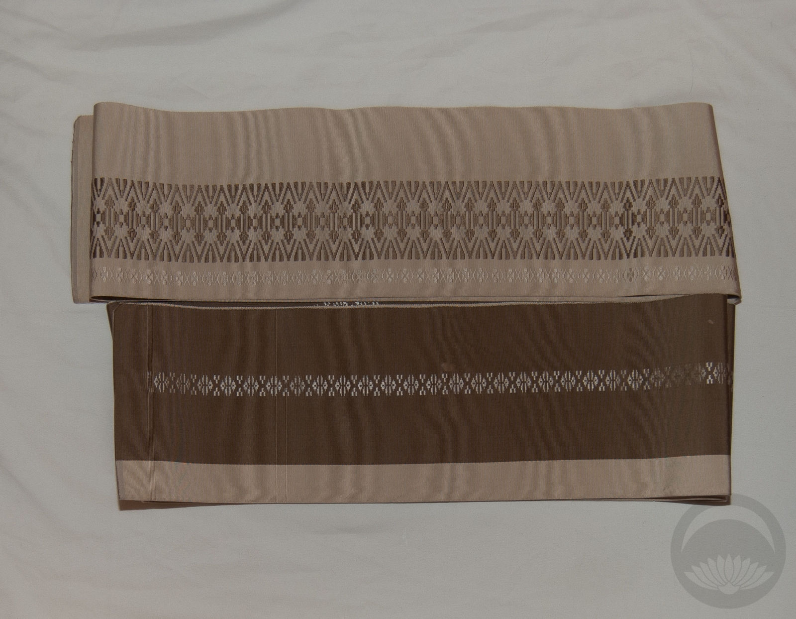
All that being said, I am completely and utterly thrilled with how well these two pieces suit each other. Not only are the base colours nearly identical, but the abstracted half-round peacock motifs perfectly echo the graphic round kiku on the obi. I decided to emphasize those motifs by accenting the outfit with cream and gold accessories, and I don’t think I could be happier!
Items used in this coordination
-
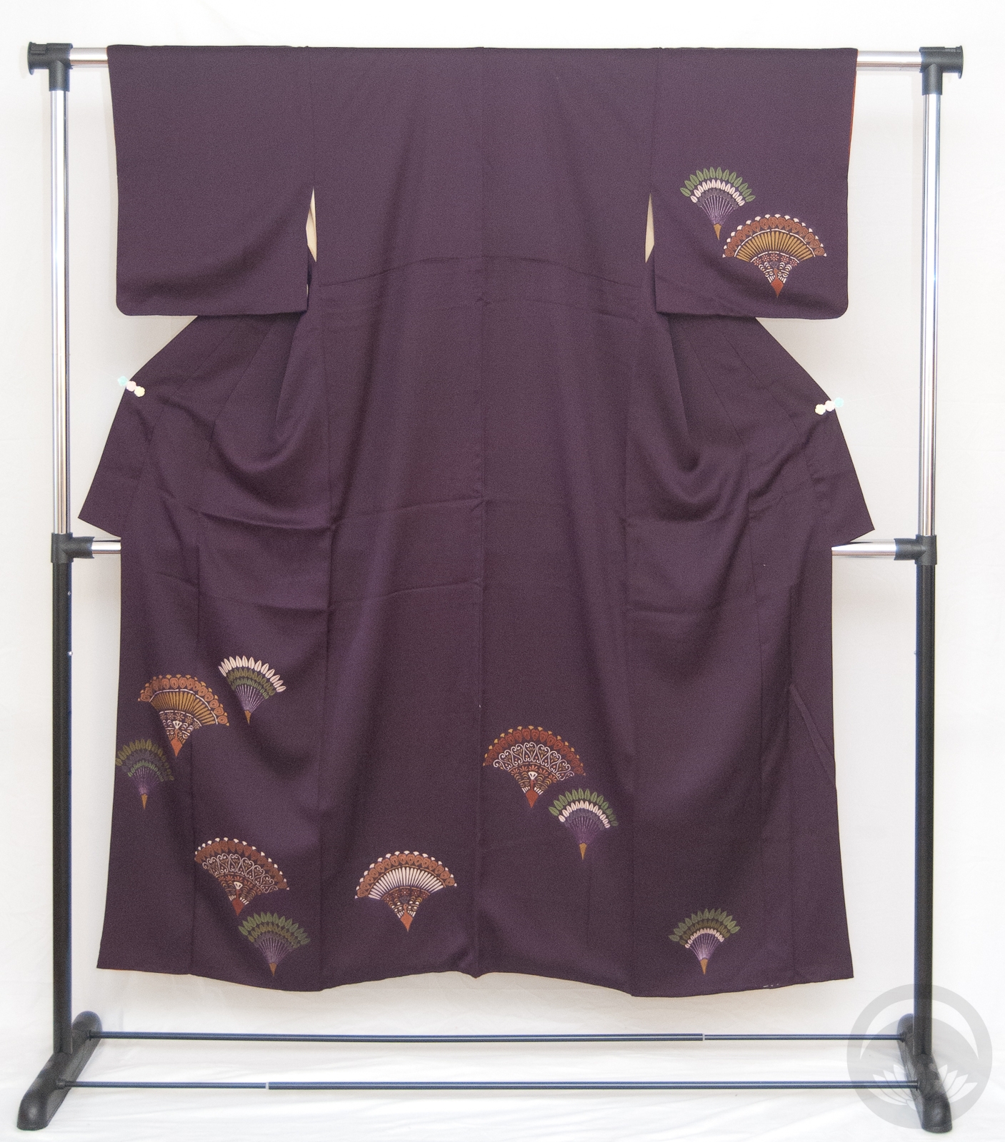
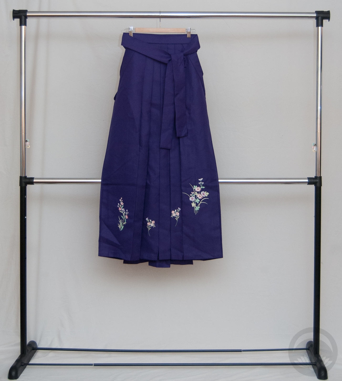
- Eggplant with Abstract Peacocks
-
- Plum with Kiku
-
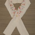
- Sakura

-
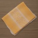
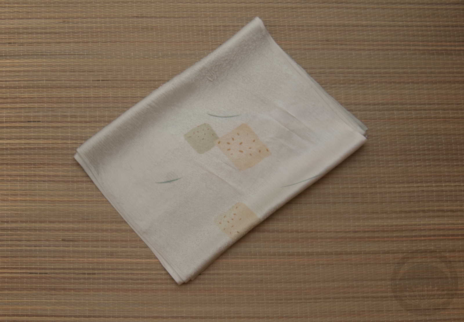
- White and Gold Rinzu
-
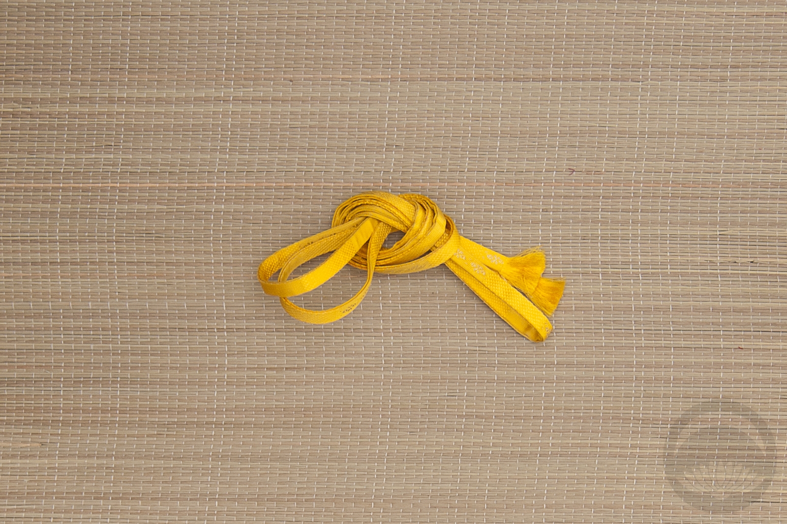
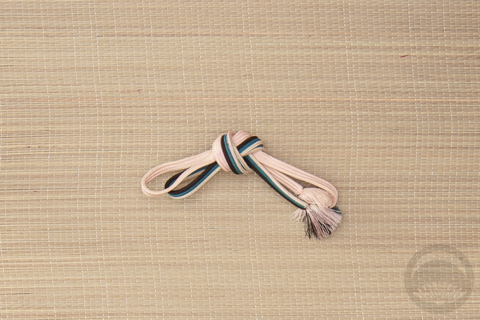
- Saga-nishiki all Gold


 Bebe Taian
 CHOKO Blog
 Gion Kobu