
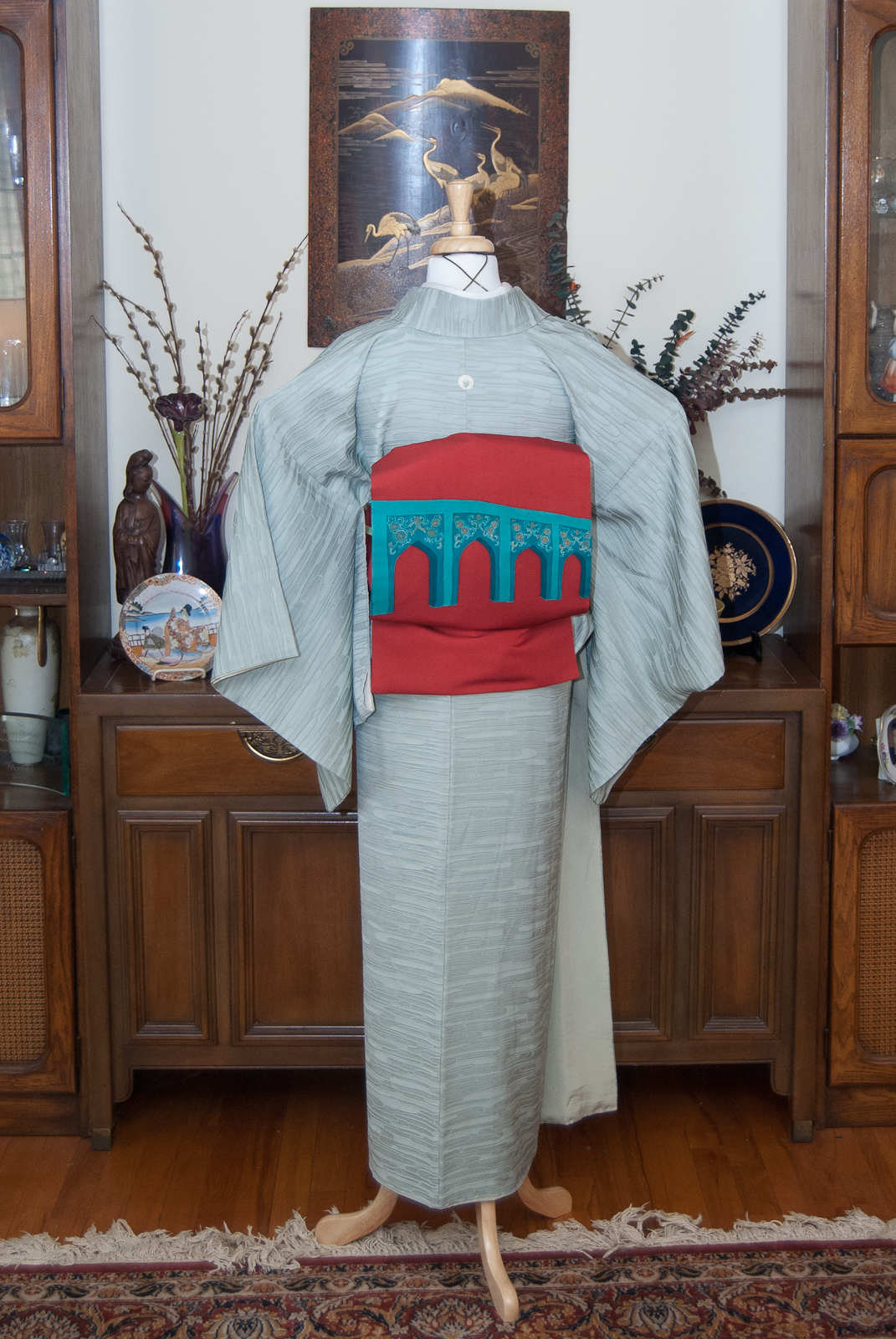
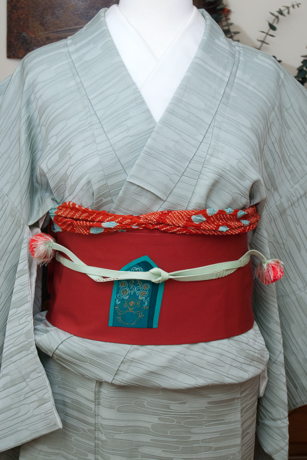
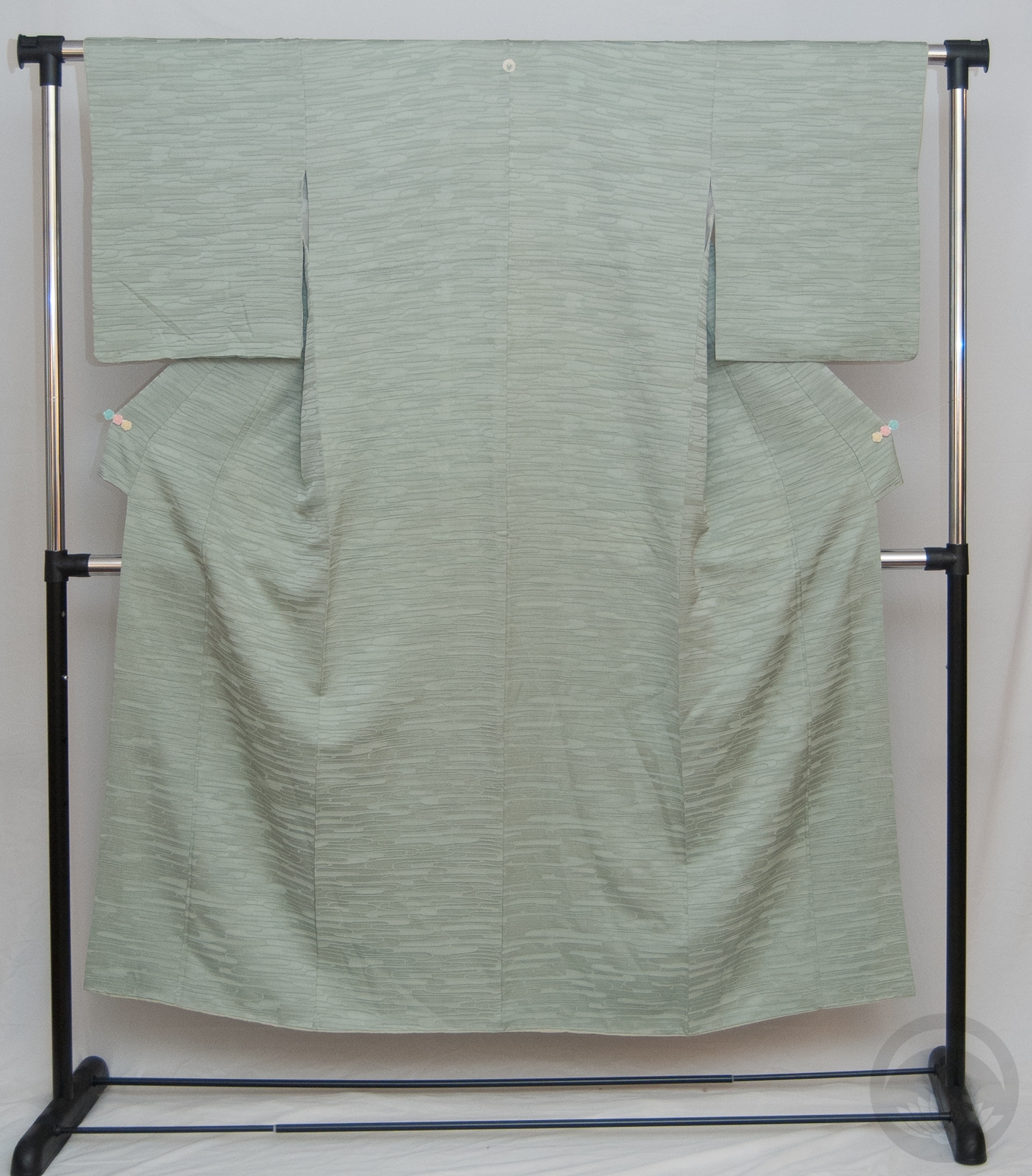
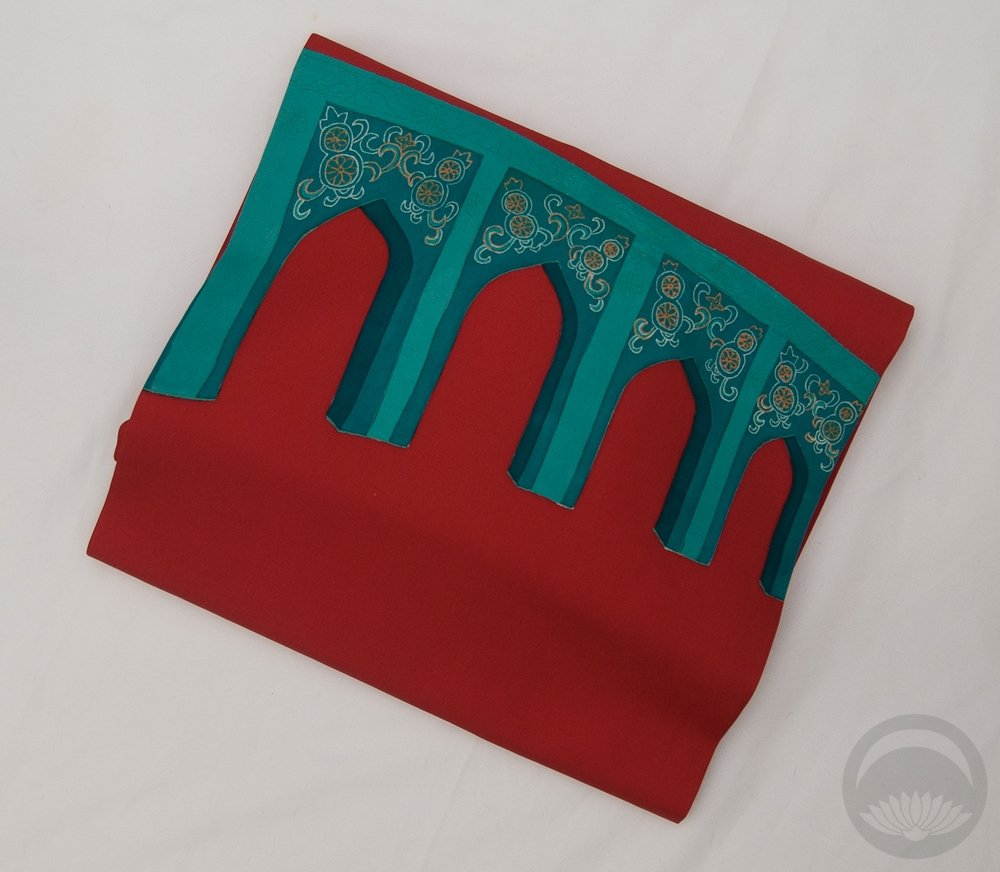
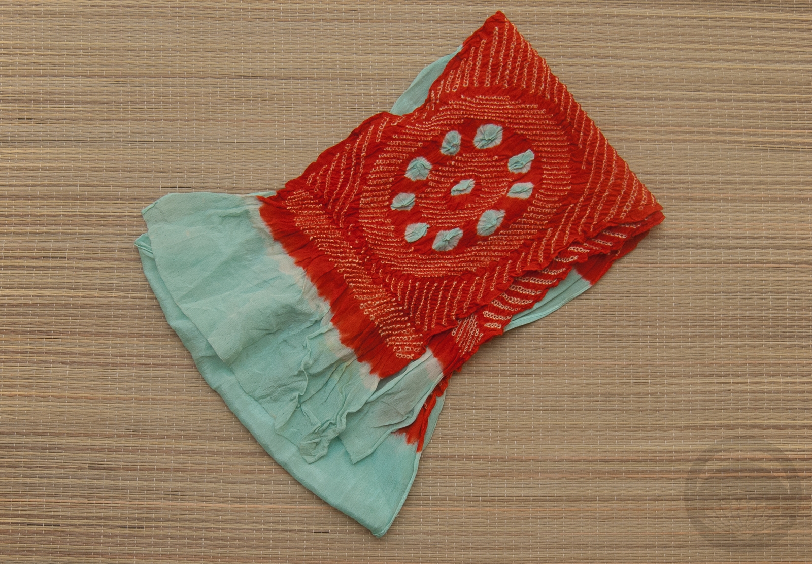
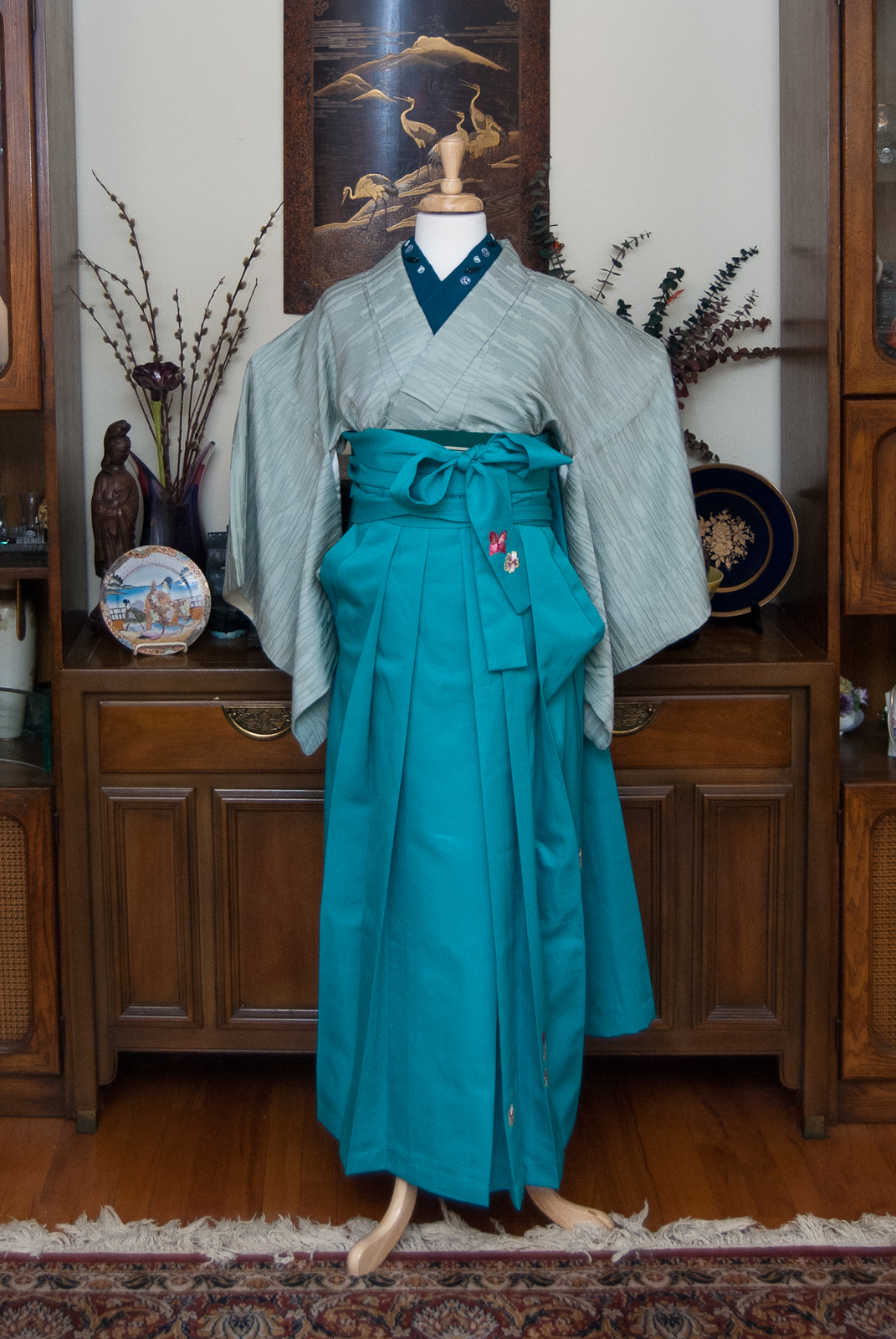
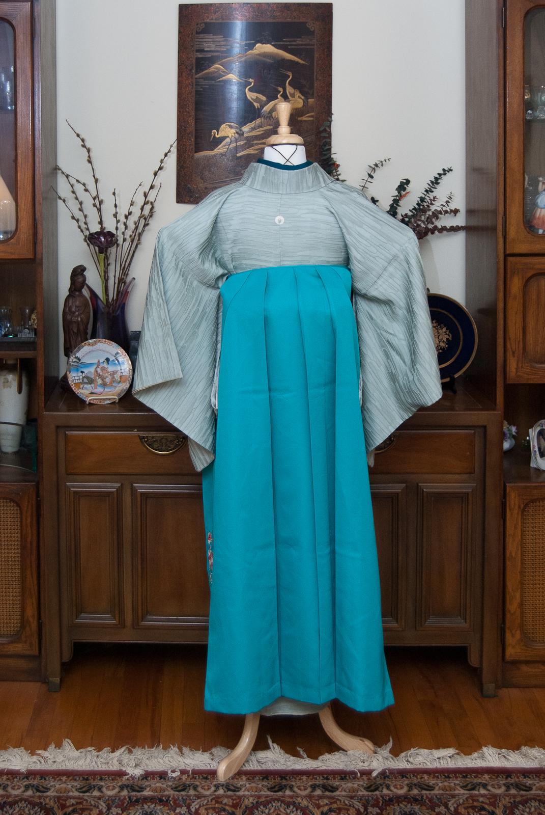
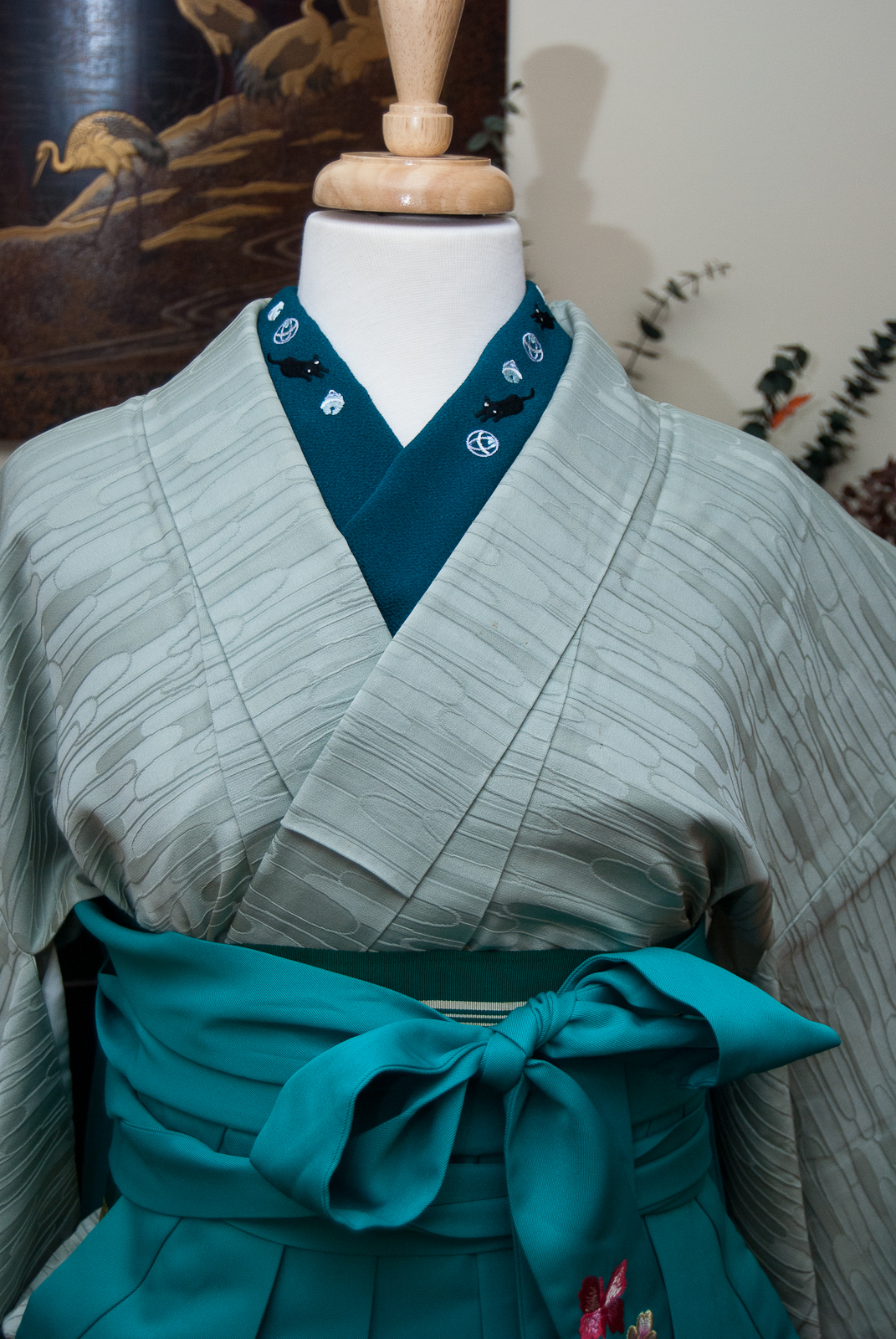
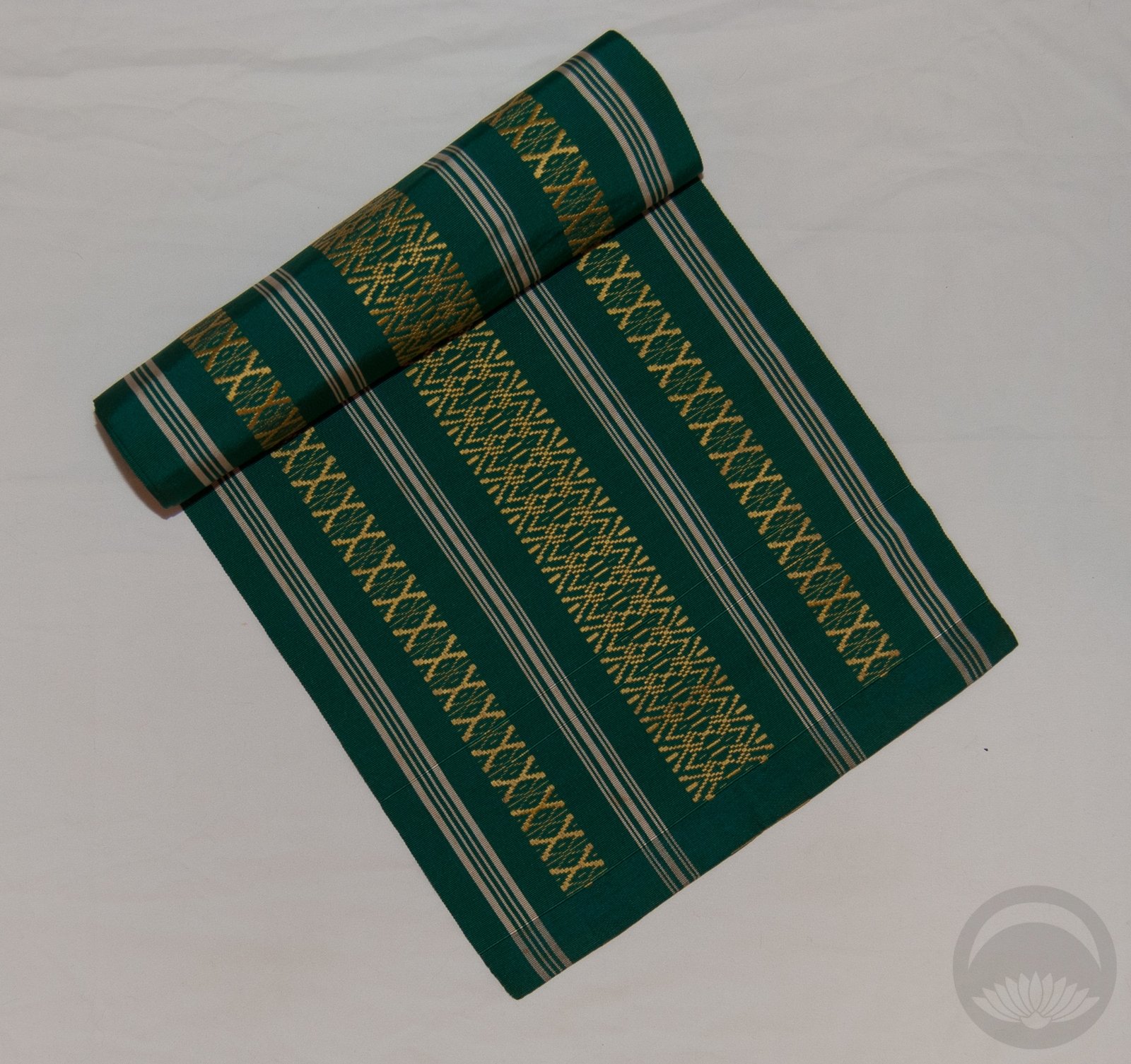
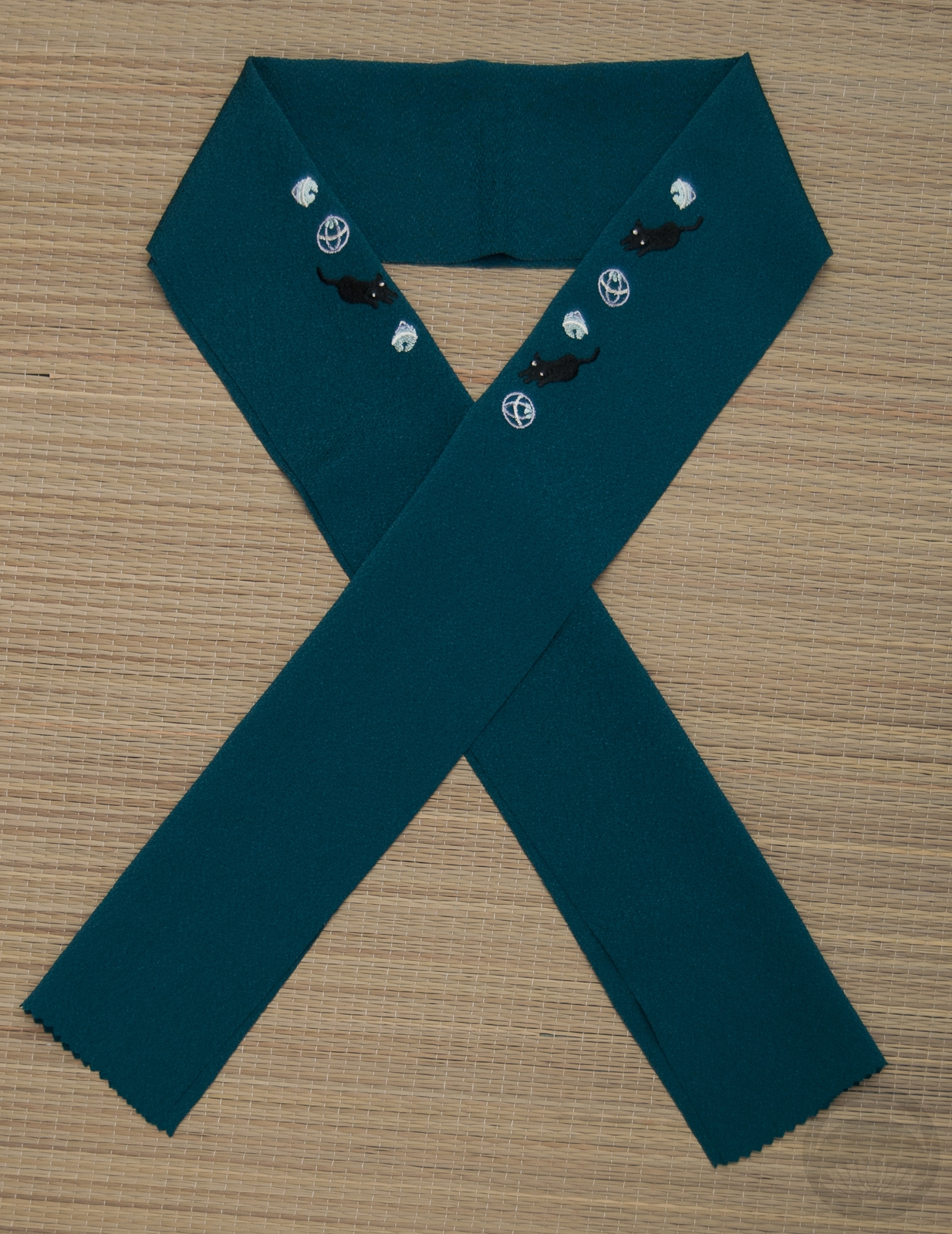
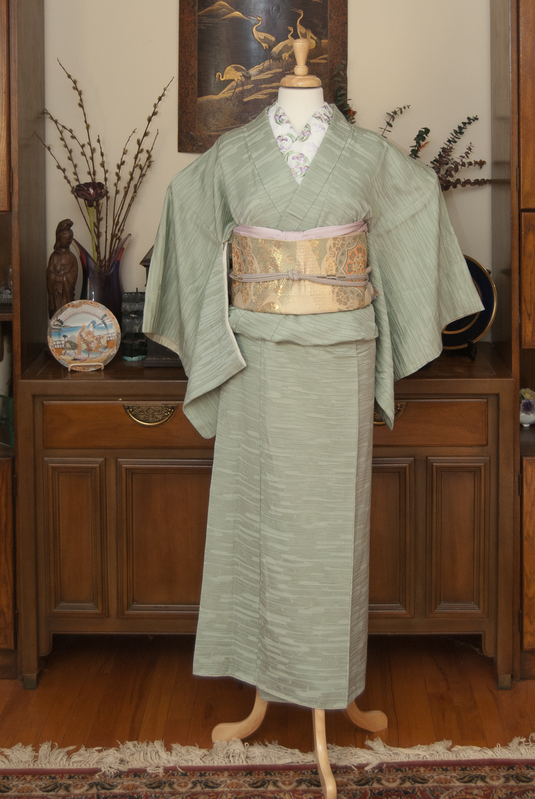
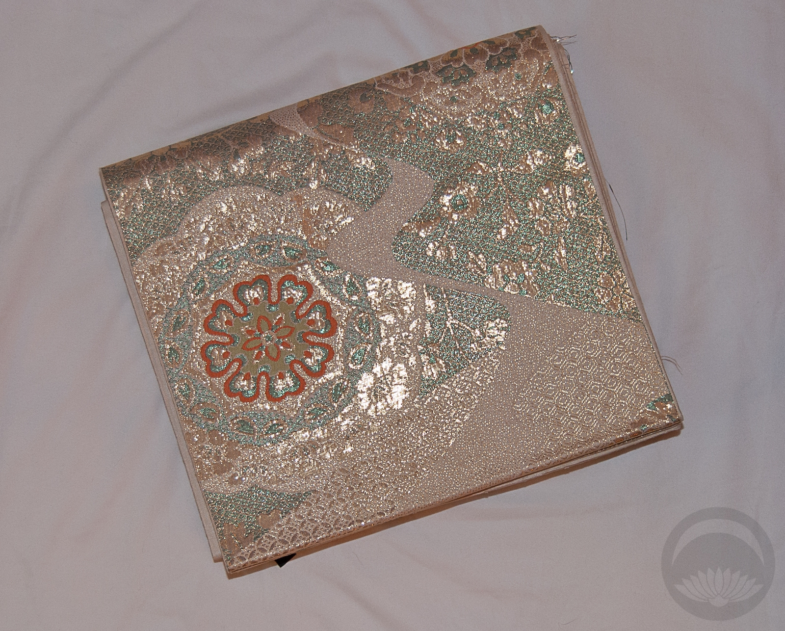
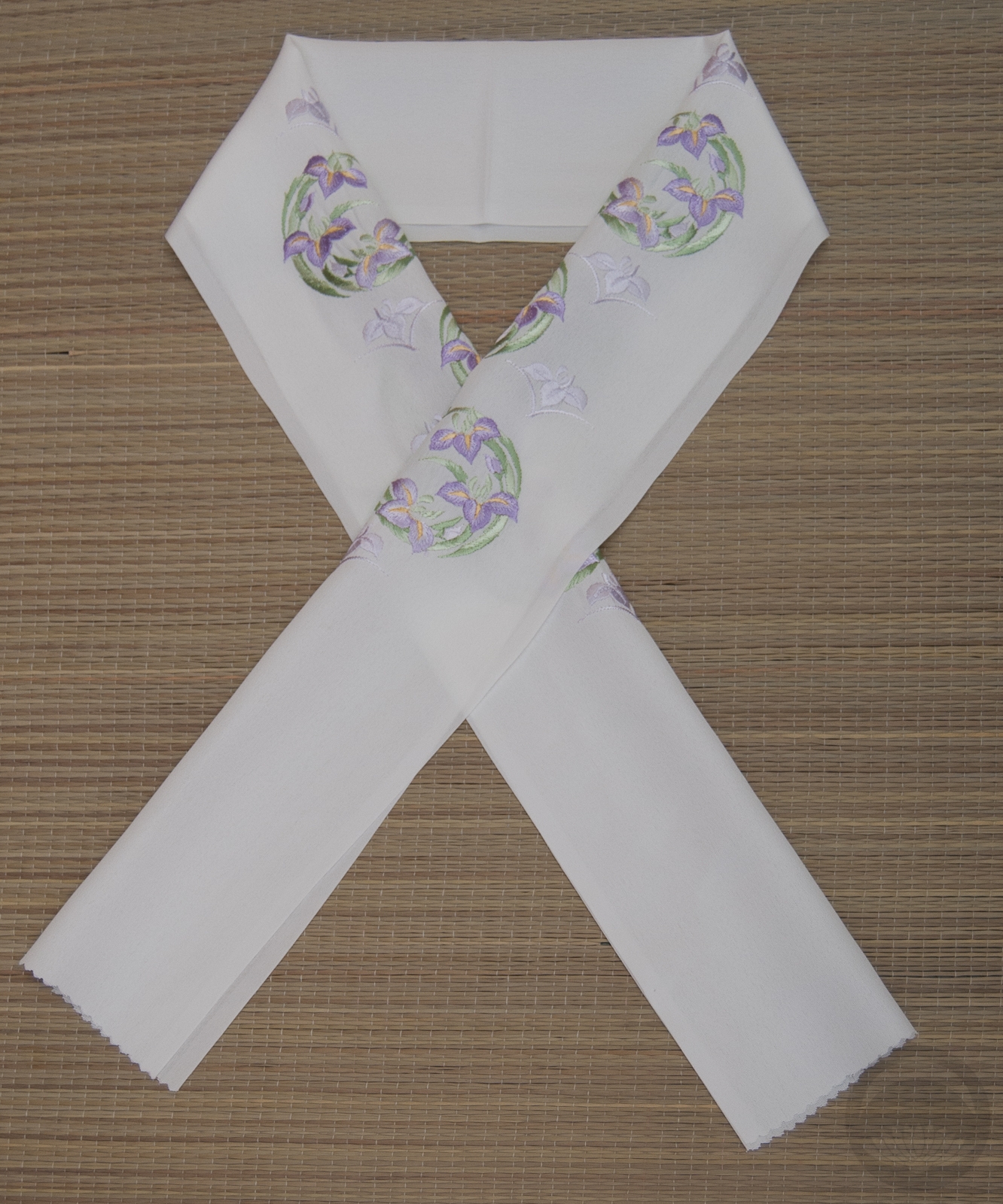
One of the great things about iromuji is how they can allow you to really focus attention on something other than the kimono itself. They make a great neutral canvas for a really bright or busy obi. I decided for this week’s entry that I’d do a really high-contrast coordination with a lot of “punch” to it, and this obi was the perfect place to start. It’s a very special obi; I received it anonymously from some lovely person online. I suspect their intent was to have me coordinate it with my Shah Mosque houmongi, but in the end the styles and colours were too different and I could never get them to work together. This kimono, however, is ideal. It’s a similar background colour to the houmongi and the orange-red of the obi really pops against it, but it doesn’t compete with the pattern on the obi itself. It’s a wonderfully neutral foil for the gorgeous obi, and the colours couldn’t work better together if they’d been made to go together. I’d initially thought of using a third bright colour (yellow or pink) for the obiage and obijime but then I remembered these pieces, and everything just clicked.
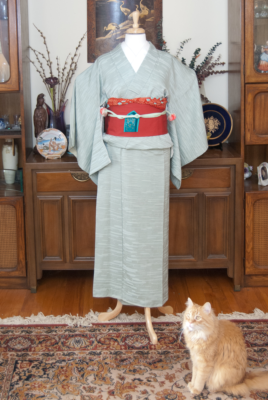
We’ve also got a special guest photobomber today! Those of you who are longtime readers have probably seen Vinnie before. He usually avoids the mannequin but today he decided he wanted to be the star of the show.
I hope you’re enjoying seeing these posts as much as I’m enjoying doing them! We’ve got one left, and then it’s time to focus on newer things.
One Kimono Four Ways
- February 2nd: Stylish and Subdued
- February 9th: Modern and Monochrome
- February 17th: Punchy and Popping
- February 23rd: Cute and Casual
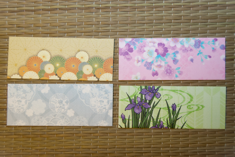
Items used in this coordination
-
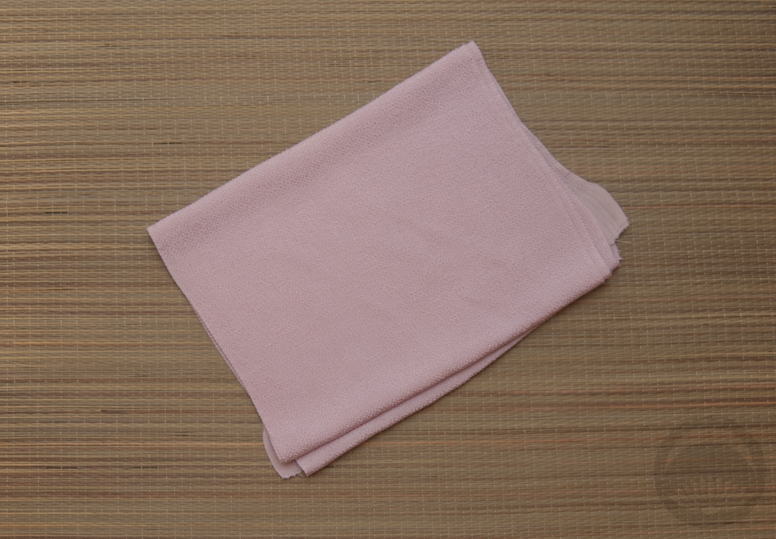
- Mint Green
-
- Moorish Arches
-
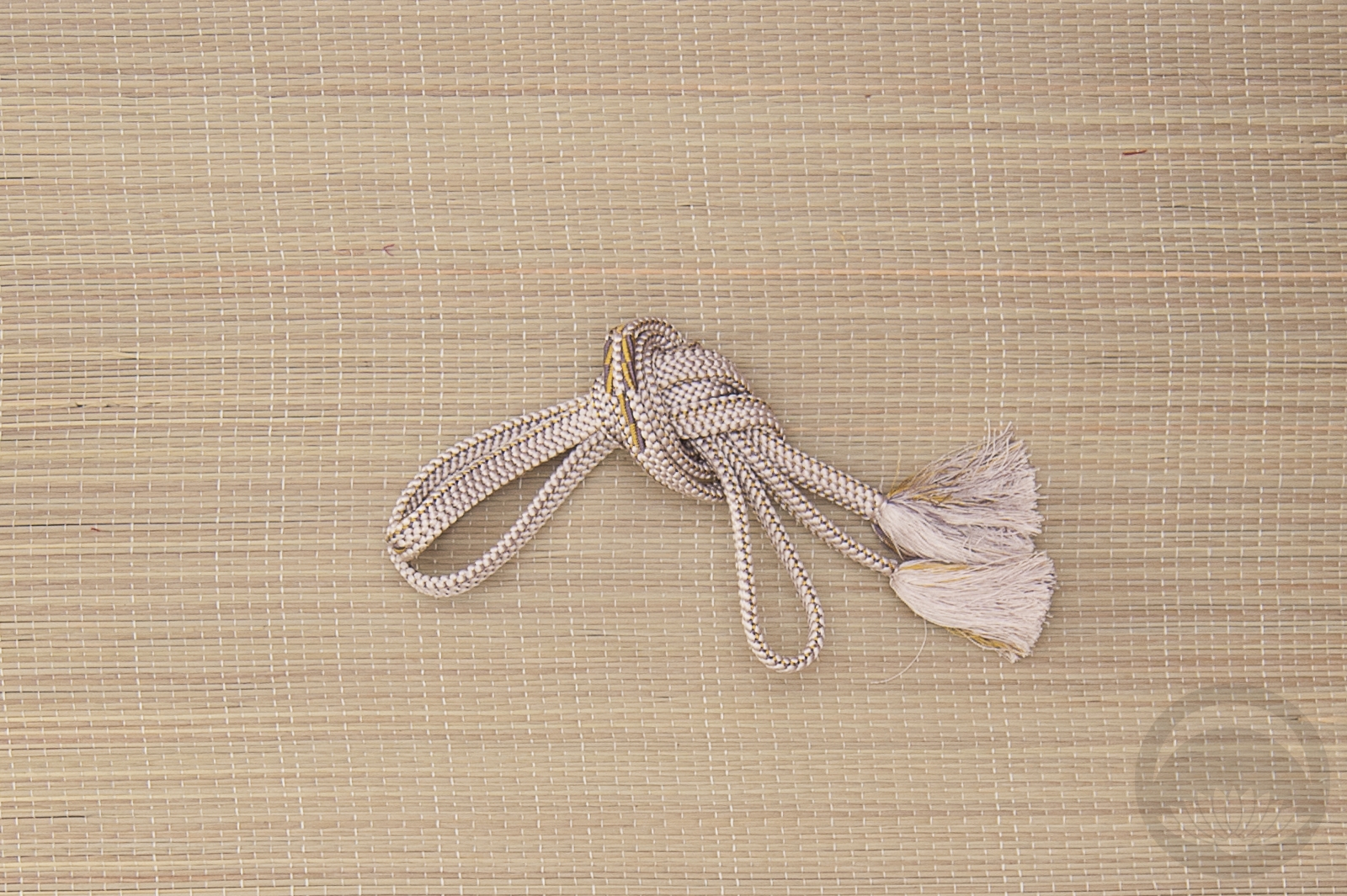
- Red and Blue Shibori
-
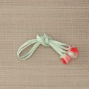
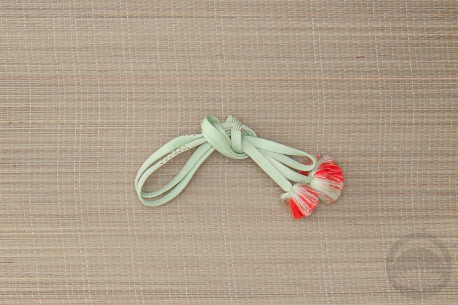
- Mint with Orange


 Bebe Taian
 CHOKO Blog
 Gion Kobu