Art Gallery – Takarazukushi Motif

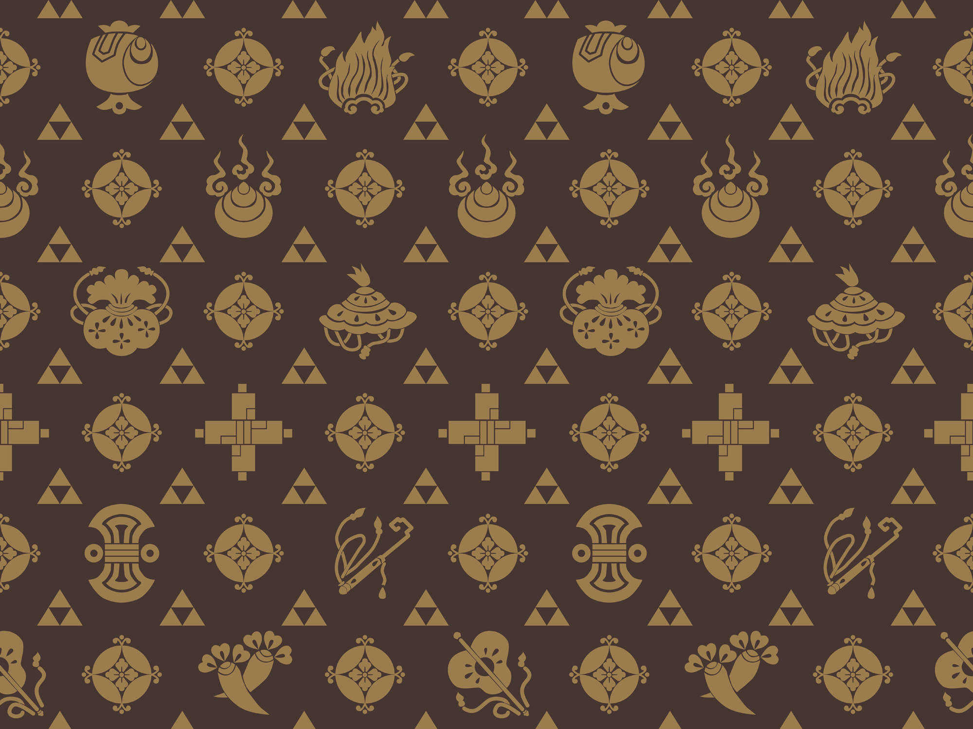
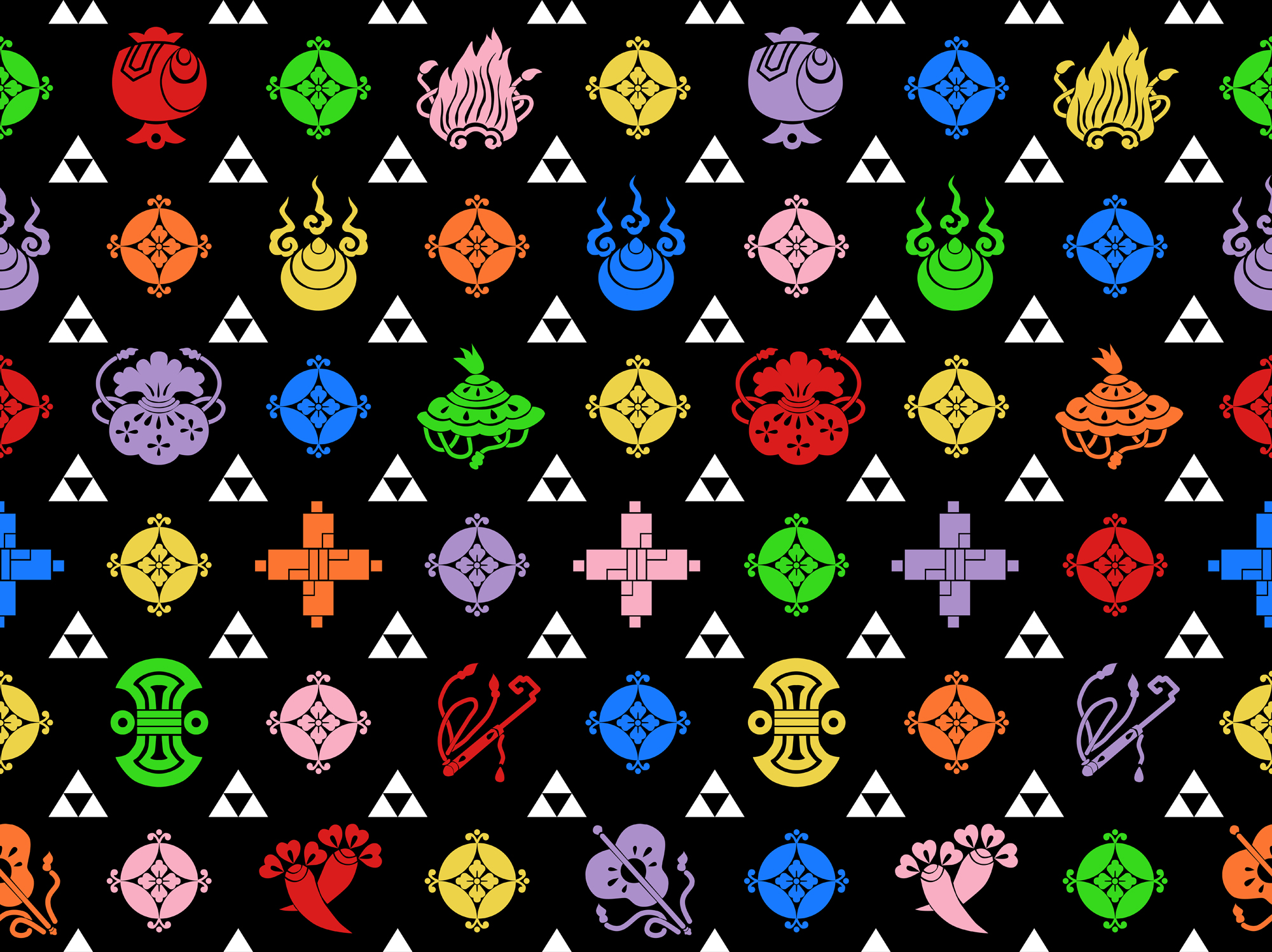
Happy March! Spring finally feels like it’s within reach after this miserable winter. Something about the change in the air has got my creative juices flowing. I got the idea for this pattern while stuck at work earlier this week and spent my day off getting it out of my system. I was inspired by the iconic Louis Vuitton monogram motif in both the traditional brown colourway and the neon colours, combined with simplistic kamon-based representations of Takarazukushi (宝尽くし, mixed treasures).

Typically the combined motif has seven of these treasures, and which seven varies from representation to representation, but I couldn’t decide which ones I like best so I drew them all. It was a challenge, but a fun one. They are:

  • nyoihōju (jewel of one’s wishes)
  • kakuremino (cloak of invisibility)
  • kakuregasa (hat of invisibility)
  • chōji (clove)
  • uchide no kodzuchi (fortune-bringing small mallet)
  • hōyaku (treasure key)
  • kinnō (money bag)
  • makimono (scrolls)
  • fundō (counterweight)
  • gunhai (war fan)
  • shippō (seven precious gems)

See if you can figure out which one is which! The three triangles that look like the Triforce from Legend of Zelda is uroko (鱗 fish scales motif), often paired with takara. I wanted something a little simpler and more neutral for the smaller repeat, and think this worked out great.

Feel free to download these patterns and use them as wallpapers (right-click and “Open as new window” to get the large version), phone lock screens, or whatever other personal use tickles your fancy. They’re seamless so they’ll repeat very smoothly. Just please don’t use them on things you plan to sell.

These patterns are available on all sorts of cool products over in my Society6 shop, along with prints of some of my other kimono-adjacent artwork. Please do check them out, it helps the blog out enormously when people buy things from there!

Art Gallery – Rilakkuma & Friends


There are a number of Rilakkuma cafés spreading across parts of Asia, and on their coasters is this absolutely charming little drawing of Rilakkuma, Korilakkuma, and Kiiroitori in furisode-style kimono. The first time I saw it, I knew I wanted to make a little drawing based off of it, because it was just too cute. I ended up making this sort of quilted-style illustration and I think it turned out really well.

Now, I realise Rilakkuma is supposedly a boy bear, and putting him in a pink furisode seems a bit odd, but I figured since the original illustration had all three of them in furisode with female-type dressing and accessories, I’d just run with it. I’m glad I did, because this is so adorable it’s kind of making my teeth hurt. I’m quite happy with the end result.

If you’d like a print of this goofy little drawing, you can always click here to buy one from my Society6 shop. You get art, I get a few dollars to help defray the costs of this blog. Everyone wins!

Lastly, a quick note; for the next week or two, I will likely not be changing the mannequin. I’m in the throes of a nasty sciatica flare-up and it’s making it difficult to stand, let alone do something like wrestle with kimono. I’ve got lots of other fun things to share with you all in the meantime, and I appreciate your patience and understanding in advance.

Art Gallery – Washi Papercraft Maiko

Washi Papercraft Maiko This week has been a long and frustrating one. Bad weather, work stress, and my grandmother is having some medical issues. So yesterday, when I found myself with some free time, I decided to self-soothe by working on a digital washi papercraft maiko collage. Typically, I make these based on characters from pop culture – movies, cartoons, etc – and prints of those are available here. However, I realised that the bold and graphic shape of them would be very well-suited to traditional woodblock printing as well. Armed with my large collection of washi and chiyogami paper stock textures and scans, I set out to work.

I stuck to a primarily dusty, desaturated palette to keep things feeling soft and vintage, and applied textures to her outfit to bring it all to life. I added the origami flowers as kanzashi and the bamboo pole on her parasol to bring a bit more depth to it and make it look even more like a “real” mixed-media piece instead of an entirely digital one.

Overall, I’m very happy with how she turned out. It always feels good to create something pretty and share it with the world. I suspect I’ll be making more of these sometime in the future.


Spookitsuke – Non-Compliant

Until now, the outfits in this feature have been more thematic than actually costumey. Today’s coordination is a little bit different. This one is lifted straight out of the pages of one of my favourite current comic books, Bitch Planet by Kelly Sue deConnick. Without spoiling too much, the basic premise is that women who are deemed “non-compliant” are sent to an essentially lawless prison colony in space. Being deemed non-compliant can be as simple as being too loud, too big, too “unappealing” to men. It’s an incredibly interesting examination of gender and society. I would absolutely be deemed non-compliant and I revel in that.

There is one scene where one of the characters, in hologram form, plays the violin for her father. Typically, the inmates wear orange jumpsuits emblazoned with the NC logo, but in this scene she’s wearing a kimono with an NC obi. Due to the stylistic way she’s represented as a hologram everything is sort of pink and washed out, but I am going by the assumption that the kimono is the same colour as the jumpsuits. As soon as I saw this panel, I knew at some point I was going to try to reproduce the outfit.

I had big plans for this  costume. Unfortunately, life has a tendency to get in the way. Originally I was going to buy an orange iromuji and paint the obi. However, it’s nearly impossible to find an iromuji in prison-jumpsuit orange. Especially a cheap one, since I know I’d never wear something this colour aside from in this costume. As for the obi, I cut and sewed this inexpensive white obi into a tsuke to make it easier to work with, and I’d intended to stencil the Non-Compliant pattern onto it. Unfortunately, I couldn’t find any fabric paint that didn’t bleed all over and turn into a blurry grey mess. I fought with the whole thing for nearly two weeks – hence the lateness of this entry – and eventually figured I could put my image editing skills to use and at least make a composite of the outfit! Eventually I will make the obi and possibly wear it to a convention at some point in the future, but for now I think this works out quite well!

I know I’d initially said I had five outfits planned, but between my health being not great lately and this one being delayed, it’s going to be the final entry. I hope you enjoyed this little month-long venture into ways to wear kimono for Halloween!

Spookitsuke October 2016