
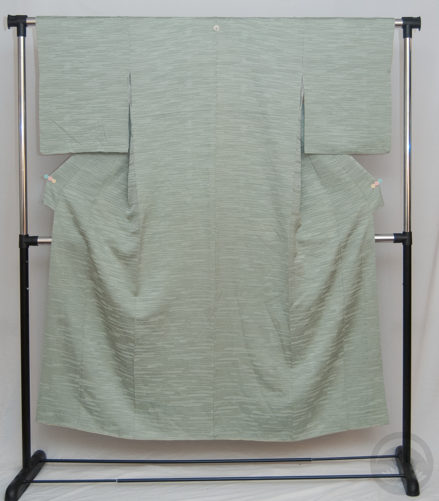
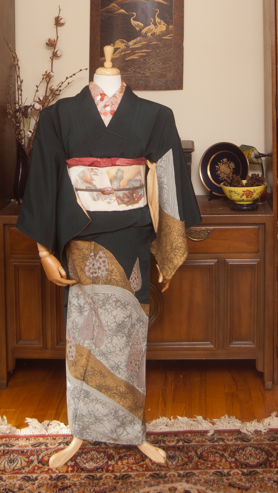
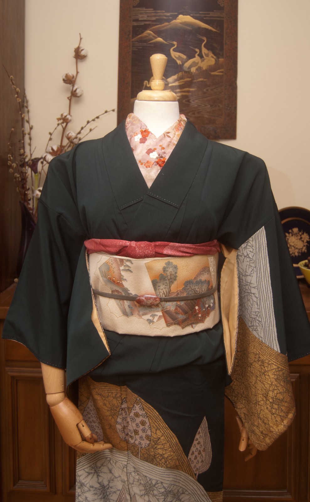
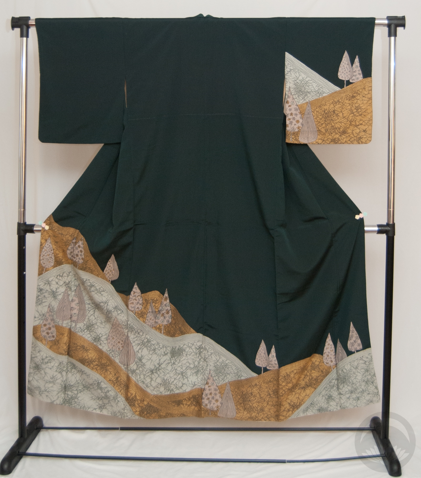
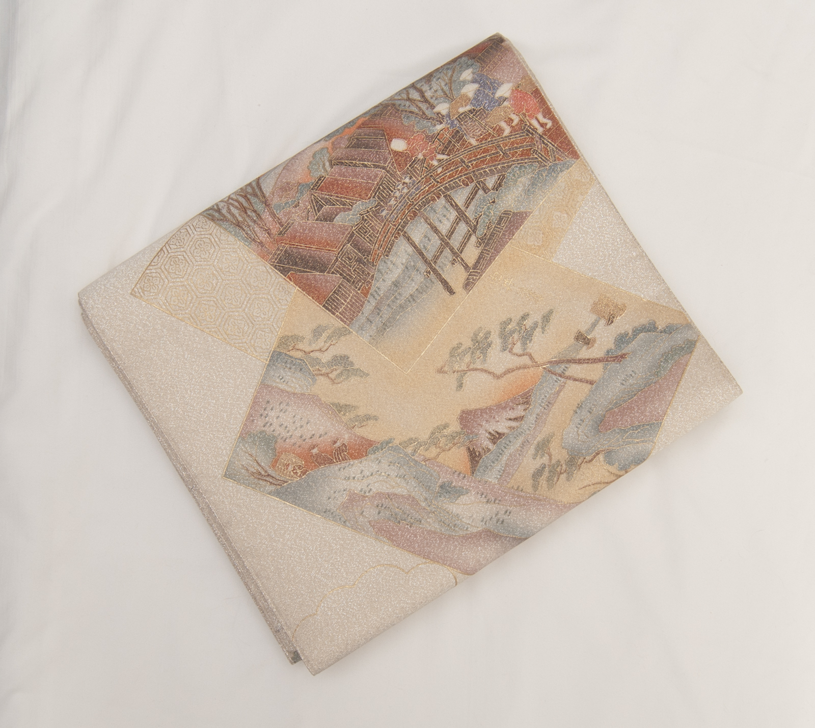
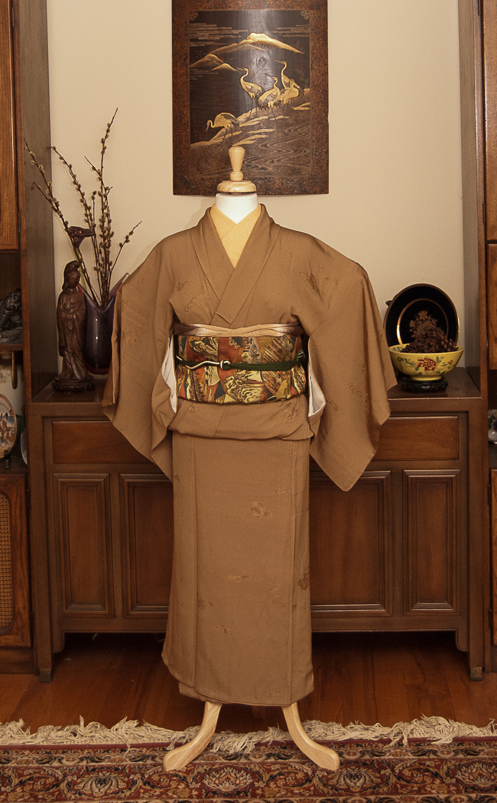
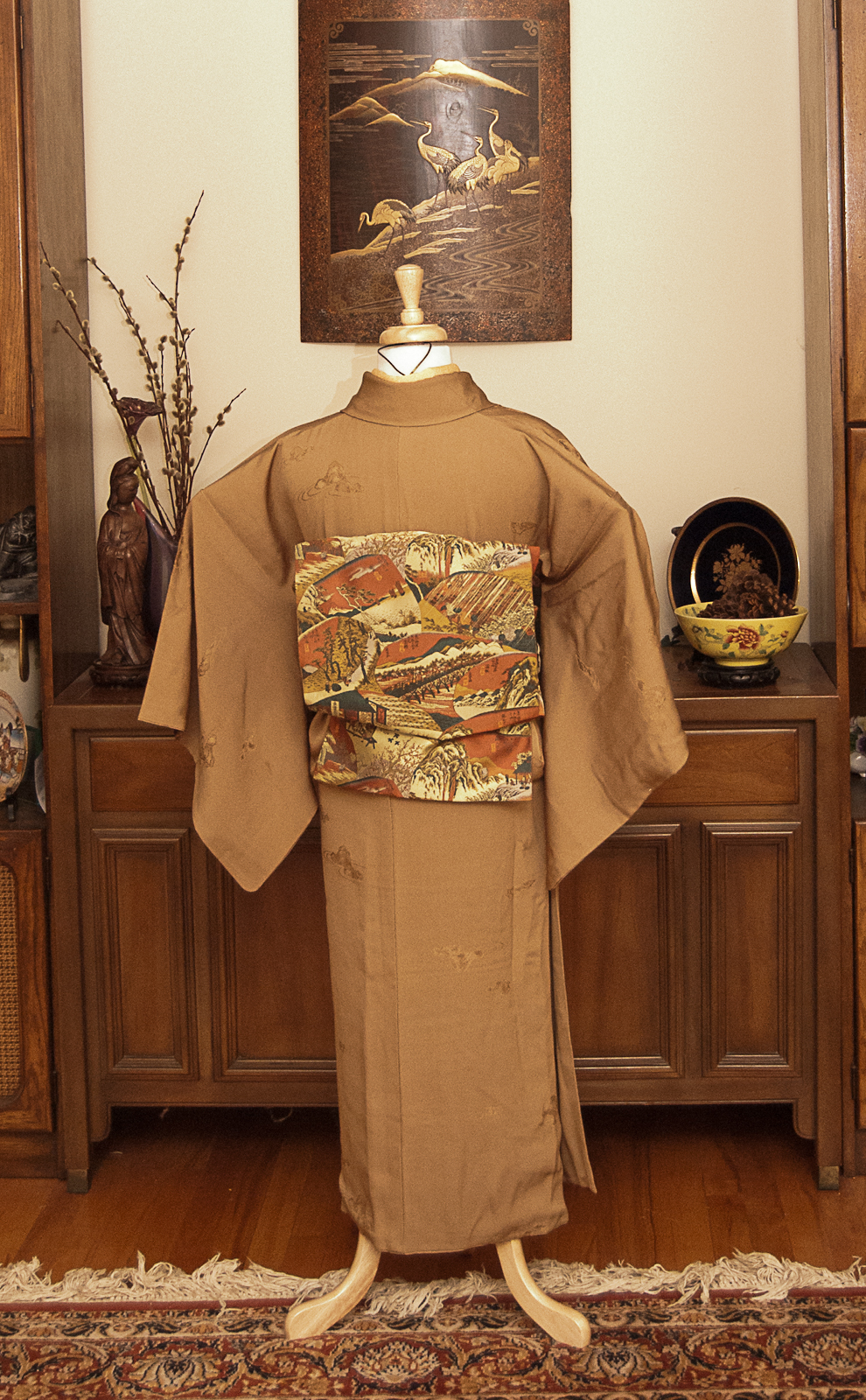
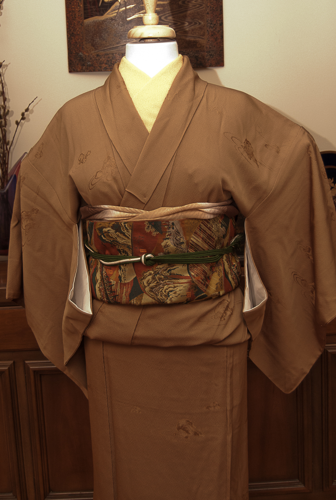
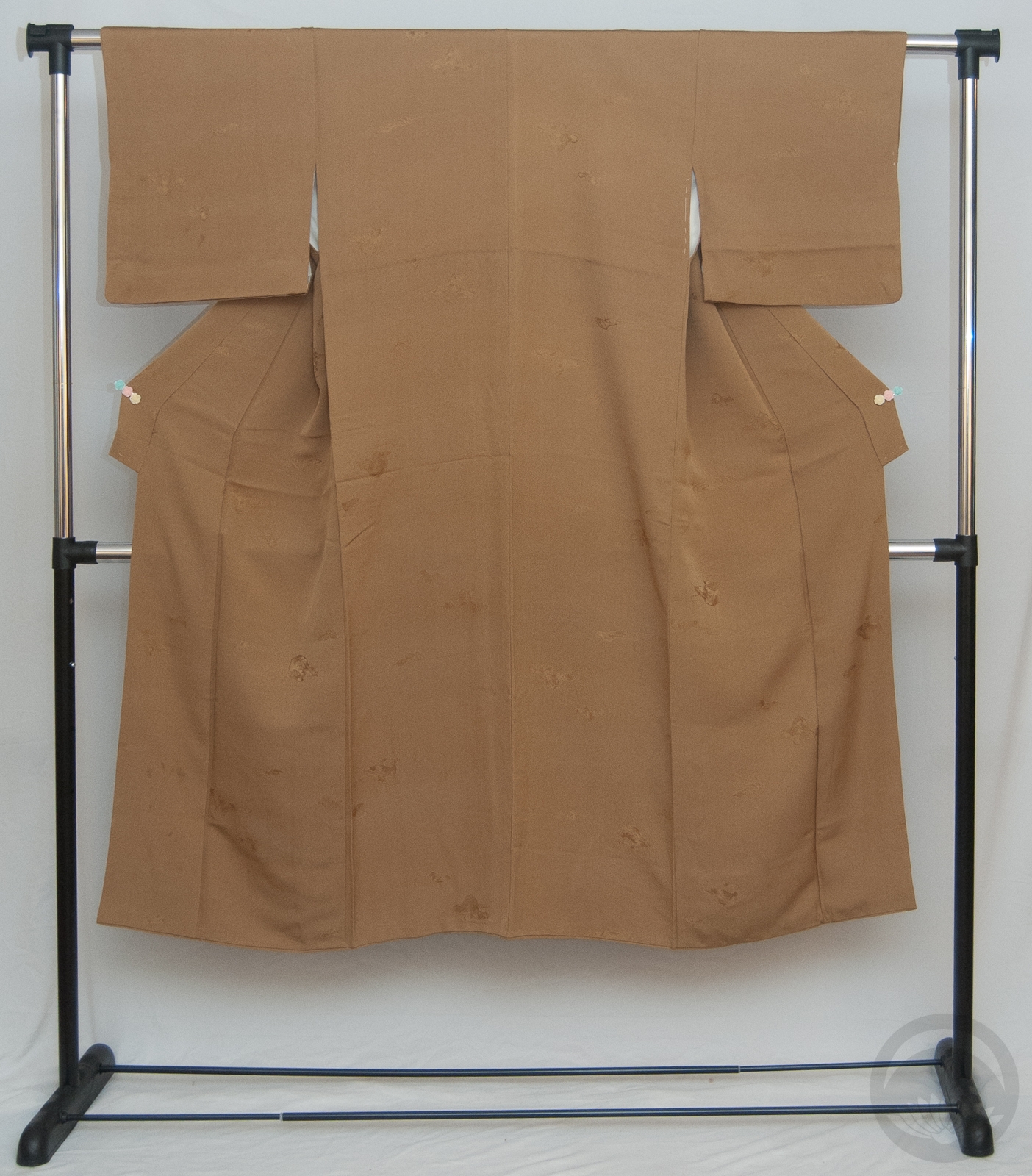
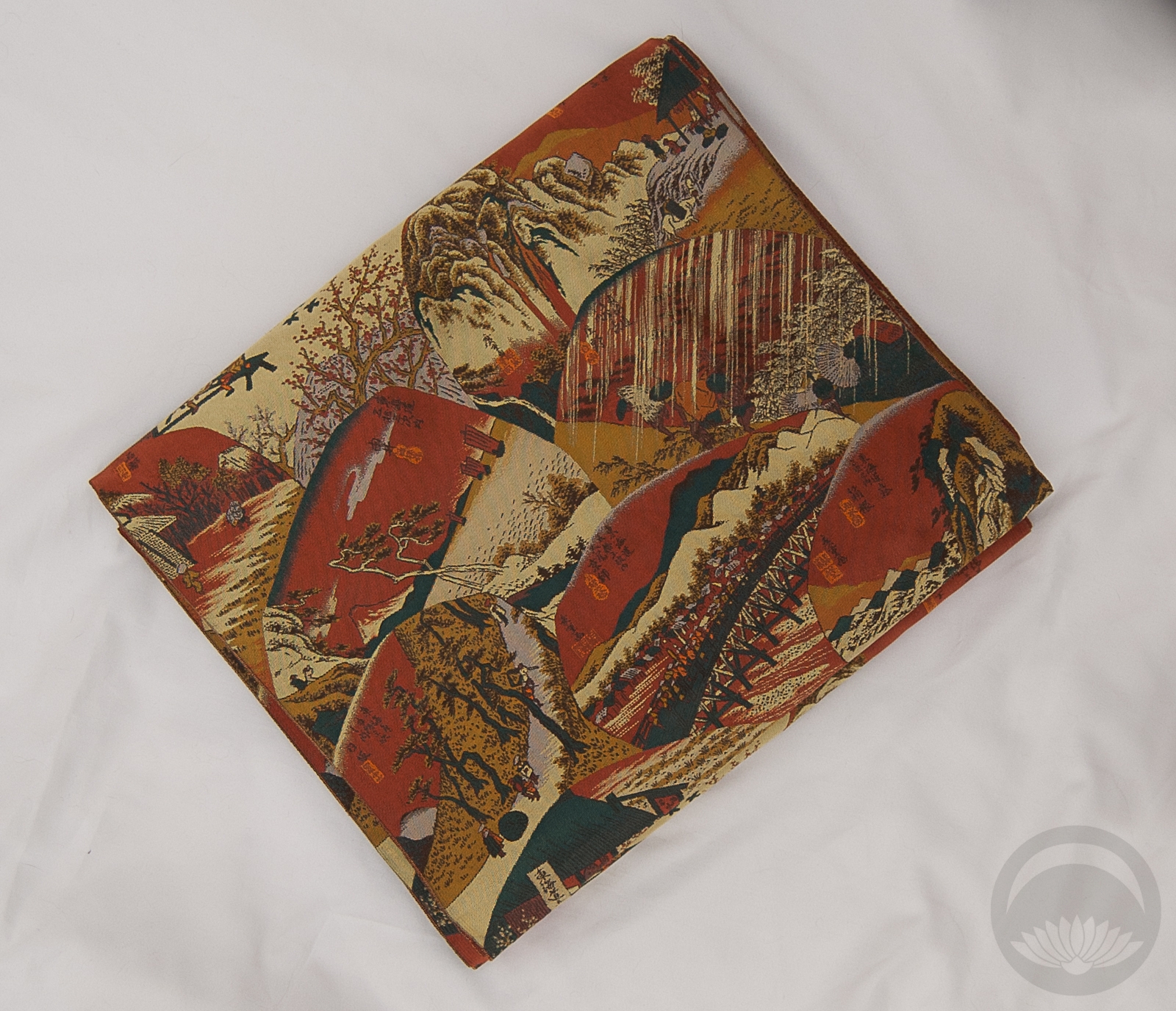
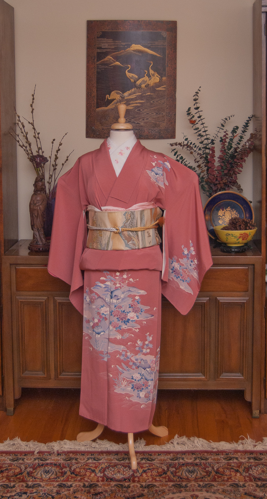
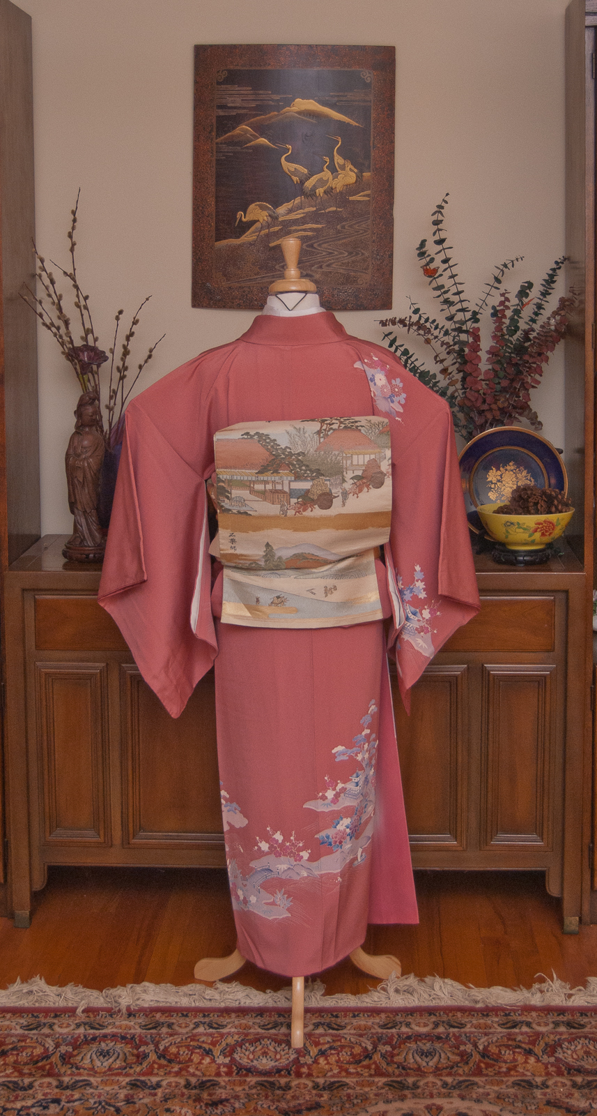
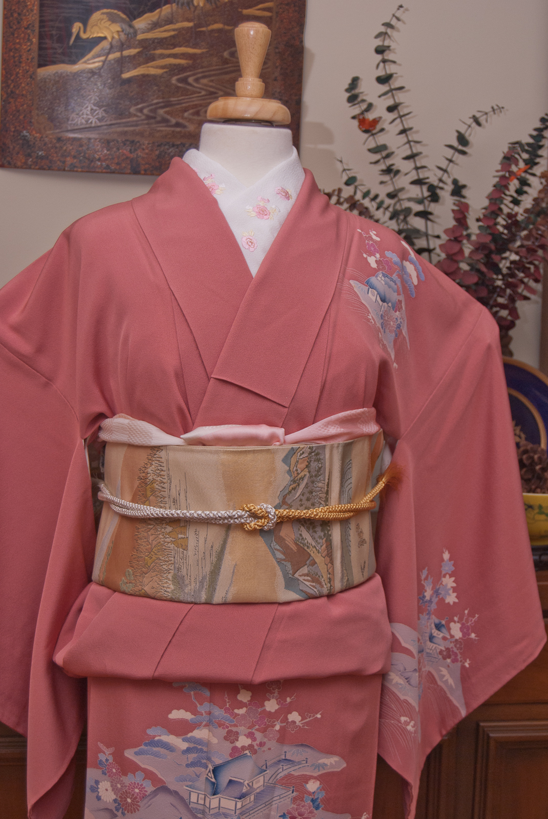
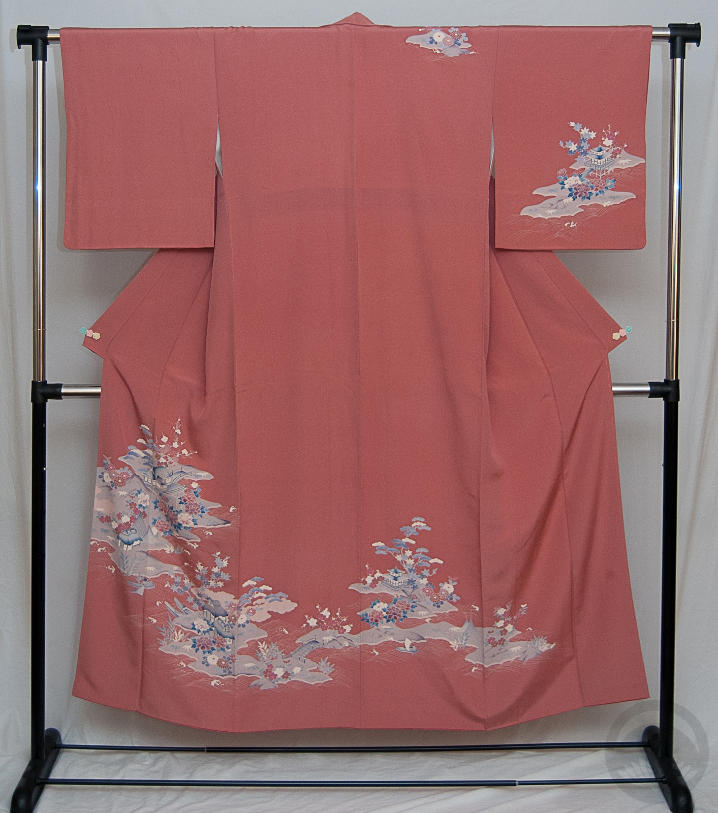
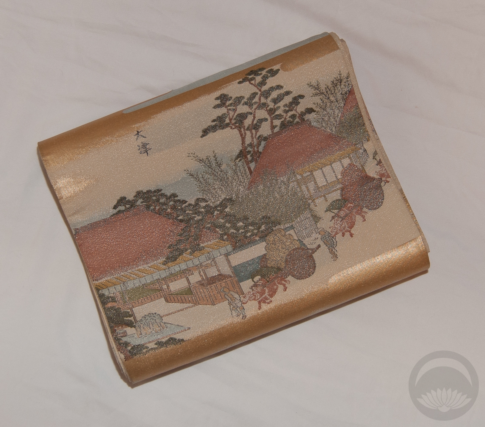
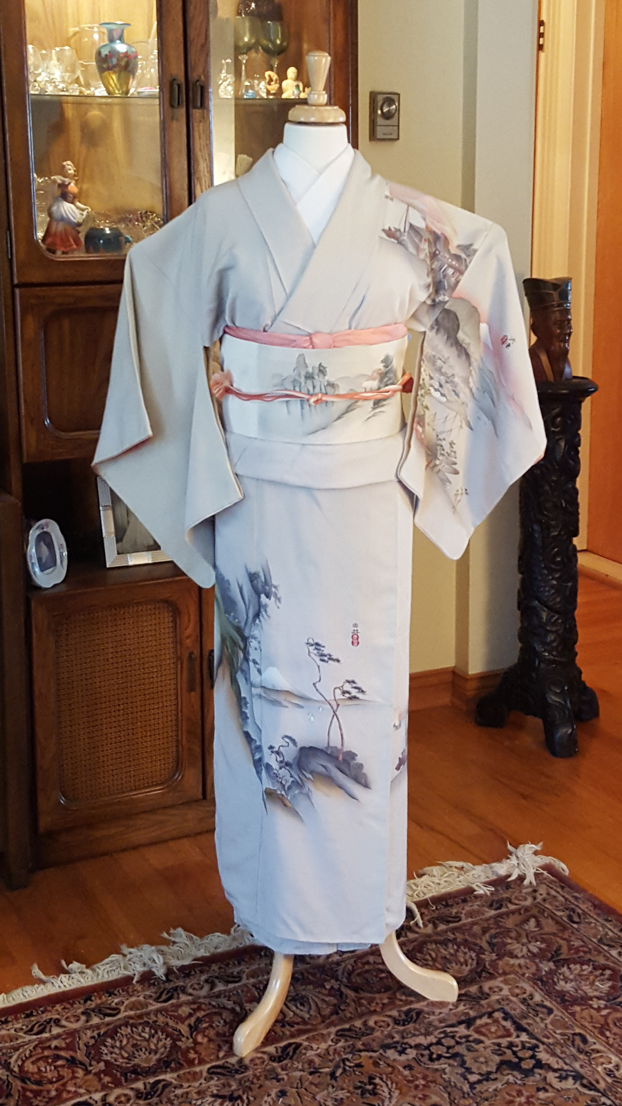
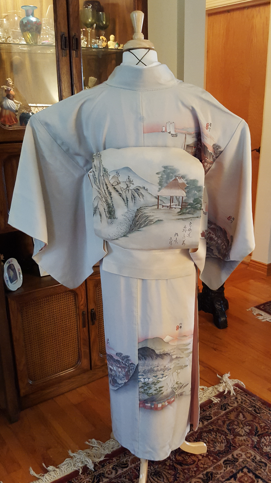
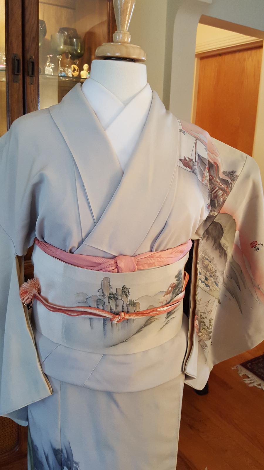
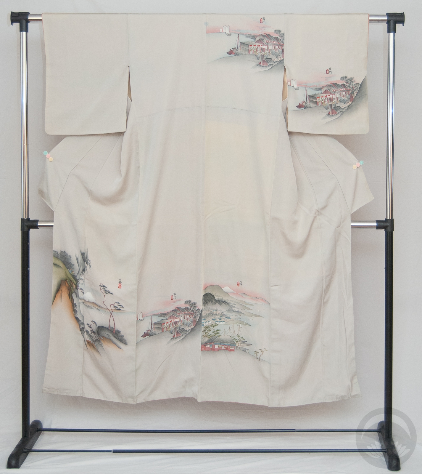
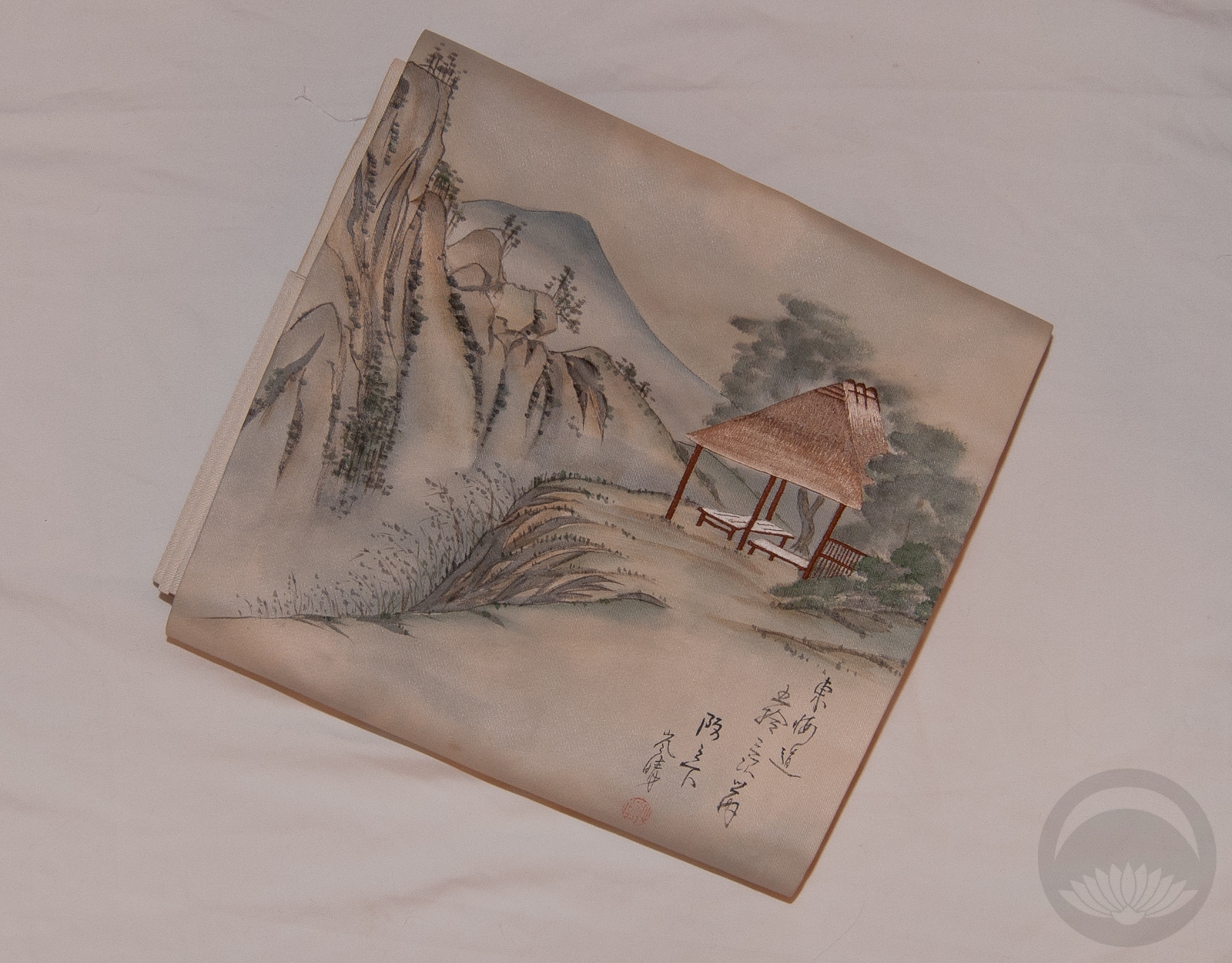
This obi was the first piece I ever got with a Stations of the Tokaido motif, and it’s very special to me. When I was hunting for inspiration for a new coordination I looked out the window and it hit me. Everything is very snowy and wintery and monochrome here in Montreal, and I wanted to capture that feeling of cold, blustery, no-contrast weather. Ideally a pale blue-grey iromuji would probably have worked better but I don’t own one, and this one is close enough in colour. Also the heavy texture looks like windblown snow-drifts, which helped reinforce the feeling I was going for.


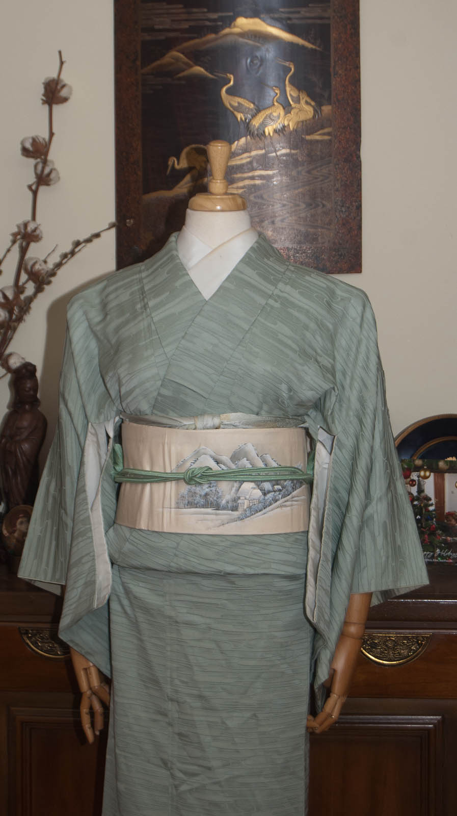
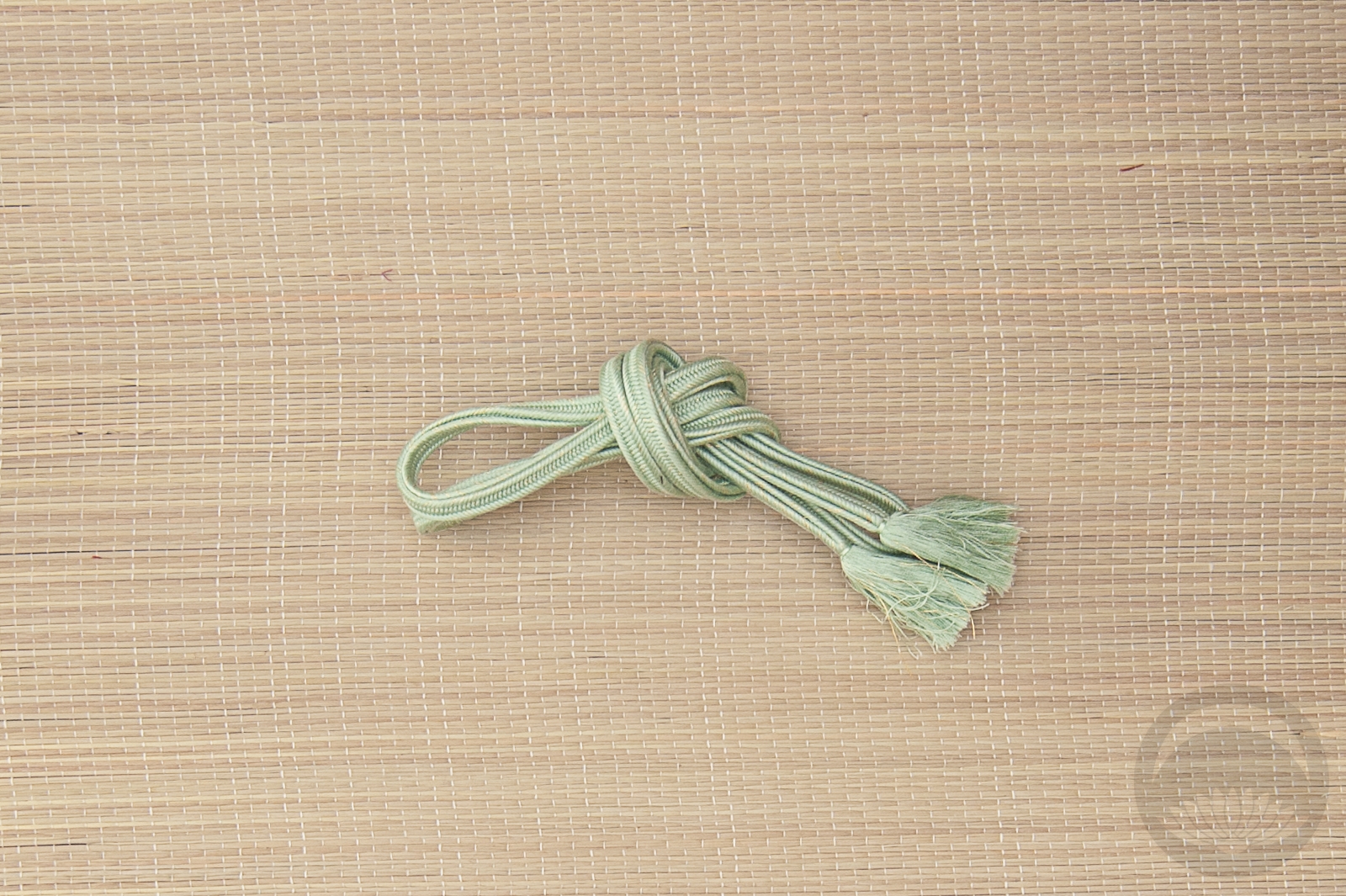
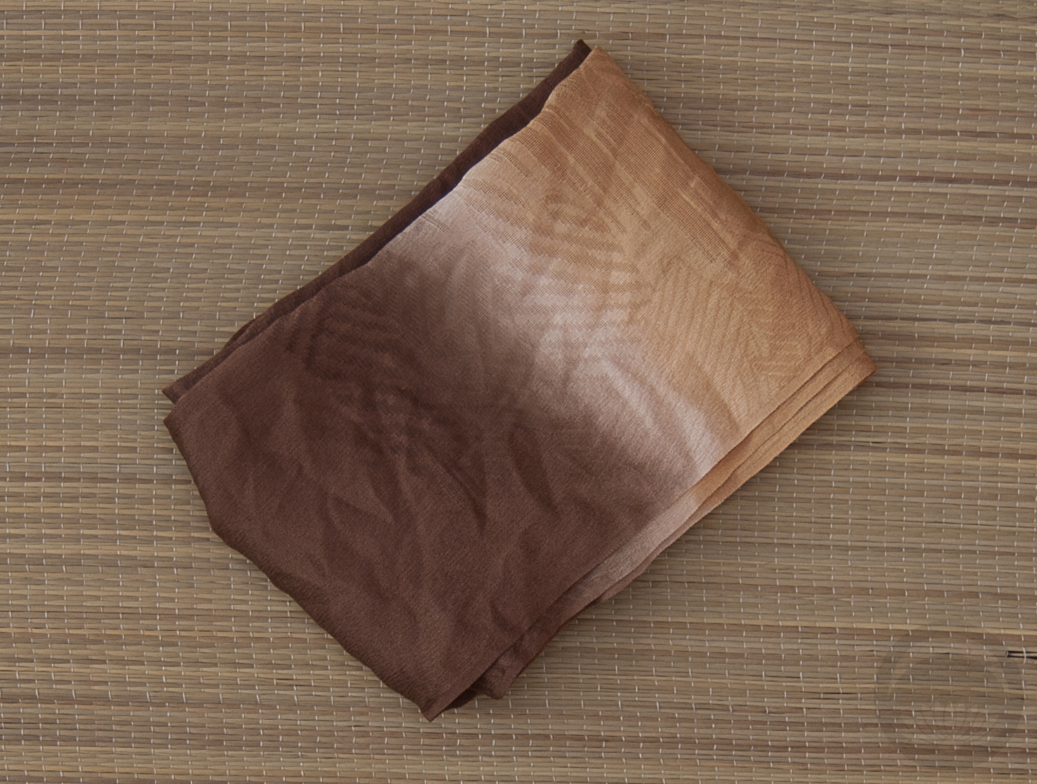
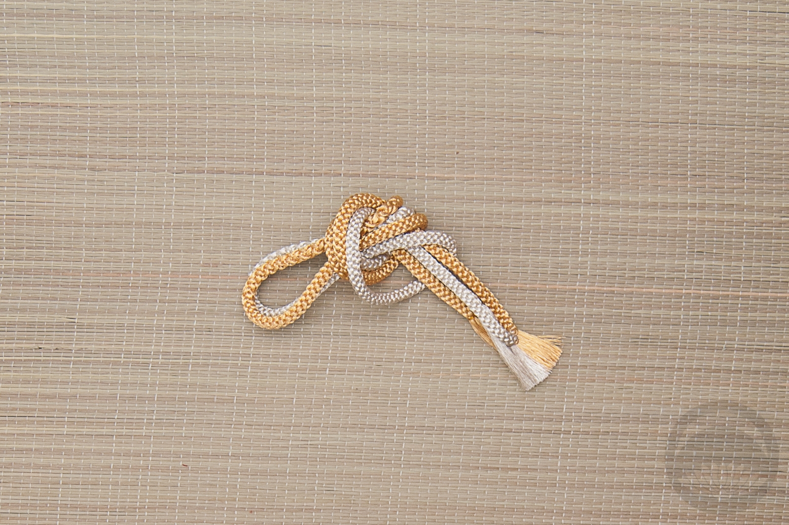
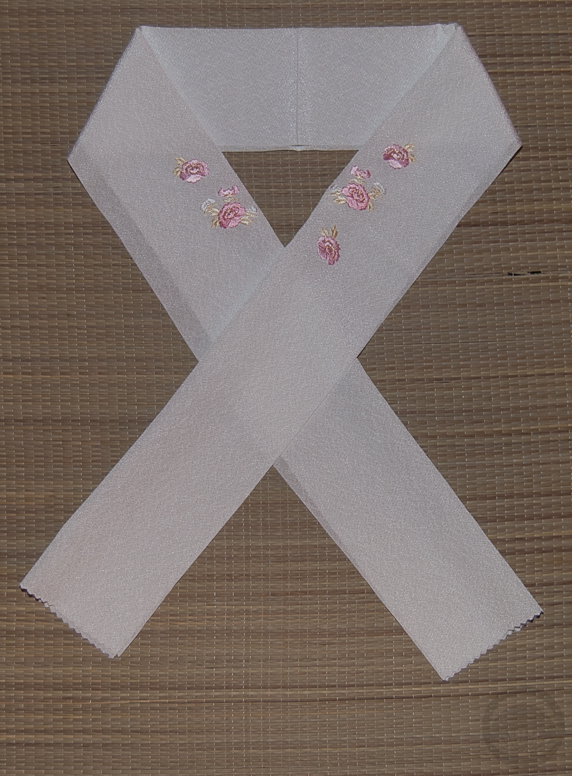
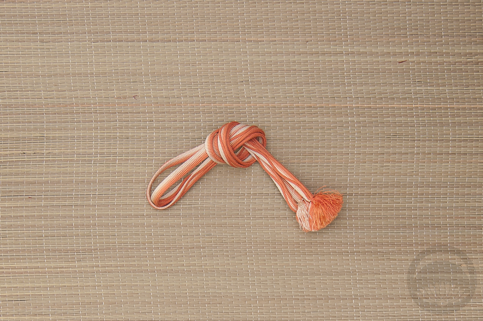
I chose an obiage and an obijime in an almost-identical icy mint colour to keep things very monochrome and ensure all the focus was on the obi.
As pretty as winter is, I am very ready for it to GO AWAY. I want grass and flowers and longer days, please! Is winter bad where you are? Are you also fed up with it?
Items used in this coordination
-
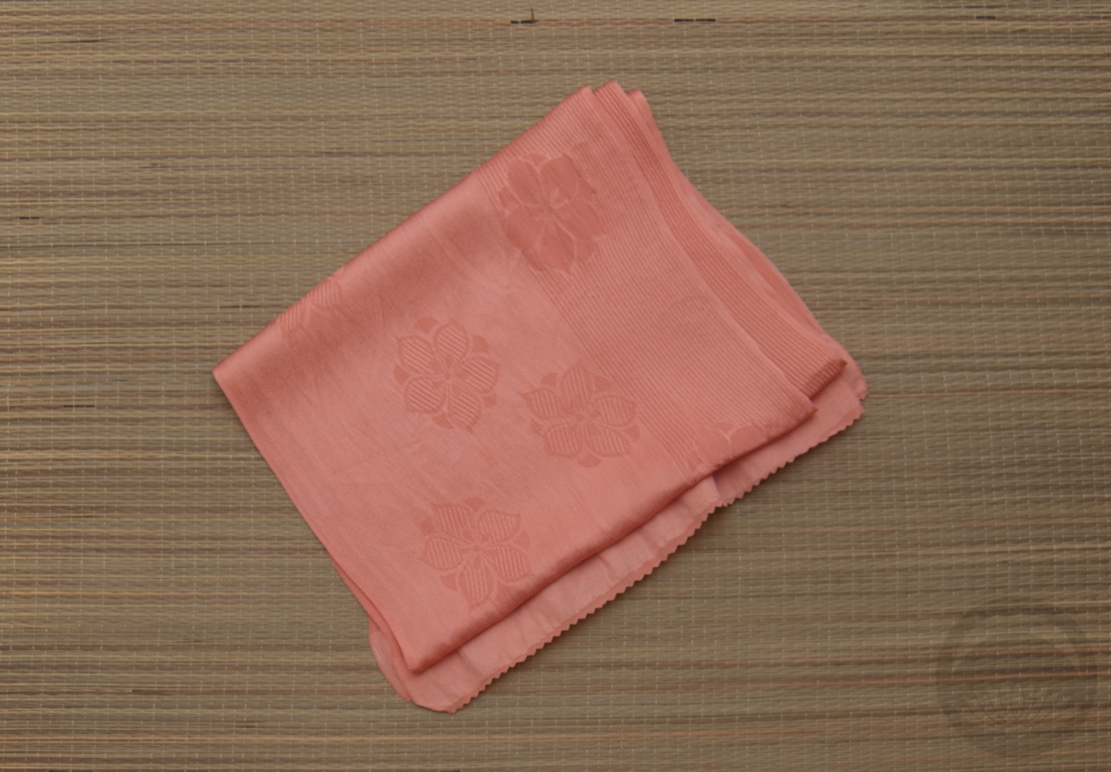
- Mint Green
-
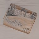
- White Tokaido

-
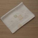
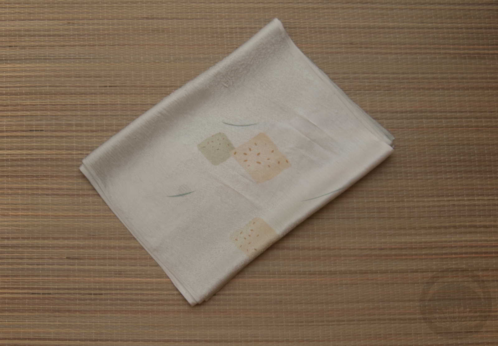
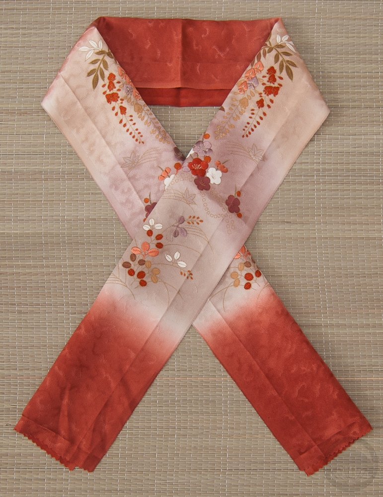
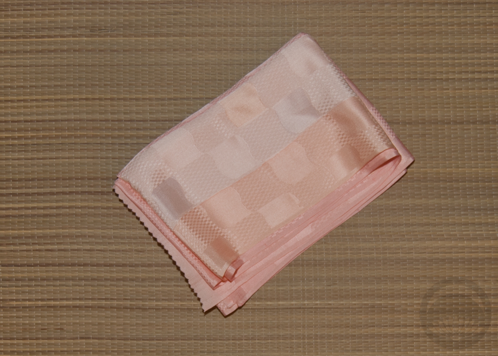
- Ice-blue Rinzu
-
- Mint with Gold


 Bebe Taian
 CHOKO Blog
 Silk & Bones
 Gion Kobu