
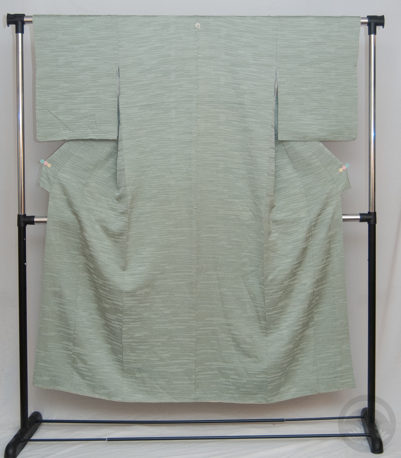
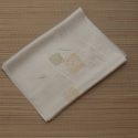
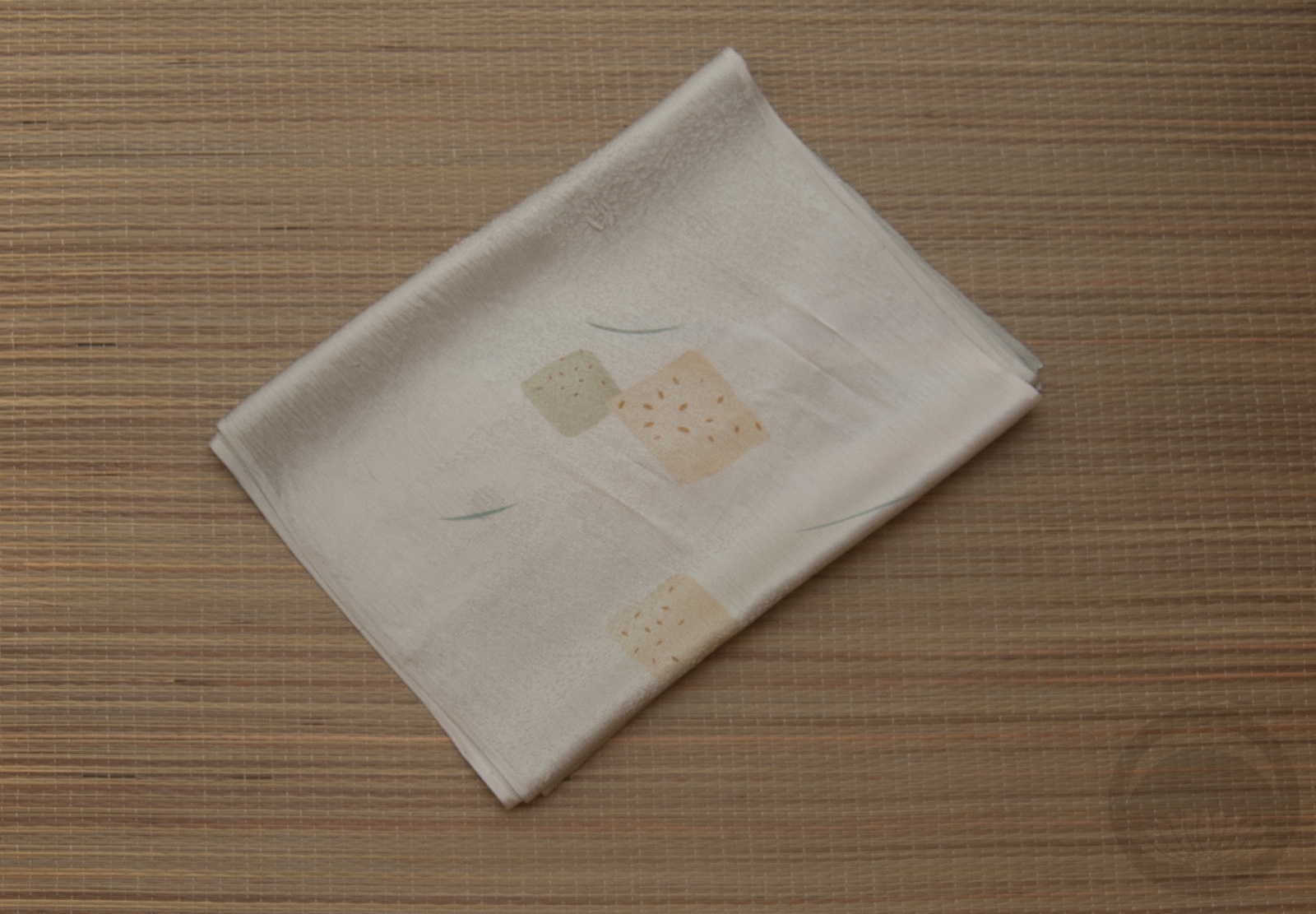
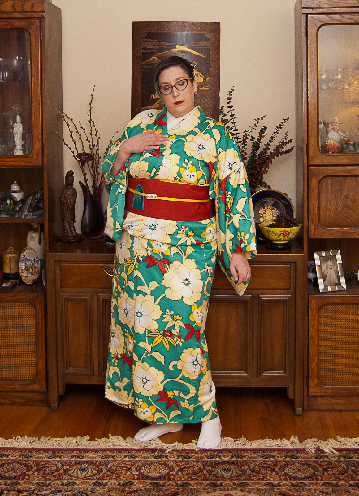
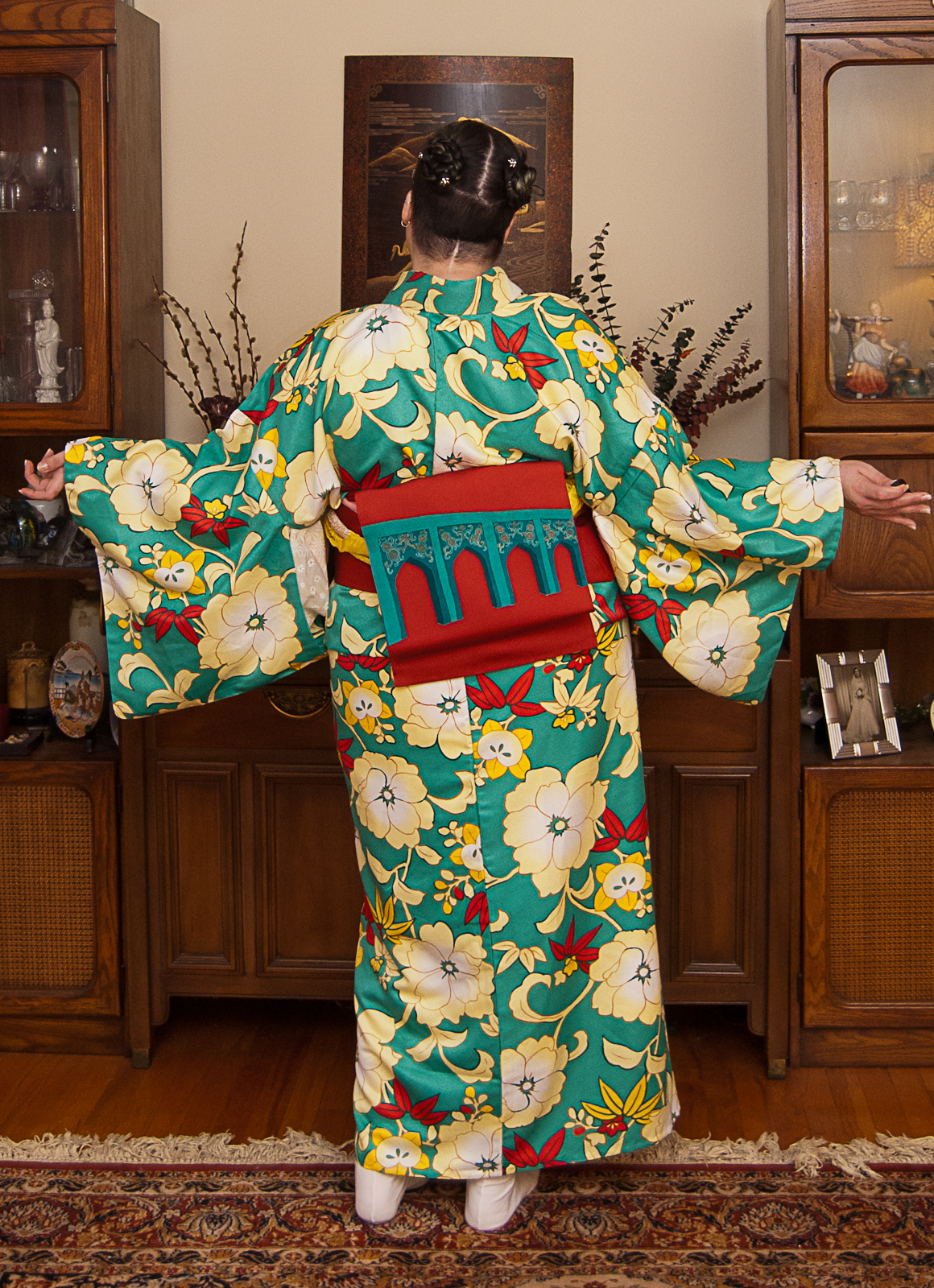
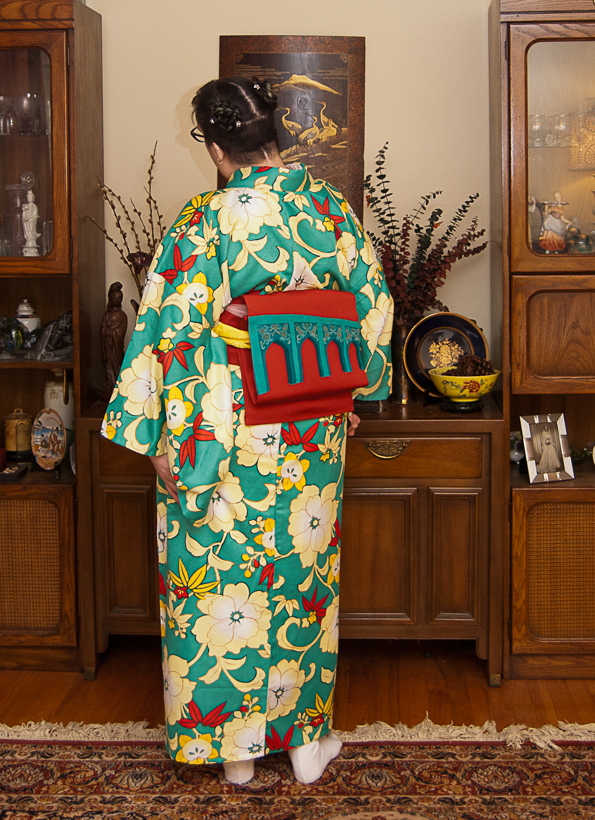
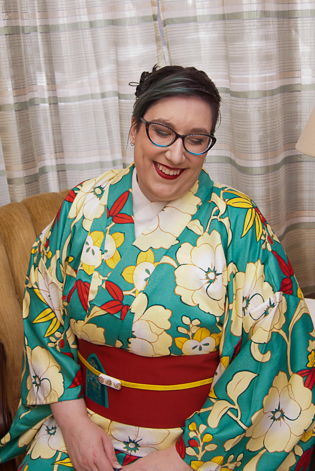
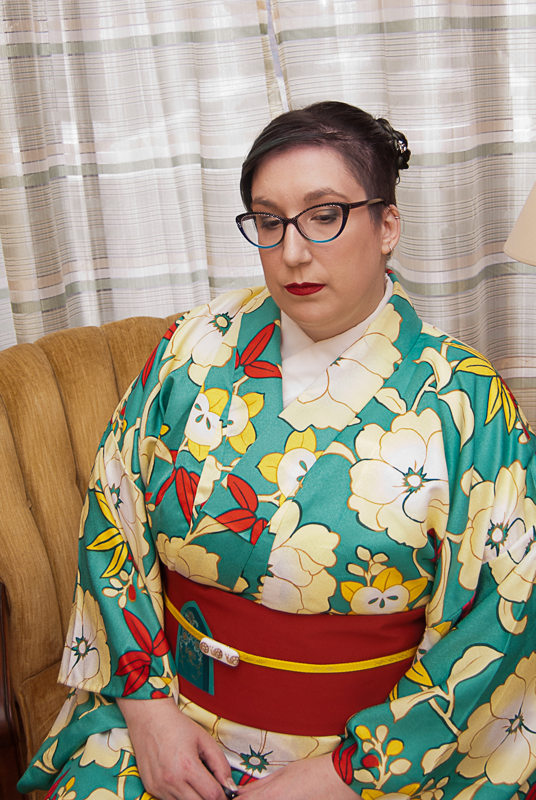
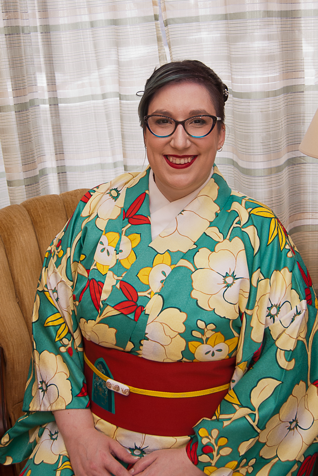
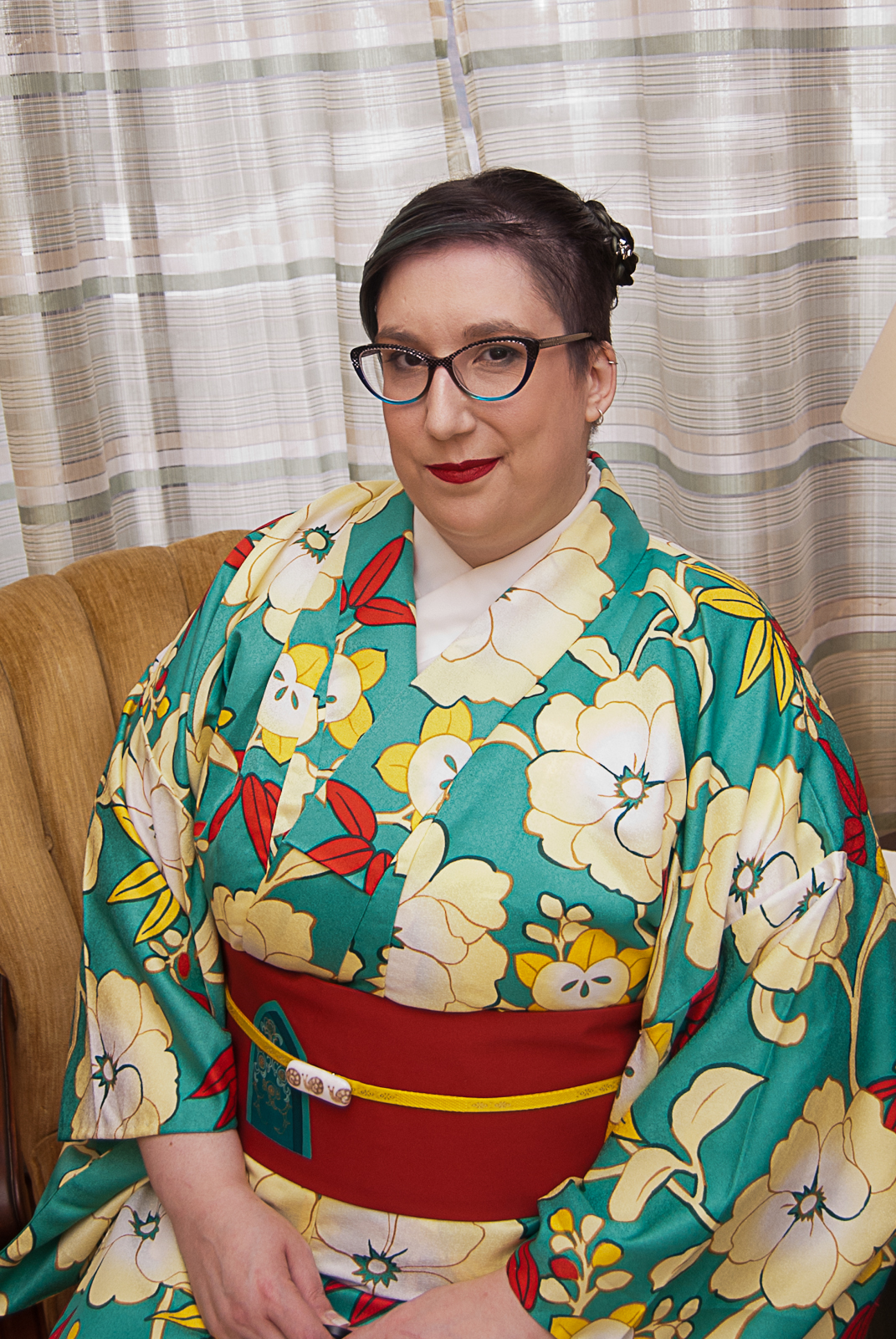
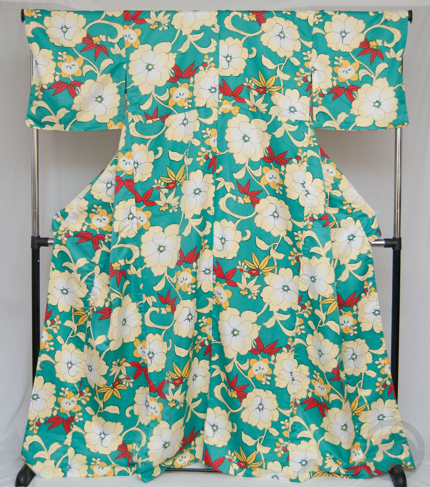
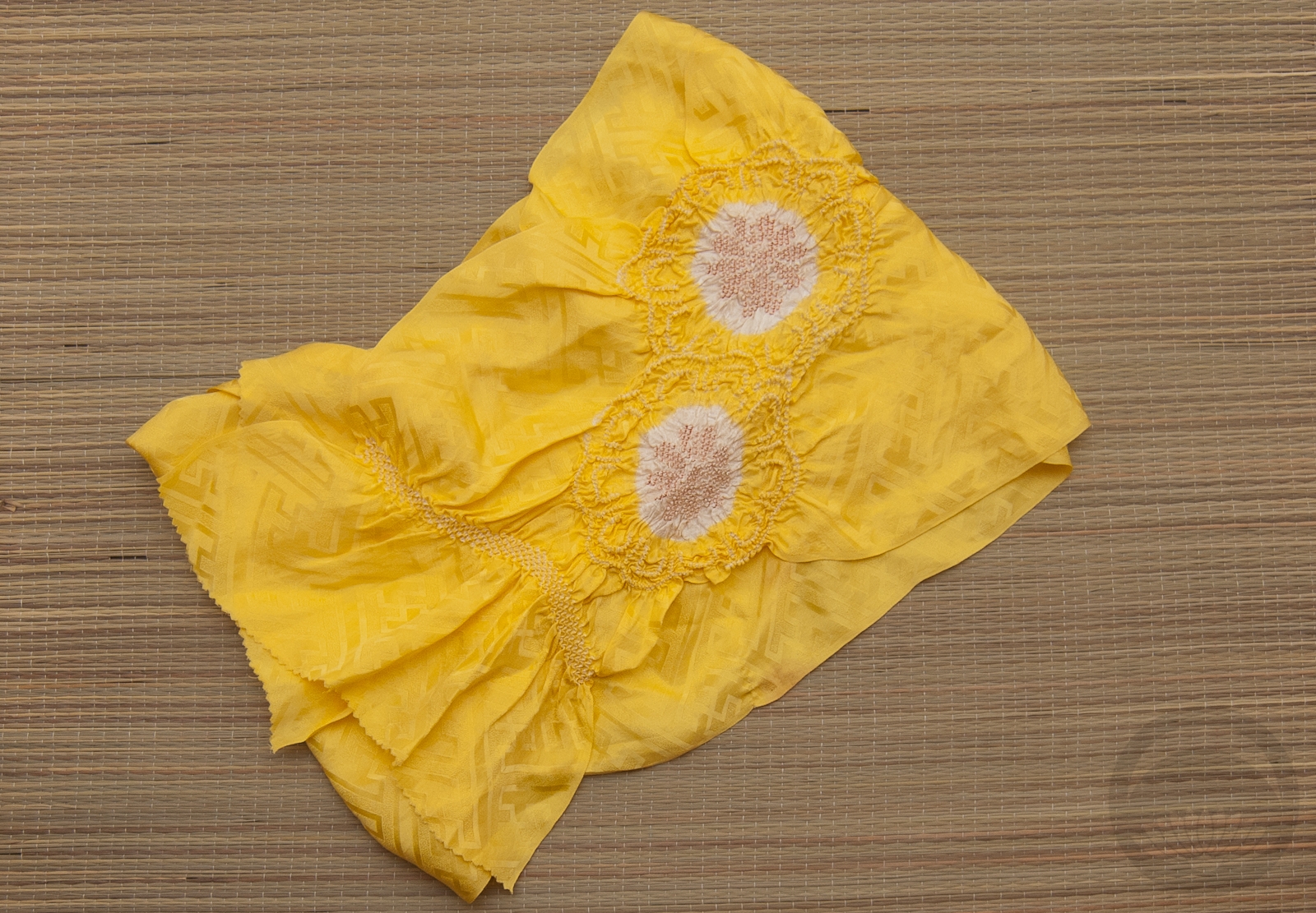
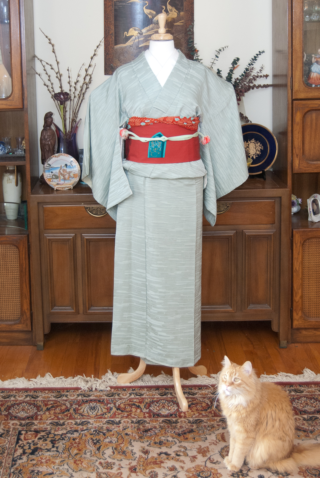
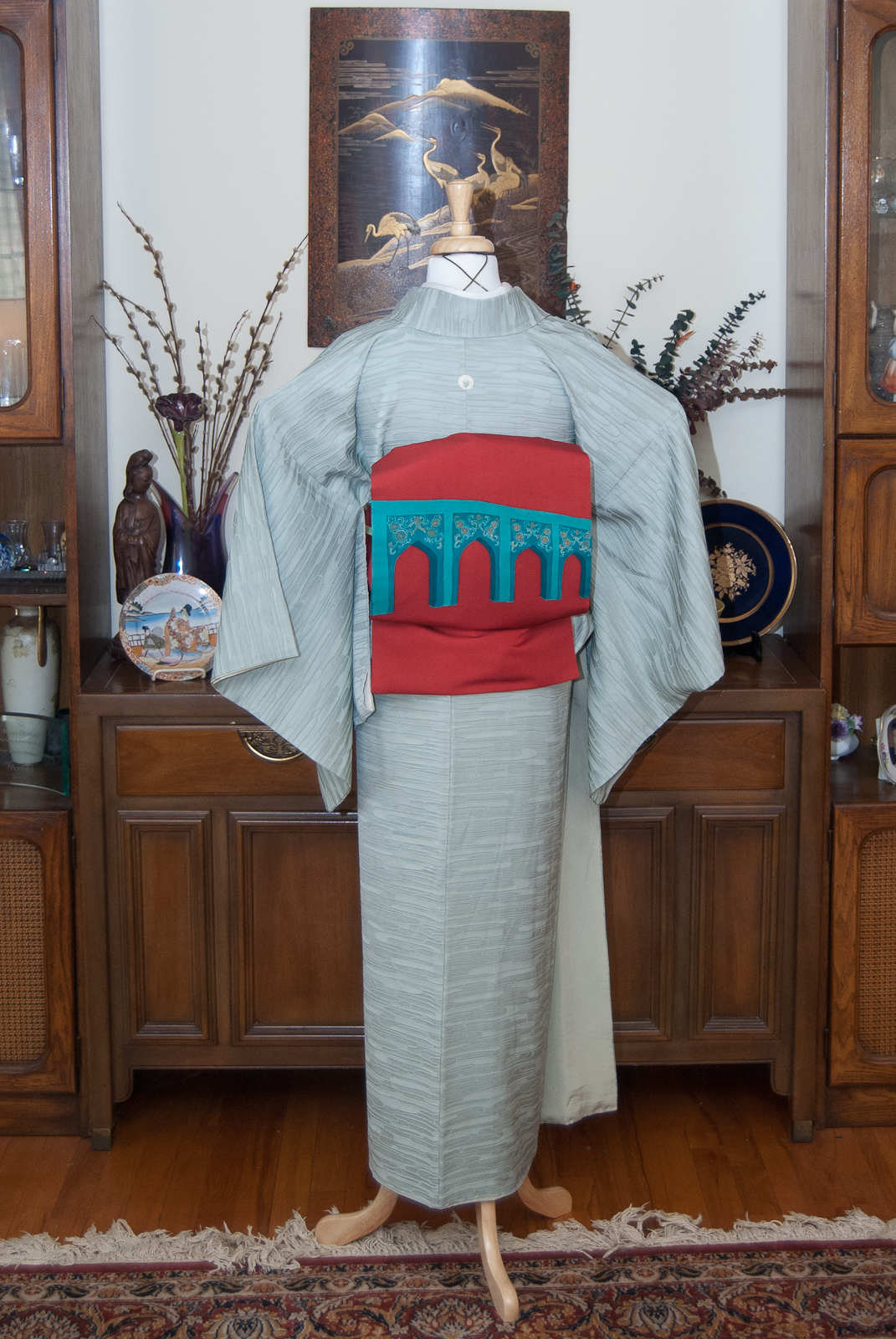
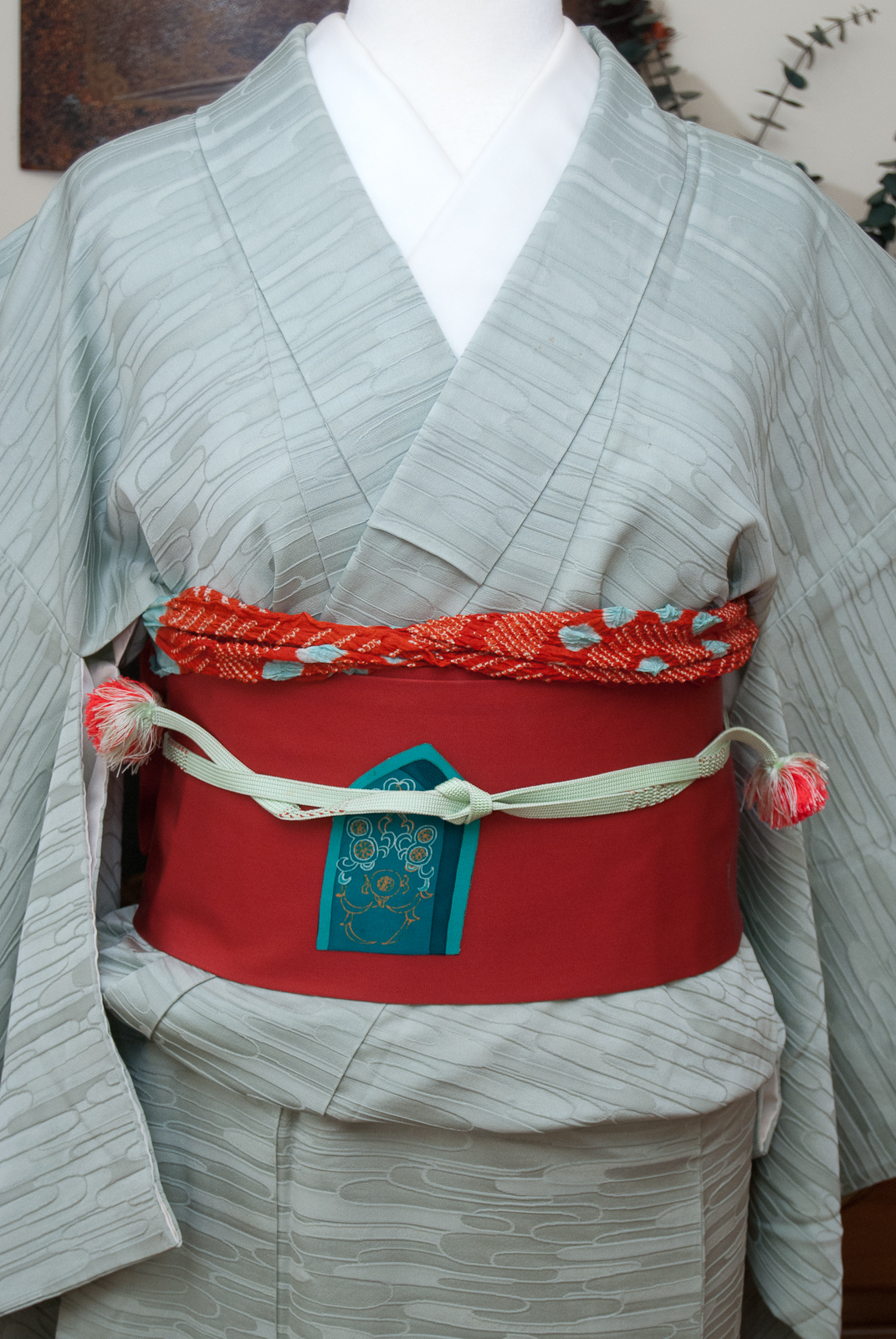
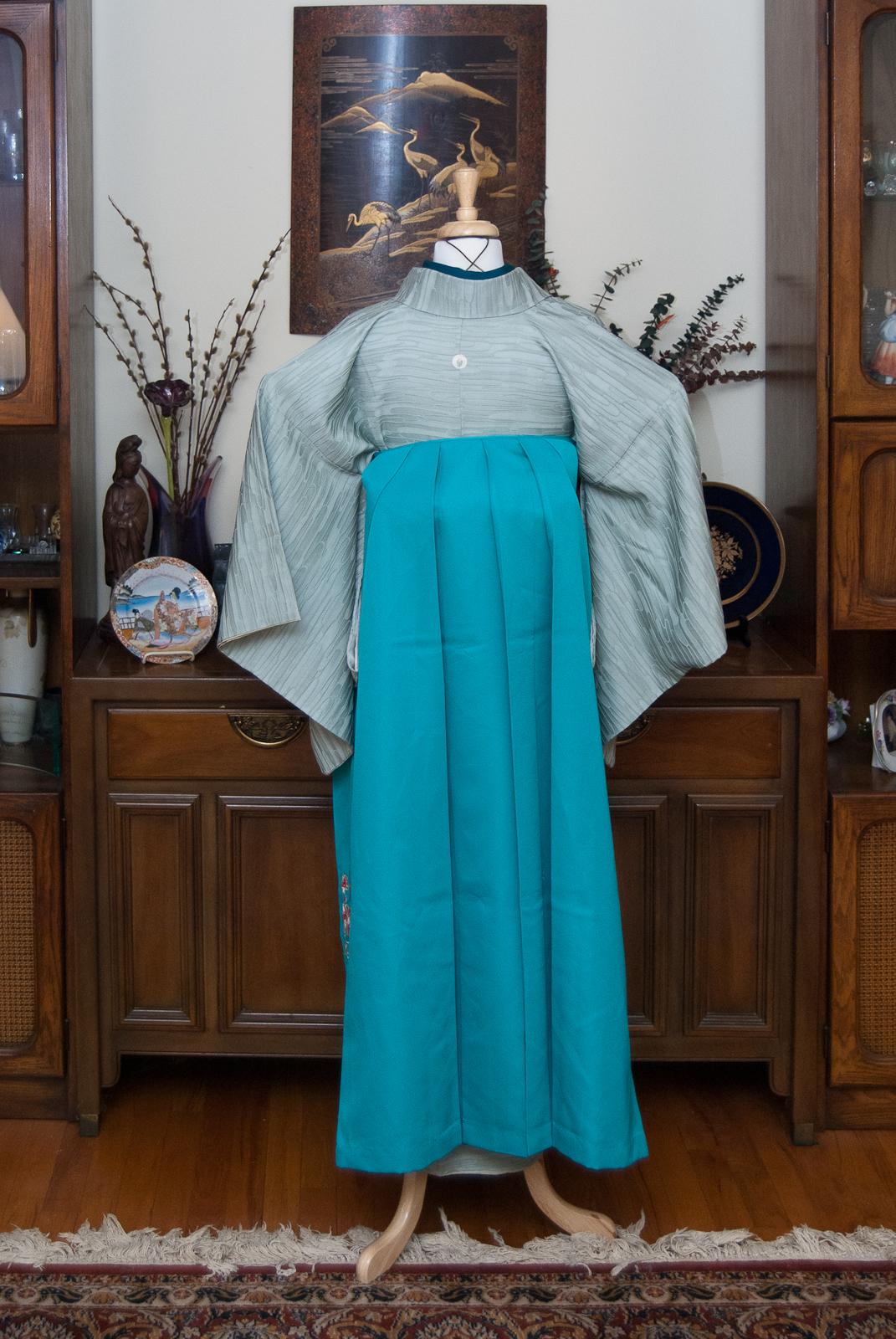
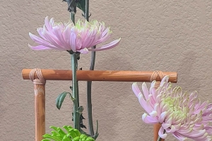
Does anyone else love Misty Mint candies? If you’ve never had them, they’re these wonderful, creamy, melty mint candy drops in beautiful pastel colours. They don’t make them anymore, sadly, and even if they did I couldn’t eat them since I’m allergic to dairy now, alas. However, the colour of this iromuji makes me think so fondly of them!
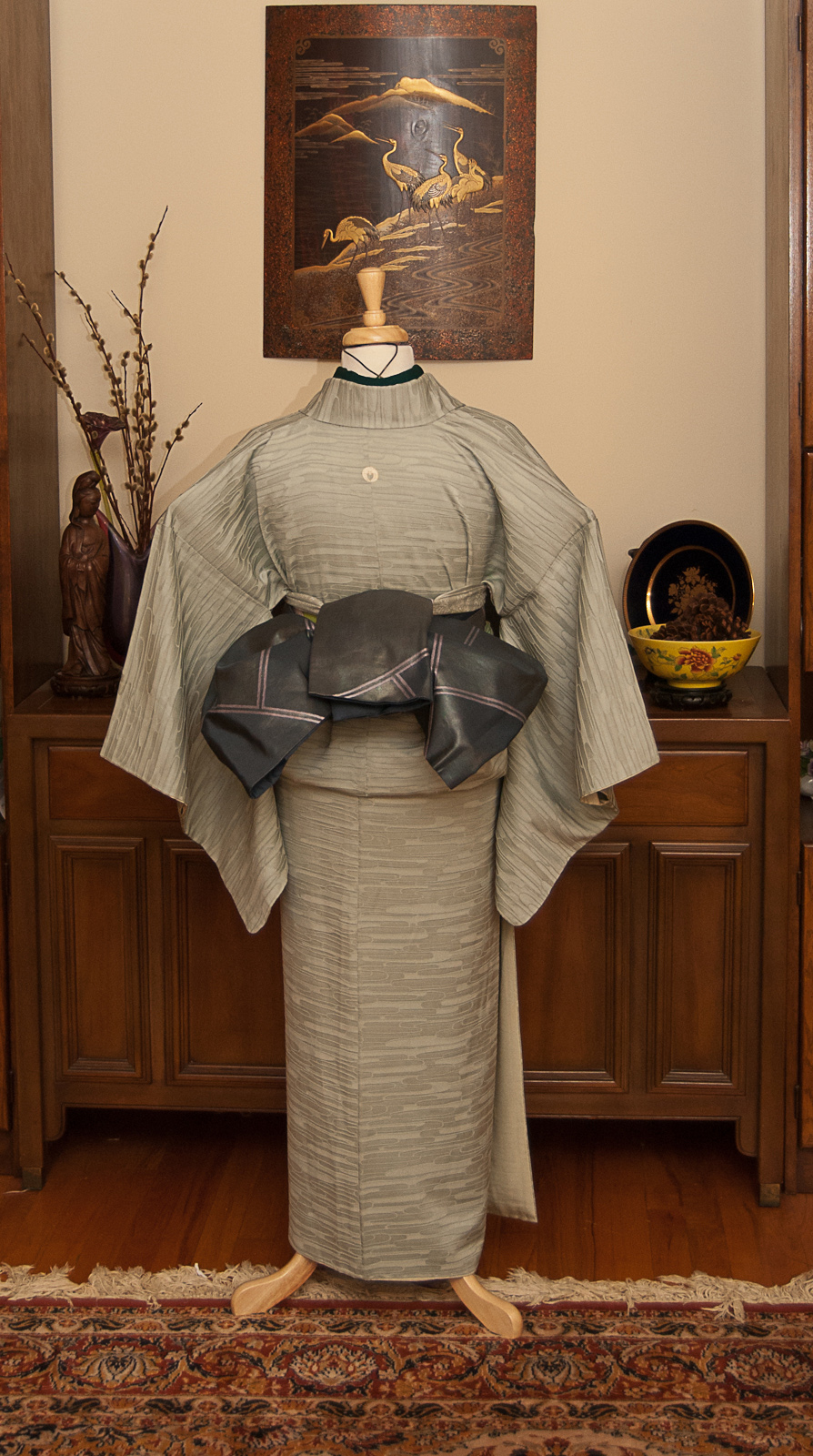
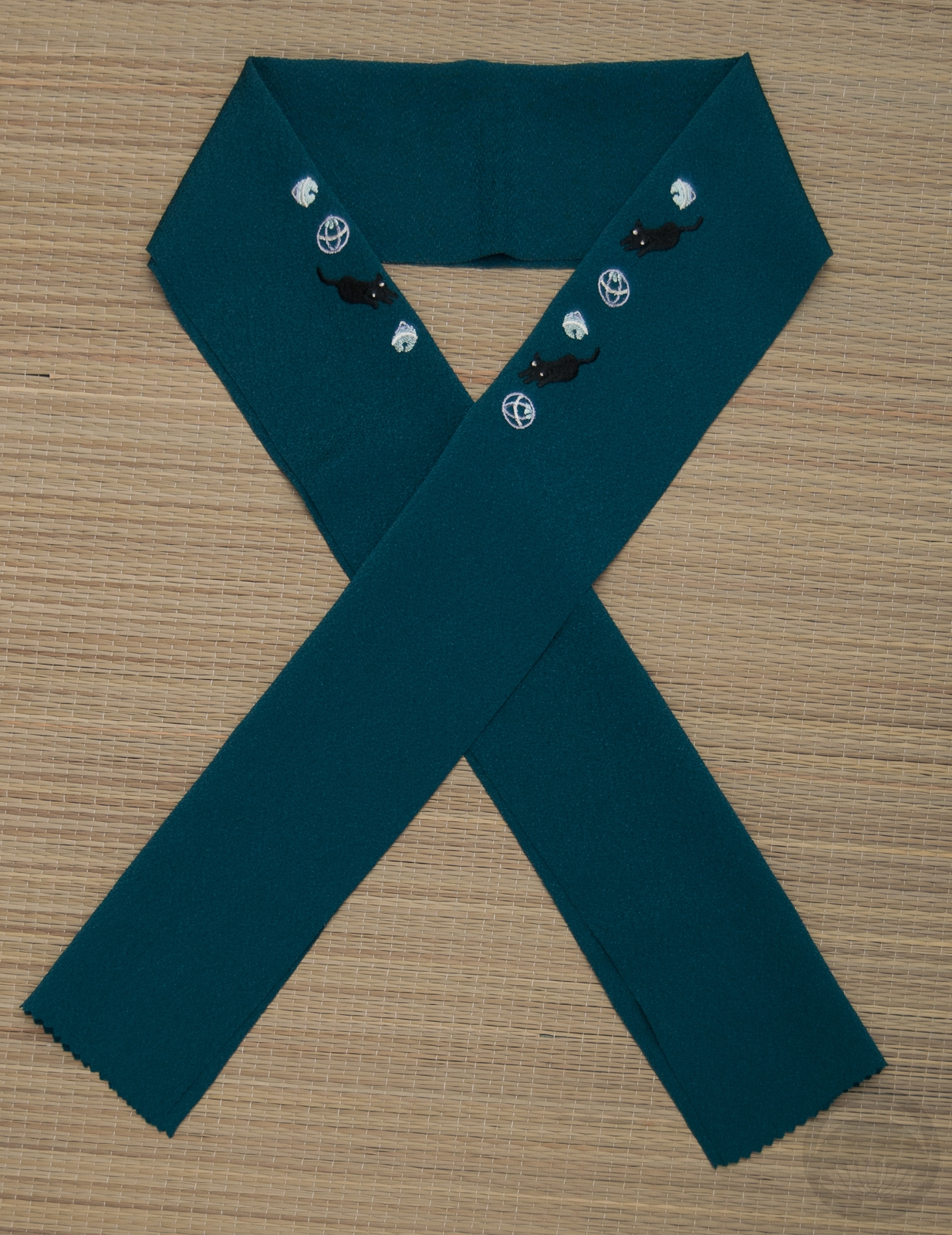
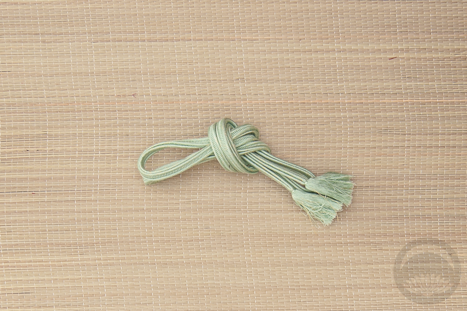
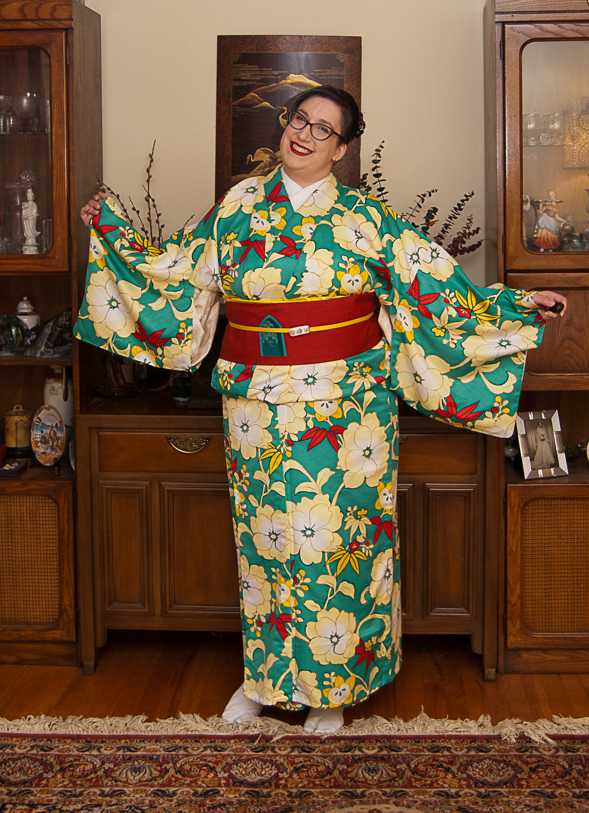
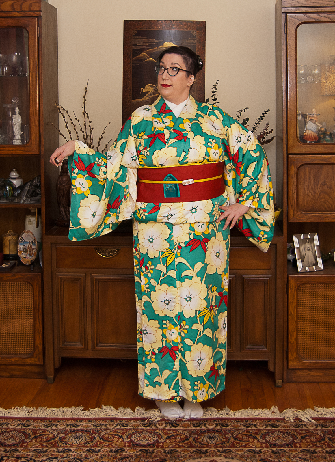
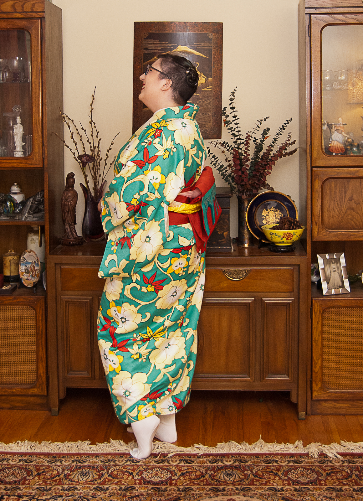
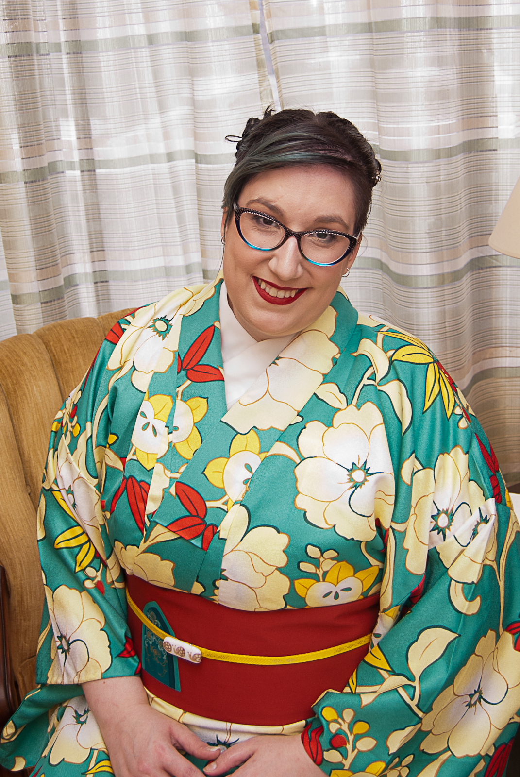
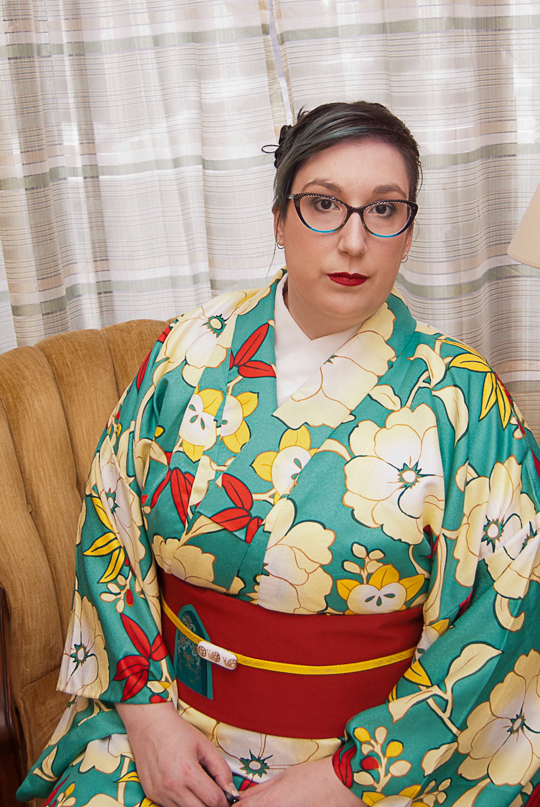
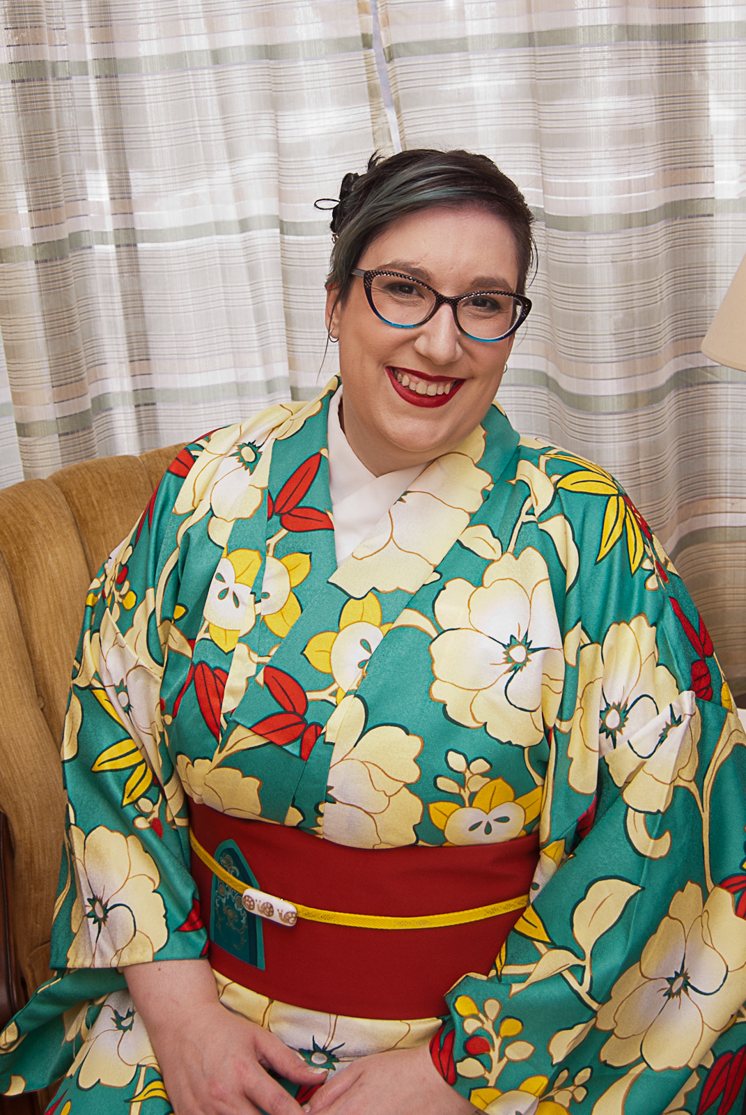
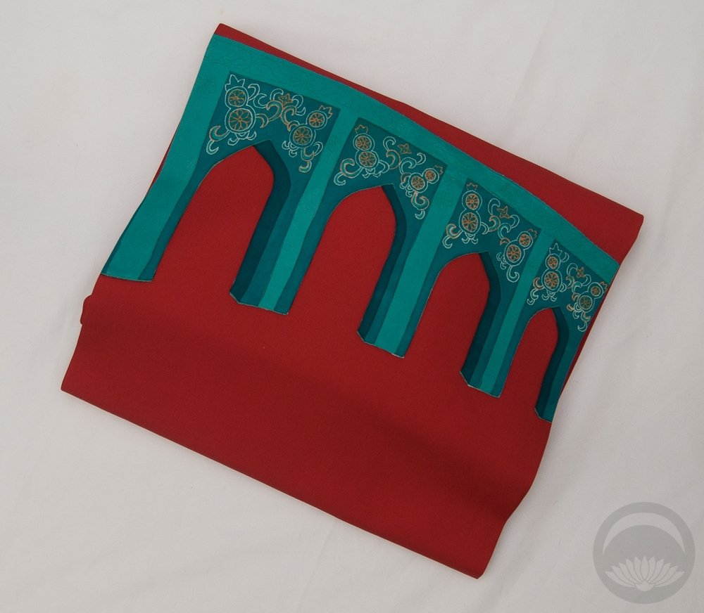
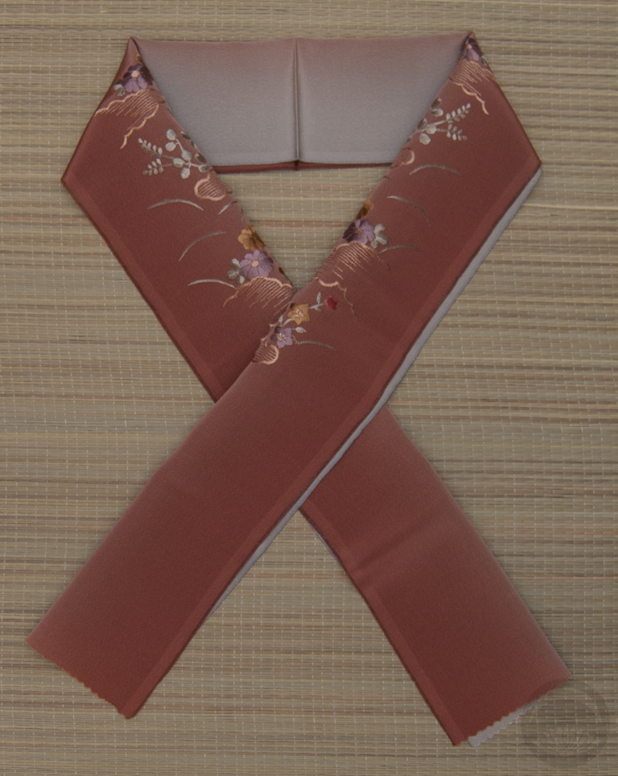
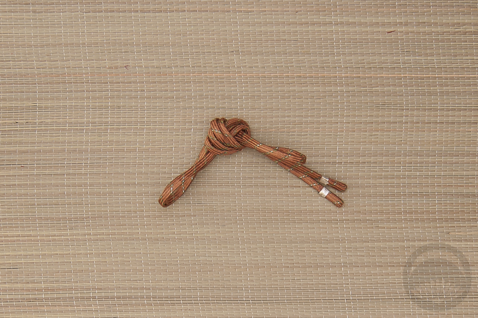
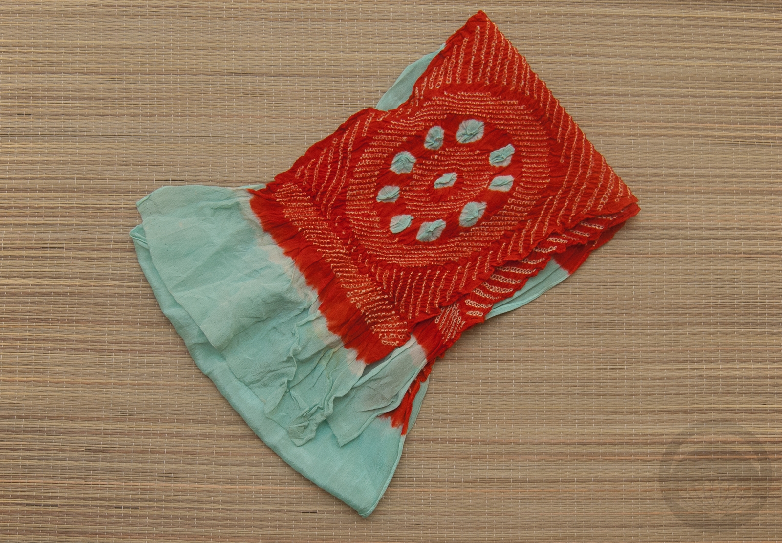
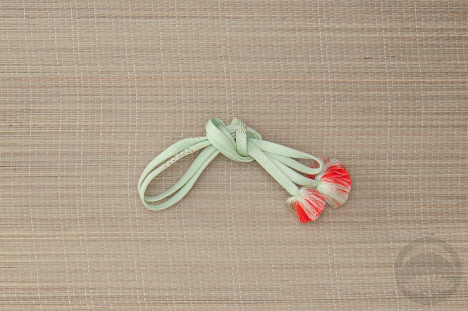
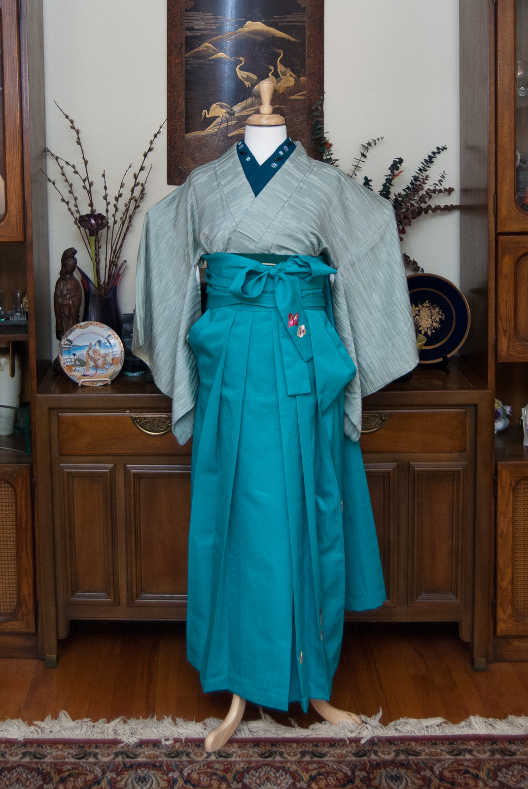
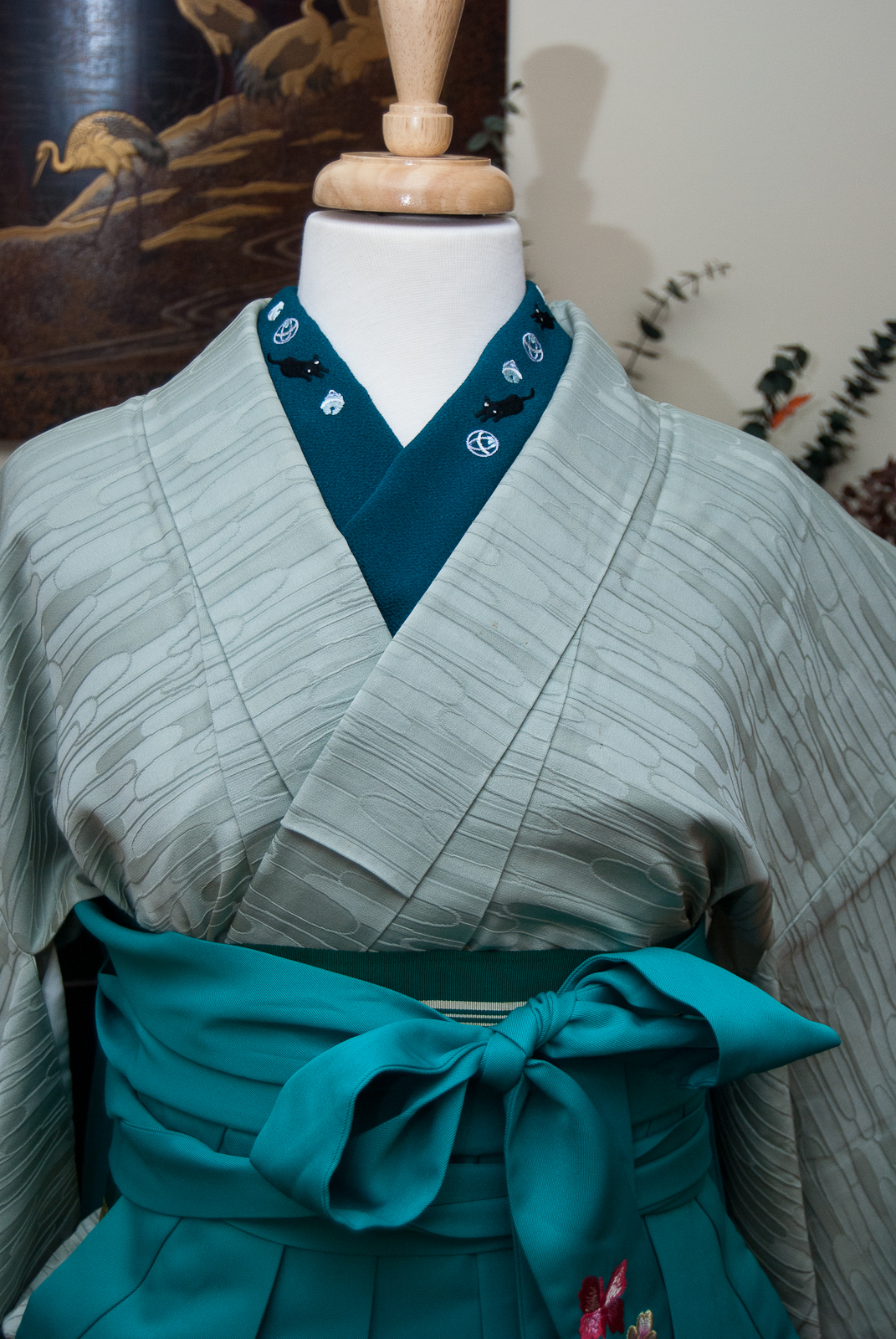
This coordination is basically a revisit of this monochrome outfit, but I wanted to do something softer, and without the hakama. This one feels more wearable, overall. I used the same kimono and haneri, but switched up to this shiny fukuro obi and accessories that blend in with the kimono itself. I had fun doing a sort of bunko variation with the obi, I quite like how it looks and it was very quick to do.
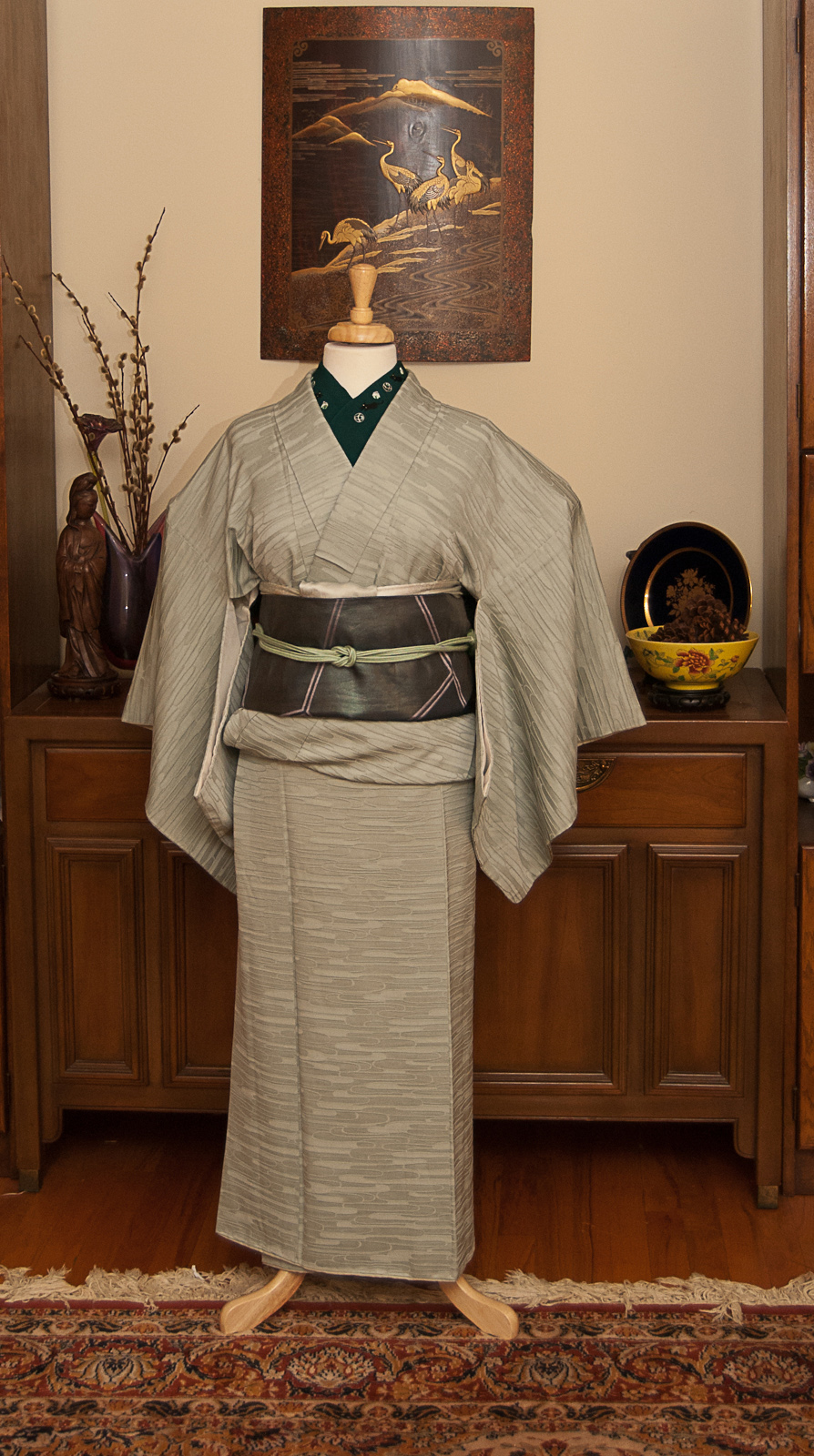
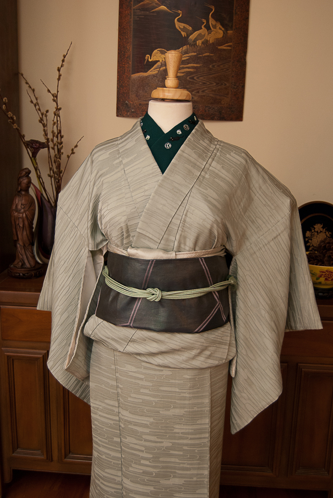
It’s also very interesting to me how this colour family photographs. In the original outfit with the hakama, it looks much more blue, today’s photos look much more green, and the catalogue photos below feel somewhere in between. All due to ambient light, time of day, and other external factors.
We’re halfway through the #monokimono challenge! I’m proud of myself for sticking with it, and already have plans for the second half of the year. Are you doing the challenge? If so, please share links in the comments, I would love to see!
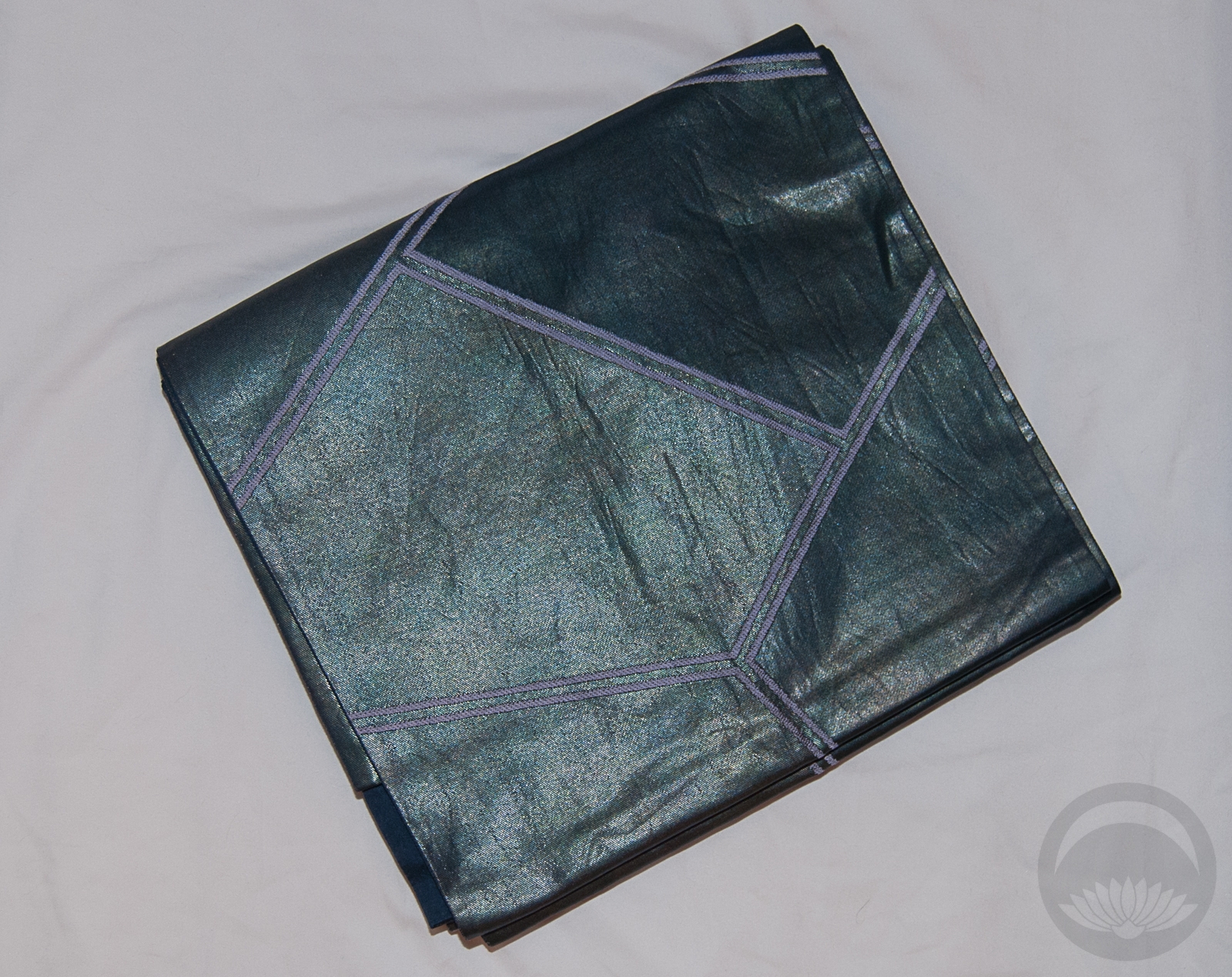
Items used in this coordination
-
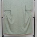
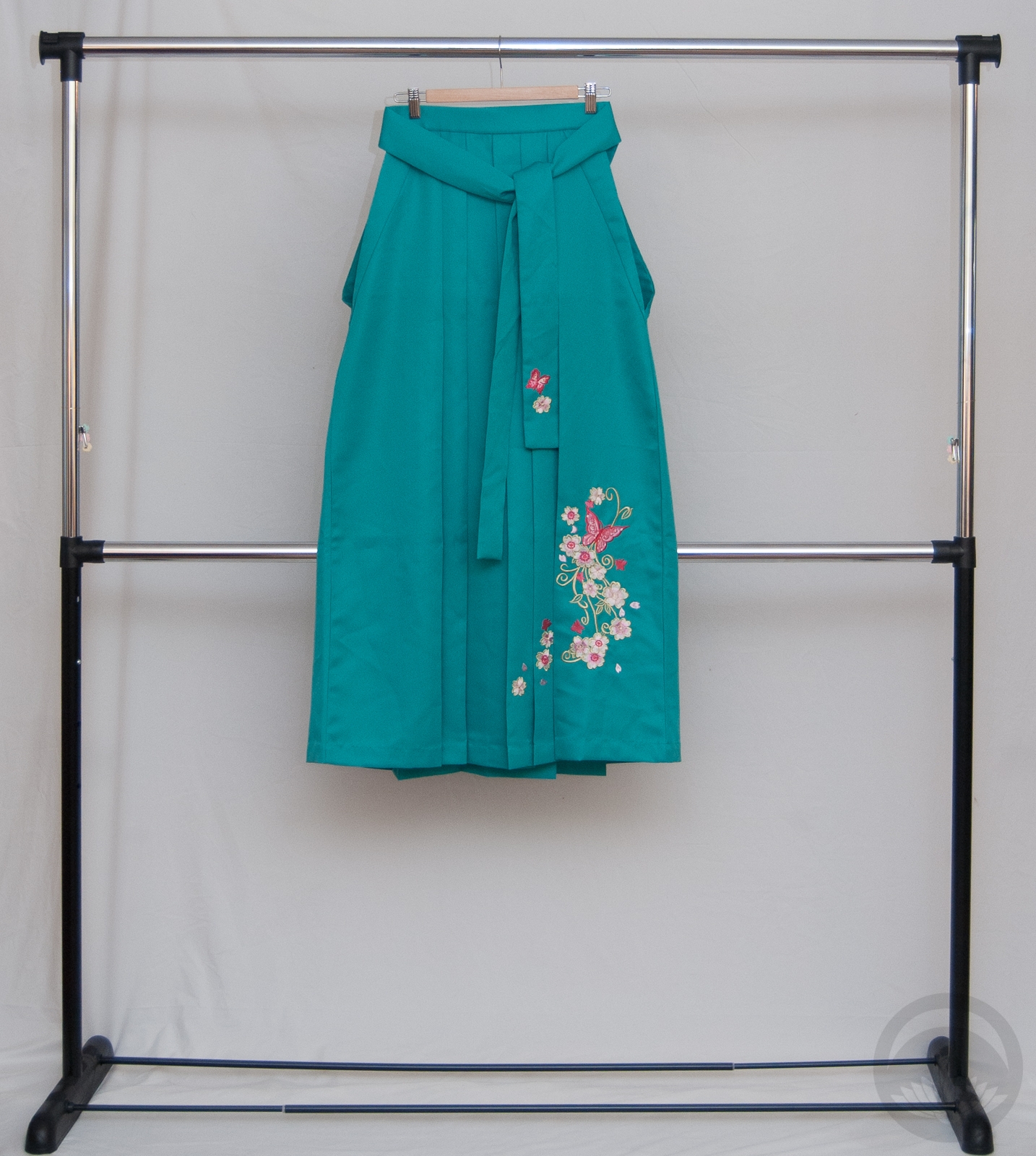
- Mint Green
-
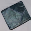
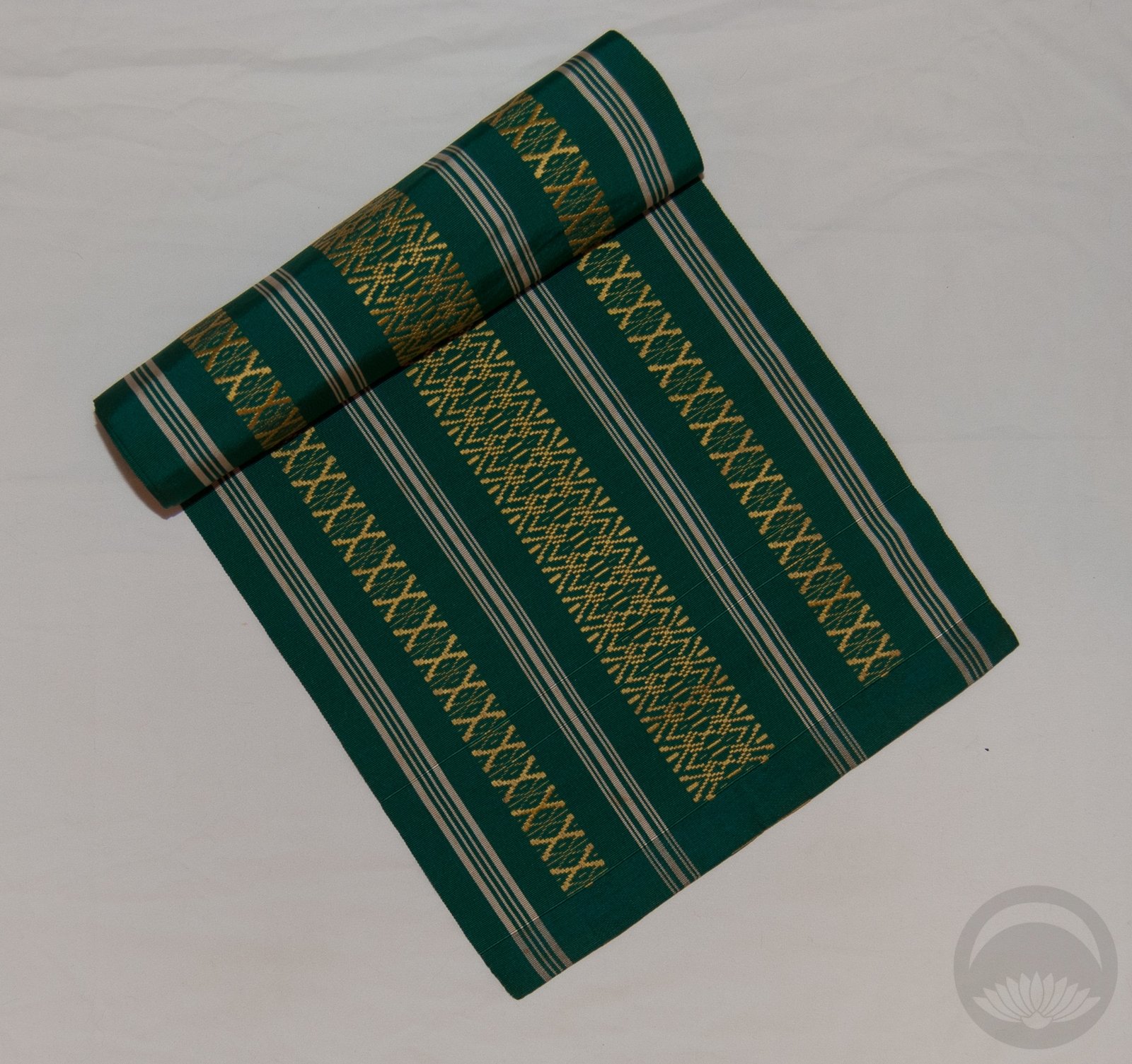
- Teal Geometric
-

- Cats
-
- Ice-blue Rinzu
-
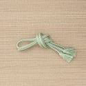
- Mint with Gold


 Bebe Taian
 CHOKO Blog
 Silk & Bones
 Gion Kobu
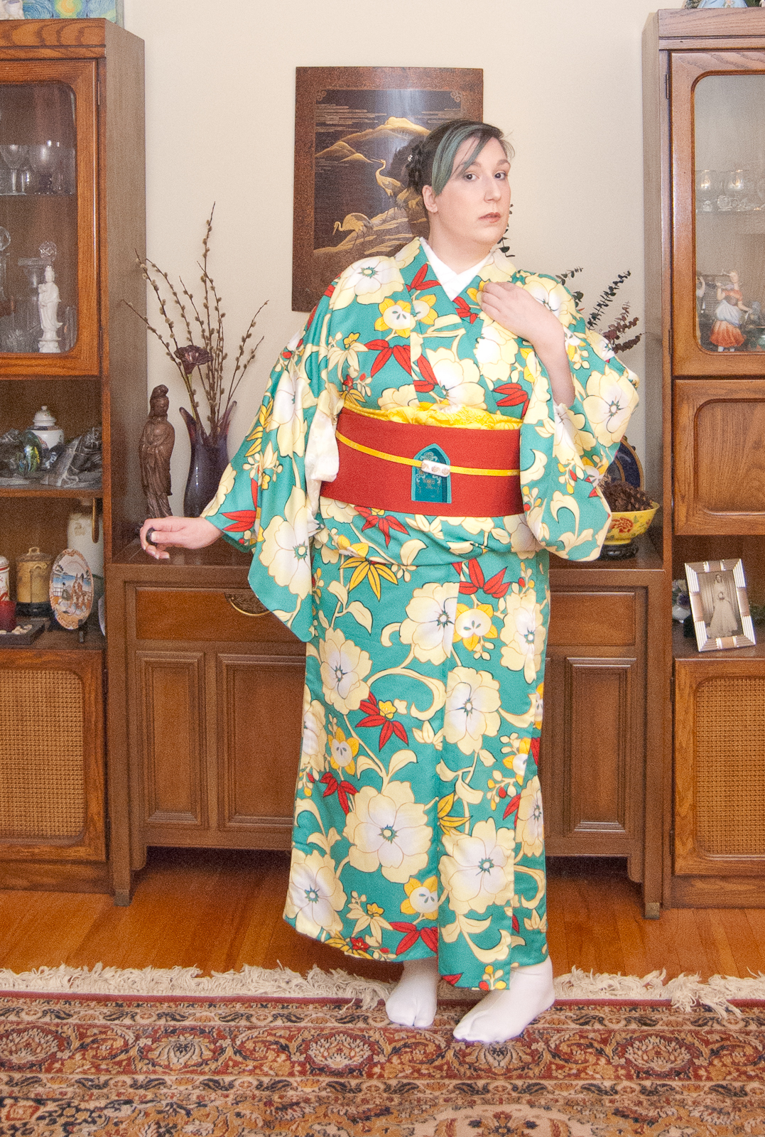