
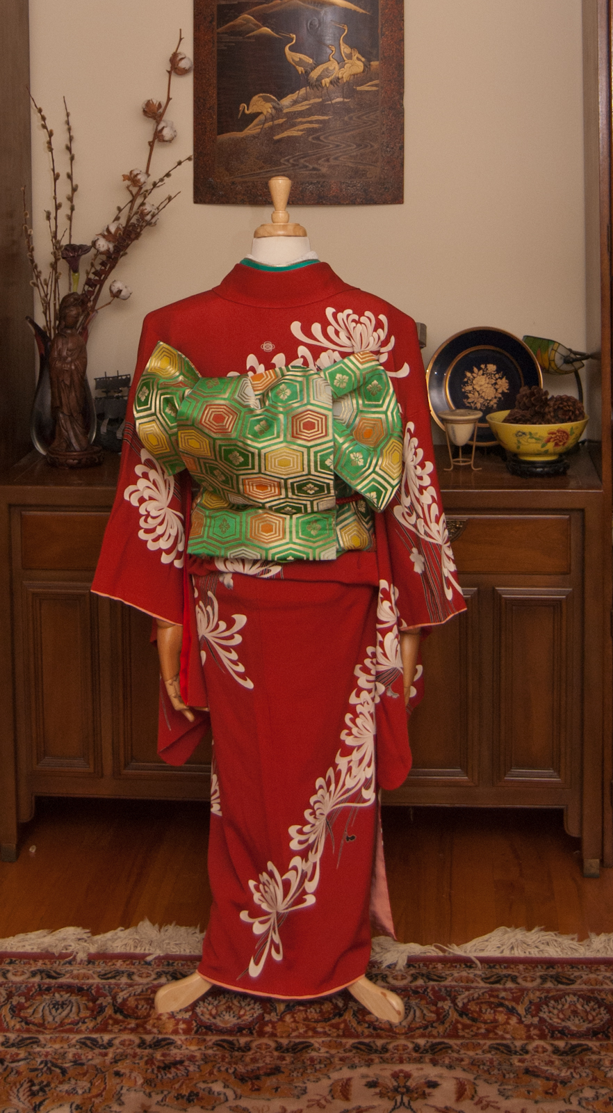
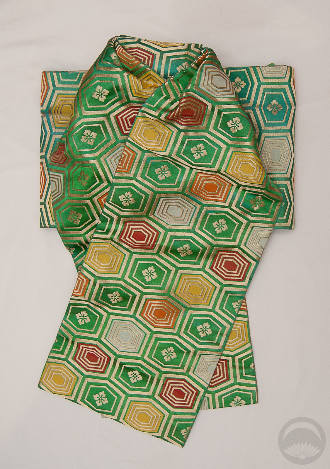
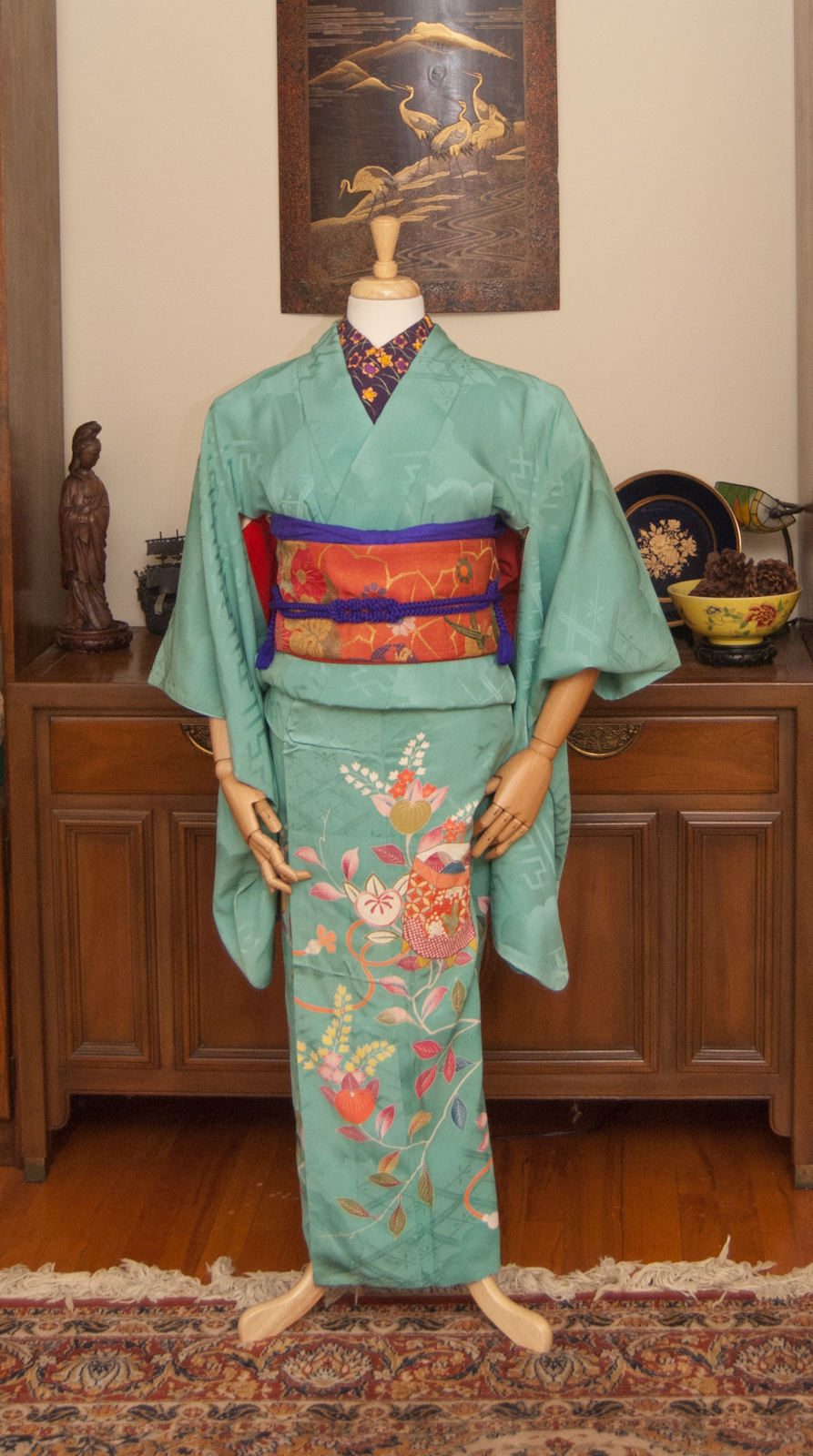
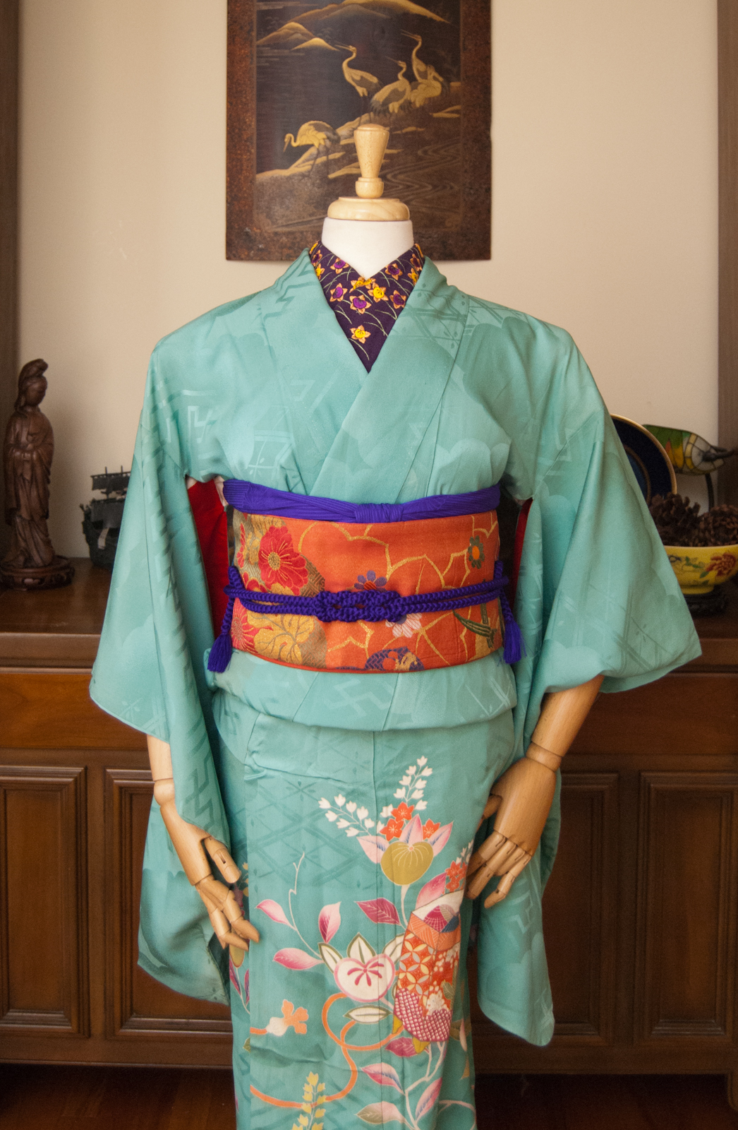
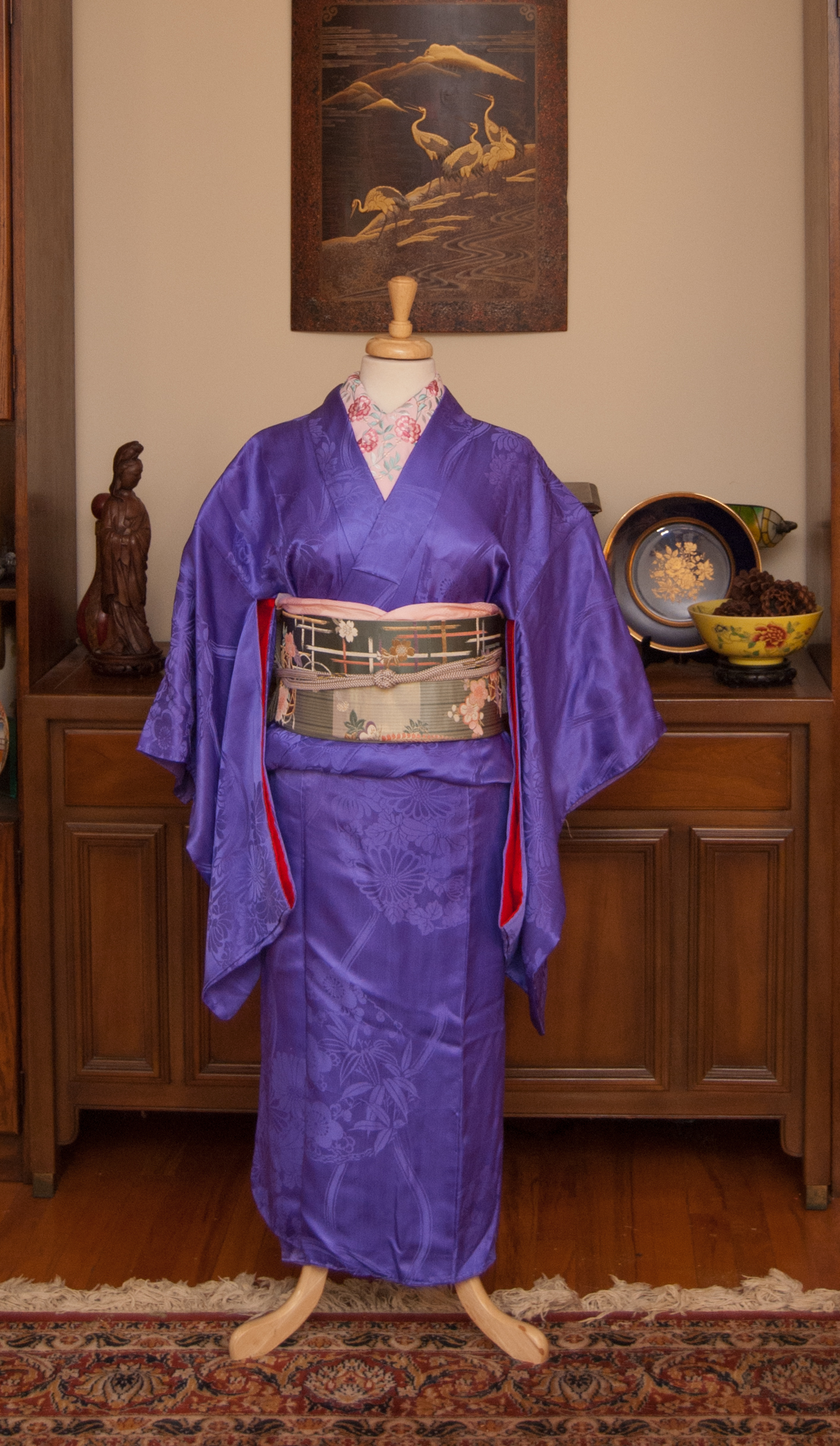
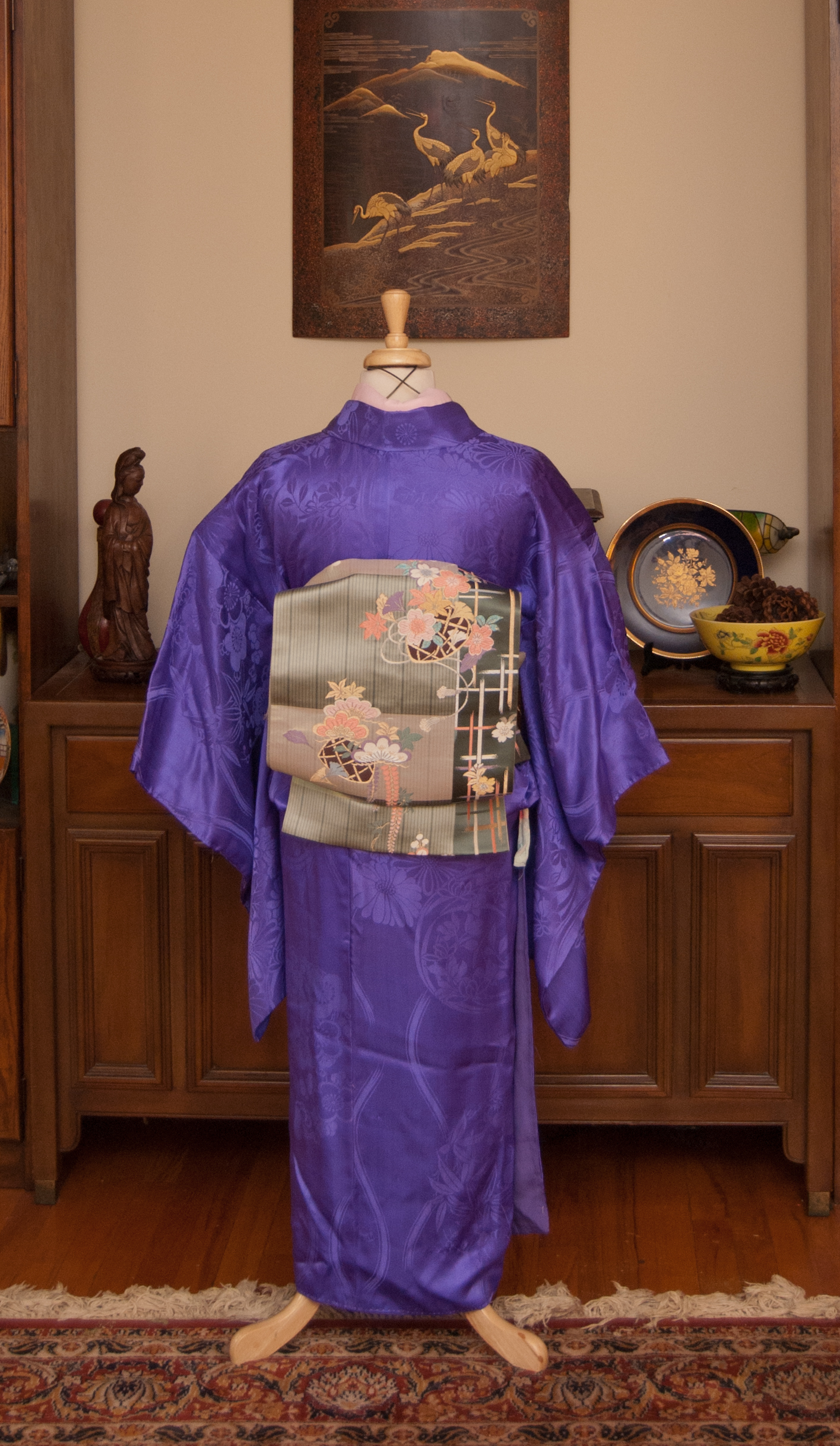
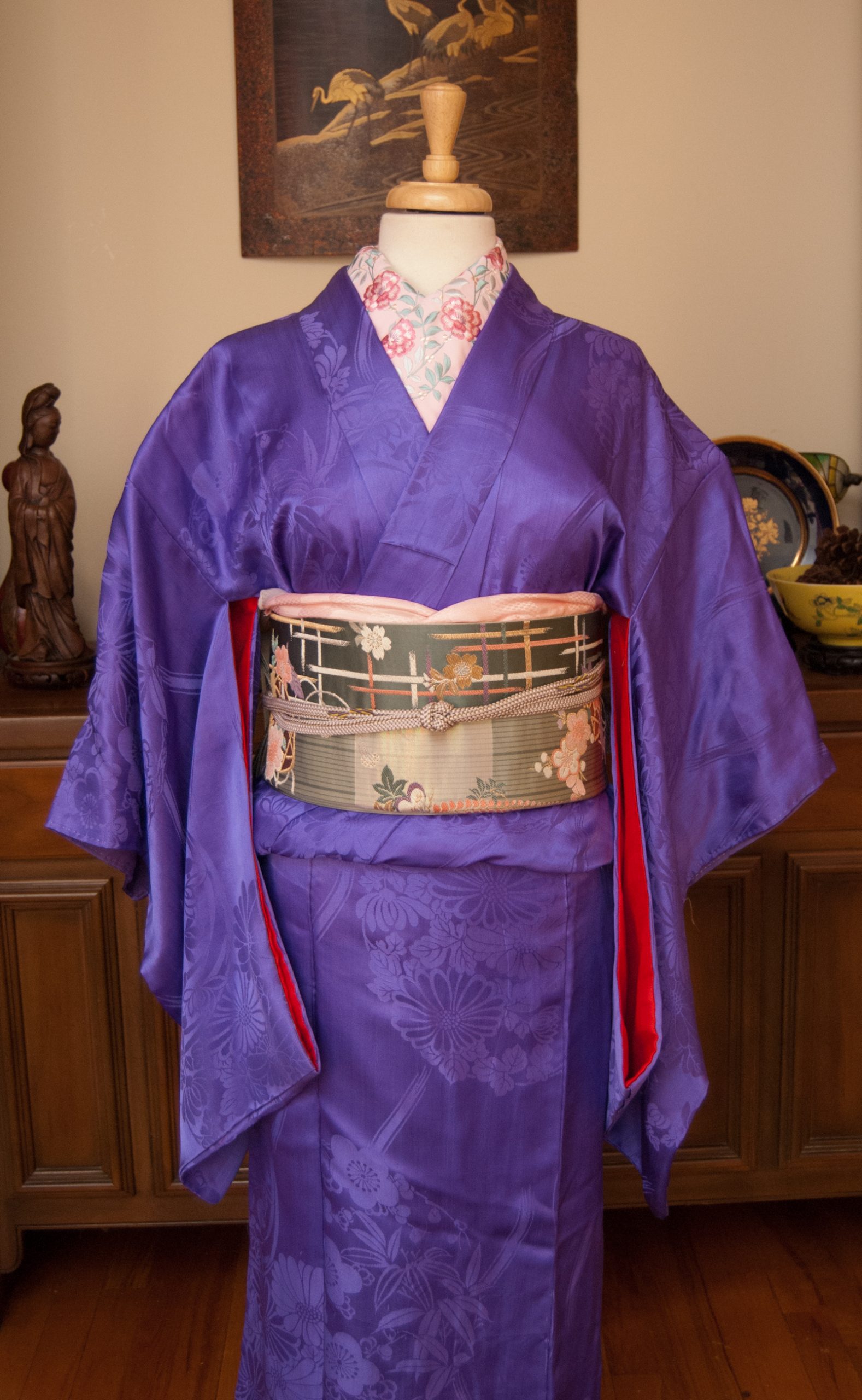
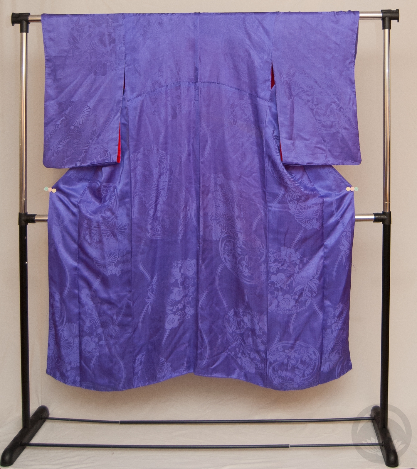
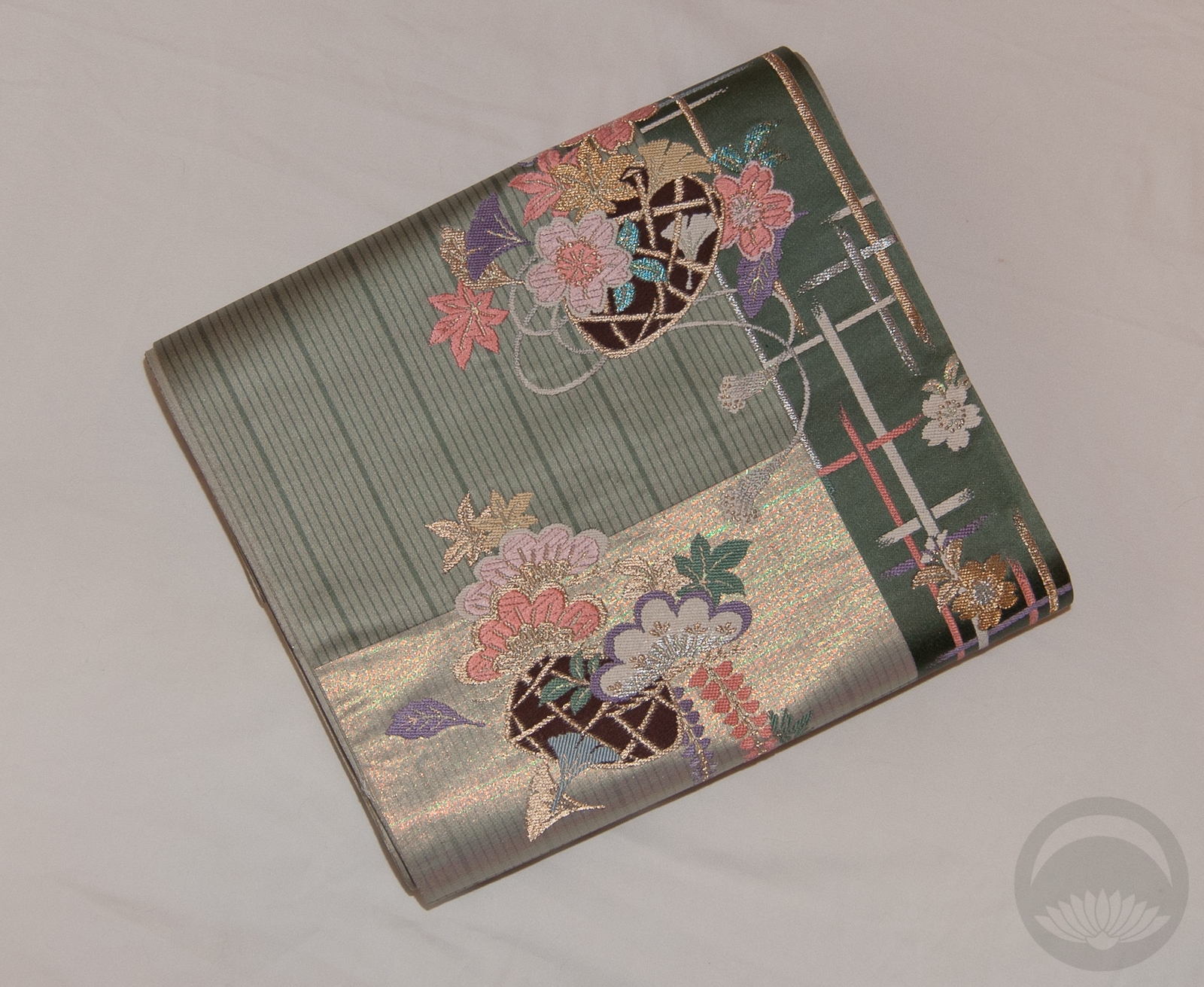
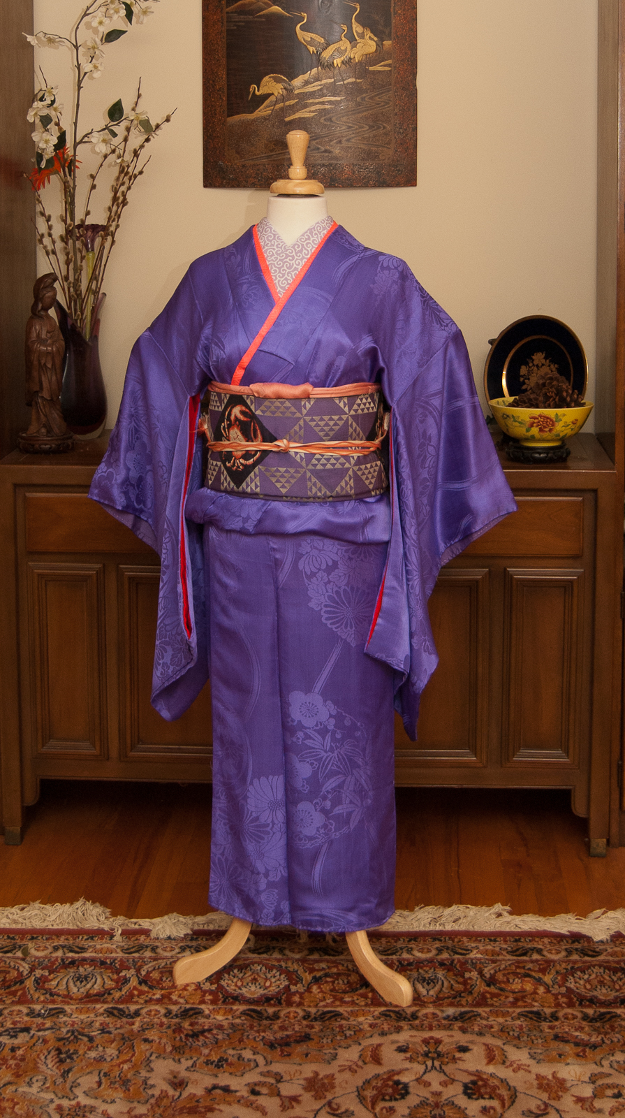
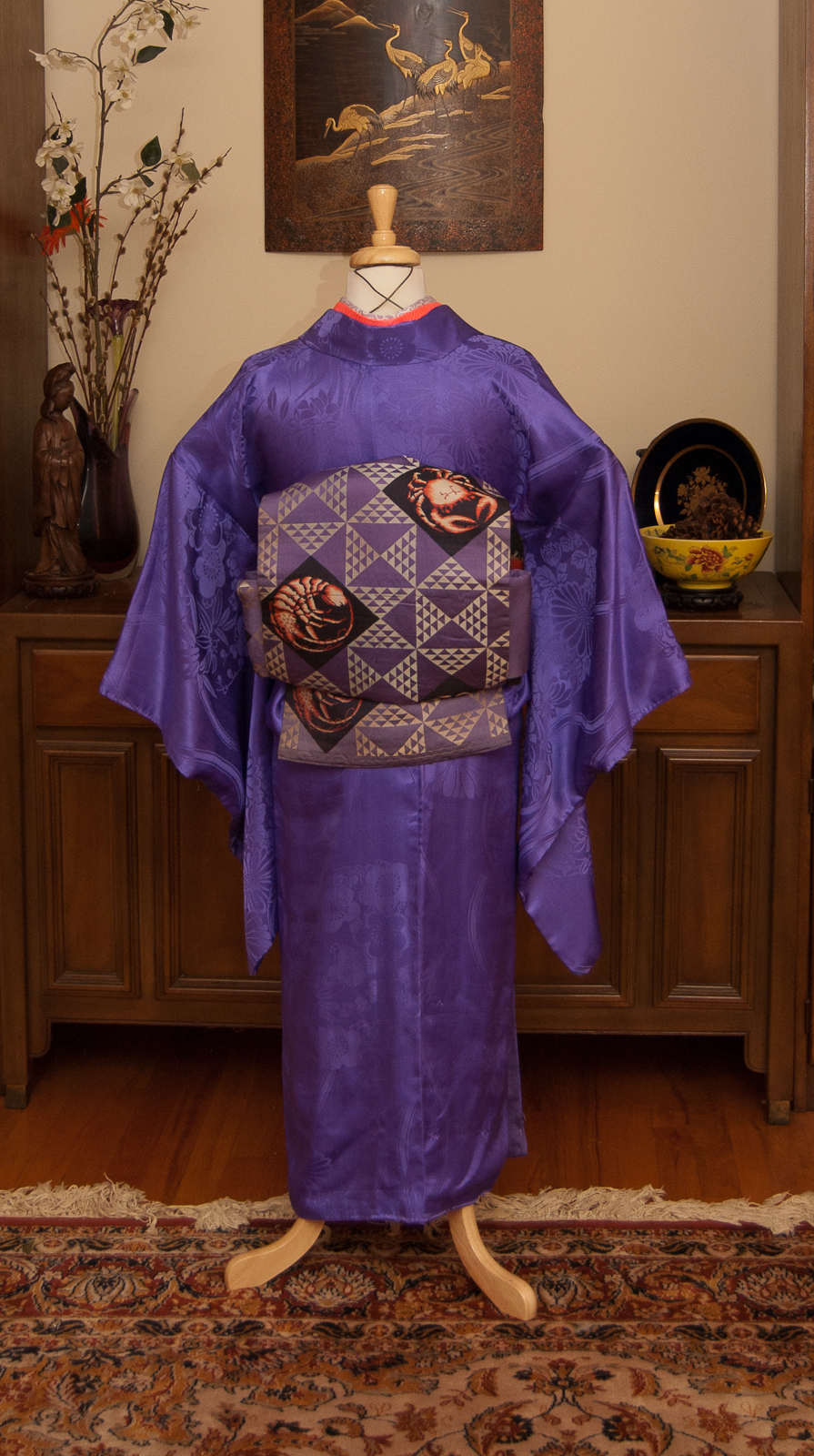
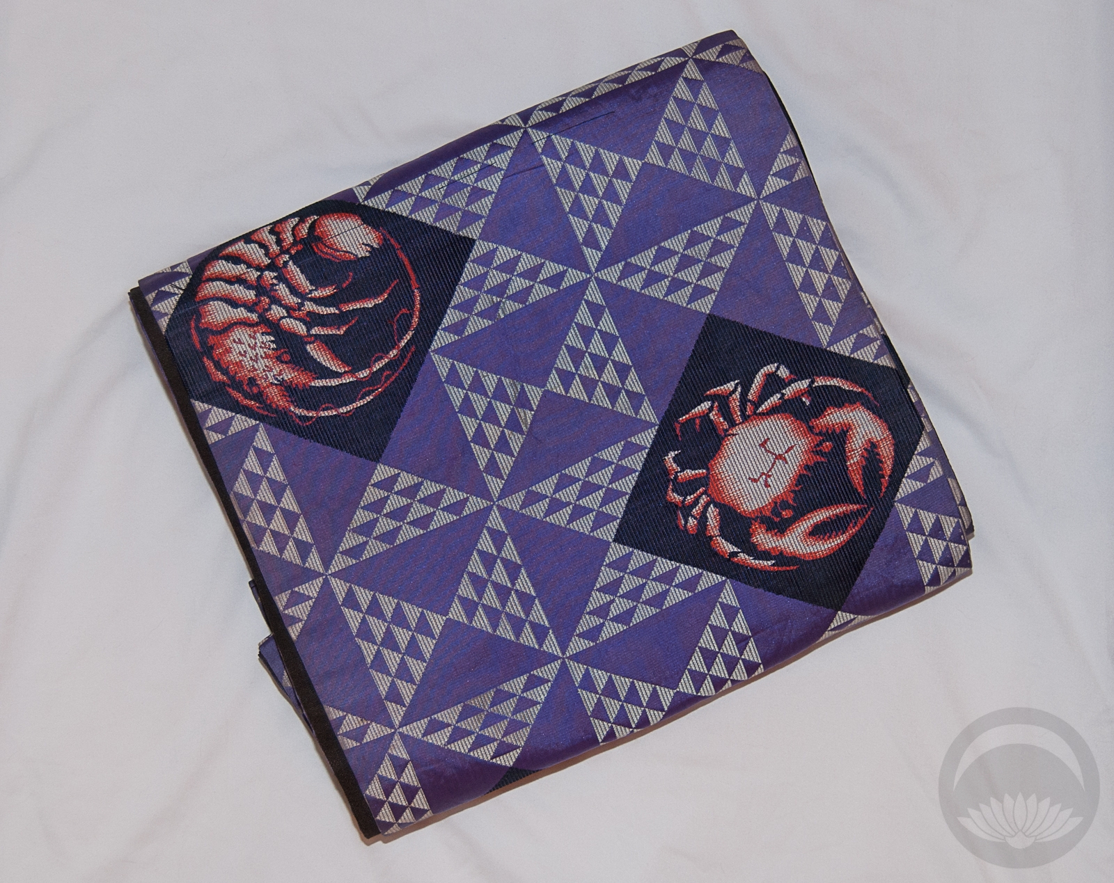
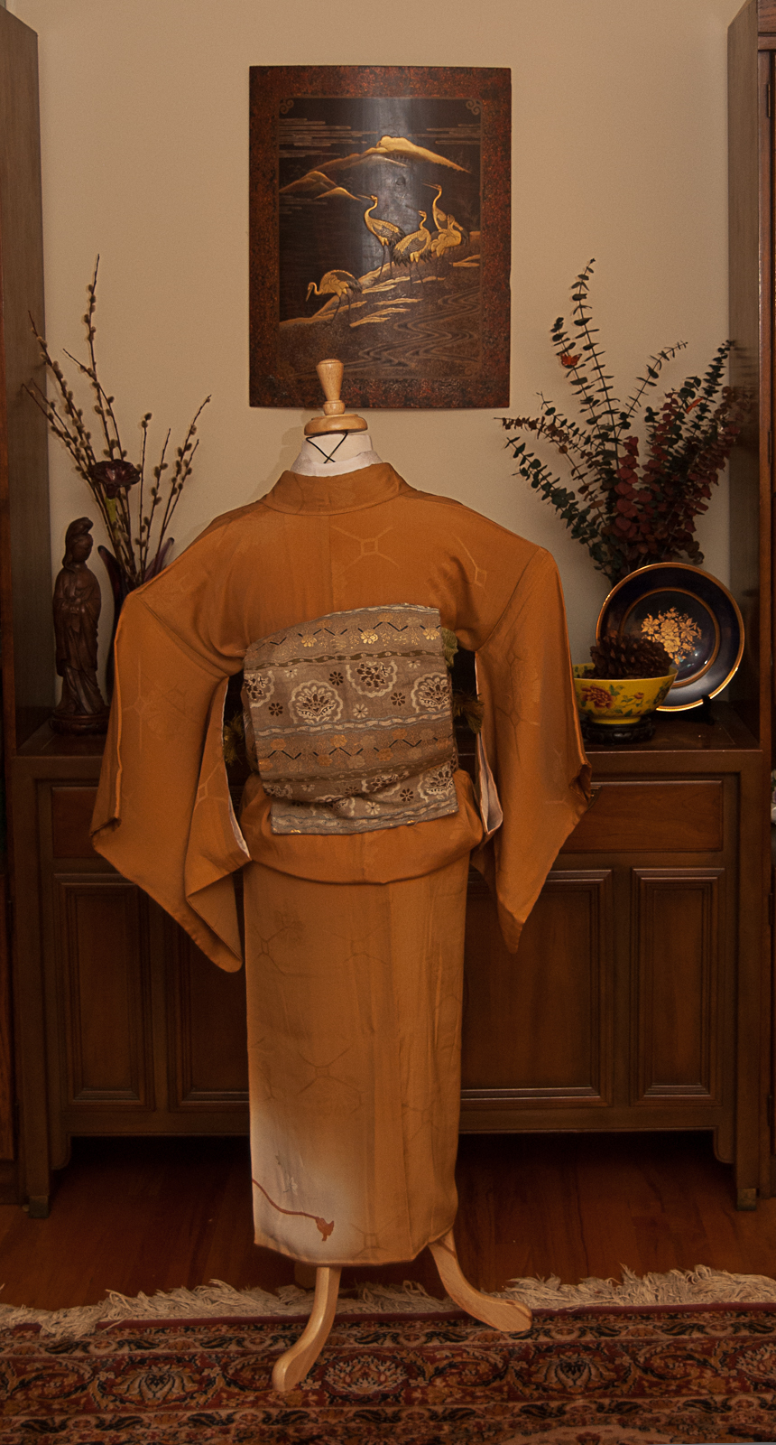
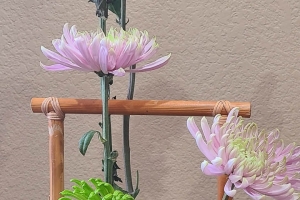
It’s still hotter than the surface of the sun here in Montreal, but I was determined to see if I could turn my han-darari tsuke obi into a passable fukura suzume bow in preparation for the Otakuthon fashion show. I figured while I had the mannequin and obi out, I may as well go all-in and change her outfit. This isn’t going to be a full outfit in the show but it’s good practice and visualisation for something that’s in the works.
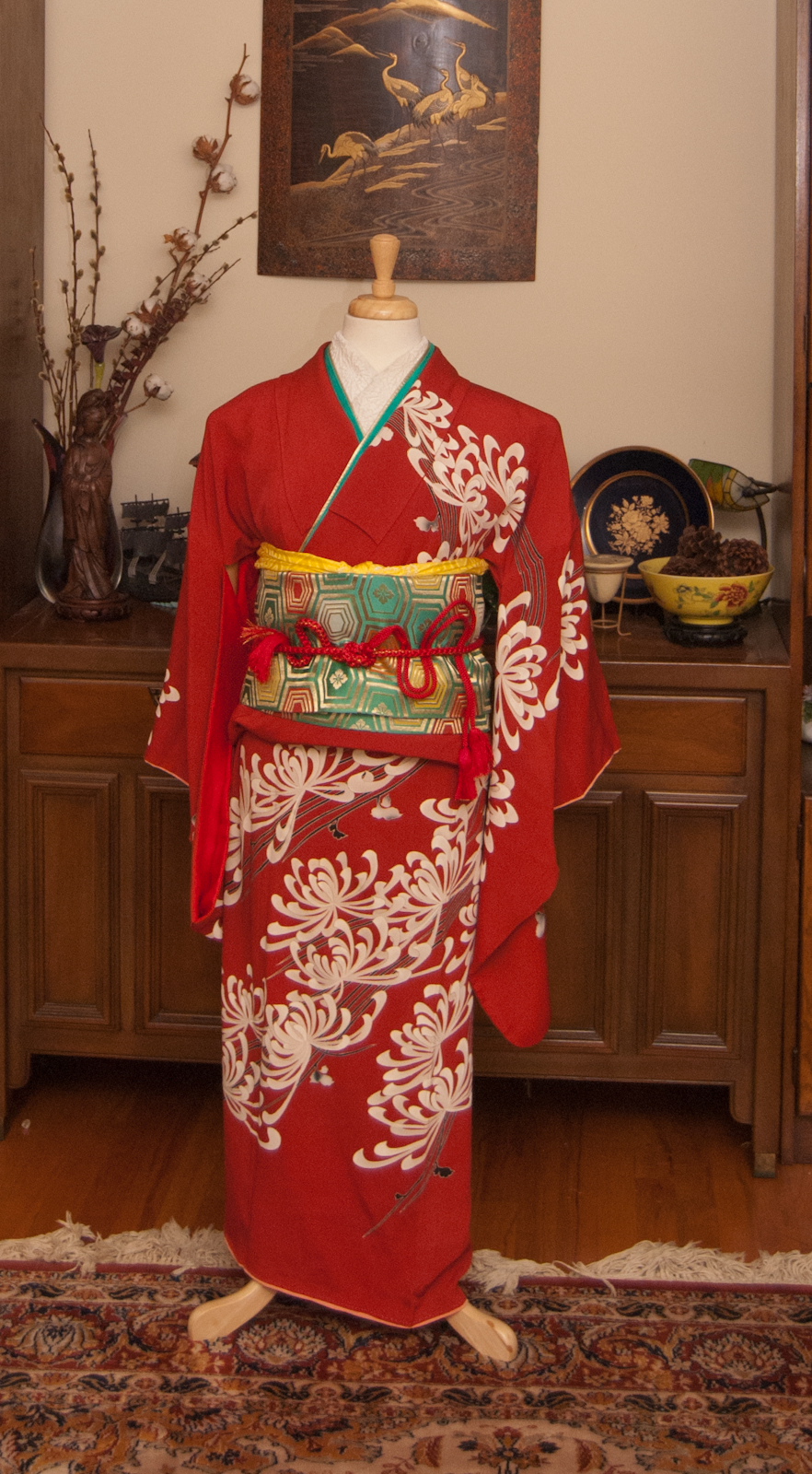
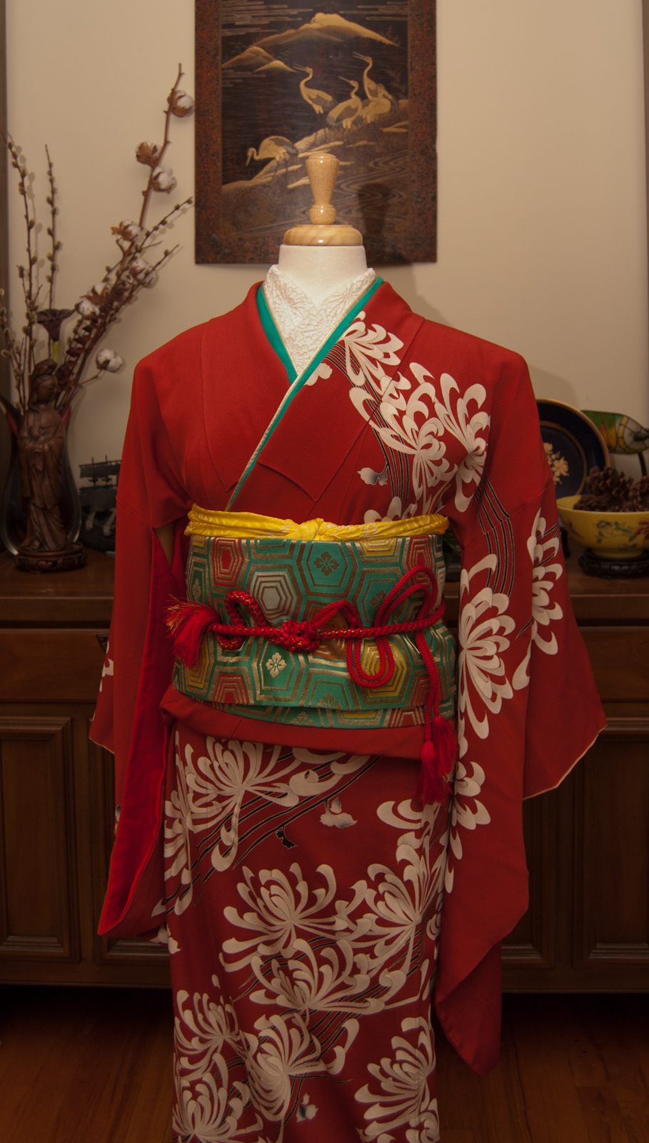
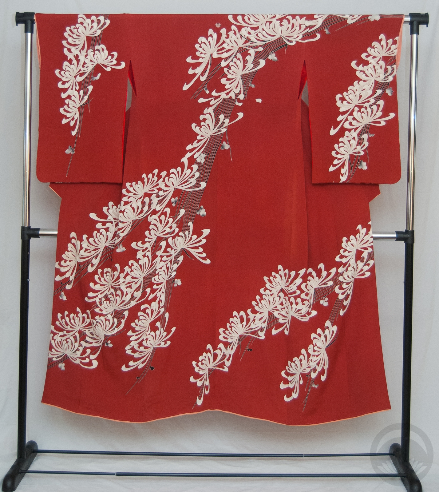
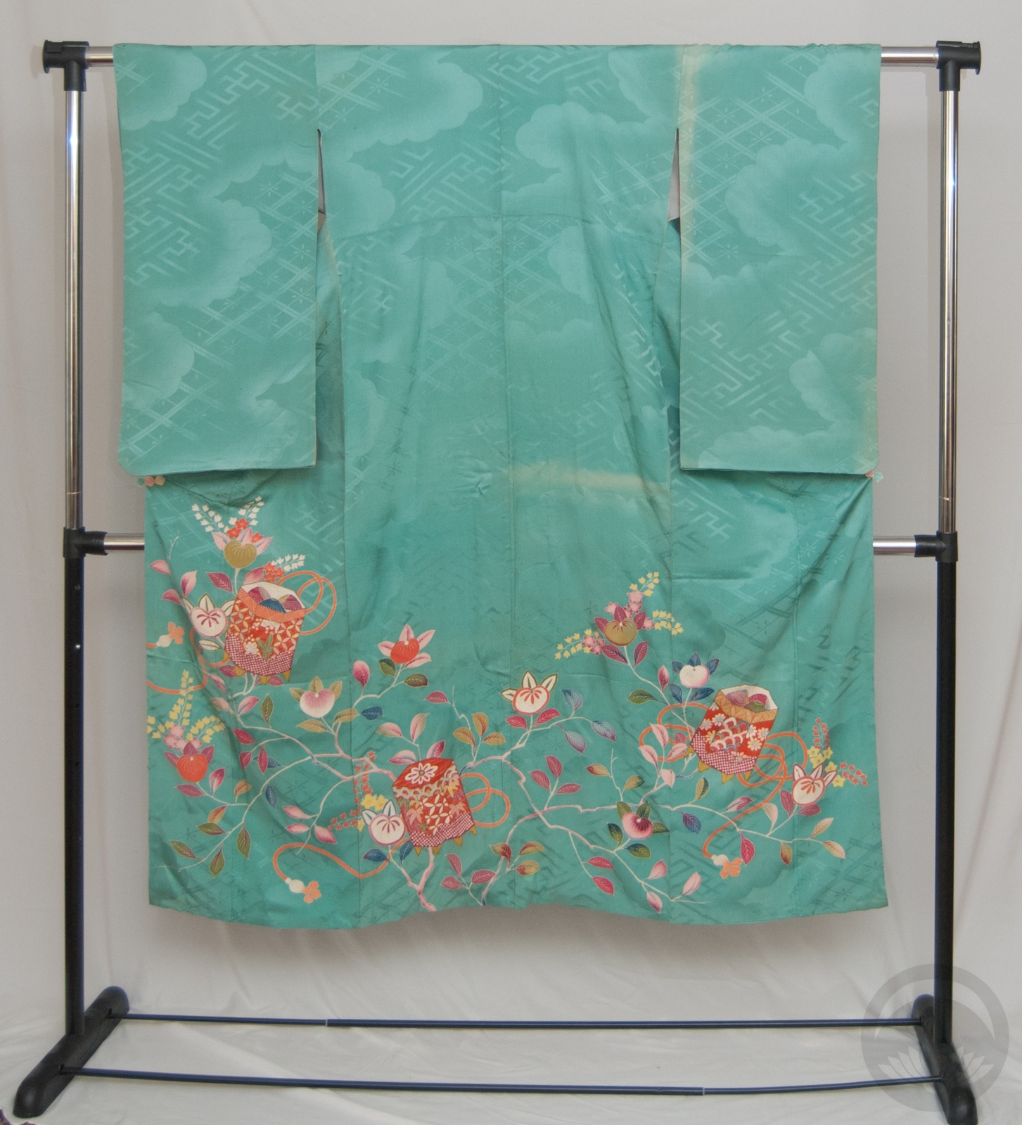
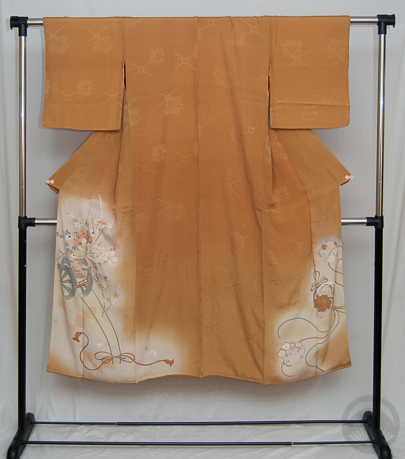
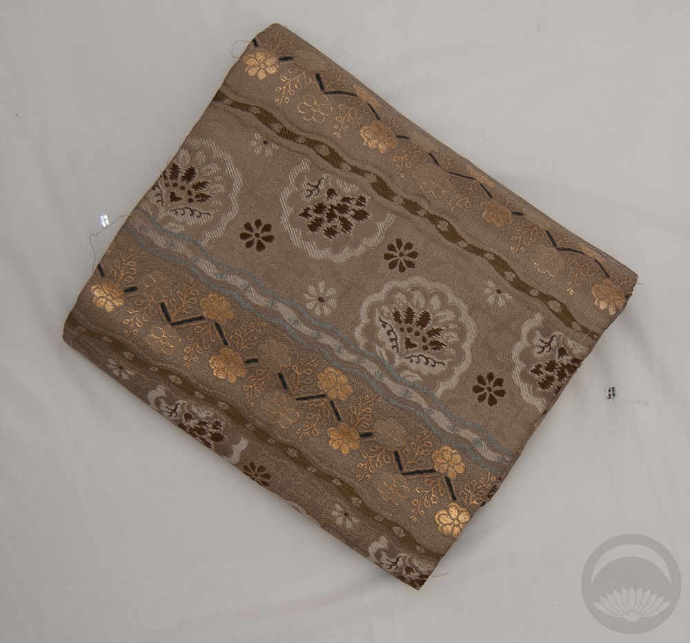
The obi has such a gorgeously shiny showa fabulous feel to it that it felt like the perfect time to bust out my precious post-war kiku houmongi. I went with gold, red, and green accessories, and while I worried initially that the outfit would feel Christmassy, it actually worked out really well. Besides, Christmas in July might help me feel a little bit cooler!
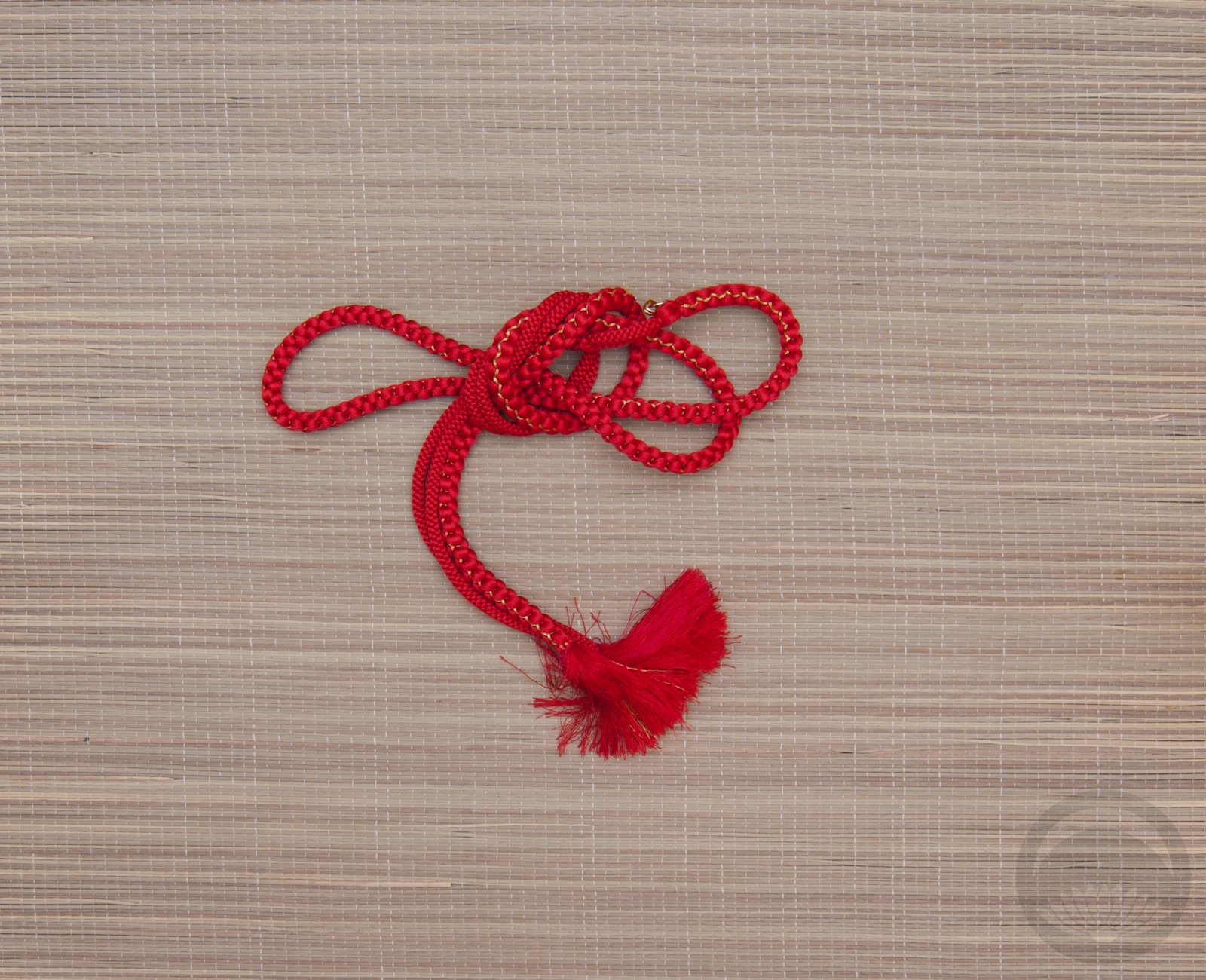
As for the obi experiment, it definitely worked in theory. I just need a few more himo to make things a little tidier, but I’ll definitely be able to pull it off properly for the show on a real model, and I’m thrilled.
Items used in this coordination
-
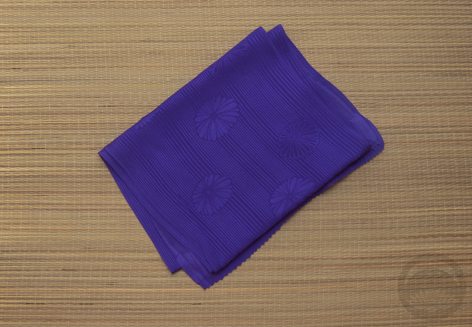
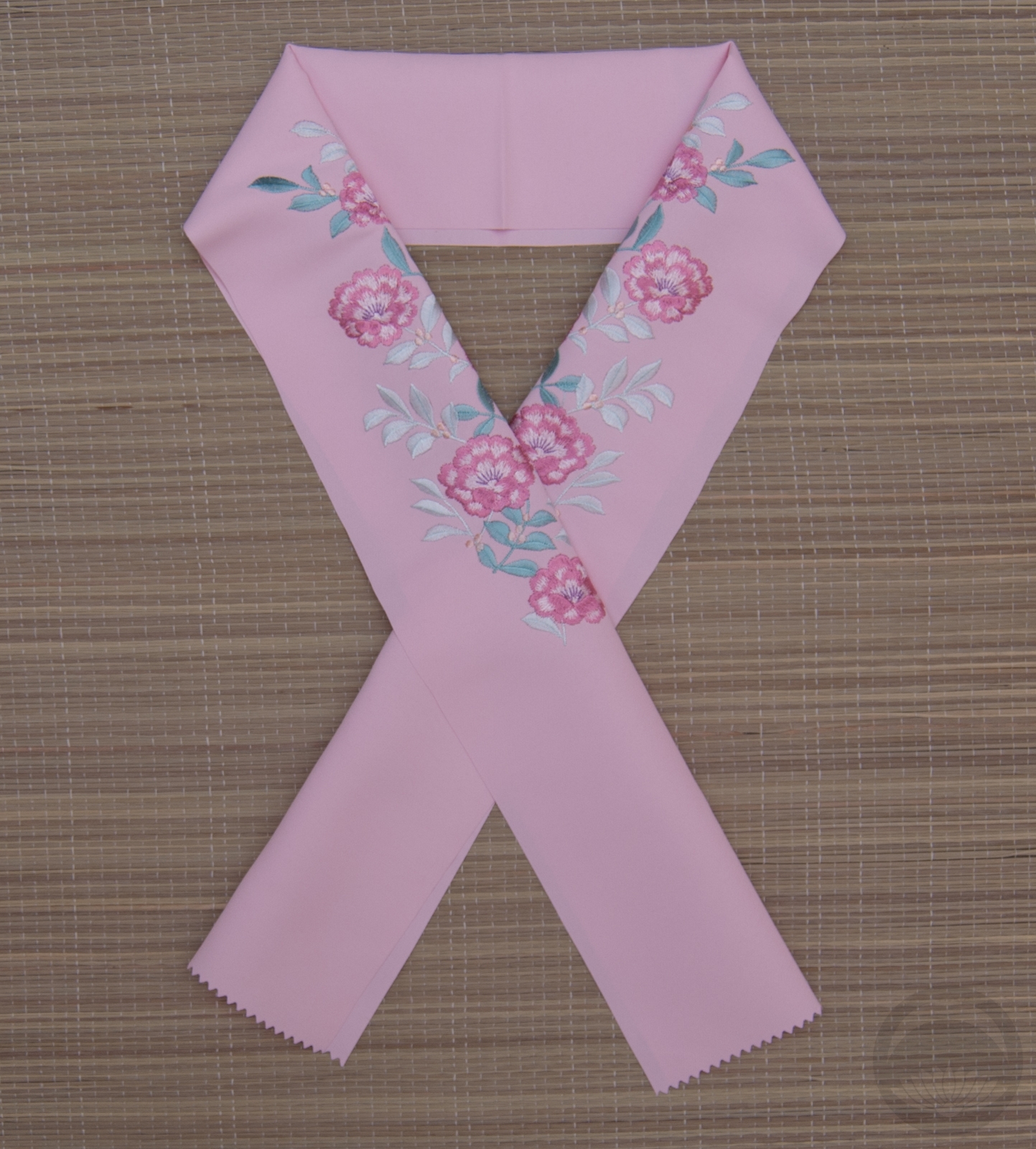
- Vibrant Red with Kiku
-
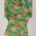
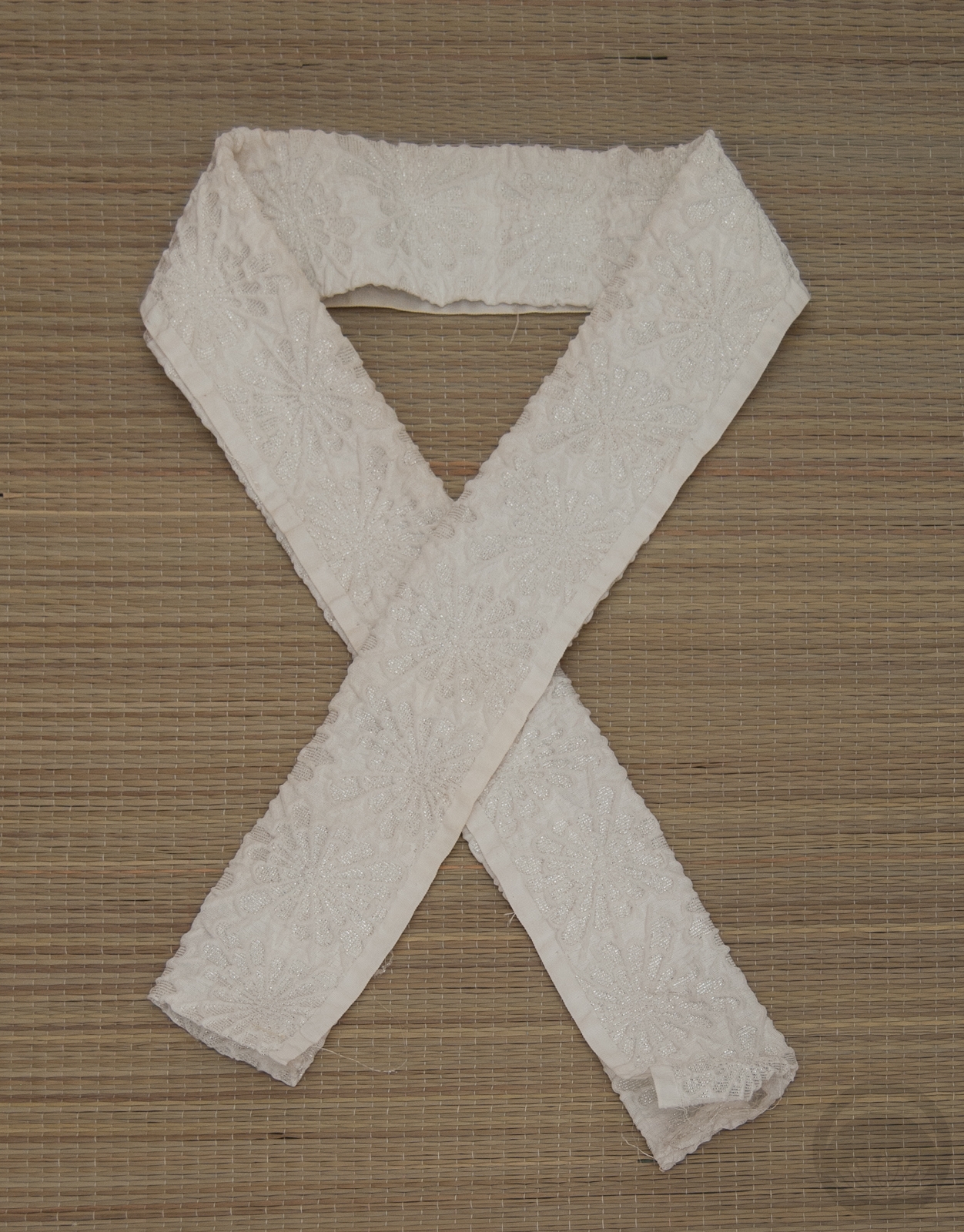
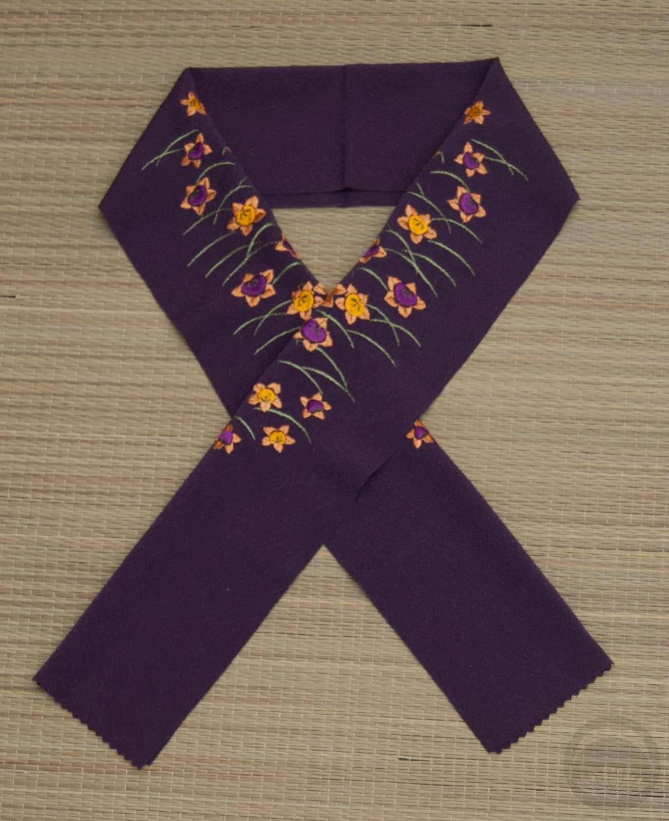
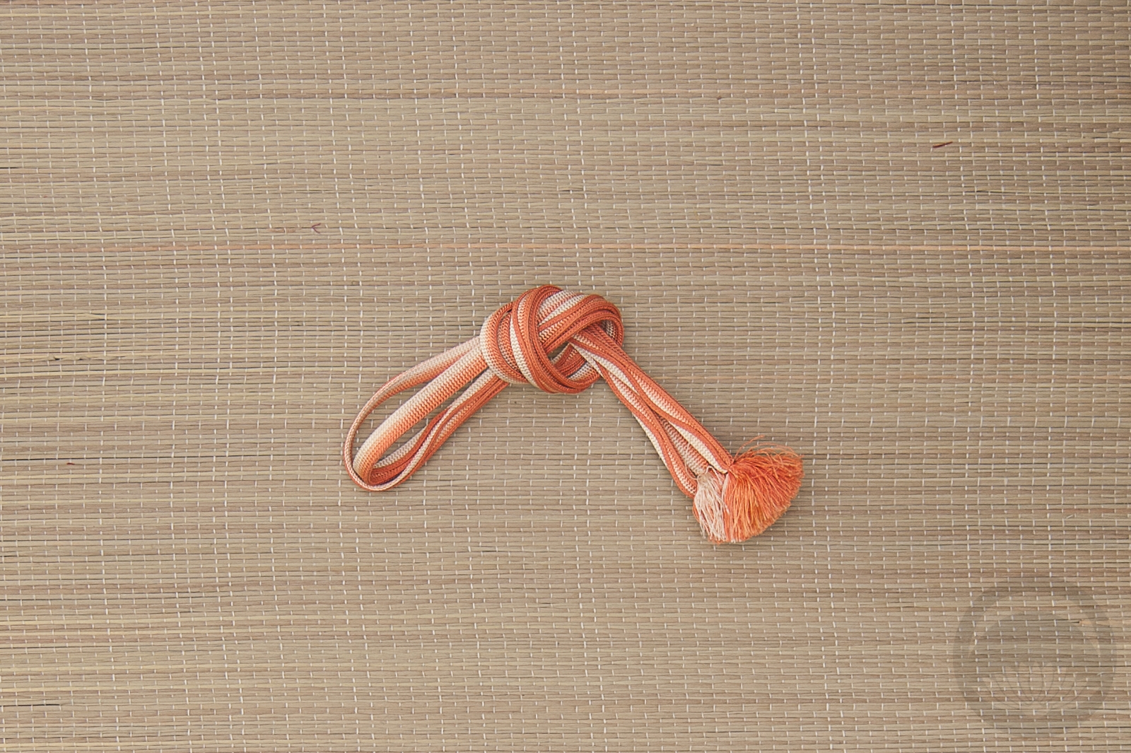
- Green Tsuke Darari-Style
-
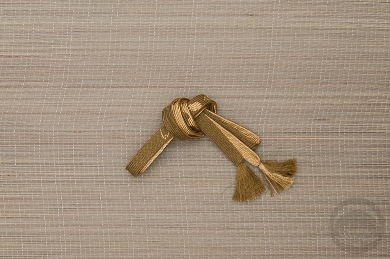
- Textured Kiku
-
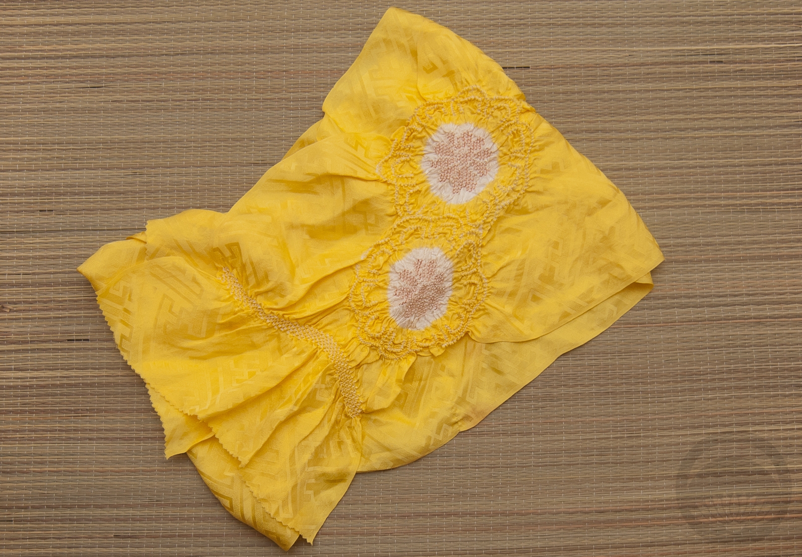
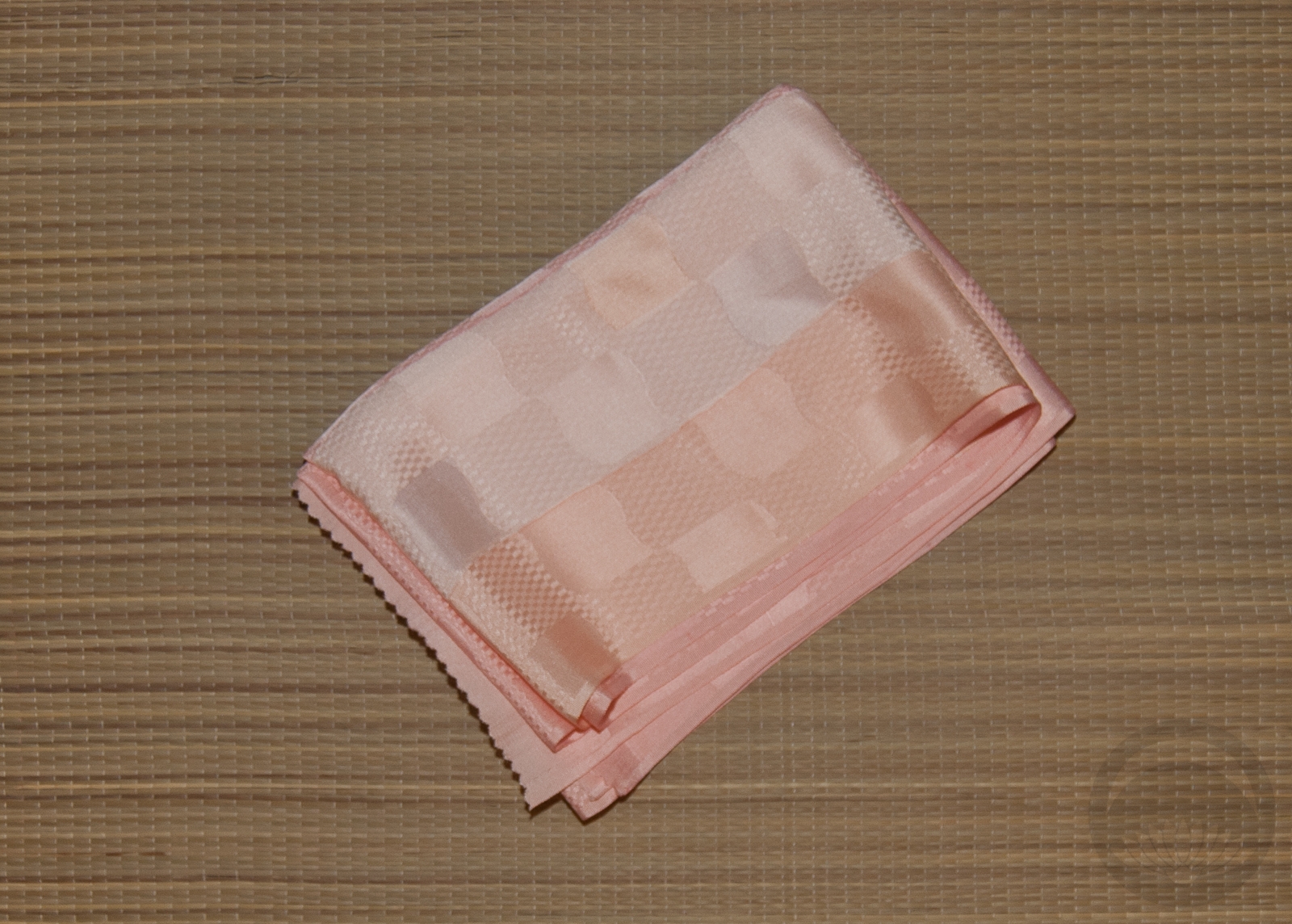
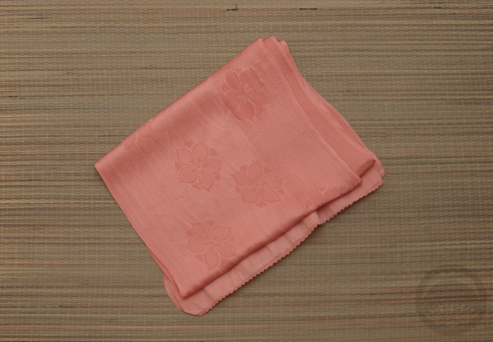
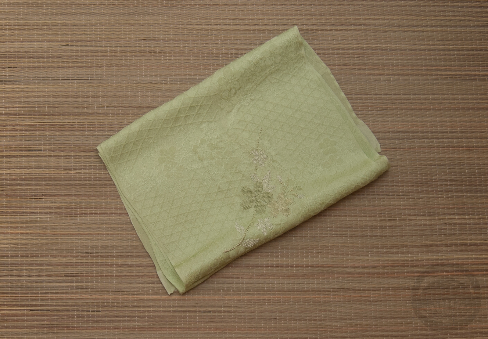
- Lemon Yellow Shibori
-
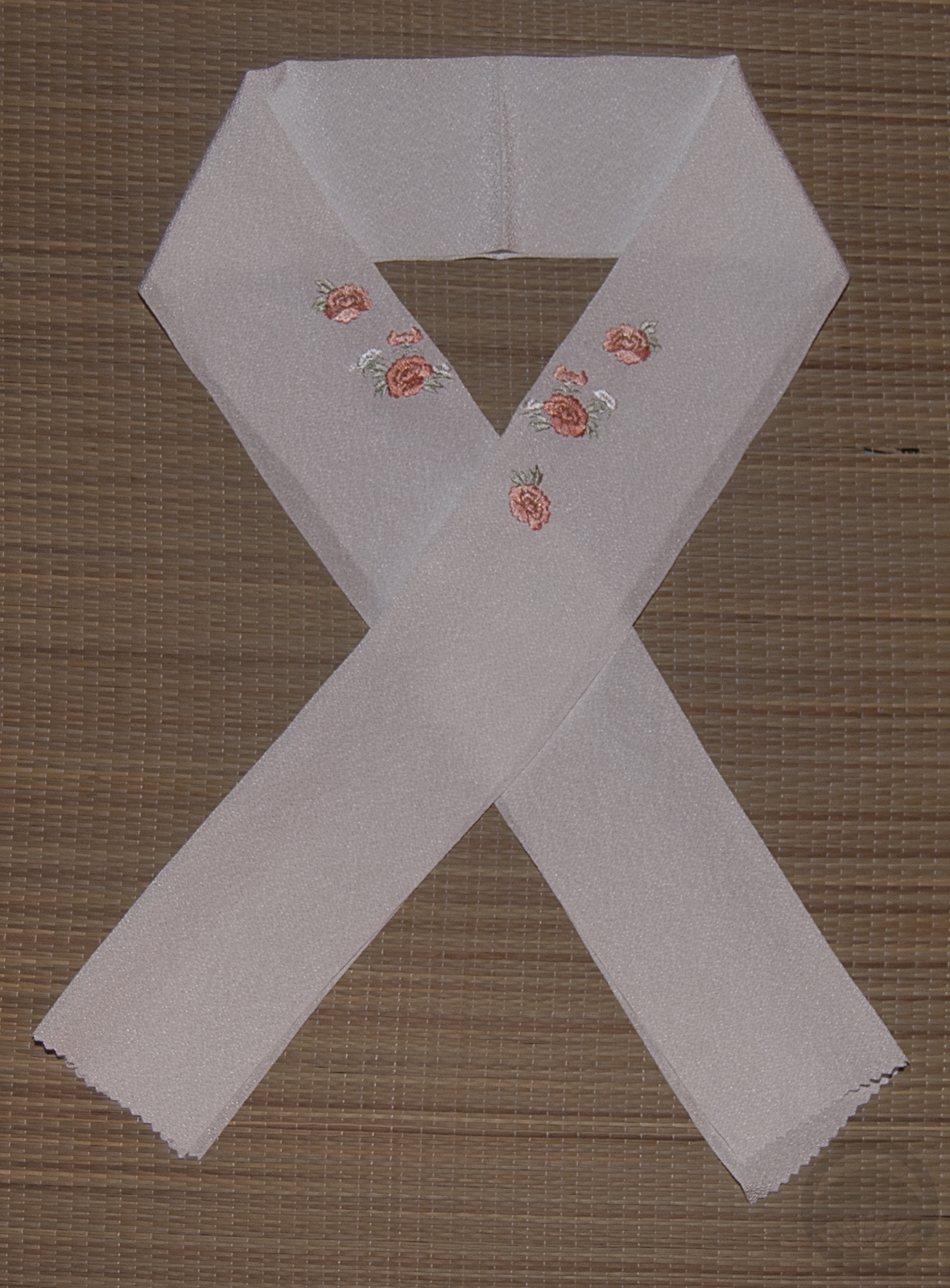
- Red Furisode


 Bebe Taian
 CHOKO Blog
 Silk & Bones
 Gion Kobu