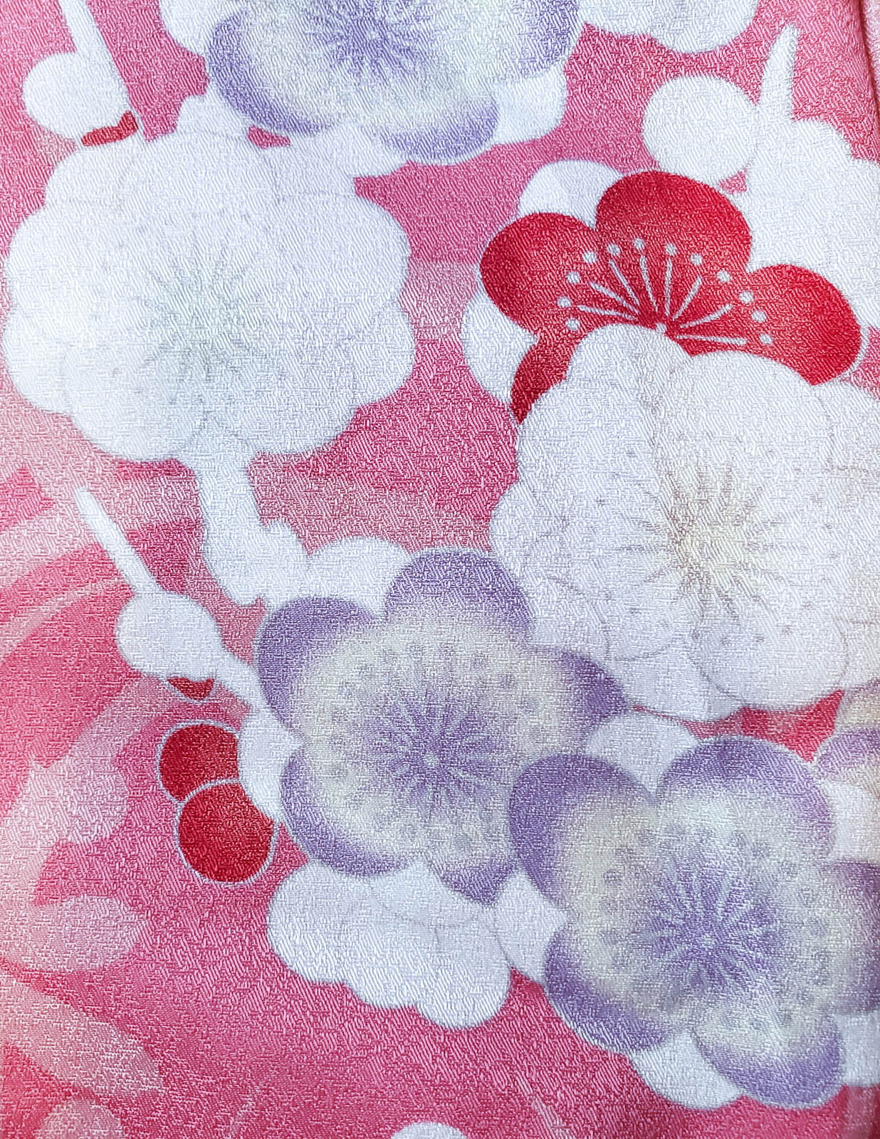
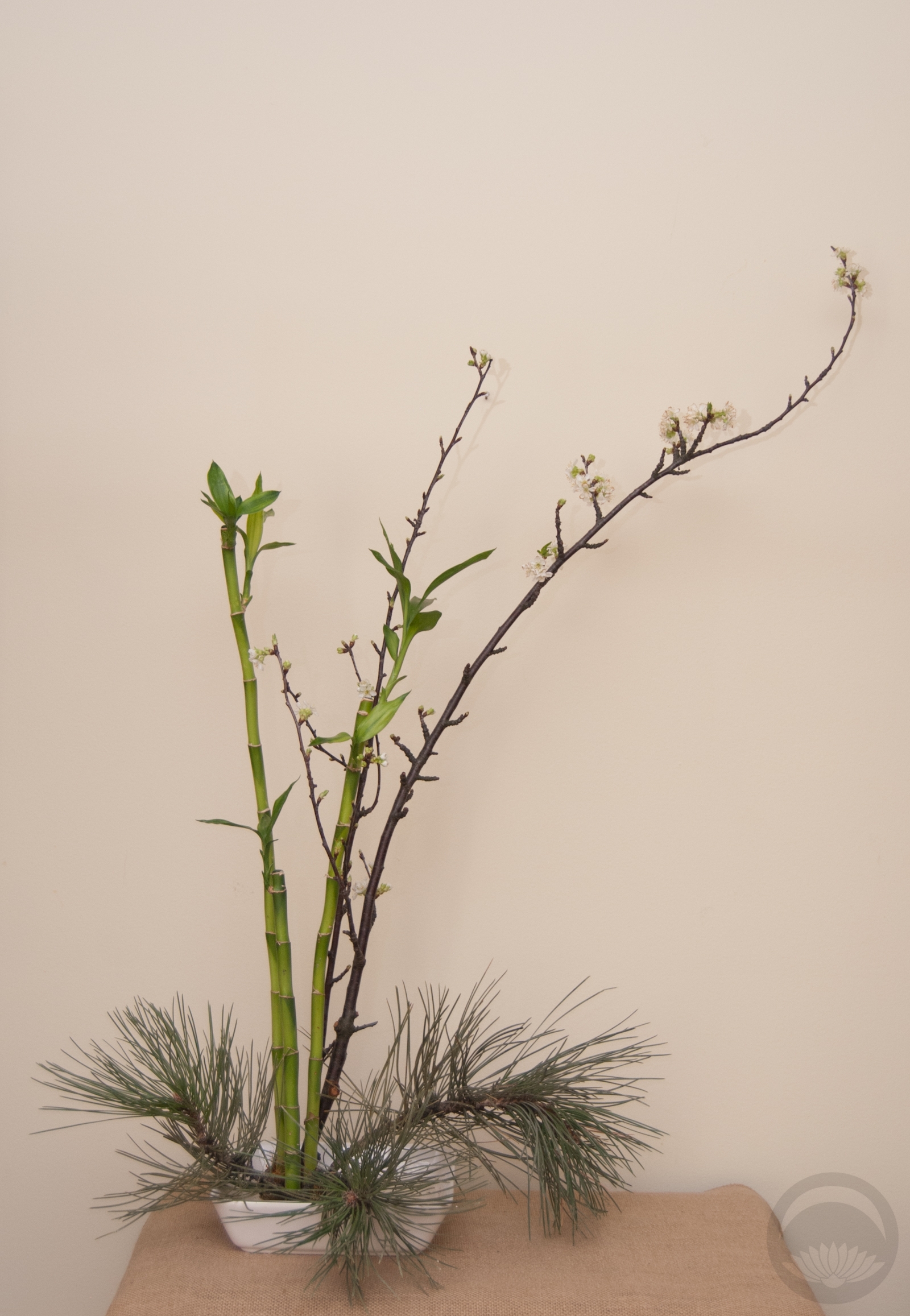
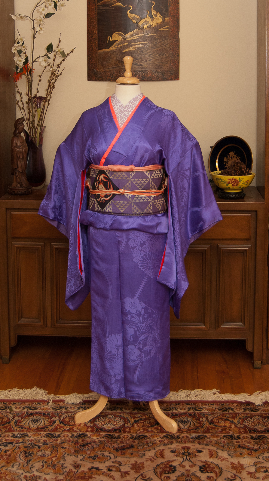
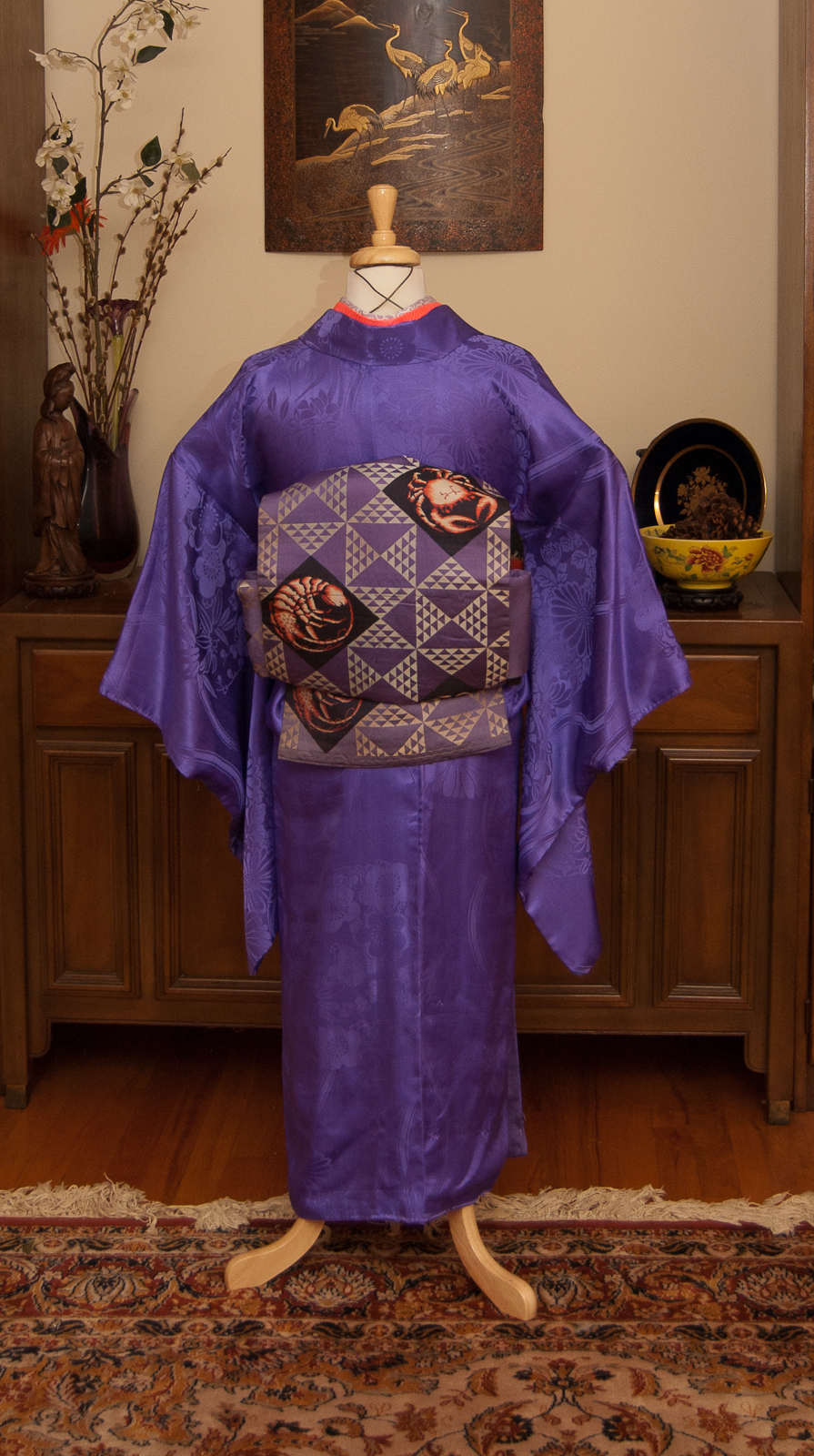
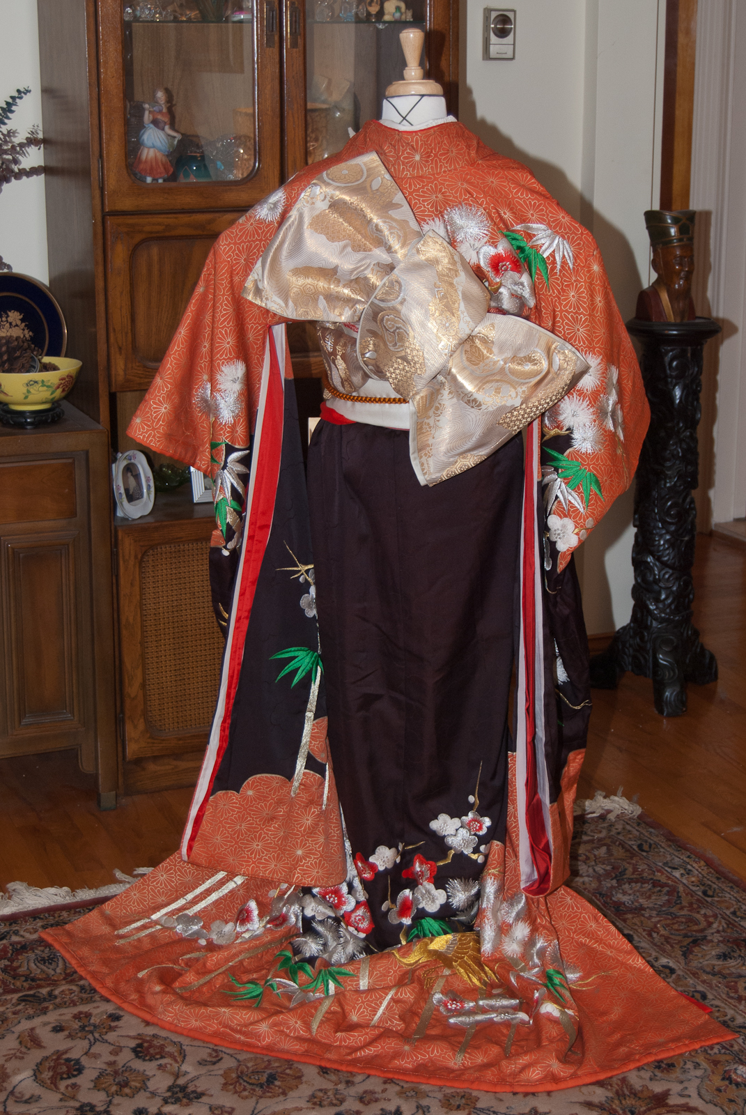
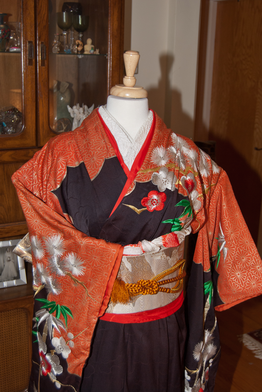
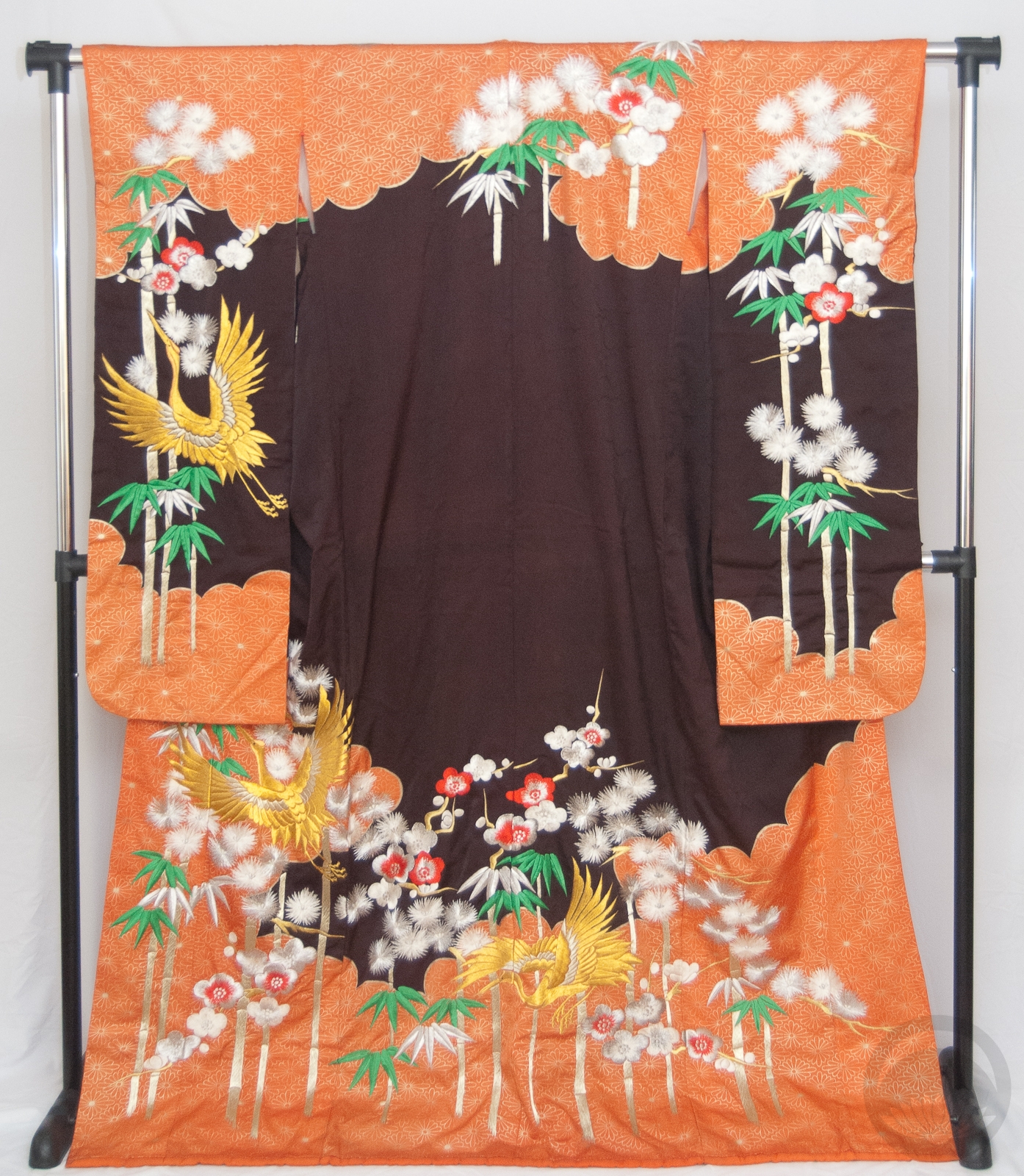
U is for Ume

Ume, 梅, Plum

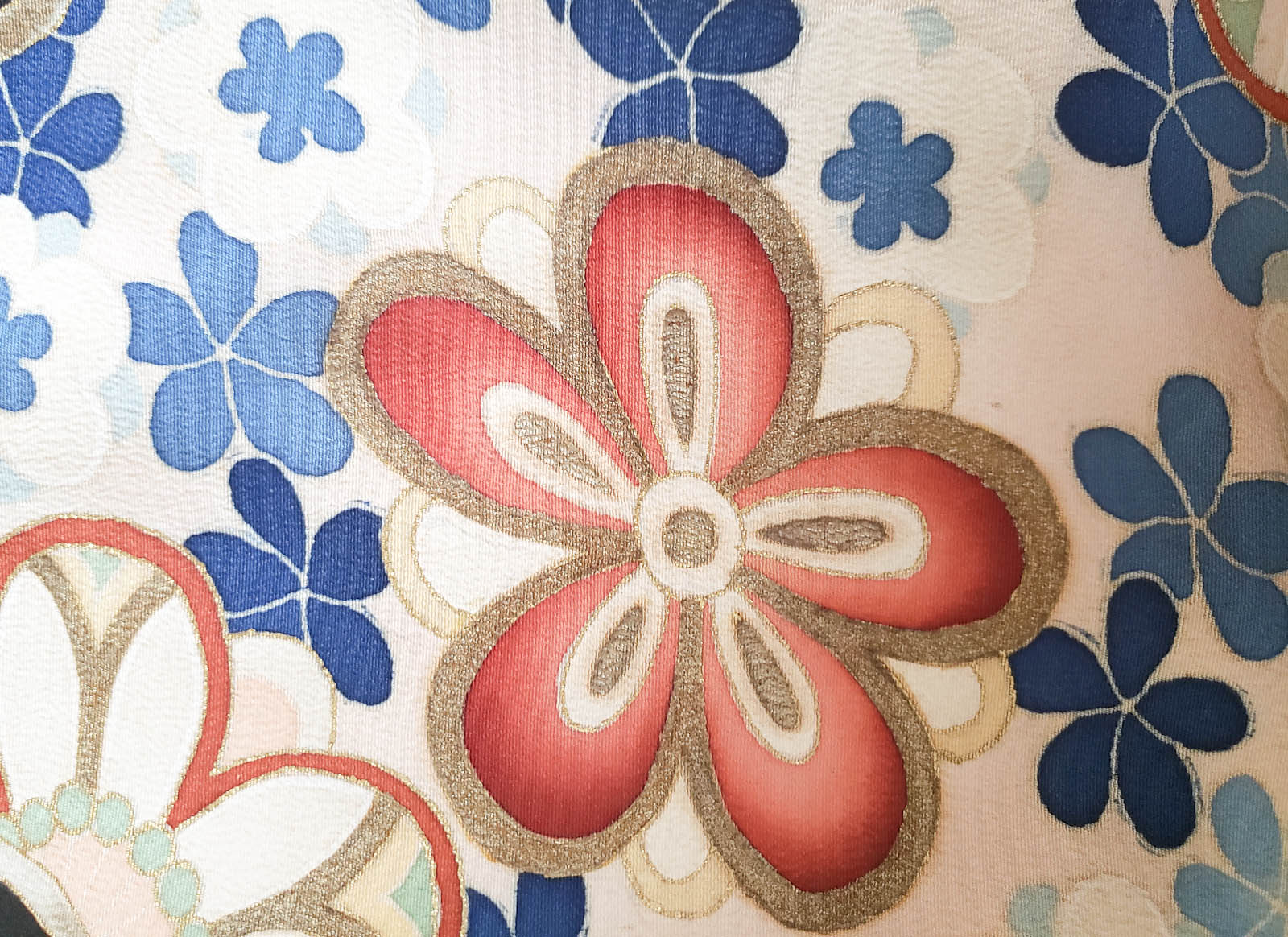
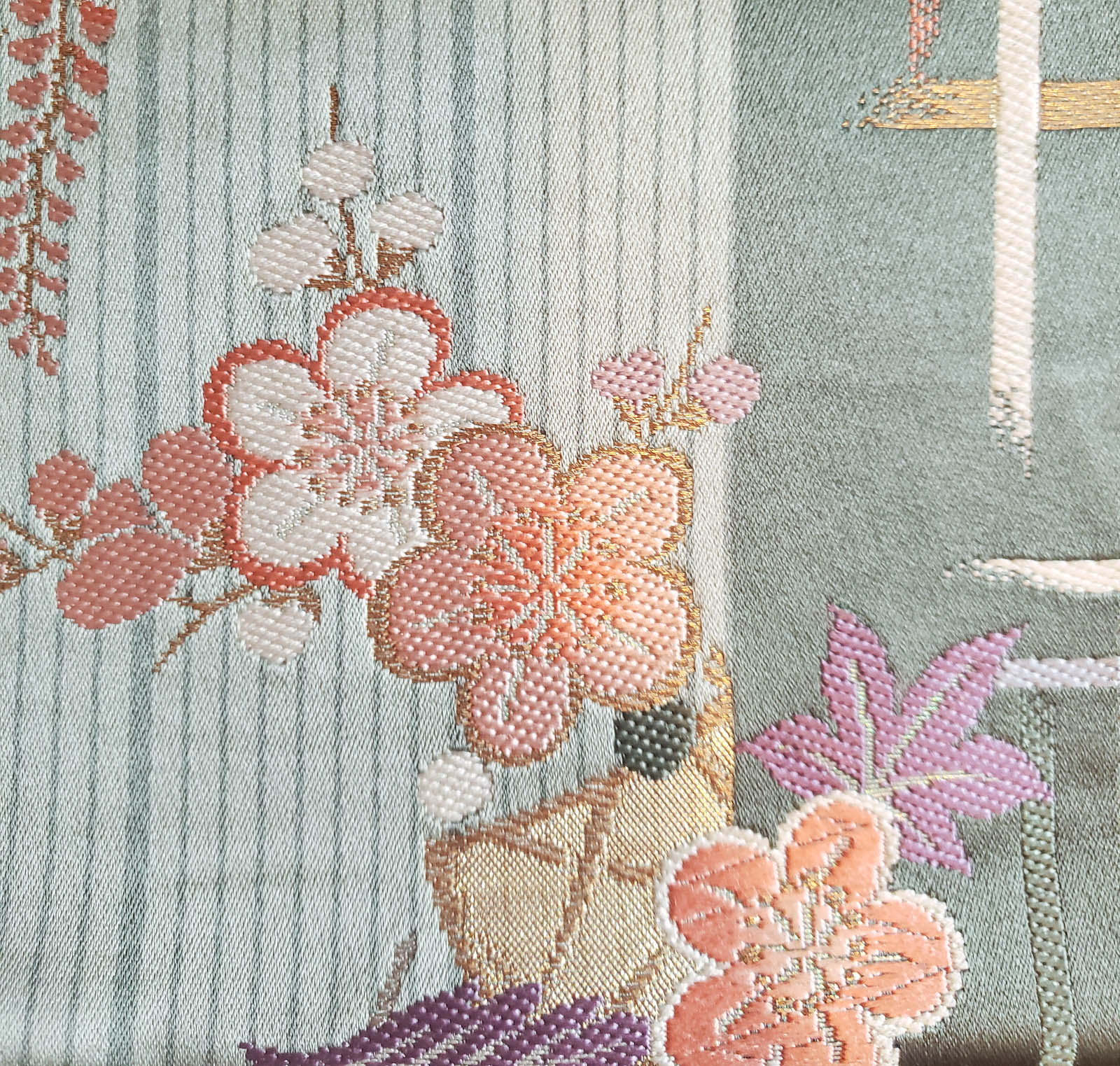
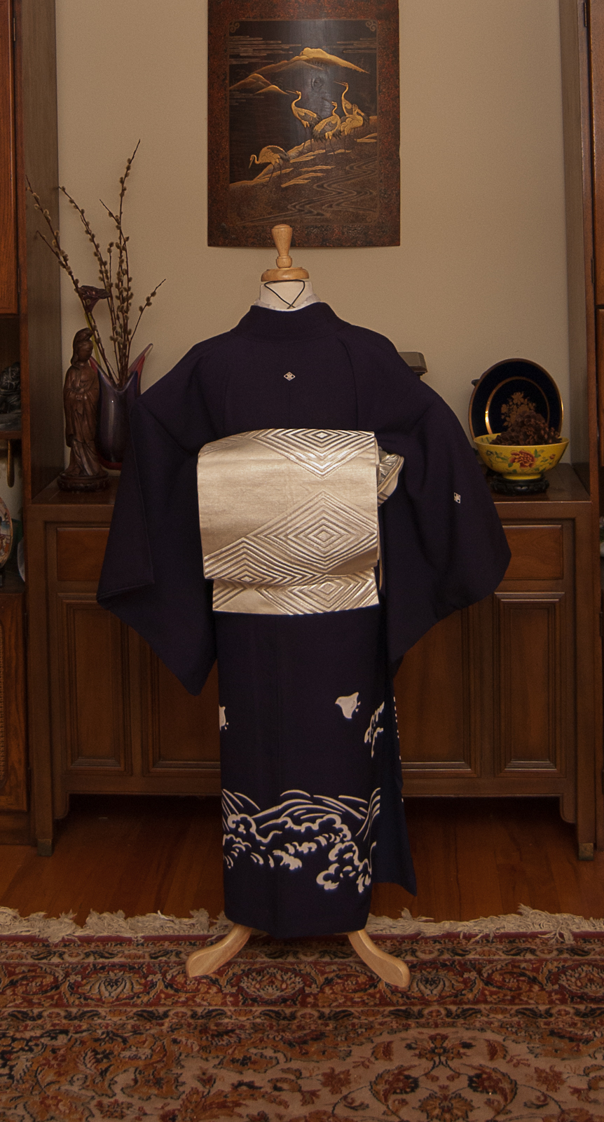
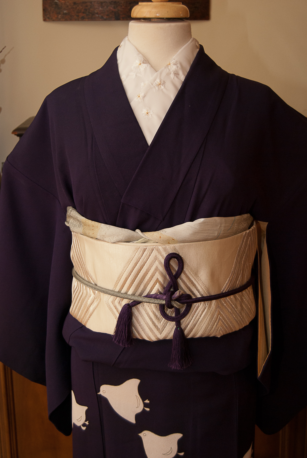
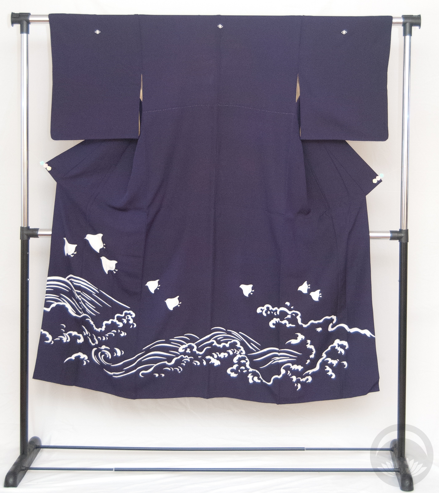
Another of Japan’s more iconic flowers, ume or plum blossom can be found on nearly as many things as sakura nowadays. While their blooming season is not as celebrated, they’re an icon of the new year (since they bloom in winter), and a common motif for luck and prosperity. They’re one third of the “three friends of winter” or sho-chiku-bai, the other two being pine and bamboo. This combination can quite often be found on formal celebratory kimono such as wedding kakeshita or kuro-tomesode.

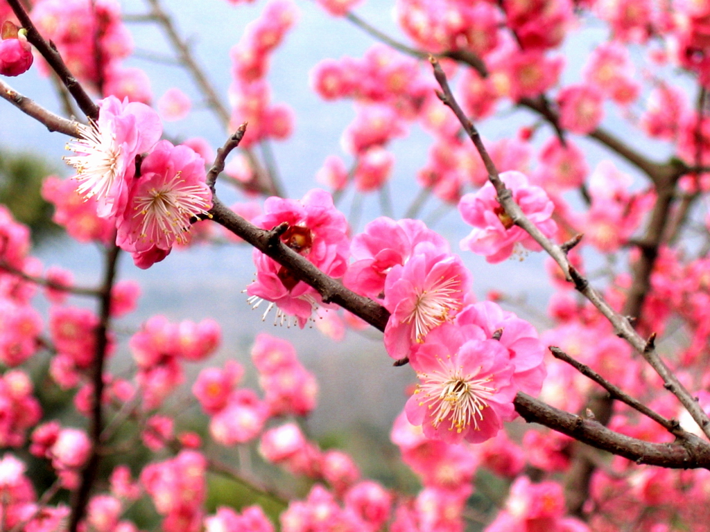
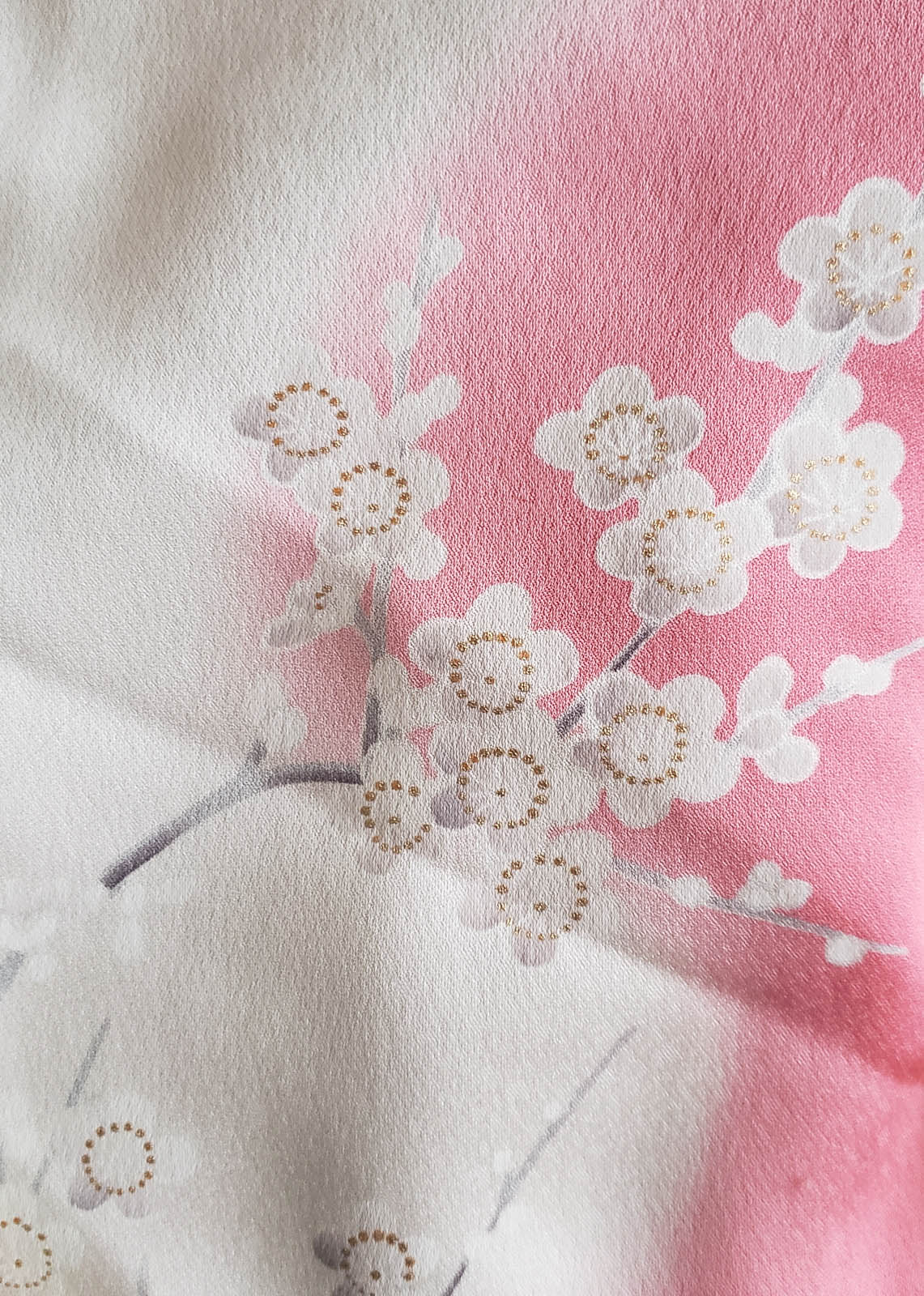
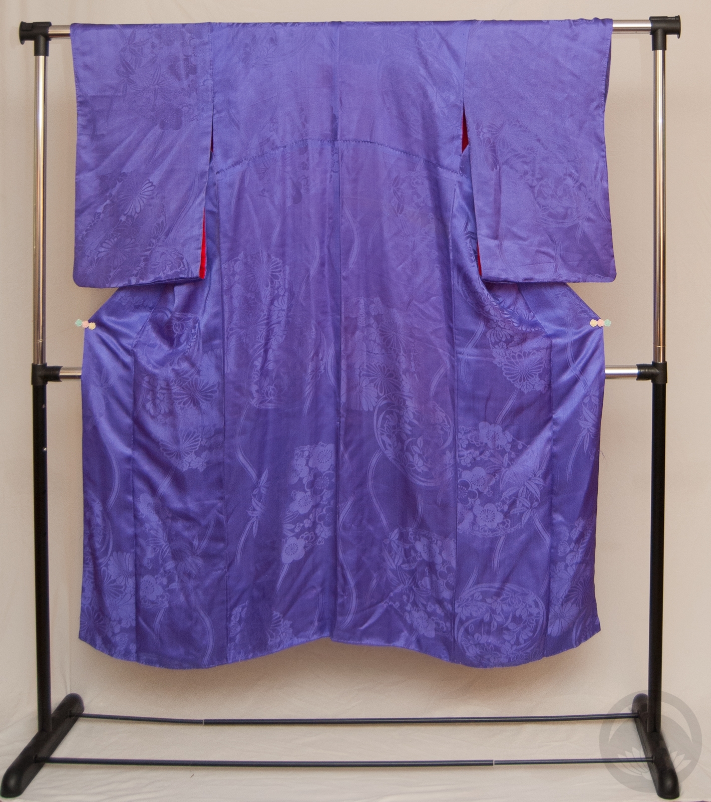
Visually they’re quite similar to sakura; five-petalled blossoms directly on wooden branches, with little to no foliage. There’s one obvious difference that allows for easy identification though, where sakura petals have that tell-tale notch in the tip, ume petals are very round. In more stylised representations they may even be depicted as full circles.

Ume is primarily a late winter motif, However, much like sakura, ume has become such a common and popular flower that it shows up on items for all seasons nowadays. It’s often used in the summer on things like yukata to evoke a feeling of coolness.

All the photos in this entry come directly from my collection. You are welcome to use them for personal projects and reference, but not for anything commercial. If you’re uncertain, feel free to contact me.

Sho-Chiku-Bai Serendipity

As some of you may know, I’ve been wanting to do a sho-chiku-bai (歳寒三友. Three Friends of Winter) pretty much since I started learning and practicing ikebana. Unfortunately, plum branches are very difficult to find around here. They’re finicky, they’re expensive, they’re fragile, and most florists just don’t bother stocking them. So I shelved my plans and moved along.

Last week, my favourite local florist posted some photos of some, so of course I made a beeline for the shop. Unfortunately, they were put aside for a big contract project, but the owner said he’d keep any leftovers for me.

Today I made a detour to the walk-in clinic (nothing serious, just a weirdly swollen painful toe), but frustratingly, they weren’t accepting walk-ins anymore. However, the clinic is right next to the florist so I figured I’d duck in just to see. Lo and behold, he had a container full of freshly budding branches on the counter. It was meant to be! My trip to the clinic may have been a gigantic waste of time, but at least the trip wasn’t. I chose the one with the most appealing curve to it, and then three branches of lucky “bamboo” (it’s actually a variety of dracaena, but close enough…) to balance things out. I knew I could get pine branches from the park near my house. Funnily enough, when I got to the park, there was one large, perfect branch lying right in the middle of the path. I didn’t even need to cut anything, it was like it was waiting for me. Truly serendipitous!

The only thing that didn’t just click right into place was the actual photo, sadly. The lighting just wasn’t working out in this nook, and the arrangement is too big to fit unobstructed anywhere else. I might try again tomorrow before work, while the sun is higher. If it works out, I will update the picture. *Photo updated 02/23/2019

#MonoKimono Challenge – Plummy & Crabby

Well, it’s been a hot minute since I’ve done an outfit on the mannequin, hasn’t it? Between events, injuries, heat waves… it just got sort of pushed to the wayside. But I was determined to keep going with the monoKimono challenge this weekend!

A dear friend sent me this kimono a few weeks back, and since it’s a beautiful solid colour I knew it would be great for a monochrome outfit. Problem is, it’s that very difficult shade of royal purple that kimono fans all know intimately; it’s hard to coordinate, it’s hard to photograph. Even the catalogue photo of it looks a bit off, since I had to process it to make the kimono colour accurate.

The only obi I had that was in the same cool-toned range was my beloved crustacean chuuya obi, so that was a done deal. Rather than try to hide the orange accents in the obi, I figured I’d use them as a pop of contrast and emphasize it with the accessories. The outfit still feels primarily monochrome, but the brighter salmon tones help break it up and keep it visually interesting. The haneri is a lighter shade of purple, but I think it still works well and echoes the white in the obi. Overall, the outfit is even more successful than I thought it would be, which pleases me immensely.

Items used in this coordination


Concert Style

You might have seen this awesome treble-clef obijime knot going around lately. Youandi over at Chayatsuji Kimono posted a great video showing how to tie it, and it’s actually deceptively simple once you’ve got the basic concept down.

This rich purple nami-chidori irotomesode has always been one of my favourite kimono, and it’s always given me a dramatic stage vibe with its bold contrast and large scale design. It seemed like a good opportunity to pull it out and show it some love. I wanted to go for something you might see on an enka singer, bridging the gap between traditional and modern.

The obijime knot and the kimono really needed to be the focus here so I kept the obi and accessories simple. A white haneri with white sakura and a geometric white-and-silver obi help to bring a subtle bling to the outfit without being distracting, and my ice-blue obiage echoes the pale end of the obijime. It’s a very simple, classic, elegant coordination and I think it would look absolutely perfect up on a stage. I definitely accomplished what I’d set out to, which always makes me very happy.

Items used in this coordination

A most beautiful gift

For someone who has no plans to get married in the remotely near future, I sure do seem to be amassing a lot of wedding items. This one comes courtesy of an online friend who has a heart of gold. She’d had this piece – as well as two others that will be making appearances soon – for quite some time and felt that it was time to pass it along to someone who would genuinely appreciate it. I am beyond touched that she felt I would be worthy of them.

The package arrived in the mail today, and while she had sent me photos of the pieces they did this piece in particular no justice whatsoever. The silk is lush and heavy, the embroidery is stunning, and there’s a full secondary red lining. Despite the fact that I was hot and tired from work, I was determined to see how this piece looked on the mannequin. It took far longer than it should have and I’m not thrilled with the tidiness (or lack thereof) of the kitsuke but I love the combination of warm gold of the obi with the orange and dark, chocolatey, almost-black plum of the kimono. I would very much like to revisit this coordination in the future, once I’ve got a proper set of bridal accessories. I also think this kakeshita would be absolutely stunning combined with the uchikake I acquired not long ago.

Items used in this coordination