A Promissory Note for Spring

I am utterly, completely fed up of winter! I am tired of the cold and the snow, and I am tired of this awful ear infection/sinus/flu situation I’ve been fighting off since the beginning of December. I really needed to remind myself that this will come to an end eventually, and spring is on its way.

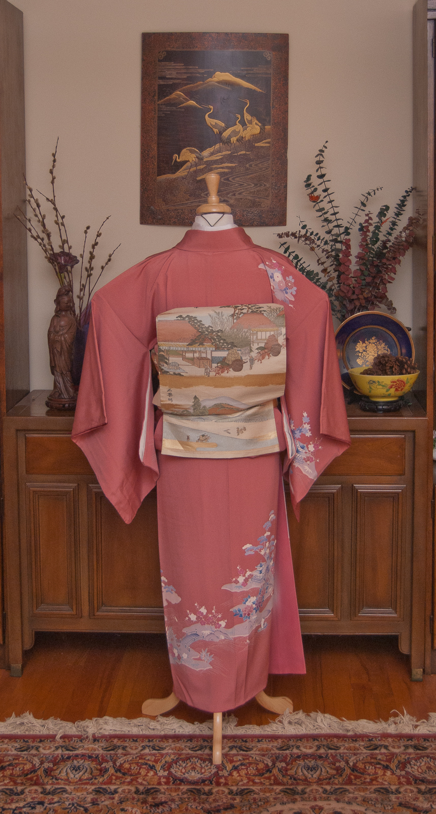
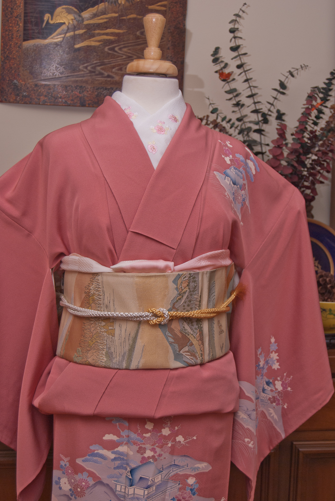
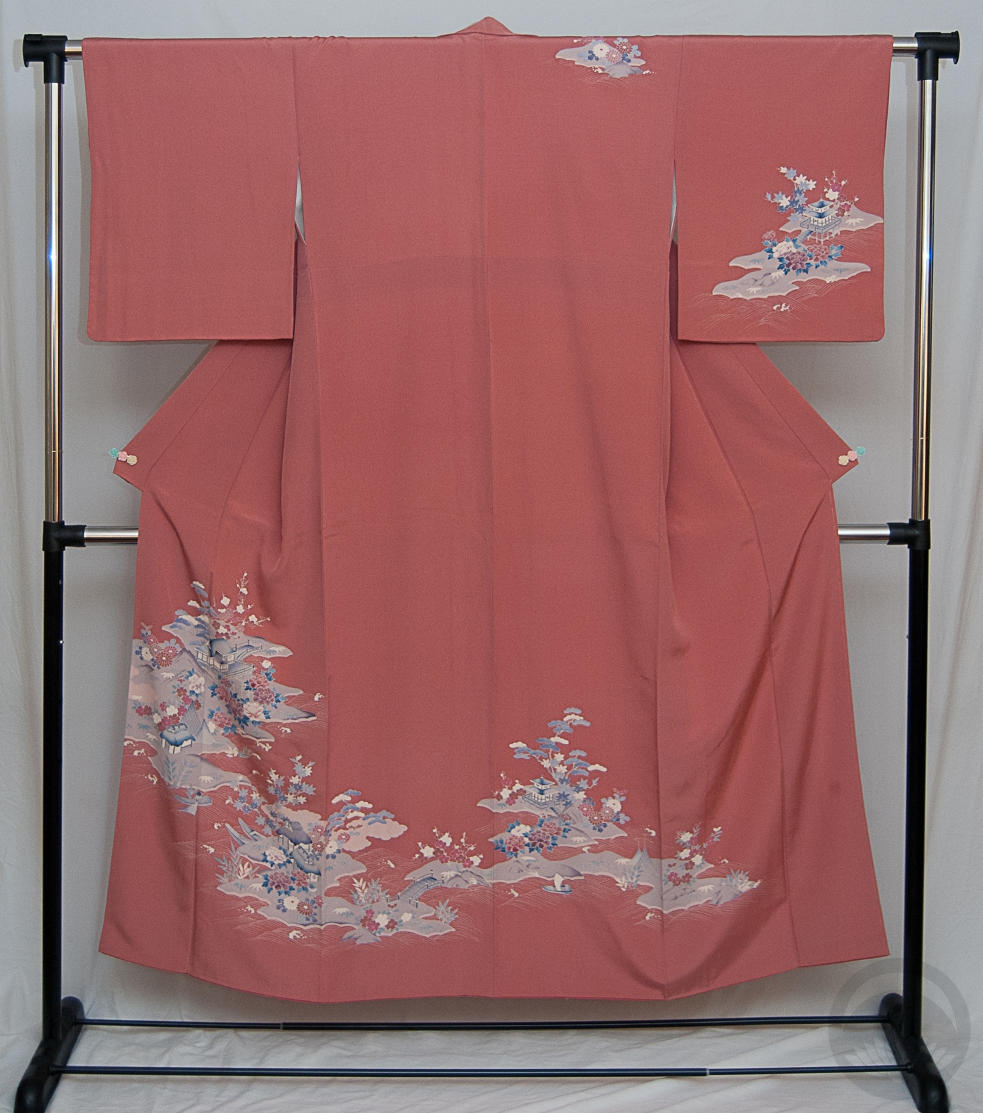
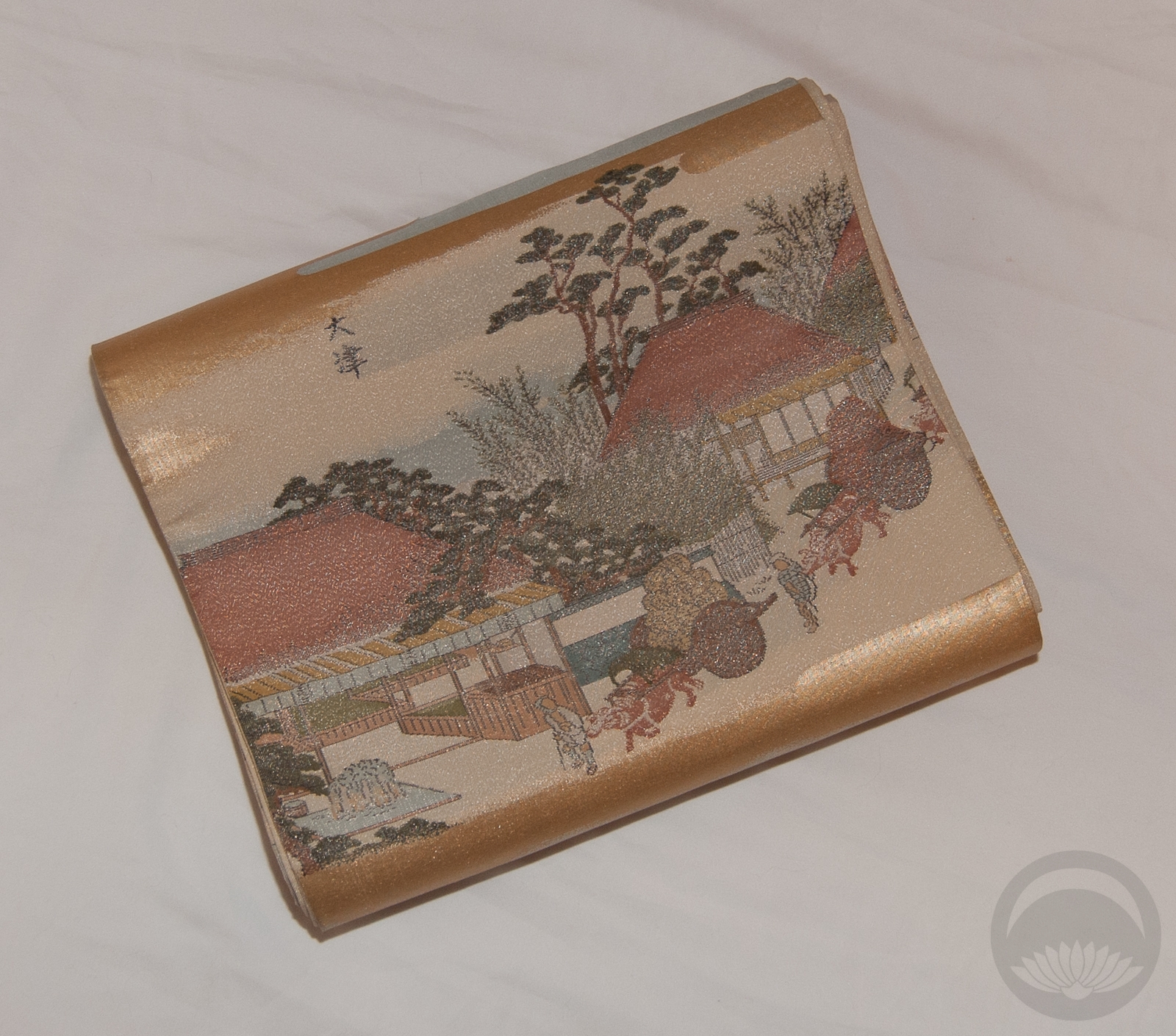
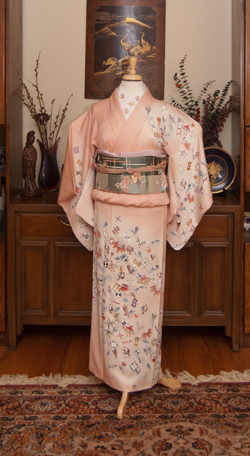
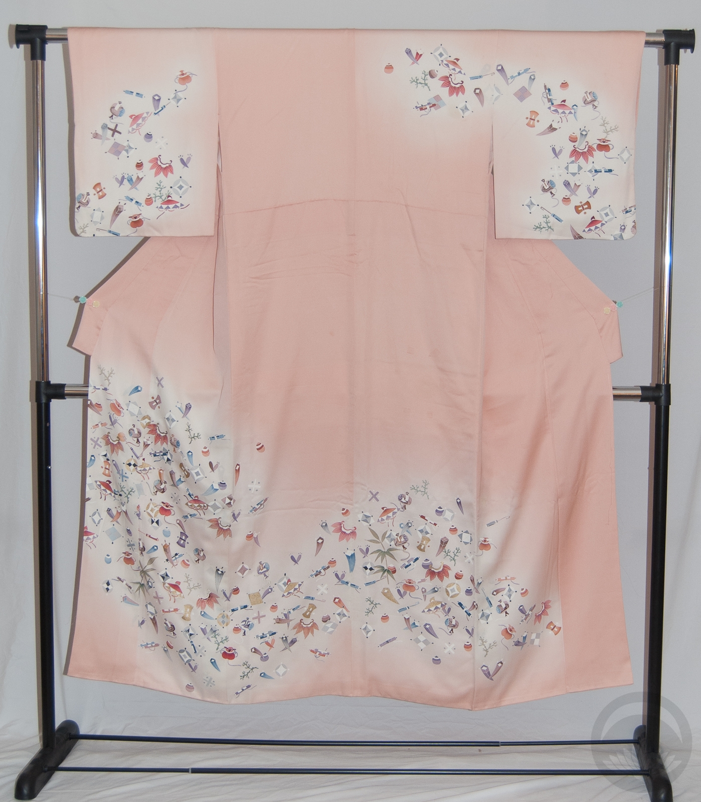
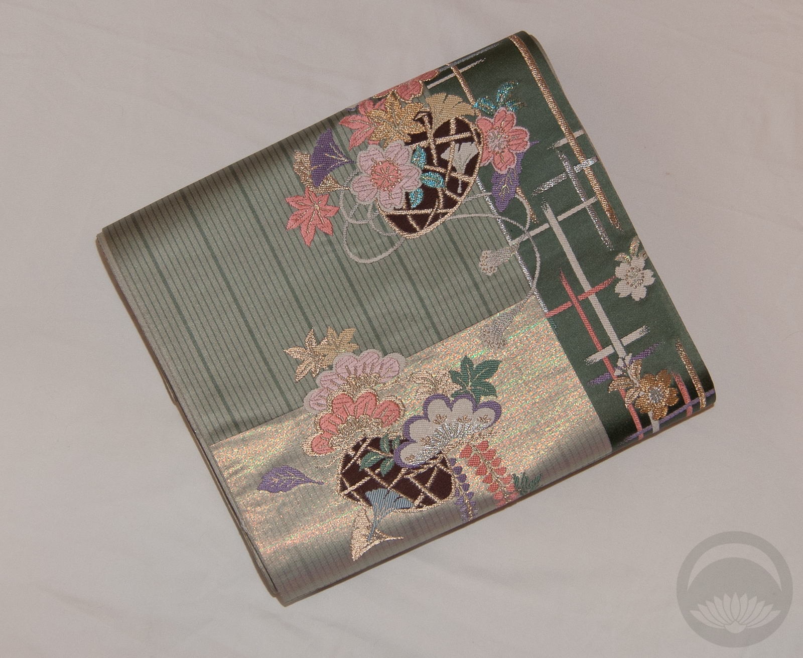
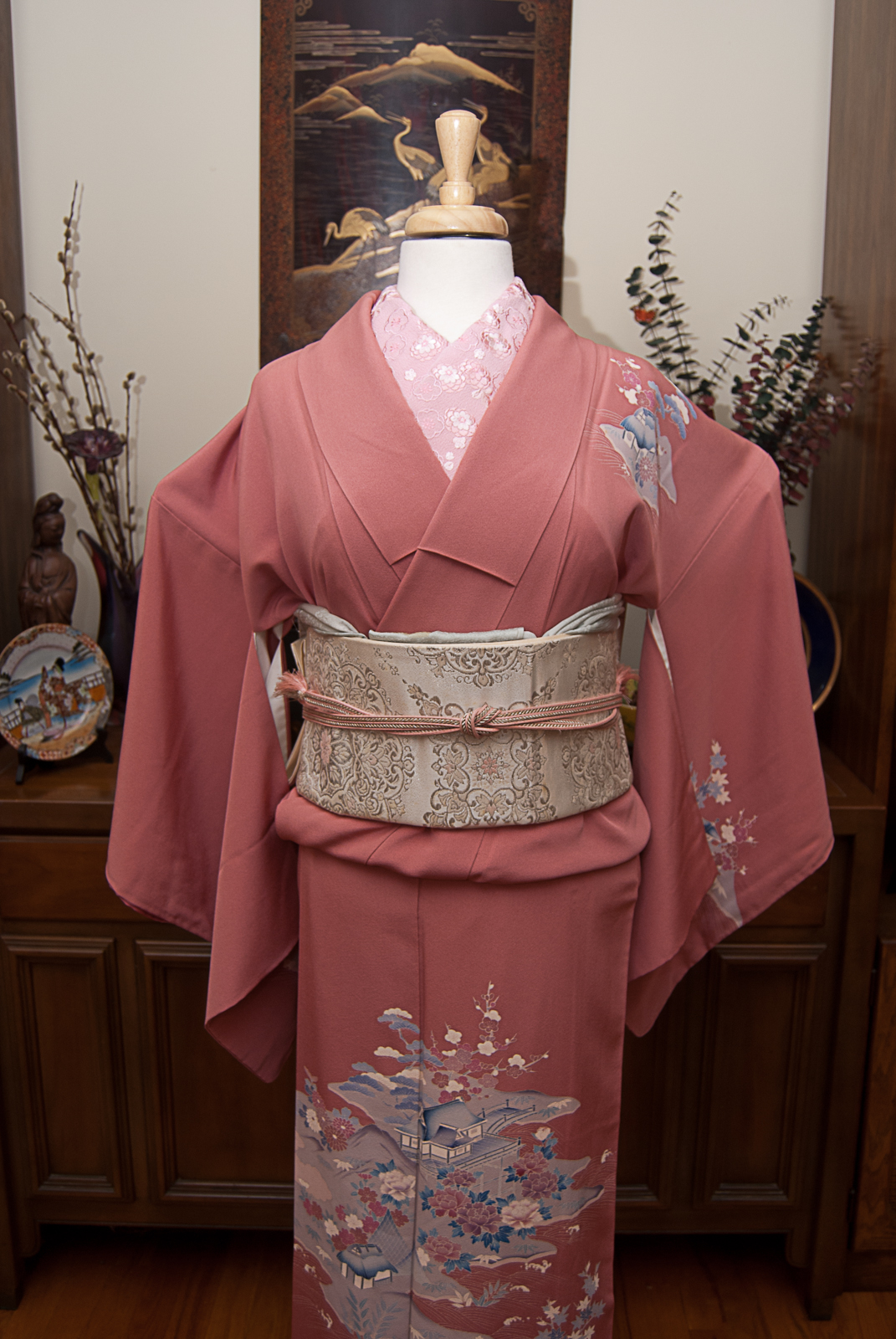
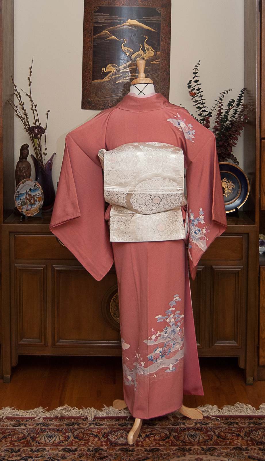
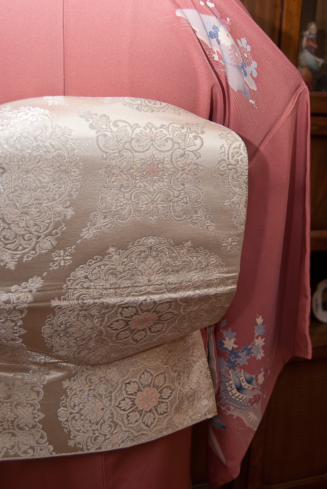
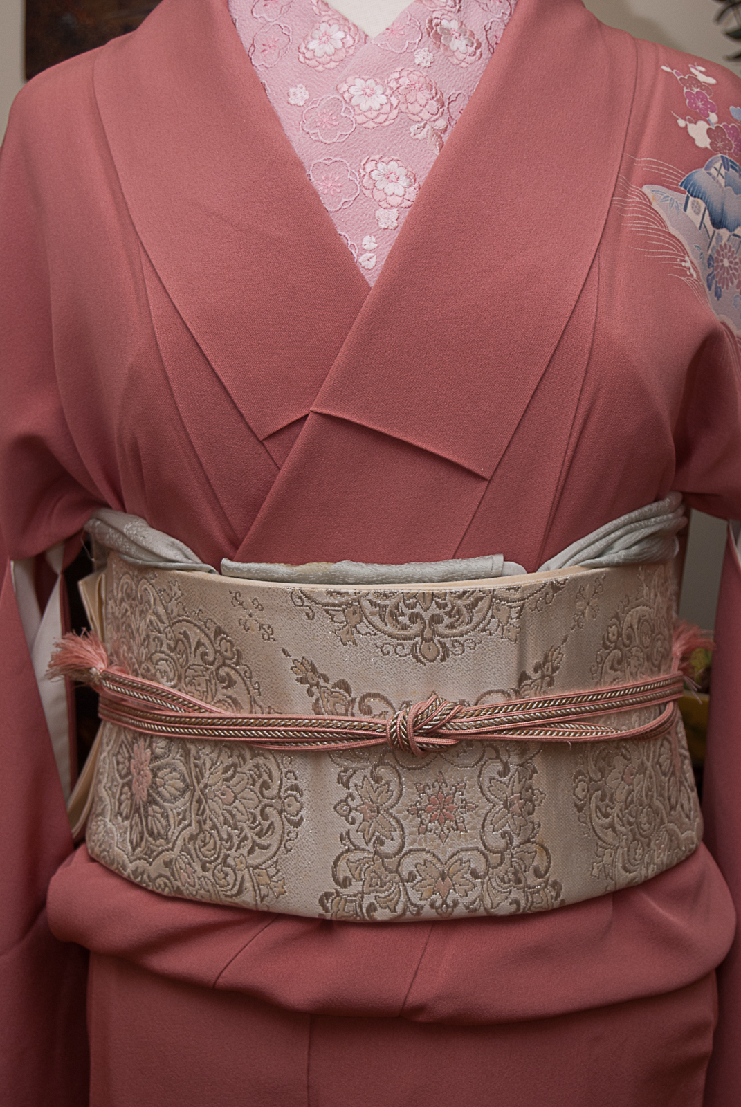
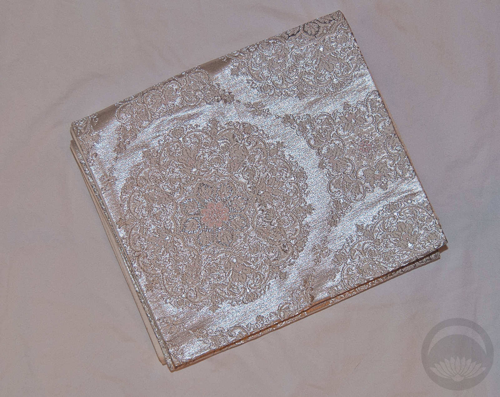
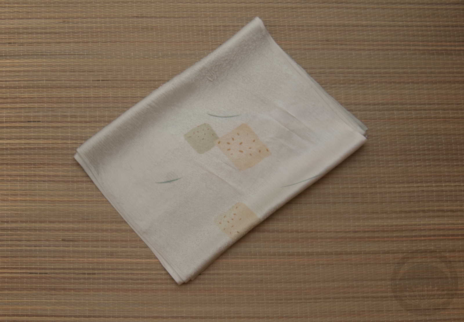
This kimono always feels good for this time of year, since it’s got multi-seasonal flowers and the colour scheme is pretty subdued, but with the right accessories it can really pop. I got the obi from Lyuba of Strawberry Kimono and I suspect it’s going to be come a fast favourite. I love the bold pattern, and it’s really nice and soft, but textured enough to hold well against itself. I tend to dislike overly soft formal obi because they can also be slippery and don’t hold a nice shape, but the slightly rougher fabric of this and the fact that it feels more casual means it’s great for relaxed, natural-looking obi musubi.

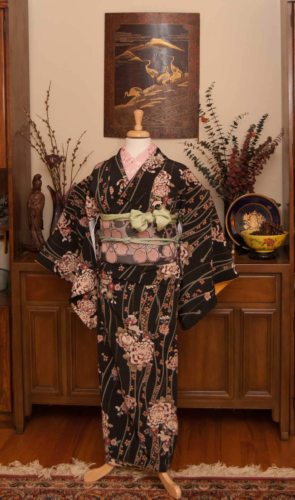
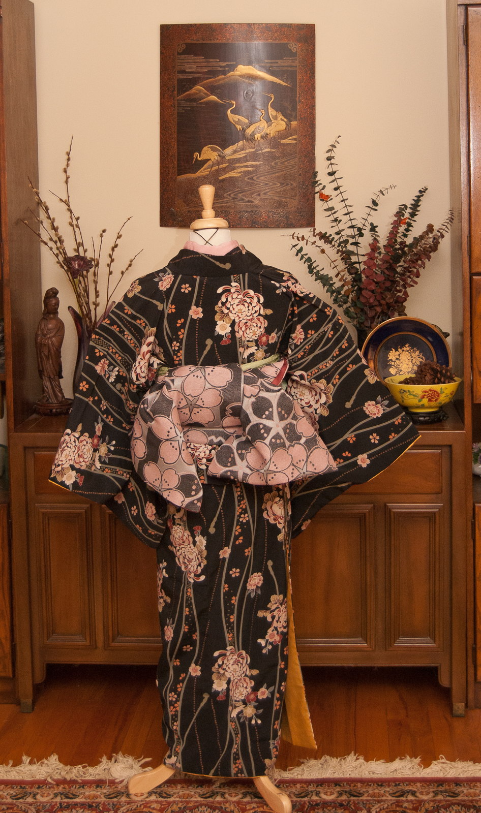
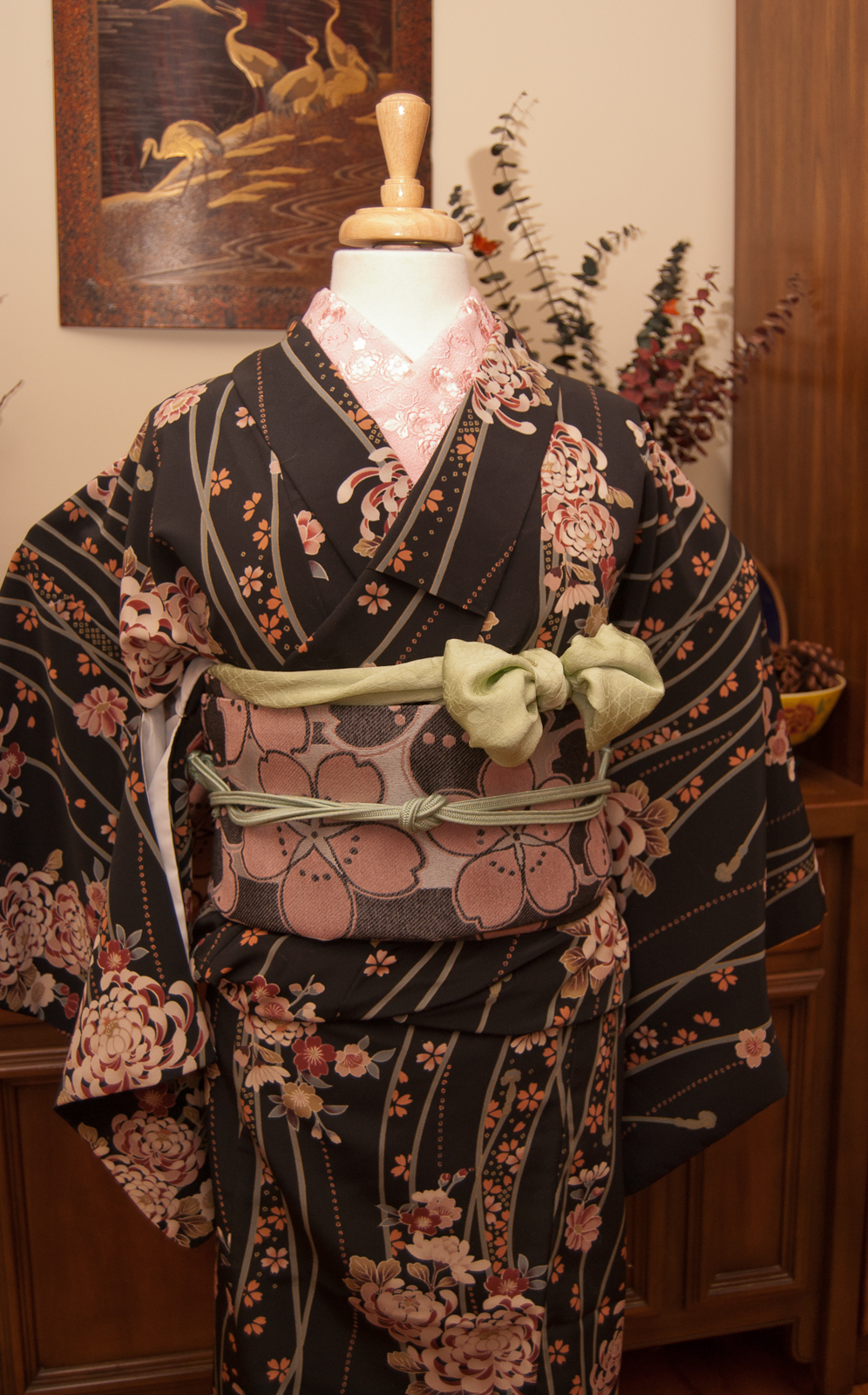
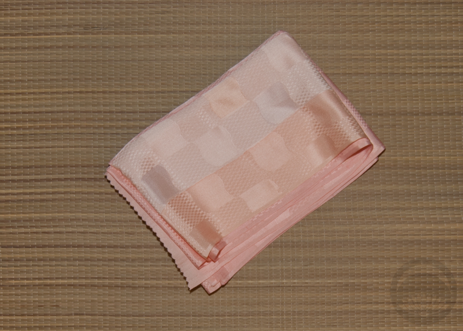
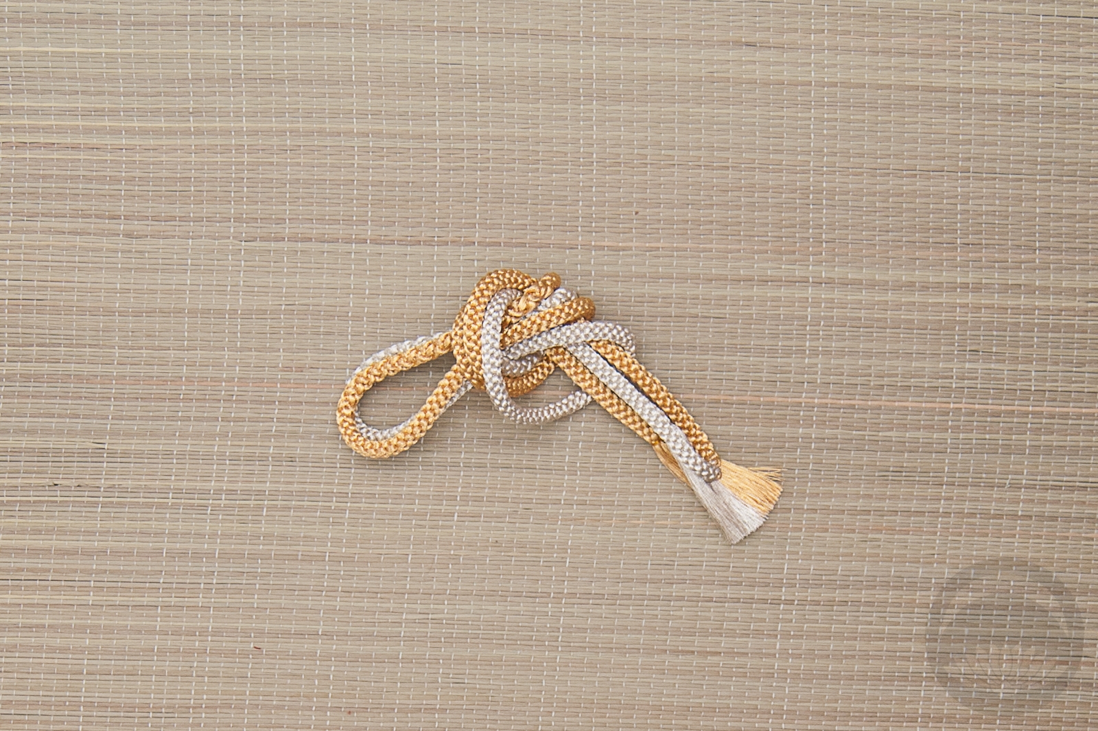
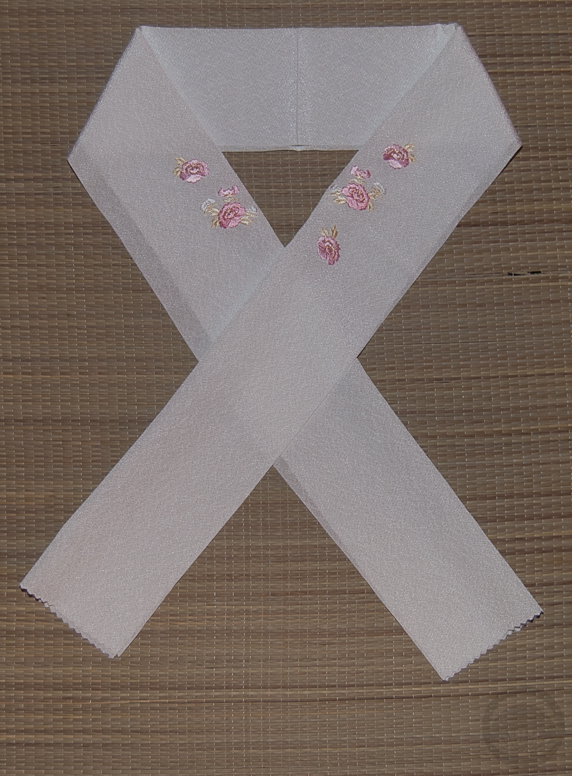
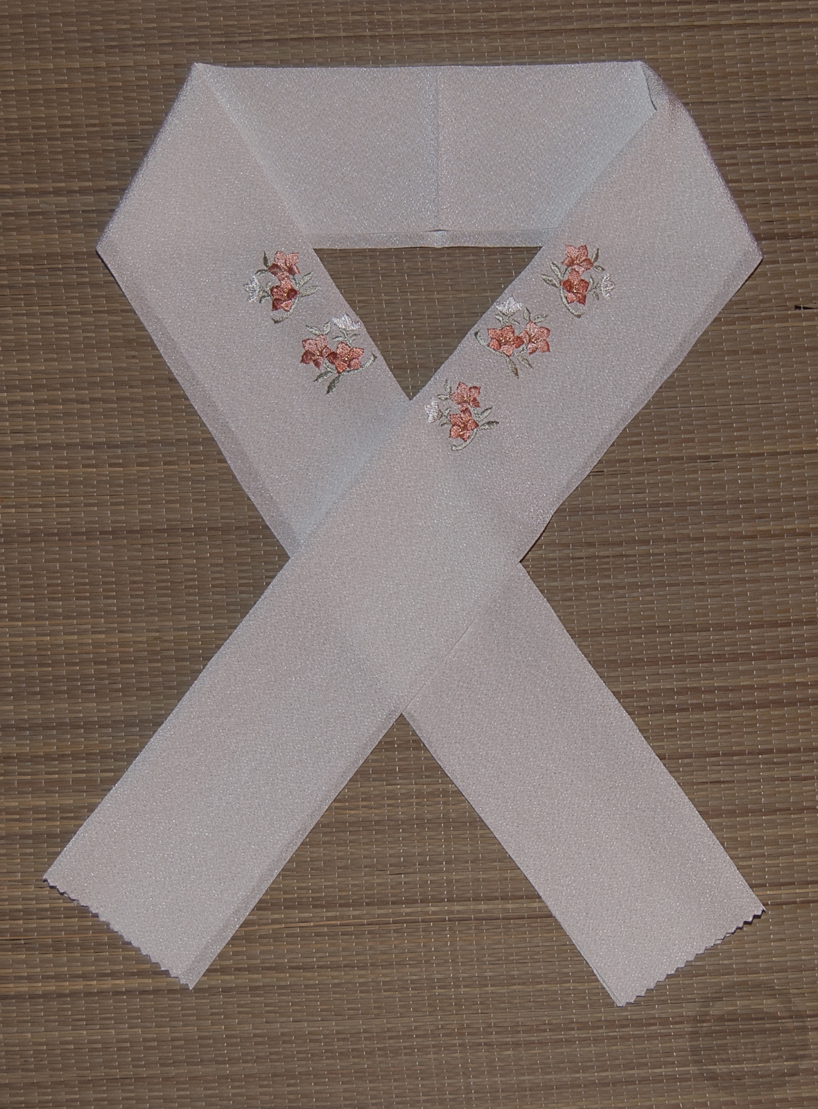
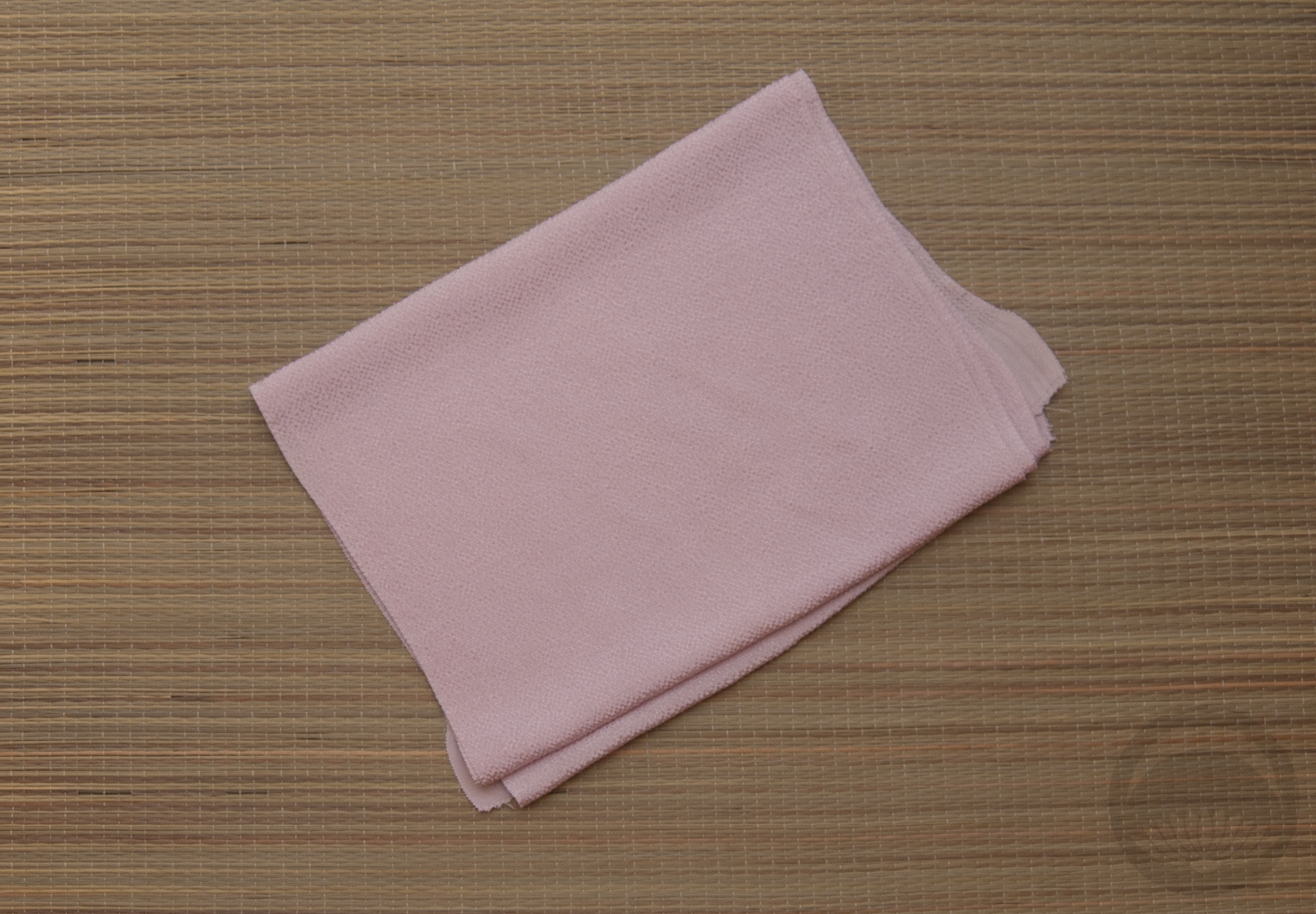
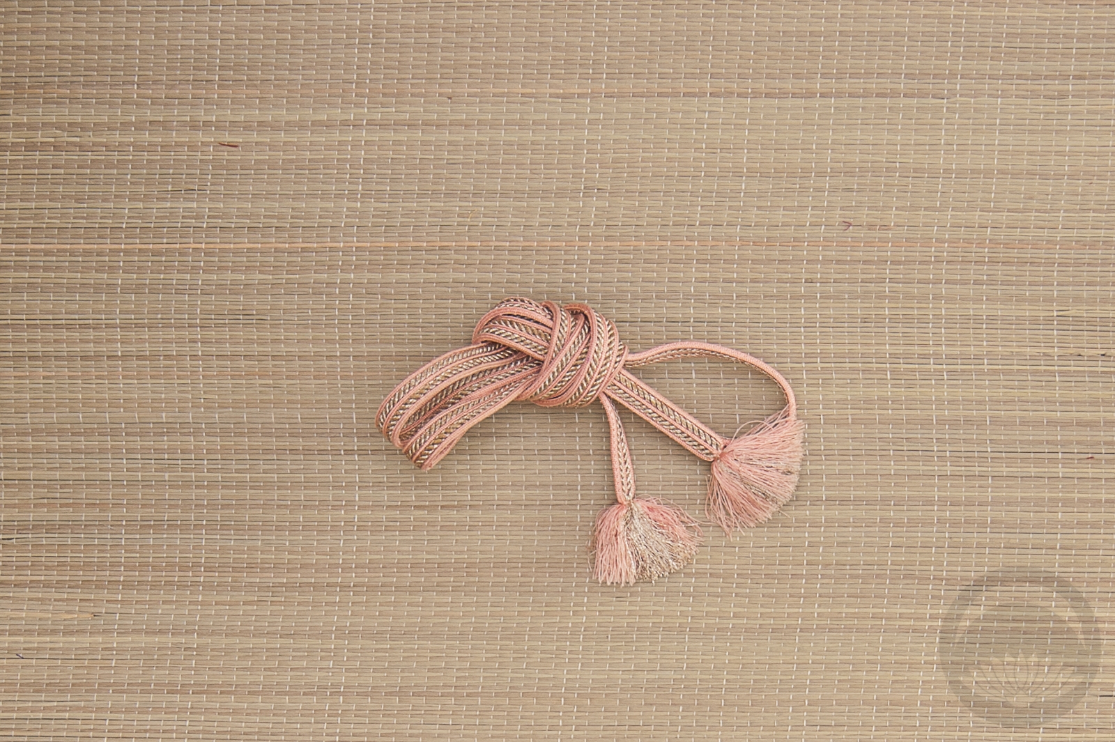
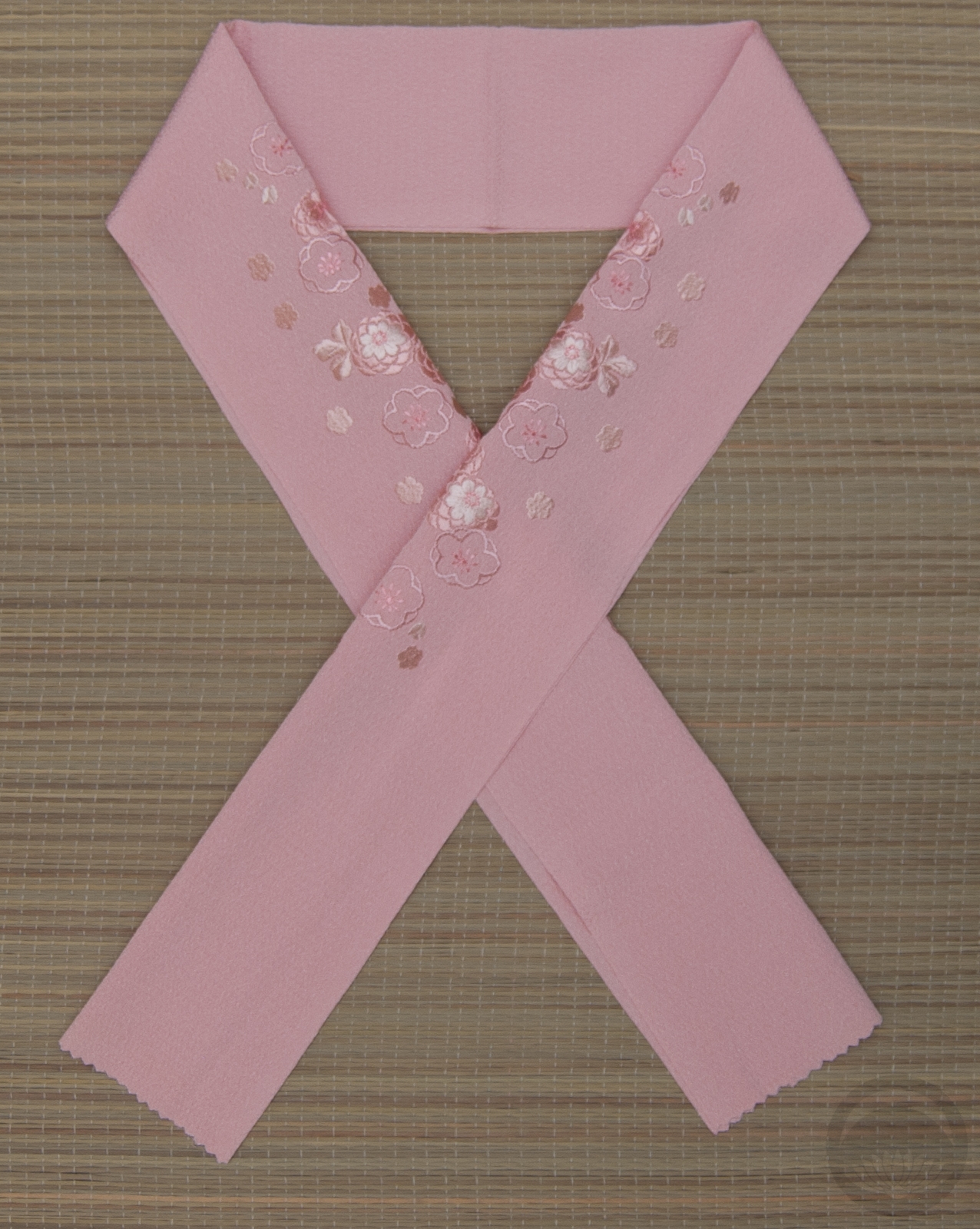
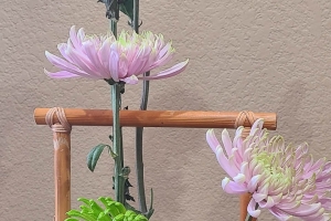
Soft leaf-green accessories helped reinforce the spring vibe of the outfit, and a pink haneri helped to emphasise the pink bits of the outfit. Of course, since I got the obi from Lyuba I had to tie the obiage in a bow shape that always reminds me of her kitsuke.

After the winter-heavy efforts of the 12 Days of Kits-Mas, it felt good to do something more transitional and bright. It was tiring working through being sick to do this, but I’m glad I did!

Warm Pink on a Cold Day

This warm pink beauty made her debut as Aurora‘s outfit in the Disney Princess Kimono Project, but while I was working on that I saw these two pieces together and knew I had to coordinate them at some point. Since winter has finally hit in full force here in Montreal, I was in the mood for something happy and pleasant-feeling, and this seemed like the perfect thing.

The gold tones of the gorgeous Tokaido obi are offset by small hints of a dusty rose-raspberry colour (visible on the roofs in the back view photo) that is nearly identical to the kimono itself. There are also areas of pale blue on the obi, similar to the details in the kimono motif. Simple pink and metallic accessories pulled everything together; even the leaves on the haneri are gold. This makes for a very classic and cohesive outfit that wouldn’t be out of place at a wedding or formal event. I like how it came together very much and could easily see myself (or nearly anyone, really) wearing it at some point in the future if I could get it to fit properly.

This will probably be the last mannequin coordination for a little while; I’ve got something silly and quite possibly over-ambitious in the works for the next few weeks. There will still be updates and plenty of reasons to visit, but I just wanted to assure you all that this is still the primary focus of my blog, even though it may not look like it as the holidays creep up on us all. There will be outfits to make up for it soon enough.

Items used in this coordination

Birthday Pastels

Today is my birthday! I’m now officially closer to 40 than I am to 30. Ack! My initial plan for today was to dress myself in the blue Cinderella furisode and take pictures, but this week has been a very long and exhausting one and I knew when I woke up I was not going to have the energy to do it. I might try on the weekend, but until then I decided I would at least redo the mannequin.

This obi was an entirely unexpected surprise; I was discussing my collection with a customer at work and she told me she had one of those “belt table runner things” and she’d bring it to show me one day. Imagine my shock when she showed up with this stunning springy green fukuro obi with flowers and foliage all over it and insisted I keep it. It’s absolutely beautiful. It’s also got a really nice sage green fabric with gold pinstripes on the reverse, and I’m looking forward to using that side of it sometime soon. It felt like the ideal thing to do a birthday outfit with. It pairs so perfectly with the pink takara houmongi that Naomi’s husband Arian got for me years ago. They feel so classic and elegant together, and subtle pastel accessories finish things off. The obiage is kind of a mess but let’s all ignore that and focus on the beautiful kimono and obi instead.

I’m still holding out hope that I can put the furisode on this weekend but if that doesn’t happen at least I did something productive today!

Items used in this coordination

Shape and Colour Ikebana

I bought this set of bud vases at everyone’s favourite enormous Scandinavian home goods store a while ago, with the intention of doing something with them, but I hadn’t decided on what. When I found a rose that was a very pale celadon green while out running errands today, I knew I’d found my project. I loved the idea of focusing on shape and colour here, and having three very balanced separate units forming one cohesive and harmonious grouping. I did debate using three different flowers to coordinate with the three different textures of vases, but in the end I felt that using the classic and neutral shape of the roses had the most impact. Thankfully, finding the pink and white ones was a breeze after the stroke of luck that was finding a greenish tinted one (I will be honest, I have no idea if it’s natural or if it was dyed for the florist’s, but either way it worked out quite well for me!) I think the soft, organic roses contrast the tactile and architectural quality of the vases perfectly, and the seeing the three of them together is like hearing three distinct notes coming together in one lovely chord. I arranged them simply on a dark surface to ensure all attention was on them without any background distractions, and I love the way they pop, pop, pop!

Aurora – Disney Princess Kitsuke Project

🎵 Once Upon a Dream🎵

Aurora, the lovely Sleeping Beauty. While she may certainly not be the most progressive of princesses, speaking less than any other princess and spending a large chunk of her movie unconscious, there’s no denying that as one of the original three she helped pave the way for what came after. I was initially quite stumped on how to coordinate her outfit, since we don’t really get a huge sense of her personality from the movie. Pink seemed obvious, but then I thought back fondly to the scene where the fairies are arguing over the colour of her dress. When I found this beautiful pink kimono with blue accents, everything fell into place.

I paired up the pink kimono with this beautiful white and platinum obi with tiny pink details. The design is of an abstract flower motif but with a little imagination, the round shapes are reminiscent of the spinning wheel upon which she pricks her finger, bringing Maleficent’s curse to fruition. Since Aurora seems like a fairly traditional, demure, romantic woman I decided to keep this coordination fairly straightforward too, sticking to appropriate accessories and tying the obi in a nice, stiff niijudaiko obi.

I hope you’re enjoying seeing these coordinations as much as I’m enjoying doing them! We’re more than a third of the way through, and I can’t wait to share more soon.

Items used in this coordination