
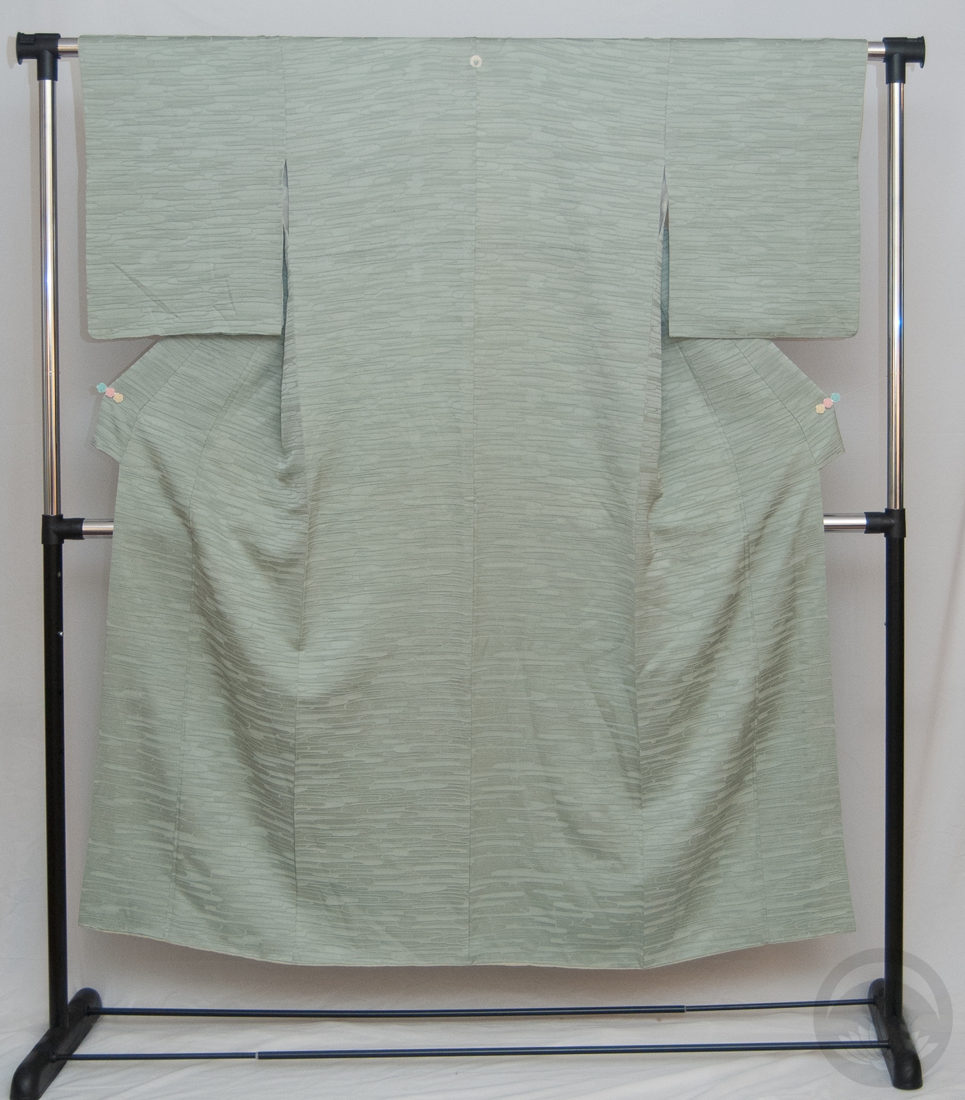
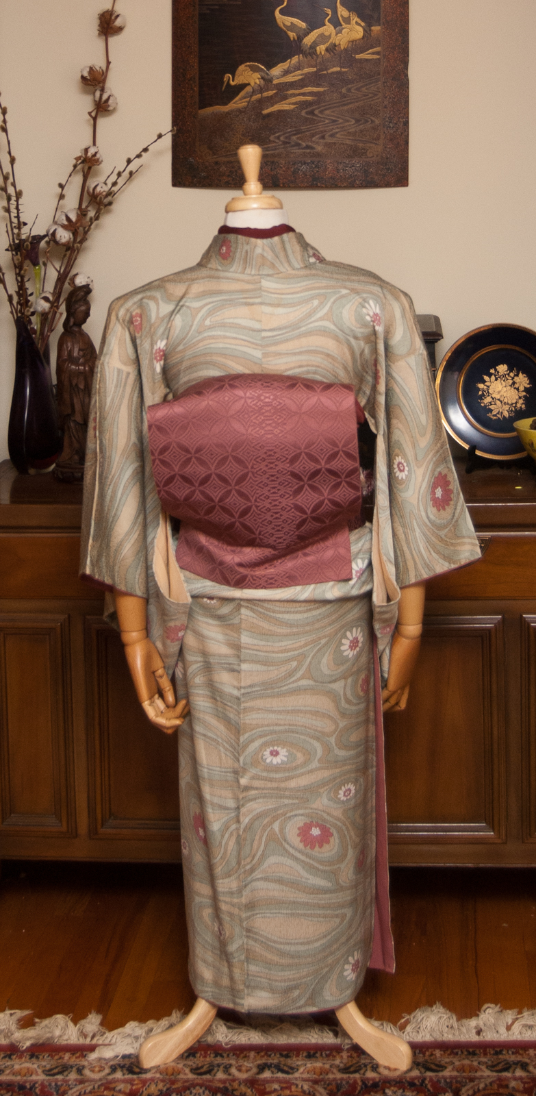
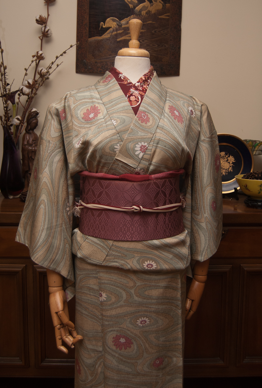
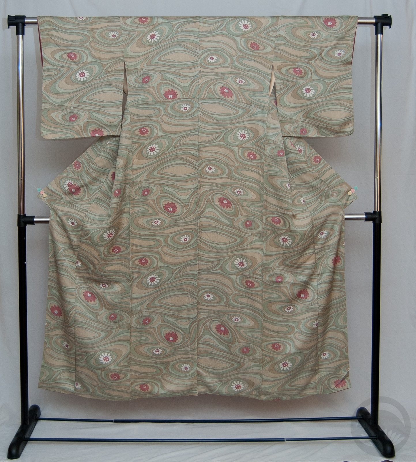
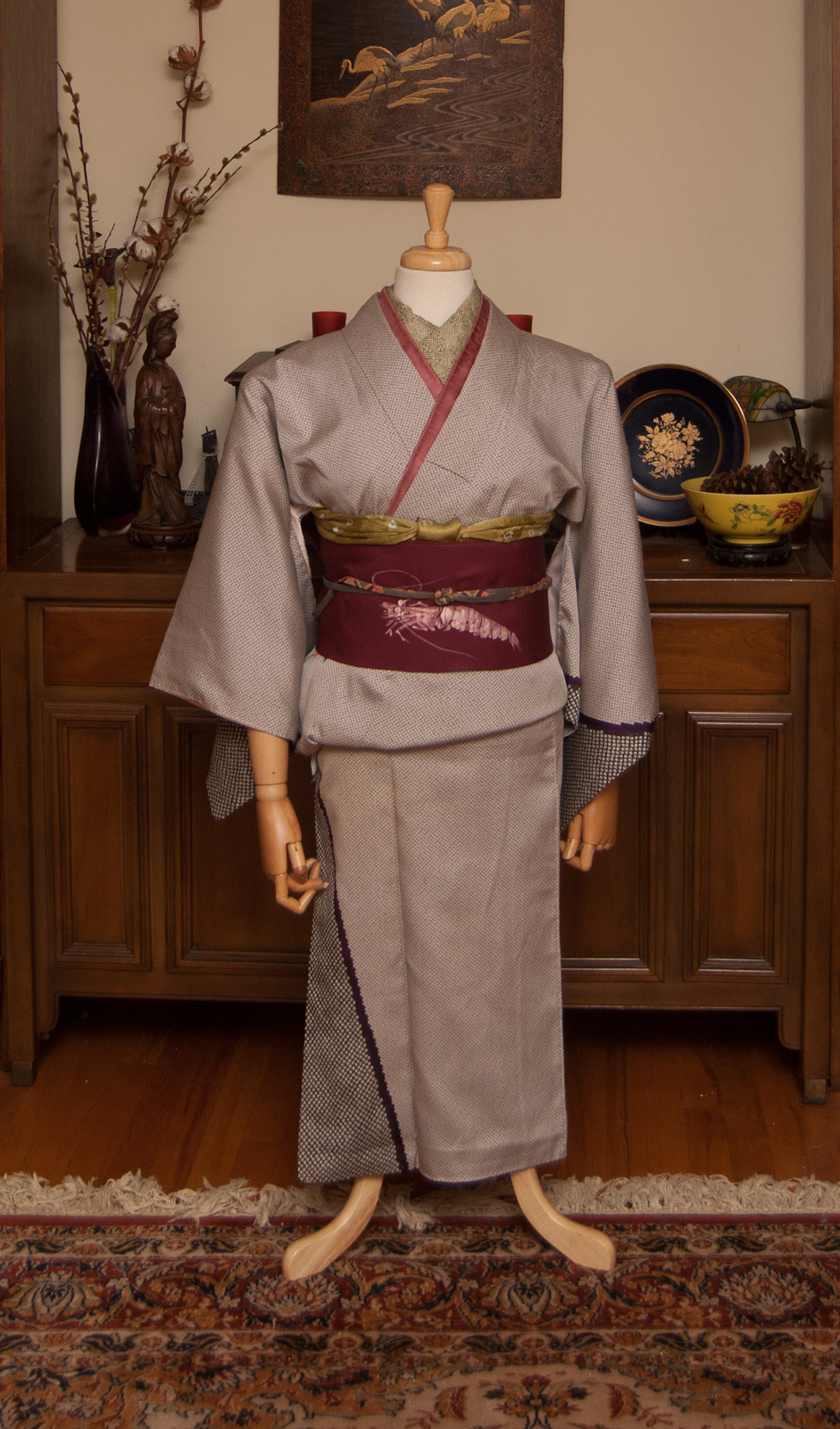
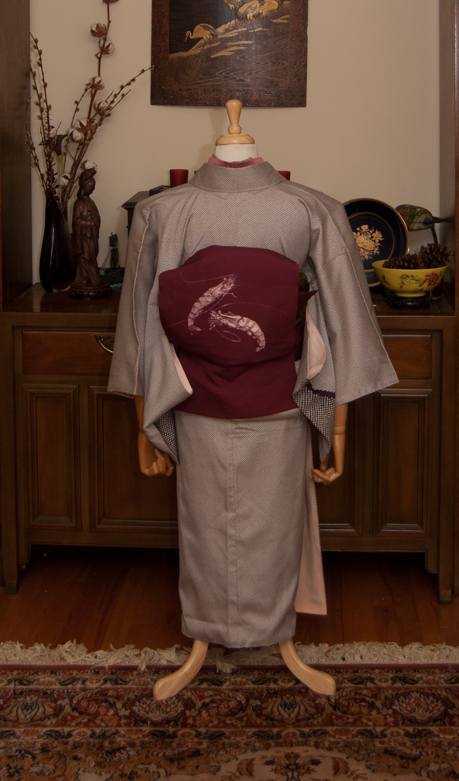
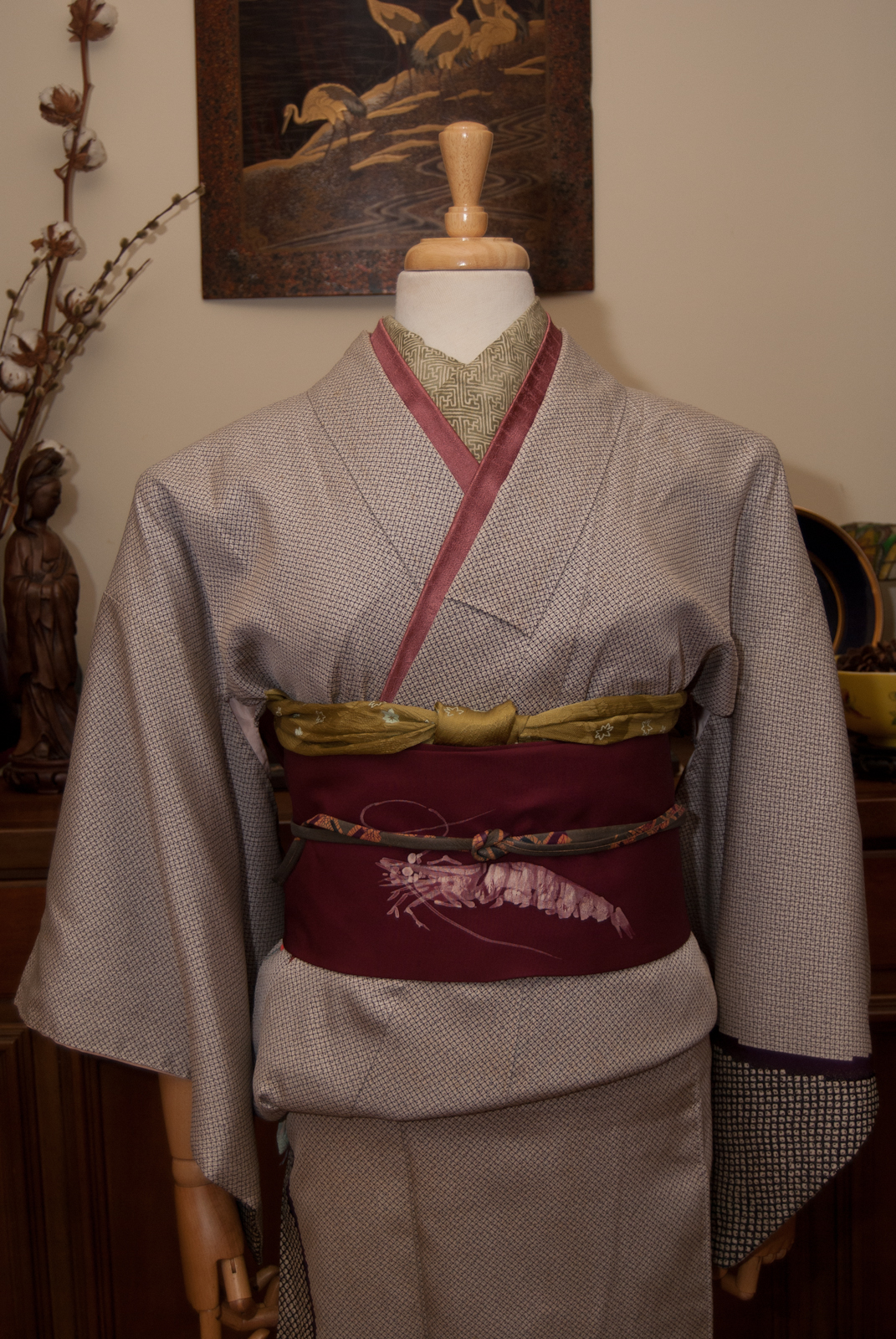
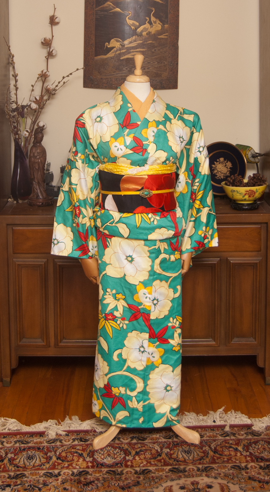
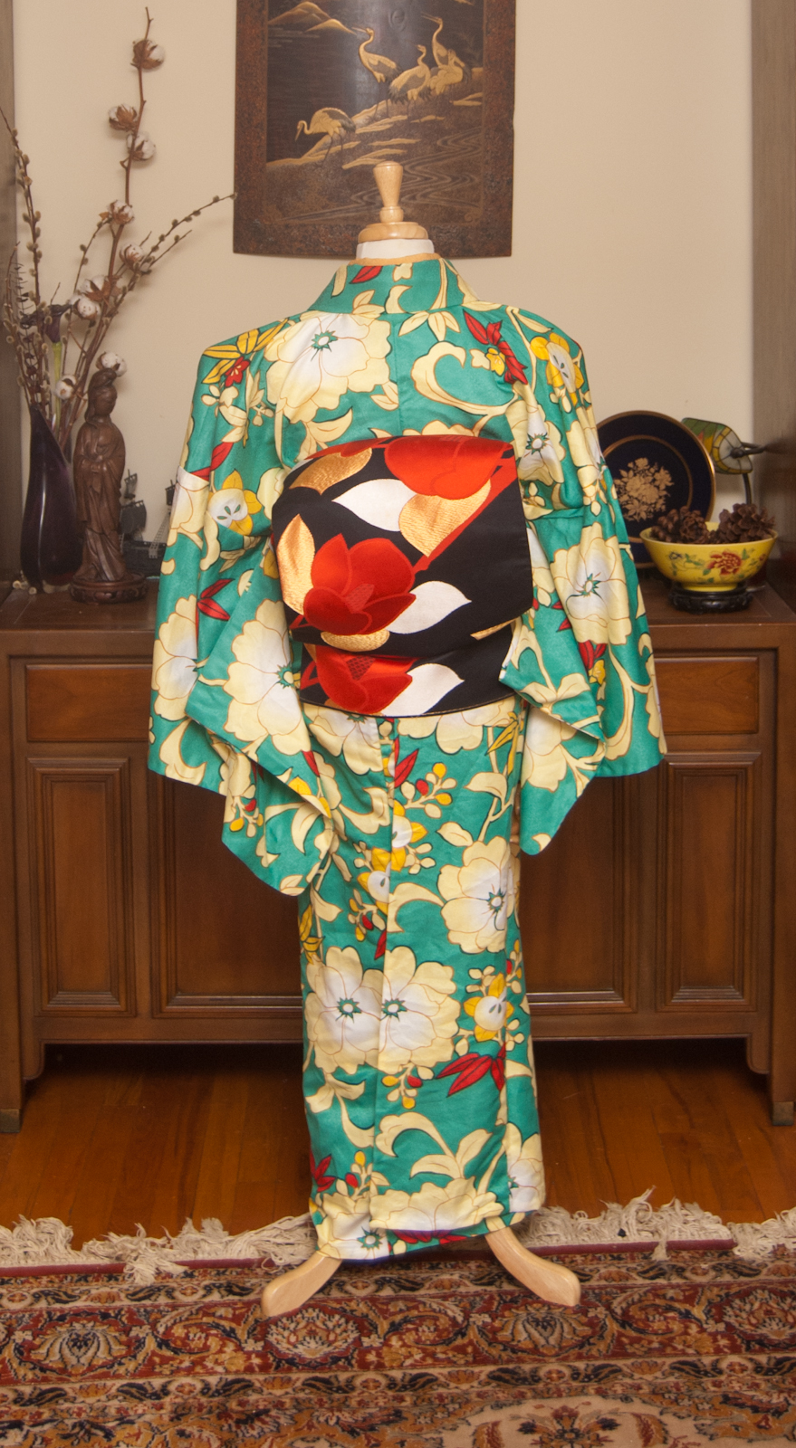
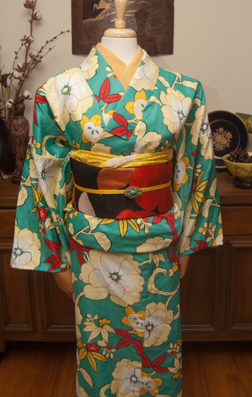
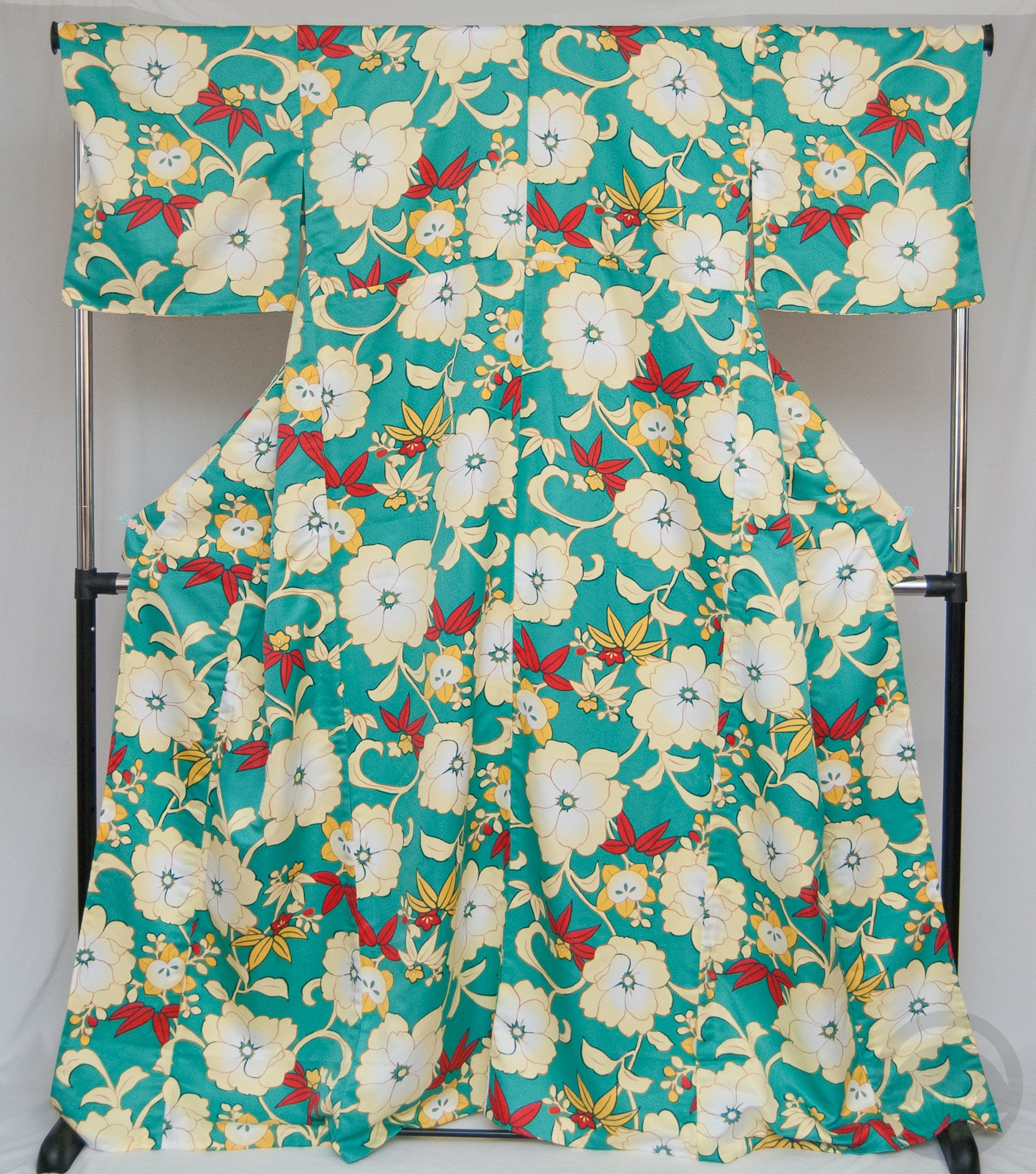
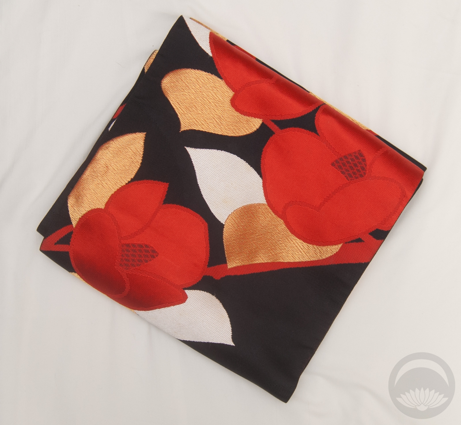
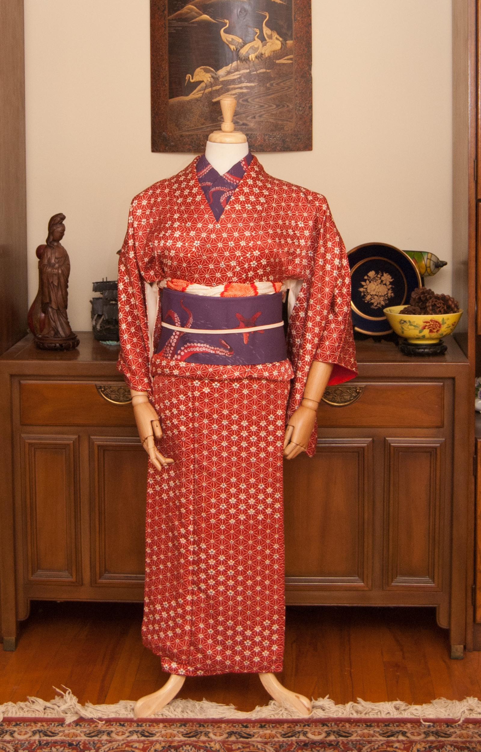
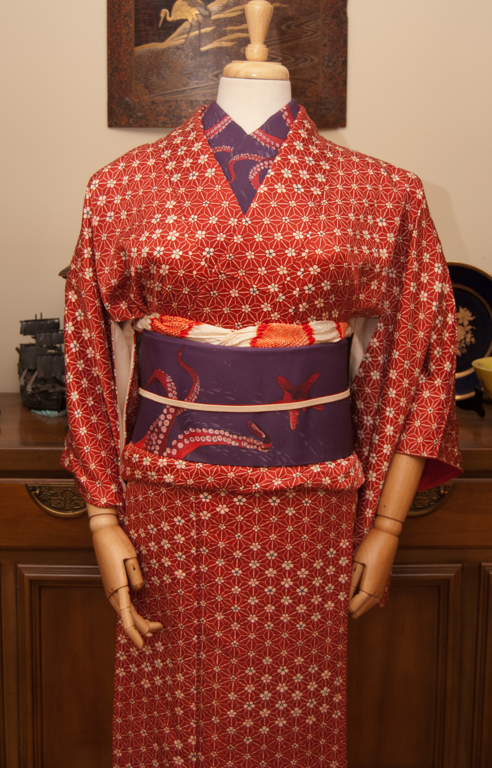
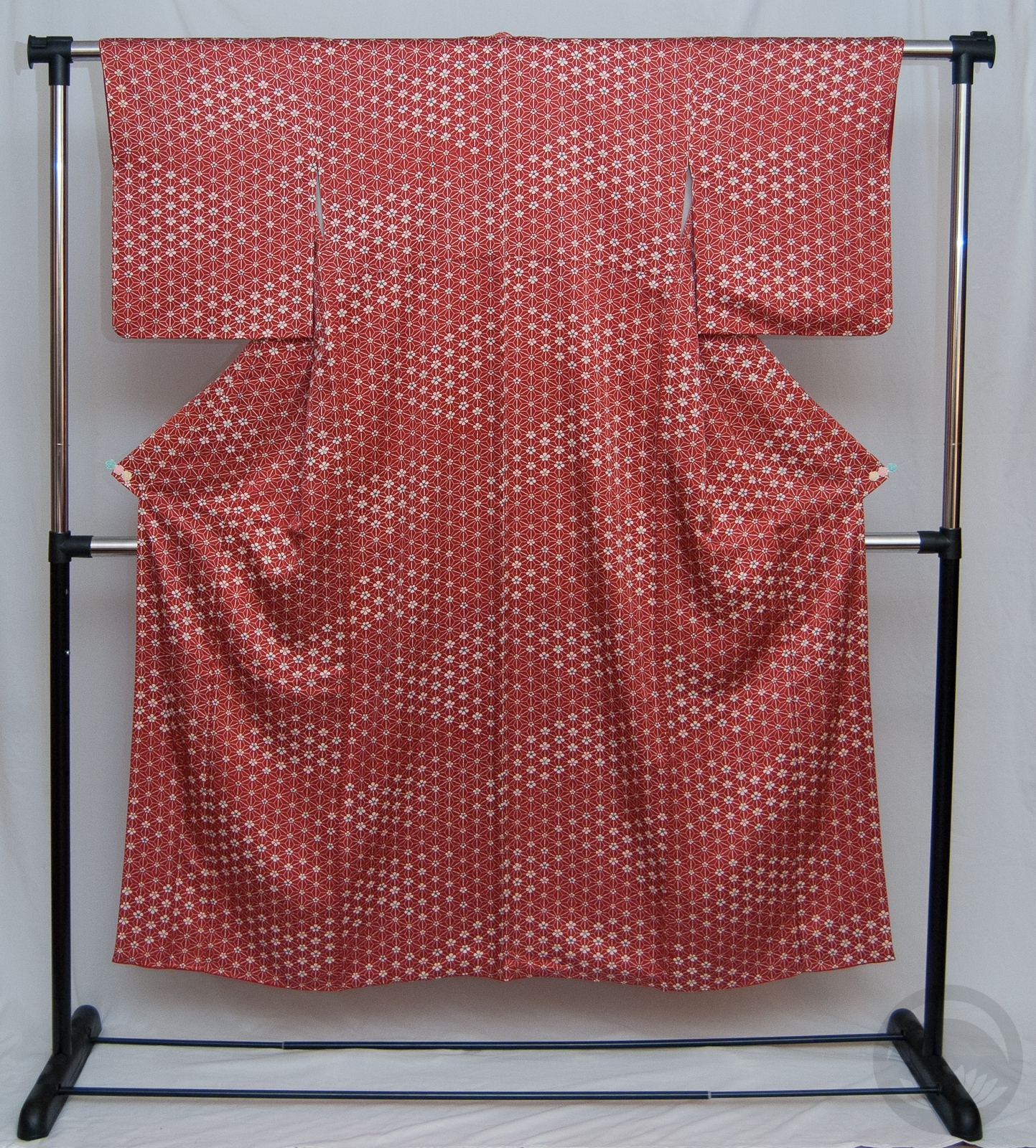
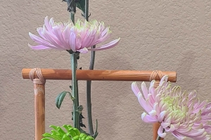
As much as it pained me to remove last week’s coordinate, it was time to change the mannequin. I thought for today I would focus on textures, an often-overlooked facet of kimono style and construction. This outfit may have no real variation in colour, and yet it’s anything but boring!
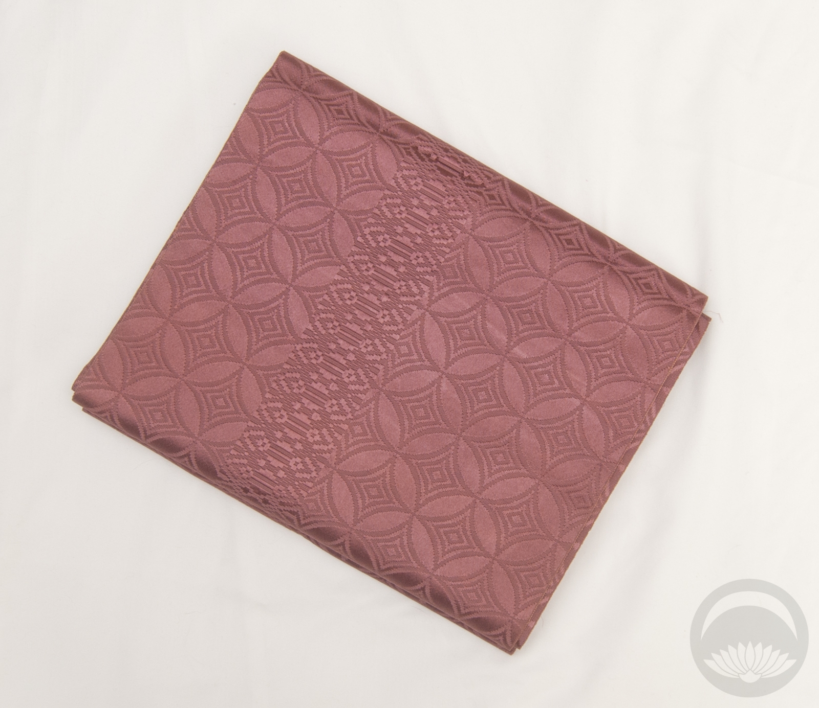
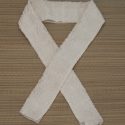
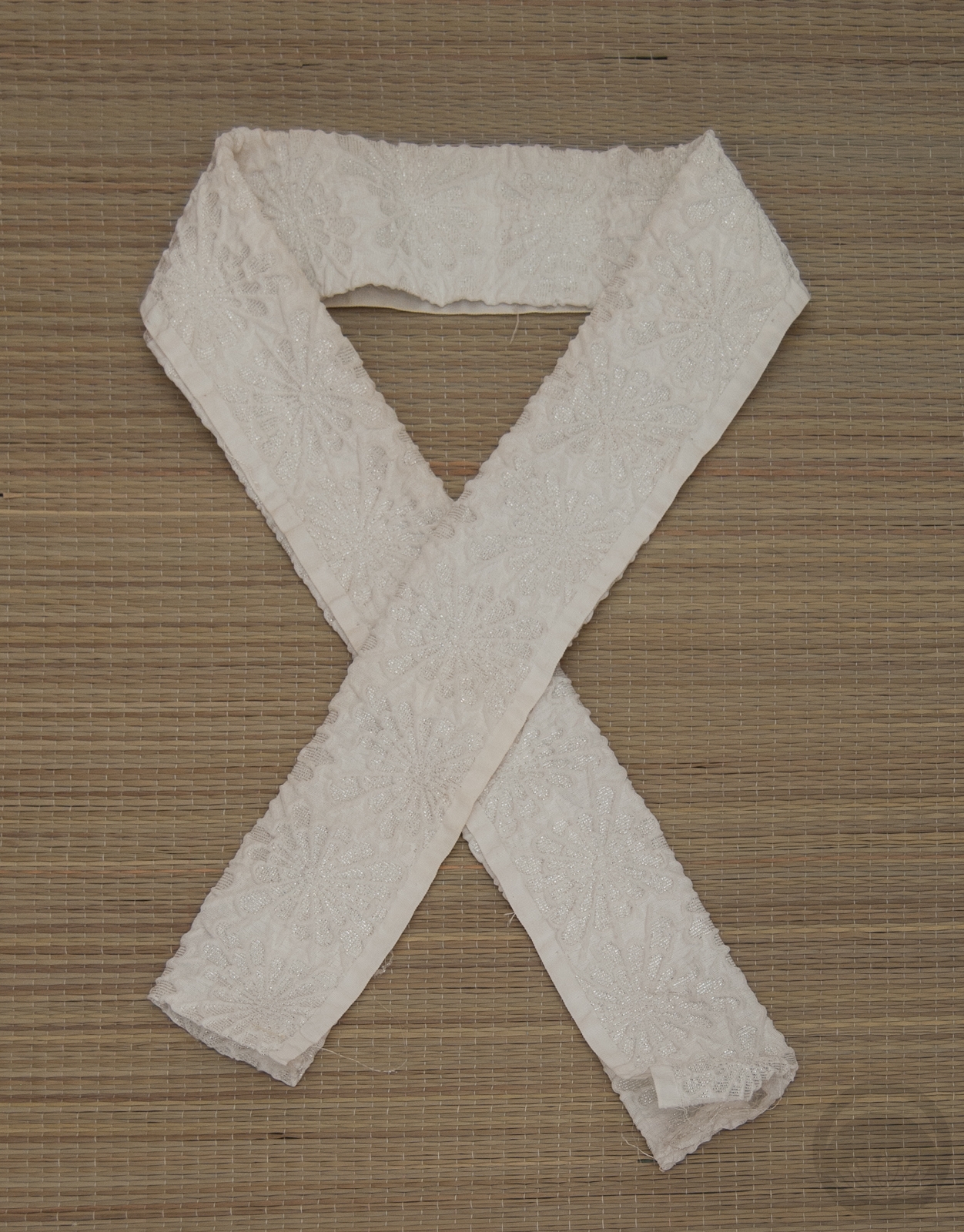
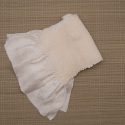
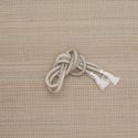
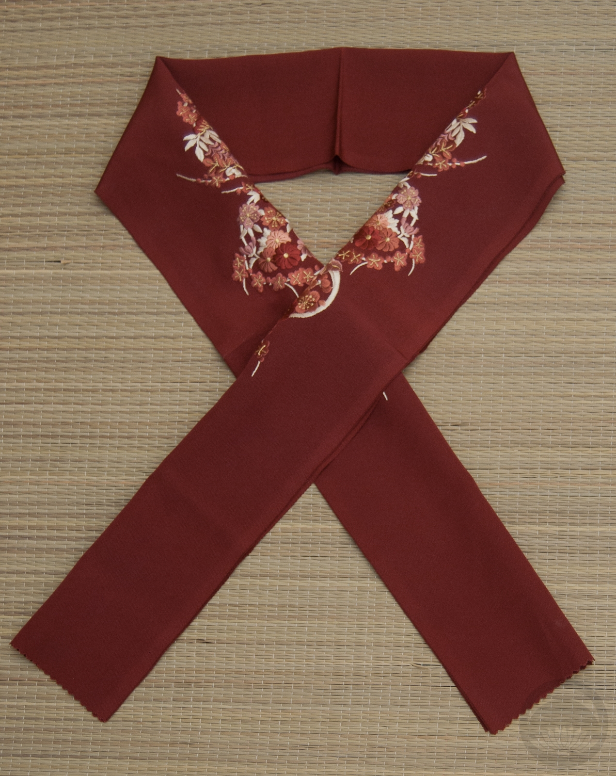
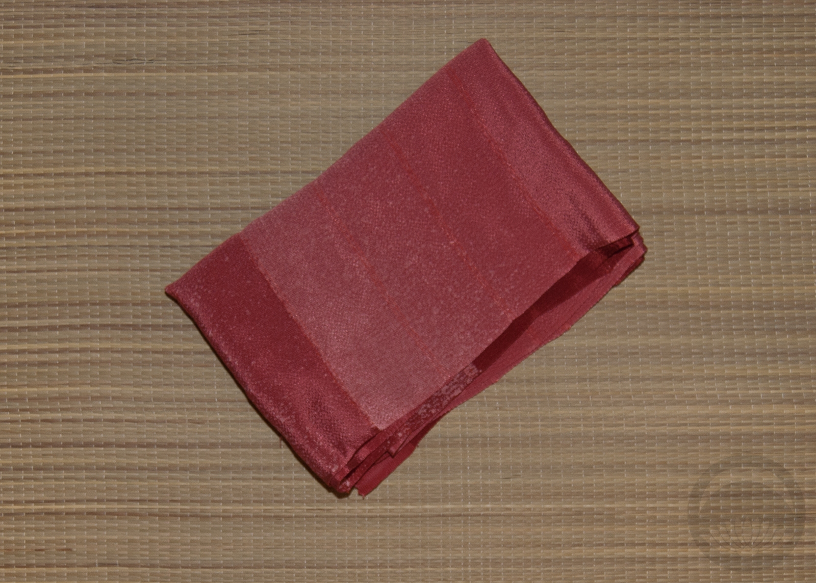
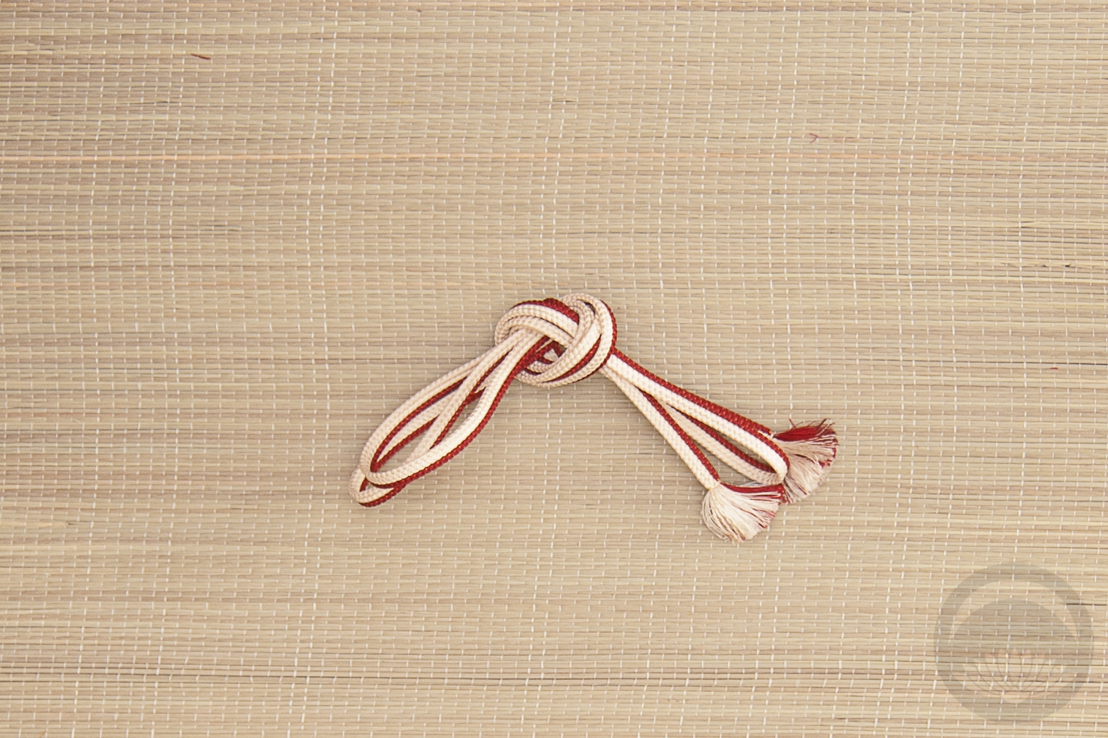
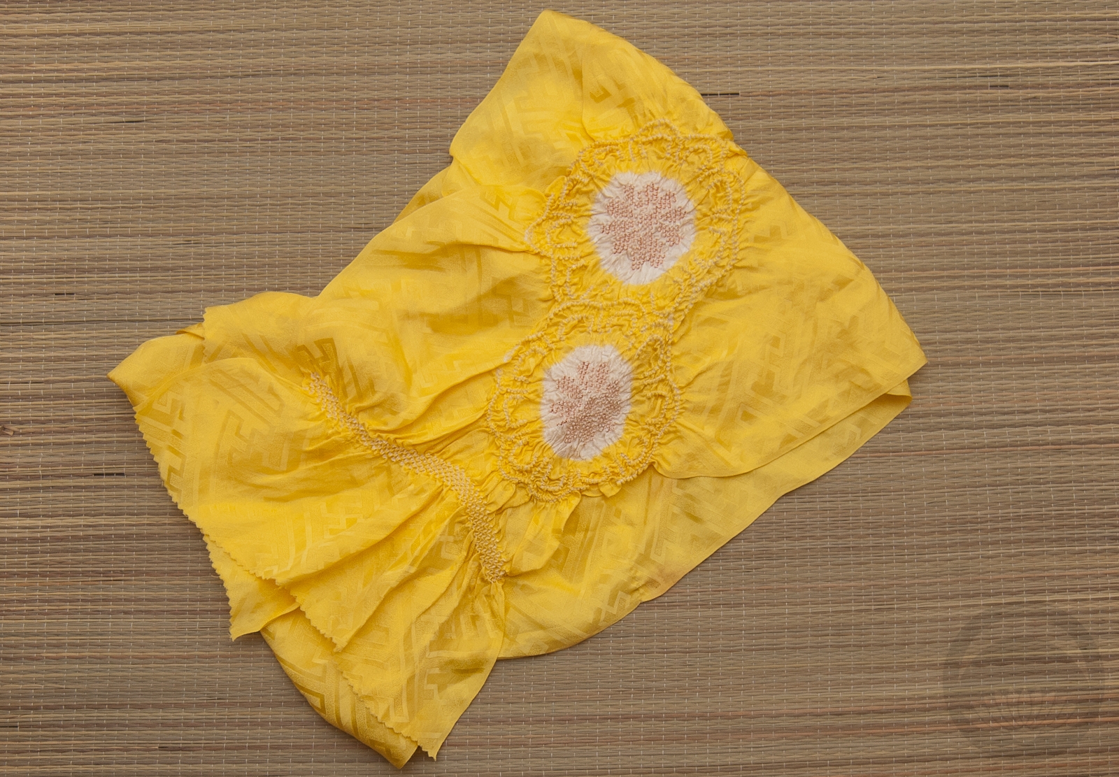
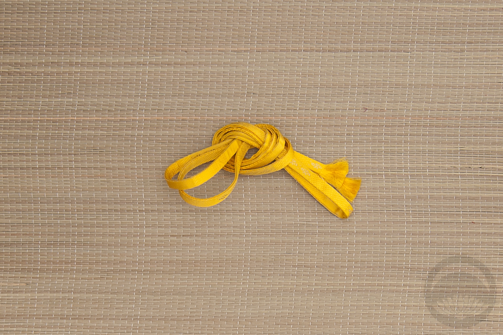
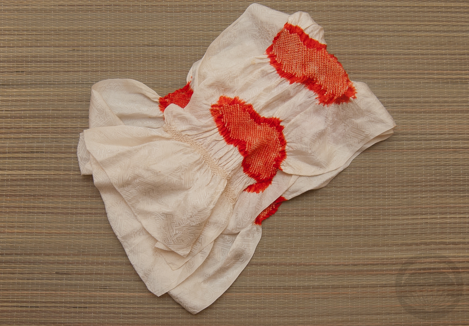
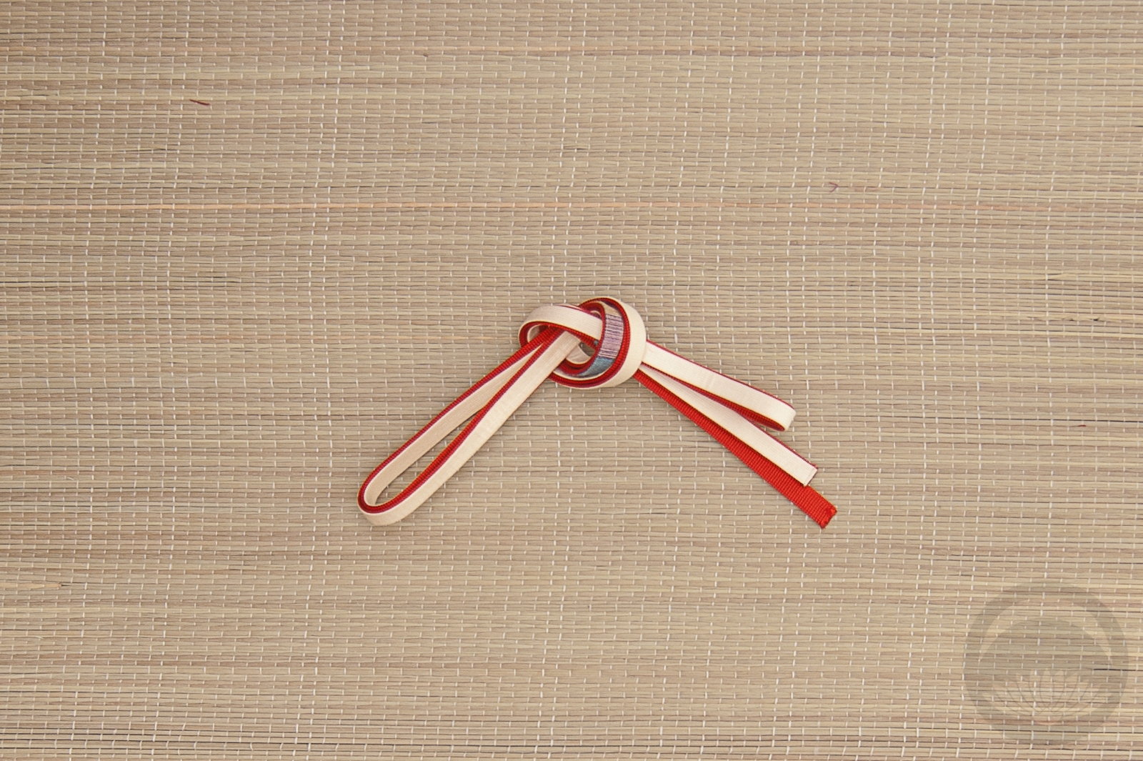
I paired my richly-textured mint iromuji with a tone-on-tone dusty pink hakata obi. Not only do these two pieces play well together texture-wise, the muted colour palettes complement each other perfectly. I emphasised the texture aspect even more with this haneri with a thick woven kiku design, a white shibori obiage (which is a bit too formal for this coord but it worked so well thematically) and a a white beaded obijime to introduce one last texture without adding more colour. I even arranged the obiage so the ruffled hem was visible, just to add one more layer of interest. Typically that edge is tucked away out of sight, but I thought it was a nice little touch.
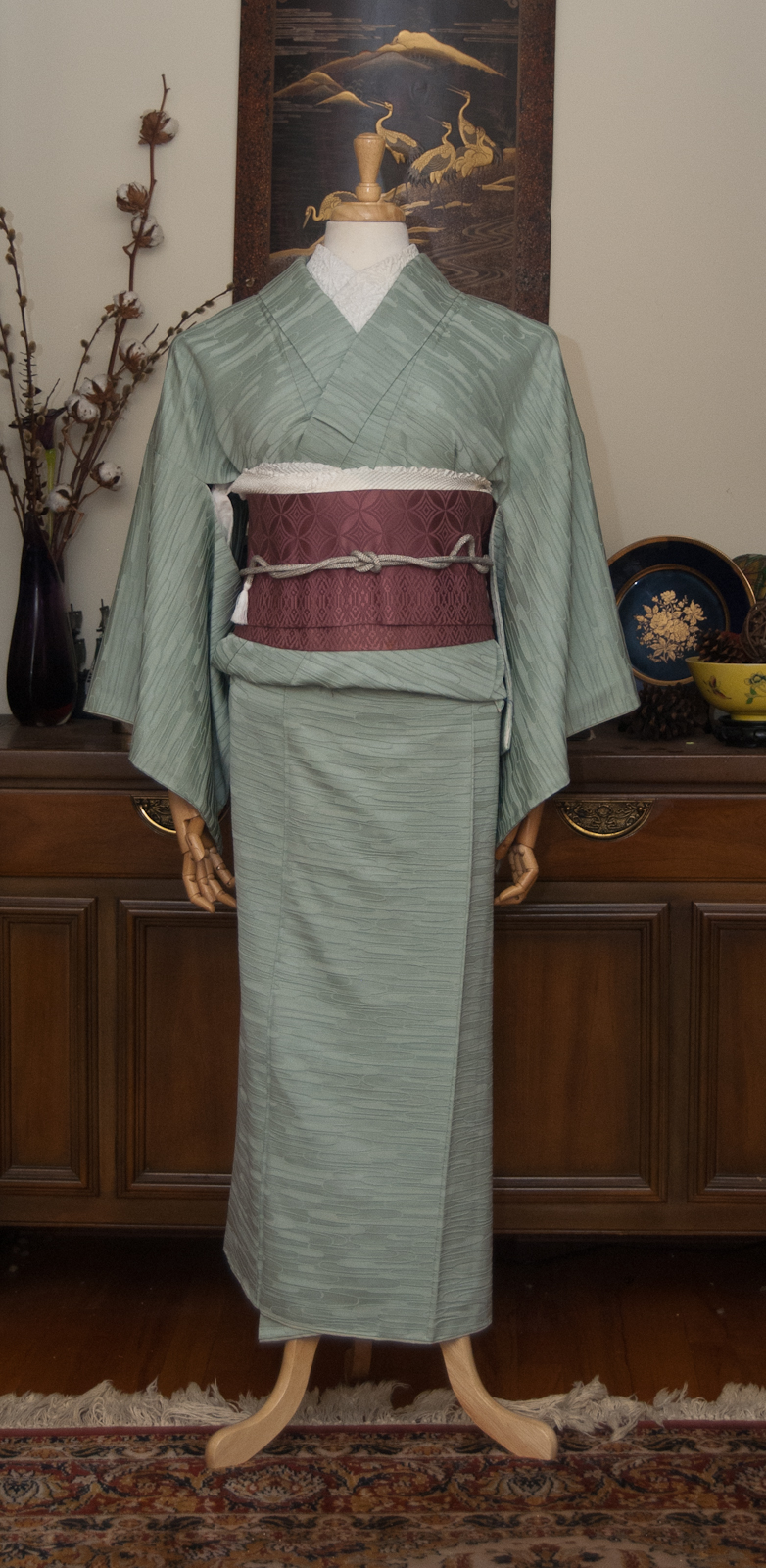
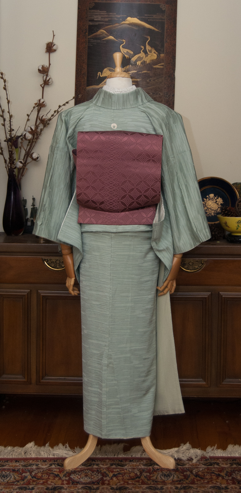
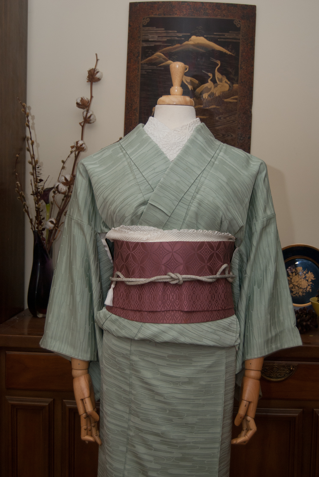
I really like how this all came together. It’s very simple but also feels very luxurious, due to the nature of all the fabrics together. It’s even more effective in person, but you’ll just have to take my word on that!
Items used in this coordination
-
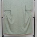
- Mint Green
-
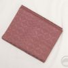
- Dusty Rose Hakata
-
- Textured Kiku
-
- White Shibori

-
- White Beaded


 Bebe Taian
 CHOKO Blog
 Silk & Bones
 Gion Kobu