
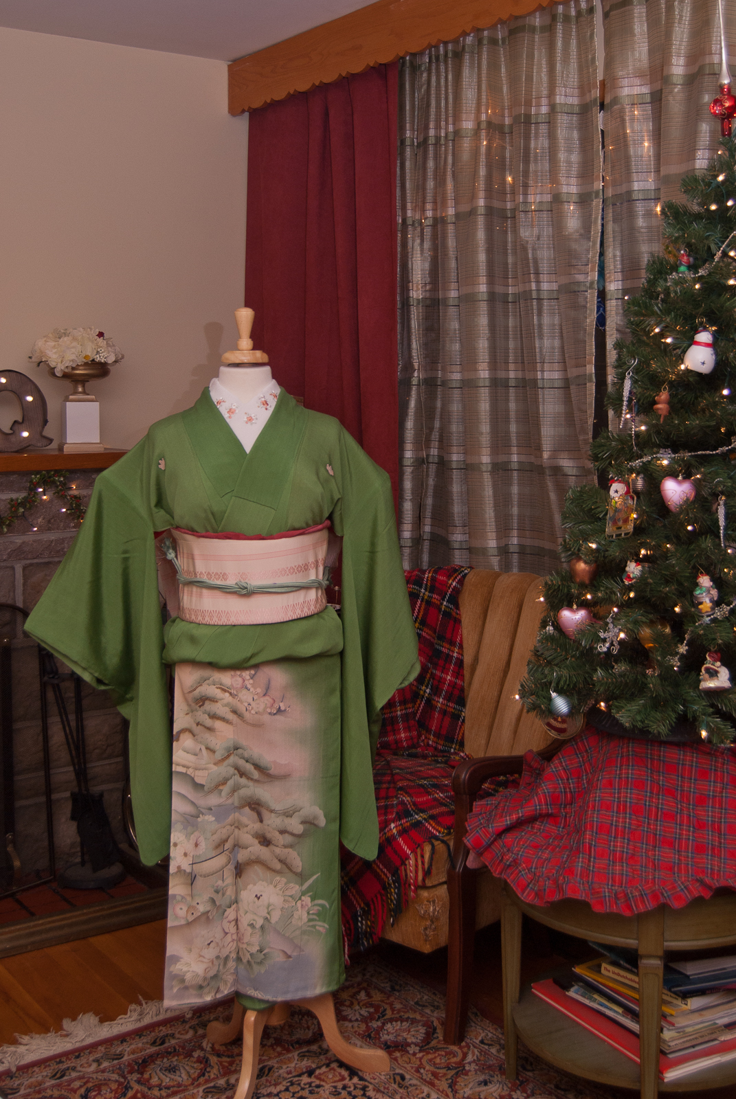
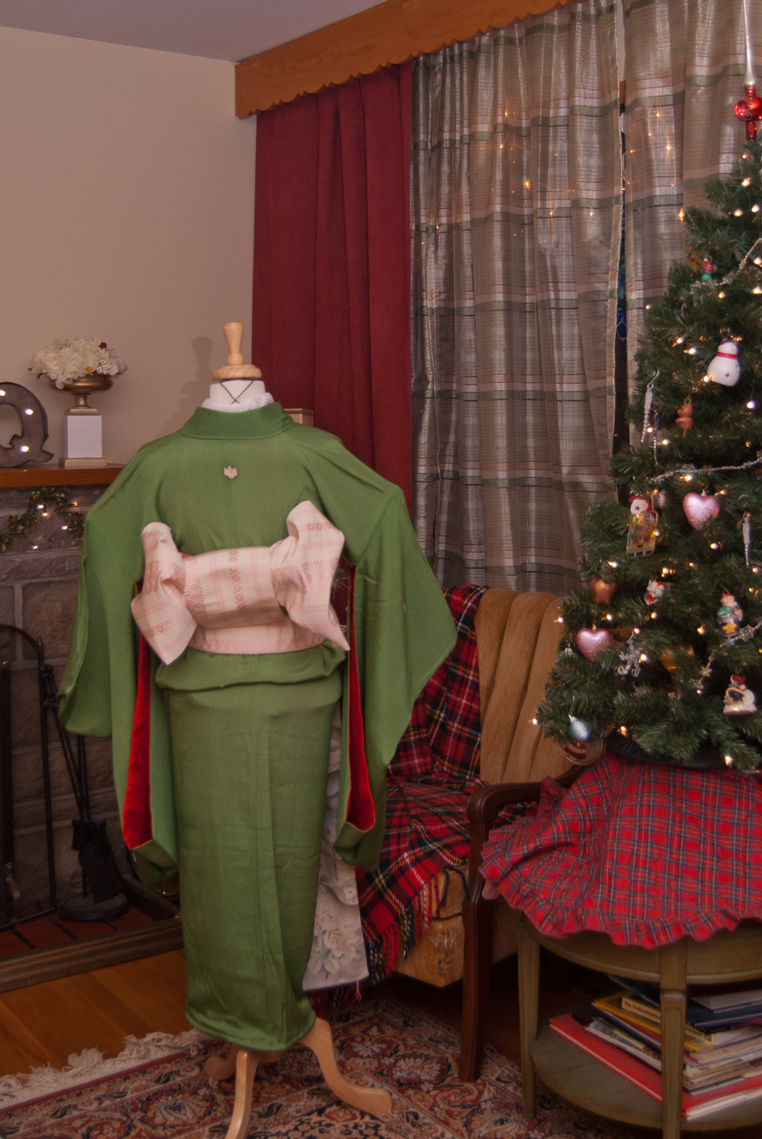
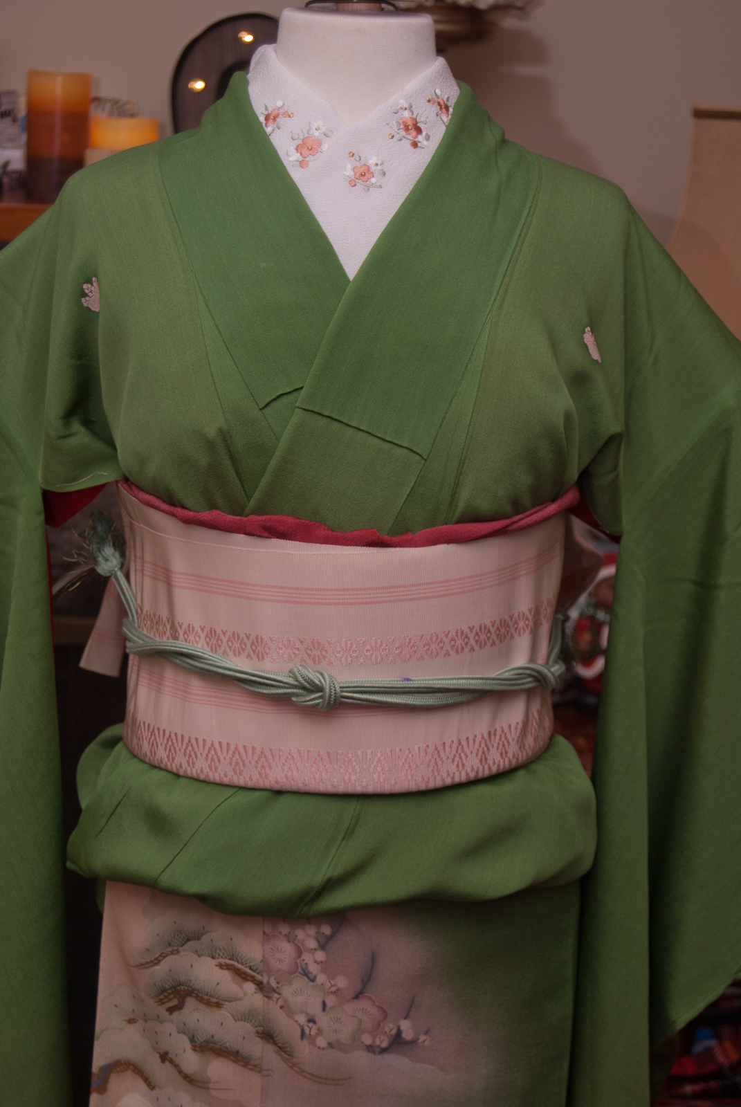
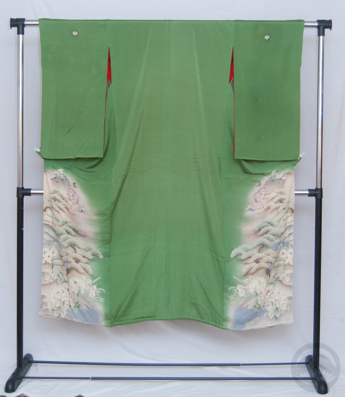
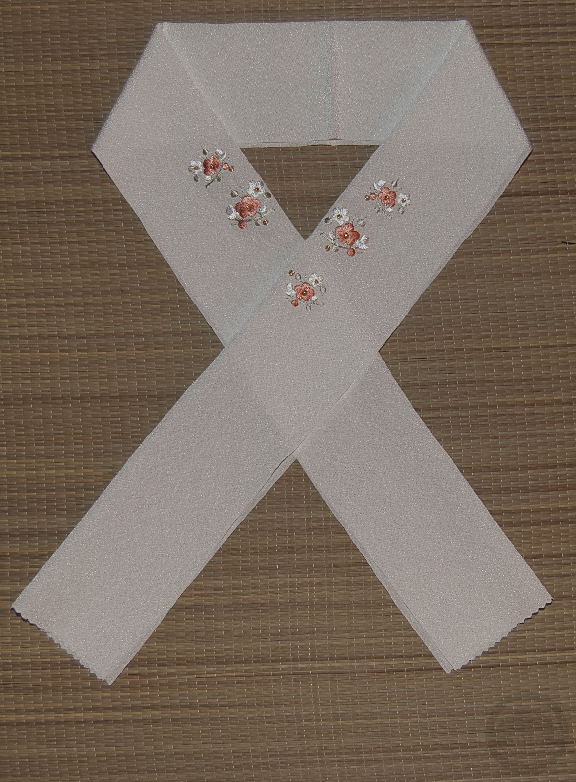
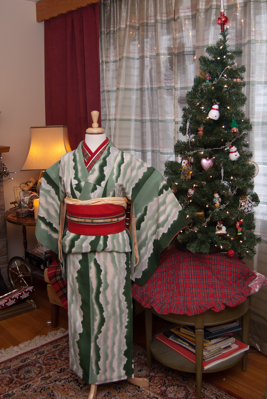
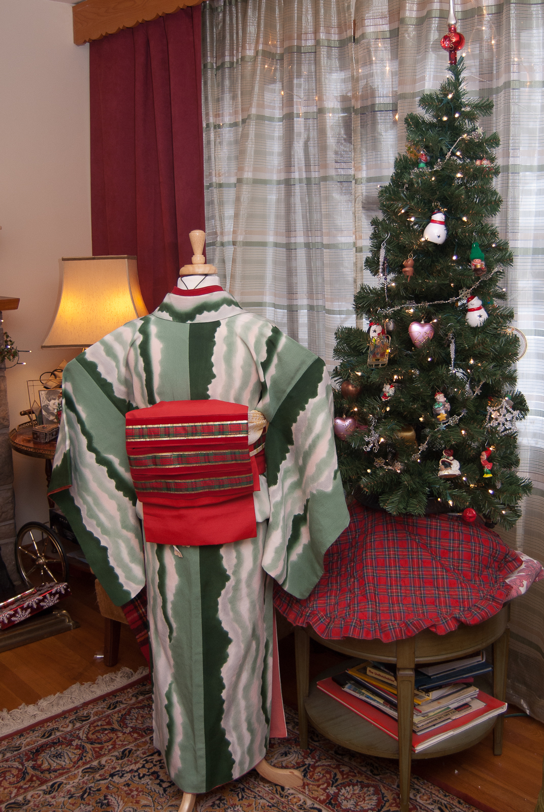
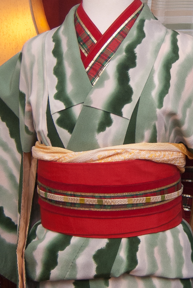
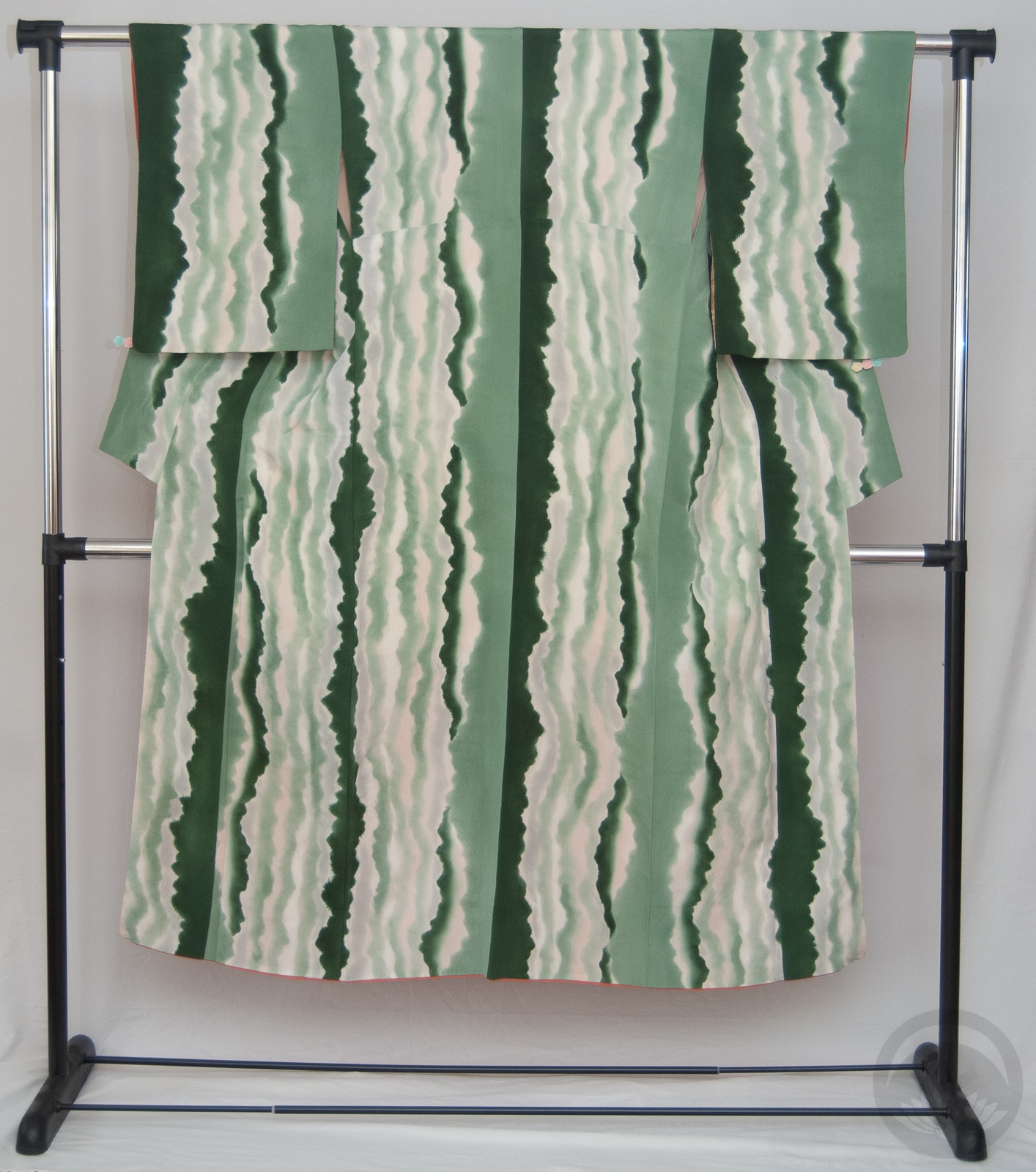
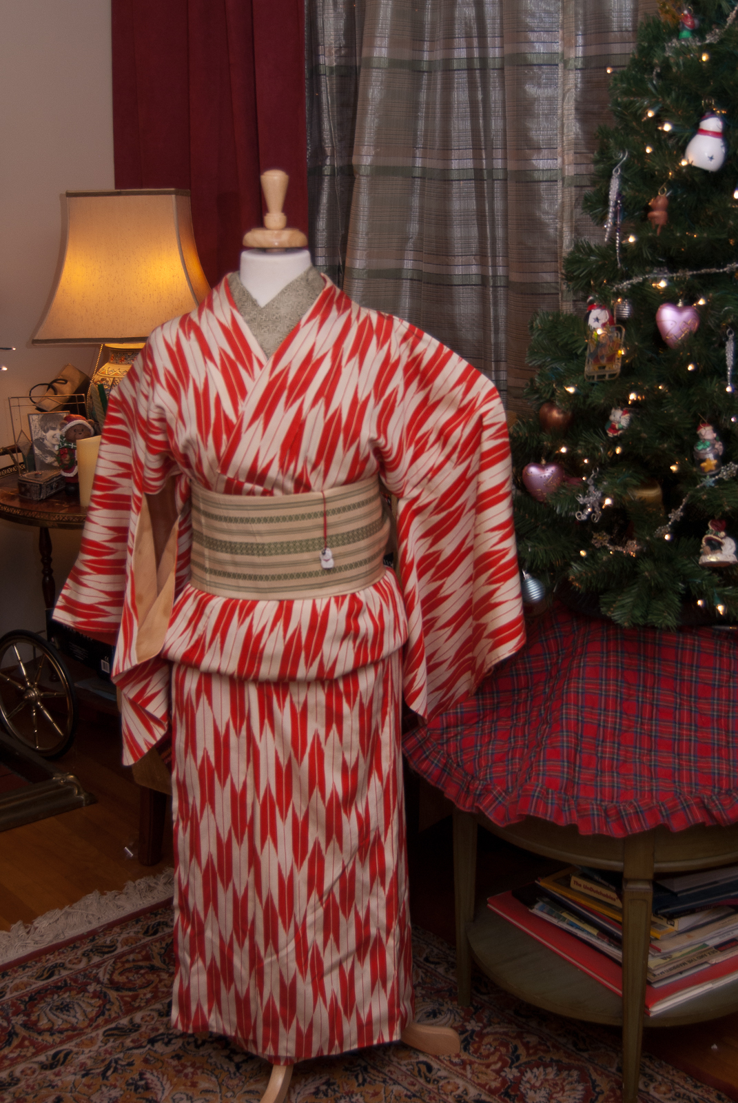
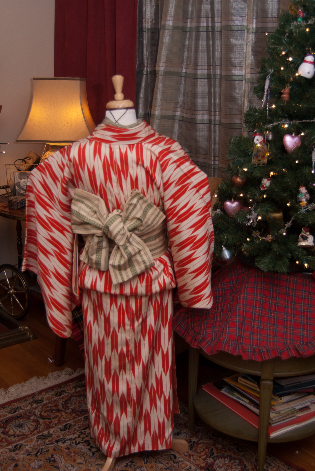
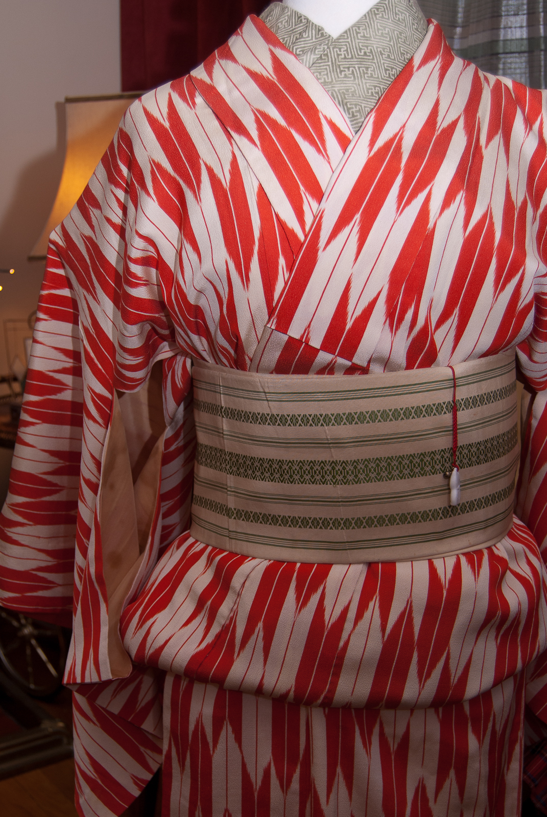
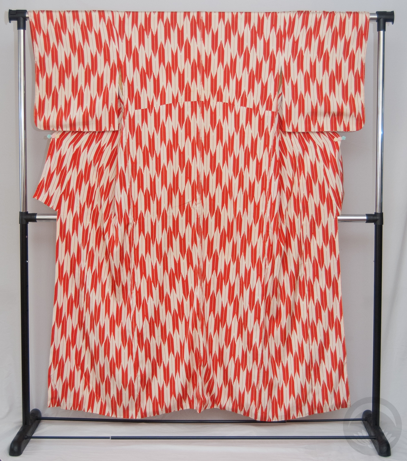
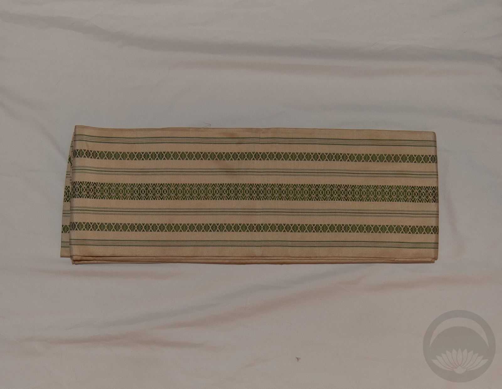
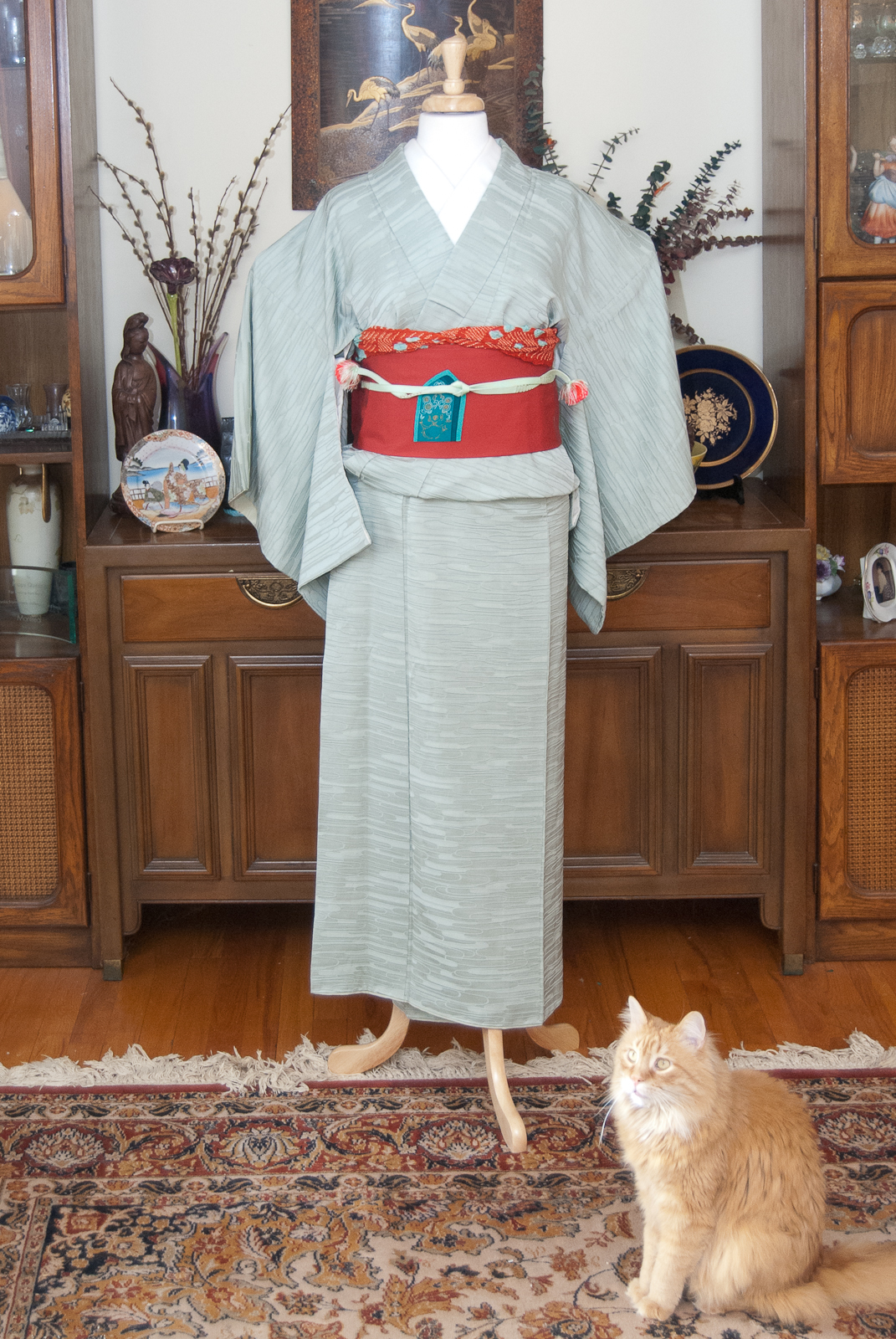
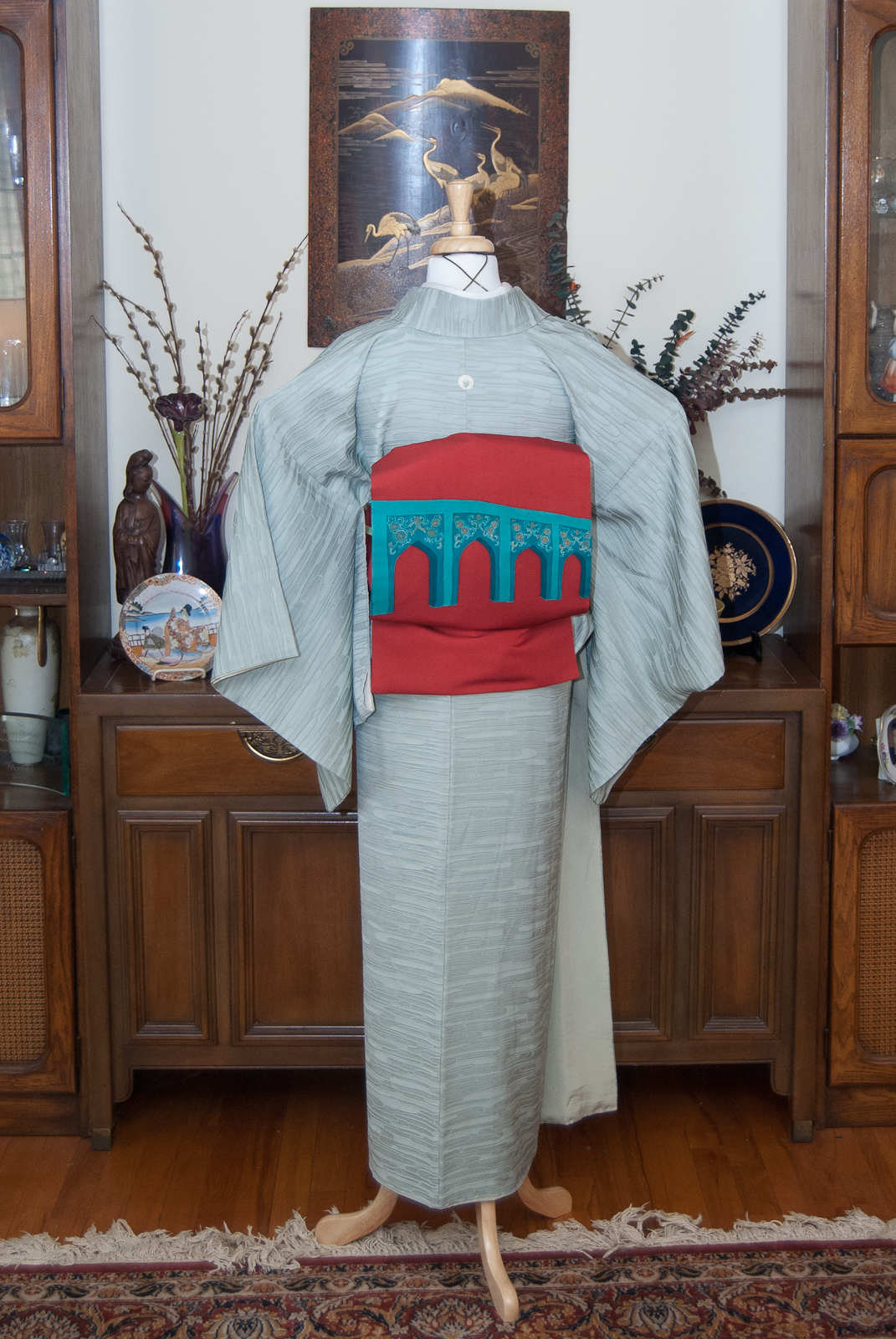
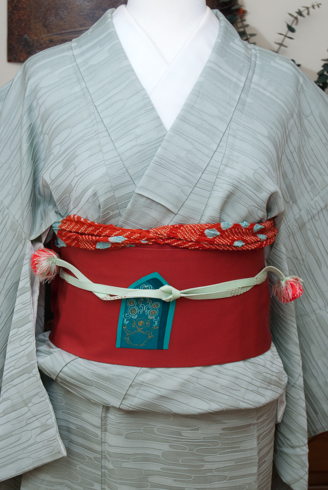
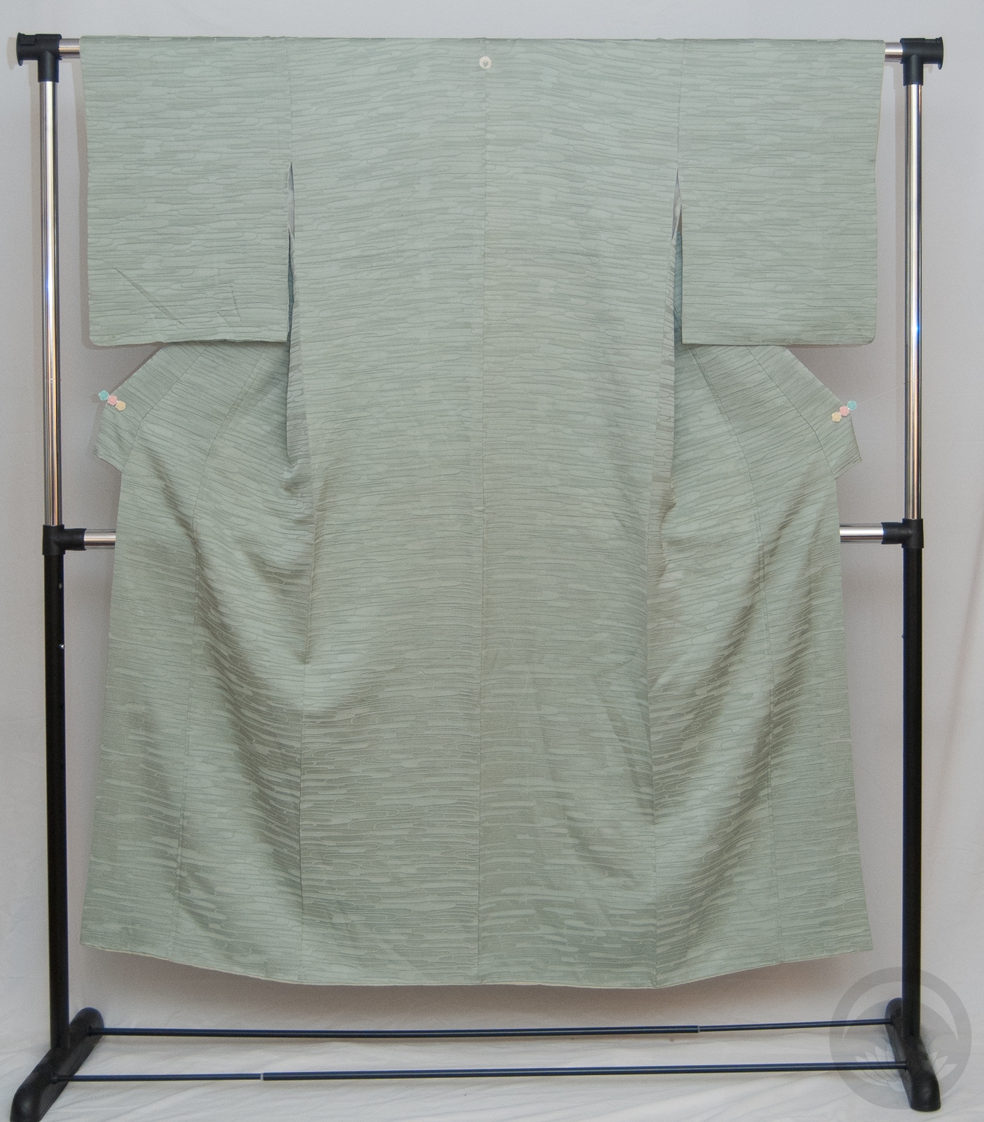
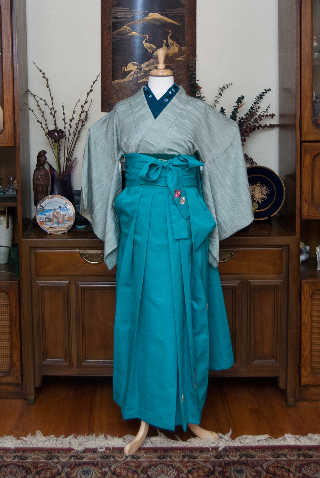
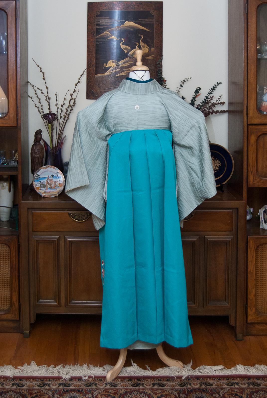
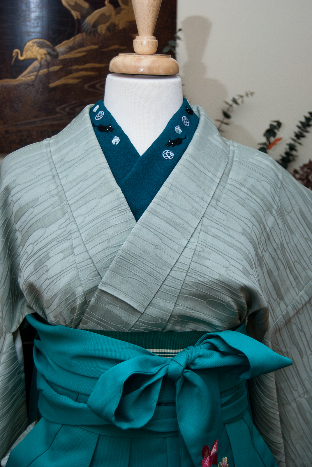
Goodness, it’s almost the end of the year! For today’s coordination, I wanted something that was still within the Christmas colour scheme but felt more spring-like. Looking forward to the new year, if you will. I love this green irotomesode, and it pairs so perfectly with my pink and white hakata obi. I brought a small bit of red in with the obiage, but still tried to it in the same desaturated and vintage-feeling colour scheme. The flowers and colours around the hem of the kimono have always felt like they had one foot in winter and one foot in spring. Considering how blisteringly cold it’s been lately here in Montreal, I need a reminder that this utterly miserable weather won’t be around forever.
This one may not scream “festive” in the way the previous ones have, but I’m still quite pleased with how it’s turned out. It’s a nice subdued coordination, a calming breath before the next few outfits I’ve got planned. Be sure to check back to see tomorrow’s!
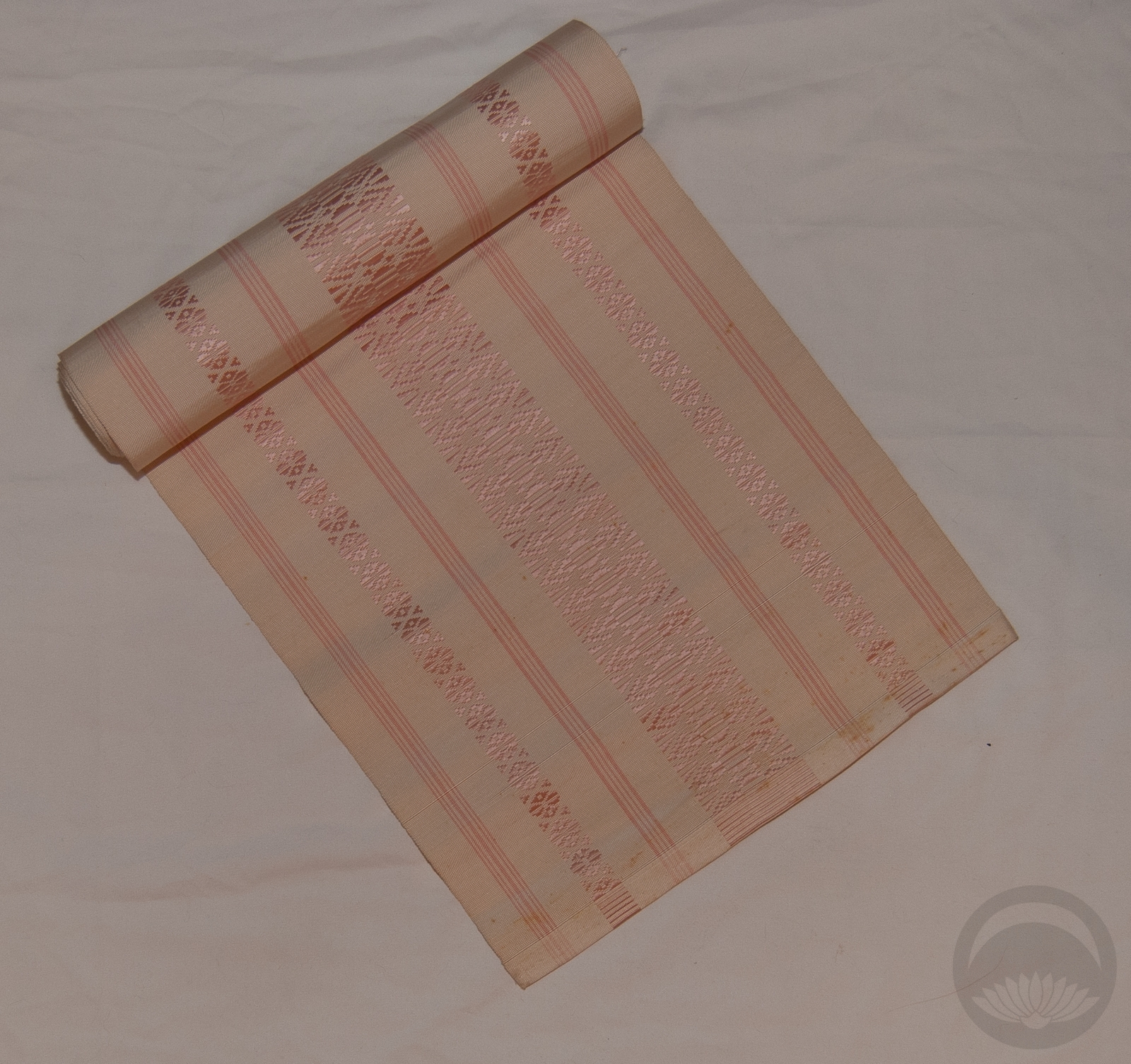
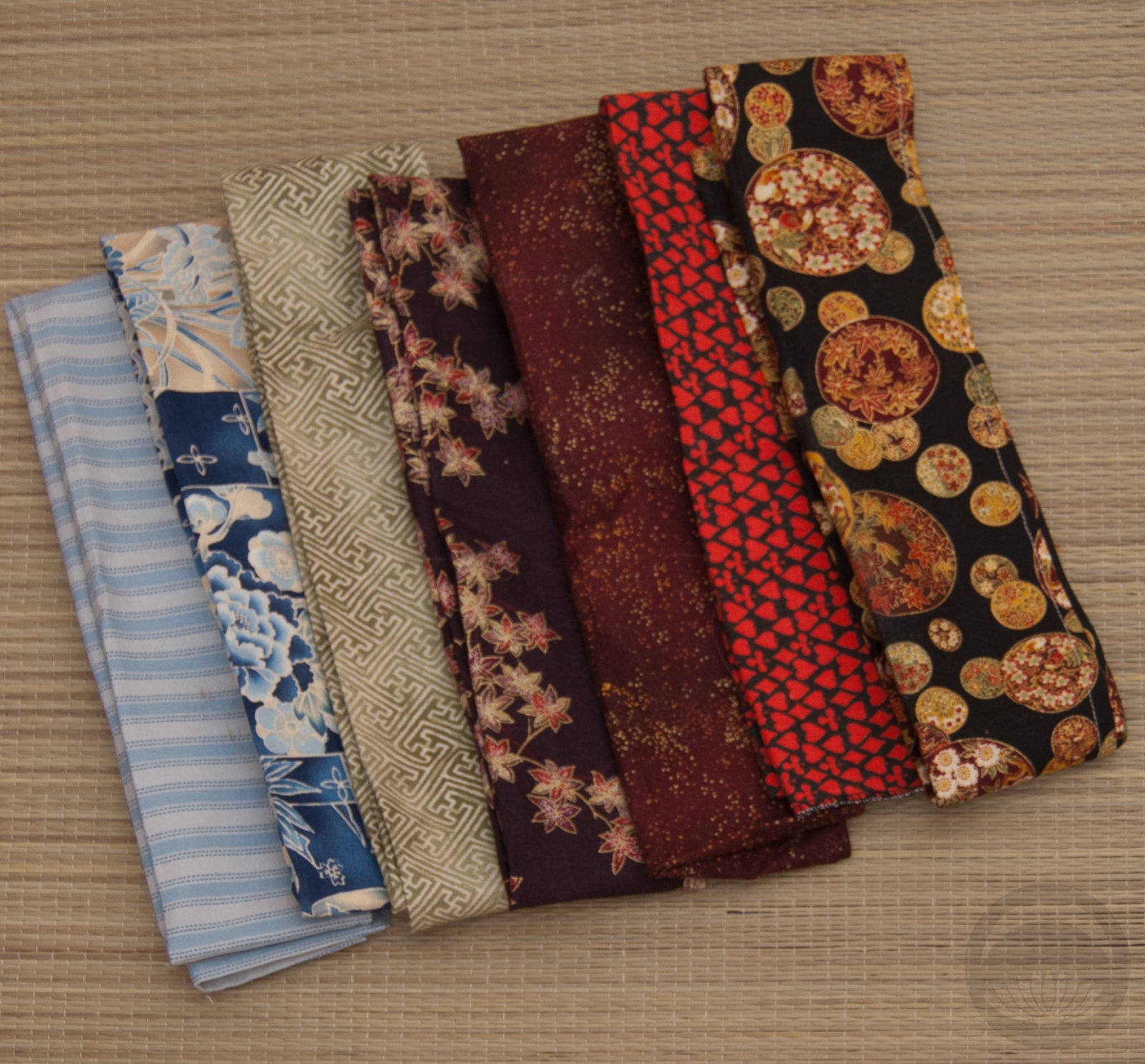
Items used in this coordination
-
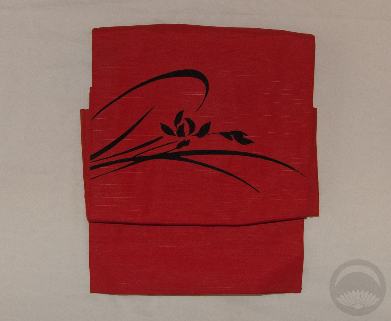
- Leaf Green Mirrored
-
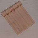
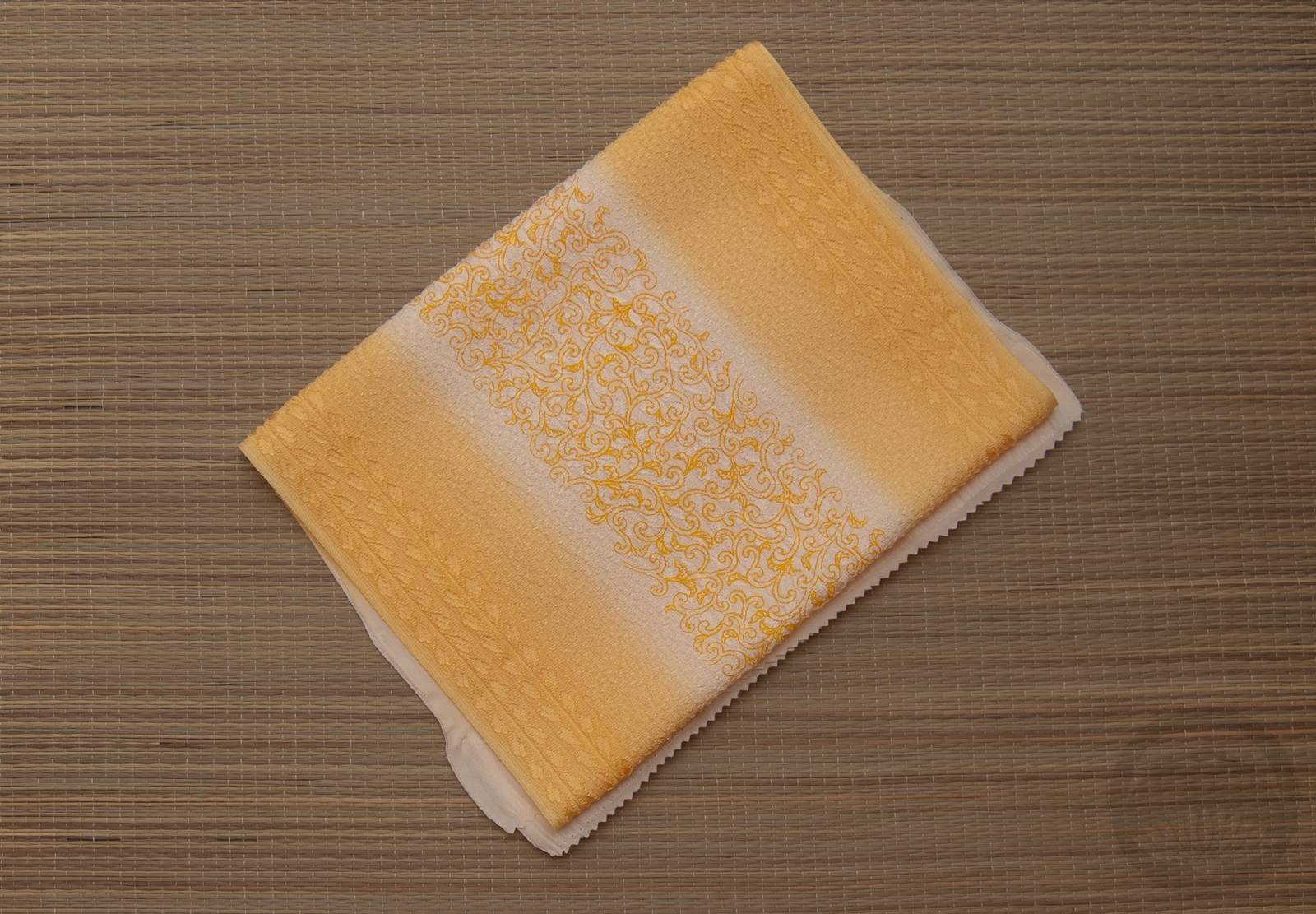
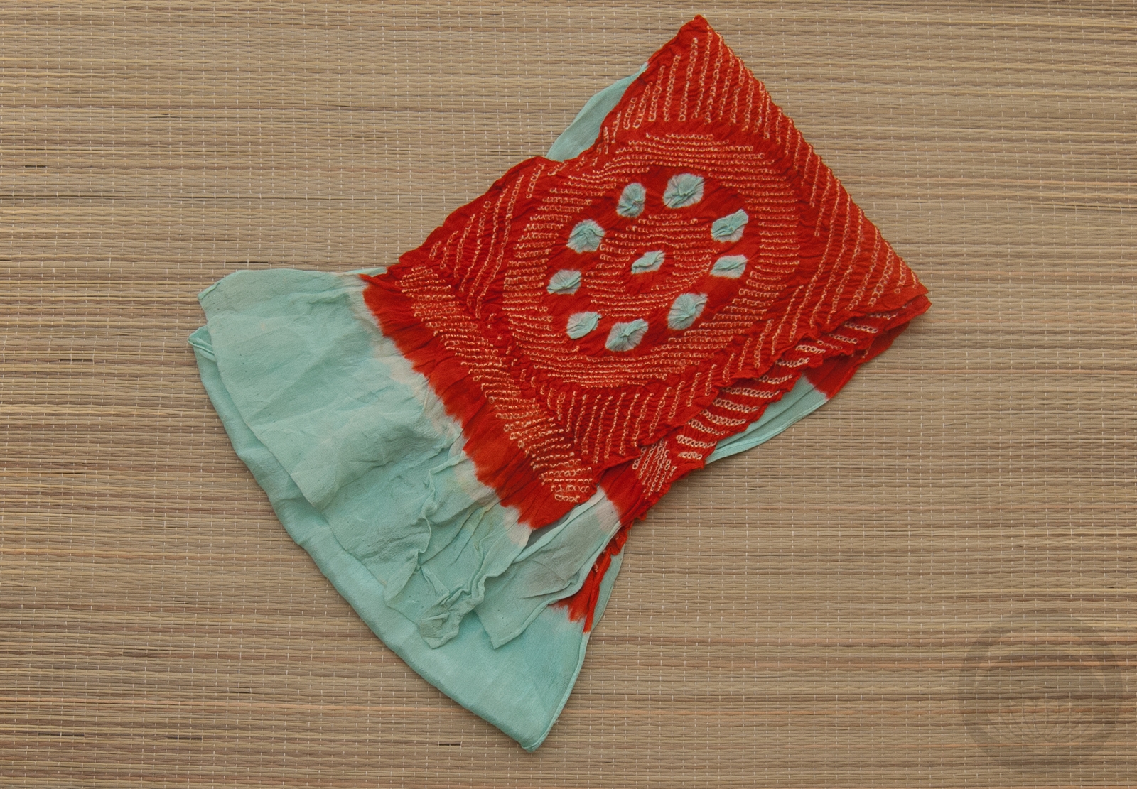
- White & Pink
-

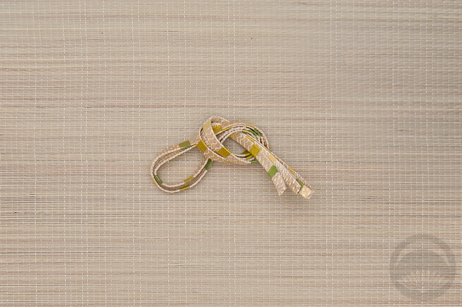
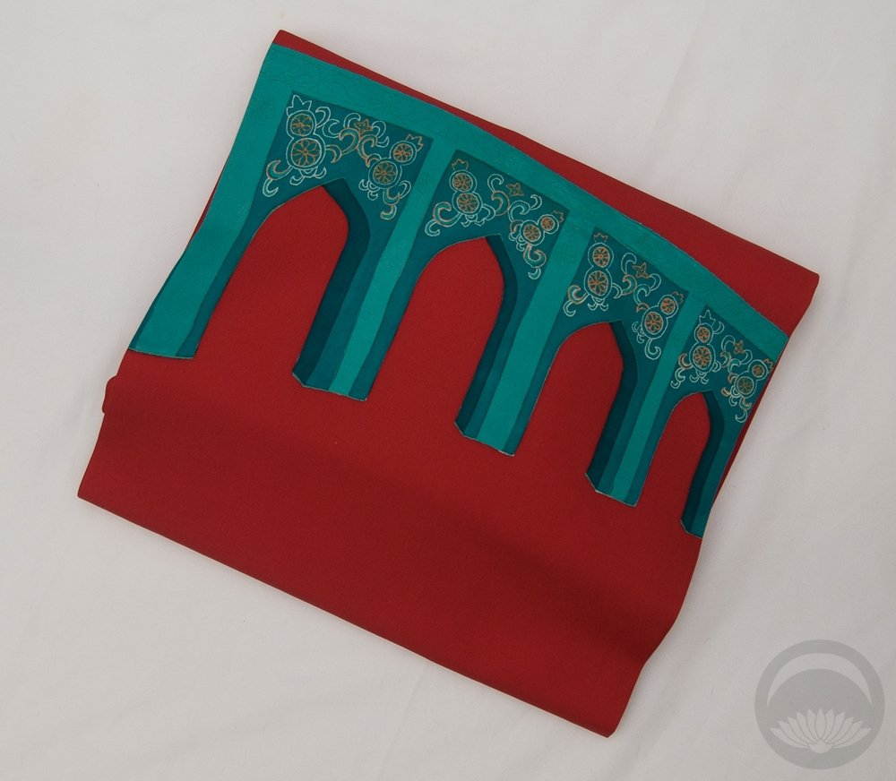
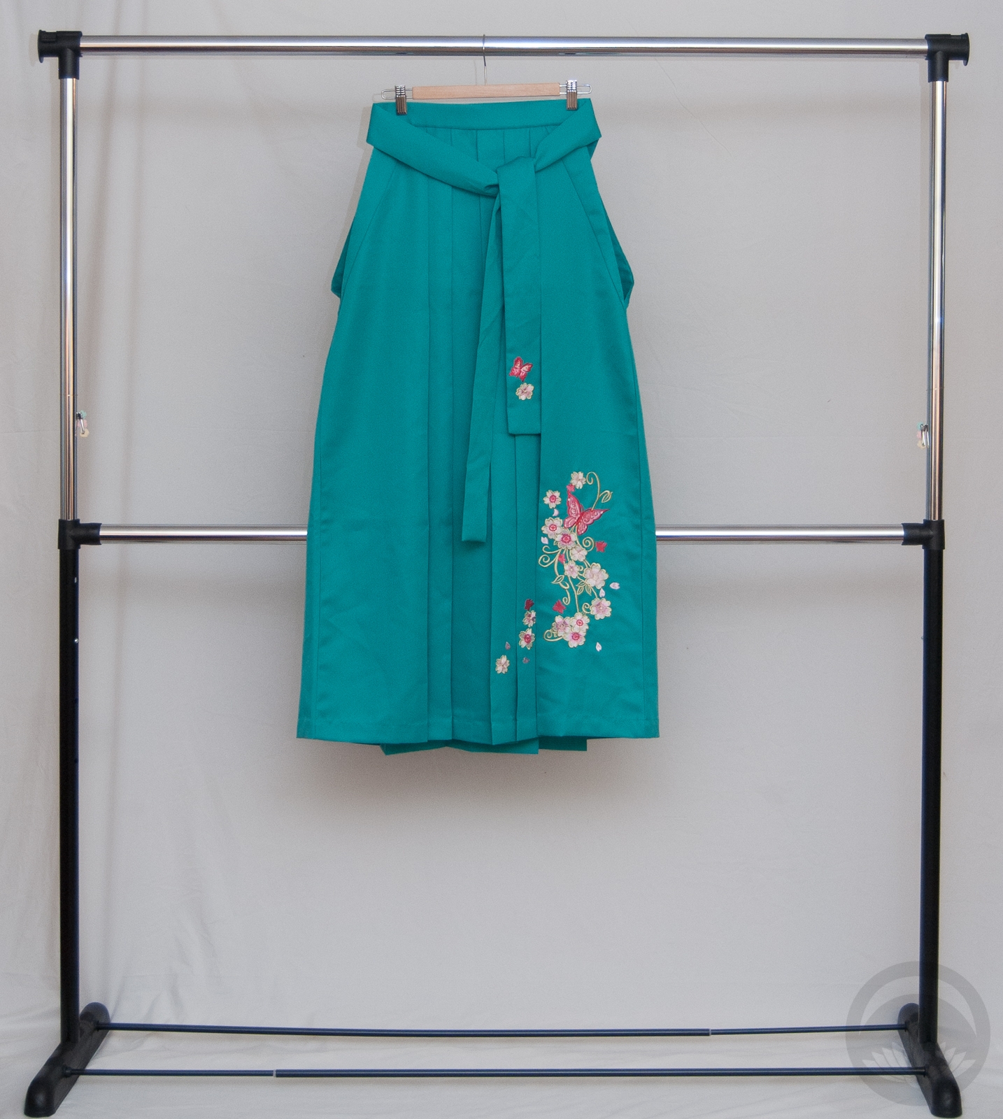
- Pink Ume
-
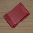
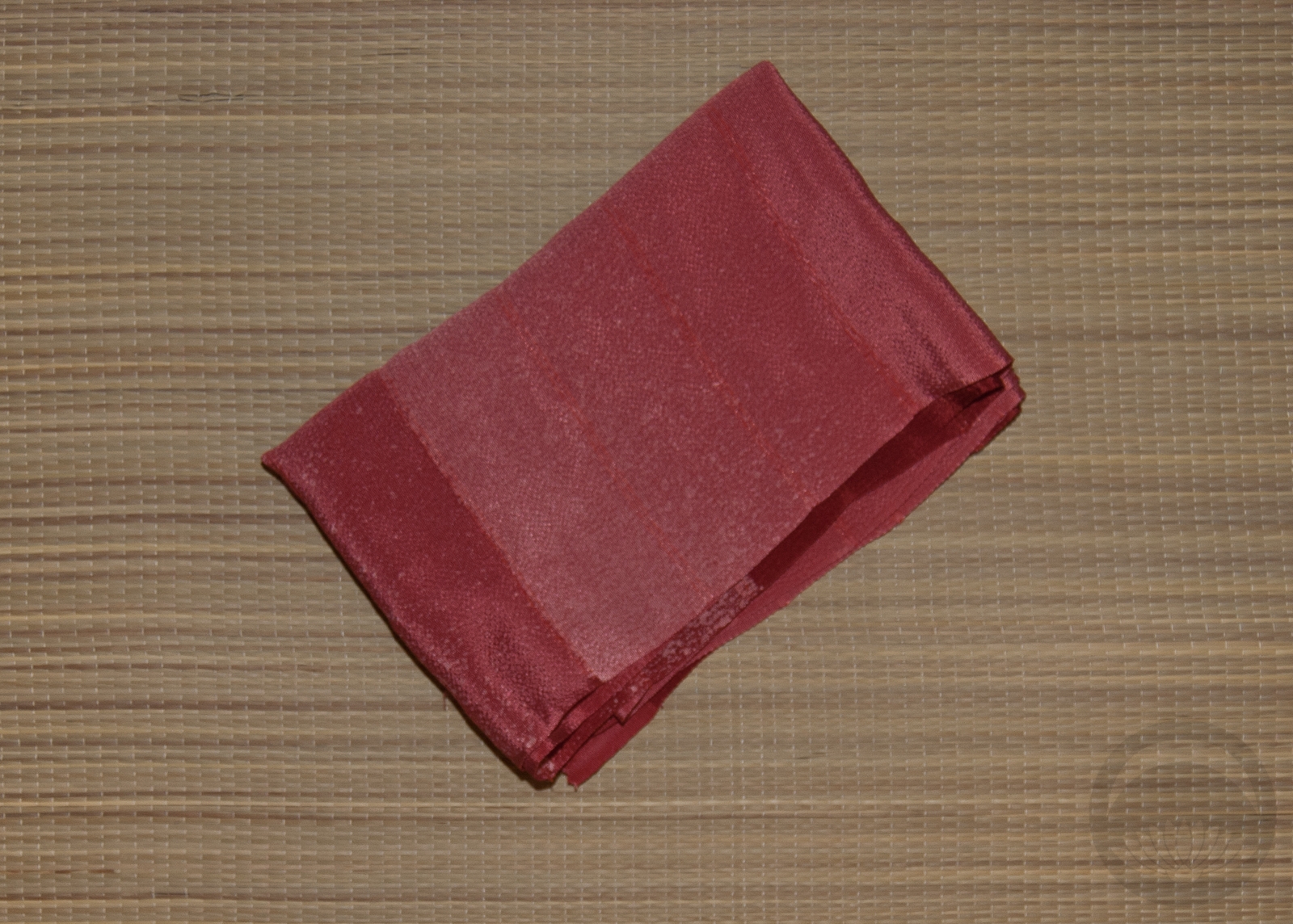
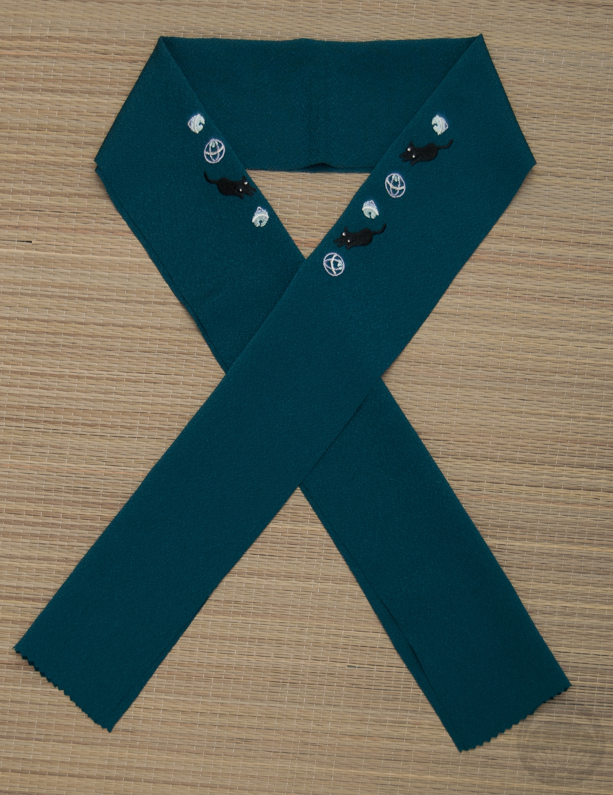
- Maroon Rinzu
-
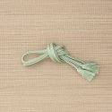
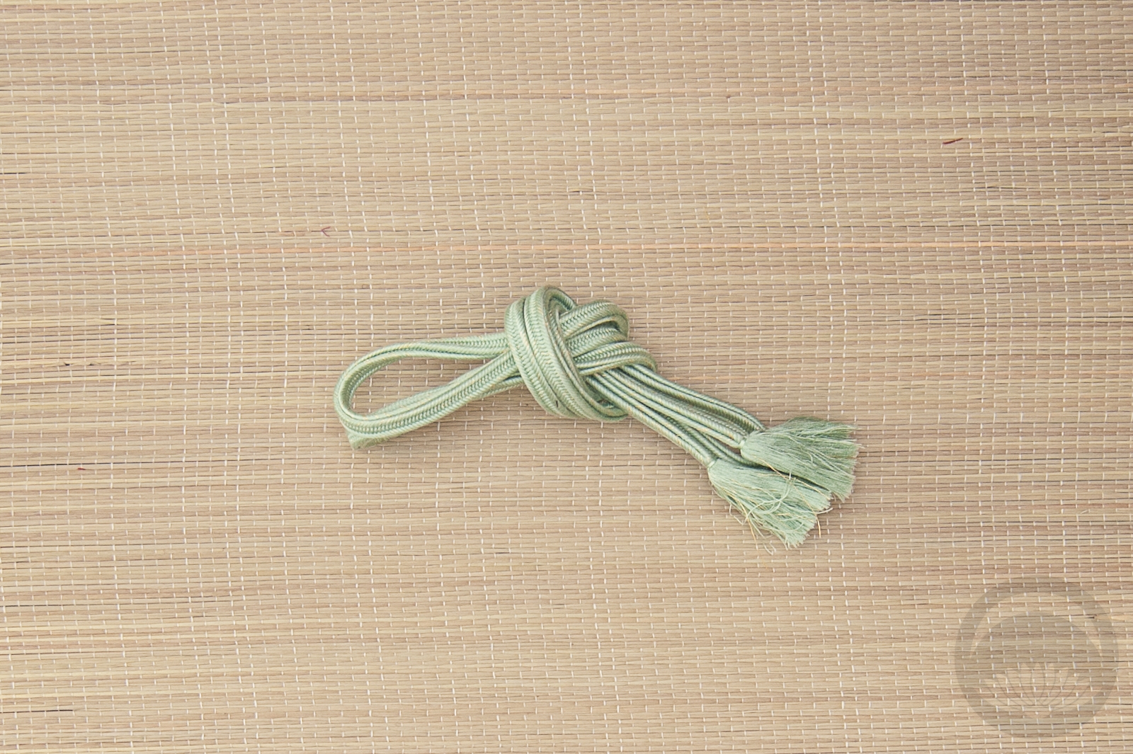
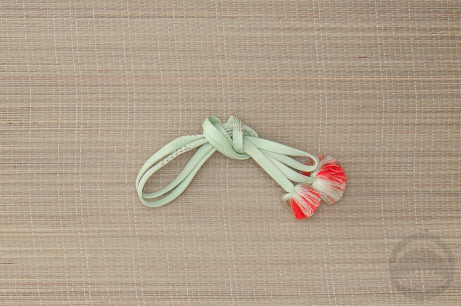
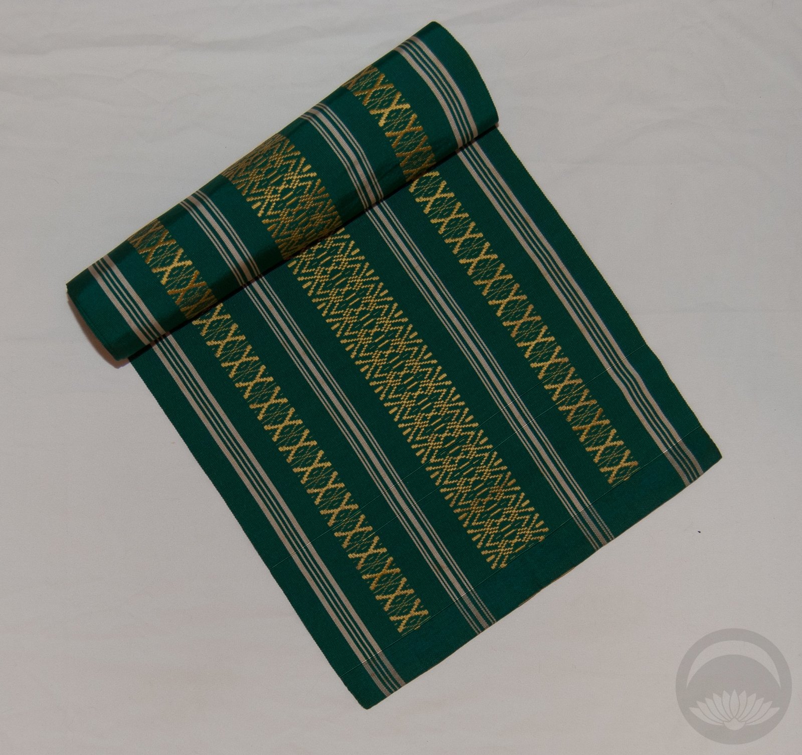
- Mint with Gold


 Bebe Taian
 CHOKO Blog
 Silk & Bones
 Gion Kobu