
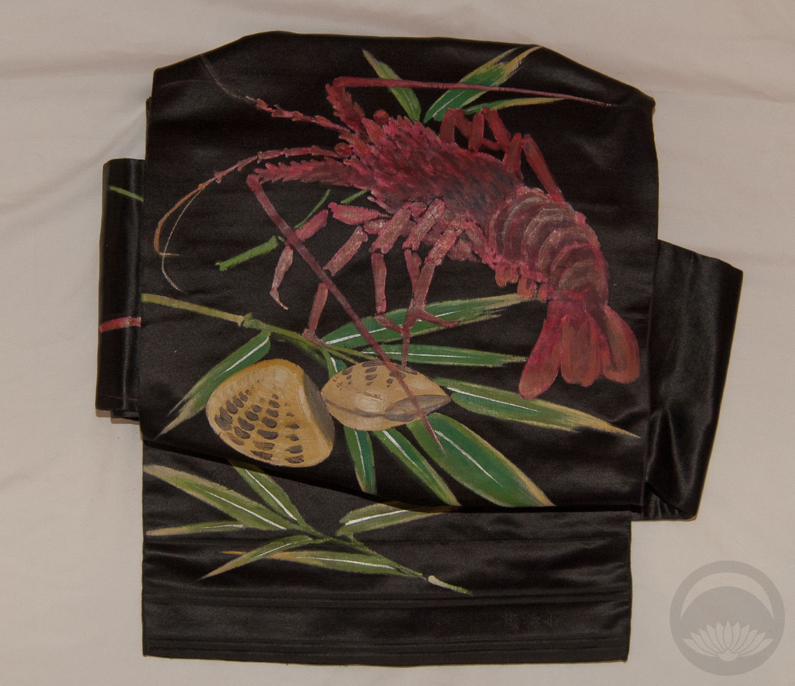
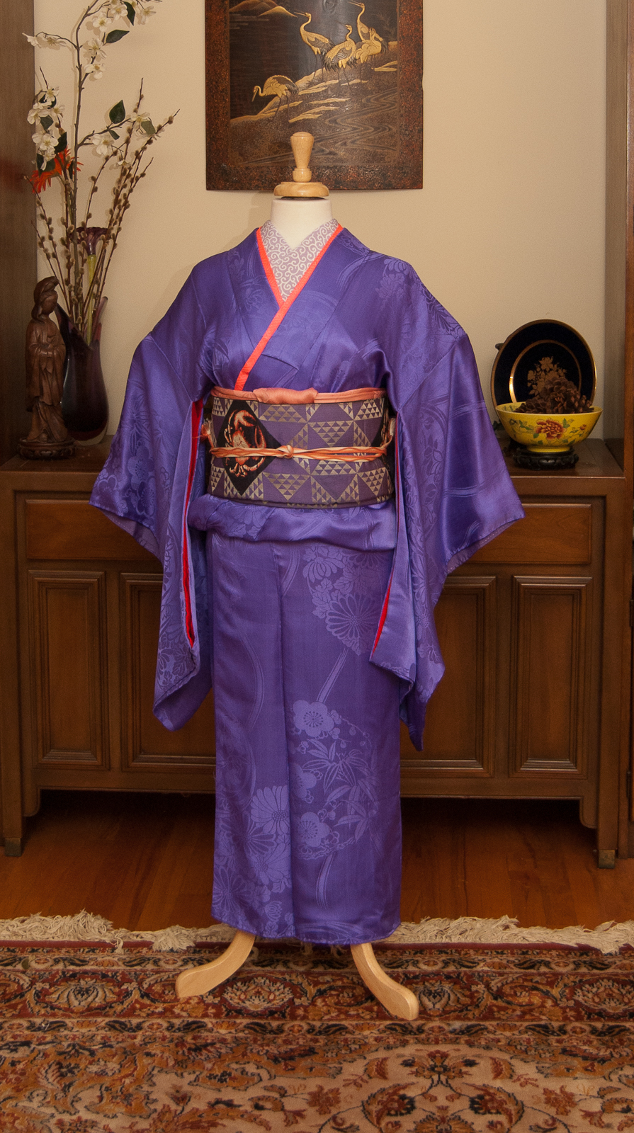
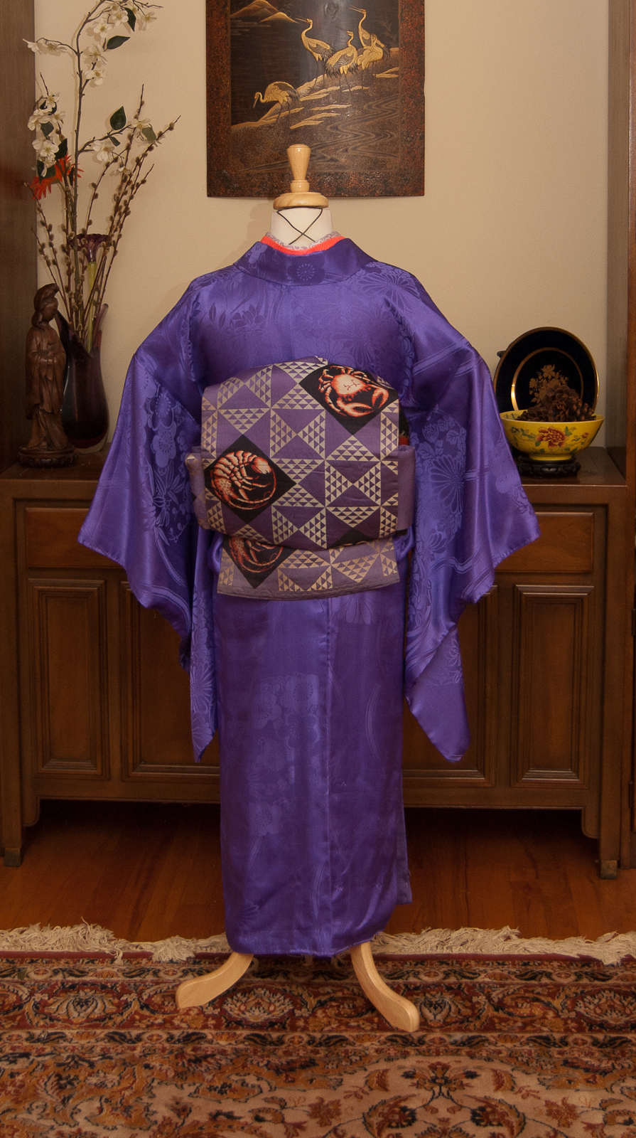
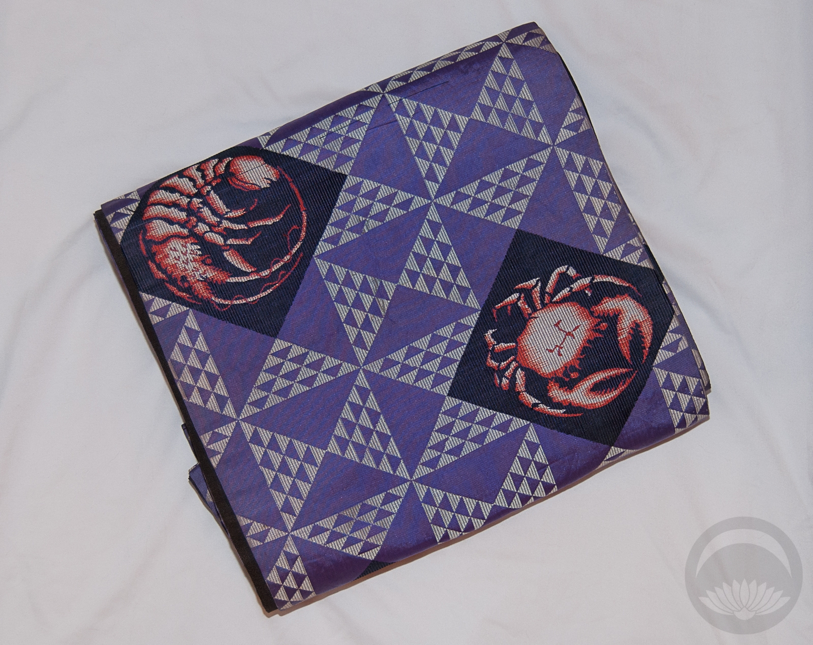
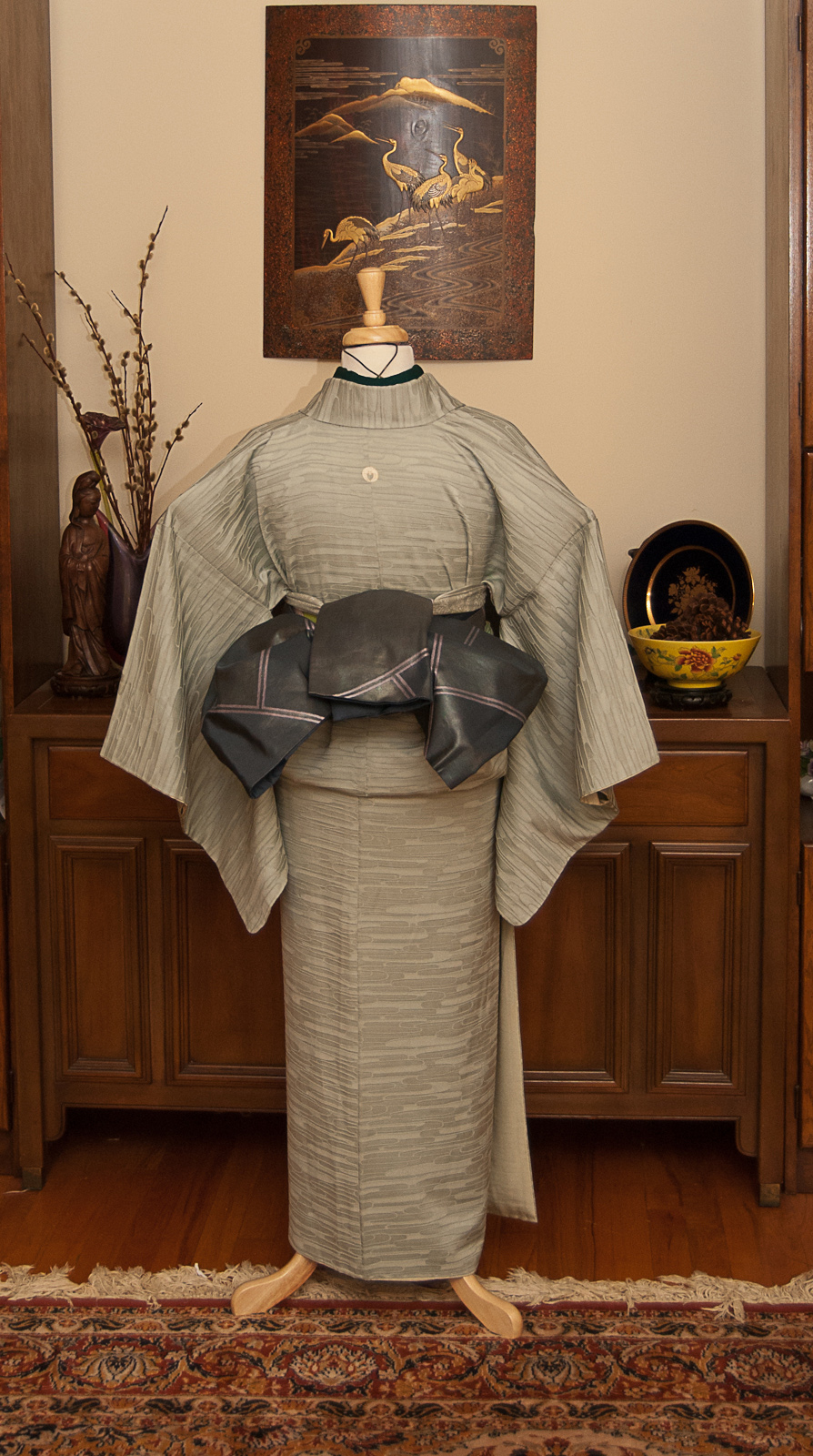
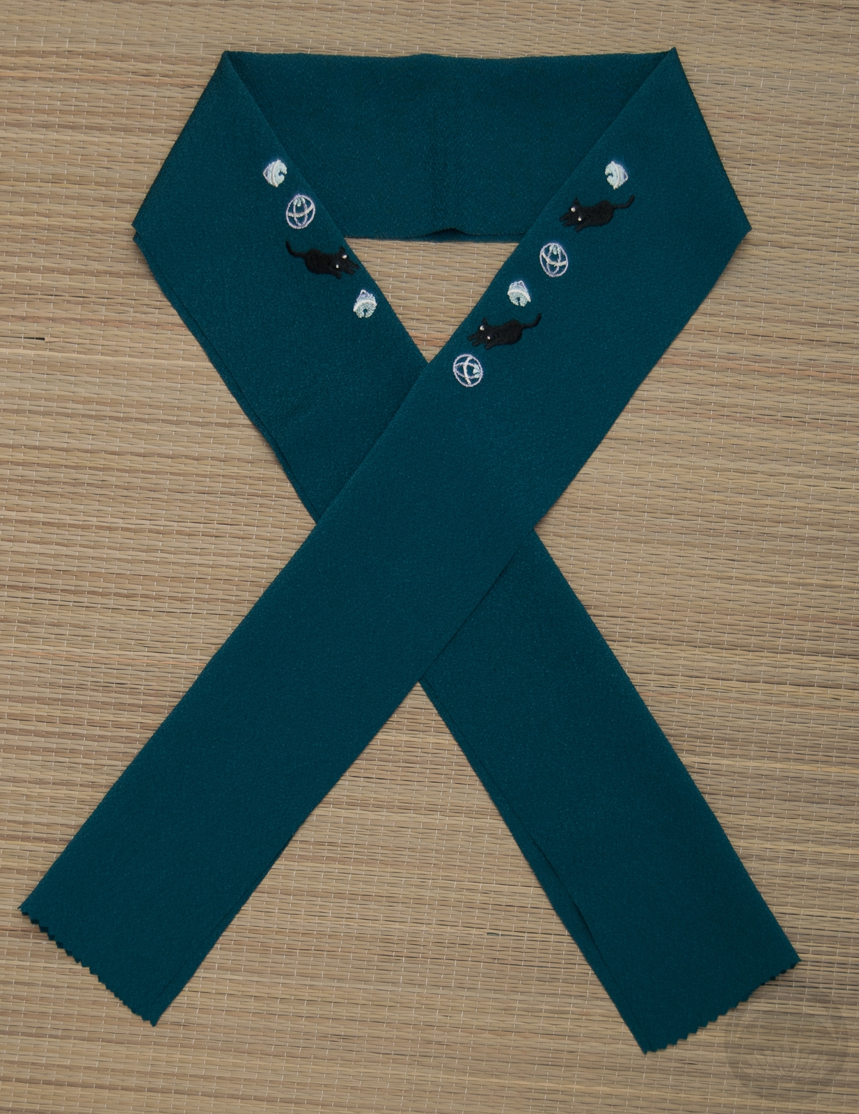
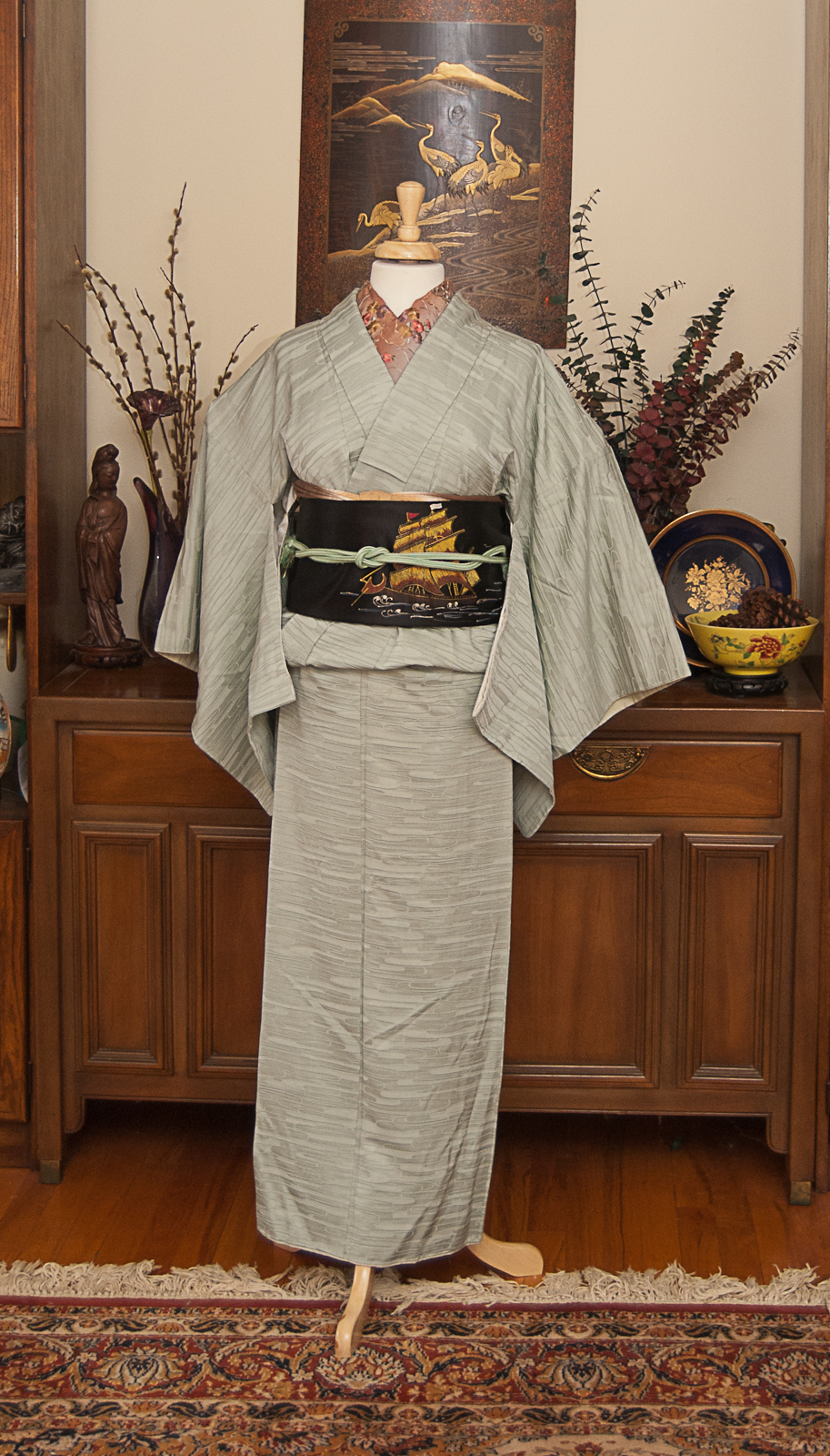
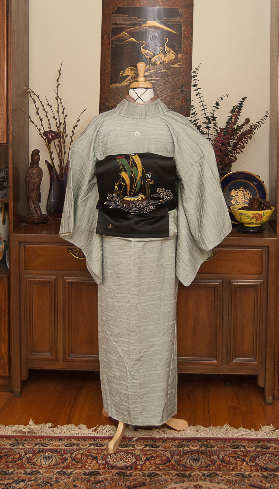
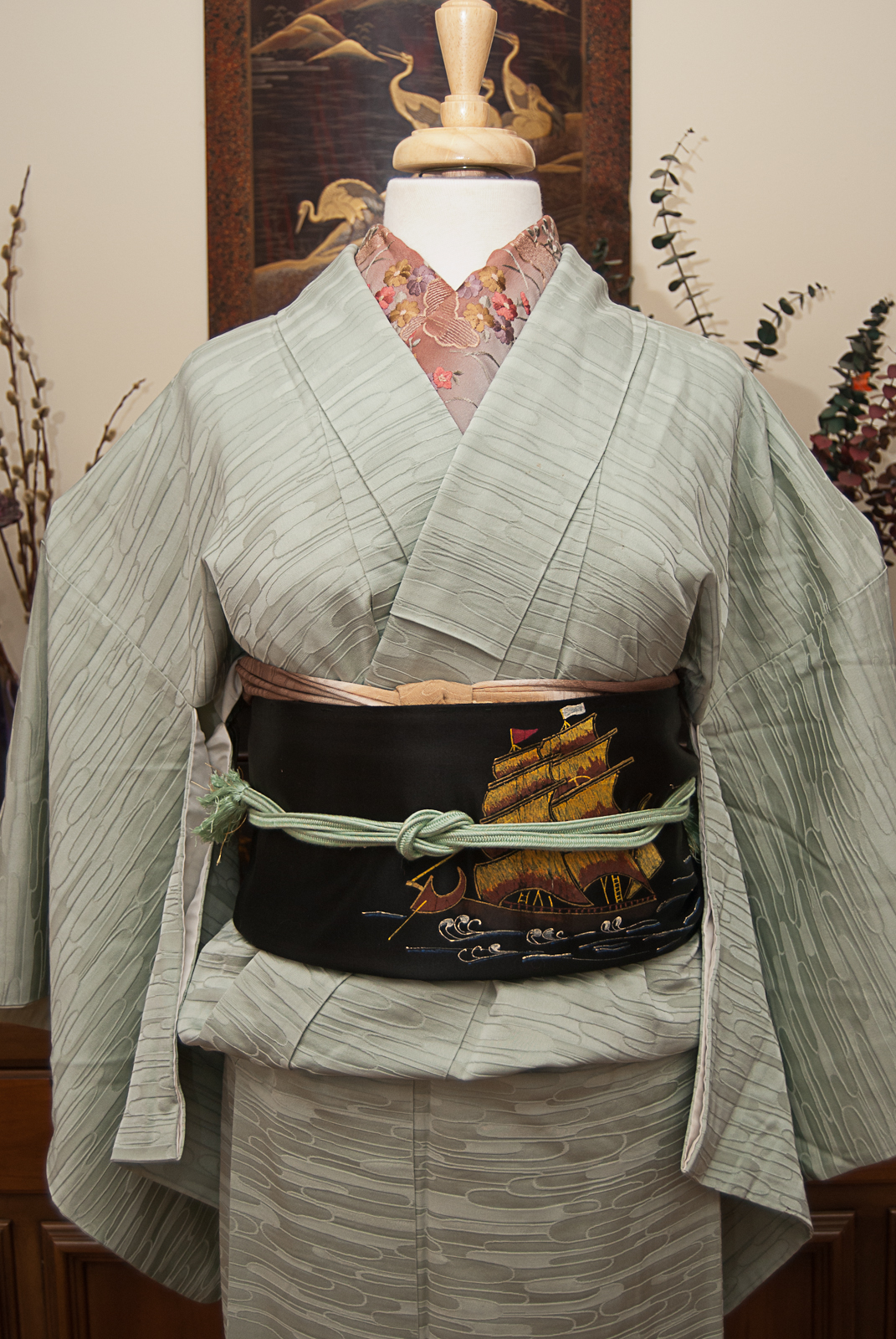
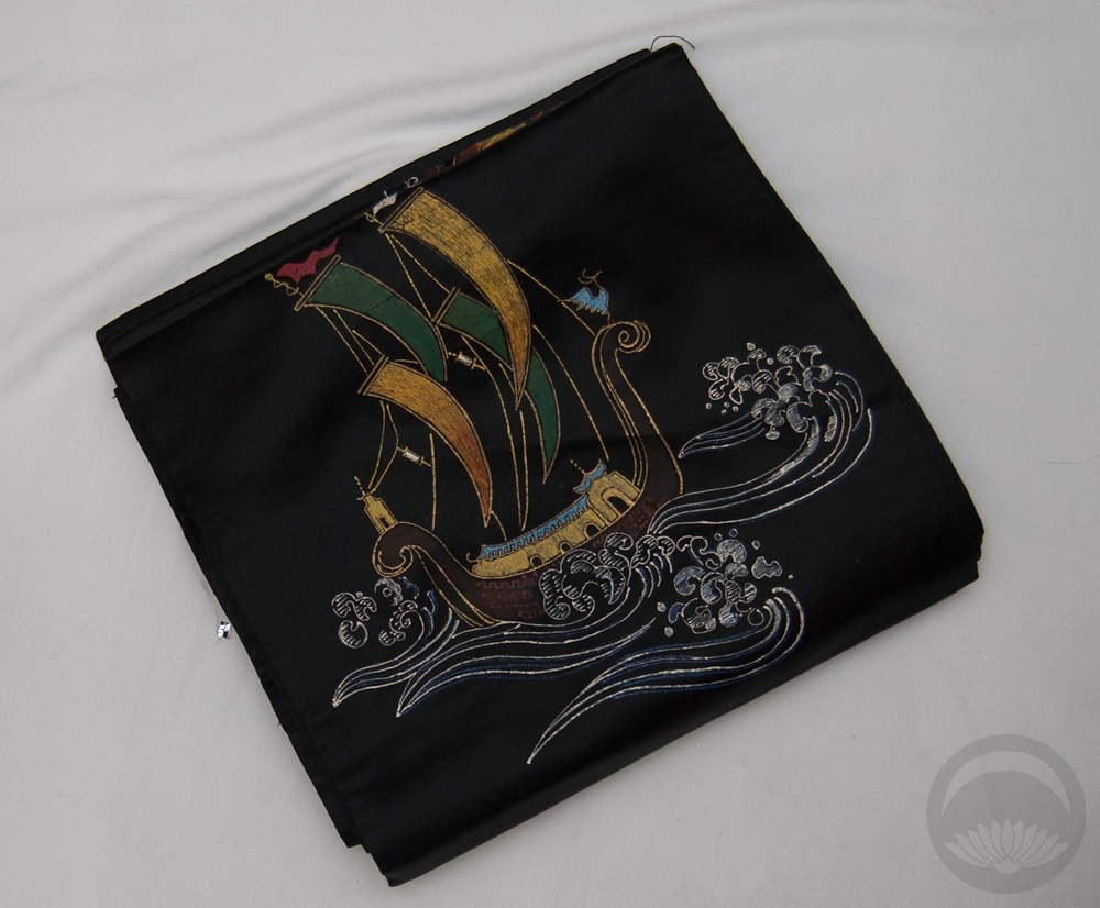
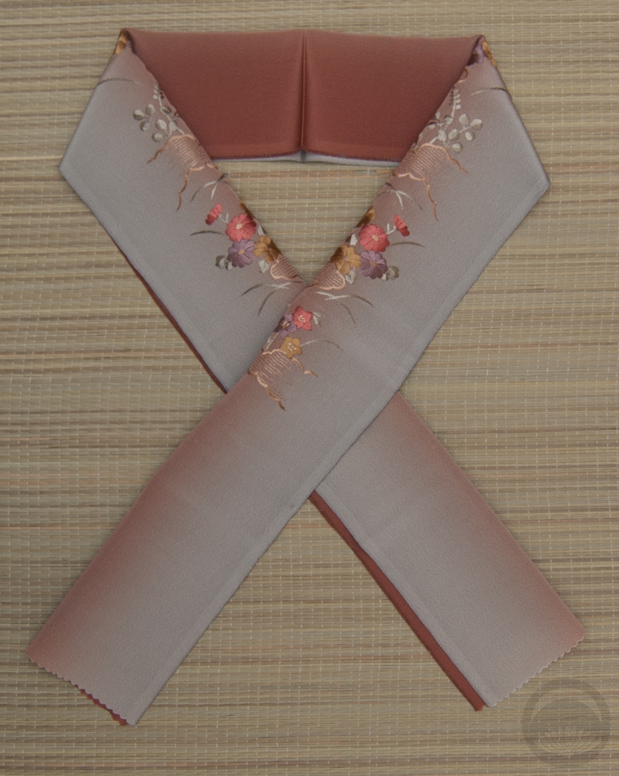
Recently, someone on the Kimono Tsuki facebook page reminded me of my incredible pente lobster obi. I decided it had been far too long since I’d done anything with it, so I went about putting together an outfit in my notes.
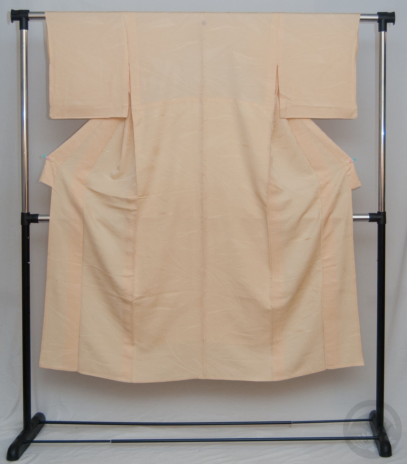
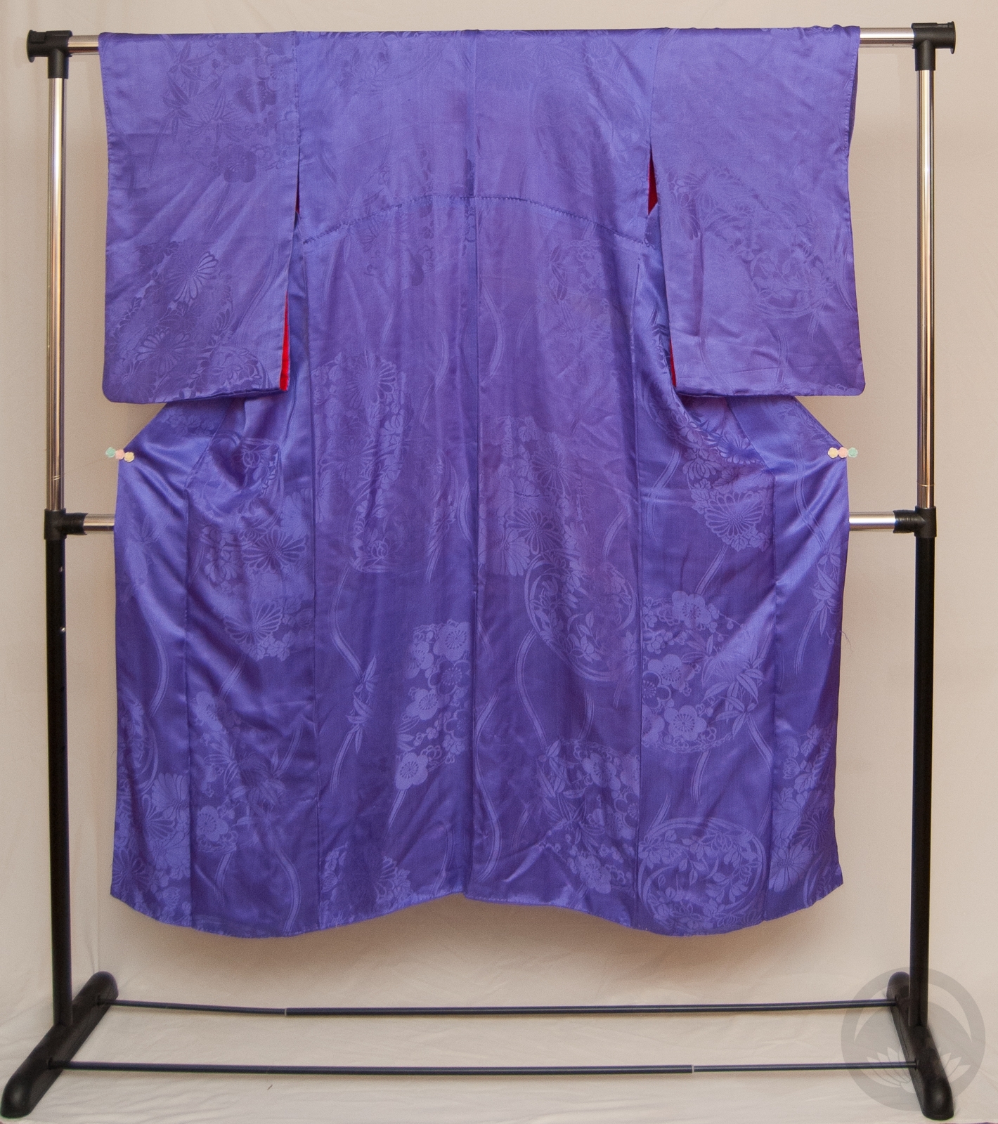
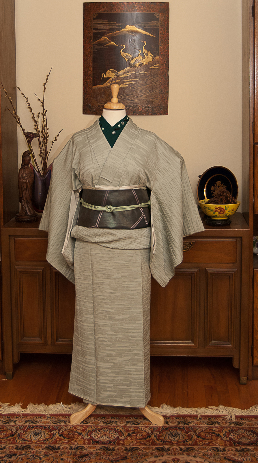
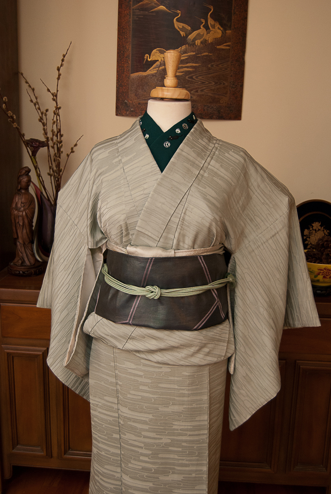
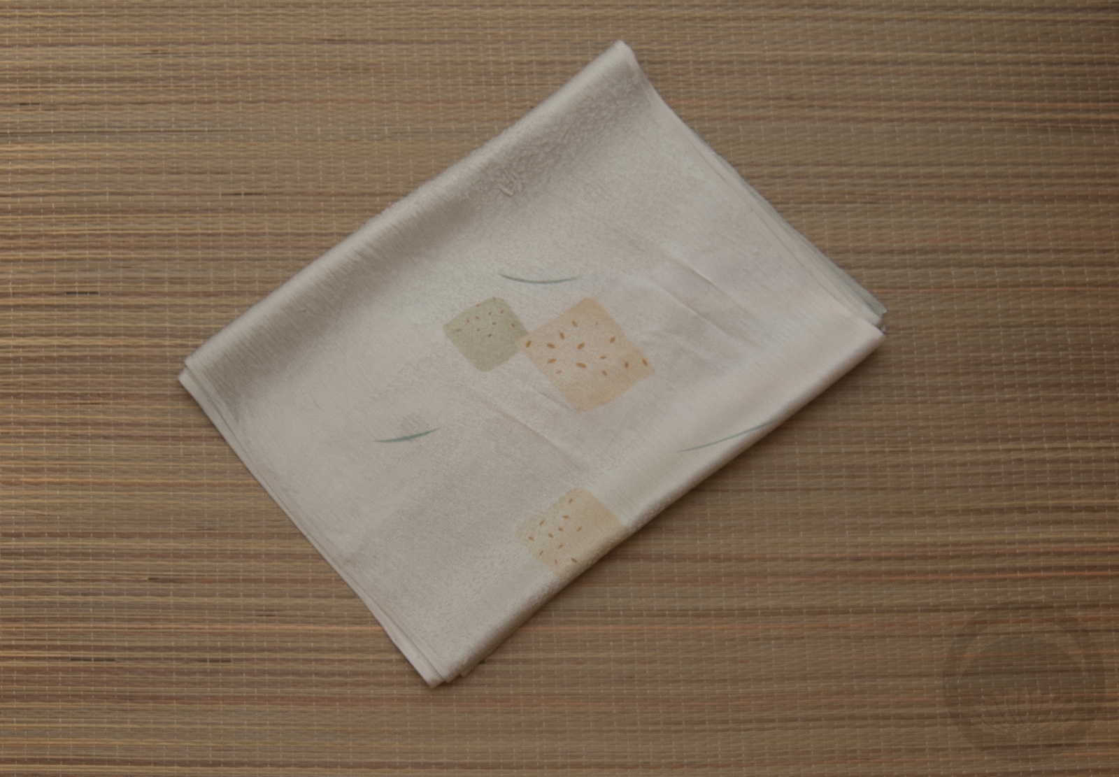
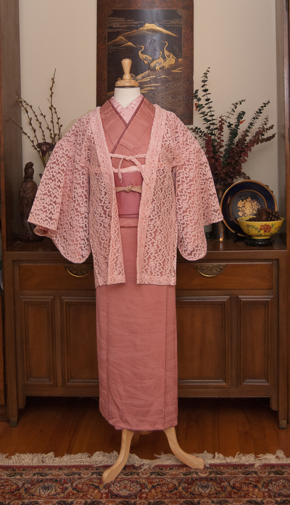
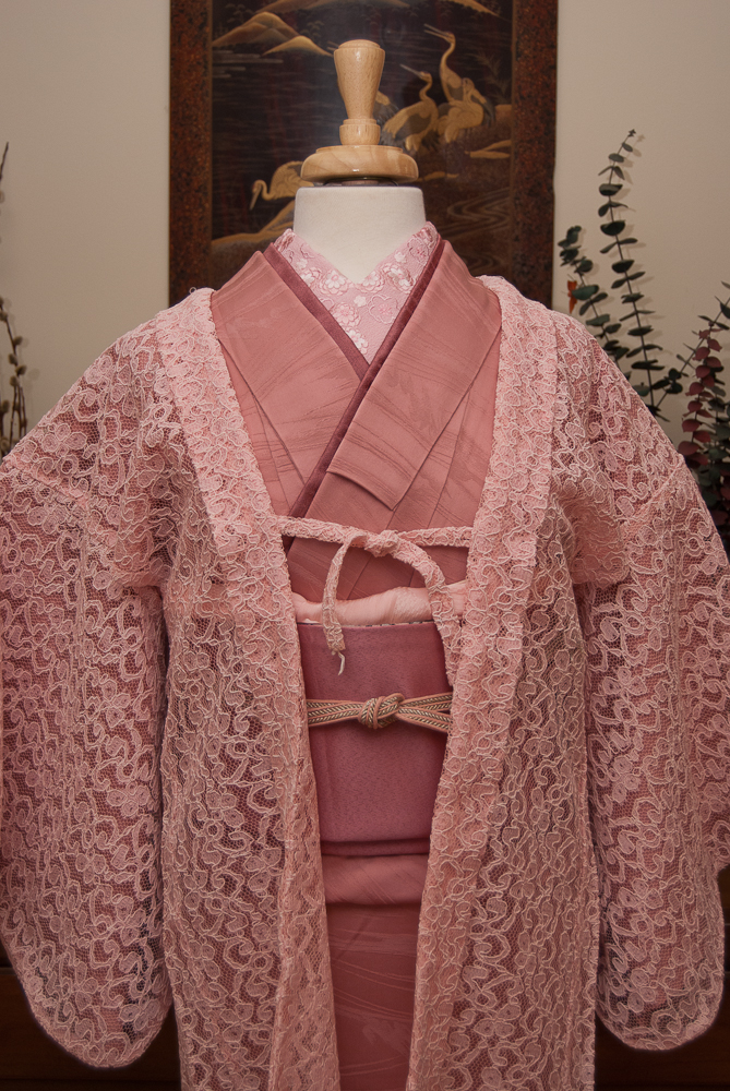
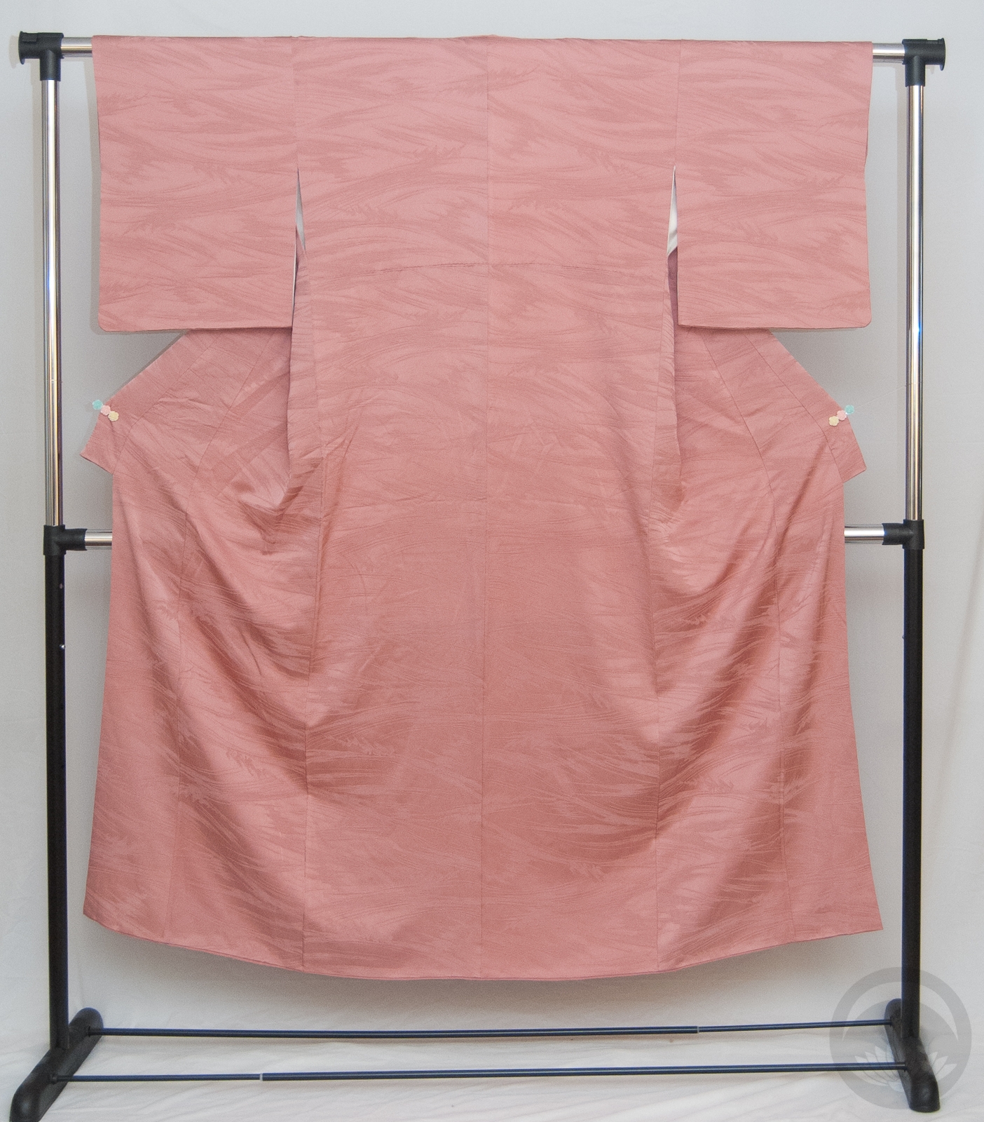
I took advantage of today’s holiday to actually get it up on the mannequin. It always makes me happy when the parts of an outfit look as good in person as they did in my head. I knew I wanted to the obi to be the star of the show so I used my ivory iromuji to make sure it really popped. It coordinates well with the shells on the obi and is the most neutral base I’ve got in my collection. From there it was a pretty effortless thing, pulling accessories out in colours that echoed parts of the obi.
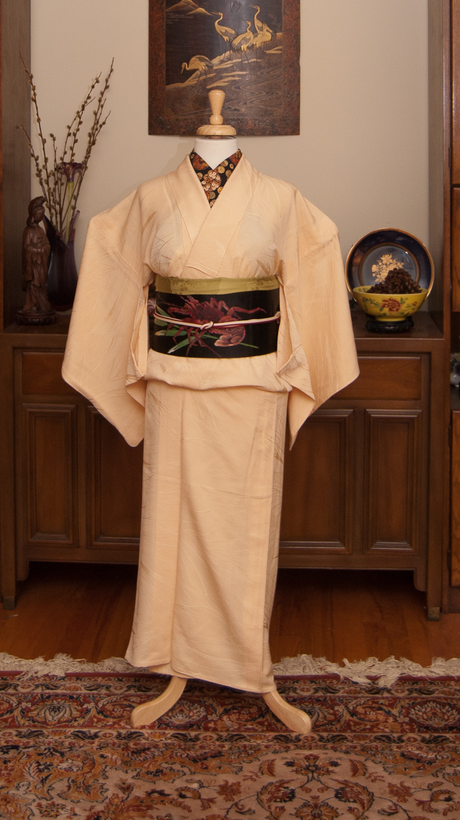
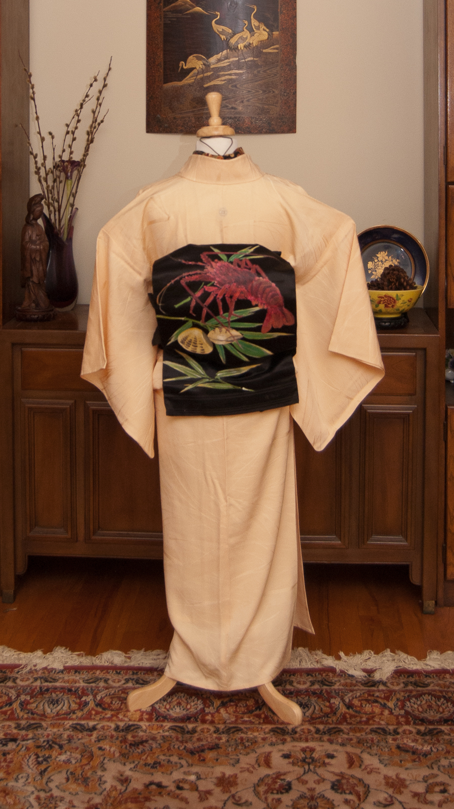
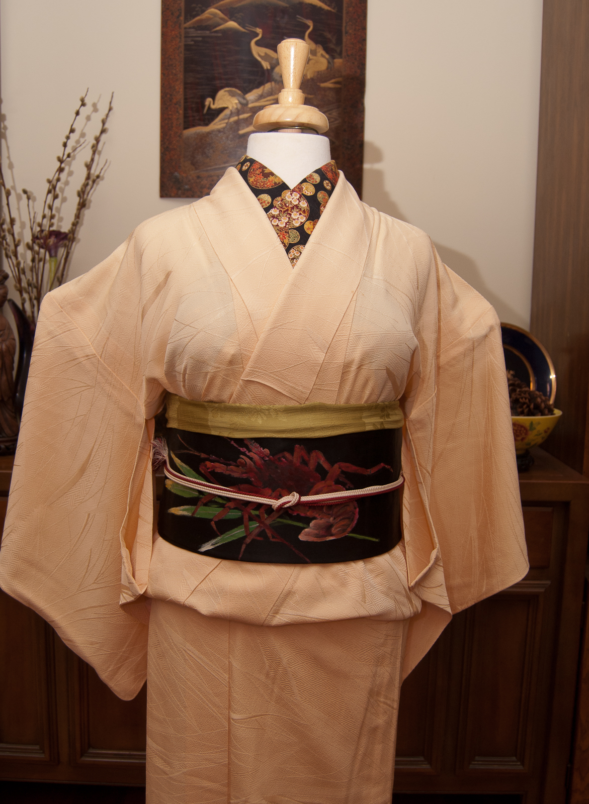
Overall, the end result is a very simple and straightforward outfit, but I think that works really well. The obi is so fun and just quirky enough that balancing it with otherwise very simple pieces feels right. I’ve had fun doing more non-traditional outfits with it before, and it felt good to go in the other direction. In spirit, this outfit actually feels very similar to how I coordinated the stencilled obi I made recently, but I don’t think that’s a bad thing. Iromuji are always a great way to make the obi the star of the show.
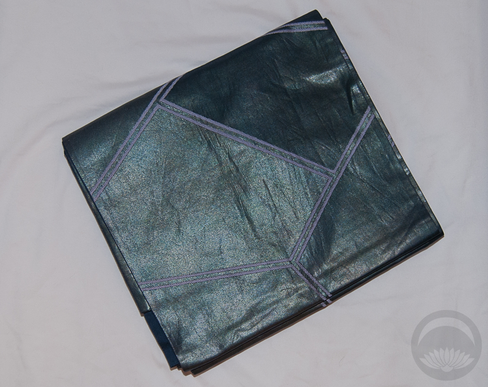
Items used in this coordination
-
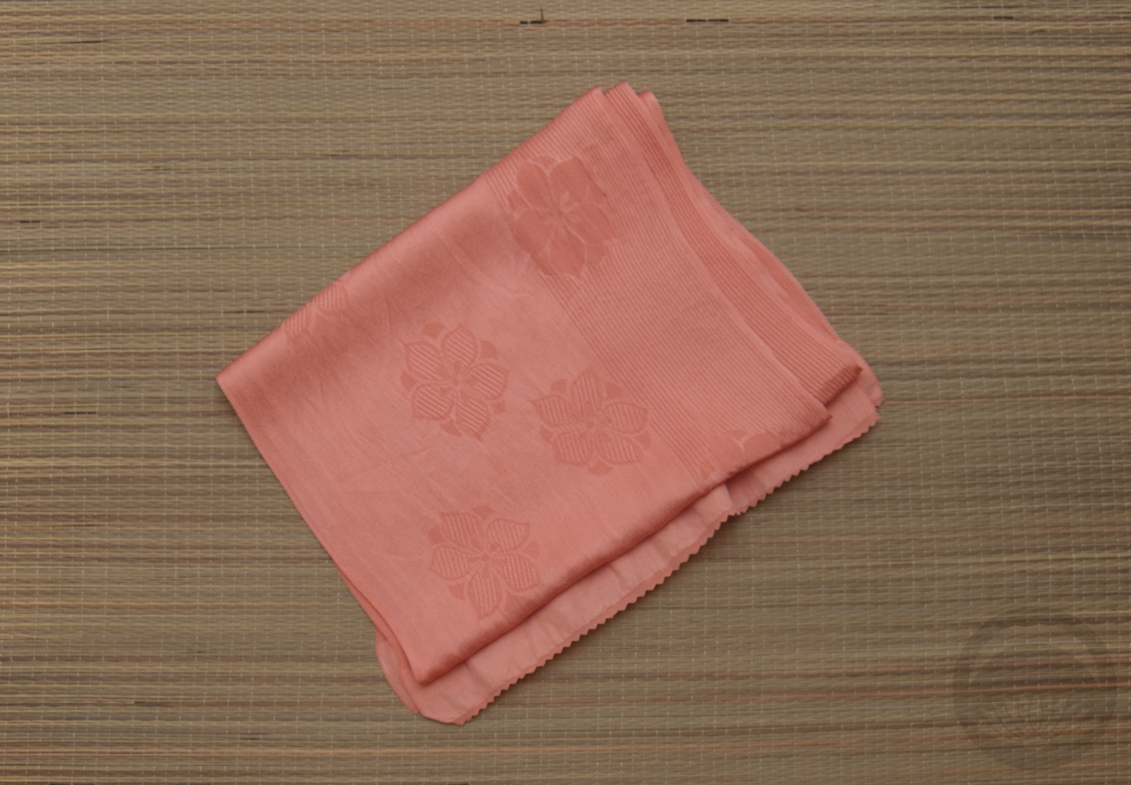
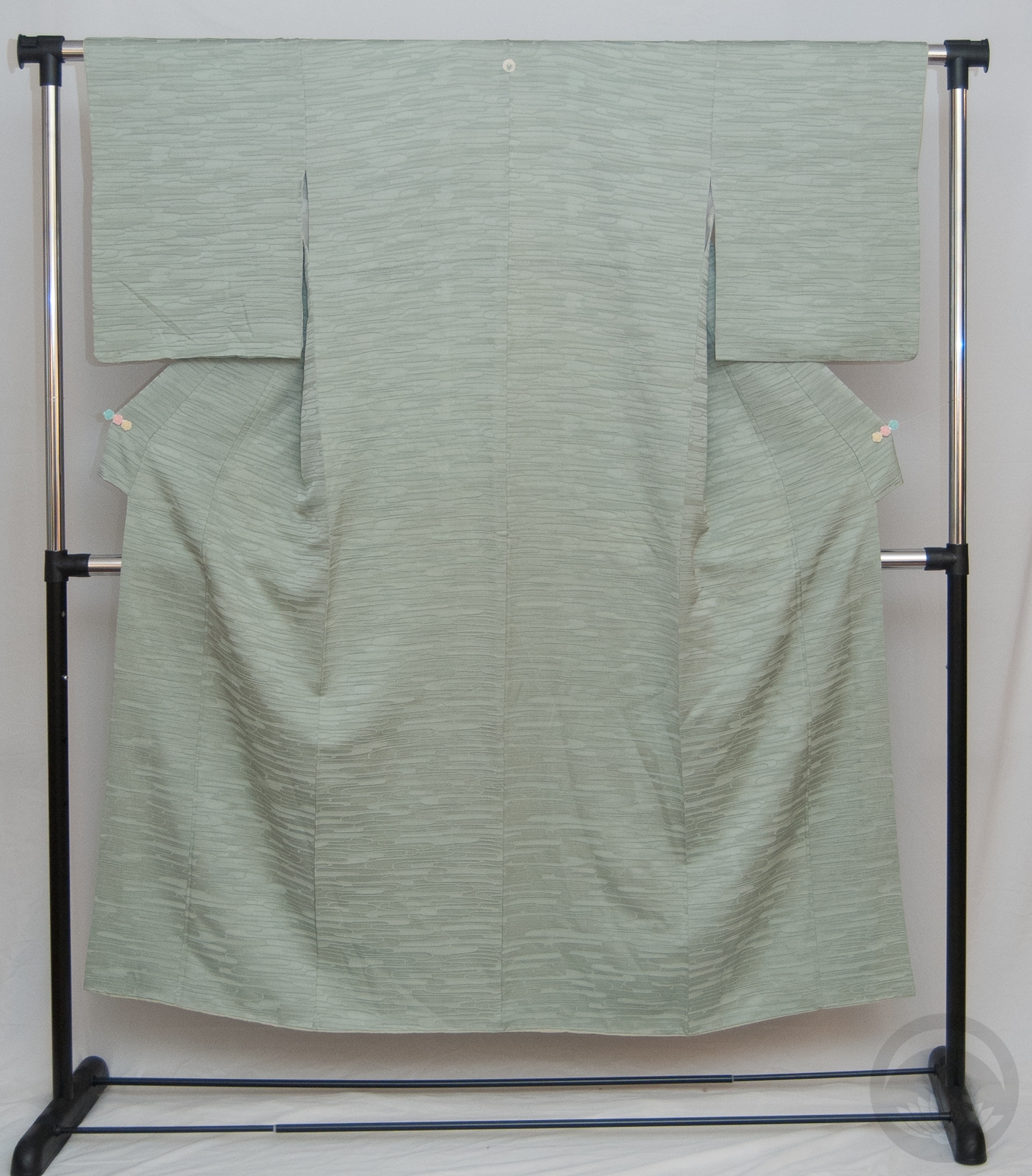
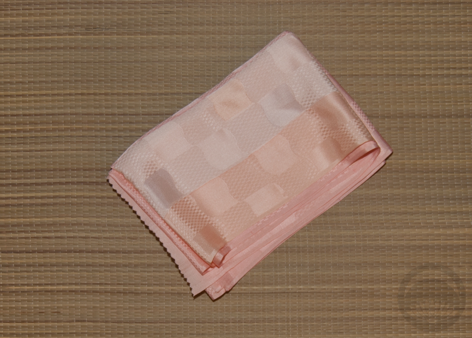
- Ivory
-
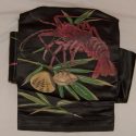
- Black Pente Lobster
-
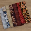
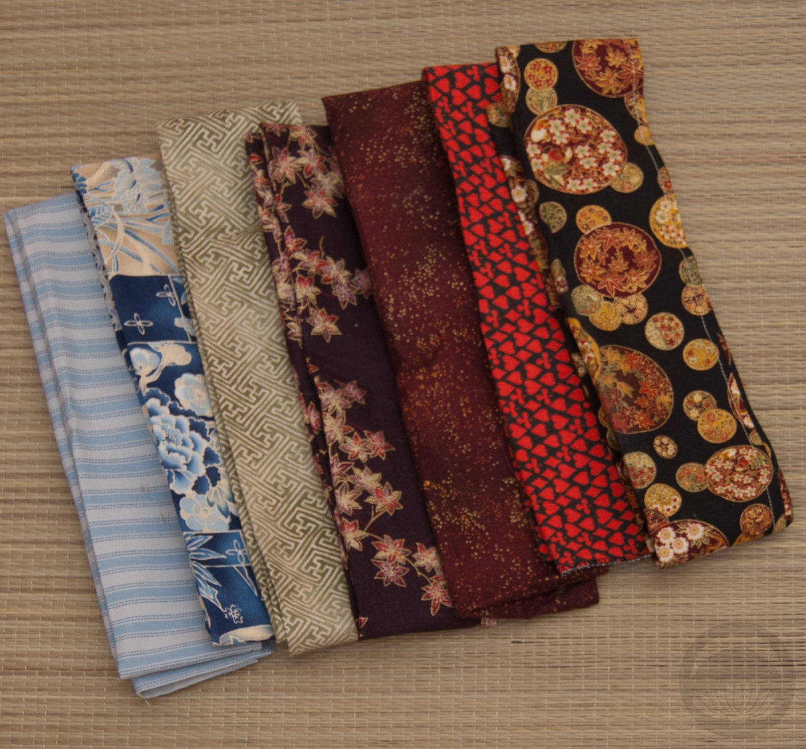
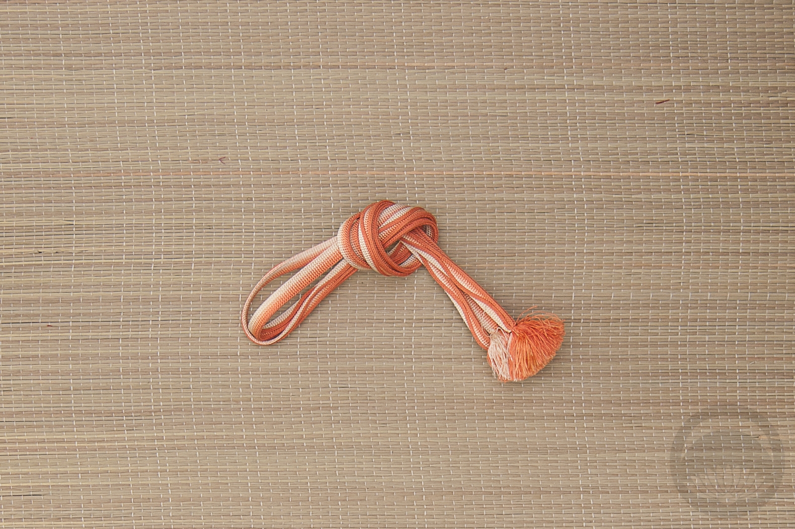
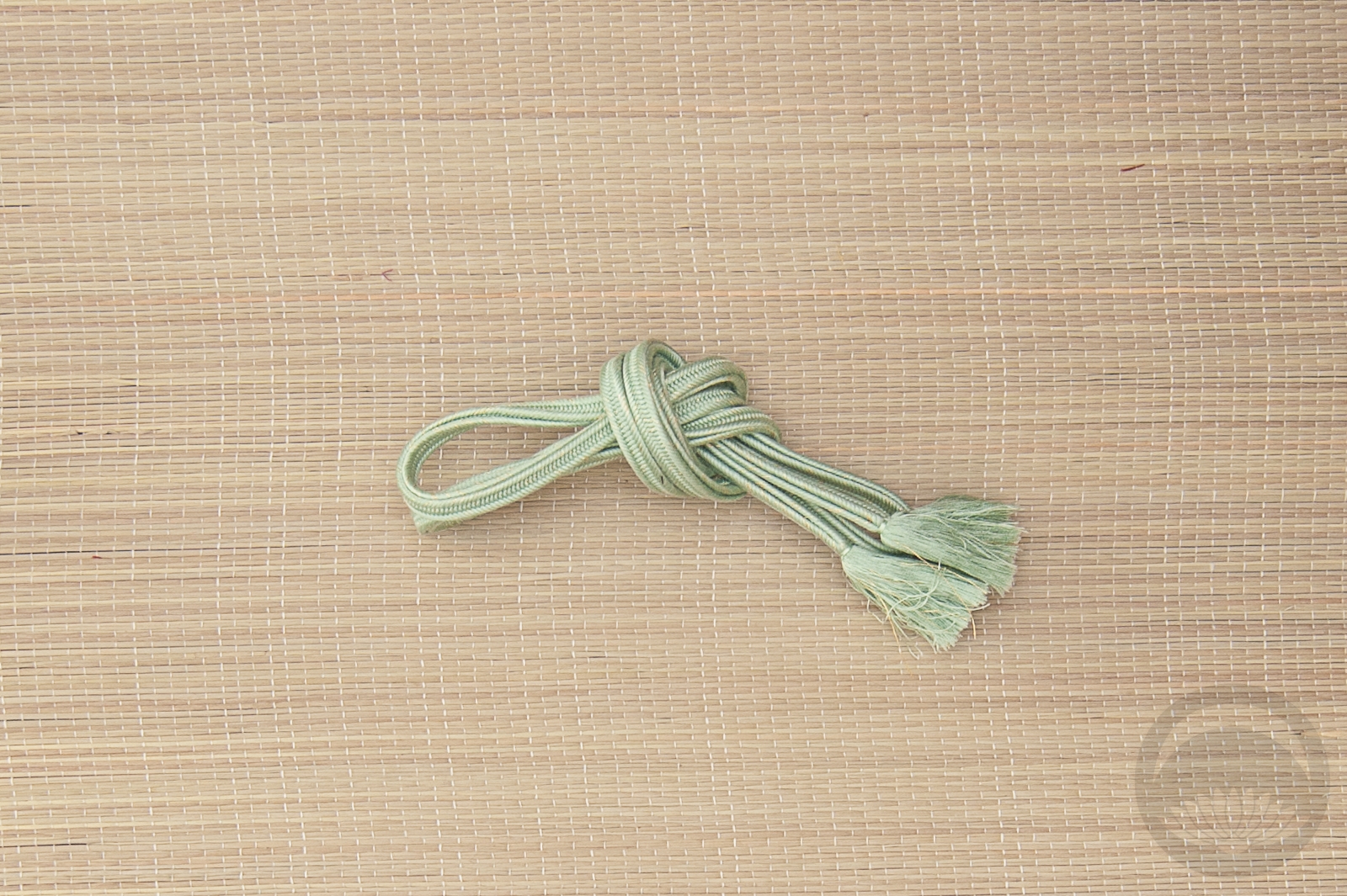
- Mixed Cotton
-
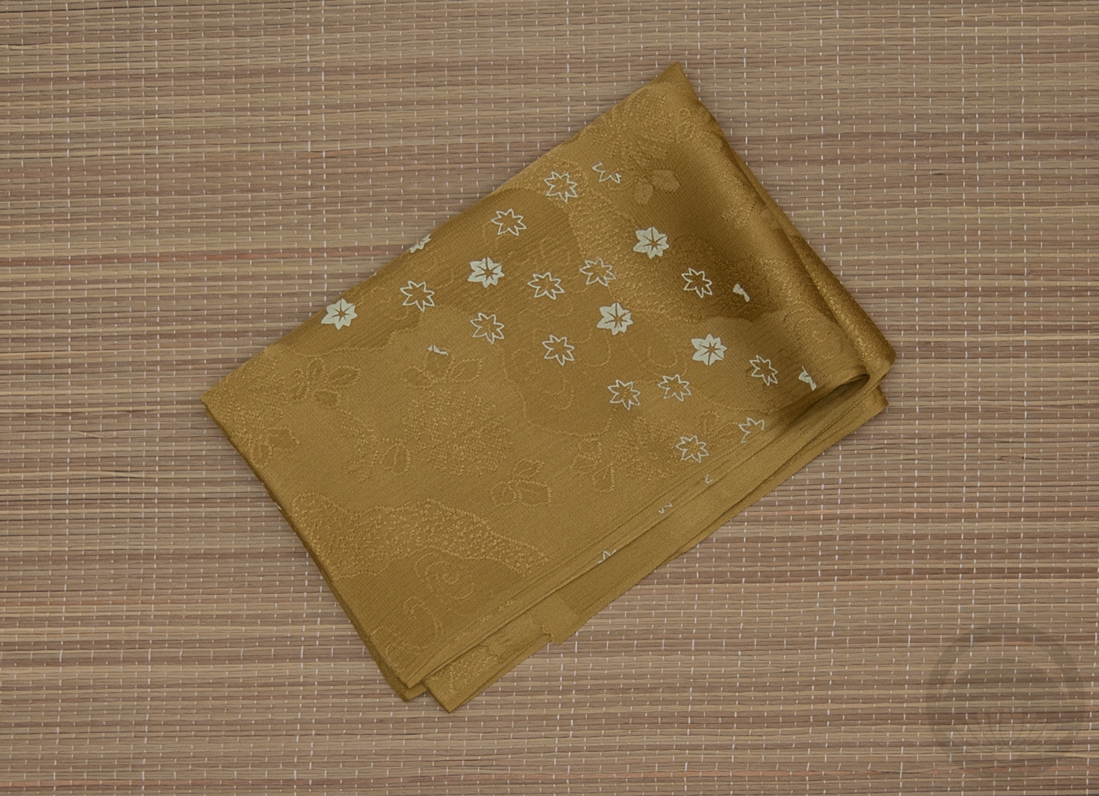
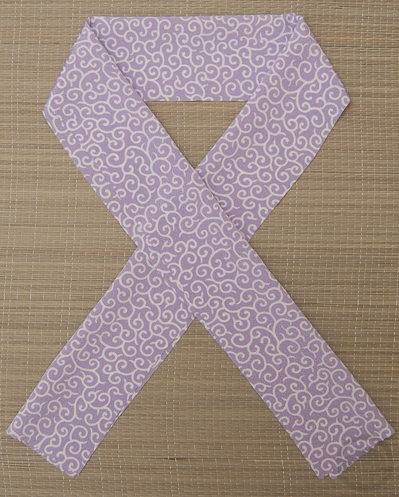
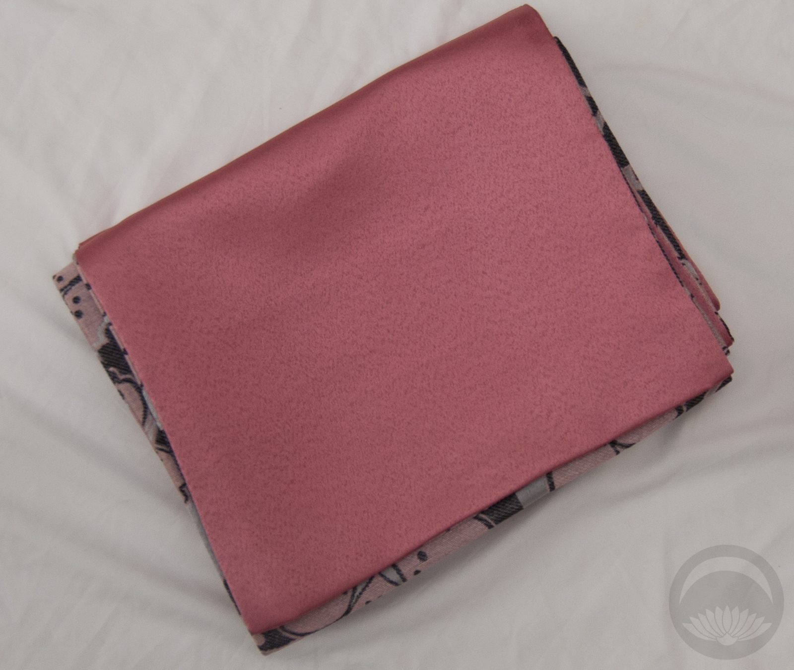
- Olive Rinzu
-
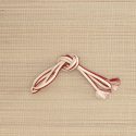
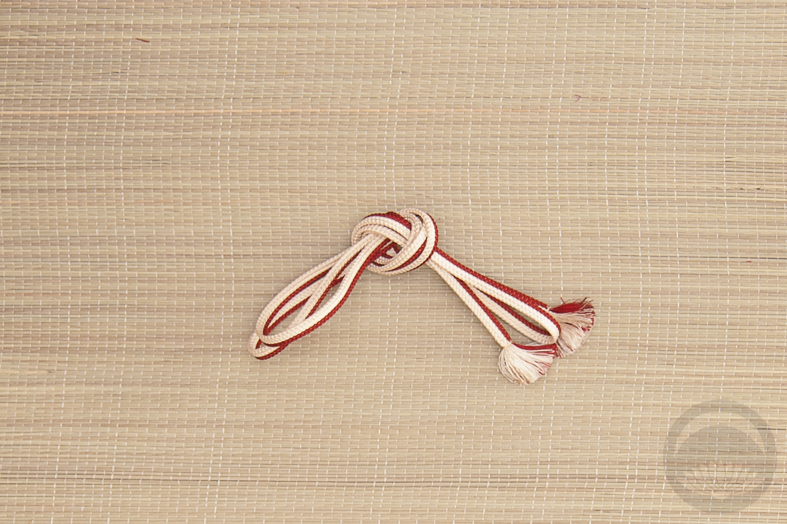
- Red & White


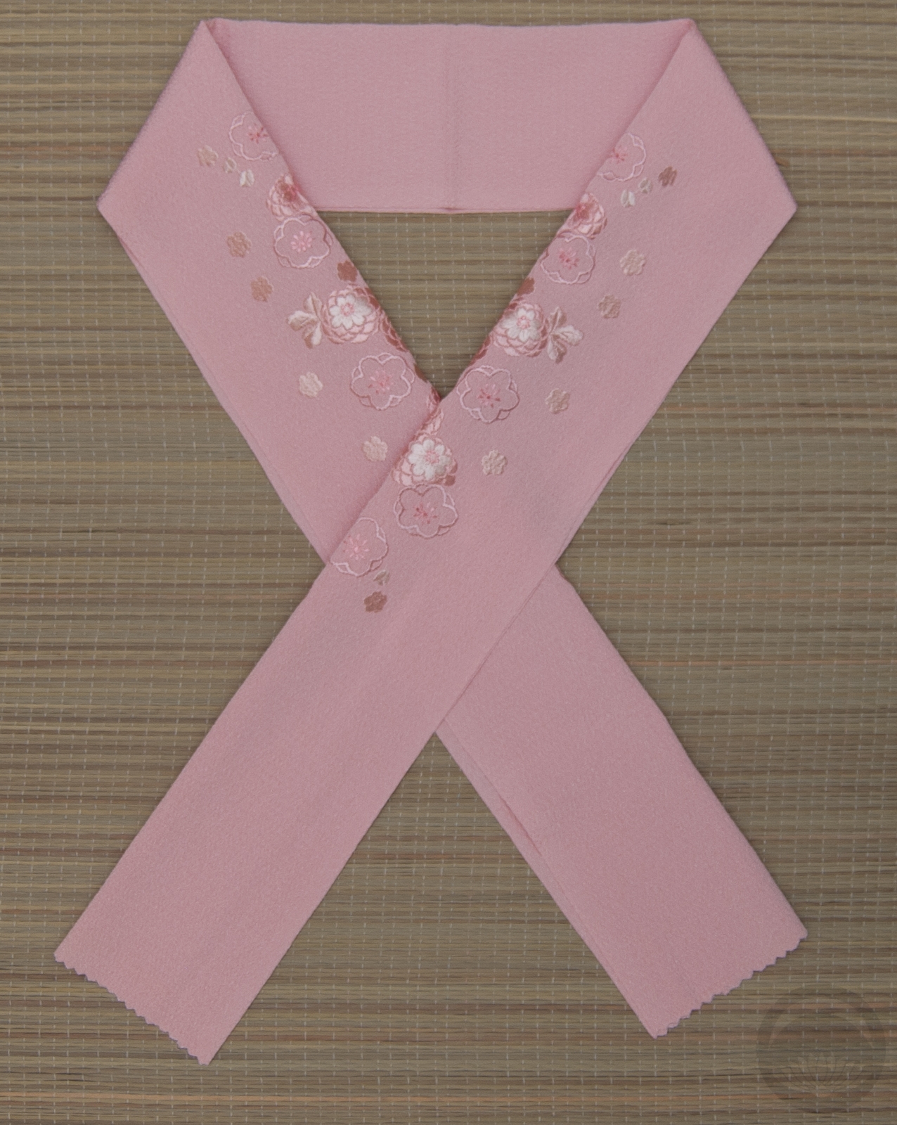


 Bebe Taian
 CHOKO Blog
 Silk & Bones
 Gion Kobu