
Merry Christmas to any and all celebrating today! You might remember me mentioning recently that I had a silly ambitious project in the works, Well, here it is!
Today is the first day of Christmastide, or what is often referred to as the Twelve Days of Christmas. A lot of folks seem to think it’s the twelve days leading up to Christmas, but that’s because over time it’s become sort of merged with Advent. In reality, Christmastide runs from December twenty-fifth to Epiphany on January sixth. My plan is to do one themed outfit per day, mostly revolving around the traditional colours of red, green, and gold, but with some variations. Kits-mas is a combination of the words kitsuke and Christmas, because I’m a sucker for a terrible portmanteau.
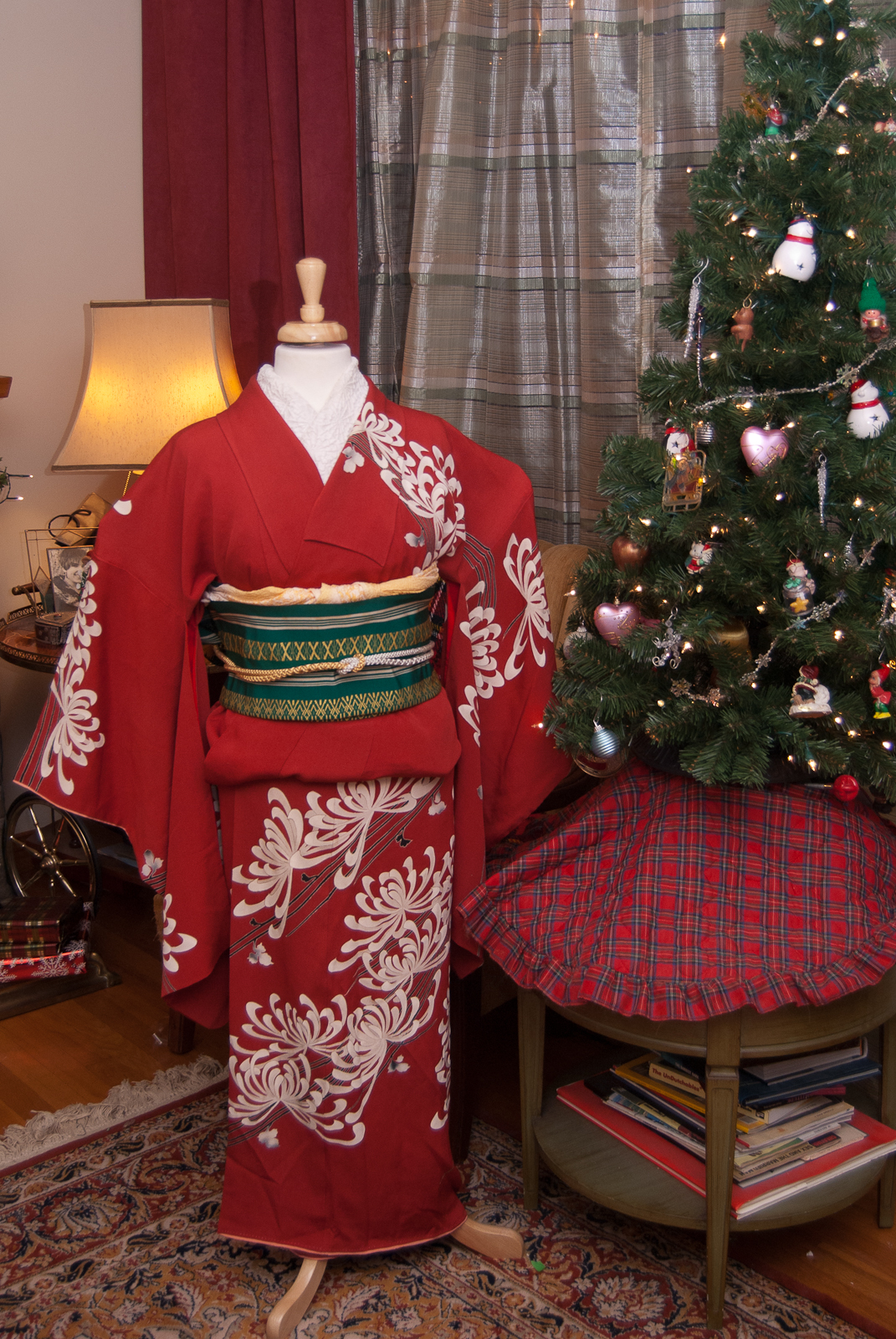
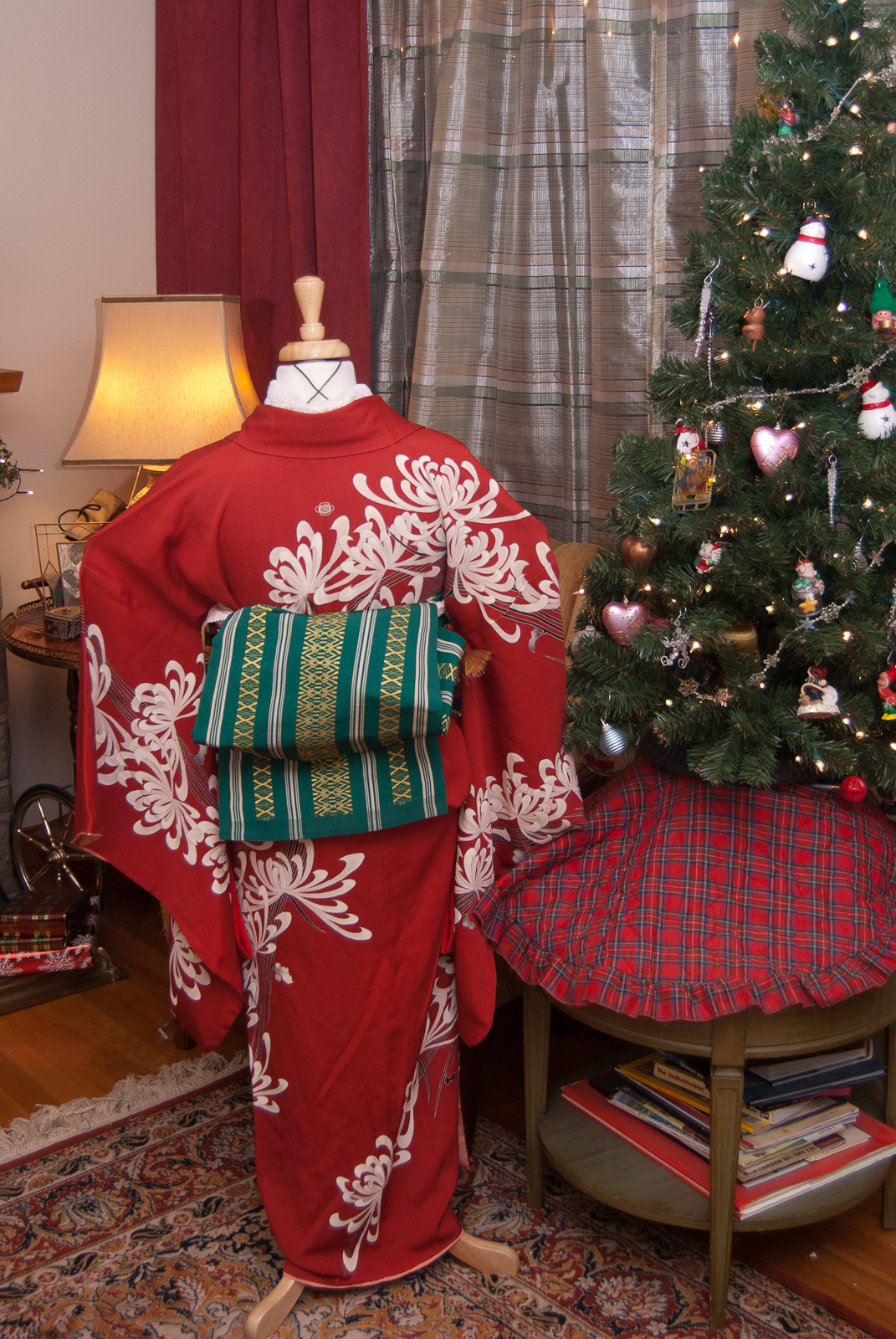

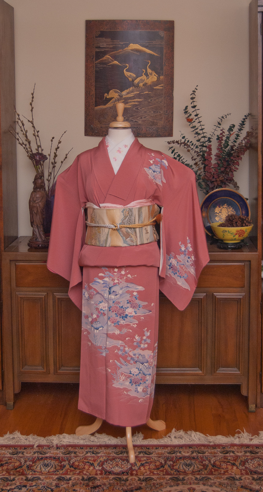
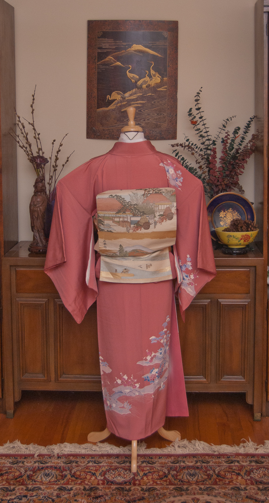
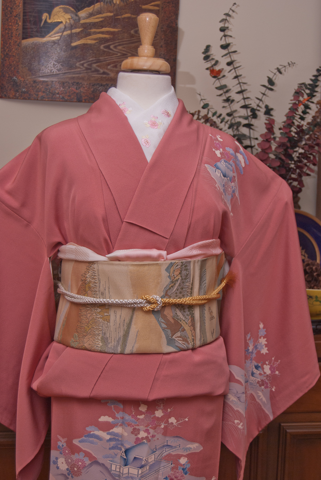
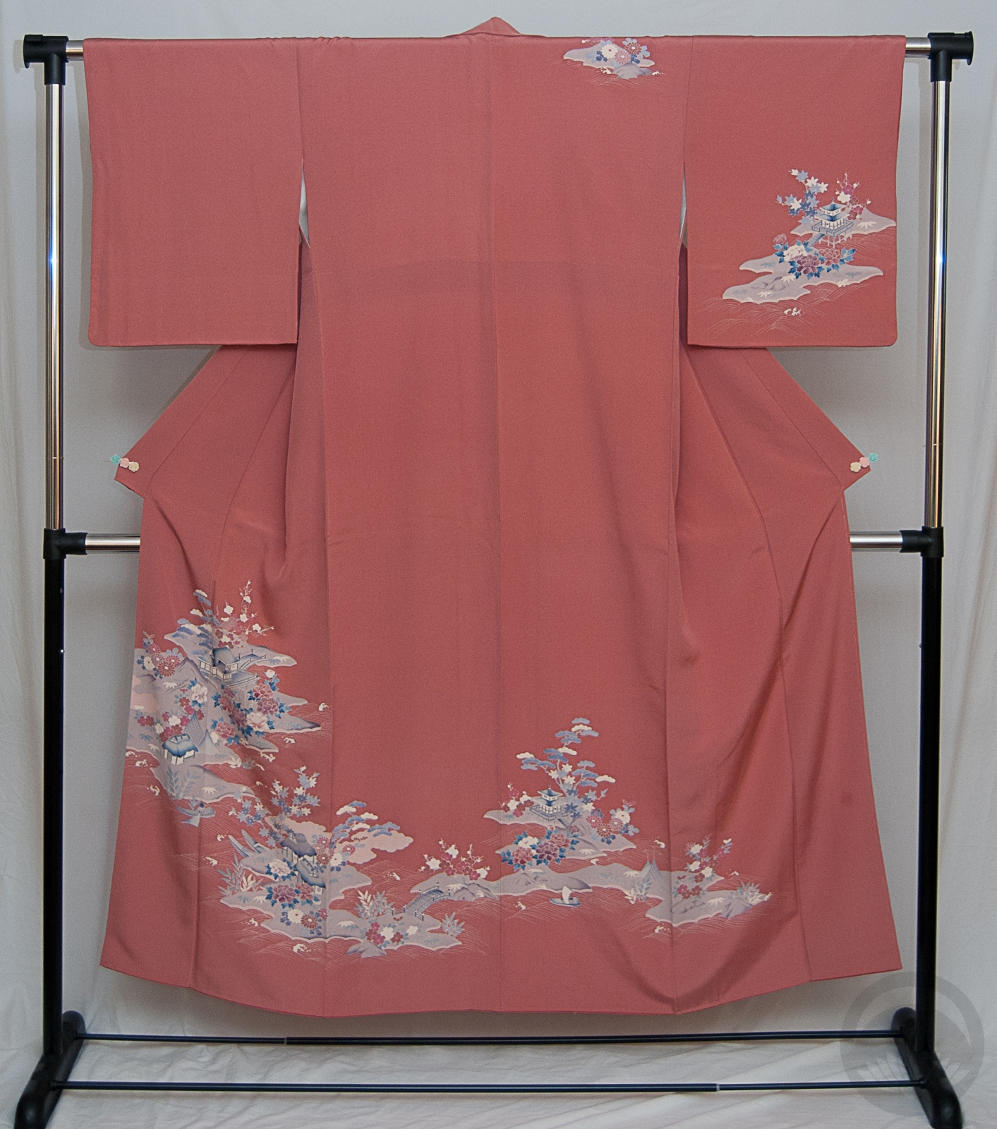
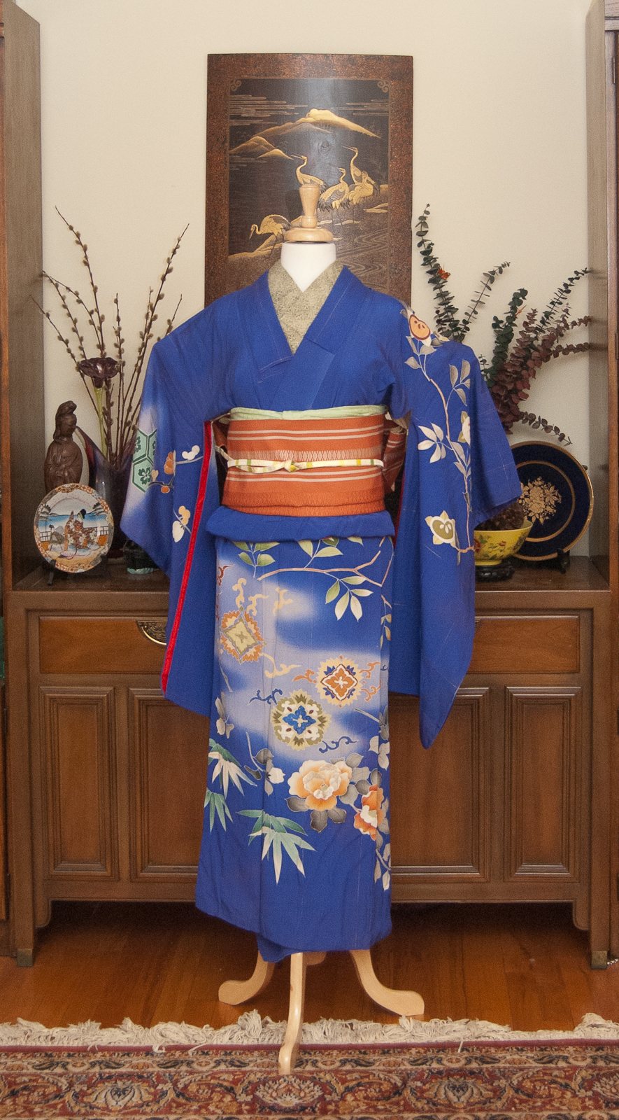
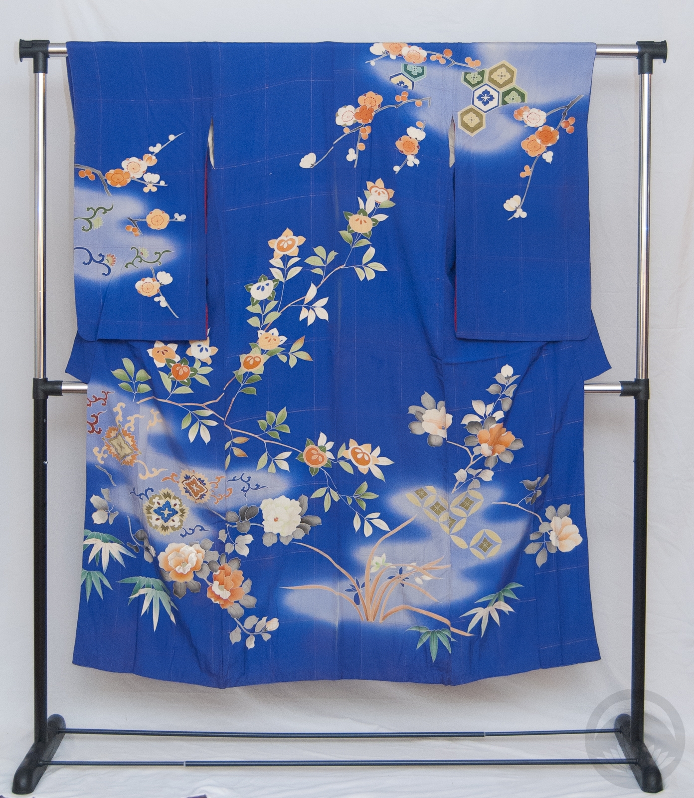
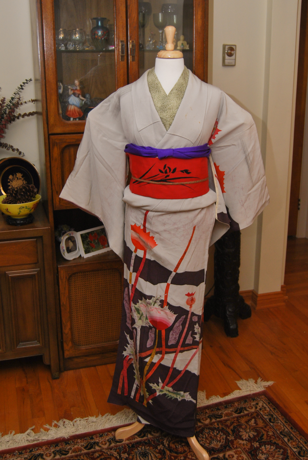
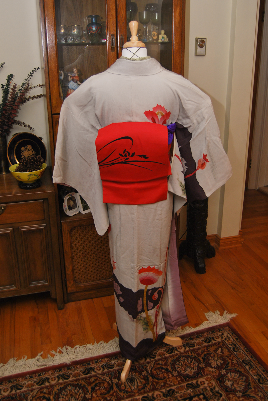
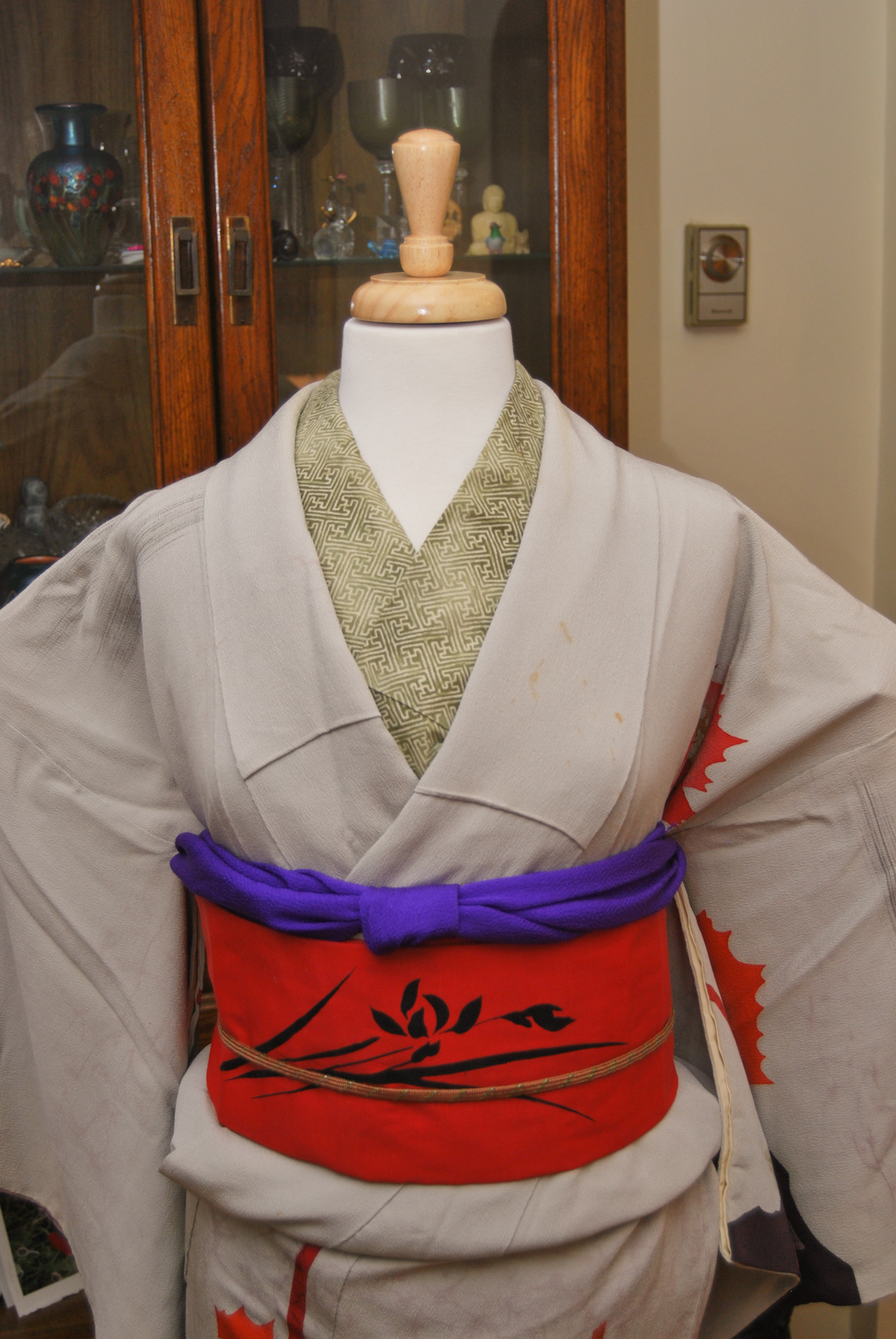
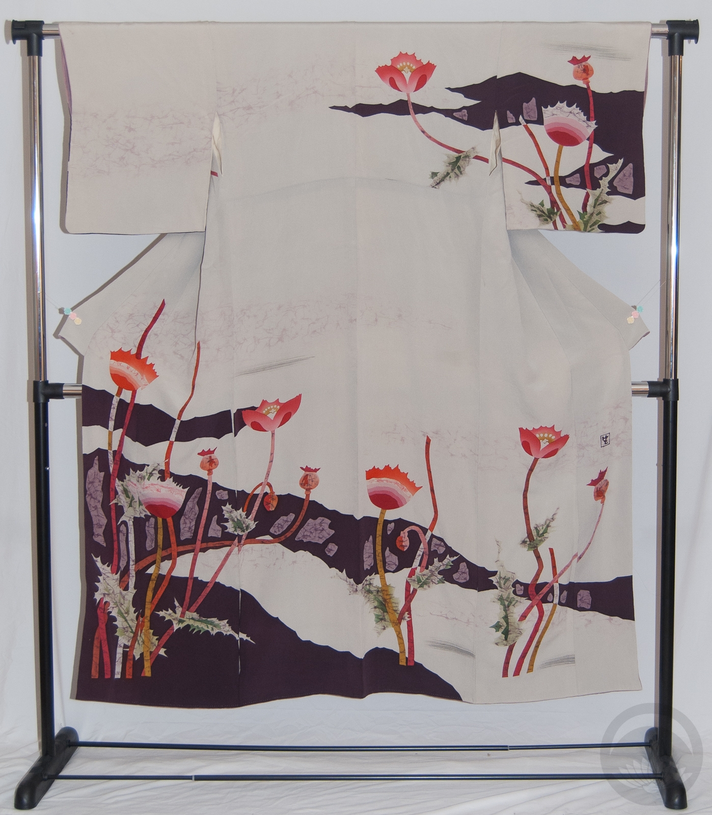
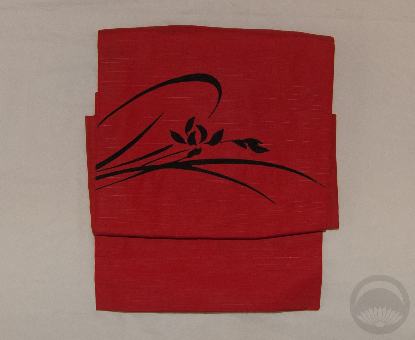
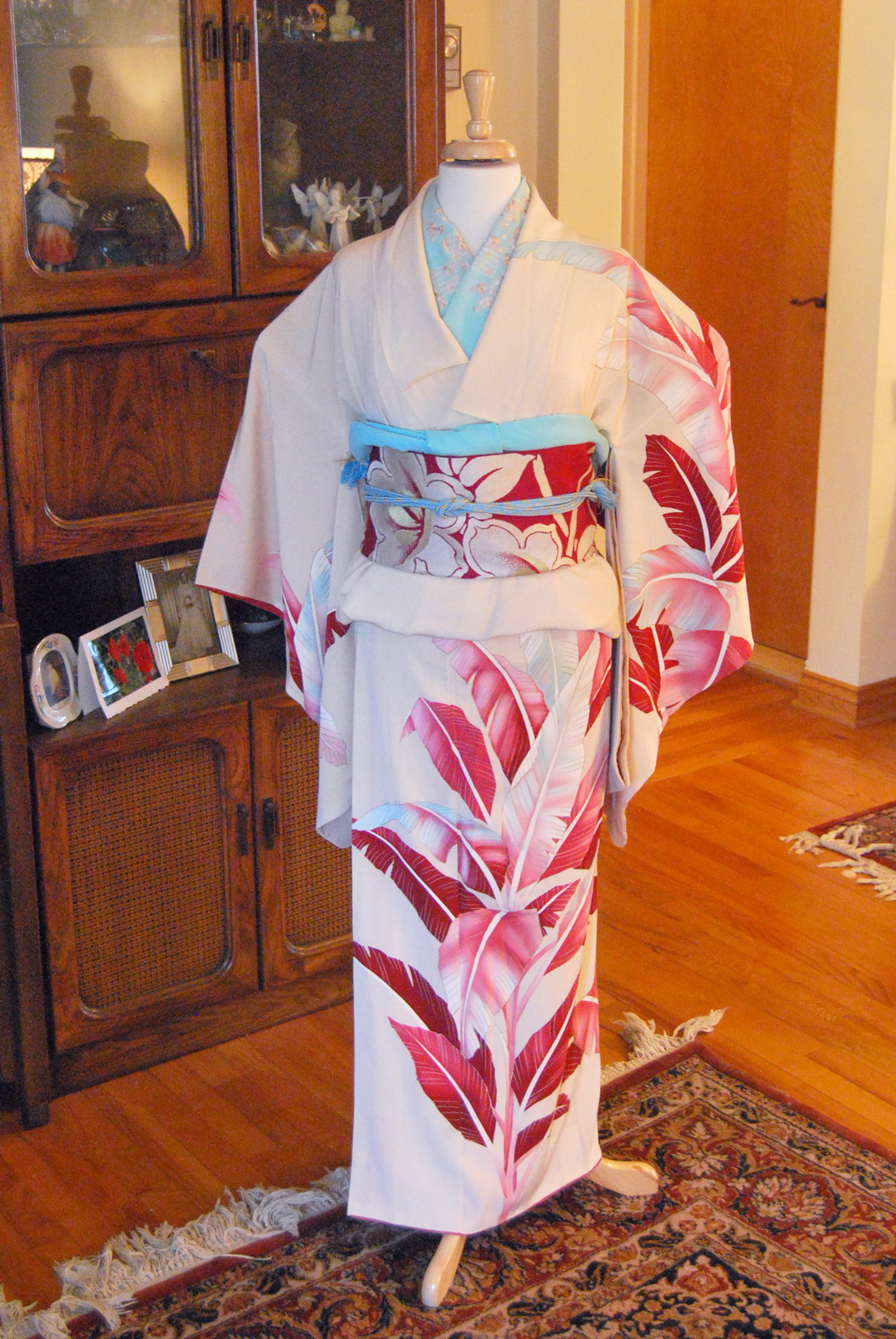
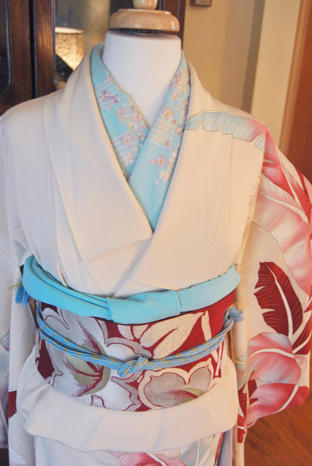
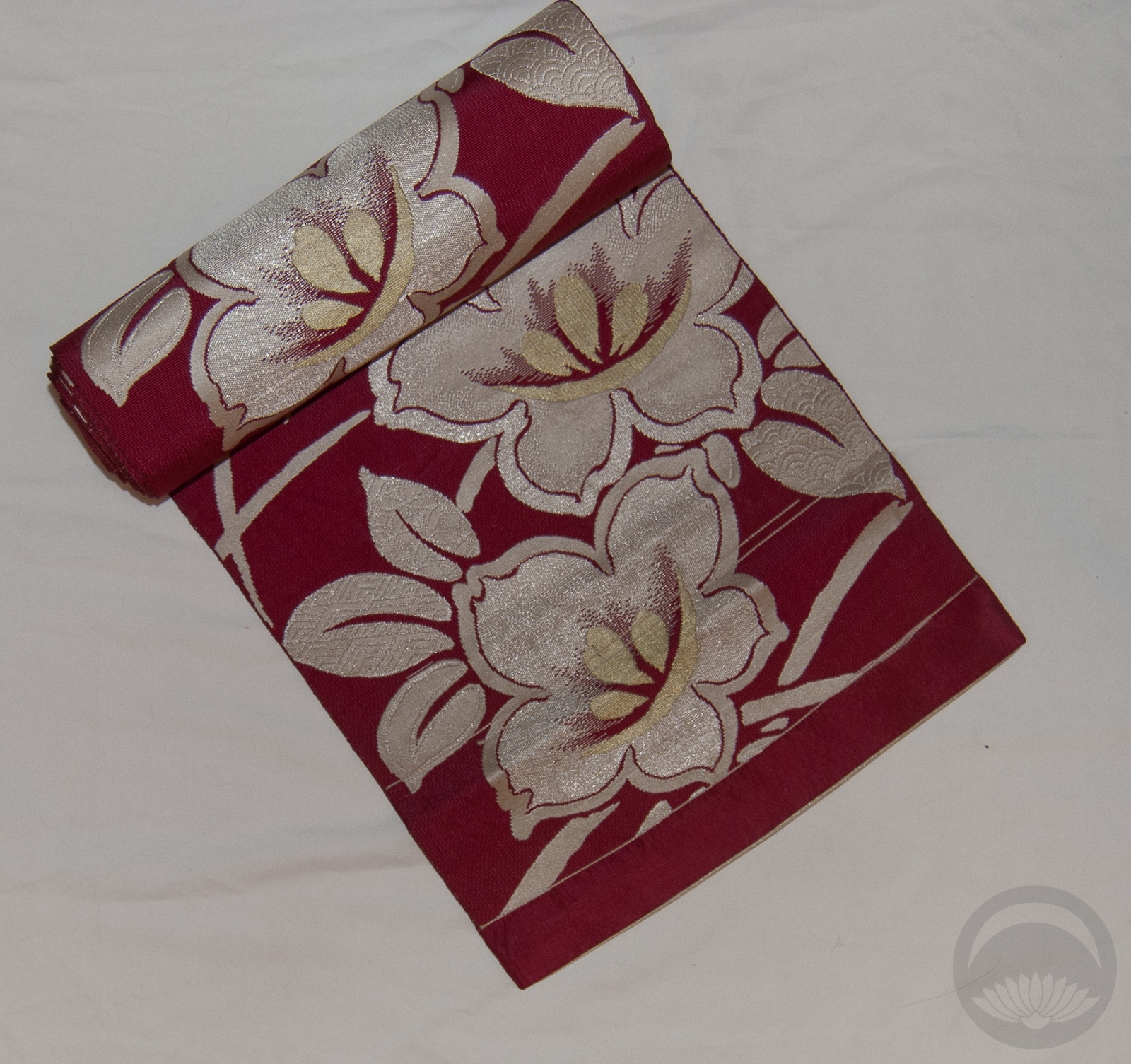
For the first day I went very simple and traditional; my favourite vintage houmongi in a rich red, paired with a green and gold hakata obi and metallic accessories. I wanted something classic that just screamed “Christmas” for today, and I definitely accomplished that! I also decided to change the mannequin’s usual position to show off our tree and decorations. It seemed fitting.
Be sure to check back every day for a new coordination until January 6th. 🙂
Items used in this coordination
-
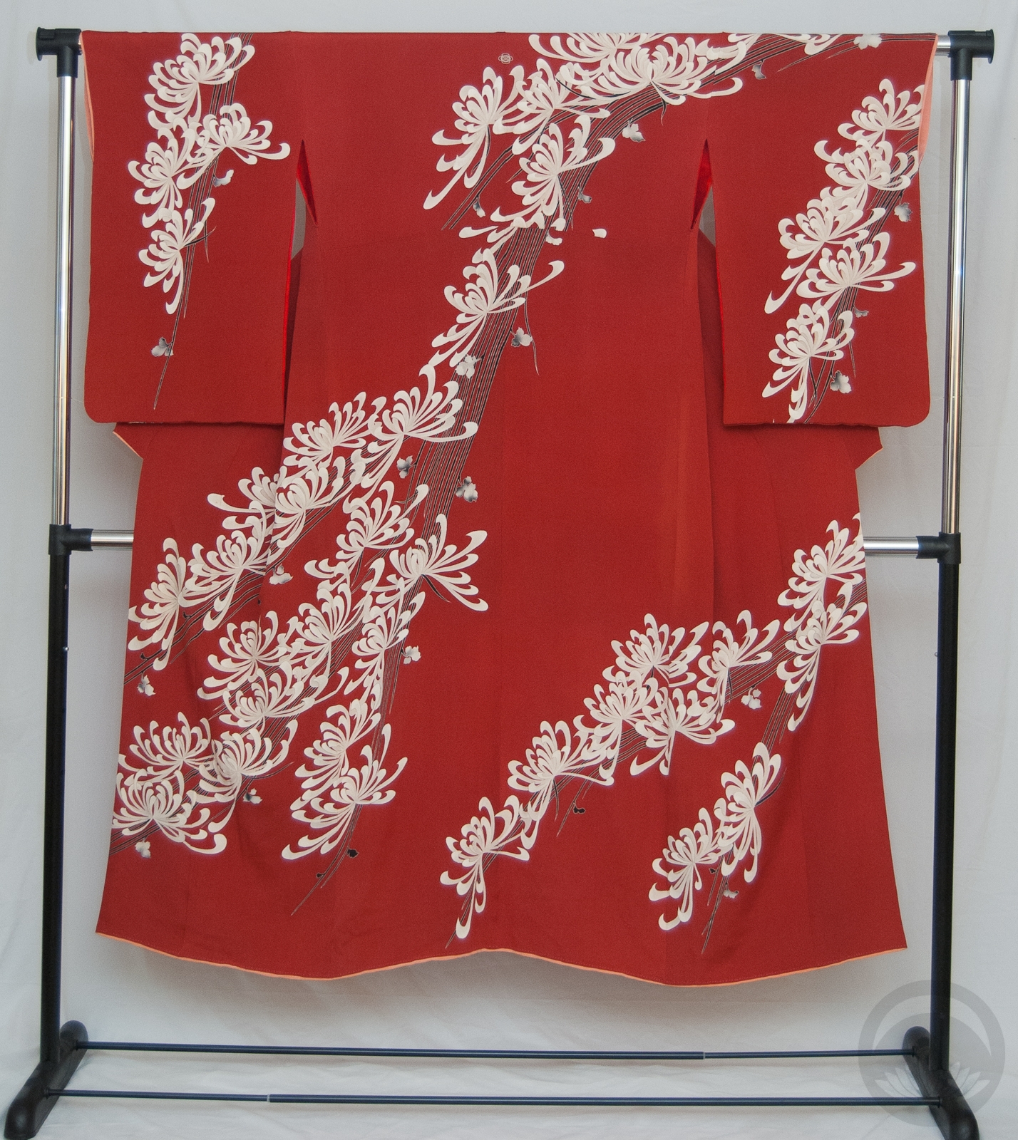
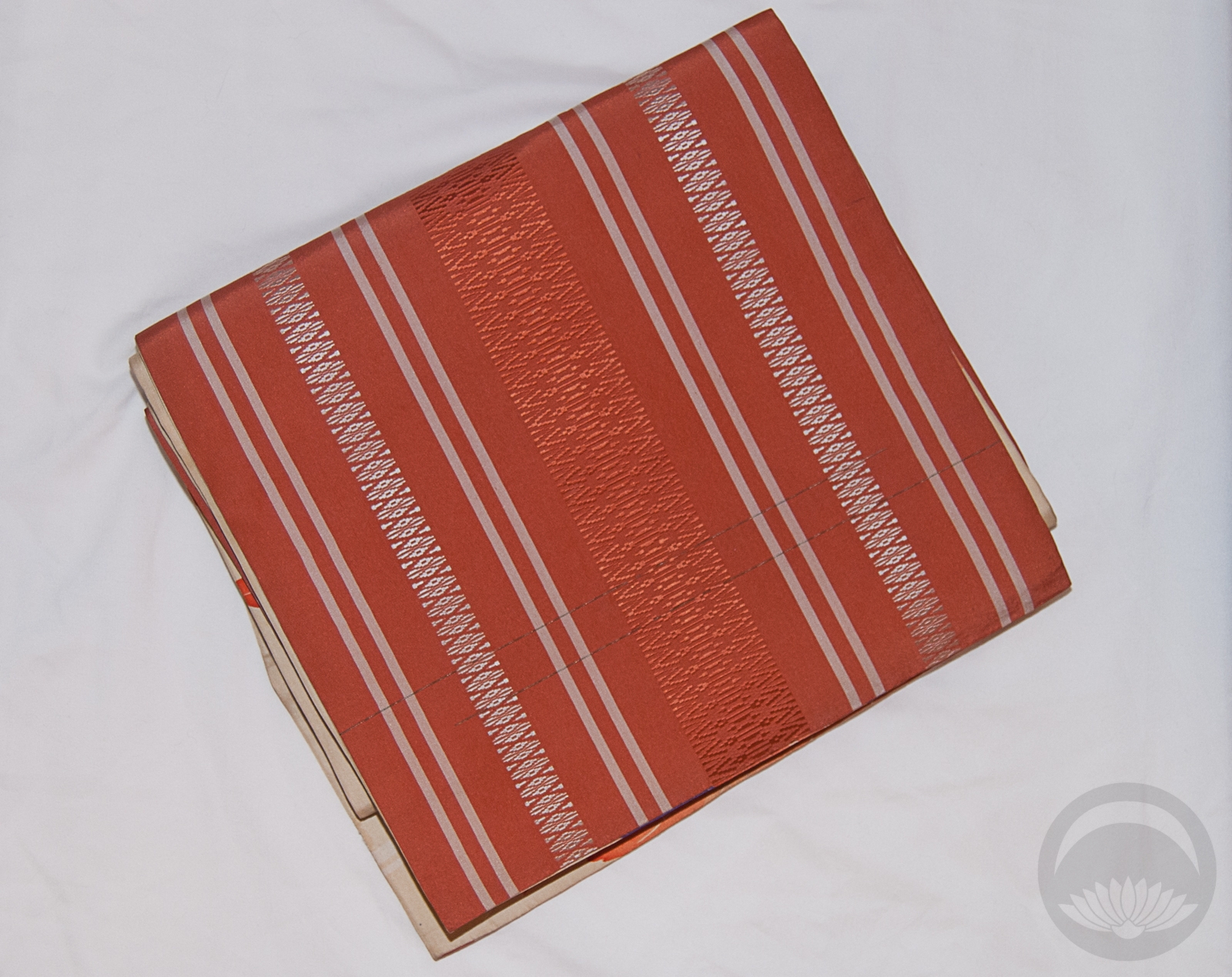
- Vibrant Red with Kiku
-
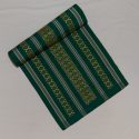
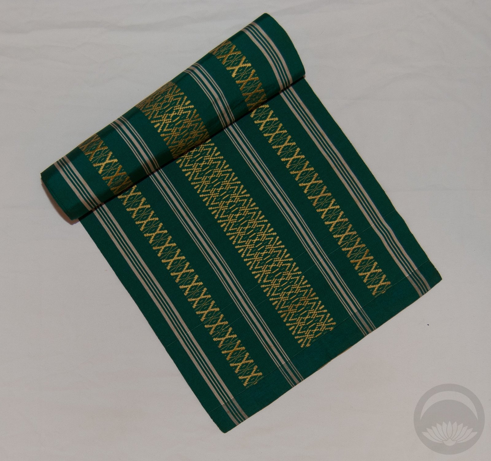
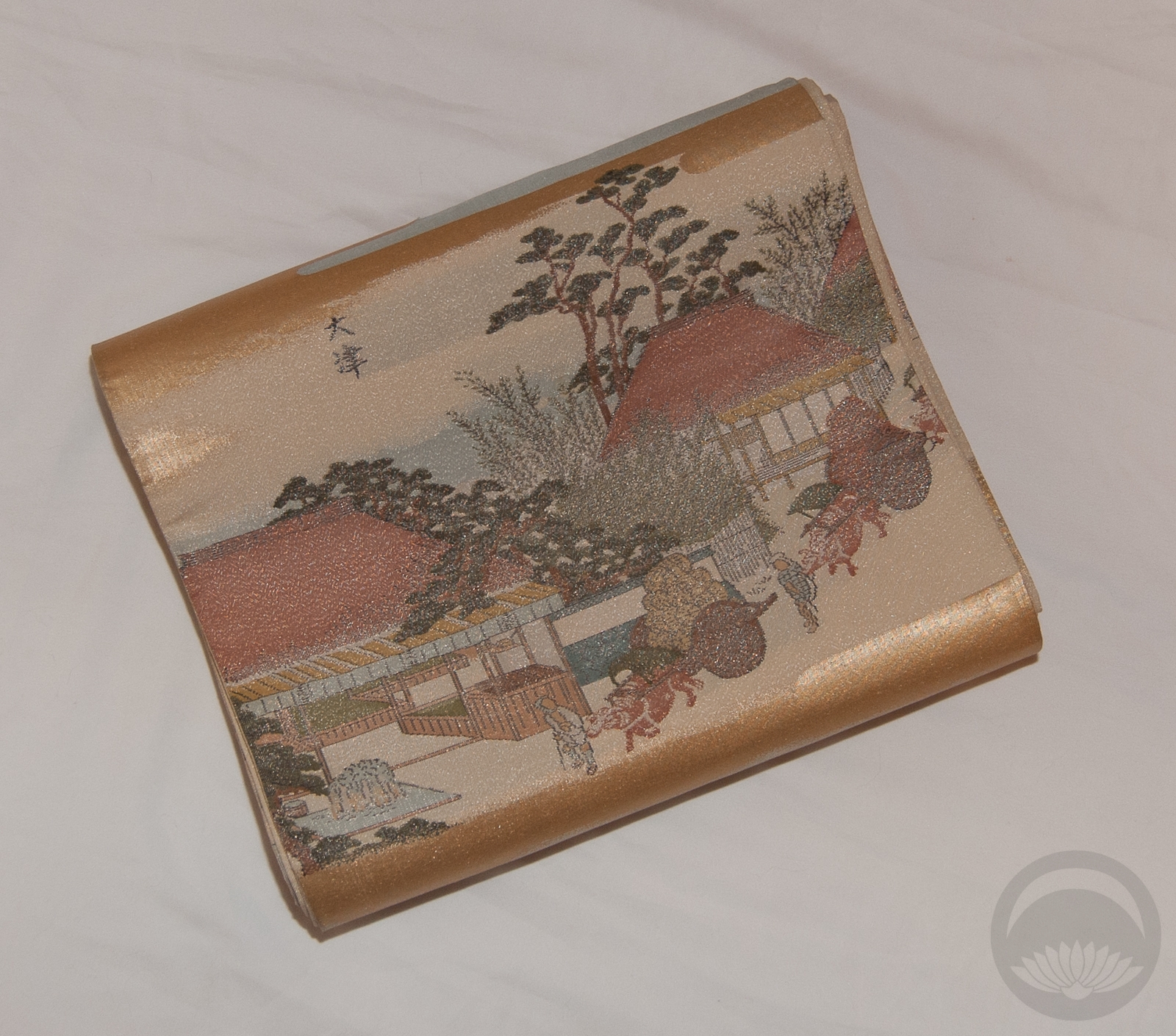
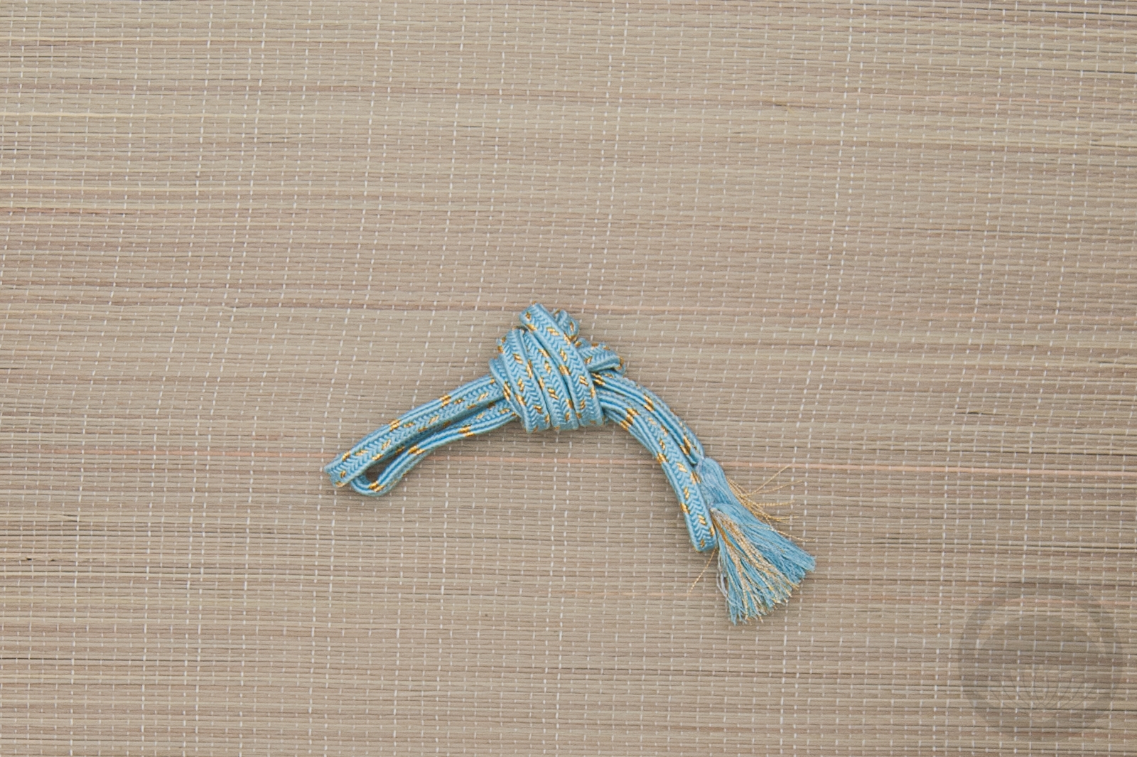
- Emerald with Gold
-
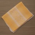
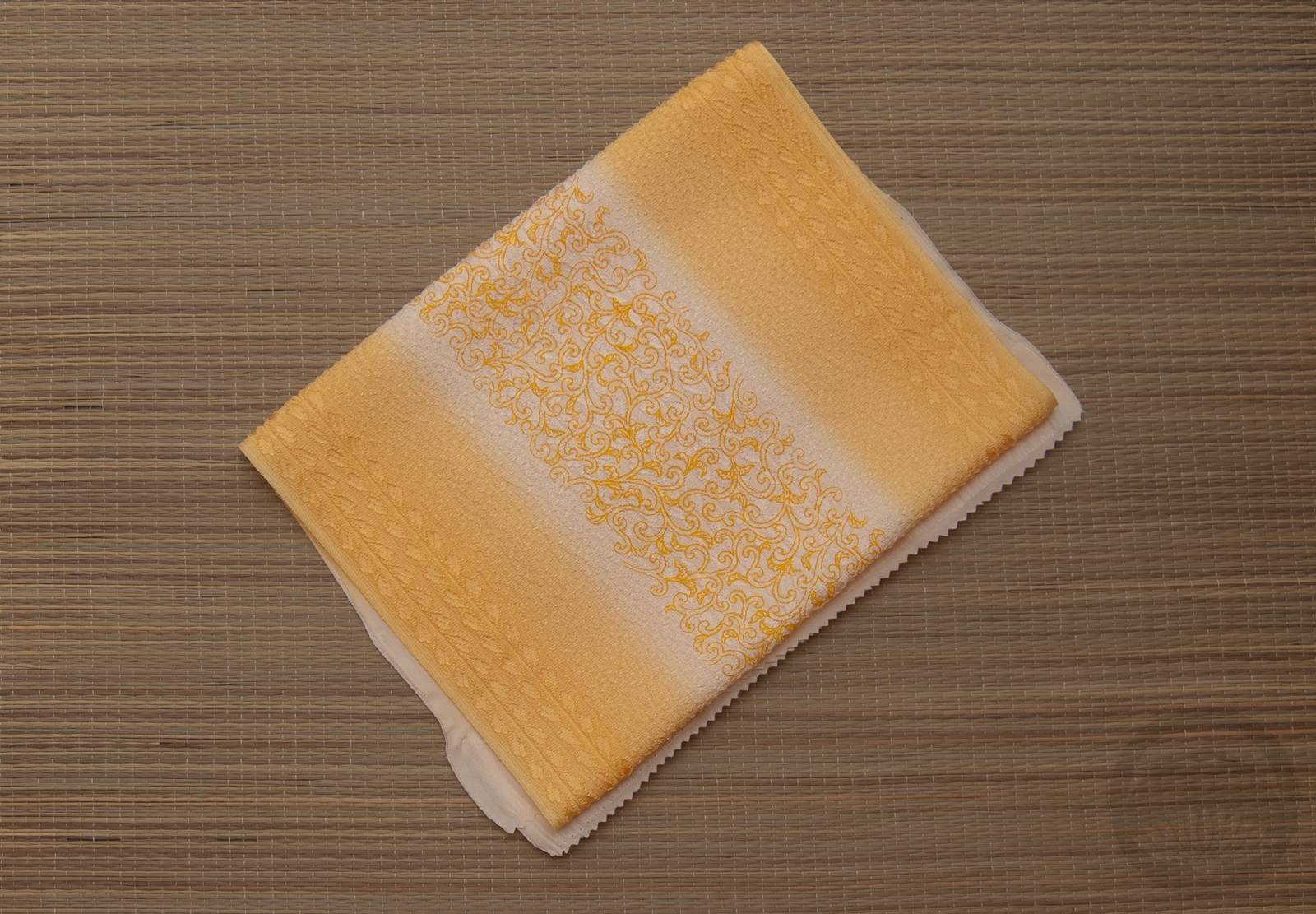
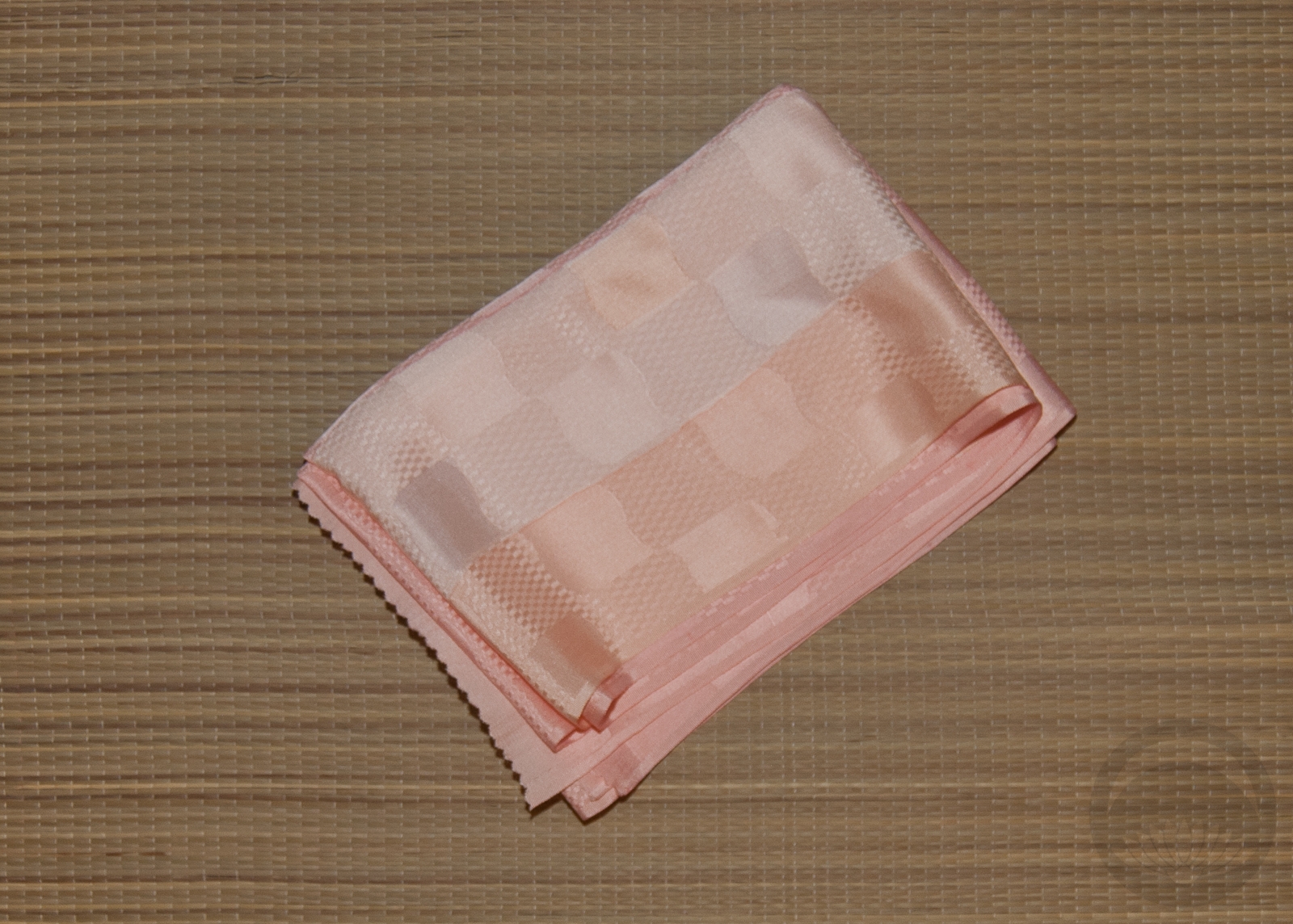
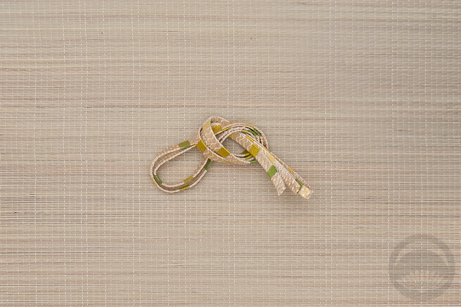
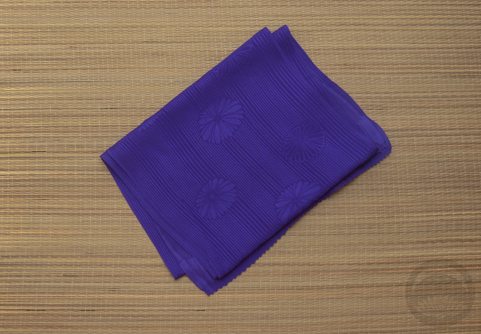
- Textured Kiku
-
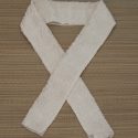
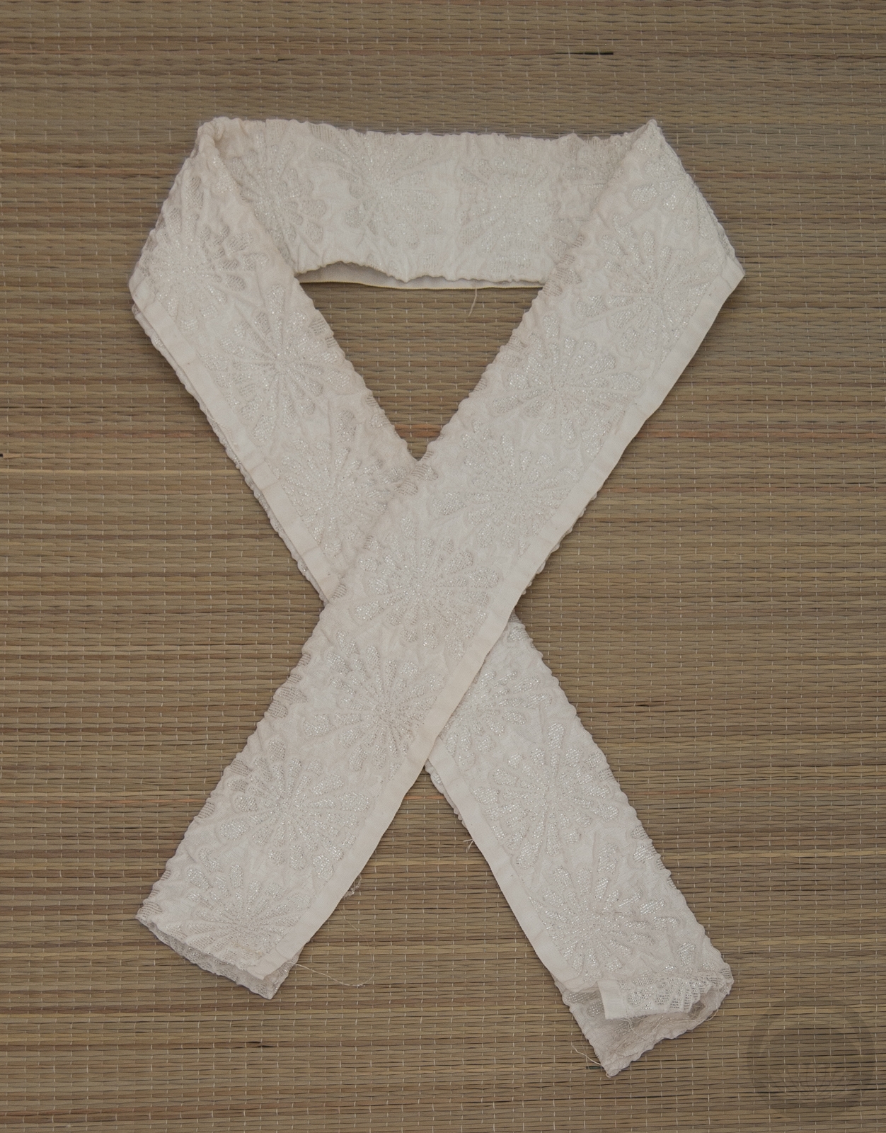
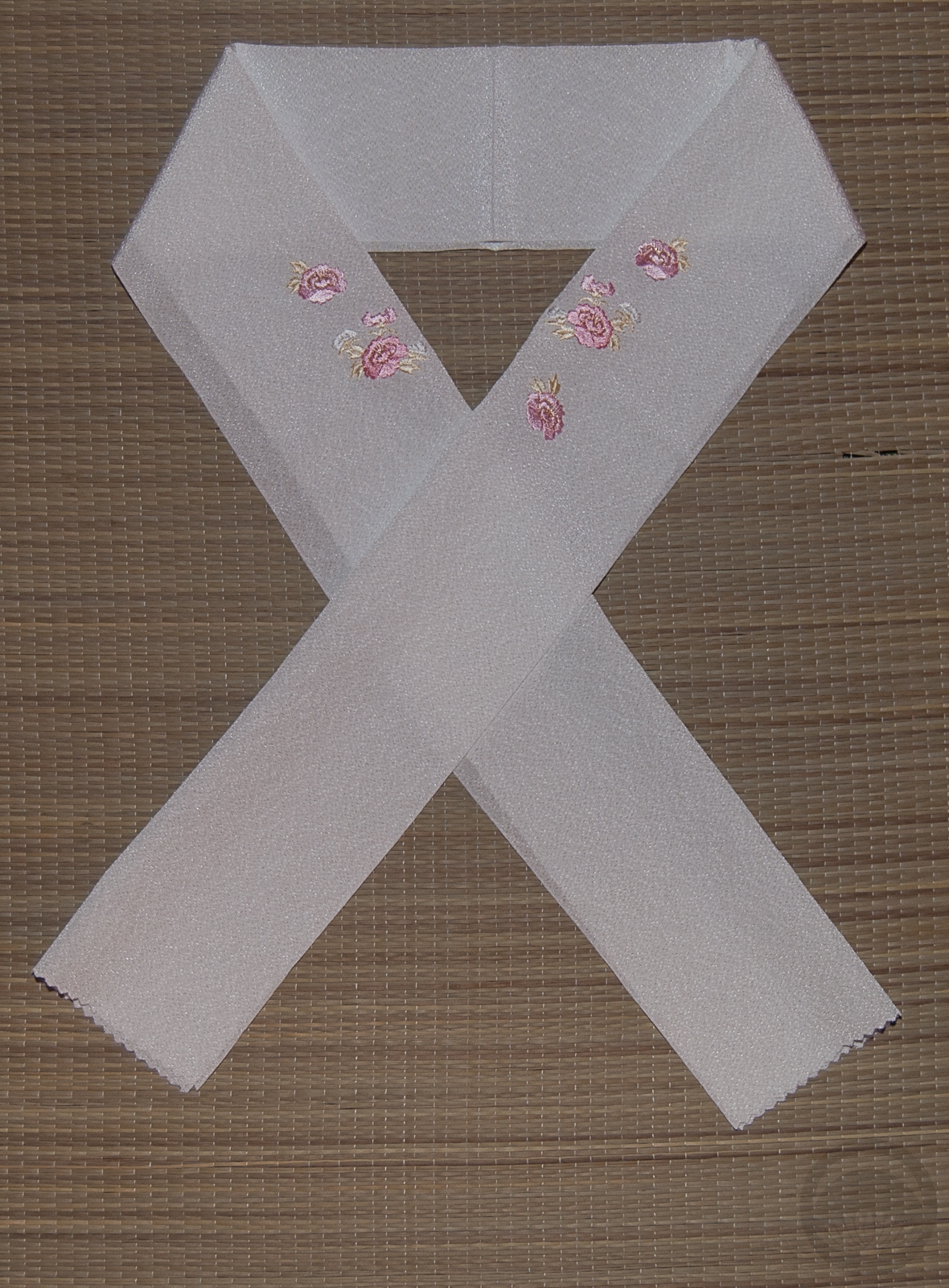
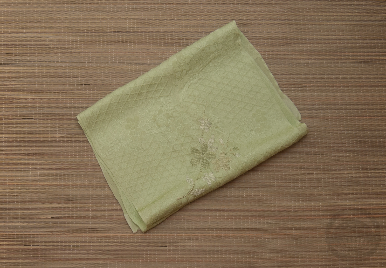
- White and Gold Rinzu
-
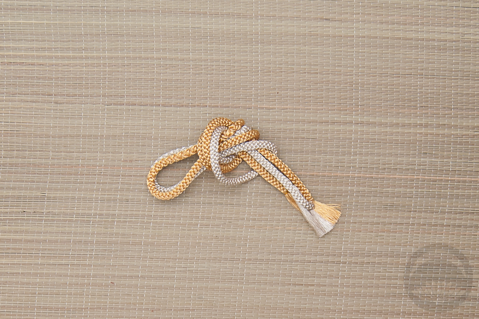
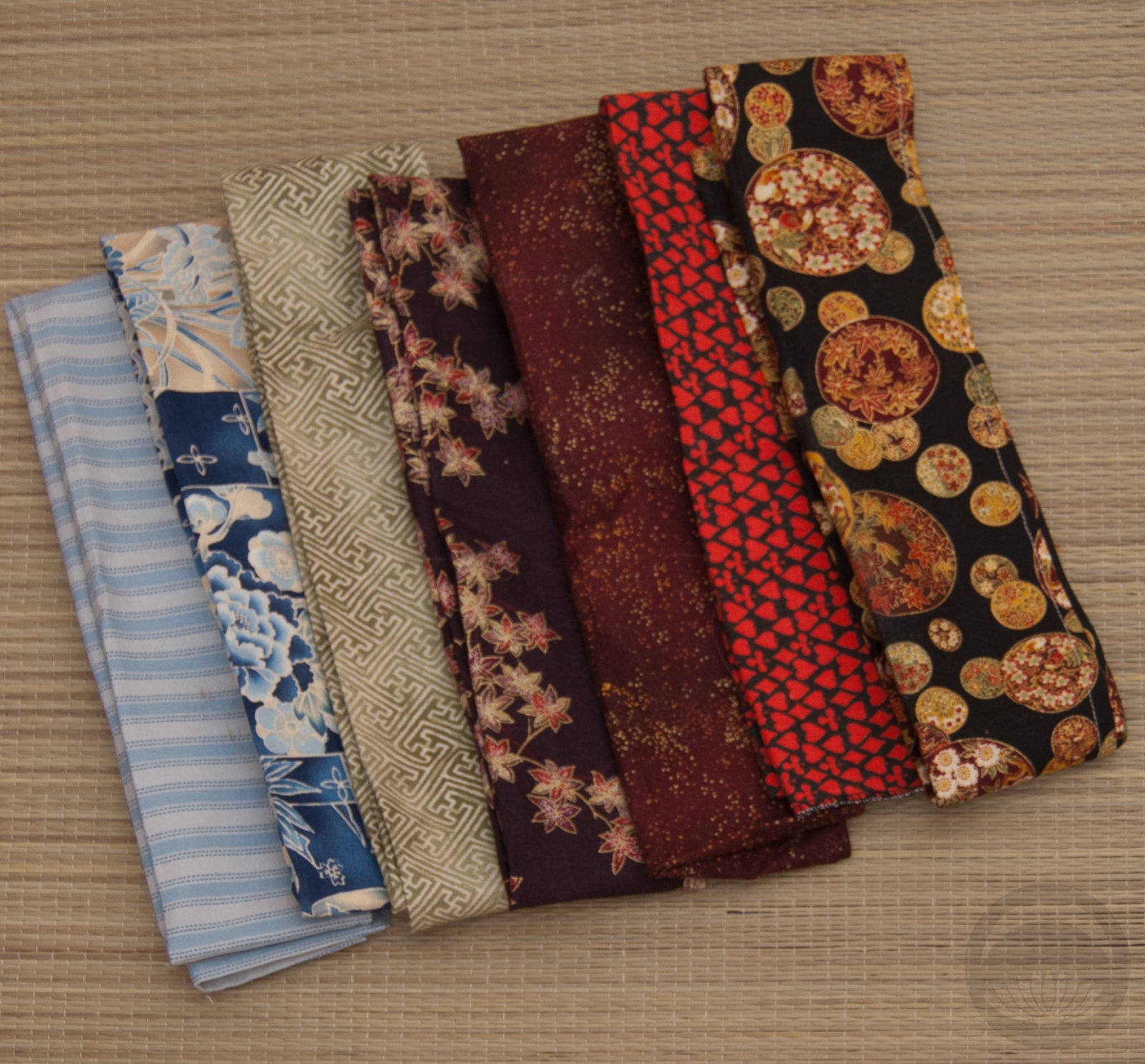
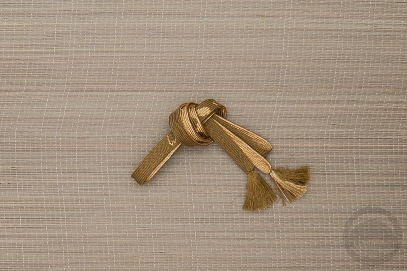
- Gold & Silver


 Bebe Taian
 CHOKO Blog
 Silk & Bones
 Gion Kobu