
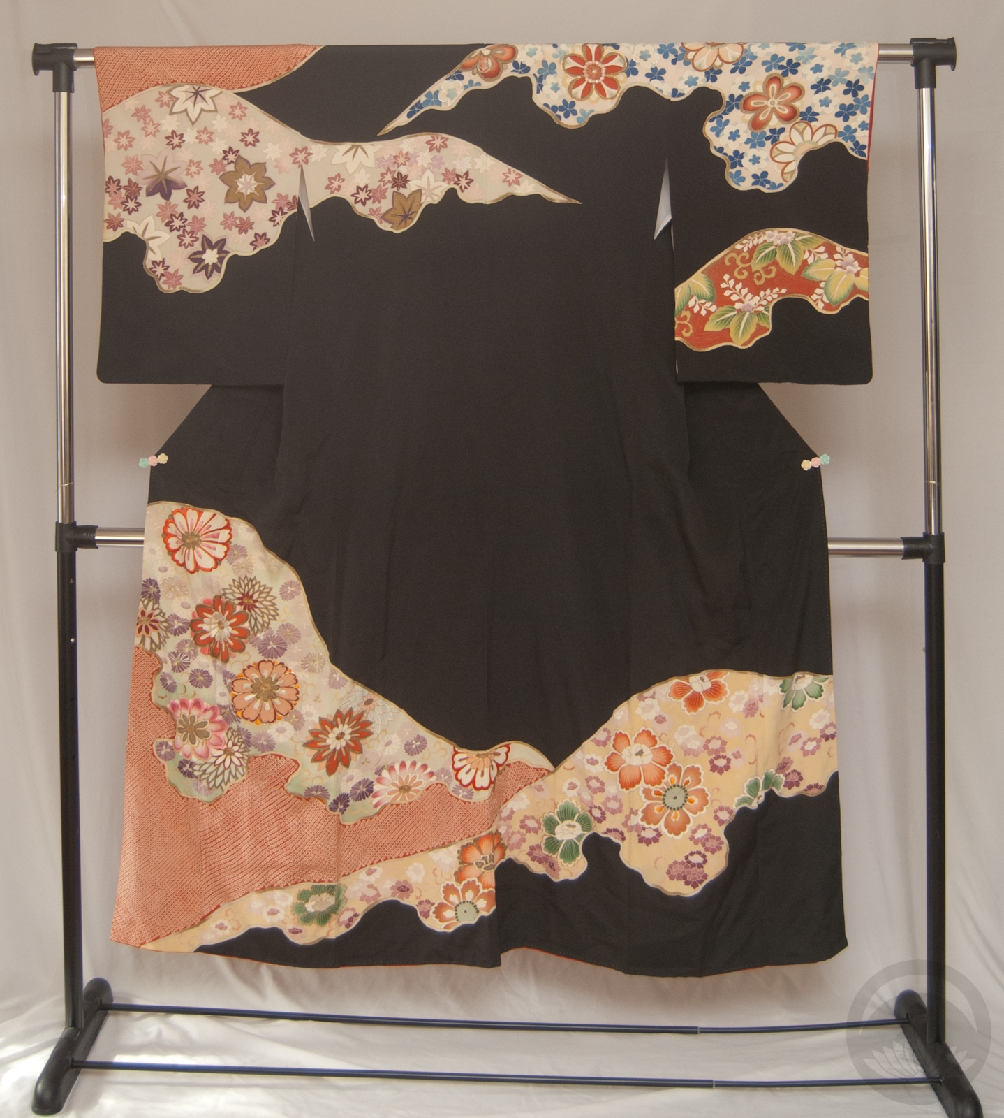
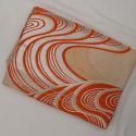
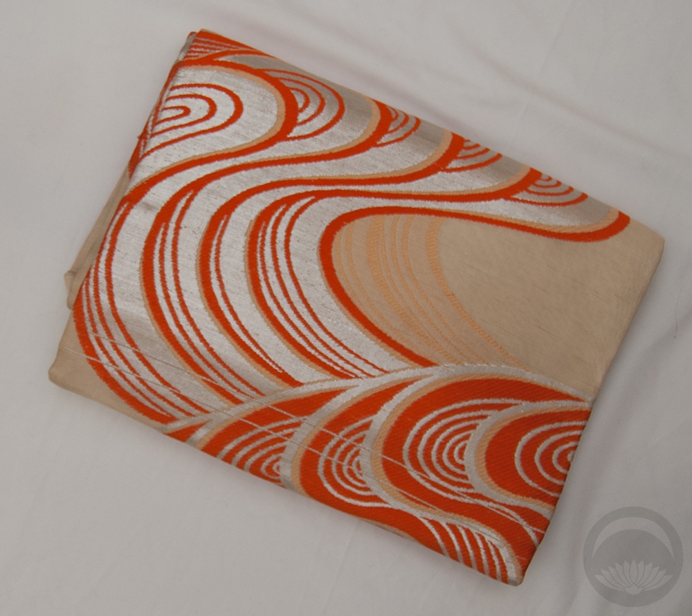
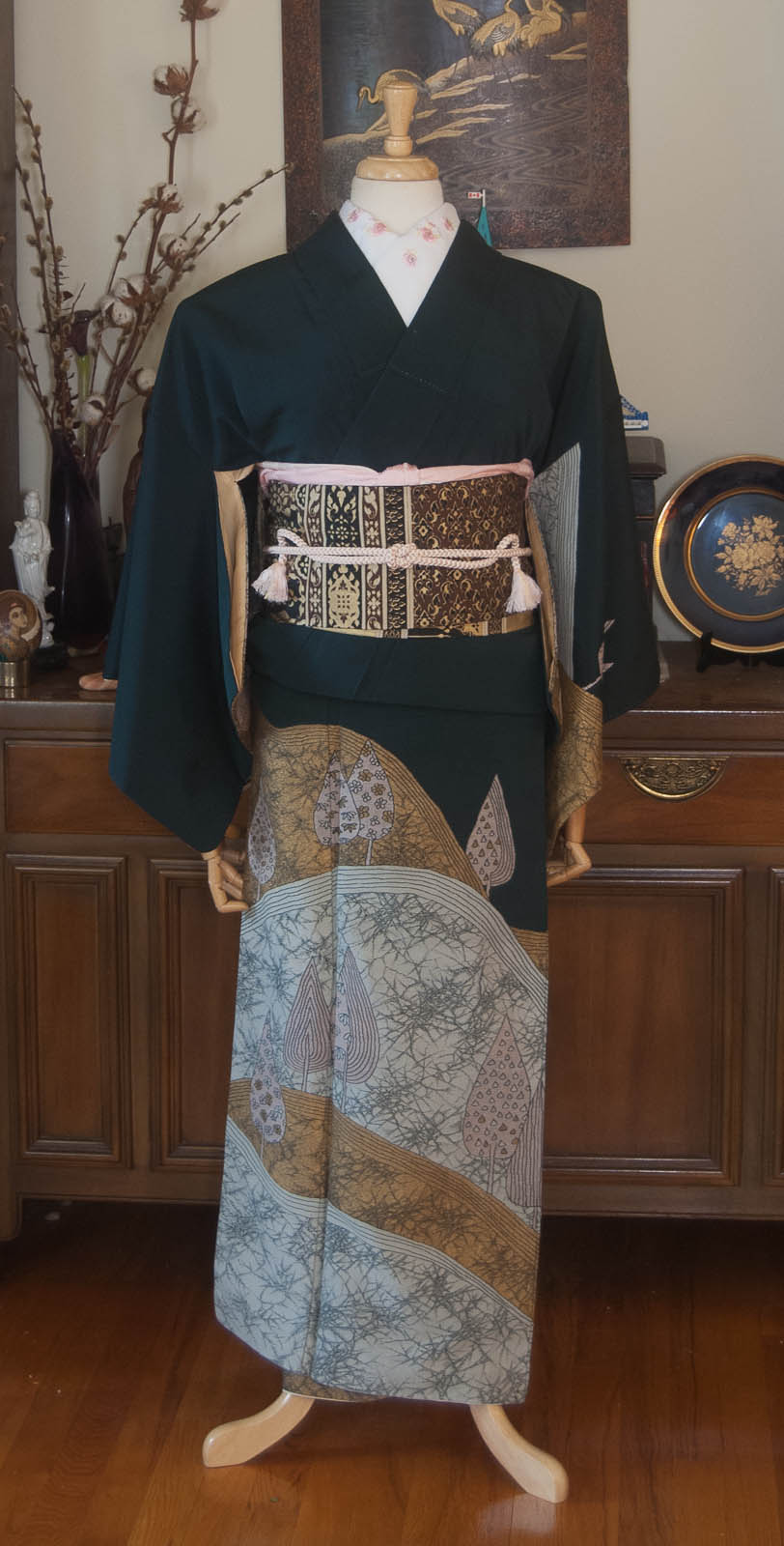
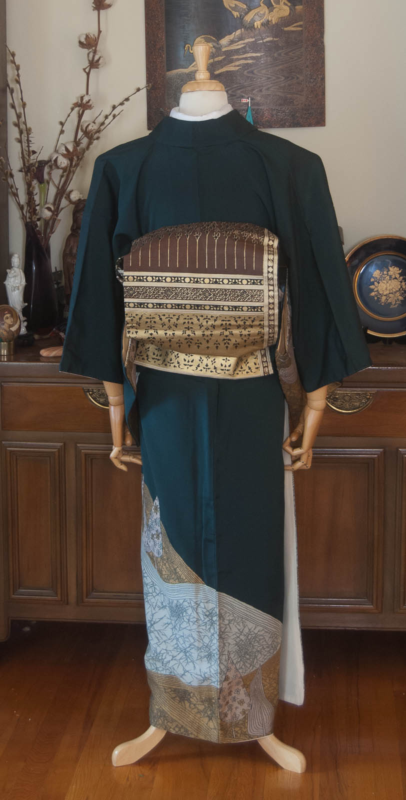
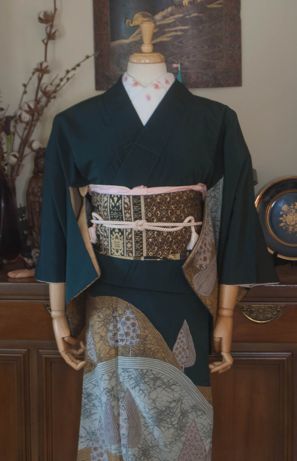
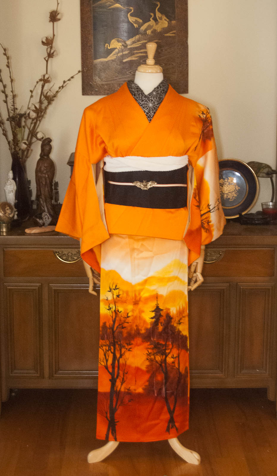
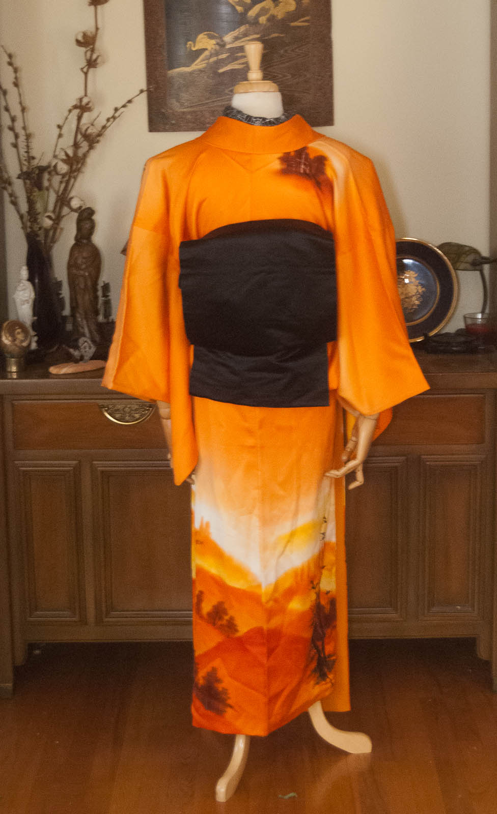
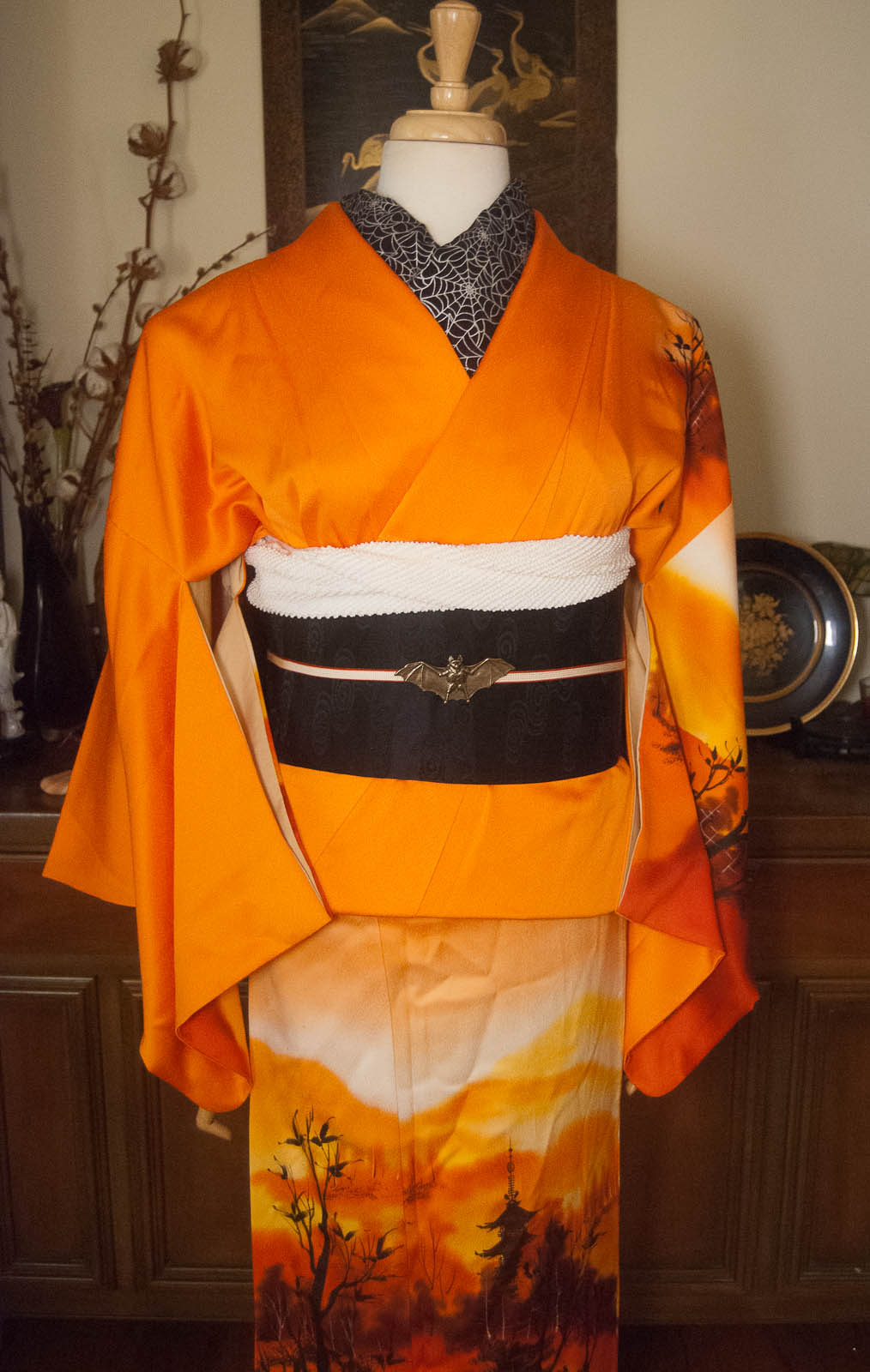
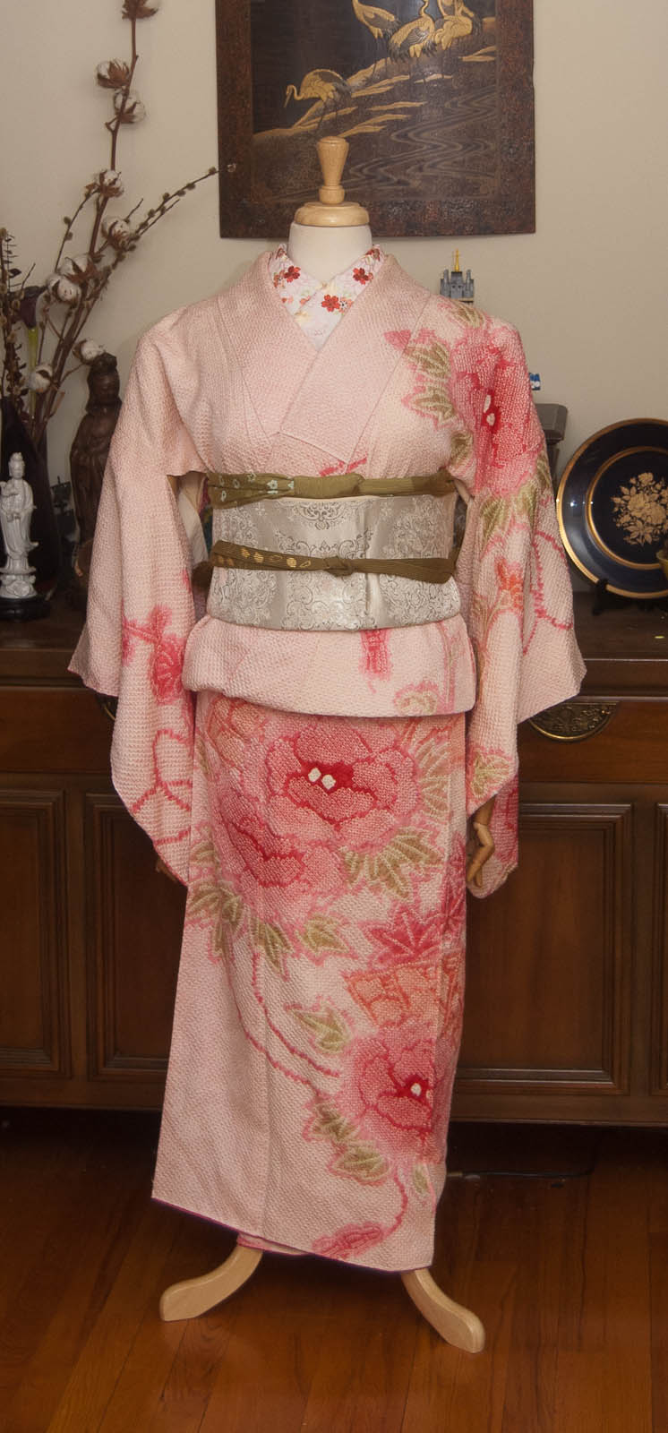
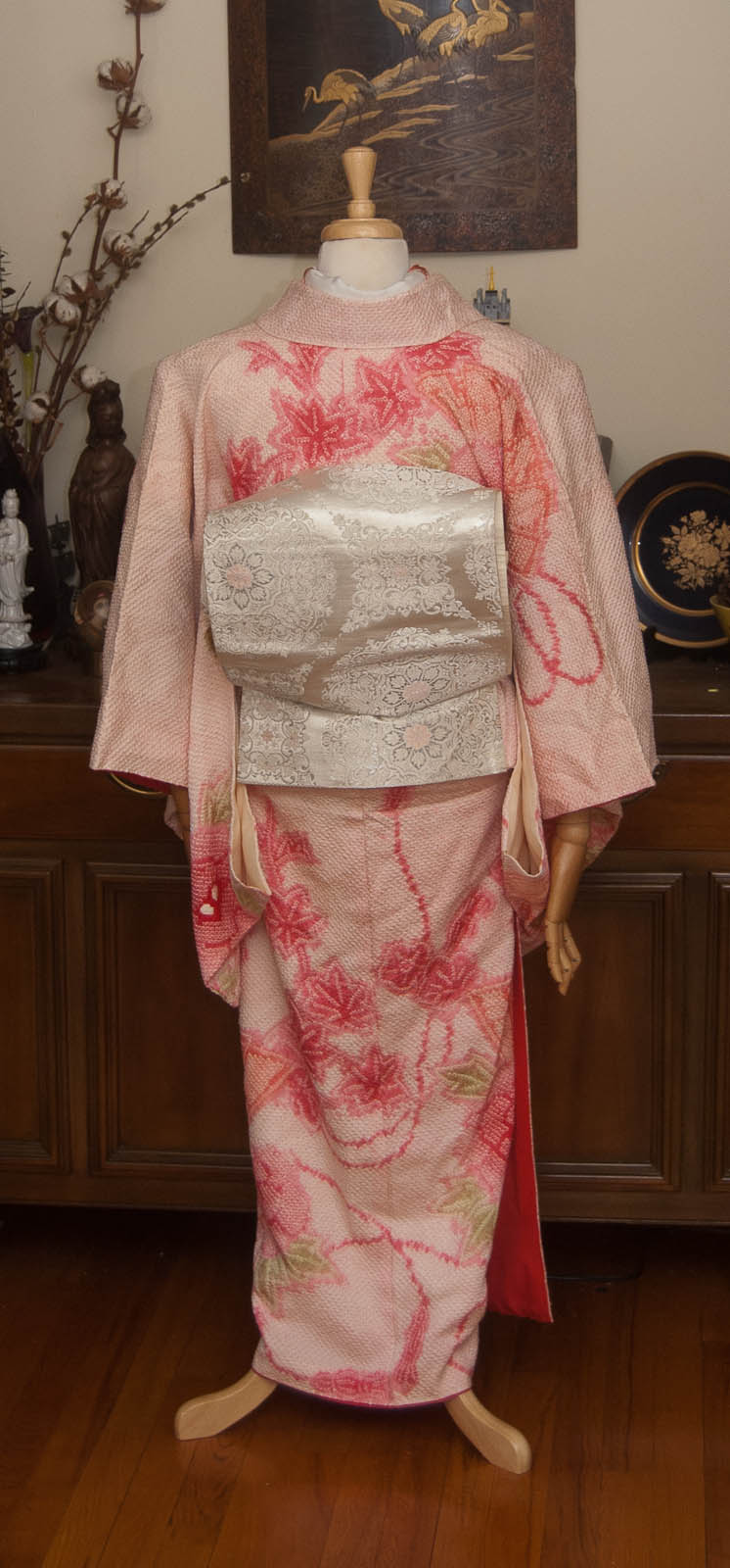
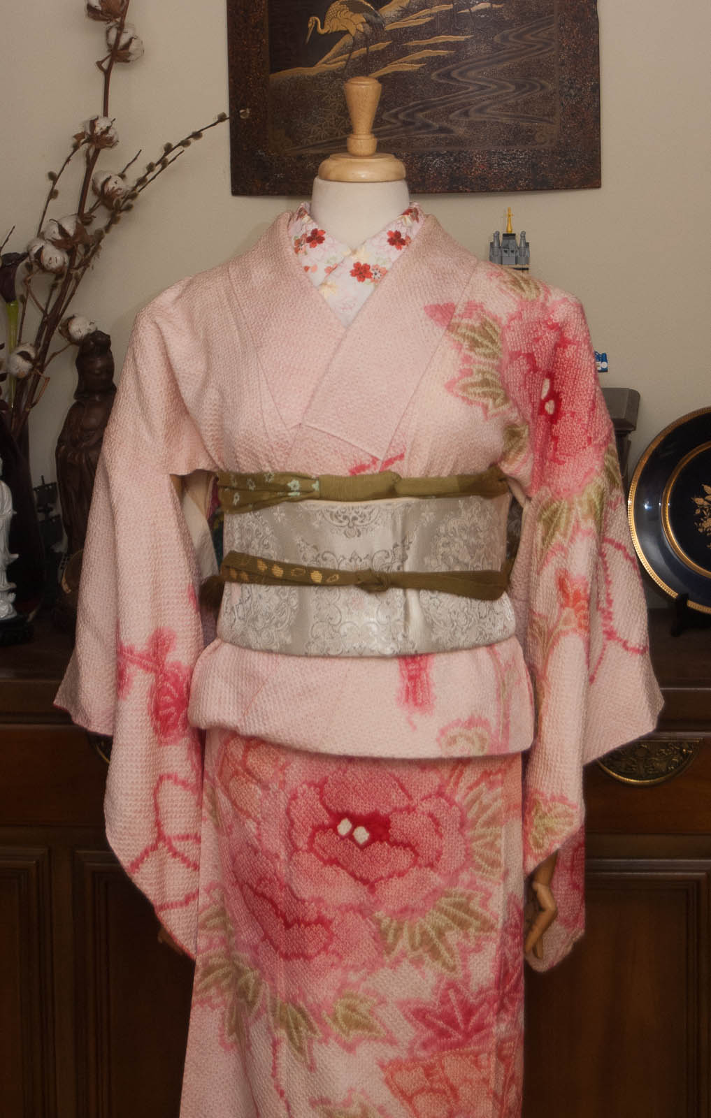
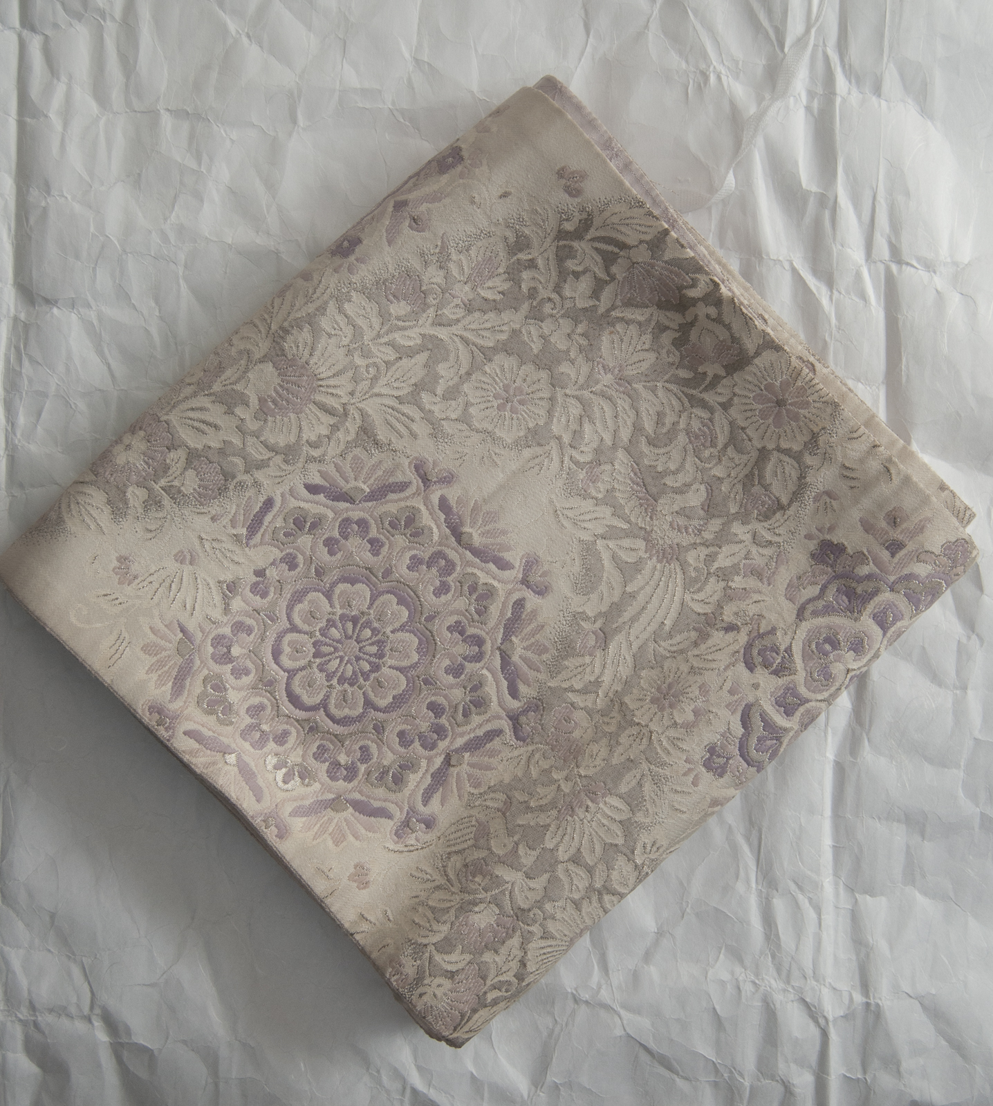
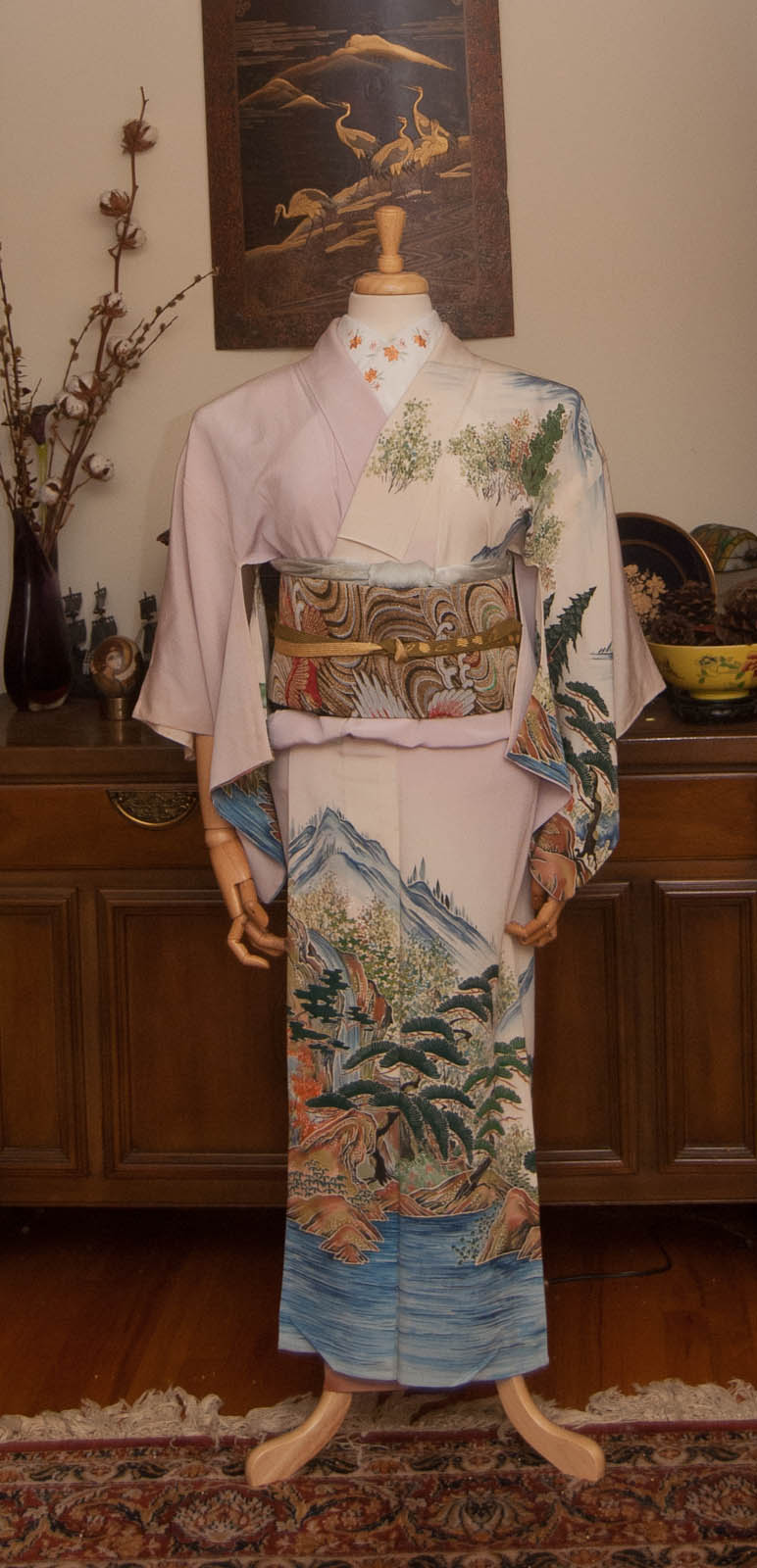
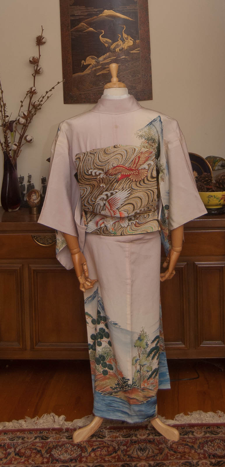
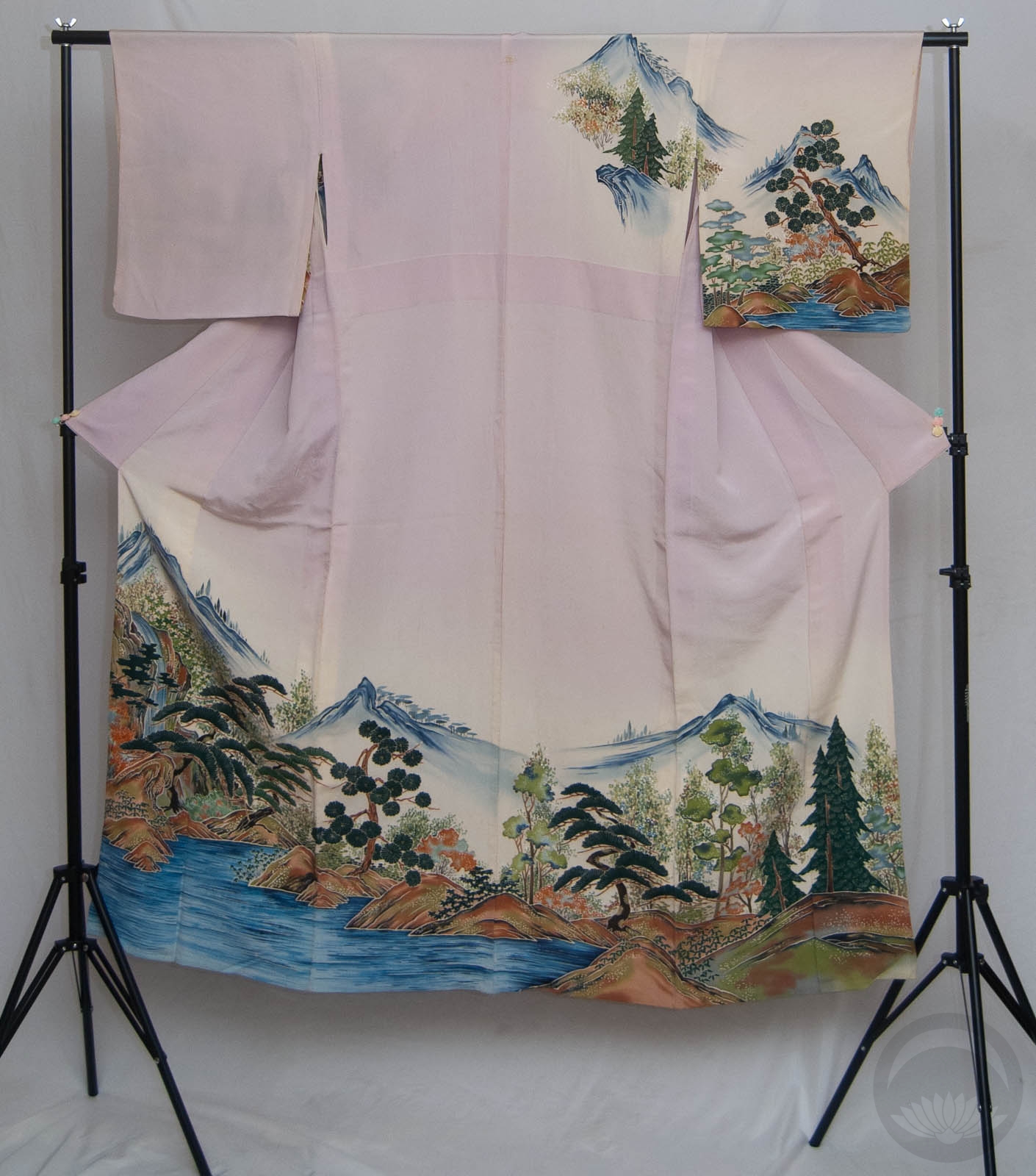
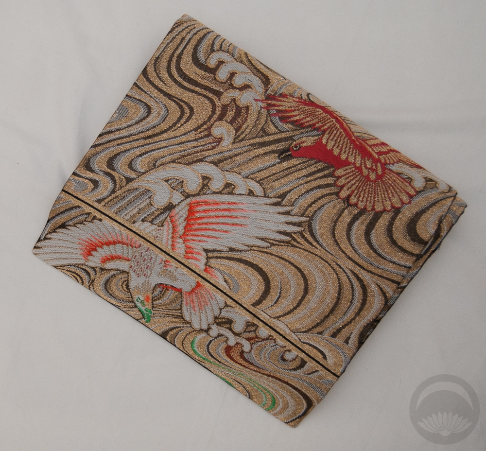
I haven’t used this gorgeous showa-fabulous houmongi Sophie got me for my birthday a while back anywhere near frequently enough. I decided to have some fun with it today, and realised this obi (which I nearly sold! what was I thinking?) is the absolute perfect seventies-style match for it.
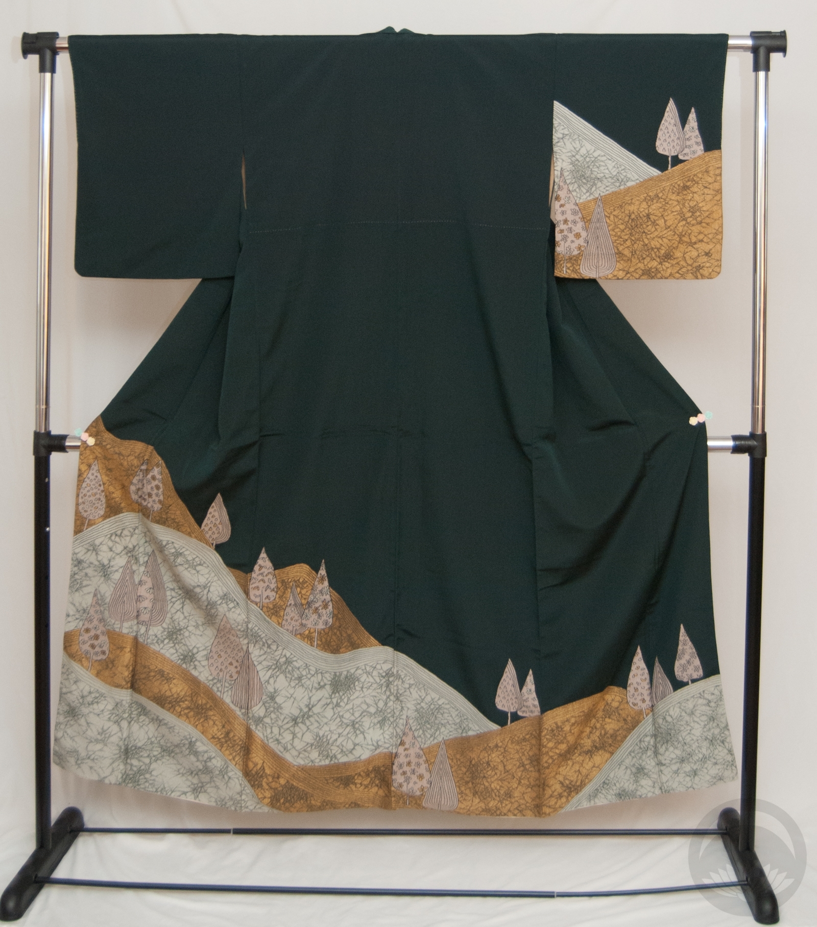
As timeless as the shape of a kimono may be, the patterns and colours are just as susceptible to trends as western clothing is. This particular shade of orange, especially paired with gold, and the big warm-toned and almost pop-art flowers, are very emblematic of the middle of the second half of the Showa era, from the late 60s to the early 80s. I could just as easily see this general colour and pattern scheme on a polyester pantsuit as I could on this particular coordination.

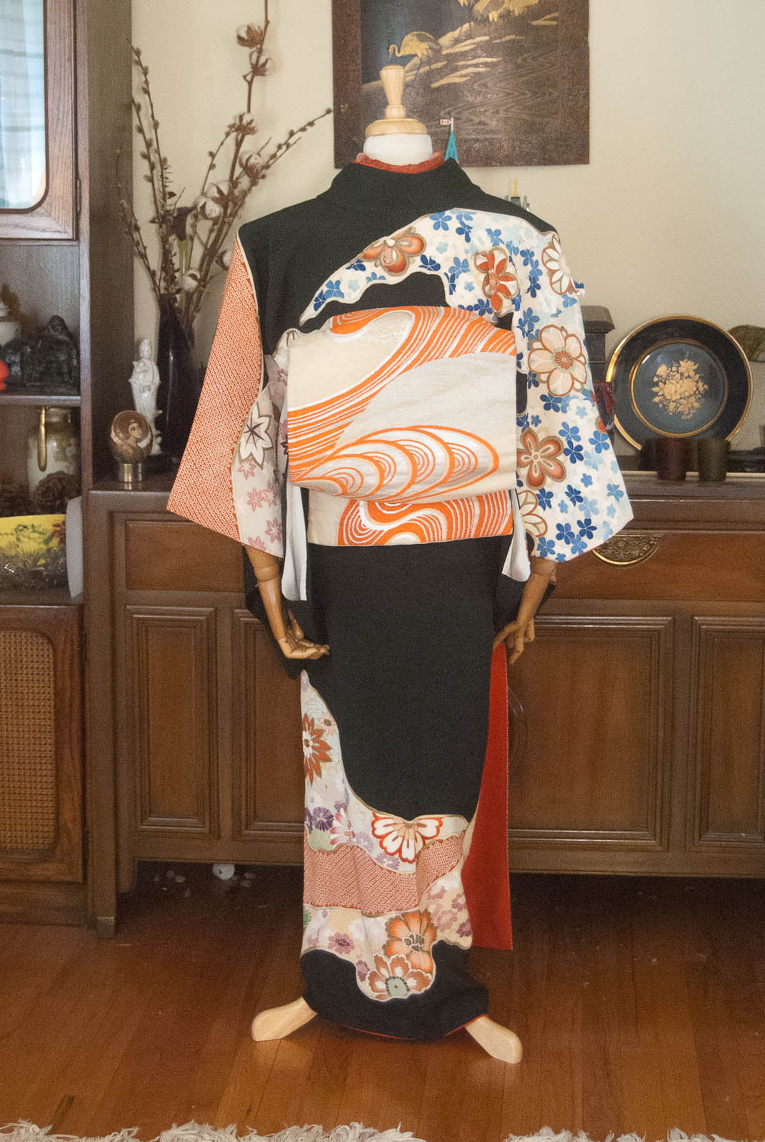

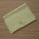
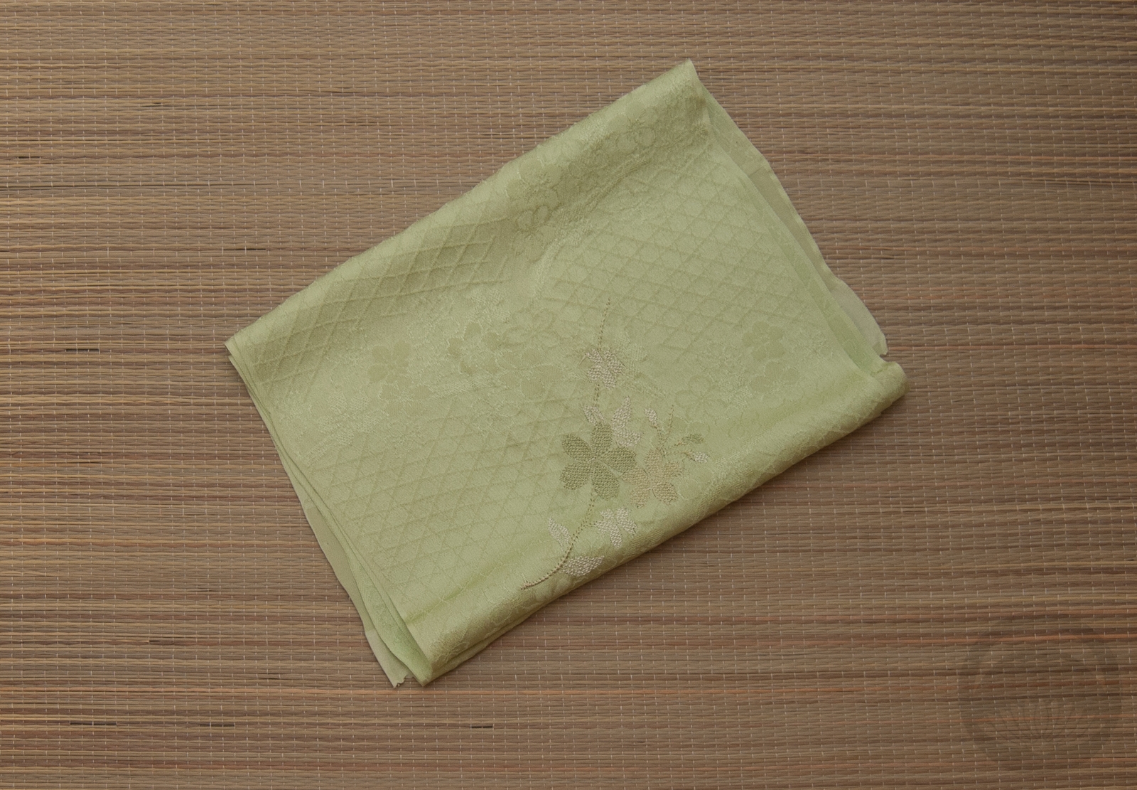
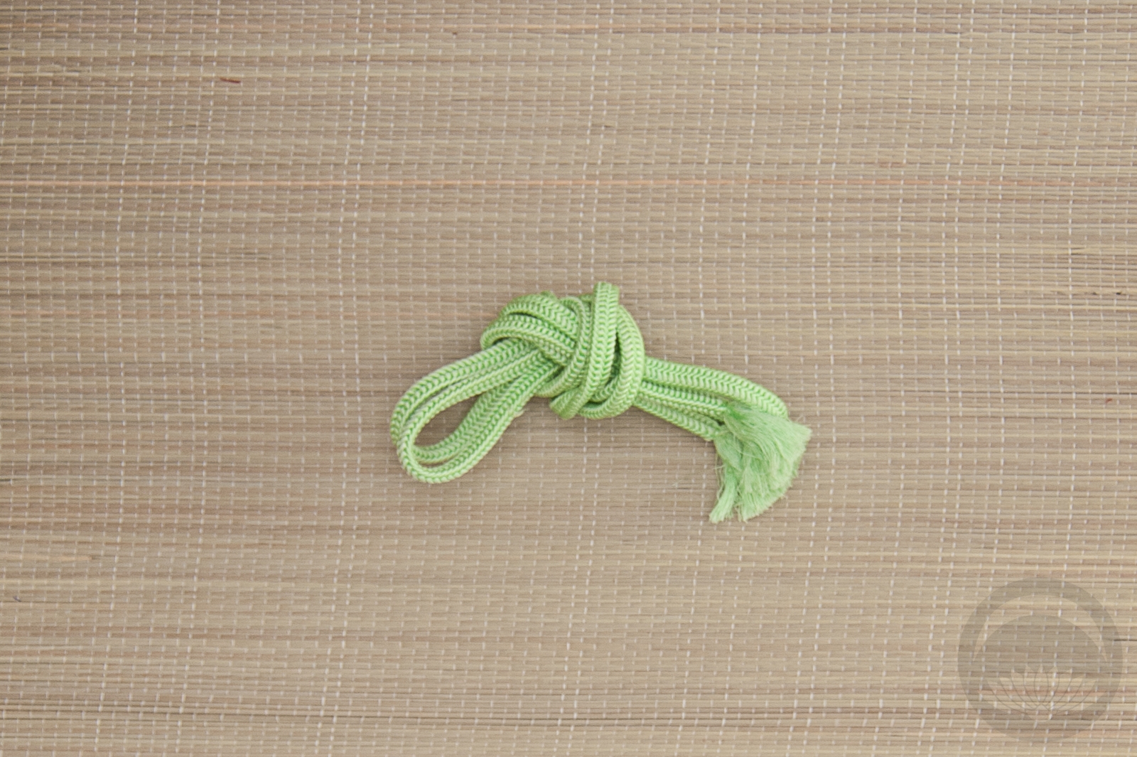
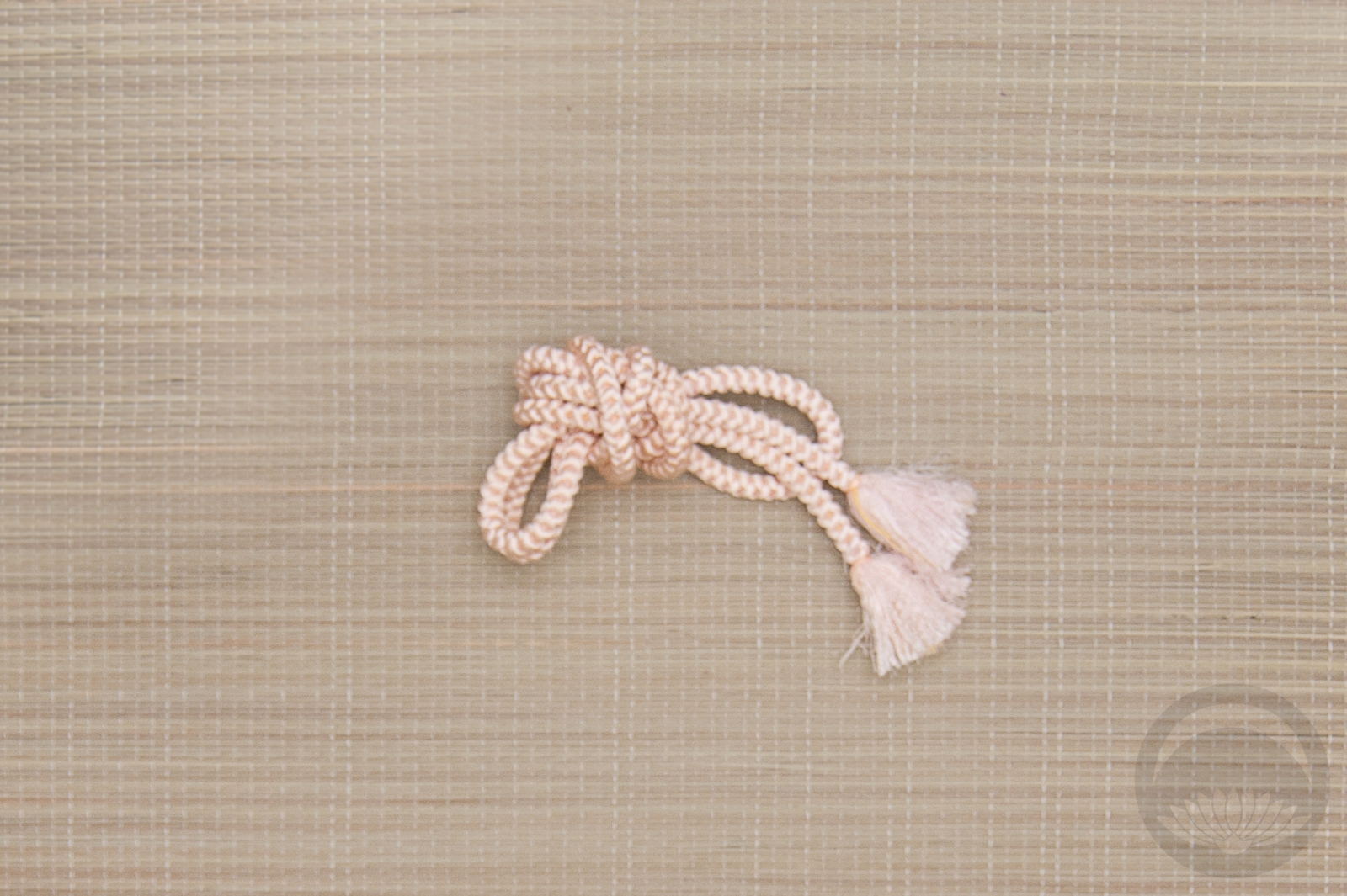
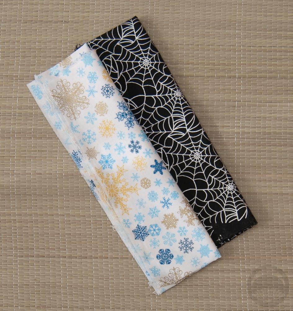
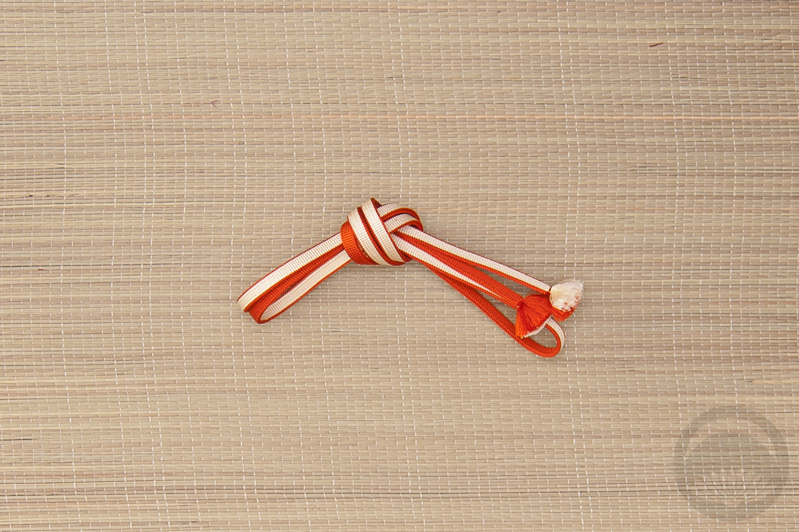
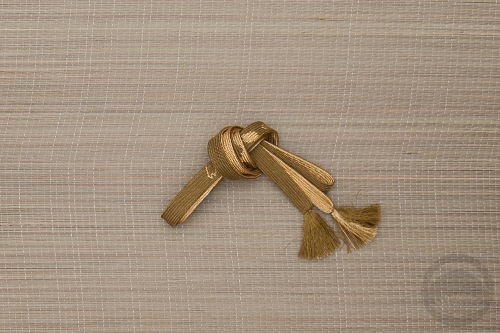
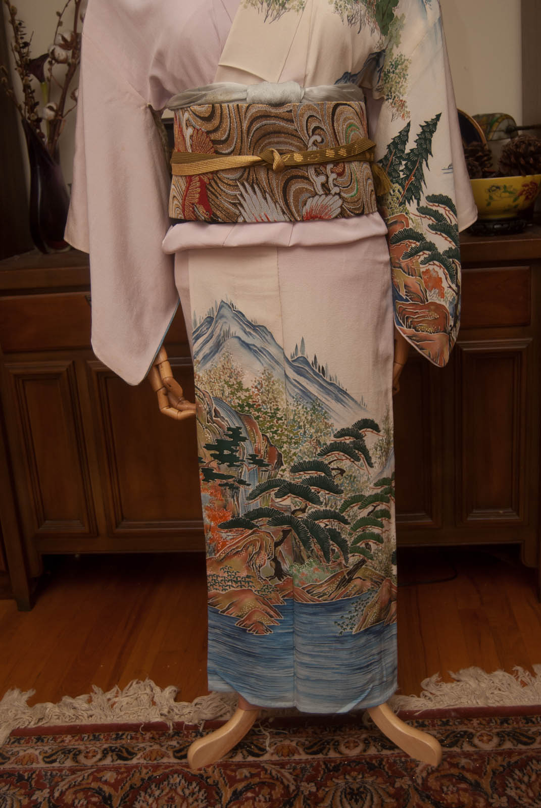
I decided to keep things relatively quiet with the accessories, since the kimono and obi are so flashy already. This soft leafy green picks up the green accents in the design so it seemed like the best choice, but the obijime did get a bit lost against the obi. Then I remembered this padded, decorative little cord I picked up at the Daiso last time I was in California. It’s a bit too thin and delicate to be a functional obijime by itself but it’s absolutely perfect wrapped around as an accent. The black and bold colours just call back to the kimono so well and I’m so happy I remembered I had it!
Items used in this coordination
-
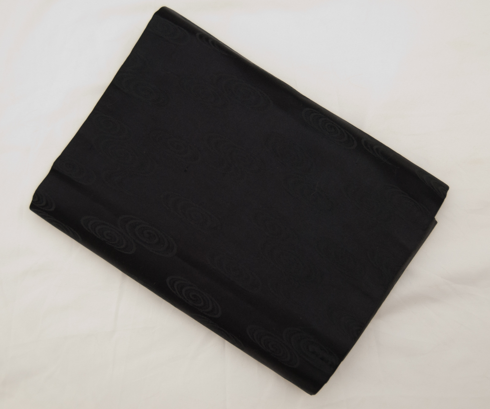
- Black Floral
-
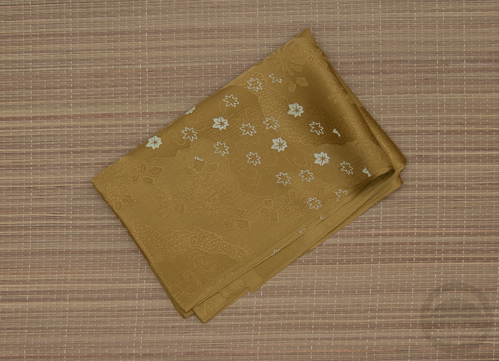
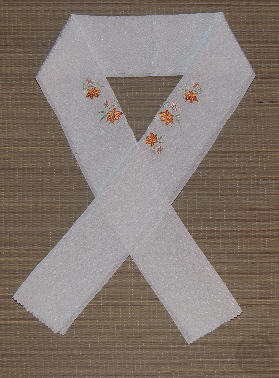
- Orange Waves
-
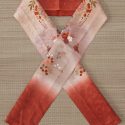
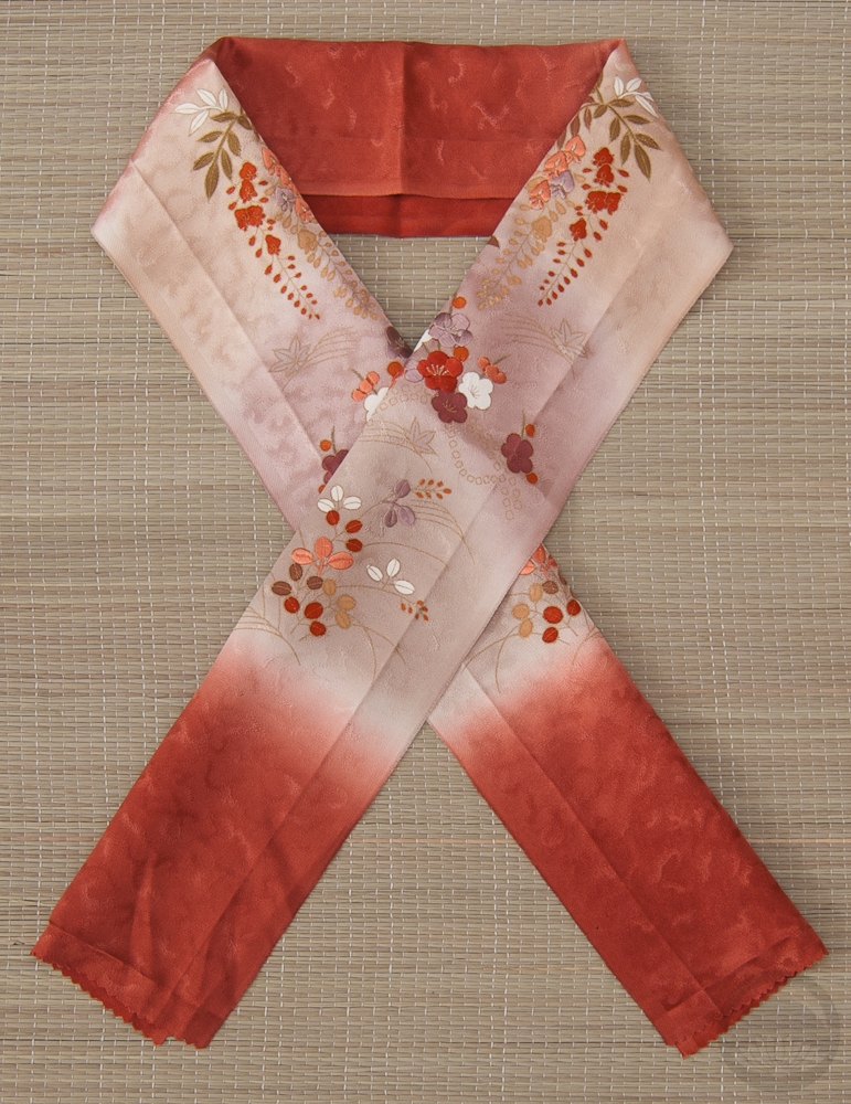
- Embroidered Bokashi
-
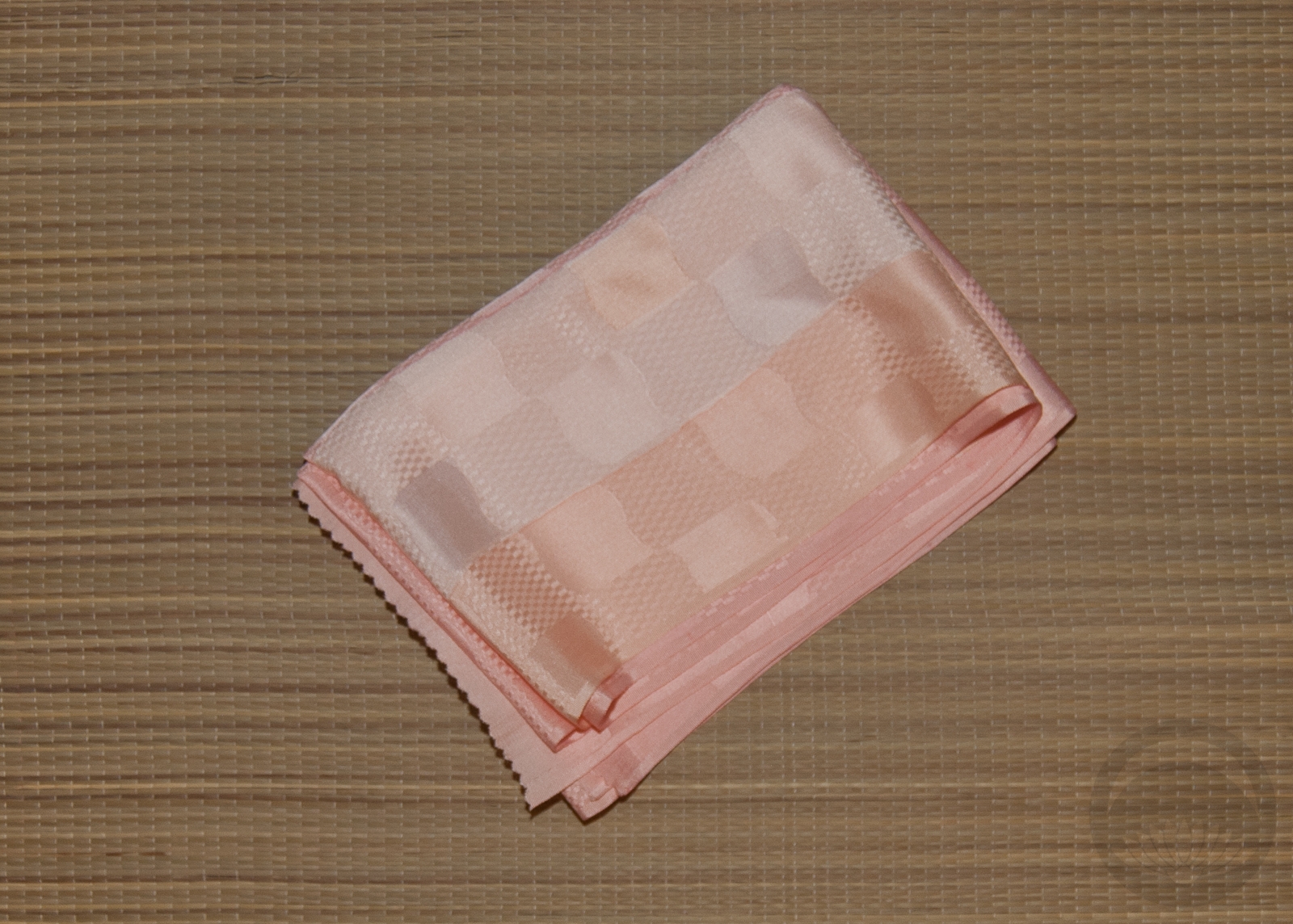
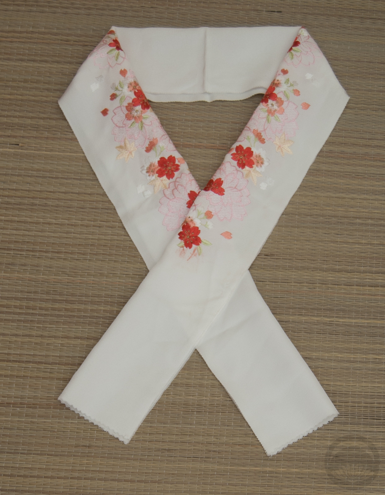
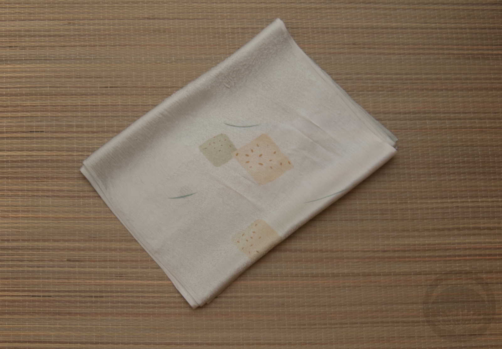
- Pale Green Rinzu with Embroidery
-
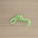
- Green Round


 Bebe Taian
 CHOKO Blog
 Silk & Bones
 Gion Kobu