
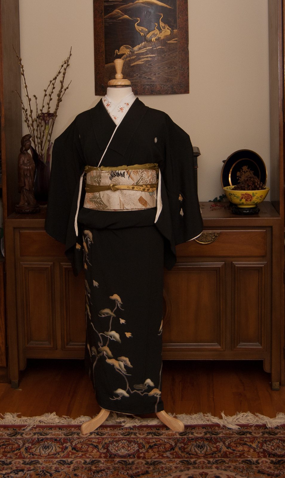
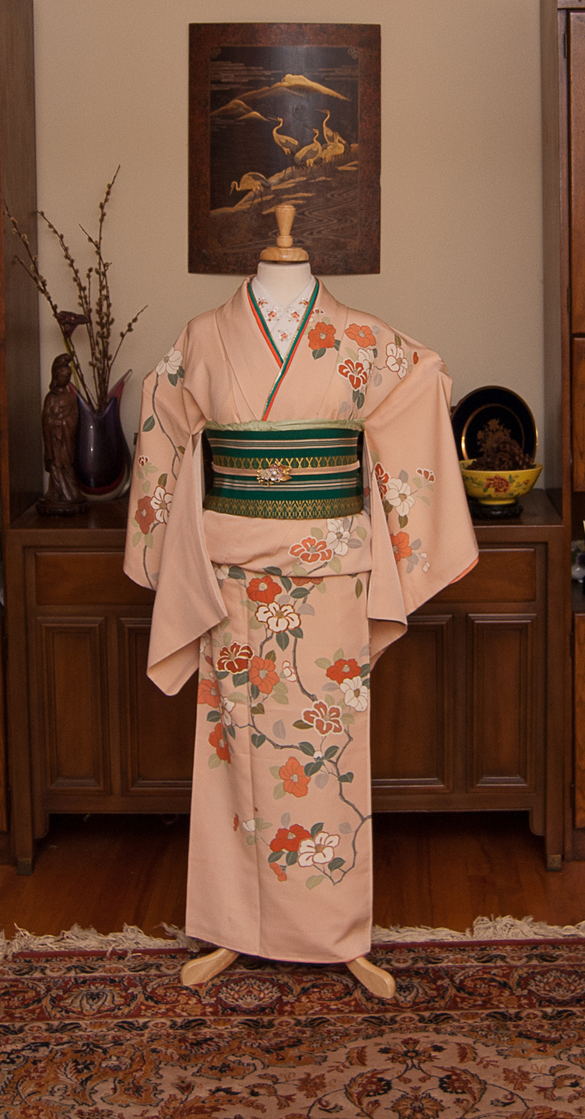
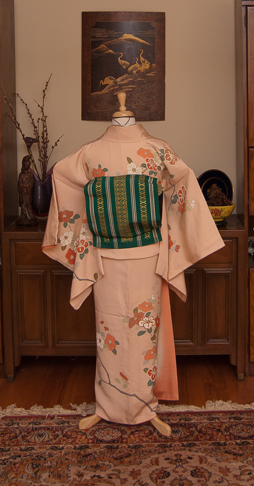
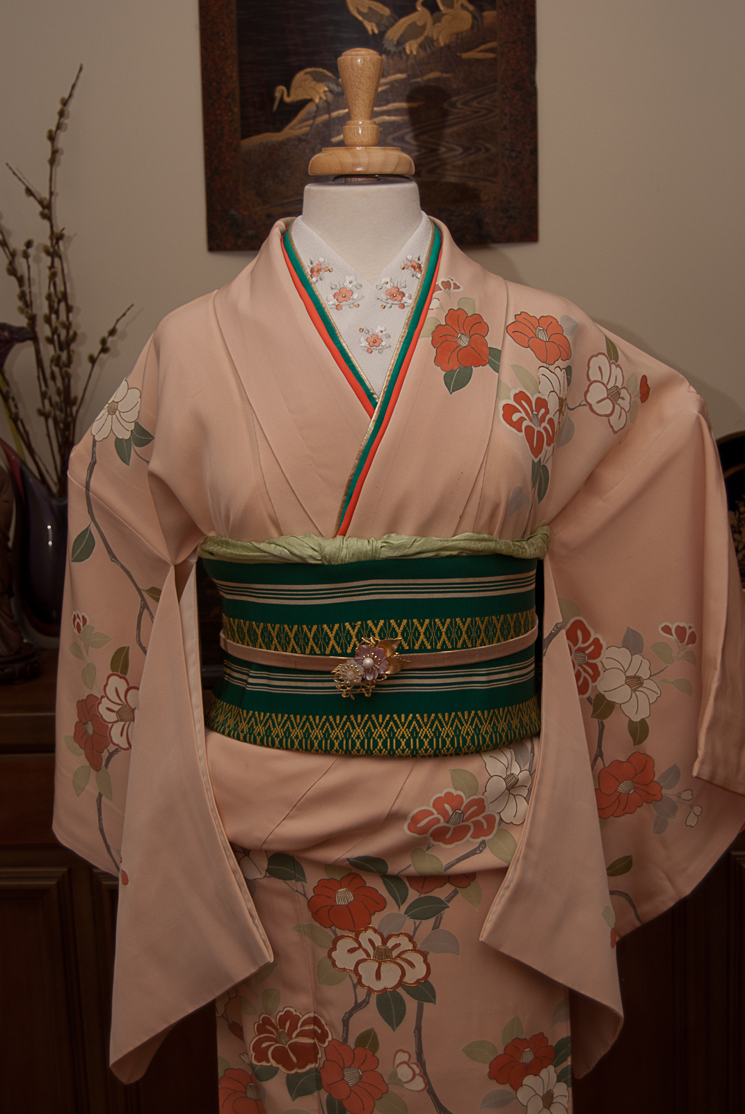
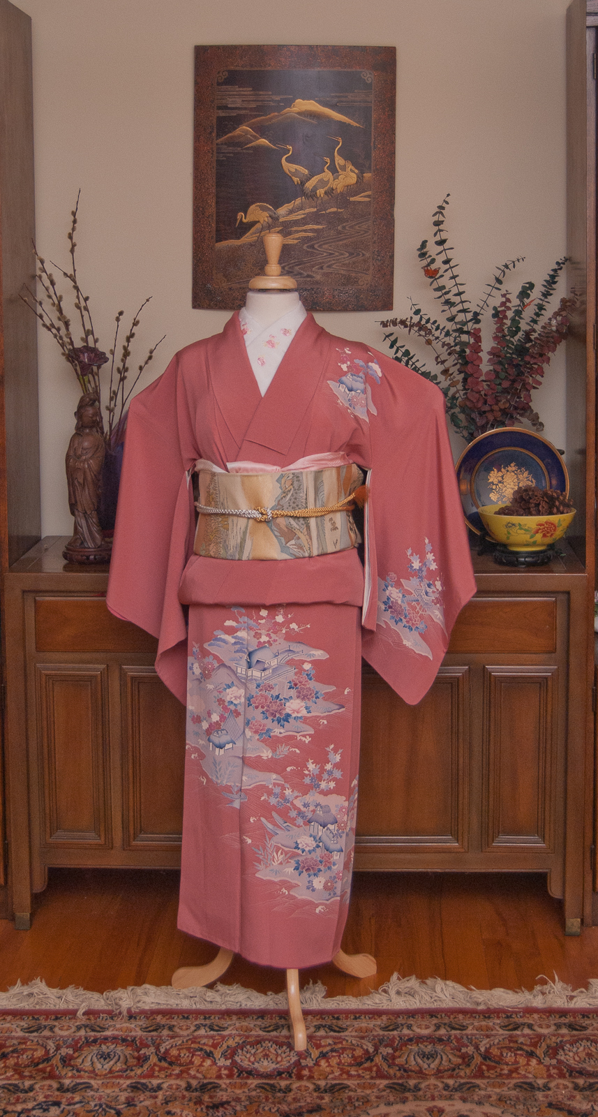
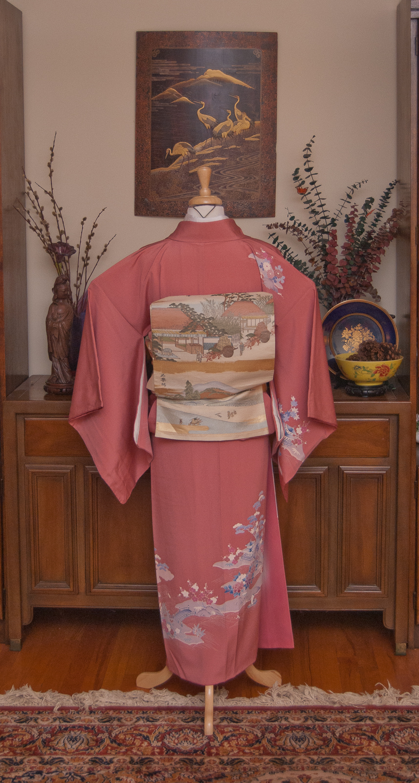
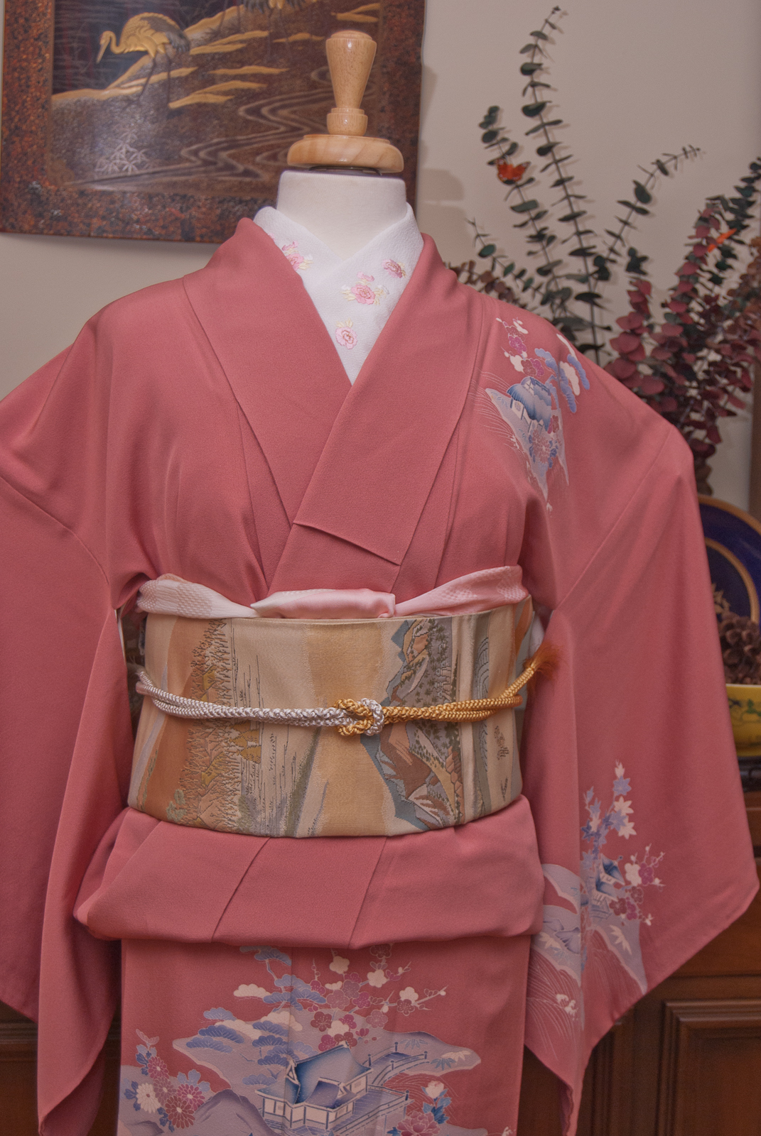
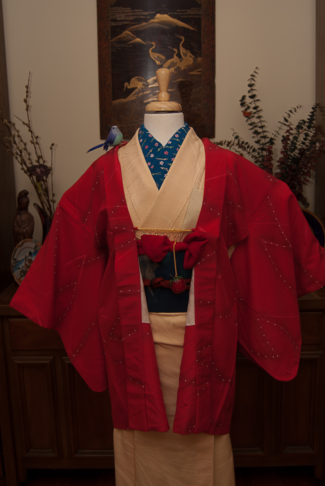
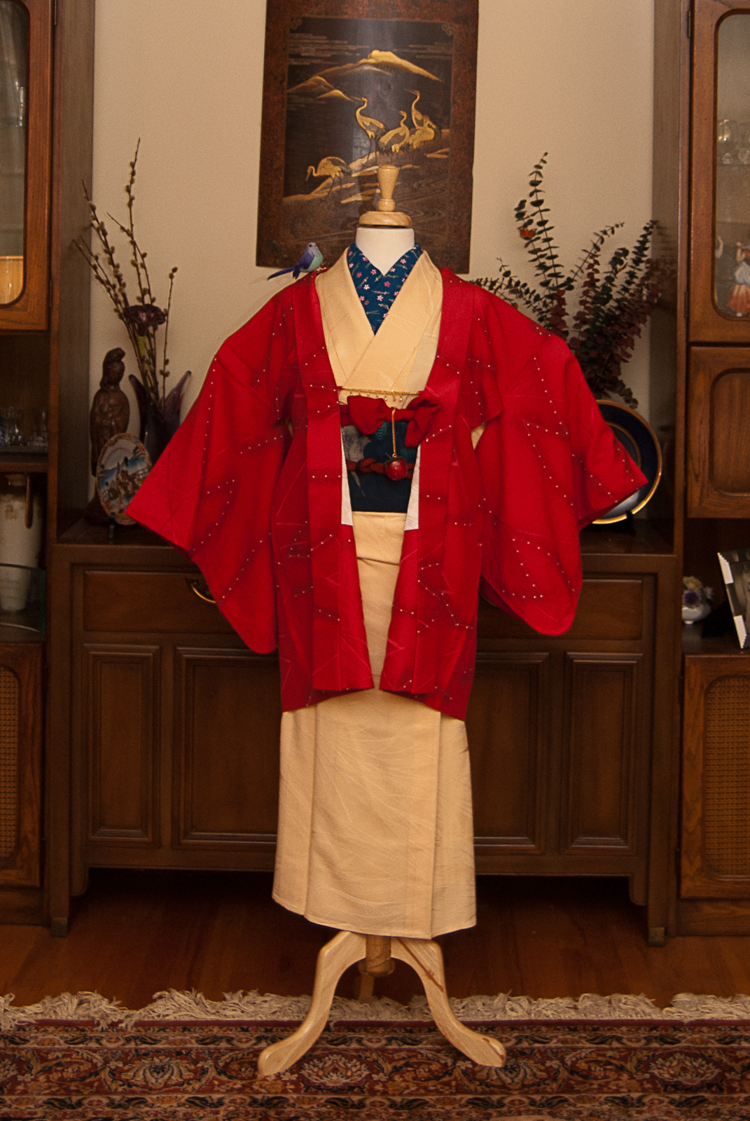
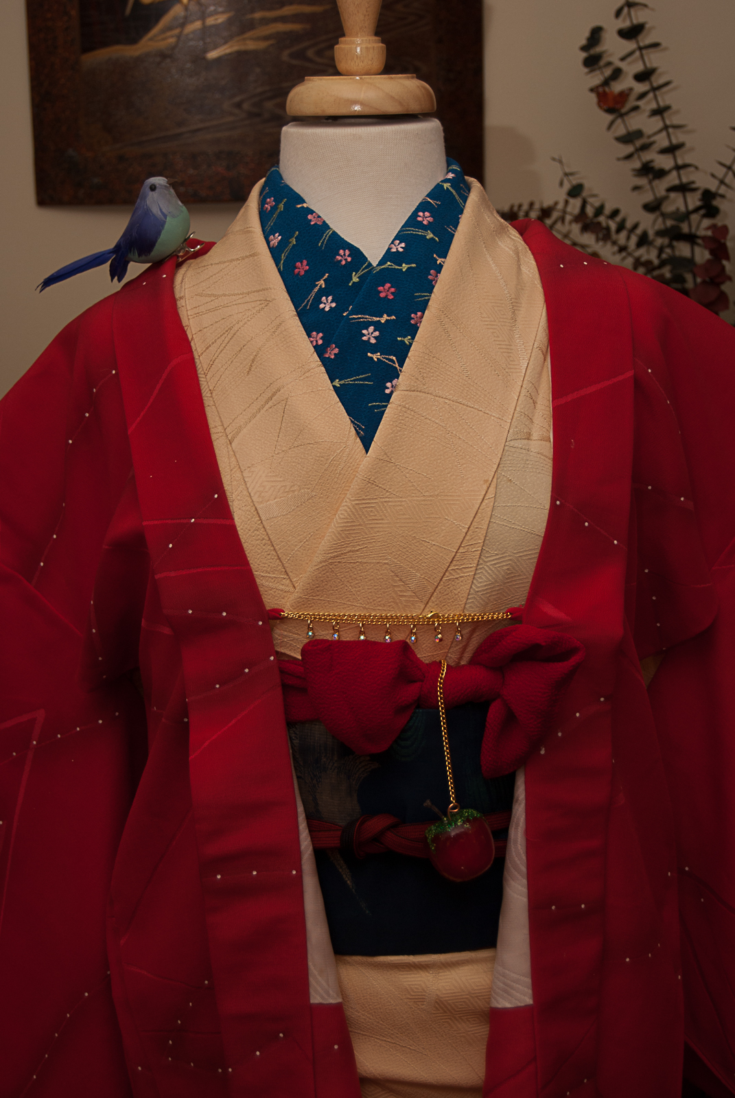
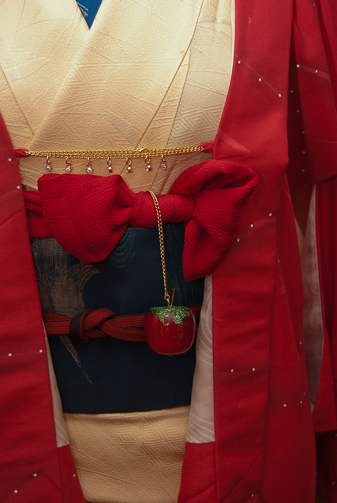
I’ve been doing a lot of fancy and non-traditional kitsuke lately, and was itching to get back to kimono basics, if you will. Just an elegant, simple coordination. No fuss, no muss. I also realised I’ve been sticking to more Western colour coordinations, doing things that look “right” in my head and not necessarily keeping kimono colour rules in mind.
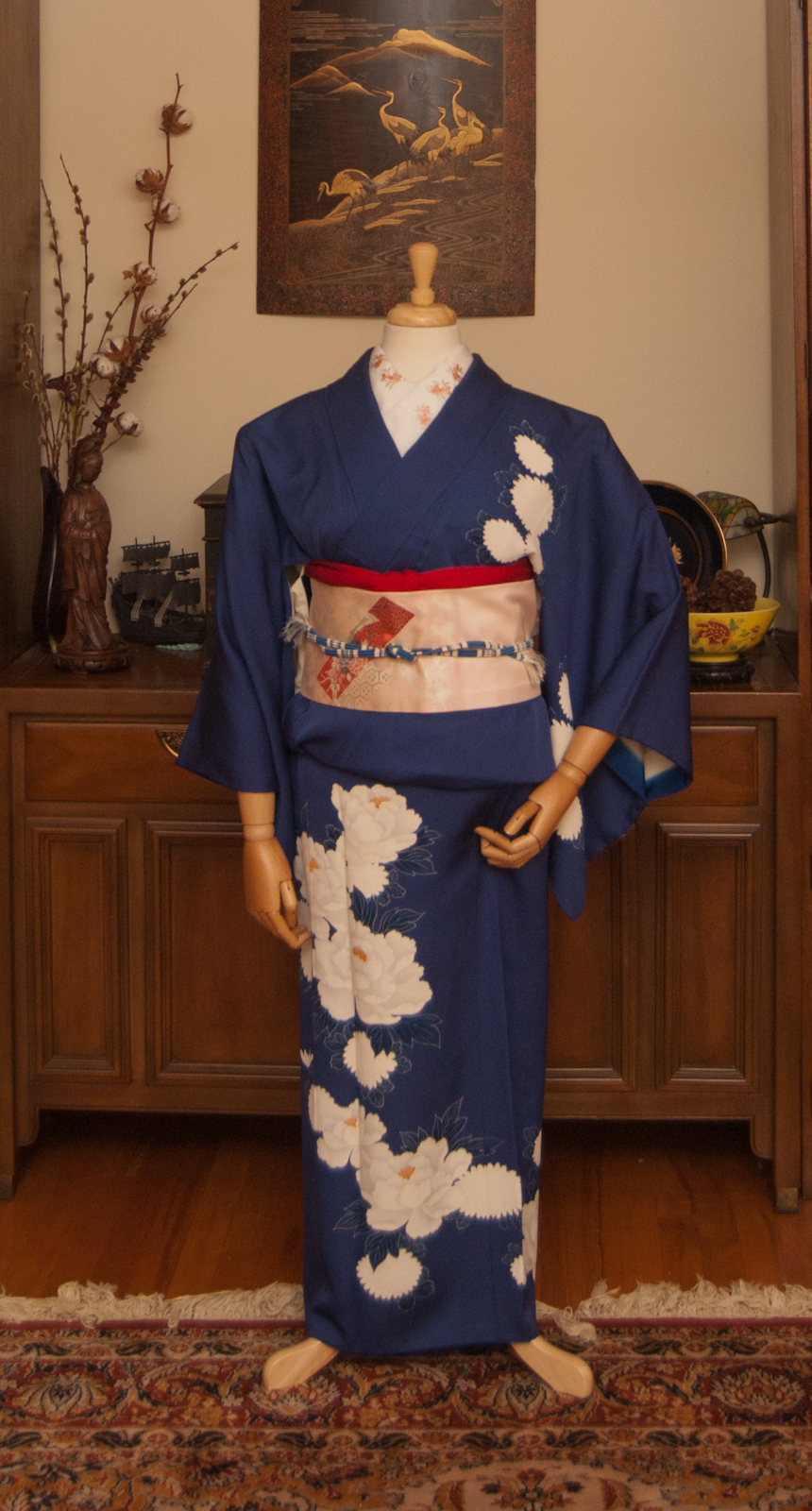
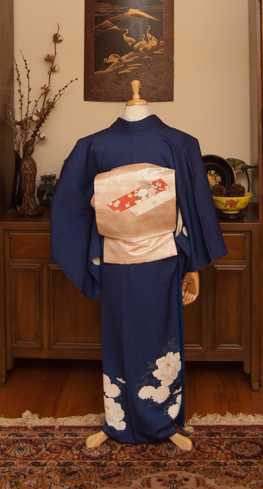
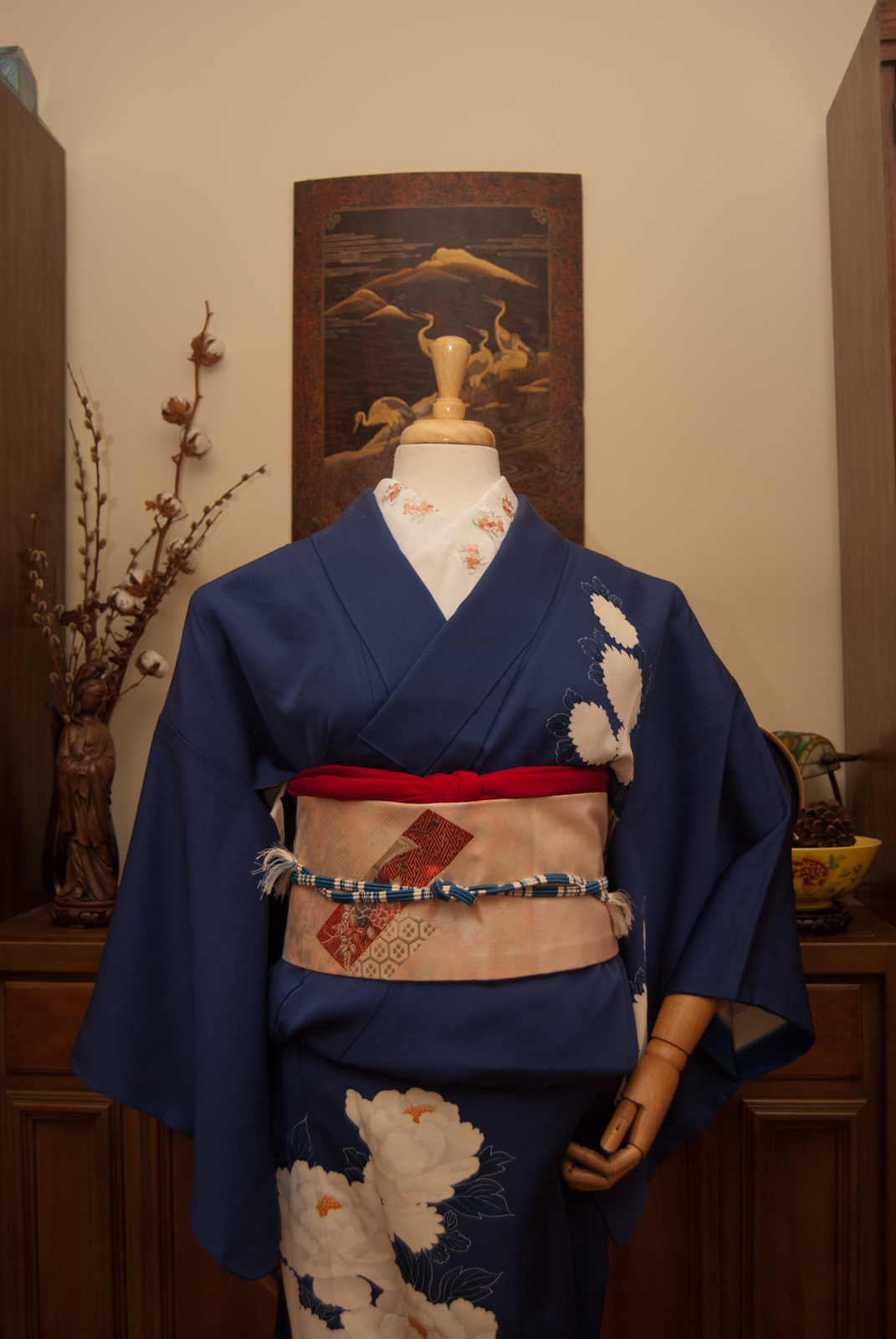
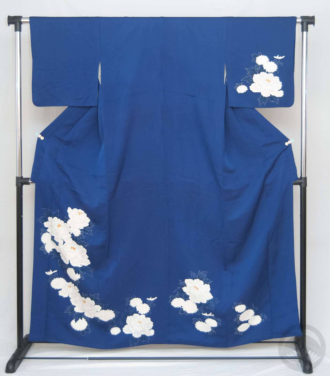
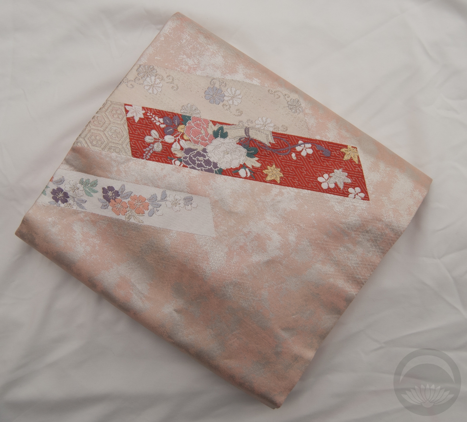
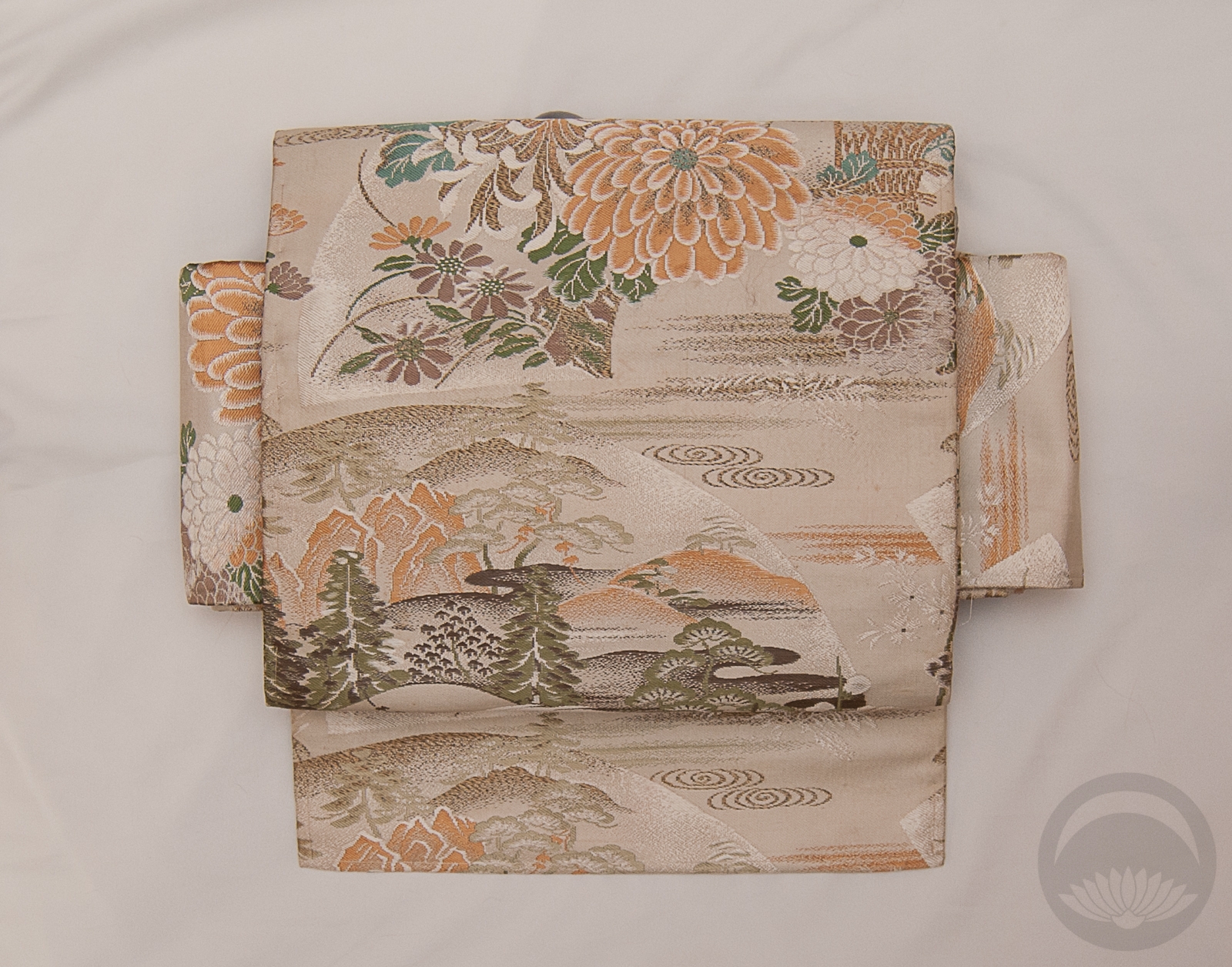
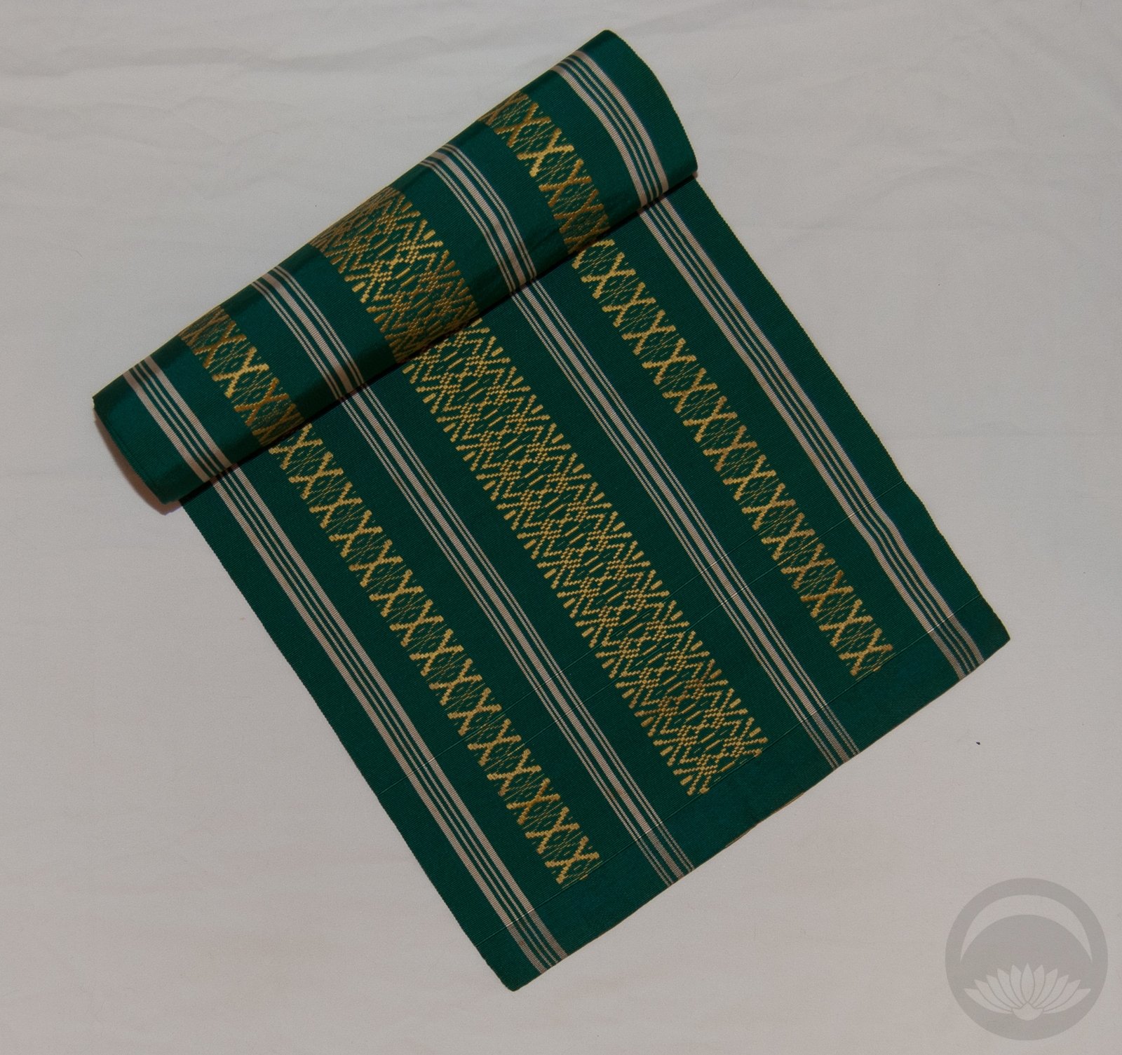
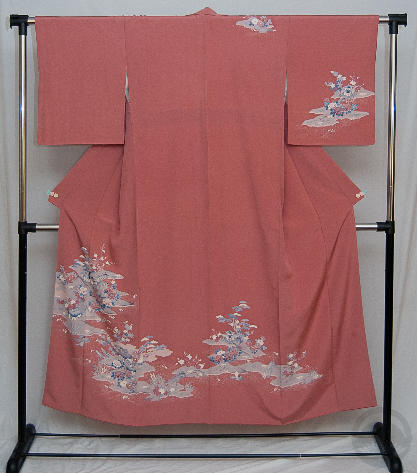
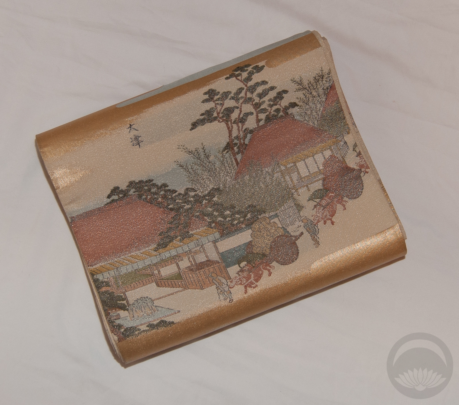
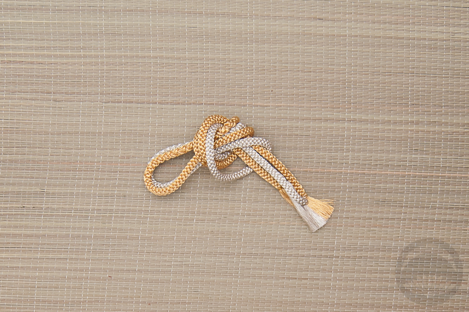
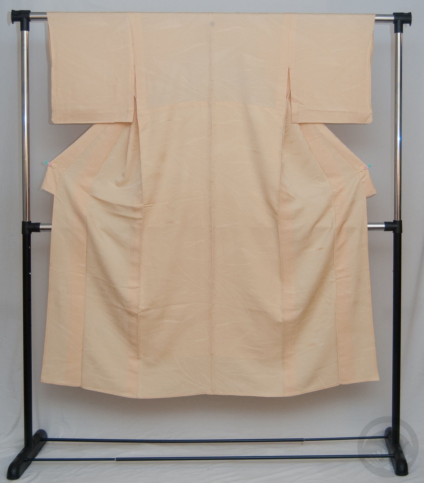
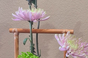
With that at the forefront of my mind, I decided it was high time I coordinate this beautiful pale pink nagoya obi I got earlier this summer. My original instinct was to stick with pastels, but I pushed through and paired it with this rich blue houmongi instead. I love the contrast, and the soft genteel obi pairs so well with the very delicate shading on the botan of the kimono. Red and blue accessories helped pull it all together cohesively.
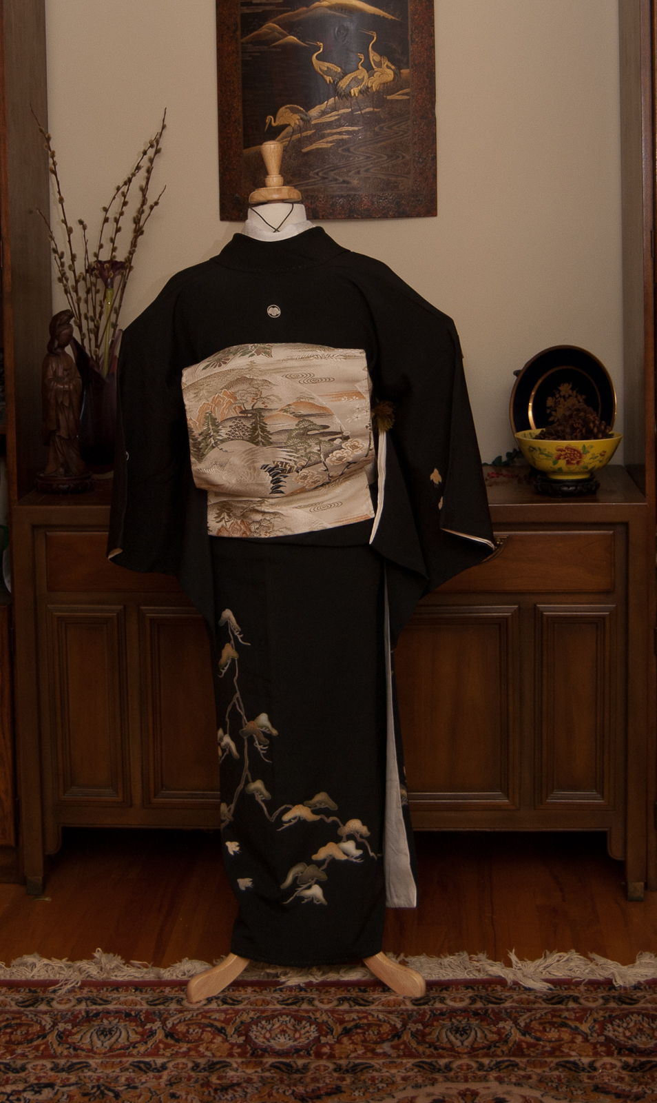
My next thought for this obi is a black-based kimono. I really love how it pops against darker, richer colours. It’s technically not formal enough for kurotomesode, but because it’s got a metallic pearly-silver sheen to it, I think I can make it work! Maybe I should do that next week. Less folding to do if I use the same obi two outfits in a row 😉
Items used in this coordination
-

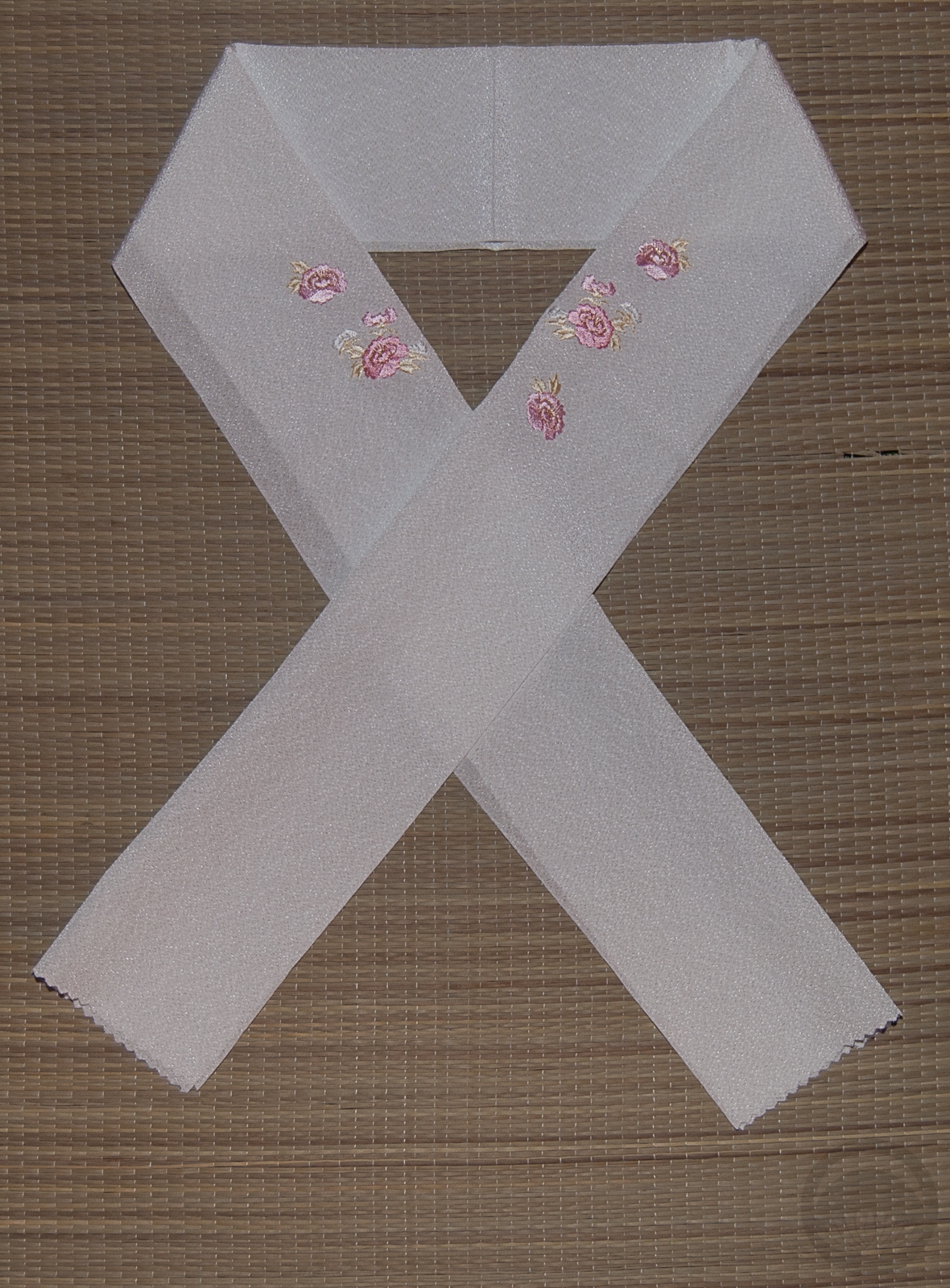
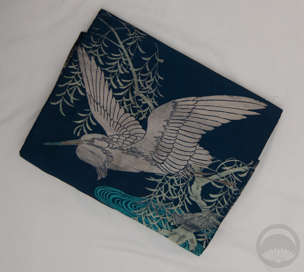
- Blue with White Floral
-
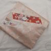
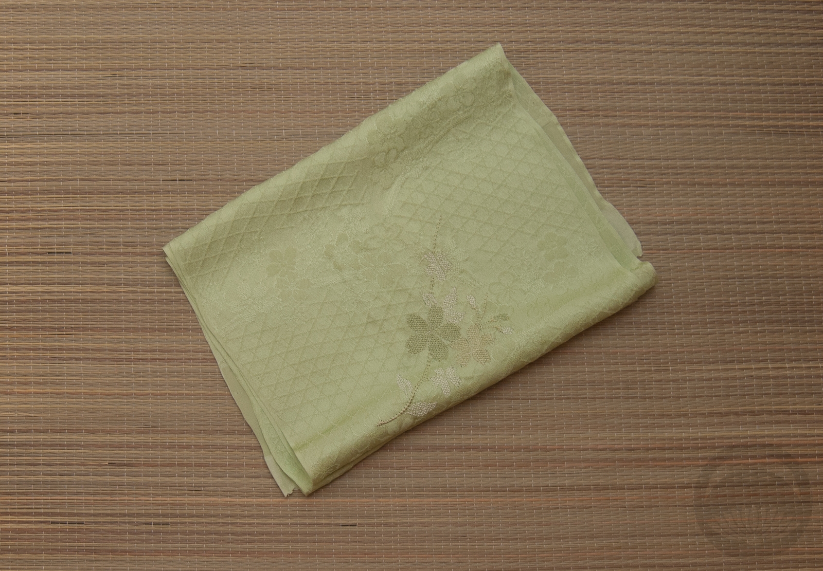
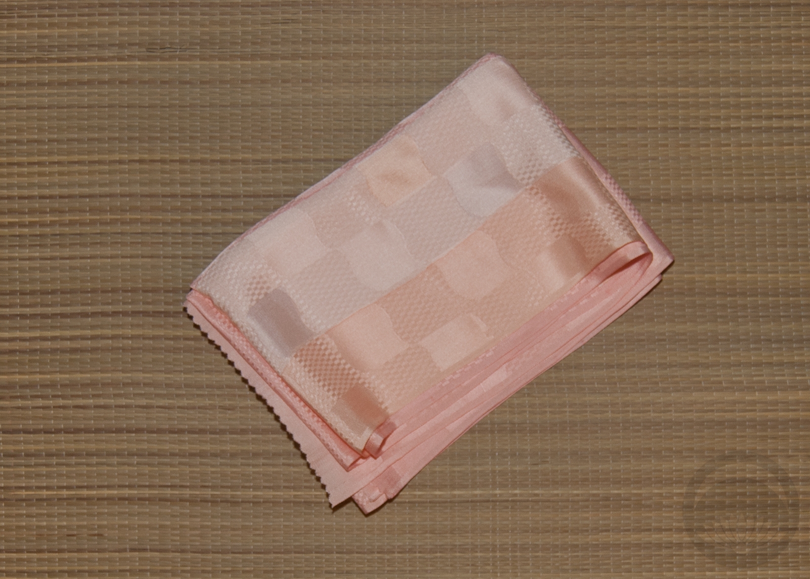
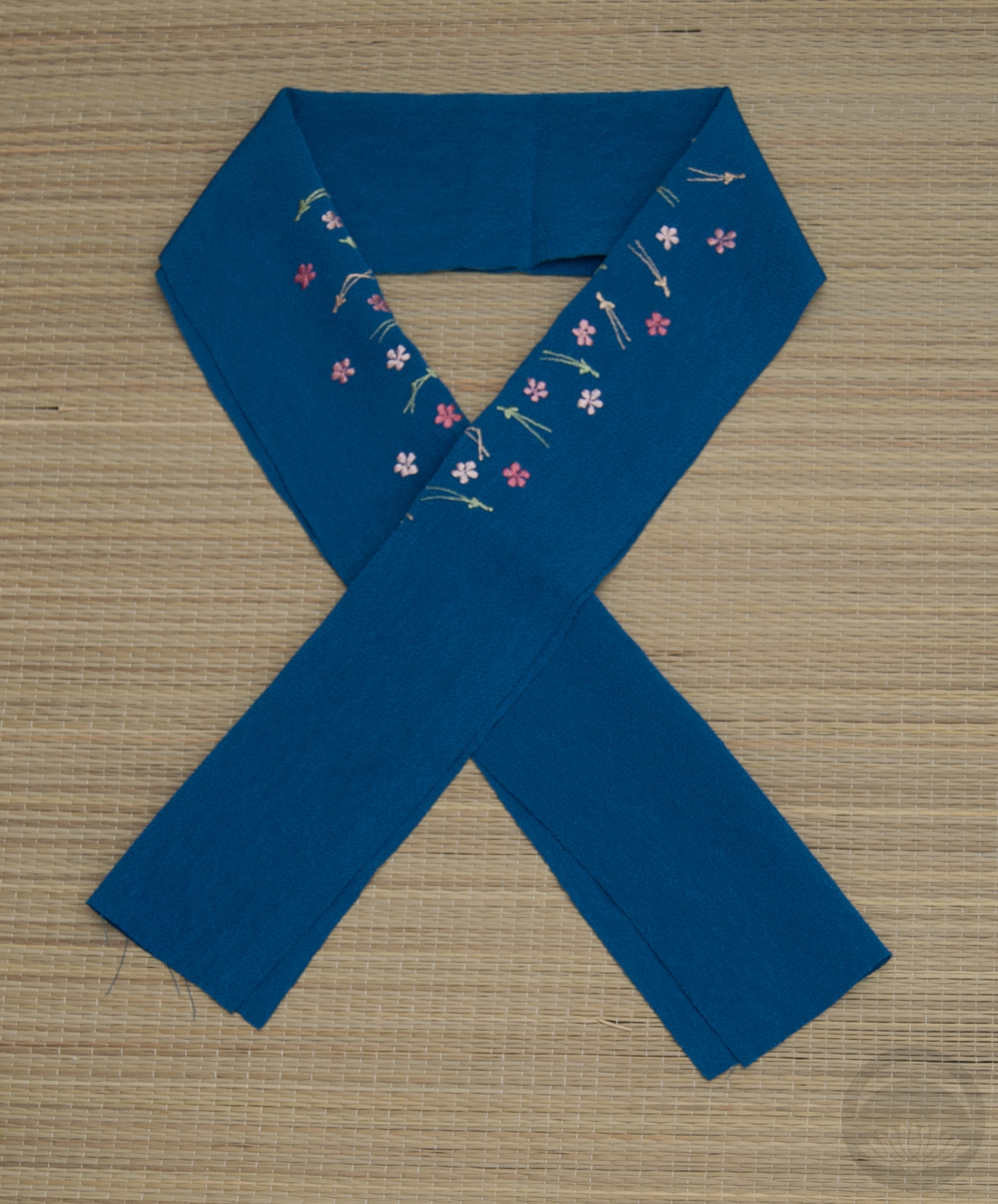
- Pale Pink
-

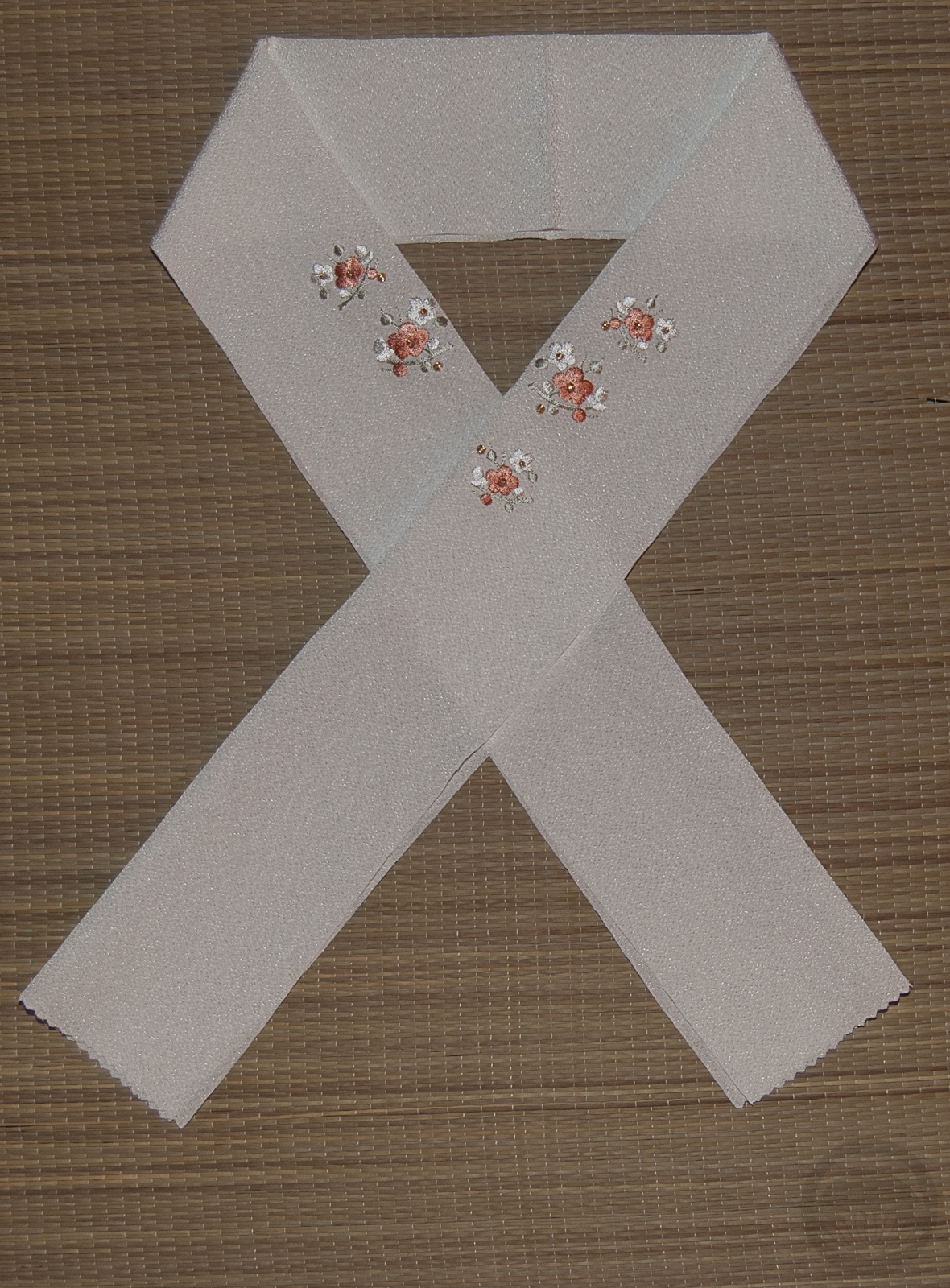
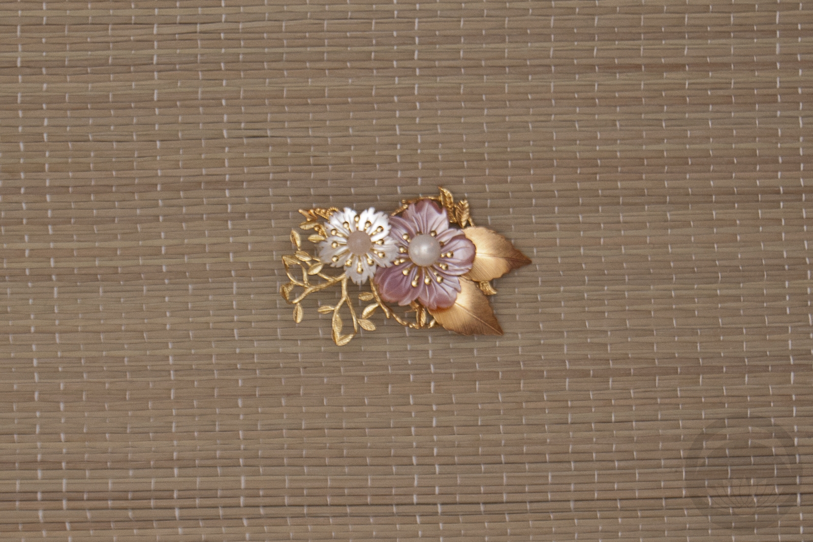
- Pink Ume
-
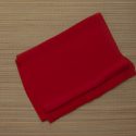
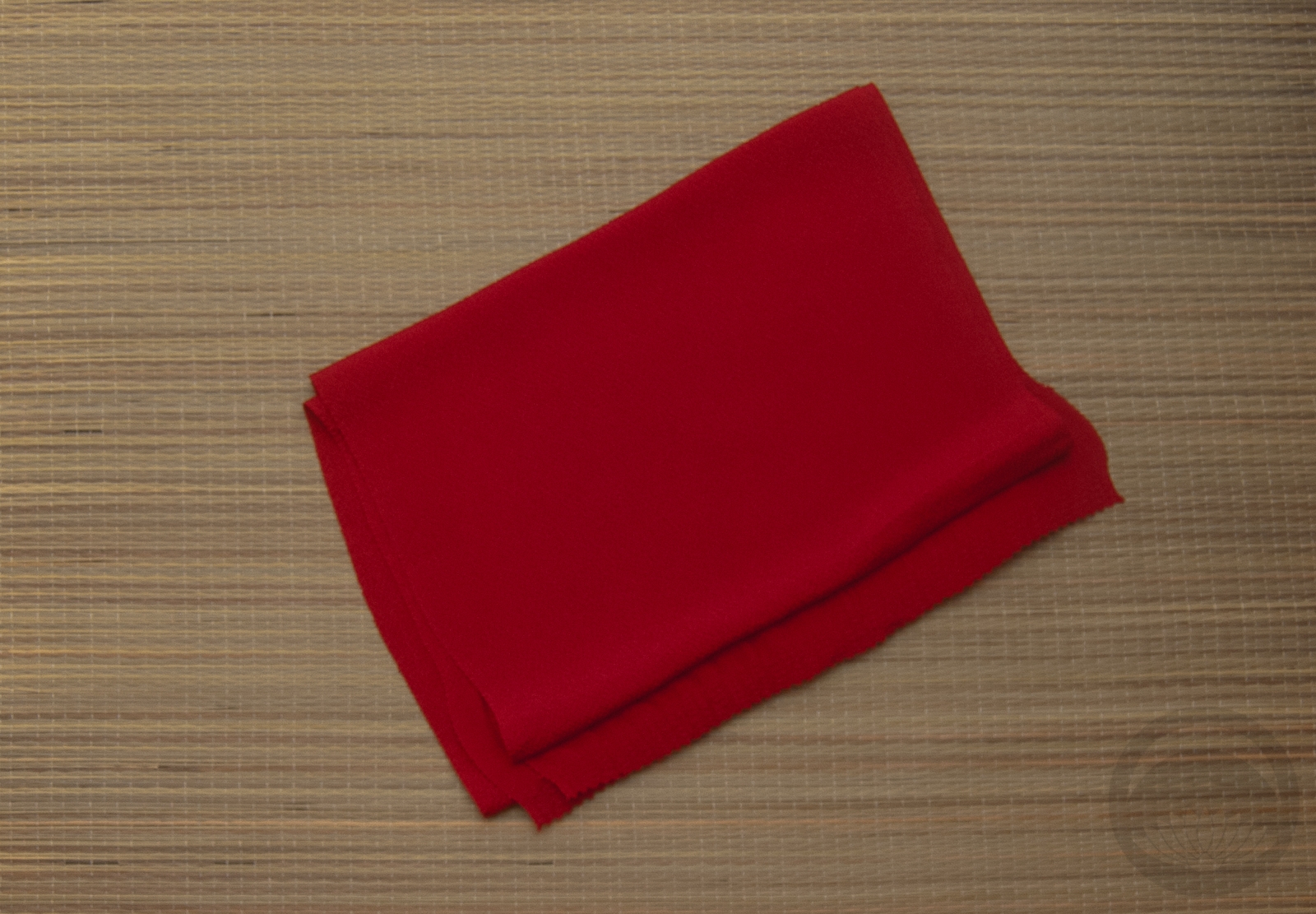
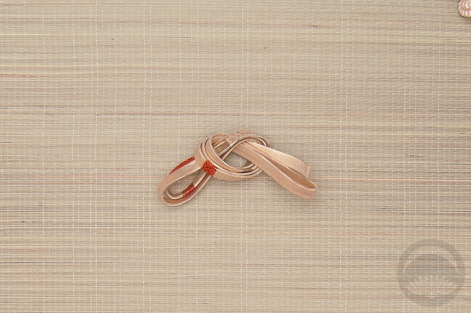
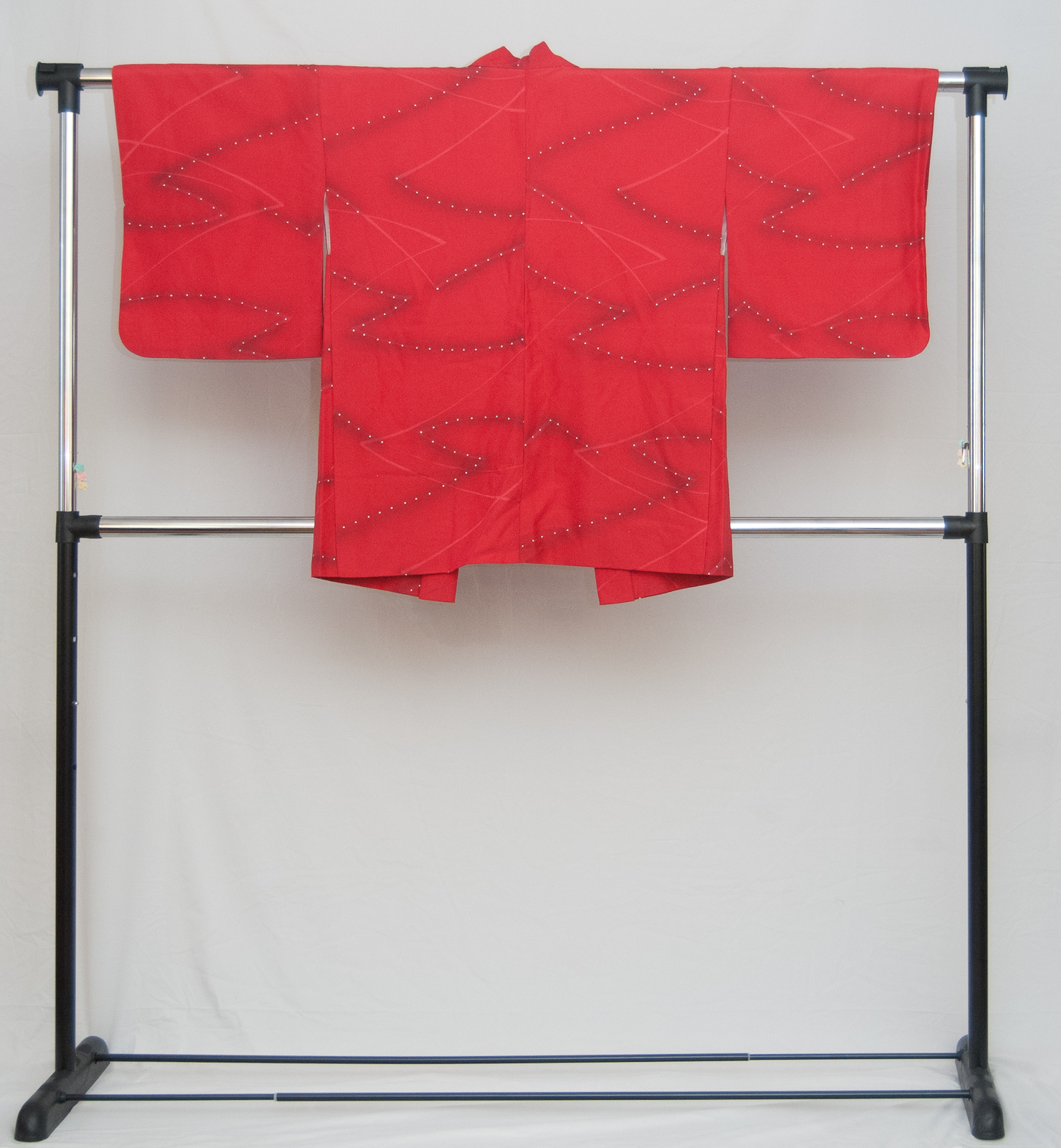
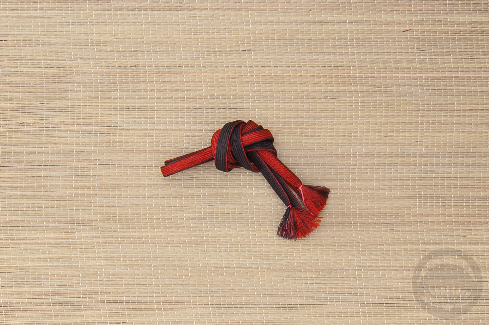
- Red Chirimen
-
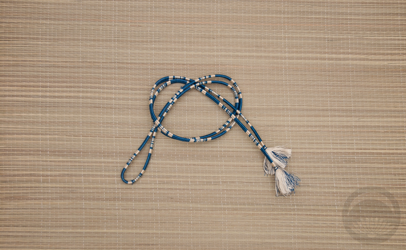
- Blue with White Stripe


 Bebe Taian
 CHOKO Blog
 Silk & Bones
 Gion Kobu