
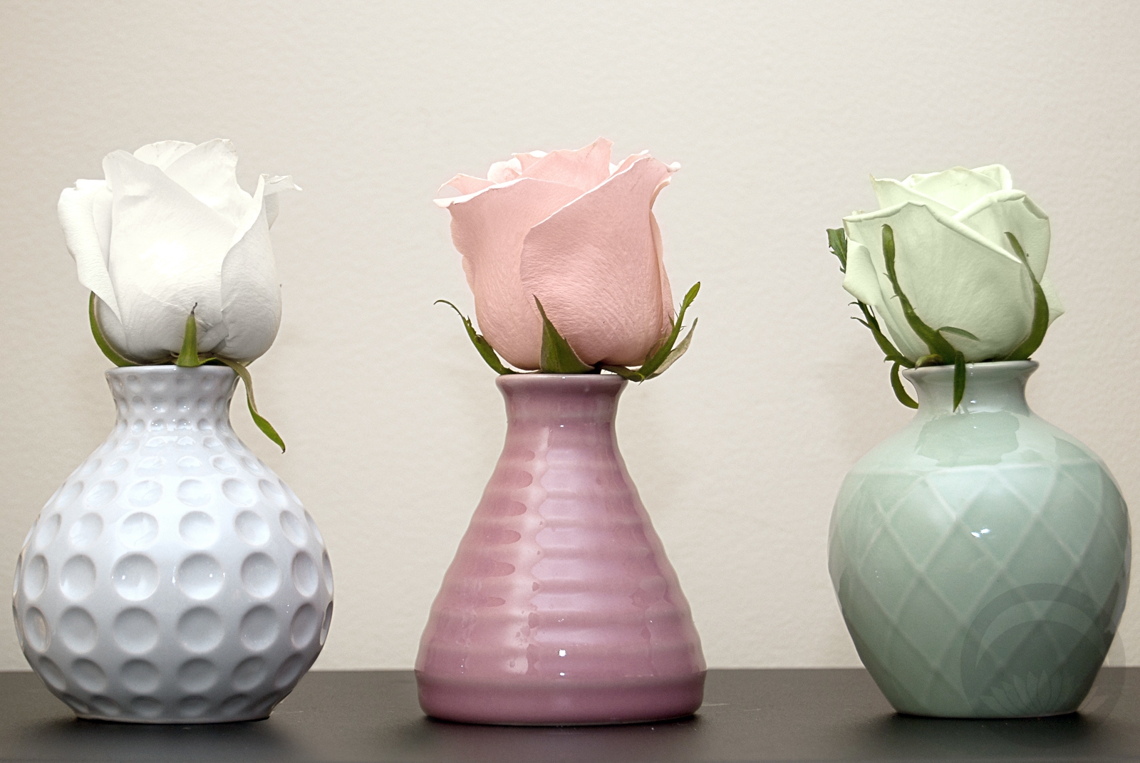
 I bought this set of bud vases at everyone’s favourite enormous Scandinavian home goods store a while ago, with the intention of doing something with them, but I hadn’t decided on what. When I found a rose that was a very pale celadon green while out running errands today, I knew I’d found my project. I loved the idea of focusing on shape and colour here, and having three very balanced separate units forming one cohesive and harmonious grouping. I did debate using three different flowers to coordinate with the three different textures of vases, but in the end I felt that using the classic and neutral shape of the roses had the most impact. Thankfully, finding the pink and white ones was a breeze after the stroke of luck that was finding a greenish tinted one (I will be honest, I have no idea if it’s natural or if it was dyed for the florist’s, but either way it worked out quite well for me!) I think the soft, organic roses contrast the tactile and architectural quality of the vases perfectly, and the seeing the three of them together is like hearing three distinct notes coming together in one lovely chord. I arranged them simply on a dark surface to ensure all attention was on them without any background distractions, and I love the way they pop, pop, pop!
Tiana – Disney Princess Kitsuke Project
🎵 Dreams Do Come True in New Orleans🎵
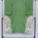
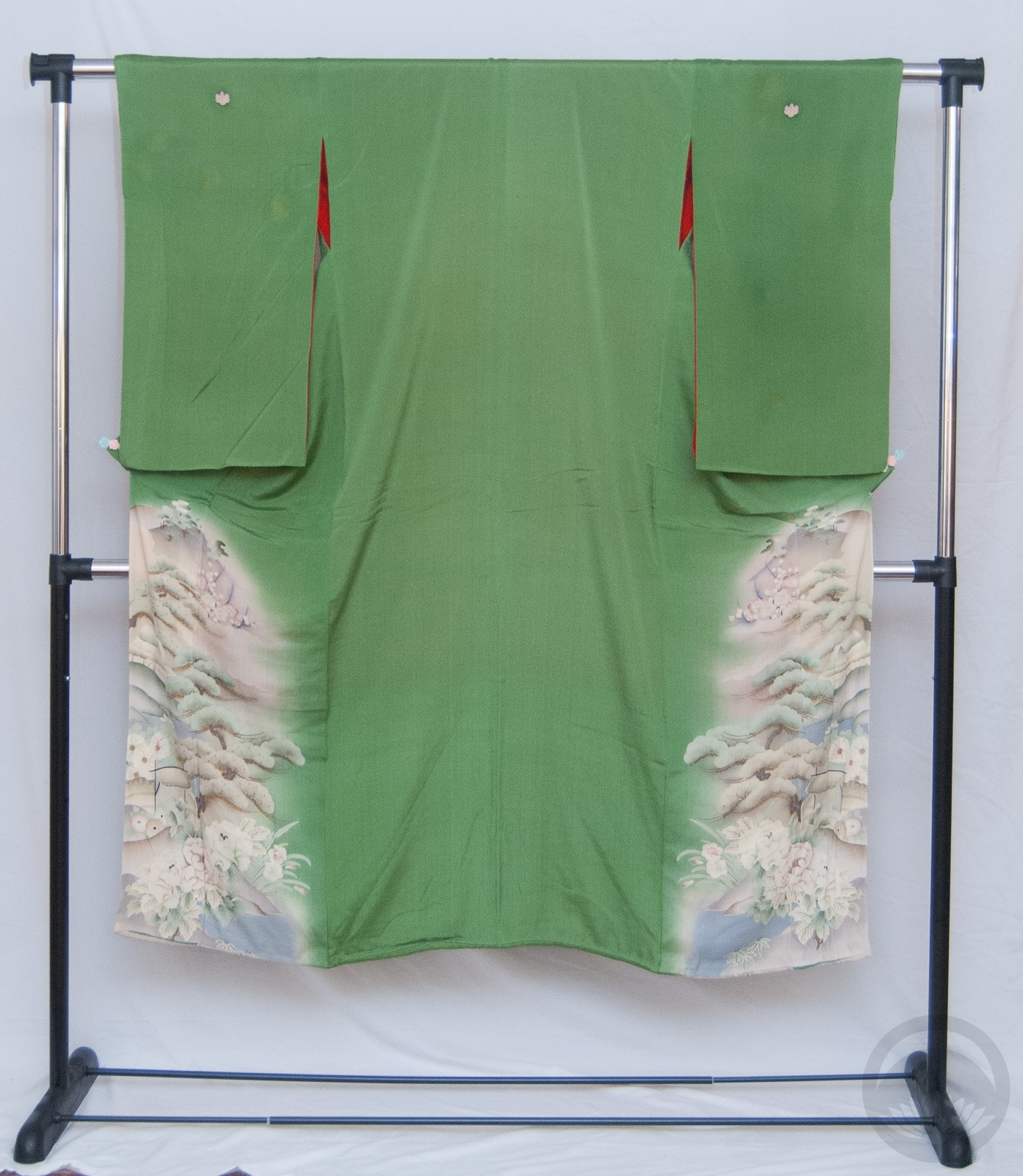
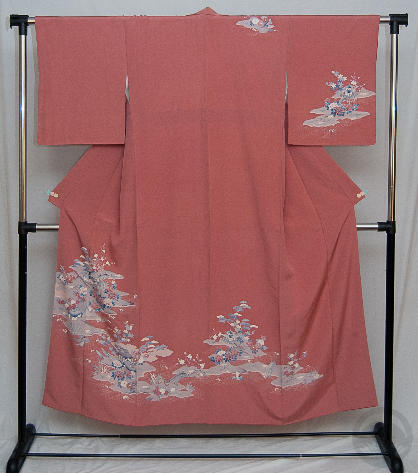
Tiana is one of the princesses I have had the most fun with so far. I knew right away I wanted to use this green irotomesode. Not only its it the perfect shade of froggy green, but it’s also from the same era as Tiana is. While most of the Princess movies exist in a bit of an amorphous time and space, The Princess and The Frog has such a distinct and concrete setting. I wanted something that brought together Taisho-era Japan and Jazz Age New Orleans, and felt like a kimono-hime outfit would strike exactly the mood I was aiming for.
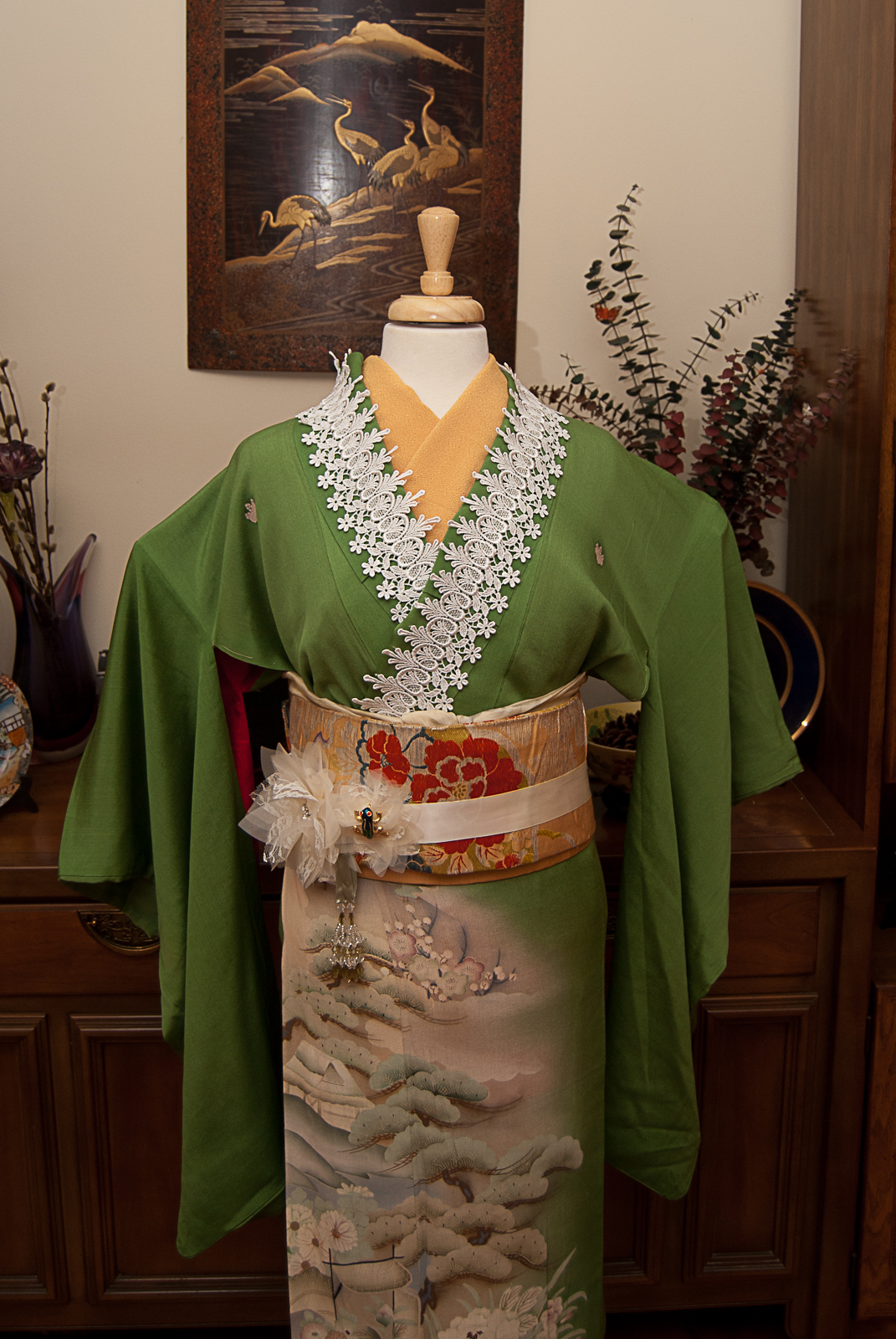

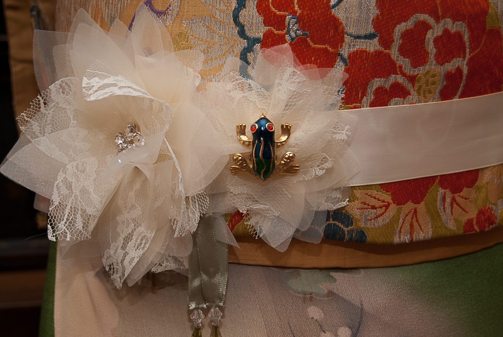
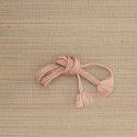
I built the outfit around the kimono, using golden yellow accents as a callback to her beautiful flowery gown. Some ivory lace appliqué on the collar and hem is reminiscent of flapper fringe, and when I found this gorgeous flower belt in the bridal section of the craft store, I knew I’d found my parallel for the lily on her gown. Of course, what is the princess without her frog? An enamel and gold brooch looks perfectly at home nestled in one of the flowers.
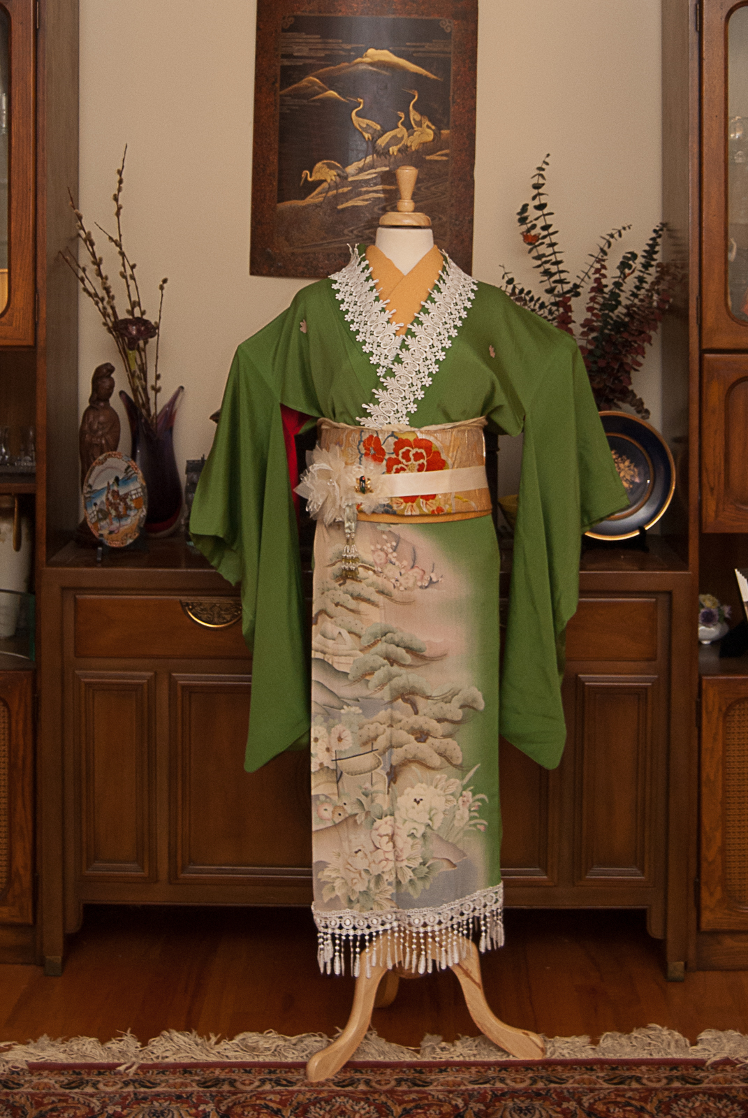
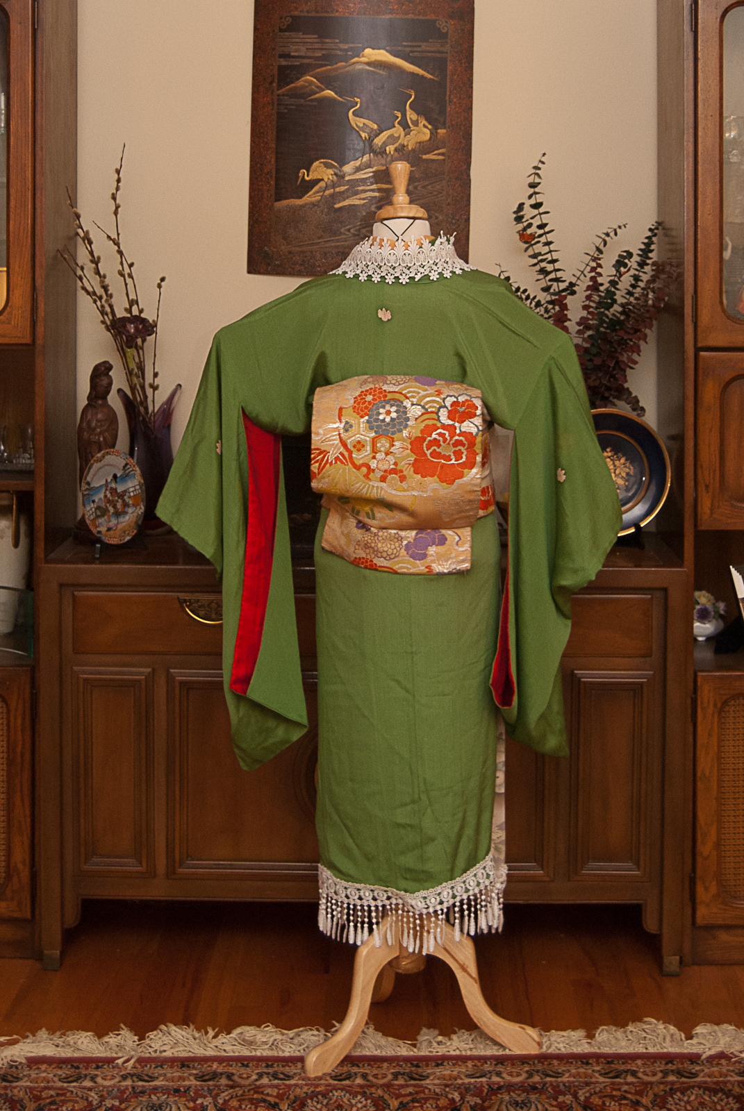
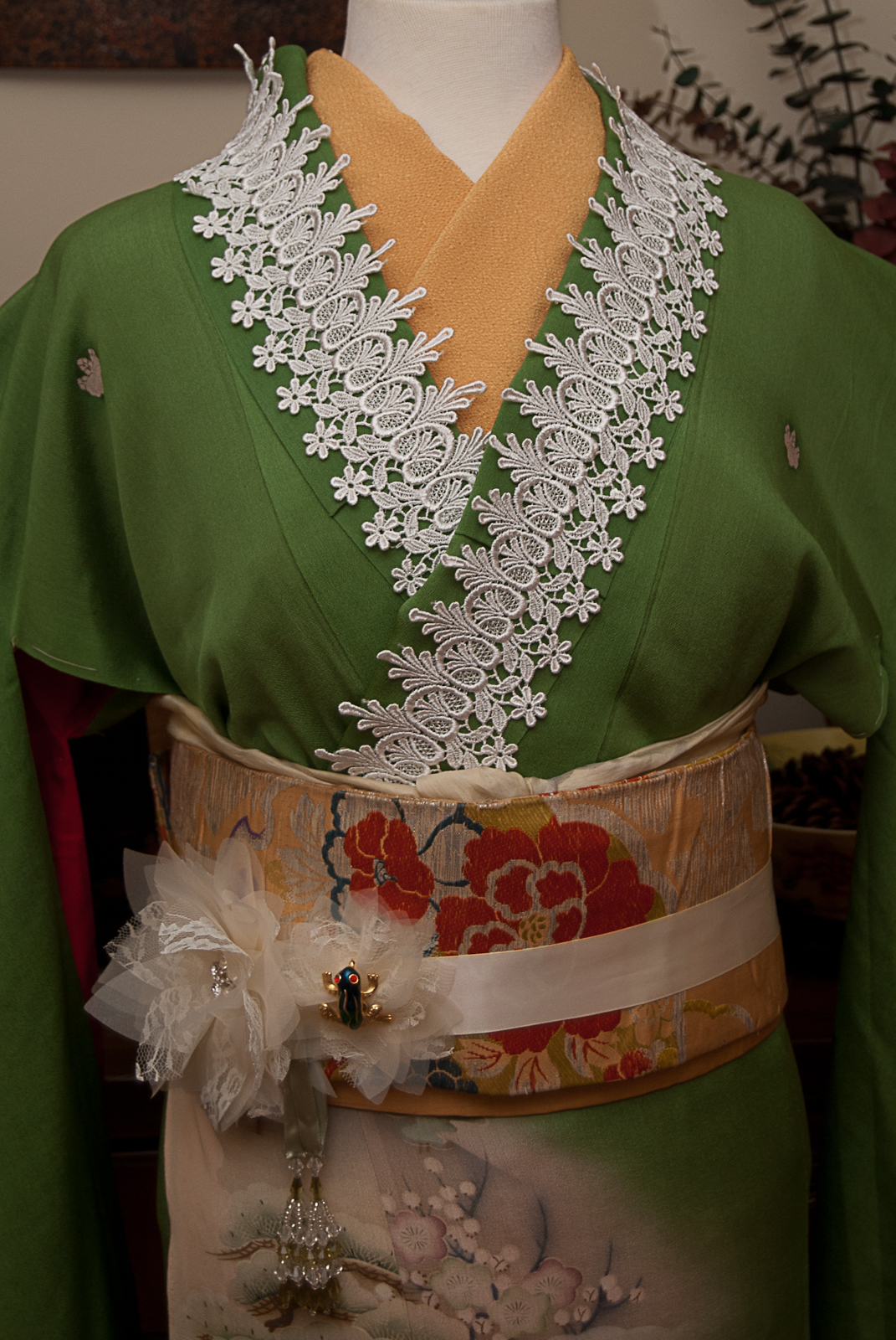
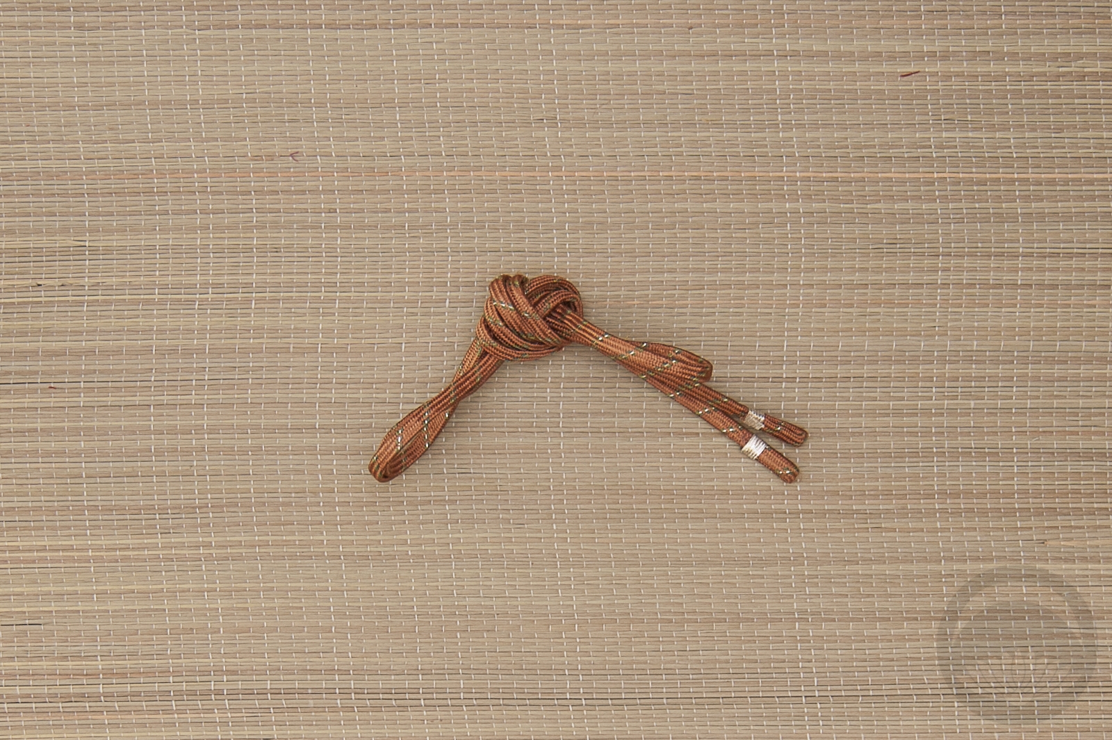
My original plan was to tie the obi in a more vintage-feeling musubi, especially since I used a standard niijudaiko on Aurora last week, but this obi is incredibly short and fragile, and I wasn’t comfortable putting too much strain on it. I then realised that the yellow colour tied in a puffy little square otaiko is reminiscent of Tiana’s famous beignets, so it worked out better than I’d planned. Aside from the obi, this one turned out almost identical to what I had in my head, and I couldn’t be happier that it came together so well!
Items used in this coordination
-
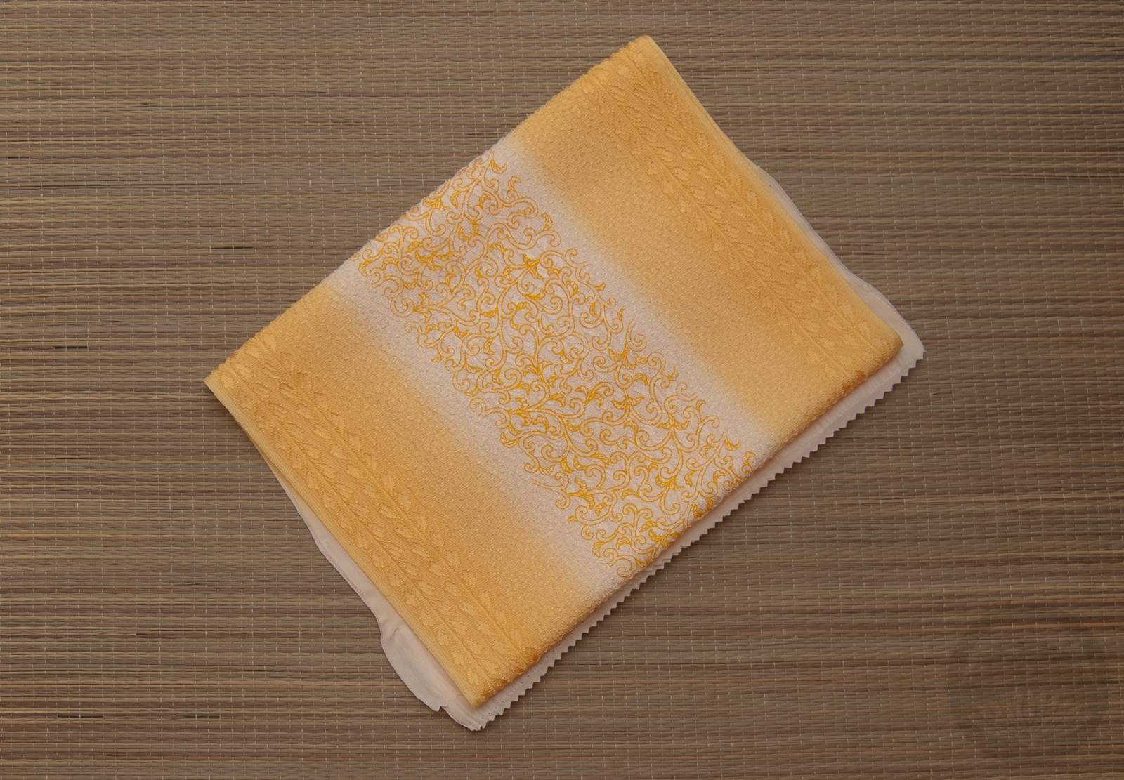
- Leaf Green Mirrored
-
- Yellow Florals
-
- Solid yellow

-
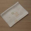
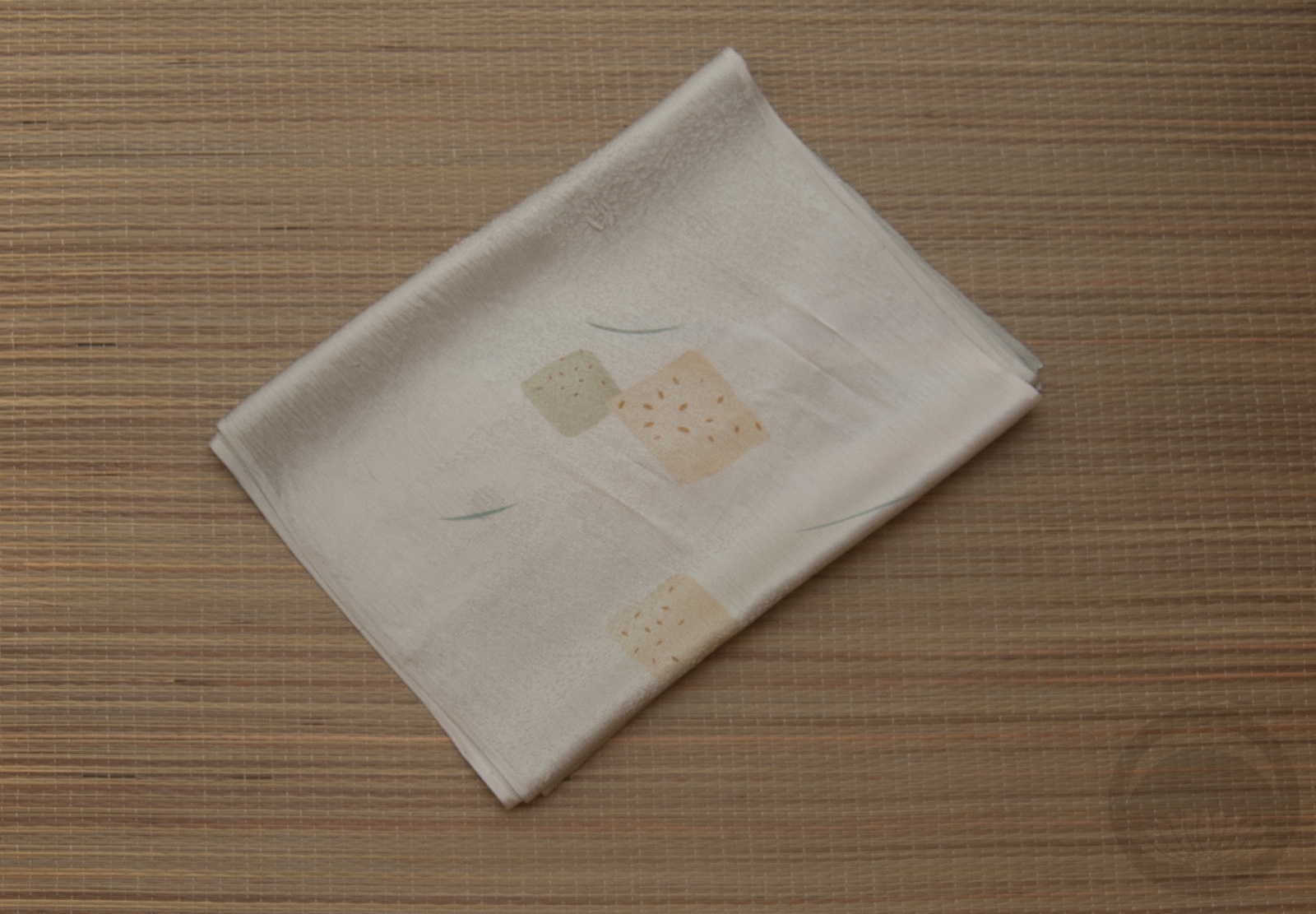
- White and Gold Rinzu
Art Gallery – Yukata Cutie by Nikki R
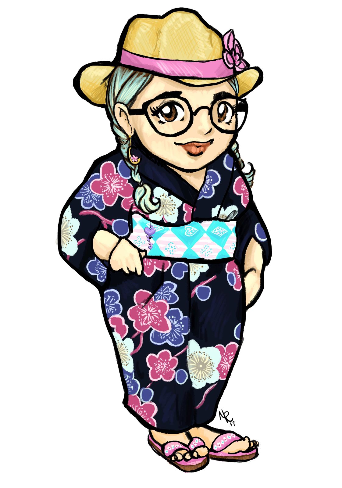 Check out this utterly adorable drawing of my recent yukata outfit! It was drawn by my friend Nikki, who draws all sorts of awesome comic, pin-up, and stylised artwork. This chubby little caricature style is probably my favourite, though, and I’ve loved watching her artwork evolve over the years.
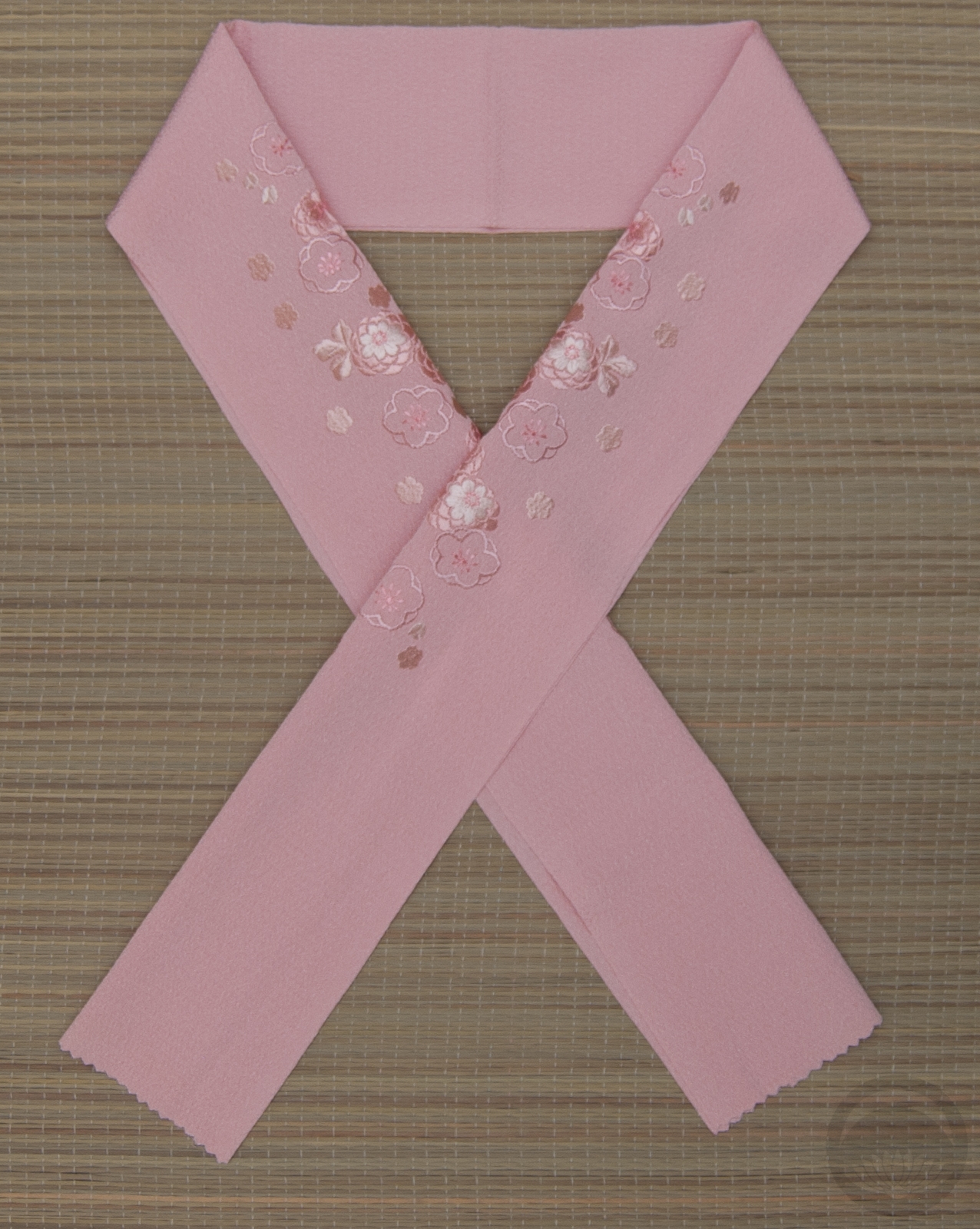
I’m amazed by how much detail she managed to fit in to such a tiny and cartoony piece. It’s super accurate without feeling cluttered or busy. She even got the ume kanzashi on my hat and the little obi-kazari down pat. For someone not in the habit of drawing kimono-related artwork, she did a fantastic job of getting the details spot-on!
The artist’s going through a bit of a rough spot financially right now, and she deserves all the best. So if you love this style as much as I do and would like one for yourself, please check out Nikki R Illustration on Facebook! Also, I always love seeing how different artists interpret my coordinations so if you’re an artist taking commissions and are interested in giving it a shot, please don’t hesitate to contact me.
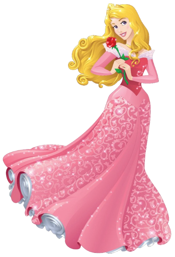
Aurora – Disney Princess Kitsuke Project
🎵 Once Upon a Dream🎵
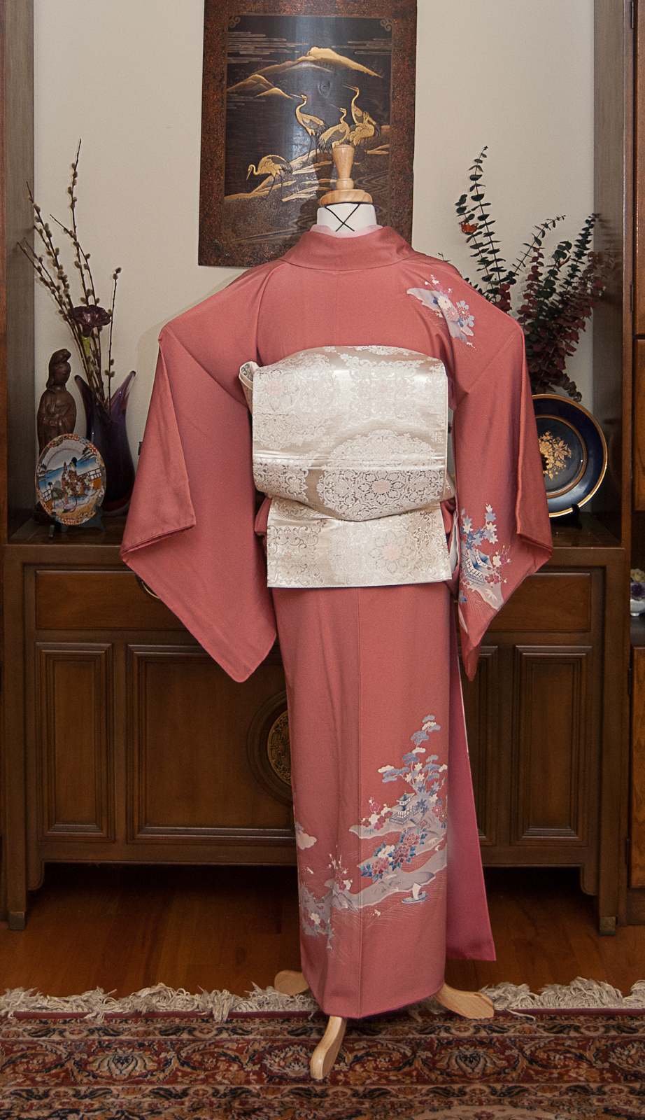
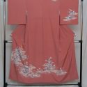
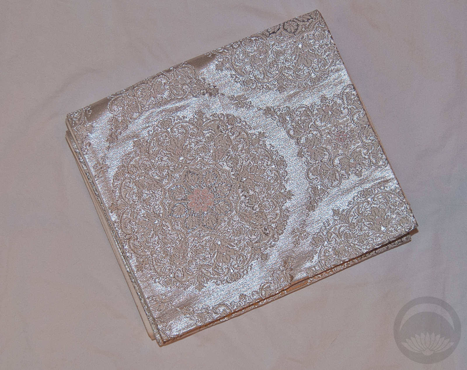
Aurora, the lovely Sleeping Beauty. While she may certainly not be the most progressive of princesses, speaking less than any other princess and spending a large chunk of her movie unconscious, there’s no denying that as one of the original three she helped pave the way for what came after. I was initially quite stumped on how to coordinate her outfit, since we don’t really get a huge sense of her personality from the movie. Pink seemed obvious, but then I thought back fondly to the scene where the fairies are arguing over the colour of her dress. When I found this beautiful pink kimono with blue accents, everything fell into place.
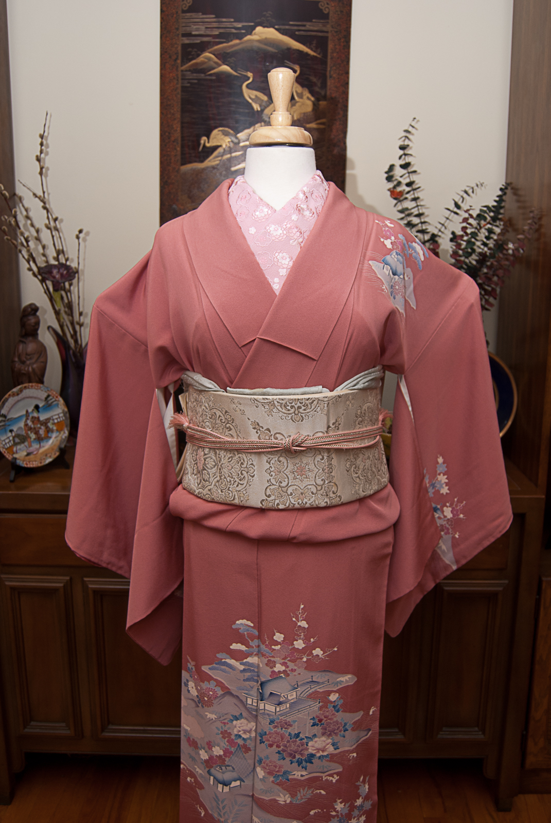
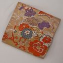
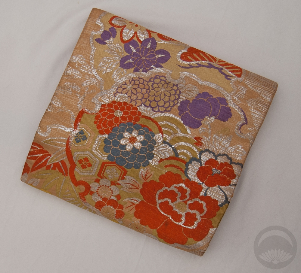
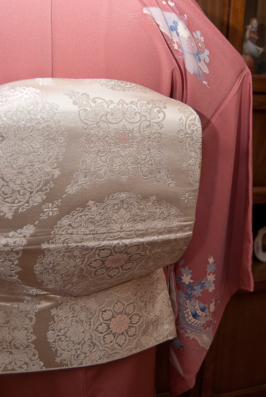
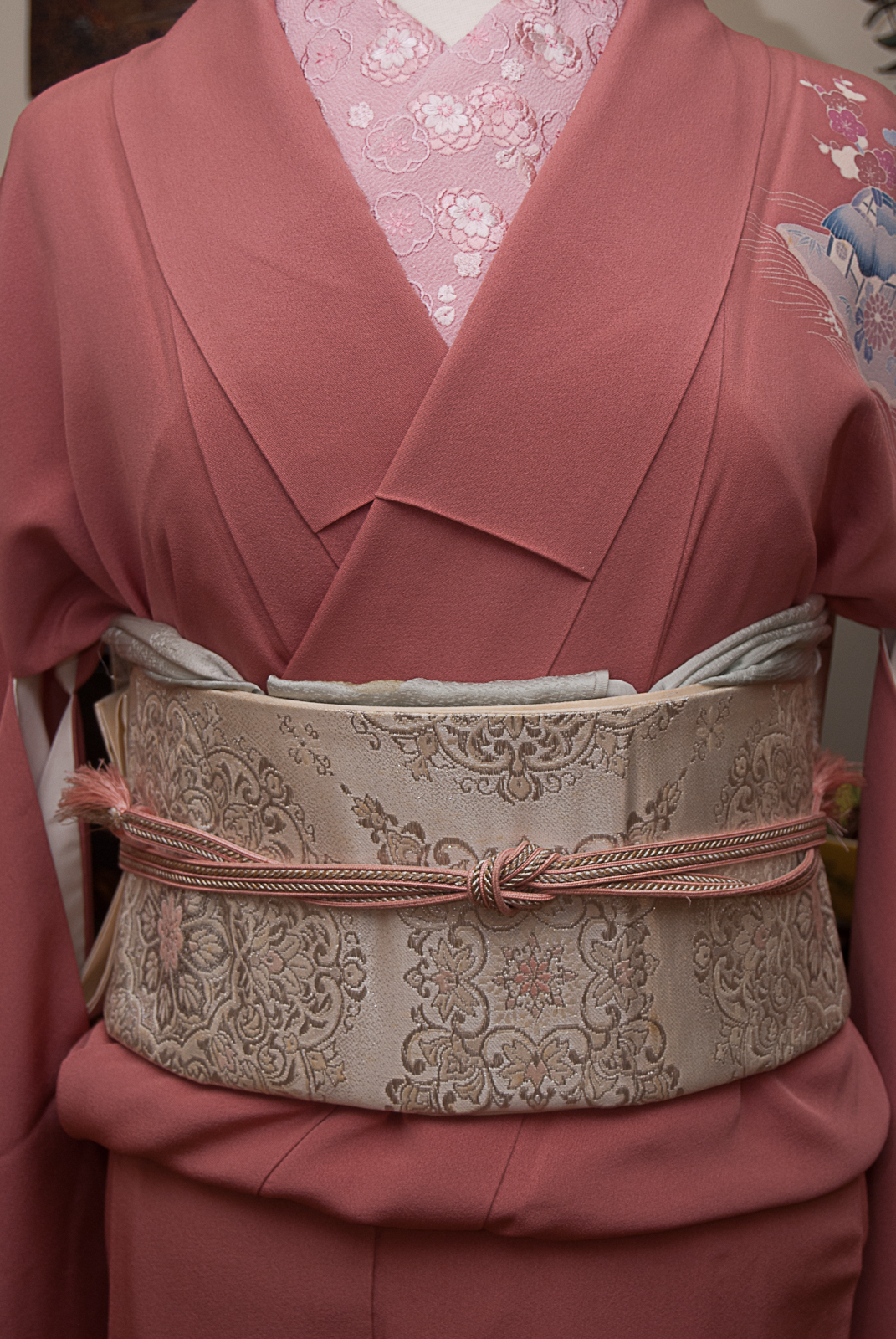
I paired up the pink kimono with this beautiful white and platinum obi with tiny pink details. The design is of an abstract flower motif but with a little imagination, the round shapes are reminiscent of the spinning wheel upon which she pricks her finger, bringing Maleficent’s curse to fruition. Since Aurora seems like a fairly traditional, demure, romantic woman I decided to keep this coordination fairly straightforward too, sticking to appropriate accessories and tying the obi in a nice, stiff niijudaiko obi.

I hope you’re enjoying seeing these coordinations as much as I’m enjoying doing them! We’re more than a third of the way through, and I can’t wait to share more soon.
Items used in this coordination
-
- Dusty Pink with Blue Landscape
-
- Platinum Roundels with Pink
-
- Pink Ume
-
- Ice-blue Rinzu
-
- Pink & Silver
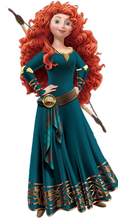
Merida – Disney Princess Kitsuke Project
🎵 Chase the Wind
and Touch The Sky 🎵
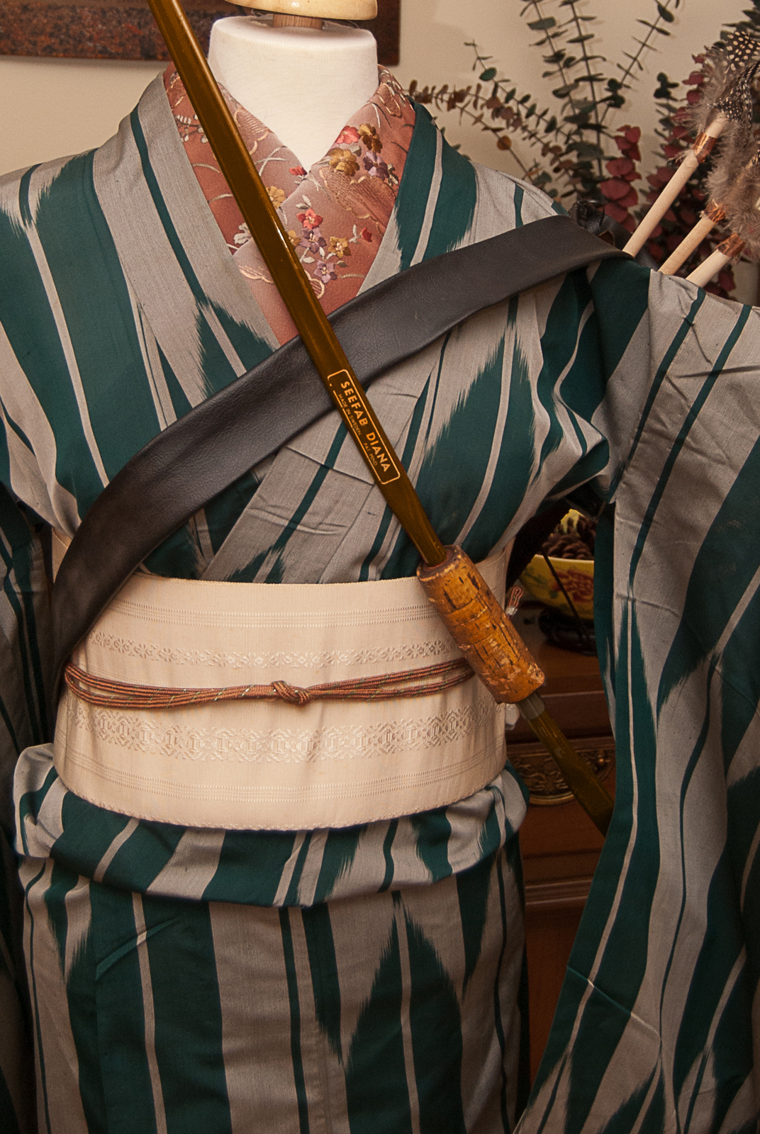
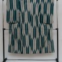
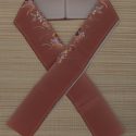
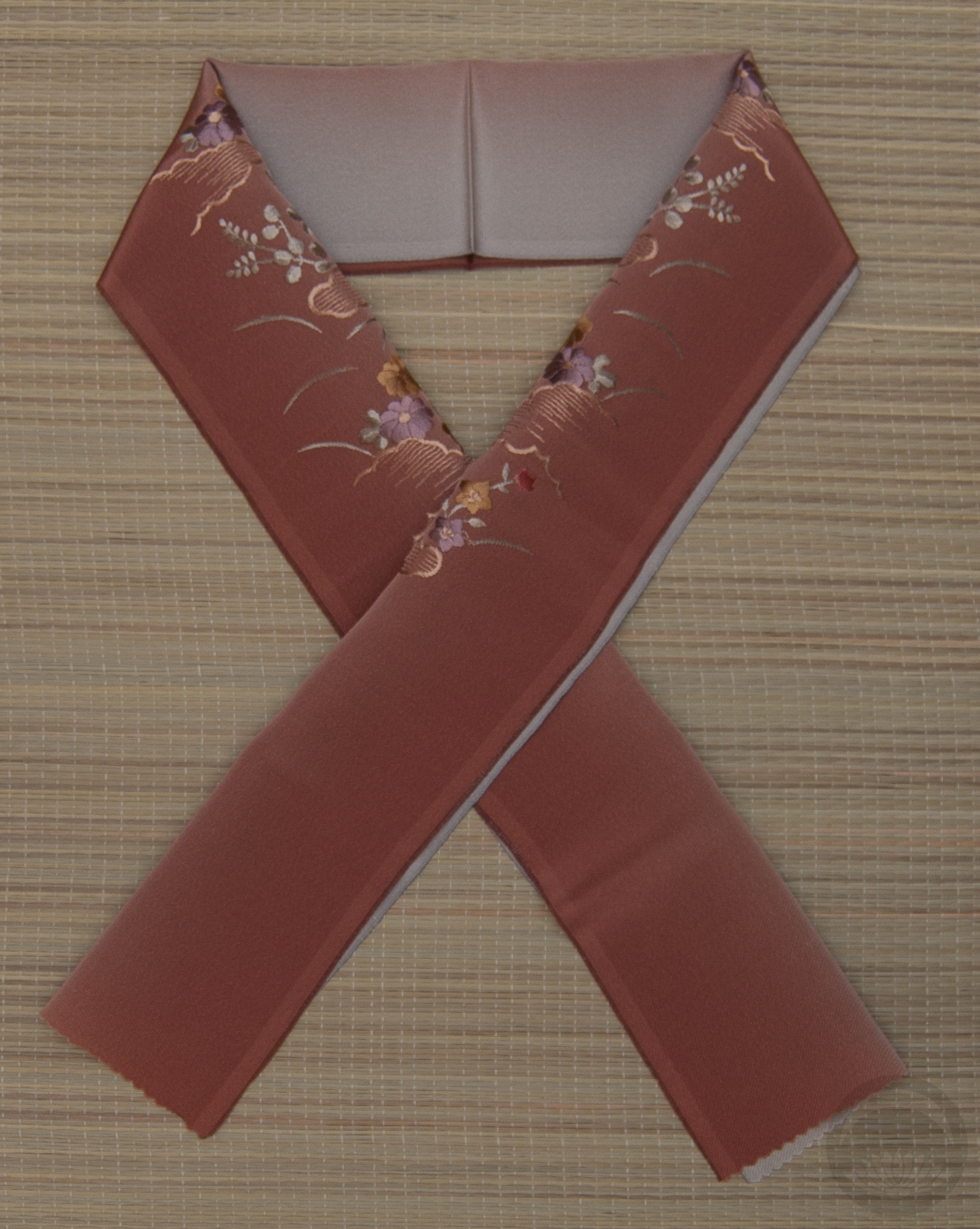
We’ve done a Renaissance-era princess and a Silver-era princess so it felt like it was time for one of the modern revival princesses. Merida is one of my favourite princesses. She’s snarky, she’s witty, she’s tough but still vulnerable, and she’s determined to be the architect of her own fate. I found a few kimono online that were close in colour to her dress, but nothing really jumped out at me until I found this utterly perfect vintage piece. Not only is the base of it nearly the identical colour to Merida’s dress, but the yabane, or arrow fletching, motif could not have been more appropriate.

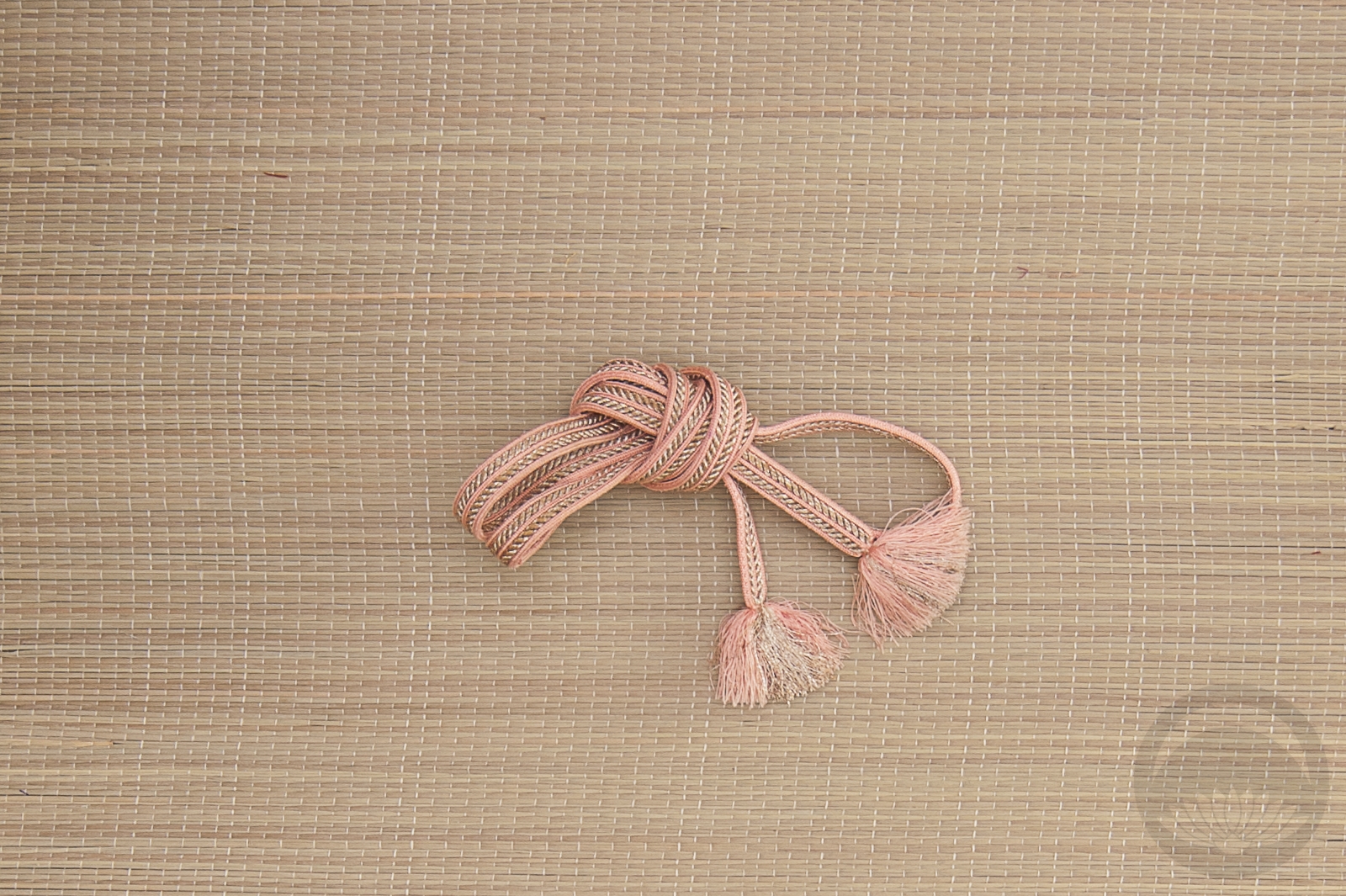
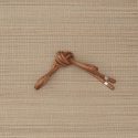
I debated using a brown obi to echo her brown belt but it made the whole outfit feel too heavy and overly mature. Instead, I went with a plain white hakata tied in a very practical karuta musubi, and amped up the warm brown tones in the obijime and dusty embroidered haneri. The bow was my grandmother’s, and I have fond memories of learning to shoot with it as a kid. Using it was pretty much a given. In the interest of full disclosure, I will admit that it’s actually a bright candy-apple red, but that’s nothing a little bit of photoshop couldn’t fix.


I really feel like this project is just continuing to build momentum, and I couldn’t be happier! It’s really satisfying to watch these come together. Maybe one day I’ll try to coordinate a fashion show or something and see them all at once.
Items used in this coordination
-
- Taisho Hitoe Yabane

-
- White with White

-
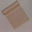
- Reversible embroidery (side b)
-
- Brown with Lime


 Bebe Taian
 CHOKO Blog
 Silk & Bones
 Gion Kobu